10,000 search results
(0.118 seconds)
- Caskey by Twinletter,
$15.00 Caskey is a unique font with a graffiti motif, outdoor activities, and an abstract display with gorgeous graphics. We put all of it into this typeface, which we dubbed Caskey. We also include alternates, ranging from thin to thick, to make it easier for you to use; you are free to choose whichever suits you best. Now is the time to use this typeface to bring your specific project to life. This graffiti font is great for product logos, poster titles, headlines, packaging, film titles, logotypes, gorgeous writing, and trendy graffiti designs, among other things. Of course, if you utilize this font in your numerous creative projects, they will be perfect and outstanding. Use this typeface right away for your one-of-a-kind and remarkable projects.
 - Kadigan by Missy Meyer,
$12.00 Kadigan: (noun) A placeholder word. A kadigan can be used to substitute for any other noun: persons (John Doe, Acme Company), places (Anytown, 123 Main Street) or things (whatchamacallit, thingamajig). Just like kadigans can be used in nearly any situation, the members of the Kadigan font family can be used in nearly any design! These sans-serif beauties are clear and easy to use, but they also have a little bit of wiggle in their strokes and weights, for a fun hand-lettered look! The three members of the family: - Kadigan Light: An all-purpose lightweight stroke, with sharp corners. - Kadigan: A nice mid-weight stroke, with slightly rounded corners. - Kadigan Heavy: A thick, chonky stroke with pillowy rounded corners. And each member of the family is packed with features, including: - All of the basic stuff you expect from every font; - 340+ extended Latin characters; - Cyrillic character set; - Greek character set; - Those character sets? Support over 110 languages! - 52 double-letter ligatures for variety (That's right, EVERY letter. I'm looking at you, savvy revved trekkers!); - A full set of small caps (including Cyrillic & Greek); - And more! (Seriously, it was hard to stop.) So whether your work is in English, Español, български, ελληνικά, Türkçe, or over a hundred other languages, this cute and fun sans-serif may be just what you've been looking for!
 - Brigast by suhadidesign,
$17.00 Brigast modern retro typeface Hi Ladies and Gentlemen! According to the market demand for fonts that tend to be more modern, then I decided to make a serif font that is in your view. The Brigast font is a serif font with very beautiful and popular alternates, comes with a modern style hoping to become a market favorite. We keep this font looking elegant, classy, easy to read, stylish, attractive and easy to use. Brigast Font is a great choice for magazines, wedding invitations, retro designs, newspapers, books, brand names, branding, branding, quotes, album covers, and other projects. The Brigast font is here to take the quality of your designs to a higher level. Brigast Font is my thirtieth Font created in 2023 The Brigast font style will make you love designing and taking advantage of the cool design results for this font. Continue to follow us for updates on making further fonts :) Font Features: • Standard uppercase and lowercase letters • Stylistic alternate • Stylistic ligatures • Multilingual Support • Numeral and punctuation
 - Neustade by Twenty-Six Types,
$3.00 Neustade is a layered typeface based on a simple grid, taking inspiration from the work of Wim Crouwel and Foundry Types. I challenged myself to create a typeface where words and letters can appear within or outside of other words and letters with the help of layering. Neustades grid also applies to the spacing and kerning of individual letters or words, ensuring that every layer will line up and allowing different weights to interact with each other. Individually each weight within the Neustade family has been designed with legibility at small sizes in mind, allowing for smooth and uninterrupted reading. Neustade in large sizes feels both modern and retro, especially when mixing weights and colors.
 - Tamba Sans by Dharma Type,
$19.99 Tamba Sans has strong geometric frames. Somewhat condensed and somewhat squarish letterforms can create a powerful atmosphere. At the same time, the very clear, neutral and distinguishable letterforms make it legible and readable. With the spread of the internet, the digital world is overflowing with “designed” stuff. To survive this chaotic world as a designer, you should use a strong typeface to catch the eyes of an unspecified large number of visitors/customers. This is why it is so important to be strong and powerful. One more important thing is the legibility, but the eye-catching design has a tendency to be unusual. Those two things conflict with each other. Tamba Sans solved this problem with an exquisite balance. Tamba Sans consists of 7 weights and their matching Italics for a wide range of usages. Farther, Tamba Sans is supporting international Latin languages and basic Cyrillic languages including Basic Latin, Western Europe, Central and South-Eastern Europe. Also CSS covers Mac Roman, Windows1252, Adobe1 to 3. This wide range of international characters expands the capability of your works.
 - DM Unarmed by DM Founts,
$12.50 Unarmed began life as a series of rectangles in Fireworks. The task was designing my own business card for the first time in years, and the perfect lettering couldn't be found in either free or commercial fonts. While there were some good choices, none of them really communicated who I was. Initially only the lowercase letters in my name were created, with each being designed around a 7 x 4 grid of squares. I liked the result so much that I wanted to use the same typeface in different projects - and to save time in future, I decided to create this font. In creating DM Unarmed, the intention was to avoid diagonal lines, and to keep all the lines horizontal, vertical and grid-like. This made creating some of the characters - particularly the rounded ones and the letters X and Z - challenging. Coming from both worlds, I wanted to achieve a blend of technicality and creativeness, without trying to pretend one was the other. For best results this font should be used for large and prominent text, although it works at smaller sizes up to 12pt. I've spent a lot of time trying to hint a few characters that wouldn't play ball, such as 2, 7 and 8. In case you're wondering: DM Unarmed got its name from my philosophy of facing challenges without reliance on tools and weapons.
 - Greyfriars by Hanoded,
$15.00 Greyfriars Kirkyard is the graveyard surrounding Greyfriars Kirk in Edinburgh, Scotland. I needed a rather ‘English’ name for this hand drawn Baskerville, but I ended up with a Scottish one. Greyfriars font was hand drawn with a Japanese brush pen. It is based on Baskerville, a font I really like. The glyphs are a bit rough and jumpy, which adds to Greyfriars’ unique look. Use it for your titling, book covers and product packaging, or stick it in a website and see what happens! Comes with a jolly bundle of diacritics.
 - Vingard by Ergibi Studio,
$20.00 Vingard is a sophisticated serif, The many alternate character swash on serif makes this typeface unique and stands out rather than the regular serif font, perfectly for headlines, logos, posters, packaging, T-shirts,coffee shops, restaurants, magazine's headers, signs or gift/post cards,cafe's and weddings or any type of advertising purpose. comes with 2 versions namely Regular and bold What's Included : Standard glyphs Ligatures Alternate Characters International Accent Works on PC & Mac Simple installations If there is a problem, question, or anything about my fonts, don't hesitate to ask! Big Thanks ~ Ergibi Studio
 - Karlo by The Northern Block,
$28.95 Karlo is a super family of several branches, originating in the same lightweight skeleton. The lightweights are based on a pen of an even stroke-width. Inspired by the writings of calligrapher Edward Johnston, the family moves on in two directions in the heavier weights. Johnston demonstrated that the broad nib pen can produce different writing styles. Following this, one heavy weight has a humanistic low stroke contrast (KarloSerifBold and KarloSansBold), and another has a high stroke contrast of vertical axis with references to the 19th century jobbing typefaces (KarloOpen). The latter is inspired by Johnston’s demonstration of the broad nib pen, where he suggested fastening two pencils together. With each pencil representing an edge of the pen, it becomes more evident how the pen works in writing. The friendly informal look makes KarloSans and KarloSerif usable for both running text and for display sizes. KarloOpen, on the other hand, is solely designed for display purpose showing few words at a time. In Denmark, a guy named Karlo would typically be an old fellow with a slick hairstyle that makes an effort with his appearance. He is a handyman who can do a bit of this and that when needed. He is a happy go lucky kind of guy that takes one day at a time. To me, the typeface family has some of the same qualities. Check out Pyke which is a great pair for Karlo.
 - HWT American Chromatic by Hamilton Wood Type Collection,
$24.95The HWT American Chromatic set is a multilayered font set that will allow for thousands of possible color and pattern combinations. The original 19th Century Chromatic upon which this font set is based included two fonts. The HWT digital version includes eight. The alignment is configured to allow any combination of the eight fonts to all align when identical text is set and arranged, one on top of the other. Due to the highly decorative nature of this font set, the character set is limited to upper case only with basic punctuation. Five of the eight fonts in the set can be used individually as variations of the classic Tuscan style of wood type, which is defined by its concave stems and serifs. There are no accented characters due to the ornate nature of the design and because there were no accents originally intended for this design. This font is best used at sizes of 72 pt or larger and is ideal for a wide array of design uses. For webfont use, CSS with z-index and position will allow for easy online layering. - Wasabi by Positype,
$20.00 Remastered in 2019. Wasabi is the re-imagining of my very first release, Iru. Like Iru, Wasabi was heavily influenced by the monument lettering style, Vermarco. The simple, geometric forms allowed for small lettering sizes to be sandblasted cleanly and has been a monument lettering workhorse for decades… the only issue centered around the lack of a lowercase or any other letters beyond the 26 uppercase glyphs and the numerals. Wasabi solves this with the same simple, efficient line reminiscent of the old Vermarco while bringing it into the 21st century. Visual and optical incongruities of the original uppercase were replaced with new interpretations for the capital letters, a new lowercase and small caps were produced and the original single weight alphabet was replaced with six new weights. Wasabi has several ‘lighter’ weights primarily because the thin lines and simple transitions produce very elegant relationships… and I wanted to make sure those relationships could be explored regardless of the scale of letter. Stylistic Alternates show up through the upper, lowercase and small cap glyphs that attempt to simplify these shapes even more when the opportunity arises. Wasabi is as much a utilitarian typeface as it is a headline face. This realization led to the decision to produce a companion Condensed version shortly after the initial regular weights were developed and tested; so, try them all!
 - Wasabi Condensed by Positype,
$20.00 Remastered in 2019. Wasabi is the re-imagining of my very first release, Iru. Like Iru, Wasabi was heavily influenced by the monument lettering style, Vermarco. The simple, geometric forms allowed for small lettering sizes to be sandblasted cleanly and has been a monument lettering workhorse for decades… the only issue centered around the lack of a lowercase or any other letters beyond the 26 uppercase glyphs and the numerals. Wasabi solves this with the same simple, efficient line reminiscent of the old Vermarco while bringing it into the 21st century. Visual and optical incongruities of the original uppercase were replaced with new interpretations for the capital letters, a new lowercase and small caps were produced and the original single weight alphabet was replaced with six new weights. Wasabi has several ‘lighter’ weights primarily because the thin lines and simple transitions produce very elegant relationships… and I wanted to make sure those relationships could be explored regardless of the scale of letter. Stylistic Alternates show up through the upper, lowercase and small cap glyphs that attempt to simplify these shapes even more when the opportunity arises. Wasabi is as much a utilitarian typeface as it is a headline face. This realization led to the decision to produce a companion Condensed version shortly after the initial regular weights were developed and tested; so, try them all!
 - Victoria Smitters by Din Studio,
$29.00 It is critical to ensure that your design appearance represents the messages you deliver. However, it can be such a difficult task and time wasting to create a personal, lovely design. Therefore, Victoria Smitter is the answer to what you need. Victoria Smitter is a visually beautiful handwriting font which is perfect to show modern, elegant impressions in a personalized design to impress your customers and to make your messages more prominent than the others. It is designed in a cursive way in which the letters are connected to each other. Details on each letter and cursive wipes on the edges show high contrasts. Furthermore, this font is suitably applicable for big text sizes for better legibility. In addition, you can enjoy the available features here. Features: Stylistic Sets Ligatures Swashes Multilingual Supports PUA Encoded Numerals and Punctuations Victoria Smitter fits best for various design projects, such as brandings, posters, banners, invitations, greeting cards, magazine covers, quotes, printed products, merchandise, social media, etc. Find out more ways to use this font by taking a look at the font preview. Thanks for purchasing our fonts. Hopefully, you have a great time using our font. Feel free to contact us anytime for further information or when you have trouble with the font. Thanks a lot and happy designing.
 - Saskya by Dear Alison,
$29.00 While I was in Boston in 2014, I visited the Museum of Fine Arts and to my good fortune there was an exhibit of etchings by Rembrandt, one of my favorite artists. As to be expected, many were simply gorgeous, but one especially caught my eye. It was an etching of a priest (Jan Cornelis Sylvius, Preacher) with an extensive amount of writing in Latin. While I'm not certain that it was Rembrandt's own hand, the script was beautiful and I was fascinated by it because it had to be written on the etching plate in reverse. I snapped a few photos using my phone and later found other editions on line. I was so taken by the script that it begged me to create a modern typeface from it. The result is Saskya, named after Rembrandt's wife Saskia. There were many ligatures and glyph variants in the print, of which I captured many of them and made them accessible via OpenType features. The complete alphabet was not present in the sample, however, I discovered some other source material to sensitively fill in those gaps, with a remaining last few that I created myself. A truly romantic hand, Saskya will work well for invitations of many sorts, and when you're looking for that 'old thyme' scripty feeling in your graphics.
 - Funny Business JNL by Jeff Levine,
$29.00 The hand lettered title on the sheet music for "Gee, But I'd Like to Make You Happy" (from the 1930 MGM motion picture "Good News") presented a conundrum. Some of the lettering was a classic Art Deco "thick and thin" design while the others resembled comic book title lettering. Leaning toward the comic book style, the conflicting letters were revised and the finished result became Funny Business JNL; available in both regular and oblique versions.
 - York Village by Letterhend,
$19.00 York Village is a stylish retro font with swashes. The stylistic alternates and ligatures make this font event more unique and stands from the crowd, with 70s vibe. This font perfectly made to be applied especially in logo, and the other various formal forms such as invitations, labels, logos, magazines, books, greeting / wedding cards, packaging, fashion, make up, stationery, novels, labels or any type of advertising purpose. Features : uppercase & lowercase numbers and punctuation multilingual alternates, swashes & ligatures PUA encoded We highly recommend using a program that supports OpenType features and Glyphs panels like many of Adobe apps and Corel Draw, so you can see and access all Glyph variations.
 - Bright Gesture by Letterhend,
$19.00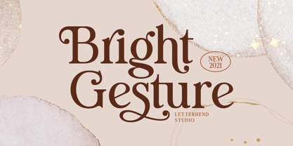 Introducing, Bright Gesture - A Modern serif font with swashes. The stylistic alternates and ligatures make this font event more unique and stands from the crowd. This font perfectly made to be applied especially in logo, and the other various formal forms such as invitations, labels, logos, magazines, books, greeting / wedding cards, packaging, fashion, make up, stationery, novels, labels or any type of advertising purpose. Features : uppercase & lowercase numbers and punctuation multilingual alternates, swashes & ligatures PUA encoded We highly recommend using a program that supports OpenType features and Glyphs panels like many of Adobe apps and Corel Draw, so you can see and access all Glyph variations.
 - Rackmon by Letterhend,
$19.00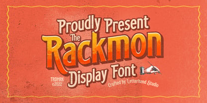 Rackmon is a vintage display typeface with the touch of nostalgic feel. The bold looks make this font standout to be used as a title or a logo. This font perfectly made to be applied especially in logo, and the other various formal forms such as invitations, labels, magazines, books, greeting / wedding cards, packaging, fashion, make up, stationery, novels, labels or any type of advertising purpose. Features : Uppercase and Lowercase Numbers and punctuation Stylistic alternates multilingual PUA encoded We highly recommend using a program that supports OpenType features and Glyphs panels like many of Adobe apps and Corel Draw, so you can see and access all Glyph variations.
 - Louislemon by Letterhend,
$19.00 Introducing, Louislemon Display - a unique display script with a reverse slant style. The unusual look of the script makes this typeface one of a kind. This type of font perfectly made to be applied especially in logo, and the other various formal forms such as invitations, labels, logos, magazines, books, greeting / wedding cards, packaging, fashion, make up, stationery, novels, labels or any type of advertising purpose. Features : uppercase & lowercase numbers and punctuation multilingual alternates and ligatures PUA encoded We highly recommend using a program that supports OpenType features and Glyphs panels like many of Adobe apps and Corel Draw, so you can see and access all Glyph variations.
 - Black North by Letterhend,
$17.00 Black North is a vintage display typeface with the touch of nostalgic feel. The strong and bold looks make this font standout to be used as a title or a logo. This font perfectly made to be applied especially in logo, and the other various formal forms such as invitations, labels, magazines, books, greeting / wedding cards, packaging, fashion, make up, stationery, novels, labels or any type of advertising purpose. Features : Regular & Stamp Version Numbers and punctuation multilingual PUA encoded We highly recommend using a program that supports OpenType features and Glyphs panels like many of Adobe apps and Corel Draw, so you can see and access all Glyph variations.
 - Dreamy Spaces by Letterhend,
$14.00 The Dreamy Spaces is a beautiful typeface based on manual hand writing. The natural flow make this font looks a real hand writing instead of typing a font. This type of font perfectly made to be applied especially in logo, and the other various formal forms such as invitations, labels, logos, magazines, books, greeting / wedding cards, packaging, fashion, make up, stationery, novels, labels or any type of advertising purpose. Features : uppercase & lowercase numbers and punctuation multilingual alternates and ligatures PUA encoded We highly recommend using a program that supports OpenType features and Glyphs panels like many of Adobe apps and Corel Draw, so you can see and access all Glyph variations.
 - Sunshine Daisies by My Creative Land,
$19.00 Sunshine Daisies Hand Lettered collection brings 15 handwritten fonts infused with fun and sunshine. All of them, including sans serif layered font, can be combined in many ways. The script is full of alternates and the layered font has a pseudorandom function embedded that means two letters will never look the same when placed next to each other. To add even more fun we’ve included a special Sunshine Daisies Extra font that has 150+ doodles with 2-color fills. Perfect for quotes, t-shirts, book covers, posters, packaging projects, all Sunshine Daisies fonts are fully unicode mapped so you can use them in any application. Enjoy!
 - Ground Castle by Letterhend,
$19.00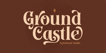 Introducing, Ground Castle - A Modern high contrast serif font with swashes. The stylistic alternates and ligatures make this font event more unique and stands from the crowd. This font perfectly made to be applied especially in logo, and the other various formal forms such as invitations, labels, logos, magazines, books, greeting / wedding cards, packaging, fashion, make up, stationery, novels, labels or any type of advertising purpose. Features : uppercase & lowercase numbers and punctuation multilingual alternates, swashes & ligatures PUA encoded We highly recommend using a program that supports OpenType features and Glyphs panels like many of Adobe apps and Corel Draw, so you can see and access all Glyph variations.
 - Candleton by Letterhend,
$19.00 Introducing, Candleton - A classic sans serif with swashes. The stylistic alternates and ligatures make this font event more unique and stands from the crowd. This font perfectly made to be applied especially in logo, and the other various formal forms such as invitations, labels, logos, magazines, books, greeting / wedding cards, packaging, fashion, make up, stationery, novels, labels or any type of advertising purpose. Features : uppercase & lowercase numbers and punctuation multilingual alternates, swashes & ligatures PUA encoded We highly recommend using a program that supports OpenType features and Glyphs panels like many of Adobe apps and Corel Draw, so you can see and access all Glyph variations.
 - Villantez by Ilhamtaro,
$23.00 VILLANTEZ is a display that is basically a serif font that has been modified in such a way that there are breaks or distances at the body meeting of each letter, almost like in stencil letters. Creating a more attractive and different impression from other display serifs, this font can also be categorized in a more modern Victorian style by carrying a slight stencil modification. This font is also an all caps font with different letter and character heights in the uppercase and lowercase. To enable the OpenType Stylistic alternates, you need a program that supports OpenType features such as Adobe Illustrator CS, Adobe Indesign & CorelDraw X6-X7. Cheers!
 - Vindale by Letterhend,
$19.00 Introducing, The Vindale - a vintage script with reverse contrast and a touch of nostalgic look. The unusual reverse contrast make this typeface one of a kind. This type of font perfectly made to be applied especially in logo, and the other various formal forms such as invitations, labels, logos, magazines, books, greeting / wedding cards, packaging, fashion, make up, stationery, novels, labels or any type of advertising purpose. Features : uppercase & lowercase numbers and punctuation multilingual alternates and ligatures PUA encoded We highly recommend using a program that supports OpenType features and Glyphs panels like many of Adobe apps and Corel Draw, so you can see and access all Glyph variations.
 - 99 Names of ALLAH Linear by Islamic Calligraphy75,
$12.00 We have transformed the “99 names of ALLAH” into a font. That means each key on your keyboard represents 1 of the 99 names of ALLAH Aaza Wajal. The fonts work with both the English and Arabic Keyboards. We call this Calligraphy "Linear" for obvious reasons. The first "Alef" has a "fatha", this indicates that the name can be pronounced only one way, "AR-RAHMAAN". (in the zip file you will find a pdf file explaining the differences in the "harakat", pronunciation and spelling according to the Holy Quran). This calligraphy is very clear and no letters overlap. Decorative letters used in this calligraphy: "Mim, Aain, Sin, HHe, He, Kaf, Ta & Saad". Purpose & use: - Writers: Highlight the names in your texts in beautiful Islamic calligraphy. - Editors: Use with kinetic typography templates (AE) & editing software. - Designers: The very small details in the names does not affect the quality. Rest assured it is flawless. The MOST IMPORTANT THING about this list is that all the names are 100% ERROR FREE, and you can USE THEM WITH YOUR EYES CLOSED. All the “Tachkilat” are 100% ERROR FREE, all the "Spelling" is 100% ERROR FREE, and they all have been written in accordance with the Holy Quran. No names are missing and no names are duplicated. The list is complete "99 names +1". The +1 is the name “ALLAH” 'Aza wajal. Another important thing is how we use the decorative letters. In every font you will see small decorative letters, these letters are used only in accordance with their respective letters to indicate pronunciation & we don't include them randomly. That means "mim" on top or below the letter "mim", "sin" on top or below the letter "sin", and so on and so forth. Included: Pdf file telling you which key is associated with which name. In that same file we have included the transliteration and explication of all 99 names. Pdf file explaining the differences in the harakat and pronunciation according to the Holy Quran.
 - Raj JY by JY&A,
$39.00JY Raj has had a lengthy gestation. The original one was a sans serif adaptation of a slab serif typeface design by Jure Stojan. Raj looked instantly better as a sans serif. After refining it further one lengthy night in 2001, he showed the drafts to Jack Yan, who completed the character sets and finished the kerning. A characterful sans serif, JY Raj pushes the boundaries of what is possible with various geometric shapes, combining legibility and tradition with sharp, unexpected angles. As with Stojan's earlier JY Koliba, it possesses a delightful balance, thanks to the designer's eye for detail and typographic harmony. The name has little to do with the Asian subcontinent: it translates to paradise in Stojan's mother tongue, Slovenian. - DIN Neuzeit Grotesk by Linotype,
$40.99 The German Standards Committee suggested the light Neuzeit-Grotesk’ font in 1970 for use in official signage, traffic directional systems, etc. The typeface had been designed by Wilhelm Pischner and appeared with the font foundry D. Stempel in 1928. The font Neuzeit Grotesk was once the standard in the print industry, as a timeless typeface with no real distinguishing features. Like other typefaces of the 1920s, DIN Neuzeit Grotesk reflects the philosophy of the times, Form is Function.’
 - Dante Alighieri by RMU,
$35.00 From the great Schelter & Giesecke collection, Dante Alighieri is a splendid companion to Aldo Manuzio. With its rather condensed characters it makes an ideal body text font even for narrow columns. Dante Alighieri comes with the historical long s and swash letters of H and T. It can be used for all major West and Central European languages.
 - Carinthia by Scriptorium,
$18.00Carinthia is derived from the style of Roman calligraphy known as Rustica, but with some features of Roman uncial added to form a complete upper and lower case character set, including variant upper case characters with decorative spurs. The result is a rather vertical, but quite stylish font which has an antique calligraphic look and good readability. - Melidia by Nantia.co,
$16.00 My first encounter with brush lettering that has turned into a lovely bold font. I really loved the process of hand lettering with ink and I am so pleased how it developed into a lovely font. Melidia Font it’s a multilingual lettering font with Greek (of course), Cyrillic and Extended Latin characters and diacritics. The style of the font is perfect for your modern graphic design needs. For all the typography lovers, this typeface is a must-have. Also, Melidia Font is the ideal typeface for the food industry, for food branding, for restaurant menus and packaging. Additionally, you can use Melidia Font for a lovely wedding and baby shower invitation design. Especially if you are looking for a font for Instagram quote posts or any other social media content, this typeface is for you!
 - Towienk by Twinletter,
$13.00 Introducing “Towienk Font” – Your Passport to Summer Creativity. Embrace the sun-soaked vibes of summer with Towienk Font, your perfect companion for creating designs that radiate the essence of the season. This delightful display font captures the spirit of summer in every character, making it an ideal choice for all your warm-weather projects. Towienk Font’s playful and breezy style adds an instant touch of summer to your designs. Whether you’re working on beachside invitations, tropical-themed posters, or anything in between, this font will infuse your work with the carefree spirit of the season. With meticulous attention to detail, Towienk Font ensures that your text pops with the vibrancy of summer. It’s a versatile typeface that adapts effortlessly to various design applications, from travel brochures to poolside party banners. Dive into the world of Towienk Font and let your designs sizzle with the warmth and energy of summer. Elevate your creativity and make every project a sun-drenched masterpiece. – PUA Encoded Characters – Fully accessible without additional design software.
 - Hadron by Veil of Perception,
$20.00 Hadron is a fusion of gothic black letter and foundational letter forms. It has a heavy flat pen influence but is combined with more modern letter forms for increased legibility over that offered by black letter fonts. Unlike most black letter fonts, Hadron can be set all caps using the first level of caps. A basic design kernel based on the caps “O” and “H” was created first. These letter forms consist of an interplay between curves and straight lines with abrupt transitions and also possess some of the geometric crispness of a modern sans serif. The rest of the Hadron font was developed around this “O” and “H” kernel. This font could be used for any application requiring a formal black letter or foundational lettering look. Hadron could also be used for invitations, brochures and posters. The first level of caps and lower case is basic enough to set a large body of text. It could also be set all caps at that level.
 - HiFi by Pelavin Fonts,
$25.00 HiFi is a geometric script whose genesis lies in drive-in movie theaters, vintage auto emblems and radio dials. It embraces the stylistic tenets of retro futurism and proposes that the evolution of design styles, rather than being linear, is a circular process, continually revisiting and reshaping itself. It evokes the 40s & 50s and pre-transistor electronics when you turned your radio on and waited patiently for the tubes to warm up.
 - Elektrakution by Comicraft,
$19.00 SHE'S DEAD, FRANK It's the year 1991, BC (Before Comicraft) when REM were still making records and Frank Miller’s memorable run on Marvel Comics’ DAREDEVIL was just over ten years old. Comicraft’s Richard Starkings found himself working in Anaheim, California for Graphitti Designs. Graphitti had produced the first hardcover edition of Miller’s Batman tale, DARK KNIGHT RETURNS and was now putting together the sequel to Miller’s DAREDEVIL — ELEKTRA LIVES AGAIN! Richard was not engaged to letter this book, the pages of Frank’s incredible original art that came through Graphitti’s studio were already lettered by Marvel Stalwart, Jim Novak. However, there were some cover elements that needed to be added, based on the logo originally rendered by Frank’s brother, Steve. Starkings set about the task of creating an alphabet that could be used to develop Steve’s idea for the trade dress -- the cover elements, the back cover copy and credits on the interior pages. This was long before Macintosh computers and font programs made this work considerably easier, so Rich sat down with a pencil and a sheet of vellum and rendered an alphabet that could be used as the basis for the text that was needed... Those sketches have languished in a drawer for nearly thirty years, but now, finally, Comicraft’s John Roshell has dusted off those old letterforms and Elektrakuted a font based on those designs, a font we HAD to call ELEKTRAKUTION! As for Elektra; she’s dead, Frank. Features: Ten weights (Light, Regular, Bold; Rough Light, Regular & Bold; Inline, Inline Rough, Outline & Outline Rough) with upper & lowercase characters, Western & Central European accents and Greek characters.
 - Reva Pro by Arodora Type,
$20.00 Reva is an extremely aesthetic font that will warm you up. As well as being suitable for use in every field, Reva will be a good friend in your logo designs. In addition, magazines, brochures, posters will not leave you alone in your work. Reva will represent you well thanks to the round and hot images in the paragraphs. Also multilingual support, ligatures and more await
 - Bomboloni by Goodigital13,
$20.00 will be great for any projects including : branding, logo, stationery, business card, signage, flyer, brochure etc. Almost all industries will be match for this typeface: wedding, events, rmakeup artist, travel, hotel, musician etc, food
 - Agashi Signature by Nirmalagraphics,
$14.00 Agashi Signature features a handwritten style. This font is suitable for a variety of uses including magazines, brochures, flyers, Instagram posts and anything that might compliment a feminine touch. It includes multi-lingual support.
 - NorB ARCHITECT LINE by NorFonts,
$35.00 NorB Architect Line architectural fonts will add a beautiful architectural hand-lettering style to all your CAD project drawings. Architects have always wanted their CAD drawings to look more like they were drawn by hand, rather than by a CAD program. These AutoCAD fonts are the first step in bringing back that “artistic hand-drawn” feel to your CAD drawings or any graphic design project that can use true type fonts. They even can be used with any word processing program for text and display use, print and web projects, apps and ePub, comic books, graphic identities, branding, editorial, advertising, scrapbooking, cards and invitations and any casual lettering purpose… or even just for fun! NorB Architect Line is a retracing from scratch of my "NorB Architect" font coming in a sharp and round look, featuring small caps with some long stems of the following letters: b, d, f, h, k, l so resulting in more dynamic lettering font. It comes with 8 weights: Regular Italic Bold Bold Italic Round Round Italic Bold Round Bold Italic Round Note: The Italic versions are intentionally set to 20° rather to 12° for more dynamic lettering look.