10,000 search results
(0.047 seconds)
- Fantting Signature by Tebaltipis Studio,
$12.00 The alternative characters were divided into several Open Type features such as Swash, Stylistic Sets, Stylistic Alternates, and Ligature. The Open Type features can be accessed by using Open Type savvy programs such as Adobe Illustrator, Adobe InDesign, Adobe Photoshop Corel Draw X version, And Microsoft Word. And this Font has given PUA unicode (specially coded fonts). so that all the alternate characters can easily be accessed in full by a craftsman or designer.
 - Blowing Signature by Tebaltipis Studio,
$12.00 The alternative characters were divided into several Open Type features such as Swash, Stylistic Sets, Stylistic Alternates, and Ligature. The Open Type features can be accessed by using Open Type savvy programs such as Adobe Illustrator, Adobe InDesign, Adobe Photoshop Corel Draw X version, And Microsoft Word. And this Font has given PUA unicode (specially coded fonts). so that all the alternate characters can easily be accessed in full by a craftsman or designer.
 - Emague Signature by Tebaltipis Studio,
$12.00 The alternative characters were divided into several Open Type features such as Swash, Stylistic Sets, Stylistic Alternates, and Ligature. The Open Type features can be accessed by using Open Type savvy programs such as Adobe Illustrator, Adobe InDesign, Adobe Photoshop Corel Draw X version, And Microsoft Word. And this Font has given PUA unicode (specially coded fonts). so that all the alternate characters can easily be accessed in full by a craftsman or designer.
 - Flisma Signature by Tebaltipis Studio,
$12.00 The alternative characters were divided into several Open Type features such as Swash, Stylistic Sets, Stylistic Alternates, and Ligature. The Open Type features can be accessed by using Open Type savvy programs such as Adobe Illustrator, Adobe InDesign, Adobe Photoshop Corel Draw X version, And Microsoft Word. And this Font has given PUA unicode (specially coded fonts). so that all the alternate characters can easily be accessed in full by a craftsman or designer.
 - Hineda Signature by Tebaltipis Studio,
$12.00 The alternative characters were divided into several Open Type features such as Swash, Stylistic Sets, Stylistic Alternates, and Ligature. The Open Type features can be accessed by using Open Type savvy programs such as Adobe Illustrator, Adobe InDesign, Adobe Photoshop Corel Draw X version, And Microsoft Word. And this Font has given PUA unicode (specially coded fonts). so that all the alternate characters can easily be accessed in full by a craftsman or designer.
 - Wenista Signature by Tebaltipis Studio,
$12.00 The alternative characters were divided into several Open Type features such as Swash, Stylistic Sets, Stylistic Alternates, and Ligature. The Open Type features can be accessed by using Open Type savvy programs such as Adobe Illustrator, Adobe InDesign, Adobe Photoshop Corel Draw X version, And Microsoft Word. And this Font has given PUA unicode (specially coded fonts). so that all the alternate characters can easily be accessed in full by a craftsman or designer.
 - Arnold Boecklin by Linotype,
$36.99 The font, Arnold Boecklin, appeared in 1904 with the font foundry Otto Weisert. Traces of the floral forms of the Jugendstil can still be seen in this typeface. Alphabets of this type were mainly meant for larger point sizes, as on posters. A decorative feel was much more important than legibility, and Arnold Boecklin was of particular importance to the book design of the Jugendstil movement. Today the font is often used to remind people of “the good old days”.
 - LT Oksana - Personal use only

- FHA Condensed French by Fontry West,
$25.00 FHA Condensed French One could speculate that FHA Condensed French probably started life as wood type for displays, headlines and posters. The exaggerated sharp serifs and condensed forms were not uncommon for that period. At some point, sign painters picked up Condensed French added their own character. At the end of the nineteenth century, Frank H. Atkinson included Condensed French in his samples of lettering for his book, ”Sign Painting, A Complete Manual.” This book became one of the definitive guides for signwriting and hand lettering. In 1999, Mike Adkins digitized Condensed to add to our Atkinson collection. For its re-release, Condensed French has been updated with more language support, ligatures, and OpenType alternates. It has true vintage character but still plays well in more modern designs. A font for all seasons, the condensed forms and sharp serifs fit in every layout from wildwest days posters and creepy film credits to Christmas ads and Mother’s Day cards. While I can’t really see FHA Condensed French as the font for phone aps or video game text, it will provide impact to logos, branding, and product labeling.
 - Melon Script by Eurotypo,
$90.00 The melon (Cucumis melo) is an herbaceous plant monoecious trailing stems. It is known for its fruit, a berry summer season with a high water content and sweet taste. The Melon font, like the fruit in which has been inspired, is characterized by its organic shapes “soft” and heavy weight. Carefully traced and drawn by hand, offers the possibility to use linked or unlinked characters, and any combination of them, because the kerning pairs have been specifically regulated. Melon Script fonts are presented as family of four widths: Condensed, Regular, Expanded and Ultra-expanded. Each of them contains 623 glyphs, a full set of stylistic alternates, swashes, ligatures, ending letters, underlines and all diacritic signs support for Central European languages. We strongly recommend these fonts for use in packaging, web sites, advertising, magazines and logotypes. You may use these fonts when you must to generate visual impact with friendly seductive atmosphere and legibility.
 - Cigra by Identitype Co,
$19.00 Cigra is a standout display font that is an ode to fashion typography in present day. It's elaborate curves and unique shapes make it perfect for headings, logos & wedding invitations. Cigra is all class so if you want a stylish font that is guaranteed to draw the eye, then this is it! The alternative characters were divided into several features such as Stylistic Sets, Stylistic Alternates, Contextual Alternate, SWASH and Ligature. The Open Type features can be accessed by using Open Type savvy programs such as Adobe Illustrator, Adobe InDesign, Adobe Photoshop Corel Draw X version, And Microsoft Word. And this Font has given PUA unicode (specially coded fonts). so that all the alternate characters can easily be accessed in full What’s Included : Web Font Hundred of glyphs Alternates and Ligatures Punctional Works on PC & Mac PUA Encoded Characters - Fully accessible without additional design software. Simple installations Accessible in the Adobe Illustrator, Adobe Photoshop, Adobe InDesign, even work on Microsoft Word. Fonts include Multilingual Support Extended Latin
 - Ligotra by Prioritype,
$18.00 Ligotra font comes in a victorian style, looks simple and not too complicated, but still has character. What can be used in this font? Of course, there are so many and can be explored as needed because it contains many alternative characters. You can use it on digital or print media such as food and beverage products or labels, music festivals, labels, vinyl records, clothing & accessories, automotive and many more. For reference, see preview. Features: -Uppercase -Lowercase -Numeral -Punctuation -Multilingual -Alternate
 - Mrs. Santhi by Abo Daniel,
$15.00 Proudly present Mrs. Santhi, a fancy Signature Font. This font is very unique. I designed it for you who want something different from the others. It is perfect for branding, photography, invitations, quotes, watermarks, advertisements, product designs, labels, and much more! I created 194 ligatures to keep this font look natural: aa ab ah ak al am an at ant all amm ann att bh bt cc ch ct dd eb ee ek em en et enn ent ett ff gh hh ii ib ik in it inn int itt ix ixx kh ll mm mt nt nn oo oh on ob ok ol oll om ot ont ott oot onn ox oxx ph pt and more as you can see on the presentation pictures. Mrs. Santhi also features punctuations and multilingual support. Hope you love it!
 - Rail Line JNL by Jeff Levine,
$29.00 Rail Line JNL is a font for the railroad enthusiast for making their own model train car emblems. The logos contained in this font are or may be the property of the various rail companies, their assigns and/or successors. Outside of non-profit hobby use or for historical/educational purpose under the Fair Use rules, any commercial application of these logos must be obtained by written permission by the respective logo owner or owners. Jeff Levine fonts provided Rail Line JNL strictly as a hobby font. We assume no liability for the use, misuse or misrepresentation of any of the logos contained within the font file.
 - Kolm Keltek by 2D Typo,
$36.00 Kolm Keltek is a collection of ornaments organized into two font files. The ornaments can be divided into two groups: Friezes (borders) and Rapports (patterns). All ornaments belong to the Celtic culture. These ornaments are taken from manuscripts. This makes the font exclusive and unique among other digital collections of ornaments. These patterns perfectly suit to be used in the design of invitations, diplomas, certificates or other printed materials in historical style design. Kolm Keltek - Demo Guide contains basic examples of how to combine the ornaments that significantly facilitates the use of the collection. Kolm Keltek is one of the many high-quality ornamental fonts offed by the 2D Typo foundry.
 - Hive Mind by Okaycat,
$7.50This font has 2 styles in one keyboard layout! There is a solid style, and an outline style. The capital letters match the small-case. The capitals are all solid letters, while the small-case are the same, but an outline version. Same with your numbers, there is 2 styles (Outlined hollow numbers, or press shift and a number to get it's matching solid version). Common punctuation marks, brackets, etc., are included too, in both styles (There's even a hexagonal euro and dollar sign). To make these characters easier to find, repeats are spread throughout your alternate keys. The two styles can be used together, nicely complimenting each other. Hive Mind is NOT appropriate for important business presentations, lengthy novels, or anything you want to be an easy read. Use this font anywhere you want to create a funky look or need to be cryptic... Have fun with it! - DF Pigtail by Dutchfonts,
$33.00 DF Pigtail is the result of a curious marriage of the 'free'-form of writing with the fixed (mono) space for each character of the typewriter typeface. In the early sixties of the last century, typewriter typography became popular as a Fluxus vocabulary. The Fluxus art movement (in fact a Dada like follow up) which encouraged a do it yourself aesthetic, and valued simplicity over complexity and anti commercialism over the conventional market-driven approach. I was educated in the mid seventies when this form of typography was still very popular and was even applied in corporate design. This particular letter has been used by my teacher Jan Begeer to compose his design assignments. Recently I rediscovered this type and was struck by its pigtail similarity and drew it my way.
 - Izmir by Ahmet Altun,
$19.00 Izmir is a modern, geometric font family. Izmir font family consists of 44 fonts in two widths, normal and narrow where each width consists of regular and italic styles in 11 weights. Each weight is equipped with useful OpenType features. A local ampersand has been added to use in Turkish in normal weights and italics. The combination of normal and narrow weights can be an excellent choice for any graphic design and display use.
 - Gaheris by Scriptorium,
$12.00Gaheris is a decorative font in the same tradition as our Goddard and Ganelon fonts, but with a somewhat more calligraphic look. It is suitable for use as a text or title font, but has some characteristics of a script font, which gives it an unusual and appealing appearance. It's based on early 20th century advertising type of a style which you don't see much any more, but which deserves to be preserved. - Lopsickles by Ingrimayne Type,
$7.00 Lopsickles is a family in which the letters are based on lopsided, distorted ellipses. The family has four sets of letters that are combined in six different ways, yielding six fonts. Four of these fonts (styles AB, Ad, Bc, and cd) use the OpenType feature Contextual Alternatives (calt) to alternate letter sets so that top-heavy characters alternate with bottom-heavy characters. The spacing in these fonts is designed for alternating characters and will result in overlap if the characters do not alternate. The other two styles (Ac and Bd) are spaced normally. Style Ac contains the two character sets that are top heavy and style Bd has the two character sets that are bottom heavy. The Ac and Bd fonts have italics and backslanted styles that may be useful to suggest speed. Each of these ten fonts has an inset style designed to be used in a layer above the base font. This layering can be used to give the effect of hollow letters or to add a colored interior. Lopsickles joins several other alternating-characters families in the IngrimayneType library including Snuggels, CloseTogether, and Caltic, but is visually very different from them. It is a strange, unusual family that will get noticed.
 - BIENUG by Twinletter,
$17.00 Welcome to a world of elegance and grace with BIENUG, the unrivaled classic serif font. Designed specifically for projects with a classic modernism theme, this font is the perfect solution for bringing a stunning, classic touch to your designs. With ligature and alternate features, BIENUG provides unlimited creative freedom. You can combine unique character variations to create an interesting look that is different from the others. Available in a variety of styles, this font lets you explore different nuances and moods in each design. In addition, BIENUG supports multilingualism, enabling you to convey messages fluently in multiple languages. There are no limitations in reaching an international audience with this font. Enhance your designs with the beauty and elegance of BIENUG. Make an unforgettable impression with subtle details and strong characters. Add a touch of classic modernism to your project and present a stunning visual experience. Explore the BIENUG collection now and find power in the beauty of this classic serif. Let this font be your loyal partner in creating eye-catching and memorable designs. What’s Included : File font All glyphs Iso Latin 1 Alternate, Ligature Simple installations We highly recommend using a program that supports OpenType features and Glyphs panels like many Adobe apps and Corel Draw so that you can see and access all Glyph variations. PUA Encoded Characters – Fully accessible without additional design software. Fonts include Multilingual support
 - Eastside Motel - Unknown license

- Sadigu by Twinletter,
$15.00 Sadigu san serif is a unique font family that can help you stand out from the rest. Every style in this impressive collection is made to help you get the most out of your designs: advertising, posting, and many other creative projects are all made easy with this beautiful typeface. This font can be easily optimized for any project or client thanks to its many OpenType features and 18 different styles. With our newest font family, you’ll be able to create stunning looks in minutes. of course, your various design projects will be perfect and extraordinary if you use this font because this font is equipped with a font family, both for titles and subtitles and sentence text, start using our fonts for your extraordinary projects.
 - Prismatic Spirals by MMC-TypEngine,
$93.00 PRISMATIC SPIRALS FONT! The Prismatic Spirals Font is a decorative type-system and ‘Assembling Game’, itself. Settled in squared pieces modules or tiles, embedded by unprecedented Intertwined Prismatic Structures Design, or intricate interlaced bars that may seem quite “impossible” to shape. Although it originated from the ‘Penrose Square’, it may not look totally as an Impossible Figures Type of Optical Illusions. More an “improbable” Effect in its intertwined Design, that even static can seem like a source of Kinetical Sculptures, or drive eyes into a kind of hypnosis. Prismatic Spirals has two related families, its “bold” braided version Prismatic Interlaces and the Pro version. While the default is simpler or easier to use, as all piece’s spin in same way, PRO provides a more complex intricate Design which requires typing alternating caps. Instructions: Use the Map Font Reference PDF as a guide to learn the 'tiles' position on the keyboard, then easily type and compose puzzle designs with this font! All alphanumeric keys are intuitive or easy to induce, you may easily memorize it all! Plus, often also need to consult it! *Find the Prismatic Spirals Font Map Reference Interactive PDF Here! (!) Is recommended to Print it to have the Reference in handy or just open the PDF while composing a design with this typeface to also copy and paste, when consulting is required or when it may be difficult to access, depending on the keyboard script or language. As a Tiles Type-System, the line gap space value is 0, this means that tiles line gaps are invisibly grouted, so the user can compose designs, row by row, descending to each following row by clicking Enter, same as line break, while advances on assembling characters. Background History: The first sketches of my Prismatic Knots or Spirals Designs dates back then from 2010, while started developing hand-drawn Celtic Knots and Geometric Drawings in grid paper, while engage to Typography, Sacred Geometry and the “Impossible Figures” genre… I started doing modulation tests from 2013, until around 2018, I got to unravel it in square modules or tiles from the grid, then idealized it as fonts, along with other Type projects. This took 13 years to come out since the first sketches and 6 months in edition. During the production process some additional tiles or missing pieces were thought of and added to the basic set, which firstly had only the borders, corners, crossings, nets, Trivets connectors or T parts and ends, then added with nets and borders integrations. Usage Suggestions: This type-system enables the user to ornate and generate endless decorative patterns, borders, labyrinthine designs, Mosaics, motifs, etc. It can seem just like a puzzle, but a much greater tool instead for higher purposes as to compose Enigmas and use seriously. As like also to write Real Text by assembling the key characters or pieces, this way you can literarily reproduce any Pixel Design or font to its Prismatic Spirals correspondent form, as Kufic Arabic script and further languages and compose messages easily… This Typeface was made to be contemplated, applied, and manufactured on Infinite Decorative Designs as Pavements, Tapestry, Frames, Prints, Fabrics, Bookplates, Coloring Books, Cards, covers or architectonic frontispieces, storefronts, and Jewelry, for example. Usage Tips: Notice that the line-height must be fixed to 100% or 1,0. In some cases, as on Microsoft Word for example, the line-height default is set to 1,15. So you’ll need to change to 1,0 plus remove space after paragraph, in the same dropdown menu on Paragraph section. Considering Word files too, since the text used for mapping the Designs, won't make any literal orthographical sense, the user must select to ignore the Spellcheck underlined in red, by clicking over each misspelled error or in revision, so it can be better appreciated. Also unfolding environments as Adobe Software’s, the Designer will use the character menu to set body size and line gap to same value, as a calculator to fit a layout for example of 1,000 pts high with 9 tiles high, both body size and line gap will be 111.1111 pts. Further Tips: Whenever an architect picks this decorative system to design pavements floor or walls, a printed instruction version of the layout using the ‘map’ font may be helpful and required to the masons that will lay the tiles, to place the pieces and its directions in the right way. Regarding to export PNGs images in Software’s for layered Typesetting as Adobe Illustrator a final procedure may be required, once the designs are done and can be backup it, expanding and applying merge filter, will remove a few possible line glitches and be perfected. Technical Specifications: With 8 styles and 4 subfamilies with 2 complementary weights each (Regular and Bold) therefore, Original Contour, Filled, Decor, with reticle’s decorations and 2 Map fonts with key captions. *All fonts match perfectly when central pasted for layered typesetting. All fonts have 106 glyphs, in which 48 are different keys repeated twice in both caps and shift, plus few more that were repeated for facilitating. It was settled this way in order for exchanging with Prismatic Spirals Pro font which has 96 different keys or 2 versions of each. Concerning tiles manufacturing and Printed Products as stickers or Stencils, any of its repeated pieces was measured and just rotated in different directions in each key, so when sided by other pieces in any direction will fit perfectly without mispatching errors. Copyright Disclaimer: The Font Software’s are protected by Copyright and its licenses grant the user the right to design, apply contours, plus print and manufacture in flat 2D planes only. In case of the advent of the same structures and set of pieces built in 3D Solid form, Font licenses will not be valid or authorized for casting it. © 2023 André T. A. Corrêa “Dr. Andréground” & MMC-TypEngine.
 - SK Cuber by Shriftovik,
$10.00 SK Cuber™ is an expanded monumental pseudo-pixel typeface. It is based on a strict grid that is not broken in any glyph. This makes the type more organic and consistent. The type's characters are monospaced, but they do not look ridiculous and do not cause discomfort as it usually happens. This could only be achieved by carefully working out each glyph. The type also deliberately uses the contrast between geometric strokes and smooth transitions. It adds to his liveliness and character. SK Cuber is inspired by the monumental architecture of our days. It is brutal and extremely stable, which makes it an excellent font for working with posters, headlines, etc.
 - Mina Chic by Resistenza,
$49.00 Mina Chic is fresh, elegant and sexy. She was raised by the french riviera sun, loves watching Nouvelle Vague films and adores french pop divas from the 60´s. She wants to be a star! Mina Chicis a new version of one of our most popular scripts,Mina. We added some expansion on the strokes reminding of a pointed nib pen writing and kept the long connections and smooth swashes to preserve the elegance and simplicity of that classic style. This typeface contains 515 glyphs, swashes, ligatures, alternates, final forms and initial forms and offers a wide range of flexibility with its many Opentype features! Mina Chic Extra has an extra thicker strokes who gives more weight to Mina.
 - Auster by Resistenza,
$39.00 Auster, A Sans with Flair! Auster packs sensational personality in its fine-tuned forms. Confident and quirky, yet comfortable to read, this distinctive san serif family stands out from the crowd. The curves cinch and strokes flair in unconventional places making Auster an unashamed rebel sure to turn heads. Originally designed during the TipoBrda Workshop in Slovenia. Resistenza spent 3 years developing this 2 style (roman & Italic), 20 weight family. The subtle reverse contrast characters were first painted with a flat brush, then polished in pencil on tracing paper before being carefully digitized, to include language support and all the opentype features you expect in a quality contemporary font. More About Opentype Features: https://bit.ly/opentype-rsz
 - VVDS My Spellbound by Vintage Voyage Design Supply,
$10.00 My Spellbound an authentic groovy typeface. So, The Stranger Things series is already watched and you'll waiting the last one season for another two years. Well, if you miss for late 70s or early 80s in your design – this one is for you. Smooth, groovy and playful – exactly for your vintage projects. This typeface will suit for the display block texts like package labels or will be perfect for an any display header. Create a vintage t-shirt print or make groovy stickers - Spellbound will suits perfectly. A lot of alternates will give you a really wide range of results. You may combine it with Italics and get a really playful pair. Two characters for any caps and up to 6 alternates for lowercases. Regular and true Italic Open Type Features Multilingual I would really love to see what you create with my products, so please feel free to tag me @vintagevoyagedesign on Instagram. Happy creating! Thank you.
 - Jinkel by Twinletter,
$18.00 Introducing Jinkel, the perfect font for any design project requiring a retro condensed style. This font features a unique serif design on each end of the letters, providing a distinctive touch to your designs. Jinkel is perfect for titles, headers, logos, and other creative designs that require a touch of vintage inspiration. With alternate characters and ligatures included, you’ll have plenty of design options to choose from. Elevate your designs with Jinkel and give them the retro flair they deserve. What’s Included : - File font - All glyphs Iso Latin 1 - Alternate, Ligature - Simple installations - We highly recommend using a program that supports OpenType features and Glyphs panels like many Adobe apps and Corel Draw so that you can see and access all Glyph variations. - PUA Encoded Characters – Fully accessible without additional design software. - Fonts include Multilingual support
 - Starsigns by Tarallo Design,
$9.99 Starsigns is a unique set of zodiac symbols with a handmade feel. This font includes twelve astrology symbols: Aquarius, Pisces, Aries, Taurus, Gemini, Cancer, Leo, Virgo, Libra, Scorpio, Sagittarius, and Capricorn. Additionally, it features a moon and a sun symbol. The symbols were created from watercolor originals, giving them a warm and fluid quality. To utilize Starsigns, simply install it as a regular font. As you type, instead of letters, you will see the corresponding zodiac symbols. For accessing the symbols, type any lowercase letter on your keyboard between 'a' and 'm'. Most design software, such as Illustrator, InDesign, and Photoshop, provide a glyphs palette where you can select the desired symbol precisely.
 - Cherritt by Greater Albion Typefounders,
$9.95 We think of Cherritt as a 'bullnosed' serif face, because of its rounded off serifs. What that phrase may not convey is the friendly, approachable nature of this large family of faces. The design was originally inspired by traditional draftsmens' hand-drawn serif lettering, but has been given a precise geometric flavor that suits it for work owing its inspiration to any era, from Victorian times through to the purely modern. They are ideal for headings and poster work, but also for setting small volumes of text. Four weights are included in the family, as well as wide, expanded and condensed forms, true small capitals and openface forms. All family members embody extensive OpenType features.
 - Alternate Gothic by Linotype,
$20.99 Alternate Gothic was designed by Morris Fuller Benton for American Typefounders Company in 1903. All three weights of Alternate Gothic are bold and narrow. In fact, this face is essentially a condensed version of Benton’s other well-known sans serif types, Franklin Gothic and News Gothic. In the early twentieth century, the modern concept of type “families” had not yet been formed — and though Benton designed these sans serifs to harmonize with each other, the foundry gave them different names. Robust, dark, and coolly competent, Alternate Gothic is a good choice when strong typographic statements must fit into tight spaces. As a modern usage, it is currently the font of YouTube’s homepage logo.
 - Kaglia by Letterhend,
$17.00 Kaglia is a font duo package contain a hand drawn bold script and sans serif which looks great to be paired especially for vintage and adventure theme! This font duo is purposely made for headline, display or logotype, and signature which need a standout appearing. This font is also suitable to be applied especially in logo, and the other various formal forms such as invitations, labels, logos, magazines, books, greeting / wedding cards, packaging, fashion, make up, stationery, novels, labels or any type of advertising purpose. Features : Kaglia Script Regular and Rough Kaglia Sans Regular and Rough uppercase & lowercase numbers and punctuation multilingual alternates & ligatures PUA encoded We highly recommend using a program that supports OpenType features and Glyphs panels like many of Adobe apps and Corel Draw, so you can see and access all Glyph variations. How to access opentype feature : letterhend.com/tutorials/using-opentype-feature-in-any-software/
 - Frutiger Stones by Linotype,
$29.00In Adrian Frutiger, the discipline of a mathematically exact mind is joined with an unmistakable artistic sense. His independent work possesses the controllable language of letterforms. Personal and intensive, this work is the manifestation of his expressive will. Frutiger's precise sense of outline reveals itself two- or three-dimensionally in wood, stone, or bronze, on printing plates and in the form of reliefs. However, even his independent work can be understood as objectivized signs; in their symbolism, they are embedded in the fundamental questions of human existance. They might have developed in the spirit of playfulness, but their nature is always conceptual, directed towards a complex, yet harmonic, whole. Following function, form also necessarily follows the content of the language. The entire spiritual world becomes readable through letters. Essentially, Adrian Frutiger attempts to fathom the basic, central truth which defines our lives: change, growth, division - beginning and end. In a virtual synthesis, he seems to close the circle in which the world reflects itself in symbolic forms. Frutiger Stones is for Adrian Frutiger the example of his formal artistic sensibility par excellence. Searching for the fundamental elements in nature, he has discovered the pebble, rounded and polished over innumerable years by gently flowing water. And out of this, he has created his complete system, a ruralistic typeface of letters and symbols. It depicts animals and plants, as well as astrological and mythical signs. Because of its unique aura, Frutiger Stones is particularly well-suited to different purposes - in headlines and prominent pictograms, as symbol faces, illustrations, and more. - Al Valenciaga by Aluyeah Studio,
$85.00 Al Valenciaga is a strong display font. Valenciaga is a fully-kerned titlecase display typeface built for strong design vibes. Valenciaga is raw and uncut with sharp terminals and serifs that give off an aggressive appearance. The difference in depth between the uppercase and lowercase, making Valenciaga very suitable to be the display font for your product packaging, logo, branding, and more! This typeface features 180+ characters with some language adaption that is guaranteed to give your project a competitive edge. Thanks for checking out Al Valenciaga. I really hope you enjoy using it. If you have any questions I'd be more than happy to answer them, just send me a message.
 - Joyvrie by Greater Albion Typefounders,
$15.00 Joyvrie is inspired by the rather characterful lettering to be seen on a local grocer’s blackboard. It’s lettering in the style of beautifully clear, yet individualistic, hand printing. We’re pleased to report that this particular rather splendid grocer, does not succumb to the ‘Grocer’s apostrophe’ either…
 - Comic World by Fox7,
$12.00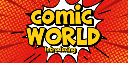 Comic World is a cool, vintage styled display font. It is the perfect font for titles or words needing a more dramatic emphasis. Whatever the topic, this font will be a wonderful asset to your font library, as it has the potential to enhance any creation.
 - Links by HouseOfBurvo,
$36.00 Links was built adhering to a strict grid of 'linked' squares; and comes with special "Grid Glyphs" that line up perfectly with all characters. These Grid Glyphs can be used to create an invisible grid for your layout or as a background to enhance your design. Perfect for posters, logos and headlines, this font is available in four styles; Round and Square with accompanying obliques. This font was inspired by much of the lettering from the Dutch movement, or Functionalism which in turn was a descendant of the International Style pioneered by the Swiss. In keeping with these traditions, Links was build adhering to a strict grid of linked squares, taking a clear scientific approach to construct each character. One of the main features of International Style is the implementation of a Grid. This font has built in special characters that I call 'Grid Glyphs'; these Grid Glyphs line up perfectly with every character, enabling you to construct your own grid that echoes the form of the characters. These glyphs can also be used to create a background for your layout, as can be seen in the gallery pictures.
 - Devin by Linotype,
$29.99Devin is designed mainly for the benefit of the advertising industry, and it surely is a nice typeface for headings, isn't it? And you should see what a nice body type it makes! I had no other typeface in mind when working with it, but I can now find several typefaces it is related to. It reminds of the egyptienne group, but I did't really plan that. The name Devin is taken from my birth region. There is a castle with that name on the northern Adriatic coast (known even from Rilke's Duino elegies - Duino is another name of the same castle). A castle ruin called Devin, too, can be found on a height above the Danube in Slovakia, not far away from its capital Bratislava. Devin was released in 1994. - Matchbox Font Collections by Adam Fathony,
$12.00 Matchbox Font Collections Inspired by a vintage book, old style design, a classic casual vintage look fonts. Minimal decoration on the fonts made it more casual look. The fonts are very versatile, even it works also on modern design but still keep the classic look. Created 6 Fonts that can be combined each other. Like on the Preview images, I've been created from the victorian style to the minimalist badges. It's still blend to each other. What's inside : Matchbox Linea - Bold, Sharp, Standout with inline cut. Matchbox Lettre - Popular Vintage Sign Style. Matchbox Deco - As it names, Art Deco Style. Matchbox Scriptura - Casual Script Fonts, Good for Pair or on a small details. Matchbox Ornato - The Only fonts with a touch of vintage decorations. Matchbox Graso - Little touch of a Fat, Fun and Casual.

