10,000 search results
(0.048 seconds)
- Zierfraktur by RMU,
$35.00 This highly stylish, engraved blackletter font was cut by Rudolf Koch between 1919 and 1921 for Klingspor in Offenbach on Main. It was then sold under the name Deutsche Zierschrift. I completely redraw and extended this font and called it Zierfraktur. To take full advantage of this fine headline blackletter font, please use it from, at least, 18 points upward. This font contains a bunch of useful ligatures, and it is recommended to activate both Standard and Discretionary Ligatures. The round s can be reached by typing the # key, and you get the numero sign by typing the combination N-o-period and activating the OT feature Ordinals.
 - Pawl by The Ampersand Forest,
$20.00 Meet Pawl, an affordable 48-font squarish sans family with a little grotesque in him! Oh, you may think you’ve got him pegged at first glance, but he’ll surprise you with his versatility. AND he's just been totally refurbished from top to bottom and boy, did he need it! Pawl lives in the same visual landscape as fantastic modular superfamilies like Eurostile, Agency, Geogrotesque, Barlow, and even the great American Gothics. Unlike those faces, though, he's nimble enough to switch between looks effortlessly. Pawl is energetic, aggressive, strident, and structural. Depending on how you use him, his voice can be retro, futuristic, industrial, or sleek. He can be sober or splashy, techy or oldschool. Use his alternate characters and stylistic sets to create looks ranging from Streamline Moderne to Futurism to Brutalism to Swiss. He works from small paragraphs all the way up to monumental signage. This guy is smart and useful, with a lotta looks! How many times have you needed multiple weights, styles, and widths for your hierarchy, but standard type families were either shockingly expensive or couldn't deliver? Pawl delivers. Give him a shot!
 - Lualaba Snake by Scholtz Fonts,
$19.00Lualaba Snake is a bold display font, characterized by the snake-like decoration used in each letter. The design of the font was inspired by the legend of the Lualaba River in Central Africa. Snakes enjoy a special status in Africa, as they are reputed to be messengers of the ancestors, and are therefore good. Near the Lualaba river is a pool in which a big snake called Kabwe lives. Our ancestors are thought to communicate through this snake. - Steagal by insigne,
$24.75 I love geometric sans serifs, their crispness and rationality. Le Havre taps into this style, but for a while, I've wanted to create a font recalling the printed Futura of the 1940s, which seems to have an elusive quality all its own. After seeing an old manual on a World War II ship, I developed a plan for "Le Havre Metal" but chose to shelve the project due to Le Havre's small x-height. That's where Steagal comes in. When Robbie de Villiers and I began the Chatype project in early 2012 (a project which led one publication to label me the Edward Johnston of Chattanooga!), we started closely studying the vernacular lettering of Chattanooga. During that time, I also visited Switzerland, where I saw how designers were using a new, handmade aesthetic with a geometric base. I was motivated to make a new face combining some of these same influences. The primary inspiration for the new design came from the hand-lettering of sign painters in the United States, circa 1930s through 1950s. My Chatype research turned up a poster from the Tennessee Valley Authority in Chattanooga, Tennessee, which exhibited a number of quirks from the unique hand and style of one of these sign artists. Completing the first draft of Steagal, however, I found that the face appeared somewhat European in character. I turned then to the work of Morris Fuller Benton for a distinctly American take and discovered a number of features that would help define Steagal as a "1930s American" vernacular typeface--features I later learned also inspired Morris Fuller Benton's Eagle. The overall development of Steagal was surprisingly difficult, knowing when to deliberately distort optical artifacts and when to keep them in place. Part of type design is correcting optical illusions, and I found myself absentmindedly adjusting the optical effects. In the end, though, I was able to draw inspiration from period signs, inscriptions, period posters, and architecture while retaining just enough of the naive sensibility. Steagal has softened edges, which simulate brush strokes and retain the feeling of the human hand. The standard version has unique quirks that are not too intrusive. Overshoots have almost been eliminated, and joins have minimal corrections. The rounded forms are mathematically perfect, geometric figures without optical corrections. As a variation to the standard, the “Rough” version stands as the "bad signpainter" version with plenty of character. Steagal Regular comes in five weights and is packed with OpenType features. Steagal includes three Art Deco Alternate sets, optically compensated rounded forms, a monospaced variant, and numerous other features. In all, there are over 200 alternate characters. To see these features in action, please see the informative .pdf brochure. OpenType capable applications such as Quark or the Adobe Creative suite can take full advantage of the automatically replacing ligatures and alternates. Steagal also includes support for all Western European languages. Steagal is a great way to subtly draw attention to your work. Its unique quirks grab the eye with a authority that few typefaces possess. Embrace its vernacular, hand-brushed look, and see what this geometric sans serif can do for you.
 - Edellyn Script by Letterhend,
$19.00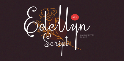 Introducing, Edellyn Script, a modern script typeface. This collection of scripts is perfect for personal branding. As you can see, this typeface has beutiful and modern look which is perfectly made to be applied especially in headline, logotype, apparel, invitation, branding, packaging, wedding card, advertising etc. Features : uppercase & lowercase numbers and punctuation multilingual alternates PUA encoded We highly recommend using a program that supports OpenType features and Glyphs panels like many of Adobe apps and Corel Draw, so you can see and access all Glyph variations. Thank you for purchase this font and Happy Creating !!!
 - Thigles by Abbasy Studio,
$15.00 Thigles, is a font inspired by Signs Painting, these pretty hand painted letters that you can see on buildings, billboards and signboards. Thigles font comes with some alternates and ligature as well to create your design more unique. With additional shadow font you will be able to create the beautiful combination and bring retro touch to your artworks!
 - Therhoernen by Proportional Lime,
$9.99 Arnold Therhoernen. (Arnoldus ther Hornen, Drucker des Dictys , Arnold ter Hoernen, Arnold ther Hoernen, Arnoldus TherHornen.) Who was this guy? He was a printer active in the city of Cologne, having graduating from the university there. He learned his craft under Ulrich Zell. He printed books from 1470 to 1482 when the plague carried him off. Was he just another printer of the era? No, he brought out the first edition of the "Fasciculus temporum'' (The most popular work by a living author at that time.) And he was the first to use both a title page and page numbers. His page numbers, an idea probably suggested to him by Werner Rolevinck, were interesting in that they were centered half way down the page on the outer margin and were set in Roman Numerals.
 - VTCTattooScriptTwo - Personal use only

- Matrixoid by Haksen,
$13.00 Matrixoid come with natural taste of letters. with the real hand done I created them, also additional variation in outline font to make good sensation feel. When you type with this font, I believe you will enjoy the sensation of the natural feel of this font, equipped with ligature and outline version features make the display even stronger for your projects such as posters, logos, advertisements, book covers and all brands for your requirement. I recommend for you to use photoshop or illustrator to make design with this font and let see when you will say WOW :) So what include when You want to use them ? OTF files Ligatures Numbers + Punctuation Non-English support Ligatures Please contact me if anything question, I'm glad to help :) Happy Designing, Haksen
 - Hyper Fatos by Bisou,
$15.00 Crafted with passion in La Chaux-de-Fonds, Switzerland, the Hyper Fatos typography was born in a moment of pure delight as the creator (Bisou) indulged in a delicious pizza. Inspired by the excitement and satisfaction that come from the most indulgent culinary pleasures, he designed this unique typography to capture the essence of gluttony and the irresistibility of the most appetizing dishes. Hyper Fatos was meticulously crafted to evoke an undeniable sense of indulgence. Its boldness and rounded forms bring to mind juicy hamburgers, crispy fries, and donuts overflowing with icing. It's the perfect typography for fast-food restaurant signs, tantalizing menus, or even advertising campaigns for giant burgers and decadent milkshakes. Picture Hyper Fatos in bright letters above a hot dog stand, and you'll see lovers of greasy food rushing to satisfy their most voracious cravings. This typography is the ultimate choice to whet your customers' appetites and encourage them to indulge in culinary delight.
 - Andaluz by Storm Type Foundry,
$38.00 The land of beauteous angels, Andalucia, connects different cultures with a curved arch. Almond trees bloom there in February, and orange trees grow in the heavenly courtyards of Gothic churches. A Catholic cathedral stands in a mosque, Moorish fountains gush with water, and ornate arcades are reflected in the mirrors of the Alhambra pools. Fishing villages have long been busy with tourism, but there are remote pubs where only locals go for fresh fish. Beer is served in wine glasses, and with each one you get a piece of cheese, shrimp, or a few slices of specially smoked ham, sitting on the bar counter. Here, in the off-season, it is possible to gaze into the distance towards the African shores and sketch watercolors for the diary completely undisturbed.
 - Heroxy by Kulokale,
$18.00 Heroxy is an sans serif display font, and with a style that is very different from the others. Heroxy is well-suited for posters, social media, headlines, magazine titles, clothing, large print formats - and wherever you want to be seen. Inspired by the style of design that is currently popular, and this is the answer to all the needs of every idea that you will pour in this modern era. We highly recommend using a program that supports OpenType features and Glyphs panels such as Adobe Illustrator, Adobe Photoshop CC, Adobe InDesign, or CorelDraw, so you can see and access all Glyph variations. This font is encoded with Unicode PUA, which allows full access to all additional characters without having special design software. Mac users can use Font Book, and Windows users can use Character Map to view and copy one of the extra characters to paste into your favorite text editor / application. Thanks and have fun!
 - Sagu Exora by Kulokale,
$17.00 Sagu Exora is an sans serif display font, and with a style that is very different from the others. Sagu Exora is well-suited for posters, social media, headlines, magazine titles, clothing, large print formats - and wherever you want to be seen. Inspired by the style of design that is currently popular, and this is the answer to all the needs of every idea that you will pour in this modern era. We highly recommend using a program that supports OpenType features and Glyphs panels such as Adobe Illustrator, Adobe Photoshop CC, Adobe InDesign, or CorelDraw, so you can see and access all Glyph variations. This font is encoded with Unicode PUA, which allows full access to all additional characters without having special design software. Mac users can use Font Book, and Windows users can use Character Map to view and copy one of the extra characters to paste into your favorite text editor / application. Thank You.
 - Mibundi by Twinletter,
$17.00 Mibundi is ideal for applications that require a classic, retro, vintage, or condensed look. This font’s ligature, alternative, and multilingual capabilities provide you the flexibility and creativity you need to convey your thoughts perfectly. Mibundi is a handcrafted font with unique and eye-catching letter shapes that will bring the finishing touch to your project. The compact design makes it suitable for use in a wide range of media, from print to digital. Mibundi also supports multilingualism, ensuring that this typeface can be used easily over the world. Using this typeface will undoubtedly capture the attention of potential customers and deliver significant value for your project. What’s Included : - File font - All glyphs Iso Latin 1 - Alternate, Ligature - Simple installations - We highly recommend using a program that supports OpenType features and Glyphs panels like many Adobe apps and Corel Draw so that you can see and access all Glyph variations. - PUA Encoded Characters – Fully accessible without additional design software. - Fonts include Multilingual support
 - Banknote 1948 by Ingo,
$39.00 A very expanded sans serif font in capital letters inspired by the inscription on a bank note Old bank notes tend to have a very typical typography. Usually they carry decorative and elaborately designed markings. For one thing, they must be practically impossible to forge and for another, they should make a respectable and legitimate impression. And in the days of copper and steel engravings, that meant nothing less than creating ornate, shaded or otherwise complicated scripts. Designing the appropriate script was literally in the hands of the engraver. That’s why I noticed this bank note from 1948. It is the first 20 mark bill in the then newly created currency ”Deutsche Mark.“ All other bank notes of the 1948 series show daintier forms of typography with an obvious tendency toward modern face. The 1949 series which followed shortly thereafter reveals the more complicated script as well. For whatever reason, only this 20 mark bill displays this extremely expanded sans serif variation of the otherwise Roman form applied. This peculiarity led me in the year 2010 to create a complete font from the single word ”Banknote.“ Back to those days in the 40’s, the initial edition of DM bank notes was carried out by a special US-American printer who was under pressure of completing on time and whose engravers not only engraved but also designed. So that’s why the bank notes resemble dollars and don’t even look like European currency. That also explains some of the uniquely designed characters when looked at in detail. Especially the almost serif type form on the letters C, G, S and Z, but also L and T owe their look to the ”American touch.“ The ingoFont Banknote 1948 comprises all characters of the Latin typeface according to ISO 8859 for all European languages including Turkish and Baltic languages. In order to maintain the character of the original, the ”creation“ of lower case letters was waived. This factor doesn’t contribute to legibility, but this kind of type is not intended for long texts anyway; rather, it unfolds its entire attraction when used as a display font, for example on posters. Banknote 1948 is also very suitable for distortion and other alien techniques, without too much harm being done to the characteristic forms. With Banknote 1948 ingoFonts discloses a font like scripts which were used in advertising of the 1940’s and 50’s and were popular around the world. But even today the use of this kind of font can be expedient, especially considering how Banknote 1948, for its time of origin, impresses with amazingly modern detail.
 - PR Hearts Take Wing 01 by PR Fonts,
$10.00 Hearts, and wings are both powerful symbols.The heart represents the seat of the emotions, and Wings represent movement upward, even spiritually, in the case of angel wings. These images have been drawn with a brush, some of them on rough paper, and are available as a black or white version.
 - Brick City by IC Fonts,
$25.00 This is a Cartoonish Brick Font that is reminiscent of some of the Brick Buildings you would see in the Inner Cities. Feel Free to add some graffiti to the brick wall to give it your own Graff City signature. It is also available in a 3d Brick Block Font.
 - Carnero Variable by Monotype,
$209.99Carnero™ is a feisty hybrid of precise geometry and calligraphic flair; a design that walks that fine line between being sensible and a standout. In an increasingly monotone typographic landscape – Carnero has a unique pulse that moves the reader along with a new energy. Carnero gives life to simple utility with kinetic letter shapes, open apertures, and generous counters Drawn by Steve Matteson for the Monotype Studio, Carnero’s versatility is its strength. From digital ads and applications to packaging and branding, Carnero is comfortable and contemporary. The lightest and boldest weights create inviting headlines, while the middle weights read well for body copy. Used together, they build a lively brand and a clear hierarchy. Matteson infused Carnero with a modernist exterior resting on a 10th century calligraphic foundation. Delightful flourishes on the capital R and K, and lowercase a, k and l, give the design a distinctive demeanor; while the alternate italic swash caps are a saucy nod to the scribes. The result is a design that is warm, approachable – and a bit lighthearted. Matteson describes Carnero as, “transcending the static posture of the geometric sans genre.” The Carnero family is a compact collection of six distinct weights, ranging from an engaging light to an authoritative black, each with an italic counterpart. Its extended Latin character set ensures worry-free localization for eastern/western European languages. This is a design that will prove its value many times over. Matteson has drawn over 80 distinctive typeface families for major corporations, branding firms and retail sales. His passions for the outdoors and performing music balances an intense focus on work – and subtly finds its way into typefaces like Carnero. Matteson has designed custom fonts for three generations of the Microsoft Xbox® game console, the original core fonts for the Android® mobile-phone platform, in addition to branding typefaces for Toyota®, Rocket Mortgage®, and Google®. He also drew the Kootenay™ family, Monotype’s proprietary branding typeface. Matteson’s retail designs range from the elegant and utilitarian Open Serif™ (a companion to Google’s Open Sans), to a growing series of Frederic Goudy revivals. Carnero Variables are font files which are featuring one axis and have a preset instance from Light to Black. - Carnero by Monotype,
$50.99 Carnero™ is a feisty hybrid of precise geometry and calligraphic flair; a design that walks that fine line between being sensible and a standout. In an increasingly monotone typographic landscape – Carnero has a unique pulse that moves the reader along with a new energy. Carnero gives life to simple utility with kinetic letter shapes, open apertures, and generous counters. Drawn by Steve Matteson for the Monotype Studio, Carnero’s versatility is its strength. From digital ads and applications to packaging and branding, Carnero is comfortable and contemporary. The lightest and boldest weights create inviting headlines, while the middle weights read well for body copy. Used together, they build a lively brand and a clear hierarchy. Matteson infused Carnero with a modernist exterior resting on a 10th century calligraphic foundation. Delightful flourishes on the capital R and K, and lowercase a, k and l, give the design a distinctive demeanor; while the alternate italic swash caps are a saucy nod to the scribes. The result is a design that is warm, approachable – and a bit lighthearted. Matteson describes Carnero as, “transcending the static posture of the geometric sans genre.” The Carnero family is a compact collection of six distinct weights, ranging from an engaging light to an authoritative black, each with an italic counterpart. Its extended Latin character set ensures worry-free localization for eastern/western European languages. This is a design that will prove its value many times over. Matteson has drawn over 80 distinctive typeface families for major corporations, branding firms and retail sales. His passions for the outdoors and performing music balances an intense focus on work – and subtly finds its way into typefaces like Carnero. Matteson has designed custom fonts for three generations of the Microsoft Xbox® game console, the original core fonts for the Android® mobile-phone platform, in addition to branding typefaces for Toyota®, Rocket Mortgage®, and Google®. He also drew the Kootenay™ family, Monotype’s proprietary branding typeface. Matteson’s retail designs range from the elegant and utilitarian Open Serif™ (a companion to Google’s Open Sans), to a growing series of Frederic Goudy revivals. Carnero Variables are font files which are featuring one axis and have a preset instance from Light to Black.
 - Voguish by Redy Studio,
$19.00 Voguish – Sophisticated Calligraphy Are you looking for an outstanding and unique font? Do you want to add some fun and playfulness to your creations? Then this is the font that you need! Say hello to Voguish – the new, exclusive, and elegant font! Voguish is a sophisticated font ideally crafted to easily create amazing results with a minimum of fuss. Voguish is a perfectly balanced font with unique, stylish letter shapes that have been combined with a sophisticated contemporary touch. Being a perfectly multifunctional font, it is the ideal fit for new season designs. It’s perfect for all those luxurious projects or designs that you want to stand out from the crowd! Download it now and make all your dreams come true! It’s so unique and elegant in look, that it will be the talk of your town! Voguish features: A full set of upper & lowercase characters Numbers & punctuation Gorgeous ligatures A full set of alternate upper & lowercase characters Uppercase beginning swashes Lowercase ending swashes Lowercase alternates characters Multilingual symbols PUA Encoded Characters – Fully accessible without additional design software. Feel free to give me a message if you have a problem or question. Thank you so much for taking the time to look at one of our products.
 - Blackout SCF by Scholtz Fonts,
$21.00 Blackout SCF is a loose and informal grungy font with a modern, electric zappy quality. The font is particularly useable for the promotion of products aimed at young and trendy consumers. It can be used for the design of: CD and DVD covers; clothing advertising and swing tags; magazines and advertising; and cosmetic packaging. It has been carefully letterspaced and kerned. It contains a full character set: all upper and lower case characters, punctuation, numerals and accented characters are present.
 - Crate Pro by Kustomtype,
$25.00 Crate Pro is a brand-new stencil font with rounded edges and thick main strokes, all glyphs have been contemplated very carefully so that all characters match in a well-balanced and streaming way. In both shaped weights, the font suits extraordinary well for headings, slogans etc. The cleanly cut and powerful Crate Pro font can easily be used for logotype, games, prints, magazines, web, apps, packaging, posters, T-shirts, signage & design projects. The font is original and custom made by Kustomtype.
 - FS Rufus by Fontsmith,
$80.00 Ligatures FS Rufus is an outgoing, likable sort of font with an eccentric streak. Wide letterforms and curious ink-traps make for an engaging personality, and a set of discretionary ligatures make FS Rufus irresistible to designers wanting to play. Not a small set, either: there are some 80 different options available. Wide The decision was made early on to make the letterforms of FS Rufus luxuriously wide. This generates a distinctive visual texture when the font is used for text. With other weights available for headlines, FS Rufus brings a curiously engaging look to editorial, magazine covers and advertising. Just look at my ink traps Ink traps are normally the preserve of fonts intended for printing at small sizes, in newspapers or directories – extra notches necessary to prevent ink from pooling. FS Rufus turns the ink trap into a beautiful eccentricity, flaunting it in both its lowercase and capitals. Take a look at the “h”, “a” and “k”, and the “B” and “N”. Attention-seeking? Moi?
 - Visine FF by Koral Creative,
$32.00 Visine FF is a typeface that aims to question the geographical borders that in so many ways can define people's lives. It was developed with the experience of advertising and commercial use in mind. The name Visine can be translated most simply as HEIGHTS. Visine FF was developed out of the necessity to make the most of the space on the visual format. With the tall arches and narrow bodies with exceptional, easy-to-read features, Visine FF aims to complement visual languages in many linguistic regions. Visine FF was developed in the Balkans, where Cyrillic, Latin and Glagolitic were the three historical writing systems used in the former Yugoslavia to denote cultural, ethnic, religious and political identities. Today, the languages of the Western Balkans are so similar that they can easily be called dialects, although they are written in different scripts. This is the result of their coexistence and parallel evolutions, which gave a rise to the common traits. This font family celebrates all the languages and scripts of the Western Balkans and is a labour of love. Love of design, love of language and the human need to communicate across borders, cultures and identities.
 - Bathysphere by Kickingbird,
$24.00 This steam era typeface, created by Gustav Schroeder in 1884, found popular use on soap box labels and tobacco tins during its initial release. Then, later, a successful and stout revival of Gustav's face, named Othello, was carried out by Morris Fuller Benton in 1934, and the typeface's appeal widened to include items such as broadside posters featuring Boris Karloff's Frankenstein. After metal gave way to film type, Gustav's creation experienced a brief fashion moment in the 1960's, but then disappeared entirely, never re-surfacing as a full digital typeface. With the release of Bathysphere, the typeface comes full circle, having been completely redrawn from scratch using Gustav's original specimens. The new extended language support establishes the typeface firmly in the modern era, while Bathysphere's refinement of subtle blunt corners restores a deep-sea grace to this iron giant.
 - Montage by House Industries,
$33.00 Montage has played a weighty role in some of the most influential and enduring typography of the past few decades, from book jackets and album covers, to posters and logos…you name it. Exhibiting an uncommon ability to wield immense power while demonstrating extraordinary finesse, Montage’s commanding profile packs a hefty punch which is softened only by its lithe yet durable serifs. Originally designed for Photo-Lettering in the mid-1960s by type legend, Ed Benguiat, the fonts were given a jump start by Jess Collins before ultimately being shaped into five compatible widths by longtime House co-conspirator, Mitja Miklavčič. Under the guidance of Ben Kiel, along with some additional chin-stroking by Ken Barber, Montage has been fully developed into a robust family ready to tackle any challenge you can throw at it. FEATURES LIGATURES: In order to ensure that Montage maintains its bold presence in tricky text settings, we’ve added a handy set of pre-drawn letter combinations. When enabled, the Ligature feature identifies problem pairs like—fl, fi, ff, ffl, and of course, fyi—and substitutes them with glyphs optimized to enhance font performance. ALTERNATES: For fickle typographers, we’ve also added a handful of alternate characters to allow Montage to suit any number of mood Like all good subversives, House Industries hides in plain sight while amplifying the look, feel and style of the world’s most interesting brands, products and people. Based in Delaware, visually influencing the world.
 - Ethylene by dotHK Studio,
$18.00 Ethylene Display Font come with masculine themes. It matches applies in some designs such as the logotype, brand, packaging, quotes, music poster, t-shirt, cover book and more custom design. The features uppercase, lowercase, numeral, punctuation & symbol, multilingual support. Ethylene Display Font This font has been equipped with OpenType features and has many glyphs. and of course by having many of these glyphs will be able to choose the letters according to your liking, lots of variations and options for each letter, so you can customize your design choices and also have other languages supported. This font is perfect for use with programs that support OpenType features like Adobe Photoshop Cs / Adobe Photoshop CC, Adobe Illustrator CS / Adobe Illustrator CC, Adobe Indesign and Corel Draw and many more programs that support OpenType, and I've also included a special alternative so you can use any program, this font can be used by everyone. if you have any question, please feel free to contact me by email. Thanks and congratulations designing.
 - Rambat Campotype - Personal use only

- Visitor BRK Ten Pro by CheapProFonts,
$10.00 This is the first true pixel-font released by CheapProFonts. It may not be the first font based on a 5x5 pixel grid, but it probably has the best language support. The glyphs have all been optimized for Flash (by making the pixel shapes slightly overlapping) and should render sharp and perfect when set in 10px size (or multitudes of 10). As with all pixelfonts: make sure to place the text at coordinates with whole numbers, and always use left (and NEVER centered) alignment. ALL fonts from CheapProFonts have very extensive language support: They contain some unusual diacritic letters (some of which are contained in the Latin Extended-B Unicode block) supporting: Cornish, Filipino (Tagalog), Guarani, Luxembourgian, Malagasy, Romanian, Ulithian and Welsh. They also contain all glyphs in the Latin Extended-A Unicode block (which among others cover the Central European and Baltic areas) supporting: Afrikaans, Belarusian (Lacinka), Bosnian, Catalan, Chichewa, Croatian, Czech, Dutch, Esperanto, Greenlandic, Hungarian, Kashubian, Kurdish (Kurmanji), Latvian, Lithuanian, Maltese, Maori, Polish, Saami (Inari), Saami (North), Serbian (latin), Slovak(ian), Slovene, Sorbian (Lower), Sorbian (Upper), Turkish and Turkmen. And they of course contain all the usual "western" glyphs supporting: Albanian, Basque, Breton, Chamorro, Danish, Estonian, Faroese, Finnish, French, Frisian, Galican, German, Icelandic, Indonesian, Irish (Gaelic), Italian, Northern Sotho, Norwegian, Occitan, Portuguese, Rhaeto-Romance, Sami (Lule), Sami (South), Scots (Gaelic), Spanish, Swedish, Tswana, Walloon and Yapese.
 - Duende by Aerotype,
$49.00 Created with headline, logo and other short display work in mind, Duende comes in two weights with alternates for the upper and lowercase, consecutive characters are controlled with the OpenType Ligature feature. Display bigger lowercase crossbars as the surrounding characters allow with OpenType Contextual Alternates on, or create your own custom lowercase f or t with a non-crossbar character and one of the included crossbar options Other features include case-sensitive quotes and smart apostrophes. Duende has an alternate for every capital letter and multiple alternate options for the lowercase including swashy terminal characters and non-connecting alternates. Also included are a few clip-on swash elements that can be used to create initial and terminal forms. Duende uses smart crossbars for common situations, unifying Af, Aft, At, Att, Aff, tt and ff with a single crossbar when the OpenType Ligature feature in on. The Ligature feature also ensures subtle baseline variation when two lowercase characters are keyed twice in a row. Enable Contextual Alternates in your OpenType menu and Duende uses bigger f and t crossbars as the surrounding characters allow. Enable Discretionary Ligatures for lowercase o connections. You can also make your own lowercase f and t to fit any situation combining one of the included crossbars and non-crossbar f or t characters (available as ‘Alternates for Current Selection’ when f or t is selected). Just select the crossbar you want from the glyph table as a separate text element and move it anywhere. Also included are ten tt ligatures with crossbars and one without. Duende also has a few other swashy things that can be used to cross the lowercase f and t. Customize alternate capitals U, V, W, X and Y with any one of the swash options available in the glyph table for those characters.
 - Digital Sans Now by Elsner+Flake,
$59.00 Digital Sans Now combines and completes the many diverse requests and requirements by users of the past years. By now, 36 versions for over 70 Latin and Cyrillic languages have become available, including Small Caps. Digital Sans Now is also available as a webfont and reflects, with its simplified and geometric construction and its consciously maintained poster-like forms as well as with its ornamental character, the spirit of the decorative serif-less headline typefaces of the 1970s. The basic severity of other grotesque typefaces is here repressed by means of targeted rounds. Exactly these formal breaks allow the impression that it could be used in a variety of visual applications. Short texts, headlines and logos of all descriptions are its domain. It is because of this versatility that the typeface has become a desirable stylistic element, especially in such design provinces as technology, games and sports, and that, for many years now, it appears to be timeless. Additional weights designed on the basis of the original, from Thin to Ultra, the Italics, Small Caps and alternative characters allow for differentiated “looks and feels”, and, with deliberate usage, give the “Digital Sans Now” expanded possibilities for expression. The basis for the design of Digital Sans Now is a headline typeface created in 1973 by Marty Goldstein and the Digital Sans family which has been available from Elsner+Flake since the mid-1990s under a license agreement. The four weights designed by Marty Goldstein, Thin, Plain, Heavy and Fat, were originally sold by the American company Visual Graphics Corporation (VGC) under the name of “Sol”. Similarly, the company Fotostar International offered film fonts for 2” phototypesetting machines, these however under the name “Sun”. The first digital adaptation had already been ordered in the mid 1970s in Germany by Walter Brendel for the phototypesetting system Unitype used by the TypeShop Group, in three widths and under the name “Digital Part of the Serial Collection.” Based on the versions by VGC, Thin, Plain, Heavy and Fat, new versions were then created with appropriate stroke and width adaptations for data sets for the fonts Light, Medium and Bold as well as for the corresponding italics
 - ITC Tyfa by ITC,
$29.99 Some words from the designer, Frantisek Storm... Designed by Josef Tyfa in 1959, digitalized by F. Storm in 1996. This Roman and Italic are well-known perhaps to all Czech graphic artists and typographers ever since their release. Although this type face in some details is under the sway of the period of its rise, its importance is timeless, in contradistinction to other famous types dating from the turn of the sixties which were found, after some time, to be trite. The italics live their own life, only their upper-case letters have the same expression as the basic design. Thin and fragile, they work excellently, emphasizing certain parts in the text by their perfect contrast of expression. When seen from a distance they are a little bit darker than the Roman face. Tyfa Roman was released in 1960 by Grafotechna in Prague for hot setting. Later on, Berthold produced letter matrices - "rulers" for Staromat devices, used for manual photosetting of display alphabets. In the eighties it was available on dry transfers of Transotype and today it is offered also by ITC. The meticulously executed designs of the individual letters in the 288 point size are arranged into a set of signs on a cardboard of about B2 in size. The yellowed paper reveals retouches by white paint on the ink. Blue lines mark the baseline, the capital line, the ascender and descender lines and the central verticals of the letters. With regard to the format of the flat scanner, the designs had to be reduced, with the use of a camera, to the format A4, i.e. to the upper-case letter height of about 30 mm. These were then scanned in 600 dpi resolution and read as a bitmap template to the FontStudio programme. The newly created bold type faces derive from Tyfa's designs of the letters "a", "n", "p", the darkness of which was increased further, approximately by 3%, to enhance their emphasizing function. The text designs have hairstrokes thickened by one third; the contrast between thin and thick strokes has been modified, in order to improve legibility, in sizes under 12 points. We have used electronic interpolation to produce the semi-bold designs. Josef Tyfa himself recommends to choose a somewhat darker design than the basic one for printing of books.
 - Jeullyta by Tigade Std,
$10.00 The name Jeullyta is taken from the Indonesian language but with modified pronunciation. The correct one is Jelita which means "Gorgeous". I named this font Jeullyta because it is gorgeous, from the initial process until the end product. It is a strong yet nice looking script font and can be considered a brush font too with the shadow on the body of each glyph. This font is suitable to be used for: Posters Advertisement Book Cover and much more It comes with hundreds of stylistic alternate glyphs to enhance the feel of your design. Enjoy!!
 - Bay Tavern by FontMesa,
$25.00 Bay Tavern is the first weathered version of our Tavern font that's based on Algerian. With three weights, open faced and outline versions to choose from you're sure to find the right style for your new project, restaurant menu, logo, t-shirt design or Pirate costume party. Bay Tavern includes all the same alternates as our regular Tavern font family. While our original Tavern font has been increased to include five weights additional weights for Bay Tavern will have to wait for now, adding the notched cut in's were all done by hand which causes a lot of cramping so a long break is needed before creating the extra weights. The Fill fonts in the Bay Tavern family are meant to be used with Bay Tavern Open fonts, if you're using Bay Tavern Open then select Bay Tavern Fill, if you're using Bay Tavern Open L then select Bay Tavern Fill L, if you're using Bay Tavern Open S then select Bay Tavern Fill S, if you're using Bay Tavern Open SL then select Bay Tavern Fill SL, the same rule goes for the Open X version.
 - Silvestern by Letterhend,
$19.00 Introducing, Silvestern. A vintage display typeface with the touch of nostalgic feel yet still looks luxury in a modern design concept. This typeface has unique looks and strong character with its ornament as bonus. This font perfectly made to be applied especially in logo, and the other various formal forms such as invitations, labels, magazines, books, greeting / wedding cards, packaging, fashion, make up, stationery, novels, labels or any type of advertising purpose. Features : Uppercase & lowercase (alternates) Numbers and punctuation Stylistic alternates multilingual PUA encoded Extra ornament in vector We highly recommend using a program that supports OpenType features and Glyphs panels like many of Adobe apps and Corel Draw, so you can see and access all Glyph variations.
 - Natural Rough by Letterhend,
$13.00 Introducing Natural Rough, the perfect font for adding a touch of organic charm to your designs. This Handwritten font boasts a beautifully natural texture, adding a unique and rustic feel to your typography. This font perfectly made to be applied especially in logo, and the other various formal forms such as invitations, labels, logos, magazines, books, greeting / wedding cards, packaging, fashion, make up, stationery, novels, labels or any type of advertising purpose. Features : Uppercase & lowercase Numbers and punctuation Alternates & Ligatures Multilingual PUA encoded We highly recommend using a program that supports OpenType features and Glyphs panels like many of Adobe apps and Corel Draw, so you can see and access all Glyph variations.
 - Adaniya by Sealoung,
$15.00 Introducing, Adaniya - a standout bold script with a touch of nostalgic look and feel. Inspired by 50s 60s signages, this font made to bring back the good ol' days. This type of font perfectly made to be applied especially in logo, headline, signage and the other various formal forms such as invitations, labels, logos, magazines, books, greeting / wedding cards, packaging, fashion, make up, stationery, novels, labels or any type of advertising purpose. Features : Uppercase & lowercase Numbers and punctuation Multilingual Alternates / swashes and ligatures PUA encoded We highly recommend using a program that supports OpenType features and Glyphs panels like many of Adobe apps and Corel Draw, so you can see and access all Glyph variations.
 - Radnick by Letterhend,
$19.00 Introducing, Captivate Script - A beautiful modern calligraphy script based on manual hand writing. The natural flow with the swashes make this font looks even more prettier. This type of font perfectly made to be applied especially in wedding invitation, labels, logos, magazines, books, greeting / wedding cards, packaging, fashion, make up, stationery, novels, labels or any type of advertising purpose. Features : uppercase & lowercase numbers and punctuation multilingual swash and ligature alternates PUA encoded We highly recommend using a program that supports OpenType features and Glyphs panels like many of Adobe apps and Corel Draw, so you can see and access all Glyph variations. How to access opentype feature : letterhend.com/tutorials/using-opentype-feature-in-any-software/
 - Maleryan by Letterhend,
$19.00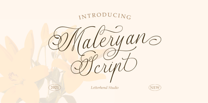 Script Maleryan Script - Modern Calligraphy Maleryan is a beautiful modern calligraphy script based on manual hand writing. The natural flow with the swashes make this font looks even more prettier. This type of font perfectly made to be applied especially in wedding invitation, labels, logos, magazines, books, greeting / wedding cards, packaging, fashion, make up, stationery, novels, labels or any type of advertising purpose. Features : uppercase & lowercase numbers and punctuation multilingual swash and ligature alternates PUA encoded We highly recommend using a program that supports OpenType features and Glyphs panels like many of Adobe apps and Corel Draw, so you can see and access all Glyph variations. How to access opentype feature : letterhend.com/tutorials/using-opentype-feature-in-any-software/
 - Emely and Peter by Letterhend,
$19.00 Emely and Peter is a beautiful modern calligraphy script with love theme. The swashes and love ornaments makes this font looks suitable for romance, wedding, feminine theme. This type of font also perfectly made to be applied especially in logo, and the other various formal forms such as invitations, labels, logos, magazines, books, greeting / wedding cards, packaging, fashion, make up, stationery, novels, labels or any type of advertising purpose. Features : uppercase & lowercase numbers and punctuation multilingual alternates and ligatures swashes PUA encoded We highly recommend using a program that supports OpenType features and Glyphs panels like many of Adobe apps and Corel Draw, so you can see and access all Glyph variations.

