10,000 search results
(0.102 seconds)
- LiebeGerda by LiebeFonts,
$29.00 Go out into the wilderness. Cut down a tree. Stop and smell the roses. And then treat yourself with this unplugged, hand-lettered typeface. LiebeGerda is an effortless-but-refined, spontaneous-but-elegant brush font. She is ready for your next project, and she wants to add that little crafty something that makes the difference. Her natural breath of fresh air lets you escape those same old monotonous script fonts you’ve been using. After our successful first brush font, LiebeDoris, and our first interconnected script, LiebeLotte, we’re combining both genres and taking them to the next level: an interconnected brush script. OpenType magic varies LiebeGerda’s letterforms: Most characters have no less than three different variations that are automatically shuffled and inserted as you type. Plus, the “All-Caps” OpenType feature exchanges uppercase letters with less-swashy variants. Now you know why every one of the four styles contains more than 1,200 characters! Ulrike of LiebeFonts painted LiebeGerda’s four styles individually from scratch and carefully adjusted every detail by hand. Rather than being one typeface with different weights, LiebeGerda is a package of four individual fonts that go together really well. Ulrike’s high level of type-nerdy craftsmanship shows. When you use LiebeGerda, your designs will easily convince your audience that they’re looking at a hand-crafted piece of lettering. Feel free to add a few of the stacked ligatures like “the”, “for”, and “new” to round off the illusion. Last but not least, LiebeGerda has a lot more detail than most other brush fonts. That means there’s no ugly, lazy bézier artifacts in the brush traces. You can print words at billboard size, and people will still believe they smell the paint from your brush!
 - Zenoa by Brenners Template,
$19.00 Zenoa Display Serif Font Family - They are sharp and sensitive, but connected-oriented. That's why they're designed by incorporating hook glyphs into an elegant serif style. Somewhat high contrast between vertical and horizontal, they reveal the strong individuality of each glyph, so you can create creative layouts. The meticulous design stands out so that readability and individuality can be expressed in harmony. And, these are the special excellences of this font family: Stylish Alternates and Ligatures where calligraphic subtlety is artistically connected. These OpenType features are decorative pleasures of using this font family more functionally. Please check first if the app you are using supports these features. They are easy to use in Adobe apps such as Photoshop and Illustrator. Alternates : A, B, C, D, E, F, G, H, J, K, L, M, N, P, Q, R, S, T, U, V, W, X, Y. Standard Ligatures : ff, fi, fl Discretionary ligatures : Am, Ba, Ca, Ch, De, En, Fr, Ge, Ha, In, Lo, Mi, No, Pa, Ro, Sa, Th, Va, Wo, Yo, an, bi, ck, de, ee, gn, ha,ie, lo, mo, no, oo, pr, ro, ss, st, te, um, ve, we, yo. Supported Languages: Western Europe, Central/Eastern Europe, Baltic, Turkish, Romanian
 - Lightbox 21 by Protimient,
$21.00 Lightbox 21 is a radical update of my previous version of a geometric sans serif. The design of the original Lightbox was fundamentally based on the idea of incorporating the proportions of the ‘Golden Ratio’ into each letterform; Lightbox 21 greatly improves on this concept by entirely abandoning it. The result is a much more readable, ‘natural’ typeface that retains elements of the original without being bound to it. Overall, Lightbox 21 has been designed to convey that classic feel of a geometric sans that makes the genre so tremendously enduring and versatile, as well as providing an effortless sense of class to whatever they are applied. Primarily intended for editorial work (i.e. short to medium length texts) or display settings, Lightbox 21 has a reasonably extensive character set, including support for Vietnamese, many currency symbols, arrows, and small caps. It also has OpenType support for nut fractions (via a stylistic set) and a barred alternate uppercase i and an alternate curled j.
 - Anselm Sans by Storm Type Foundry,
$63.00One of the good practices of today’s type foundries is that they release their type families as systems including both serif and sans serif type. Usually, the sources of inspiration need to be well tried with time and practice, since production of a type family is such a laborious and complex process. From the beginning, it needs to be clear that the result will be suited for universal use. Such systems, complete with the broad, multi-lingual variations permitted by the OpenType format, have become the elementary, default instrument of visual communication. Non-Latin scripts are useful for a wide scope of academic publications, for packaging and corporate systems alike. And what about outdoor advertisement designated for markets in developing countries? Cyrillics and Greek have become an integral part of our OpenType font systems. Maybe you noticed that the sans serif cuts have richer variety of the light – black scale. This is due to the fact that sans serif families tend to be less susceptible to deformities in form, and thus they are able to retain their original character throughout the full range of weights. On the other hand, the nature of serifed, contrasted cuts does not permit such extremes without sacrificing their characteristic features. Both weights were drawn by hand, only the Medium cut has been interpolated. Anselm Ten is a unique family of four cuts, slightly strengthened and adjusted for the setting in sizes around 10 pt and smaller, as its name indicates. The ancestry of Anselm goes back to Jannon, a slightly modified Old Style Roman. I drew Serapion back in 1997, so its spirit is youthful, a bit frisky, and it is charmed by romantic, playful details. Anselm succeeds it after ten years of evolution, it is a sober, reliable laborer, immune to all eccentricities. The most significant difference between Sebastian/Serapion and Anselm is the raised x-height of lowercase, which makes it ideal for applications in extensive texts. Our goal was to create an all-round type family, equally suitable for poetry, magazines, books, posters, and information systems. - Anselm Serif by Storm Type Foundry,
$63.00 One of the good practices of today’s type foundries is that they release their type families as systems including both serif and sans serif type. Usually, the sources of inspiration need to be well tried with time and practice, since production of a type family is such a laborious and complex process. From the beginning, it needs to be clear that the result will be suited for universal use. Such systems, complete with the broad, multi-lingual variations permitted by the OpenType format, have become the elementary, default instrument of visual communication. Non-Latin scripts are useful for a wide scope of academic publications, for packaging and corporate systems alike. And what about outdoor advertisement designated for markets in developing countries? Cyrillics and Greek have become an integral part of our OpenType font systems. Maybe you noticed that the sans serif cuts have richer variety of the light – black scale. This is due to the fact that sans serif families tend to be less susceptible to deformities in form, and thus they are able to retain their original character throughout the full range of weights. On the other hand, the nature of serifed, contrasted cuts does not permit such extremes without sacrificing their characteristic features. Both weights were drawn by hand, only the Medium cut has been interpolated. Anselm Ten is a unique family of four cuts, slightly strengthened and adjusted for the setting in sizes around 10 pt and smaller, as its name indicates. The ancestry of Anselm goes back to Jannon , a slightly modified Old Style Roman. I drew Serapion back in 1997, so its spirit is youthful, a bit frisky, and it is charmed by romantic, playful details. Anselm succeeds it after ten years of evolution, it is a sober, reliable laborer, immune to all eccentricities. The most significant difference between Sebastian/Serapion and Anselm is the raised x-height of lowercase, which makes it ideal for applications in extensive texts. Our goal was to create an all-round type family, equally suitable for poetry, magazines, books, posters, and information systems.
 - Whimster Glympse by Letterhend,
$19.00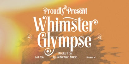 Whimster Glimpse is a stylish display font This font has unique letterform, make it looks great to be used for vintage & elegant design theme. This font perfectly made to be applied especially in logo, and the other various formal forms such as invitations, labels, logos, magazines, books, greeting / wedding cards, packaging, fashion, make up, stationery, novels, labels or any type of advertising purpose. Features : uppercase & lowercase numbers and punctuation multilingual alternates & ligatures PUA encoded We highly recommend using a program that supports OpenType features and Glyphs panels like many of Adobe apps and Corel Draw, so you can see and access all Glyph variations.
 - Transdoshan Scratch by Edd's Aurebesh Fontworks,
$5.00 Working on a Star Wars project? This font is in Aurebesh, the main written language of the Star Wars universe. In this case I designed a font that looks like it has been scratched into a wall. All the additional letters from the Aurebesh character set are includes, as well as numbers and symbols.
 - Johnny by Canada Type,
$24.95 Johnny is the latest addition to the long line of popular psychedelic/hippy/funky art nouveau fonts representing the retro side of the Canada Type library. It is the digitization of a popular 1969 Phil Martin typeface that was known by two different names: Harem and Margit. The film type version had plenty of irregularities and quirks that made it seem like it was done in a hurry. In this digital version the errors have been corrected and the character set expanded to include international characters with built-in alternates, to be on par with what today's layout artists expect from a high quality font. This font saw a lot of use on record sleeves and music posters throughout the pre-disco part of the 1970s, which makes it a veteran of both the psychedelic and funk periods. This makes it the sharper, sturdier art nouveau contemporary personality of Canada Type's Tomato font. This font contains a very expanded character set that includes full support for Central, Eastern and Western European languages, as well as Baltic, Turkish, Esperanto, Greek, Cyrillic and Vietnamese.
 - FS Millbank by Fontsmith,
$80.00 A sign of something better When designer Stuart de Rozario surveyed the fonts used in signage on London’s public transport systems, he reached a dead end. They seemed staid, sterile, lacking in personality, and ill-suited to use by modern brands. He was pointed in another direction entirely. ‘The driving force behind my thoughts was to design something more current and fresh without compromising legibility and clarity. A font with both personality and function, that’s versatile and large and small sizes, and effortless to read, but which also says something new.’ Speed reading Late for a meeting and can’t find your way? Trying to catch a flight? Lost in a hospital? Reading signs is a different business to reading a book or a newspaper. Text on signs needs to be deciphered quickly and effortlessly. So the legibility criteria for signage letterforms are different to those for normal reading, too. Throughout FS Millbank’s uppercase and lowercase alphabets, characters have been given features for extra definition, including: wide ink traps on the A, K, M, V, W, X and Y; a serifed i, accentuated spurs on the a, d, l u; and different x-height shapes on the b, g, p and q. Distinctive forms and generous, open internal shapes all help the quick reading of sign text, and wide, open terminals and counters allow similar letter shapes to be distinguished easily when viewed at different angles. Running down a corridor, maybe... Positive/negative Standard type tends to glow on the kind of dark backgrounds often used for signage, and look heavier than its true weight. To correct the imbalance caused by this optical trick, special weights of the typeface have to be drawn for these ‘negative’, light-on-dark applications. These are lighter than their comparable positive weights to overcome the ‘glow’ effect. After extensive tests of the negative weights, at all sizes, we achieved the right optical balance. Glowing, glowing, gone. Icons This wouldn’t be a signage typeface without its own set of icons, or symbols, to help people find what they’re looking for. So, to sit alongside the positive and negative fonts, we’ve created a comprehensive set of 172 icons, covering a wide range of applications from transport and user interface to information and directional. Designed within the typeface capital height, they sit on the baseline and are spaced centrally.
 - Hebrew Modern by Samtype,
$49.00 This is a classic design from the beginning of the 20th century. This font can be used in many kinds of books
 - Farm Doodles by Outside the Line,
$19.00 Farm Doodles... perfect collection of illustrations to be used for everything from the farm to table movement to the current weddings on a farm trend. 30 illustrations of farm animals... beehive, fish, bunny, chickens, cows, goat, sheep, pig and horse. Farm buildings, weather vane, windmill, tractor, milk can, hay bale, trees. And food... tomato, carrots, peas, spinach, apples, beets. Mix and match with other Outside the Line illustration fonts.
 - Champions by TypeDrift,
$15.00 Champions is our best-selling typeface that has been completely rebuilt, from the ground up. Now featuring special characters, alternate glyphs and a sans serif version. This is the font champions are made of.
 - IM FELL French Canon - Unknown license

- East Anglia - 100% free

- Gertrud by T4 Foundry,
$21.00First place in a spelling-bee competition, a Harvard University diploma or the Nobel Peace Prize? You can't go wrong with this classic Swedish calligraphy font, created by veteran designer Bo Berndal. He named Gertrud after his better half, but was also inspired by old handwritten documents: "Gertrud is a calligraphic letter design from the 16th century. I used it when I engrossed diplomas with a flat-nibbed pen in the 1980's. When I got my Mac I generated the typeface in Fontographer." Gertrud (the typeface) comes in three weights, with roman and italic. It is an OpenType creation, for both PC and Mac. Swedish type foundry T4 premieres new fonts every month. Gertrud is our sixth introduction. - Snippity Snap by Hanoded,
$15.00 Snippity Snap is a font made up of glyphs I cut out from black paper with some household scissors, then pasted onto white paper. When I was cutting out the shapes, my children asked me what I was doing, and when I told them, they thought it was pretty cool and started cutting out shapes from paper themselves. The result is a house filled with paper cuttings, which I keep finding everywhere - even in my bed. Snippity Snap is a very nice font for ads, book covers, packaging and children's books. Enjoy!
 - Whisky Trail by Vozzy,
$10.00 Introducing a vintage look label font named "Whisky Trail". All available characters you can see at the screenshot. This font have 7 styles - Regular, Full, Shadow, Light, Shadow FX, Light FX and Print. This font will good viewed on any retro design like poster, t-shirt, label, logo etc. For using effect layer: Type your text in Regular. Copy that and paste at the same position. Change the style to Light FX or Shadow FX. After that you can choose different colors for Regular font and Shadow or Light effects. For the catchwords type the word with space before and after word (for sample ' with ', or ' with2 ' for alternate view of catchword), 'Discretionary Ligatures' on the 'OpenType' tab must be turned on. Or paste it from 'Glyphs' tab in any place on your text. This in Illustrator. In Photoshop 'Discretionary Ligatures' you can find in the menu Type - OpenType. Thank you!
 - Fruitcake Fanatics by Bogstav,
$18.00 I have had the name "Fruitcake Fanatics" in my mind for quite some time now...but I needed a font that suited the name...then one day...actually last Wednesday, I was playing around with some letters (which eventually would turn out to be this font!) and suddenly it struck me: I got the letters for my Fruitcake Fanatics font! Another story could be - what does the name mean?! Well, to tell you the truth, I don't know - but what I do know is that the font is playful and unpredictable and loads of fun!
 - F2F Al Retto by Linotype,
$29.99The Techno sound of the 1990s, a personal computer, a font creation software and some inspiration had been the sources to the F2F (Face2Face) font series. Alessio Leonardi and his friends had the demand to create new unusual faces that should be used in the leading german techno magazine "Frontpage". Even typeset in 6 point to nearly unreadability it was a pleasure for the kids to read and decrypt the messages. About Al Retto: "Al" means "Alessio Leonardi" and Retto "straight", but if you read it as an italian world means "in the a**". - Courant by Hanoded,
$20.00 Courant means "newspaper". Courant font was modeled on 17th century Dutch newspapers and most of the glyphs are authentic. The 'modern' glyphs, like @, $, €, * and several others have been designed by me, as they were not in use in the 1600's.
 - Loominaire by IbraCreative,
$37.00 Introducing Loominaire - A Modern Futuristic Font! Step into the future with Loominaire, a captivating and cutting-edge font that embodies the essence of modernity and innovation. Designed to make your designs stand out and leave a lasting impression, Loominaire brings a touch of sleek sophistication to your creative projects. With its clean lines and geometric precision, Loominaire exudes an aura of futuristic elegance. Each letter is meticulously crafted to create a harmonious balance between contemporary aesthetics and legibility, ensuring that your message is conveyed with clarity and style. This font is perfect for those seeking to add a touch of modernity to their branding, advertisements, websites, posters, and more. Captivate your audience with Loominaire's versatility, whether you're creating a high-tech logo, a sci-fi movie poster, or a forward-thinking website interface. Loominaire unleashes your creative potential with its extensive character set, including uppercase and lowercase letters, numerals, punctuation marks, and a variety of special symbols. Its versatility extends beyond the confines of traditional design, allowing you to explore endless possibilities and push the boundaries of visual communication. Embrace the future of typography with Loominaire - a font that bridges the gap between contemporary design and futuristic aesthetics. Let your creativity soar and watch as your designs come to life with a touch of modern elegance. Unlock the power of Loominaire today and revolutionize your creative projects with this extraordinary modern futuristic font.
 - CAL Bodoni Terracina by California Type Foundry,
$47.00 Bodoni Terracina is a legible, fun-formal script face, with lots of curls. Sometimes script faces are hard to read. Sometimes being formal means that there’s no personality and there’s no fun. Enter Terracina: one of the masterpieces of font design. Some of the most personable italics ever carved. Includes powerful new features for: • Dates • Pricings • Addresses Not is only Terracina formal but fun, it’s also fun to use! In a program like Adobe Indesign or Illustrator, just highlight a word and see lots of fun options. Bodoni himself etched these symbols, and his fun-loving personality shines through. As a semi-script, it can go together with many script fonts, but it is more readable. When you need something equal parts elegant and whimsical, Terracina strikes a perfect balance to let the fun shine through, such as for holiday designs or fairytales. Terracina is a subheads font, but Bodoni also used it for paragraphs. So Terracina works well doing subhead paragraphs, especially when contrasting with the mood of the first font. And because of the swash variety, it works well for setting German and other European languages. CAL Bodoni Terracina is a member of our Origins Series. Origin Fonts are designed to be true to the original designer's intentions and fonts. Our Bodoni origin fonts ARE Bodoni fonts, not imitations or interpretations. They were drawn by Bodoni, our team just expanded it for modern use. For Terracina, Bodoni's original weight is the "Quasi-Lite" option, all other weights have been meticulously matched by the CAL Origins Team.
 - Yugoslavia - Personal use only

- ITC Sportbet by ITC,
$40.99Looking for something new for setting powerful headlines? Need a font that can create logos with ease? How about something masculine, a design with authority and panache? Then ITC’s newest typeface, ITC Sportbet™, may be the perfect choice. ITC Sportbet is a design that should be set tight, creating an arresting graphic image as well as words. Although a capital-only typeface, it benefits from a large suite of alternate characters that enable individual words and headlines to be customized with a distinctive personality. In addition to the obvious power of ITC Sportbet’s square-jawed character shapes, it’s fun to use. Exchange one or two letters with their alternative designs and a brand new headline or logo appears. ITC Sportbet was designed by Dane Wilson, the principal of the London-based design firm of Dane Design. Although this is his first commercial typeface design, Wilson has ample experience creating logos and custom typefaces for corporate branding. In fact, Sportbet grew out of such a project. “The idea initially came from wanting to provide a client with a stylish, modern and graphically impactful corporate identity logo font,” recalls Wilson. “Although the first sketches looked promising as a typeface, because of time and budget constraints, developing an entire alphabet would be overambitious.” Not to be deterred, Wilson continued to work on the design when time permitted. He eventually completed the font and started final application tests. The results looked good to Wilson, but he felt that the design was missing something. “I hit upon the idea of breaking out the left side of all the closed counters,” Wilson wrote about the design. “This simple device gave Sportbet the kick it needed.” Although one weight and a capital-only typeface, Wilson’s ITC Sportbet should prove to be a powerful and versatile communicator. - Lapis Pro by Canada Type,
$29.95 Lapis was Jim Rimmer's venture into a territory he'd earlier explored with his Lancelot and Fellowship faces. This time he stayed much longer, dug pretty deep, and had plenty of fun in there. The end result is the kind of mosaic of influences only a guy like Jim could consider, gather, manage and apply in a way that ultimately makes sense and works as a type family. On the surface Lapis seems like something that can be billed as what Jim would have called an "advertising text face". But under the hood, it's a whole other story. On top of the calligraphic, nib-driven base Jim usually employed in his faces, Lapis shows plenty of typographic traits from a variety of genres, from Egyptian to Latin, from blackletter angularity to Dutch-like curvature, with an overall tension even reminiscent of wood type. There are some Goudy-informed shapes that somehow fit comfortably within all this. Then it's all strung together with a mix of wedged, tapered and leaning serifs, placed with precision to reveal expert spontaneity and a great command of guiding the forms through counterspace. In the fall of 2013, the Lapis fonts were scrutinized and remastered into versatile performers for sizes large and small. The three weights and their italic counterparts have been refined and expanded across the board to include small caps, alternates, ligatures, ordinals, case-sensitive forms, six kinds of figures, automatic fractions, and a character set that covers an extended range of Latin languages. Each of the Lapis Pro fonts contains over 760 glyphs. For more details on the fonts' features, text and display specimens and print tests, consult the Lapis Pro PDF availabe in the Gallery section of this page. 20% of Lapis Pro's revenues will be donated to the Canada Type Scholarship Fund, supporting higher typography education in Canada.
 - LTC Garamont by Lanston Type Co.,
$24.95Frederic Goudy joined Lanston as art advisor in 1920. One of his first initiatives was to design a new version of Garamond based on original Garamond designs of 1540. Goudy intended his free-hand drawings to be cut exactly as he had drawn them and fought with the workmen at Lanston to keep them from “correcting” his work. This new type was called Garamont (an acceptable alternate spelling) to distinguish it from other Garamonds on the market. (The other Garamonds on the market at that time were later confirmed to be the work of Jean Jannon.) In 2001, Jim Rimmer digitized Garamont in two weights. The display weight is based on the actual metal outlines to compensate slightly for the ink gain that occurs with letterpress printing. The text weight is a touch heavier and more appropriate for general offset and digital text work. Digital Garamont is available to the public for the first time in 2005. - Mugi by Khoir,
$15.00 Not the usual bold serif, this is a bold serif that is unique, attractive and worth trying to apply to various backgrounds of your work, whether in branding, posters, logos, quotes, films, packaging and others. This serif has a magical curved shape that can be seen when you look at it, guaranteed to attract attention. Mugi Uppercase Lowercase 75+ Language So what are you waiting for? immediately purchase this font, feel free to comment, or send me my PM or email at khoirtypework@gmail.com Thank you for seeing
 - Cracks by Grewfont Studio,
$13.00 Cracks is a display font inspired for fun image and playful taste. Although initially made for comical use, this fantastic typeface is also best suited for headlines of all sizes, as well as for blocks of text that have both maximum and minimum variations. Whether it’s for web, digital crafts, logotype, wordmark, print, moving images or anything else, it fits for every young and playful design.
 - Bartosh by jpFonts,
$19.90 Bartosh is the American short form for Bartholomew. Although I chose this font name because of its sound and its short conciseness, I also liked the fact that Bartholomew had been one of the 12 apostles who had worked in India and Iran and the idea that his spirit could be the inspiration for my work.Bartosh was designed for display on the screen: the large x-height and the clear, open shapes facilitate readability. As a result, it develops a strong expression of character and makes it ideal for headings or highlighting individual text passages – it is ideal for captions of any kind. In each of the six weights, it unfolds its own and special charm. The extra-bold version is particularly noteworthy because fonts in this stroke width are rare and it is precisely these extreme bolds that give them a special graphic appeal.For all fonts there are matching italics in a well-developed set of 677 characters. In addition, it is possible to change the digits and currency characters from proportional to tabular or OldStyle via the OpenType feature, and small caps are also available in all fonts.
 - Footloose by BA Graphics,
$45.00 Footloose was a work in progress when its original designer, my friend and colleague Bob Alonso, passed away. Back then just 14 lowercase letters were designed so far. Several years have since gone by, but lately I took on the task of developing Bob’s design into a full-fledged font. The distinctive style of his supplied letterforms provided much inspiration. In blocks of short text there is a dynamic that communicates much verve and vigor, owing in part to gracefully curving lines and high contrast of stroke weight. I guess you could say that this project has been a sort of “passing on of the baton”; and I trust that Bob would have been pleased with the outcome.
 - NT Gagarin by Novo Typo,
$26.00 Anna Gagarin is the loving matriarch of the Gagarin Family. Her life was full of love and passion. She had several affairs with Futurist and Contstructivist artist in the beginning of the 20th century. She was in love with the Russian poet Vladimir Majakovski (born on July 19th, 1893 and died in Moscow on the April 14th, 1930). She gave birth to his son Boris. She called him 'a cloud with trousers'. After this love story, Anna Gagarin met the designer and artist Gustav Klucis in Italy. His radical and political ideas were much too childish for her. After a period of love and passion Anna gave birth to his son. At that time they were in Italy, which explains his italic forms. After her return to Moscow in the beginning of the 1920's Anna was introduced by Alexander Rodchenko. They were heavenly in love but Ilja Stepanova was very jealous on her husband. Anna once said that 'Alexander fills mine construction with love...' That phrase can be an explanation for the term Constructuvism as an art movement. Alexander was the great love of Anna. She gave birth to their love-baby Dimitri Gagarin. That night Alexander designed his most famous poster. A decade before that Anna told it was 'a time for a change'. In a local bar in Sint Petersburg she met Gregory Rasputin. At that time Rasputin was a well known person and a respected member of the Sint Petersburg upper class.His diabolic character influenced Anna and after several months she gave birth to their son Kurt. He inherited the main characteristics of his father. The Gagarin Family wants to give love and wants be loved...
 - P22 Numismatic by IHOF,
$24.95 This set of letters and ornaments is loosely based on on a typeface that was offered by the DeVinne Press at the turn of the century. We can speculate from its name that this type was used as a display font to try to equate the look of letters on 15th and 16th century heraldic cartouches, seals, stamps, medals and other inscriptional lettering. The sample was digitized with an “antiqued” outline to further enhance this ancient inscriptional theme. The letters were then grouped in the font with the more traditional Roman letters as the capitals and the Lombardic forms as the miniscules. The original type sample contained some unusual 15th century inscriptional numbers which have been included as extras in the font so the user the has the option to create an authentic looking design.
 - Tomato by Canada Type,
$22.95Tomato is the digitization and quite elaborate expansion of an early 1970s Franklin Photolettering film type called Viola Flare. This typeface is an obvious child of funk, the audio-visual revolution that swept America and put an end to the art nouveau period we now associate with the hippy era. Funk is of course little more than jazz with a chorus and an emphatic beat. Nevertheless, it became the definition of cool in the 1970s, thanks to blaxploitation movies with excellent soundtracks like Shaft and Superfly. Funk began as a commercial audio experience, then later expanded its signature to cover everything, from design to fashion to the later birth of disco, which is really a further simplification of funk. Funk had very strong and unique typographical elements, particularly a kind of titling with an essentially western, wooden core that suddenly changed and flared in unexpected areas until a very individual brand was achieved. Everything that can be tacked on to the alphabet was used towards that individuality. Things like curls, swirls, swashes, ligatures were always plentiful in funk, sometimes giving the titling a specific gender, sometimes bulging, sometimes speeding, sometimes fading in the distance, sometimes doing nothing but crazily aligning with other design elements, but the result was always a fascinating creature that seemed to invariably want to dance and have fun. Tomato was built in exactly that spirit. The original film type certainly had enough swashes and curls to be an unmistakable funk font in itself, but our further expansion of it cements it and makes it the definite font for the genre. With as many as 12 different possibilities for some letters, the designer's choices for a titling set in Tomato are virtually limitless. The Postscript and True Type versions of Tomato come in five fonts, including two fonts for alternates, one font for ligatures, and one font for swashes. These are split into two affordable packages. The entire family package is also available at an even more affordable price, and includes complimentary Cyrillic, Greek, Turkish, and Central European versions of Tomato. A Tomato Pro OpenType version is also available. It is a single font that includes over 650 characters, glued together with extensive programming for convenience of use in OpenType-friendly applications, where you can watch the letters morph and dance as you push the buttons and change the options of your OT palette. Now you know which font will come to mind when someone says the word "funky". - RM Hangle by Ray Meadows,
$19.00 This strong angular cousin of RM Hunky offers a bold display face. The distinctive nature of this design will be a welcome addition to any designers collection of useful fonts. Due to the nature of this design there may be a very slight lack of smoothness to the curves at extremely large point sizes (around 200 pt and above).
 - P22 Tyndale by IHOF,
$24.95Quill-formed roman/gothic with an olde-worlde flavor. Some background in the designer's own words: "A series of fonts came to mind which would be rooted in the medieval era -for me, a period of intense interest. Prior to Gutenberg's development of commercial printing with type on paper in the mid-1400s, books were still being written out by hand, on vellum. At that time, a Bible cost more than a common workman could hope to earn in his entire lifetime. Men like William Tyndale devoted their energies to translating the Scriptures for the benefit of ordinary people in their own language, and were burned to death at the stake for doing so. Those in authority correctly recognized a terminal threat to the fabric of feudal society, which revolved around the church. "This religious metamorphosis was reflected in letterforms: which, like buildings, reflect the mood of the period in which they take shape. The medieval era produced the Gothic cathedrals; their strong vertical emphasis was expressive of the vertical relationship then existing between man and God. The rich tracery to be seen in the interstices and vaulted ceilings typified the complex social dynamics of feudalism. Parallels could be clearly seen in Gothic type, with its vertical strokes and decorated capitals. Taken as a whole, Gothicism represented a mystical approach to life, filled with symbolism and imagery. To the common man, letters and words were like other sacred icons: too high for his own understanding, but belonging to God, and worthy of respect. "Roman type, soon adopted in preference to Gothic by contemporary printer-publishers (whose primary market was the scholarly class) represented a more democratic, urbane approach to life, where the words were merely the vehicle for the idea, and letters merely a necessary convenience for making words. The common man could read, consider and debate what was printed, without having the least reverence for the image. In fact, the less the medium interfered with the message, the better. The most successful typefaces were like the Roman legions of old; machine-like in their ordered functionality and anonymity. Meanwhile, Gutenberg's Gothic letterform, in which the greatest technological revolution of history had first been clothed, soon became relegated to a Germanic anachronism, limited to a declining sphere of influence. "An interesting Bible in my possession dating from 1610 perfectly illustrates this duality of function and form. The text is set in Gothic black-letter type, while the side-notes appear in Roman. Thus the complex pattern of the text retains the mystical, sacred quality of the hand-scripted manuscript (often rendered in Latin, which a cleric would read aloud to others), while the clear, open side-notes are designed to supplement a personal Bible study. "Tyndale is one of a series of fonts in process which explore the transition between Gothic and Roman forms. The hybrid letters have more of the idiosyncrasies of the pen (and thus, the human hand) about them, rather than the anonymity imbued by the engraving machine. They are an attempt to achieve the mystery and wonder of the Gothic era while retaining the legibility and clarity best revealed in the Roman form. "Reformers such as Tyndale were consumed with a passion to make the gospel available and understood to the masses of pilgrims who, in search of a religious experience, thronged into the soaring, gilded cathedrals. Centuries later, our need for communion with God remains the same, in spite of all our technology and sophistication. How can our finite minds, our human logic, comprehend the transcendent mystery of God's great sacrifice, his love beyond understanding? Tyndale suffered martyrdom that the Bible, through the medium of printing, might be brought to our hands, our hearts and our minds. It is a privilege for me to dedicate my typeface in his memory." - Mr Orange by Hipopotam Studio,
$28.00 Mr Orange is a typeface based on our handwritten letters which we used in some of our books H.O.U.S.E, D.E.S.I.G.N and Who Eats Whom. It has up to three alternate glyphs for each character, even for every diacritic letter. We do use our fonts in our books so we know that switching alternate glyphs can be a pain in the ass. Thats why we’ve created a very cool Contextual Alternates feature. It automatically sets alternate glyphs depending on frequency of appearance of the same character. The script doesn’t throw random glyphs. It’s checks if lets say letter “A” appears more then once in a sequence of characters. For example in the word “ANAKONDA”, the third “A” and the second “N” would be changed to glyphs from first stylistic set, the second “A” would also be changed but to glyph from second stylistic set. We’ve designed different rules for basic characters and different for diacritics and punctation. It really works great but of course you can always fine tune it by hand. This option has one obvious advantage for web fonts. Browsers that support OpenType calt feature will be able to display alternate characters. And since you can’t put by hand alternate glyphs on your website this is the only way to use them.
 - Prillwitz Pro by preussTYPE,
$49.00 Johann Carl Ludwig Prillwitz, the German punch cutter and type founder, cut the first classic Didot letters even earlier than Walbaum. The earliest proof of so-called Prillwitz letters is dated 12 April 1790. Inspired by the big discoveries of archaeology and through the translations of classical authors, the bourgeoisie was enthused about the Greek and Roman ideal of aesthetics. The enthusiasm for the Greek and Roman experienced a revival and was also shared by Goethe and contemporaries. »Seeking the country of Greece with one’s soul«. All Literates who are considered nowadays as German Classics of that time kept coming back to the Greek topics, thinking of Schiller and Wieland. The works of Wieland were published in Leipzig by Göschen. Göschen used typefaces which had been produced by until then unknown punch cutter. This punch cutter from Jena created with these typefaces master works of classicist German typography. They can stand without any exaggeration on the same level as that of Didot and Bodoni. This unknown gentleman was known as Johann Carl Ludwig Prillwitz. Prillwitz published his typefaces on 12th April 1790 for the first time. This date is significant because this happened ten years before Walbaum. Prillwitz was an owner of a very successful foundry. When the last of his 7 children died shortly before reaching adulthood his hope of his works was destroyed, Prillwitz lost his will to live. He died six months later. His wife followed him shortly after. The typeface Prillwitz as a digital font was created in three optical styles (Normal, Book and Display). The typeface Prillwitz Press was created especially for a printing in small sizes for newspapers. »Prillwitz Press« combines aesthetic and functional attributes which make written text highly readable. It was originally designed for a newspaper with medium contrast to withstand harsh printing conditions. Its structure is quite narrow which makes this typeface ideal for body text and headlines where space is at premium. For the Normal – even more for the Book – a soft and reader-friendly outline was created through a so-called »Schmitz« and optimized in numerous test prints. The arris character and the common maximal stroke width contrast of the known classicist typefaces (Didot/Bodoni) were edited by the study of the original prints. This was also done in order to reach a very good readability in small type sizes. This typeface is perfectly suited to scientific and belletristic works. Accordingly it has three styles: Regular, Bold and Italic as Highlighting (1). The typeface Prillwitz is a complete new interpretation and continuing development of the conservated originals from 1790. They have been kept in the German Library in Leipzig. It was always given the priority to keep the strong roughness and at the same time optimizing the readability of this striking font. The type family has all important characters for an efficient and typographic high quality work. ----------- (1) Accentuation of particular words or word orders (e.g. proper names, terms etc.). Typographic means for Highlighting could be Italic, SmallCaps or semi-bold.
 - ITC Manhattan by ITC,
$29.99Manhattan was designed in 1970 for ITC by Tom Carnase, who also created Avant Garde Gothic. The distinguishing characteristic of this designer's work is found in the emphasis on the thick-thin constrast. In this case, Carnase approached the border of the impossible. The heavy vertical strokes stand opposite the finest of lines and the thick columns dominate the overall look. The basic forms are strictly constructed, as are those of Morris F. Benton's Broadway of 1925, to which many parallels can be found. Manhattan is best used for applications which will not be placed too far from the viewer, as at too great a distance the fine lines can no longer be seen. It should be used exclusively for headlines in medium point sizes. - Houndtime - Unknown license

- Scrawny Kids - Unknown license


