10,000 search results
(0.729 seconds)
- Pasarela by Los Andes,
$26.00 The street is the new runway. Pasarela is a display typeface inspired by the new culture of fashion in the streets. A global phenomenon across continents, traveling through social networks, fashion bloggers and street style. Everything is possible, everything is combined. The new culture of fashion is eclectic with hints of each culture at miles away. The complexity generated by the start page of this mix styles is solved perfectly with his neutral and clean tone, streamlined structure and thin strokes. It has been designed in two weights plus a set of borders that can generate graphic compositions for application in blogs, magazines, posters and tv. No one needs to be a fashion victim to cross the pasarela.
 - Pattern by Mauve Type,
$29.00 The Pattern Project is an ornamental display type family. It is inspired by medieval initials and transforms their mesmerizing rhichness of detail into cool state-of-the-art typography. All letter shapes and patterns are exclusively geometric, providing a very distinct and contemporary feel. Pattern is the new sexy – perfect for vodka labels, record sleeves and posters. For editorial design and packaging. With a special typographic impact. Some practical details: - Family consists of 9 diverse patterns + a blank version. - 3 weights available. - As with patterns in general: It is quite essential how far you zoom in to change the graphic impression. 3 pattern resolutions (Coarse, Medium + Fine) allow varying the pattern size independently from the font size. - Each pattern comes with diverse weights and/or pattern resolutions. - Use in display sizes only. The bigger – the better! - Fine pattern resolutions require even larger font sizes than coarse resolutions. - Fonts gain kind of ʺtransparencyʺ through the patterns - handy for use on top of images. - Characterset is caps only and supports Central, Eastern and Western European languages. - Entertaining 2 min movie explaining the basic concept: youtube.com/watch?v=wbuUkRDApzs
 - Culoare by Luxfont,
$18.00 Introducing space-bright COLORED hologram font. Soft color transitions combined with minimalistic clean glyphs. Ideal for modern web and print design. Excellent readability of glyphs for both the title and the large volume of text is preserved. Multi-colored modern family with different types of coloring - a highlighted gradient border of letters or fully hologram glyphs - a large selection of 11 ready-made font styles. Originality of the font will fit well into the fashionable logo, headline in the magazine or on the website, emphasize the trend of the product in branding and complement web advertising on social media. This font family is based on the Regular font Boldini - which means that if necessary you can combine these two families and they will be absolutely stylistically identical and complement each other. Check the quality before purchasing and try the FREE DEMO version of the font to make sure your software supports color fonts. Features: Free Demo font to check it works. 11 OTF SVG color fonts in the family Free Demo font to check it works. Gradient and hologram fonts Kerning IMPORTANT: - OTF SVG fonts contain vector letters with gradients and transparency. - Multicolor OTF version of this font will show up only in apps that are compatible with color fonts, like Adobe Photoshop CC 2017.0.1 and above, Illustrator CC 2018. Learn more about color fonts & their support in third-party apps on www.colorfonts.wtf -Don't worry about what you can't see the preview of the font in the tab "Individual Styles" - all fonts are working and have passed technical inspection, but not displayed, they just because the website MyFonts is not yet able to show a preview of colored fonts. Then if you have software with support colored fonts - you can be sure that after installing fonts into the system you will be able to use them like every other classic font. Question/answer: How to install a font? The procedure for installing the font in the system has not changed. Install the font as you would install the classic OTF | TTF fonts. How can I change the font color to my color? · Adobe Illustrator: Convert text to outline and easily change color to your taste as if you were repainting a simple vector shape. · Adobe Photoshop: You can easily repaint text layer with Layer effects and color overlay. ld.luxfont@gmail.com
 - Tabique by Yock Mercado,
$12.00 Tabique is a typeface inspired by architecture and construction, built from geometric planes with straight lines, his glyphs has been designed to be heavy and connect as if they were concrete blocks.
 - Sportage by Burntilldead,
$10.00 Sportage is a sports font family from thin to extra bold. The Italic styles bring another vibe of speed. This family is built for people who are enthusiasts with racing, workouts, and other athletic activities. Its shape is rooted in the the competitive sports spirit. The Idea is to bring the dynamic shape mixed with weight , elevating athletic performance through progressive innovation of font, so whenever people see the font they think of hard work and sports.
 - Big Caslon CC by Carter & Cone Type Inc.,
$35.00 The three largest sizes of type made by the Caslon foundry are strangely unlike the famously consistent text faces cut by William Caslon. Perhaps they were the work of other hands—or of the master in a funky mood. Caslon’s text types have often been revived, but the display sizes, forceful and a touch eccentric, had no digital version until Matthew Carter’s Big Caslon. With striking Italics and rich design features , this typeface shines at BIG sizes.
 - Aviano Wedge by insigne,
$24.99 Firm and resolute, the sharp, triangular wedge serifs of the new Aviano Wedge stamps your copy with the confidence of late 19th century luxury, wealth, and power. Indicative of banknotes and financial strength, the large, elegant Aviano Wedge is composed in the Latin style. Aviano Wedge takes its original footing from period signage found on a building in Asheville, NC. While shaped largely by engraved faces, the elegant Aviano Wedge maintains the extra-wide comfort and ease found with the rest of the Aviano series. Aviano Wedge comes in six different weights and is packed with OpenType features. As a complement to these characters, Aviano Wedge includes 40 discretionary ligatures for artistic typographic compositions. To see these features in action, please see the informative .pdf brochure. OpenType capable applications such as Quark or the Adobe Creative suite can take full advantage of the automatically replacing ligatures and alternates. Aviano Wedge also includes support for all Western European languages. This new face has also been designed to pair well with the rest of the Aviano series, including our best-selling Aviano, Aviano Serif, Aviano Sans, Aviano Didone, Aviano Flare, Aviano Contrast, and Aviano Slab. Use it alone, or combine Aviano Wedge with any of these other fonts to build the strong presence you’re looking for.
 - Indulta SemiSerif - Personal use only

- Disoluta - Personal use only

- Original Absinthe by Vozzy,
$10.00 Introducing a vintage look label font named "Original Absinthe". This family includes seven styles - Regular, Inline, Shadow, Inline FX, Shadow FX, Full and Aged. The posters show the result of combining them. This font will be great for any retro design like poster, t-shirt, label, logo etc.
 - Georgia Script by vuuuds,
$17.00 Georgia Script is modern script font, every single letters have been carefully crafted to make your text looks beautiful. With modern script style this font will perfect for many different project ex: photography, watermark, quotes, blog header, poster, wedding, branding, logo, fashion, apparel, letter, invitation, stationery, etc. This font including alternate glyph. You can access the alternate glyph via Font Book (Mac user) or Windows Character Map (Windows user), I've been put the link tutorial inside the zip file.
 - Neon by Superfried,
$32.50 Neon is an experimental, retro display typeface designed by Superfried. Neon features two styles which can be toggled via shift. As the name suggests styling for the typeface started with classic neon signage, but quickly took a new direction of its own leading to a very distinct and versatile display face. Neon has been featured in Computer Arts magazine.
 - Gradl Highstep by HiH,
$8.00 Gradl Highstep is an archetypical Art Nouveau face by the prolific and mysterious Max Joseph Gradl. It epitomizes the visual language of elegance and sophistication. It seems strange that so little information is available today about Max Gradl: He seems to have been well known in his day. In addition to his jewelry design, he did advertising work for customers in Naples, London and New York in addition to customers in cities all over Germany. Gradl Highstep is an all-cap font with a wide range of ligatures: 094=SA, 123=CH, 125=CK, 126=TS, 167=FA, 172=PA, 177=TA, 188=WA and 190=YA. In addtion, 137=Gradl’s dated monogram “MJG 1903,” 175=LLC abbreviation, 181=alternate S. This is a subtle font with thin, variable strokes. It is best used at 28 points and larger to give it the presence it needs to be be appreciated. Gradl Highstep Initials is a companion font, incorporating a deft line drawing of a fashionable woman of the period who is every bit as elegant as the underlying font.
 - Zornale Title by Eurotypo,
$20.00 Zornale TITLE is a family of four fonts that can be combined with the rest of Zornale family (text and caption). These fonts have been designed with precise kerning and full OpenType features: Old-style figures, swashes, stylistic alternates, ligatures and case-sensitive forms.
 - Takidos by Prioritype,
$15.00 A bold and unique font is here to accompany your project, it can be applied to t-shirts, logos, video covers, book covers, food labels, and much more. See some of the previews above for an illustration. Features: -Uppercase -Lowercase -Numeral -Punctuation -Multilingual -Alternate Thanks.
 - Amber by MADType,
$21.00 Amber is a minimal font which is built on a grid of 3x3 squares. It was an experiment to see if I could build legible glyphs out of such a small grid. The 3 weights can be layered over each other to create interesting designs.
 - Credit Crunch by Comicraft,
$29.00 Here in the heart of Santa Monica, in the disused 1940s aircraft hangar we like to call the Comicraft Studios, we know that times are tough. As we were driving to “work” in the back of our chauffeur driven Humvee limo, sipping martinis out of the navels of Playboy bunnies and wondering what font we should release next, we decided it was time to reach out to the poor people. Yes, we felt it was time to create a font for the huddled masses yearning to breathe free, for the wretched refuse of our teeming shores. A font, if you will, for the tempest-tossed. It’s a little skinny and might be described as pinched and starved, but it’s guaranteed to see you through this current economic crisis as only the 26 letters of the alphabet can. It was a tall order, but Jazzy JG Roshell created this one while he was in line at the bank, waiting for his personal bailout. Meticulously crafted using one of those ballpoint pens attached to the cashier’s station by elastic, Credit Crunch is the Hamburger Helper of comic book fonts. It’s kind of a hybrid -- just like the Priuses our trophy wives drive to their personal plastic surgeons -- and it’s solar powered and also comes with a tank full of good old fashioned Biro ink. The Recession, Climate Change AND Global Hunger will probably end mere minutes after you crack open your life’s savings to buy this font. How can you afford NOT to...? See the families related to Credit Crunch: Credit Extension.
 - Caminito by JVB Fonts,
$15.00 This fontface is inspired on Argentinean classic and traditional art craft named as Fileteado Porteño. Caminito is available in 10 layered styles for compose with multi combinations and a extra of ornaments. Highly recommended to be used for colorized titles and display texts. Fileteado Porteño is a type of artistic drawing, with stylized lines and flowered, climbing plants, typically used in Buenos Aires, Argentina. It is used to adorn all kind of beloved objects: signs, taxis, lorries and even the old colectivos, Buenos Aires’s buses. Filetes (the lines in fileteado style) are usually full of colored ornaments and symmetries completed with poetic phrases, sayings and aphorisms, both humorous or roguish, emotional or philosophical. They have been part of the culture of the Porteños (inhabitants of Buenos Aires) since the beginnings of the 20th century. One of the most highlighted and recognized artists nowadays is Alfredo Genovese, who does a great job of teaching and claim this art and craft. The name Caminito reminds the emblematic and iconic Buenos Aires neighborhood immortalized by Carlos Gardel in music, in the tango.
 - Waldorfschrift by Joachim Frank,
$23.00 The Waldorfschrift family was created in digital form in the years 1993-1994 by Joachim Frank, inspired by the naturally organic letters from the anthroposophical movement of the 20th century of Rudolf Steiner . In nature there are no right angles, straight lines or complete uniformity, but instead round corners, varying thicknesses and all kinds of variability. This is what the anthroposophical movement created in their buildings, their art, in their music – and also in their lettering. And this Font is like the plants in nature: it grows upwards, branches out, letters hugs to some letters, with others they keeps more distance, some letters proudly stretch their belly, others crouch in the corner - a completely natural font. Take a look at the brand of Weleda (the natural cosmetics company), Demeter (one of the biggest organic foods companies), Filderklinik (a great anthroposophical hospital in Germany) and you will see these great companies work with different but organic letter styles. More recently, Joachim revisited the Waldorf fonts with modern type design software and added extra characters such as the euro sign, and extra weights to make the fonts useable for a wide variety of design tasks. Dez 21: A big update: All fonts have been digitized again and given a complete character set, new kerning, minor bugs removed.
 - Kids Scrawl - Unknown license

- Naive by S&C Type,
$8.00 Naïve is a serif handwritten font designed by Fanny Coulez and Julien Saurin in Paris. Our goal was to draw a font with finely irregular lines that give a human and whimsical feeling. The three weights of this subtle Parisian hand-drawn font can be enhanced with two alternates fancy glyphs for each letter, the “Fantaisies”, to improve your designs and bring a more poetic and unusual feeling. We hope you will enjoy our work :) You could follow us on our Instagram: instagram.com/sc.type Merci beaucoup! Note: This font is part of our Naïve superfamily that contains lot of variations: Line, Inline, Serif, Sans Serif, and a special Art Deco one. Just click on our foundry name to see them all!
 - Rolfter by AlienValley,
$13.00 Introducing Rolfter, a classic serif typeface with many features including ligatures, tons of alternates and multilingual support. All the ligatures and alternates can be accessed by installing just one font file. LIGATURES & CONTEXTUAL ALTERNATES We recommend that you turn on both ligatures and contextual alternates for best results. You can do this in either Photoshop or Illustrator. Photoshop: Open the "Character" panel via Window - Character and check the standard ligatures and contextual alternates icons at the bottom left corner of the panel. Illustrator: Open the "OpenType" panel via Window - Type - OpenType and also check the standard ligatures and contextual alternates at the bottom of the panel. OPTIONAL ALTERNATES These are optional alternates that can be used depending on your current design. We recommend moderate use of these for optimal results as using too many can easily make the font unreadable. To access these you need to open the following panels depending on your software: Photoshop: Window - Glyphs (Note that this panel may not be available in earlier PS versions) Illustrator: Type - Glyphs You will then have access to all the glyphs inside the font file to use them as you like.
 - Nahual Claw by Rodrigo Navarro Bolado,
$32.00 From the depths of an antique civilization is born "Nahual" inspired by my ancestral Prehispanic Culture, with traits that allows it to mimetize itself, hours of painstaking dirty work with the only goal to show all it knows we want to see, to finally give the Jaguar "Serifclaw" attack. This is a display fontface, it comes in two types, "Claw" basically the text font, and "Copete" that are the construction pieces for every single glyph of the entire font, this last also has the negative spaces of some glyphs (a, e, o, A, B, O, for example) I include them but I prefer the font without them. Comments are welcome! rodrigonabo@gmail.com
 - Rosarian by Laura Worthington,
$29.00 Rosarian celebrates the grace of the pointed brush, flowing expressively from thick, rounded downward strokes to thin, delicate hairlines to create graceful and unique letterforms. Contextual alternates help Rosarian look convincingly hand-lettered, while stylistic alternates allow you to customize Rosarian into a less formal, unconnected script. See what’s included! http://bit.ly/2bIG4Pc *NOTE* Basic versions DO NOT include swashes, alternates or ornaments These fonts have been specially coded for access of all the swashes, alternates and ornaments without the need for professional design software! Info and instructions here: http://lauraworthingtontype.com/faqs/
 - Nelson by Laura Worthington,
$25.00 Evocative of paint on weathered wood, Nelson’s engraved capital letters are as rustic and confident as the Old West. Combine the engraved face with bold and rough versions to create handsome wordmarks, or use Nelson to captivate customers of food packaging, restaurant menus, and roadside attractions. See what’s included! Engraved • Ornaments • Rugged • Bold *NOTE* Basic versions DO NOT include swashes, alternates or ornaments These fonts have been specially coded for access of all the swashes, alternates and ornaments without the need for professional design software! Info and instructions here: http://lauraworthingtontype.com/faqs/
 - Hollyhock by Angie Makes,
$32.00 Meet Hollyhock, a modern and messy calligraphy font with wild, tall letterforms that refuse to be tamed. Inspired by calligraphy the breaks the rules and hollyhocks that grow rebelliously where they please. This font includes two full sets of capital letters… a set that is tall, energetic, and wild as well as a set a bit more tame and subdued. Open type features in this font include contextual alternates, fractions, ordinals, discretionary ligatures, and swashes. Use contextual alternates to add subtle swashes to the beginnings and ends of your letters. Use your open type swashes panel to use the many and various doodles, swirls, and swashes to manually add flare and flavor to your text. Or, install the separate Hollyhock Ornaments font to access the swashes and doodles more easily. Most Diacritics included for various language support. Message me if there’s one you're not sure is included. This font works best in OpenType aware software (ie. Adobe Applications) so that you can take advantage of its many features. Comes as two .otf (OpenType font) files. See this tutorial for more on how to add the various swashes and doodles to this font! http://angiemakes.com/add-swashes-fonts-photoshop/
 - ViabellaT H Pro by Elsner+Flake,
$40.00 The script version of the typeface Viabella introduces us to the calligraphic side of the Berlin type designer and typographer Karl-Heinz Lange. The sketches for this script typeface, which resulted from the close cooperation with Veronika Elsner and Günther Flake, found their roots in sketch drawings which Karl-Heinz Lange had already drawn in the 1980’s. For the Viabella design, Karl-Heinz Lange drew the basic letterforms of the Black and Regular cuts with a brush. He then re-worked the drawings and transferred them on to tracing paper. The design studio Elsner+Flake in Hamburg cut these typeface extensions and later digitized them manually with the help of the IKARUS Sustem. With the Regular cut as a basis, Elsner+Flake extended the family with the Light version and interpolated and re-worked the Medium weight. The completion of the family was taken over by the type designer Björn Gogalla who had done the same kind of work on Rotola, a design which Karl-Heinz Lange had also created for Elsner+Flake. While Viabella was originally conceived as a headline typeface, its lighter weights can certainly be used for shorter text applications. The Black version creates powerful headlines with highly effective accents. With the help of swashes, which are available for all weights, the user can lighten up longer texts and add special character to titles. In contrast to pure headline fonts, Viabella has been enriched by an extensive complement of special characters. In addition to the Europa-Plus character set which allows setting type in over 70 latin-based languages, the user will find multiple versions of numerals as well as oldstyle figures, tabular and proportional lining figures, diagonal fractions, and a complete set of superior and inferior figures and fractions (60%). With such a rich character set, Viabella is not only ideal for many different uses in the areas of newspaper, magazine and advertising but it will surely be chosen for the design of greeting cards, invitations and other design projects within the privat sphere.
 - Yusyad by Eyad Al-Samman,
$20.00 The typeface Yusyad is designed mainly for a very sentimental and emotional reason. Metaphorically, it is a modest artistic gift offered virtually from the designer to one of his beloved and cherished persons in this life, namely, his loyal and devoting wife. She represents one of the most essential motives for many artistic and non-artistic works that the designer achieved during his life. This was done through her tranquil personality, infinite patience, sincere support, and endless encouragement. The designer's partner (i.e., the significant other) lives with him along with their three children looking both always for a life full of peace, achievements, philanthropy, and of course love. The typeface's name Yusyad is a portmanteau word consists of two morphemes. It is a simple name-meshing for two different names. Those names represent the name of the designer's wife (Yusra) and the name of the designer (Eyad). Yusyad is like an epithet that ties the two partners' honest and eternal relationship until the last day of their lives. Technically, Yusyad is a sans-serif condensed and display typeface. It comprises seven fonts with dual styles and multiple weights. Specifically, it has two main styles, namely, the normal and the inline design. The normal style comes in five weights (i.e., thin, light, regular, bold, and black) whereas the inline style has two weights (i.e., regular and bold). The typeface is designed with more than 700 glyphs or characters. Its character set supports nearly most of the Central, Eastern, and Western European languages using Latin scripts including the Irish and the Vietnamese languages. The typeface is appropriate for any type of typographic and graphic designs in the web, print, and other media. It is also absolutely preferable to be used in the wide fields related to publication, press, services, and production industries. It can create a very impressive impact when used in movies' or TV-series titles, posters, products’ surfaces, logos, signage, novels, books, and magazines covers, medical packages, as well as the product and corporate branding. It has also both of lining and old-style numerals which makes it more suitable for any printing or designing purposes. To end, Yusyad's condensed appearance—especially the inline style—makes it very memorable, eye-catching, and striking for advertising, marketing, and promotional purposes.
 - Colmena by ParaType,
$25.00 Colmena (means Beehive in Spanish) features soft viscous shapes and high contrast that resemble bees and honey. The font was entered into TypeArt Contest in 2005 under the name "FD_Harvey". Suitable for display purposes especially in books for children.
 - HS Almidad by Hiba Studio,
$50.00 HS Almidad has been started in coincidence with my designing logotypes consisting of triangle geometric, looking shape and overall structure. After designing several words, I thought of using the design concept of this logo to develop a geometric Kufi font. All letters of this typeface family were conceived with suitable and coordinated dimensions to create five weights: Thin, Light, Regular, Medium and Bold: They support Arabic, Persian, Urdu and Kurdish languages. With a triangle look, this font is a simple and creative addition, which can be useful for book titles and variety of other geometrical constructions projects. It brings new design concept to enhance beauty and harmony and enrich our previous geometrical font contributions, which started with the release of HS Alhandasi , HS Almohandis and HS Alfaris from HibaStuido.
 - Whitechapel BB by Blambot,
$20.00During the investigation of the infamous murders in Whitechapel, police received several letters allegedly from Jack the Ripper. Of the hundreds received, the so-called, “Dear Boss” letter actually included some details of a crime that had yet to be committed. Soon after, the information in this letter would be corroborated at a crime scene. This font was inspired by the handwriting in that letter. It includes dozens of European characters…and just might be the writing of Jack himself! - Ronet by yasireknc,
$10.00 It can be tricky to find typefaces that can convey the feeling of personal warmth that comes from a handwritten note, custom brandings, special series of products, especially as we type more and more and write with a pen or pencil less and less. To add some more of that warmth to a font, I’ve made Ronet. A duo font based on the my handwriting. Double eponymous styles of the font —Ronet and Ronet Alternative— each have a unique flavor with its own rhythm and character. It can be used on branding designs, product labels, invitation cards, social purposes which is bloggers, influencers but they were capable of so much more, and I’m happy to share them for general use. Ronet has extraordinary alternative characters, that makes these fonts so impressive. These two styles have dynamic substitution, alternates, and beautiful kerning! Nevertheless, they each support an impressive range of languages using the Extended Latin alphabets and because they were designed to work well in a simple tool, a rare feature of these fonts is that they look just as good no matter where you use them. LOTS of writing, and then even more care once I developed and refined digital outlines from the samples. Ronet and Ronet Alternative each wrote pages and pages of letters to produce lots of examples for comparison and selection, in order to get the most authentic overall texture that captured the spirit of my left hand.. Ronet feels friendly and personal, like a neighbor or local shopkeeper who always seems happy to see you. This will perk up your social feeds in a snap. Start with Ronet and just add in your design to make it perfect. What started with a simple pen and paper has become a diverse and ever-expanding creative outlet that blends hand-drawn creativity with cutting-edge technology — and the end results are popping out everywhere, from advertising to design and decor to art and DIY.
 - Monotype Italian Old Style by Monotype,
$41.99Italian Old Style™ was designed by Frederic W. Goudy for the Lanston Monotype Company in the USA. Goudy was asked by Monotype to copy Cloister Oldstyle, a successful font that belonged to a competing foundry (it was designed by Morris Fuller Benton, see Cloister Open Face). Goudy refused on grounds of ethics, and instead talked Monotype into producing a new face. This he based freely on fifteenth century Venetian types, which were the same historical models used by Benton for Cloister and later by Bruce Rogers for Centaur. Goudy's result was Italian Old Style, released by Monotype in 1924, and considered by many to be one of Goudy's best fonts for book typography." - Daily Sans by Up Up Creative,
$15.00 Introducing Daily Sans, a complete sans serif font family with 10-weights, plus italics (20-fonts total). Daily Sans was designed to be an everyday-use geometric typeface with excellent legibility and a neutral tone. It's a perfect go-to for branding, web, and print design projects and can stand out on its own or play a supporting role in font pairings. It’s great for body/paragraph type as well as for larger display type. Because the goal was to create a font you can truly use for any project, purpose, or occasion, Daily Sans includes a wide range of weights starting from the very thin Hairline all the way through to the very bold Heavy. This means that you’re always able to find just the right weight for your needs, and it makes creating type hierarchies a breeze. Daily Sans comprises 20 fonts, each with approximately 450 glyphs - including 16 standard and discretionary ligatures, three ampersand variants, a full set of arrows, and more - and supports over 200 languages. The OpenType features can be very easily accessed by using OpenType-savvy programs such as Adobe Illustrator and Adobe InDesign. (To access these awesome features in Microsoft Word, you'll need to get comfortable with the advanced tab of Word's font menu.) PLEASE ENJOY! I can't wait to see what you make with Daily Sans. Feel free to use the #upupcreative and #dailysansfont tags to show me what you've been up to.
 - Nouveau Spur JNL by Jeff Levine,
$29.00 The condensed, spur serif hand lettering for the title on the 1906 sheet music cover of “Gee! But this is a Lonesome Town” inspired Nouveau Spur JNL; which is available in both regular and oblique versions.
 - Santanelli by Pisto Casero,
$19.00 Santanelli is a rounded all caps display typeface. It is intended to be used in posters, editorial headlines and logotypes. It comes in three weights: Thin, Medium and Bold. Each letter has been designed with two different styles or flavors: decorative and clean. You can access each of them by typing uppercase and lowercase respectively. These two styles fit perfectly when combined within the same word or message.
 - Tamword by Prioritype,
$18.00 Introducing a new script font with a bold and clear style. Yes you can use this font in your projects and make it even more classy. It can be applied to logos, video previews, crafts, apparel products, packaging, photographer watermarks, and any of your other awesome projects. for an overview you can see some of the previews above. Features: -Uppercase -Lowercase -Numeral -Punctuation -Multilingual -Alternate -Ligature -Swash Thanks.
 - Lucky Spark by Letterhend,
$19.00 Introducing, Lucky Spark Script - an enchanting script. What makes this font unique than the other is its beautiful swashes which will make the lettering looks customized. This type of font perfectly made to be applied especially in logo, and the other various formal forms such as invitations, labels, logos, magazines, books, greeting / wedding cards, packaging, fashion, make up, stationery, novels, labels or any type of advertising purpose. Features : uppercase & lowercase numbers and punctuation multilingual alternates and ligatures swashes PUA encoded We highly recommend using a program that supports OpenType features and Glyphs panels like many of Adobe apps and Corel Draw, so you can see and access all Glyph variations.
 - York Village by Letterhend,
$19.00 York Village is a stylish retro font with swashes. The stylistic alternates and ligatures make this font event more unique and stands from the crowd, with 70s vibe. This font perfectly made to be applied especially in logo, and the other various formal forms such as invitations, labels, logos, magazines, books, greeting / wedding cards, packaging, fashion, make up, stationery, novels, labels or any type of advertising purpose. Features : uppercase & lowercase numbers and punctuation multilingual alternates, swashes & ligatures PUA encoded We highly recommend using a program that supports OpenType features and Glyphs panels like many of Adobe apps and Corel Draw, so you can see and access all Glyph variations.
 - Bright Gesture by Letterhend,
$19.00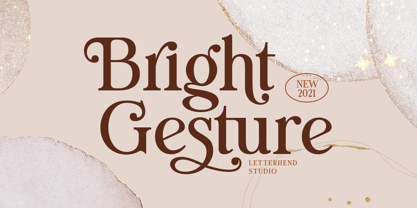 Introducing, Bright Gesture - A Modern serif font with swashes. The stylistic alternates and ligatures make this font event more unique and stands from the crowd. This font perfectly made to be applied especially in logo, and the other various formal forms such as invitations, labels, logos, magazines, books, greeting / wedding cards, packaging, fashion, make up, stationery, novels, labels or any type of advertising purpose. Features : uppercase & lowercase numbers and punctuation multilingual alternates, swashes & ligatures PUA encoded We highly recommend using a program that supports OpenType features and Glyphs panels like many of Adobe apps and Corel Draw, so you can see and access all Glyph variations.


