10,000 search results
(0.188 seconds)
- Cranach by profonts,
$41.99 This picturesque, beautiful German Blackletter typeface was originally released by Benjamin Becker Succ, Frankfurt am Main, then named ?K�nstlergotisch?. Ralph M. Unger redesigned, digitally remastered and completed the font based on old catalogues/specimen. In honor of the famous Cranach family, German artists in medieval times, we renamed the font after them. The shadowed version was added for even more eye-catching purposes, e.g. in headlines.
 - Monni by Matt Chansky,
$29.00 Meet Monni, a clean and balanced sans-serif typeface family—fresh-faced and cosmopolitan with a high x-height. Monni sports finely crafted angles, complemented by confident squared punctuation. This sans-serif has a universal appeal accentuated by select modern angles. Perfect for campaign work with its memorable lines, clear consistency, and optimization for screens. Noteworthy for both headline and body copy needs. Monni is sure to aid in brand retention. Monni is generously multilingual, including Ukrainian and comes in 5 weights, from light to black. With nearly 800 total glyphs, Monni’s versatility will make an excellent addition to any professional font collection.
 - Humayroh by Flawlessandco,
$9.00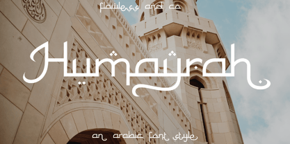 Introducing Humayroh, an exquisite Arabic font that embodies elegance and sophistication. With its graceful curves and meticulous attention to detail, Humayroh is designed to add a touch of refinement to your projects. An Original typeface that suitable for any graphic designs such as branding materials, t-shirt, print, business cards, logo, poster, t-shirt, photography, quotes .etc This font support for some multilingual. Modern Sweet Retro that contains uppercase A-Z and lowercase a-z, alternate character, numbers 0-9, and some punctuation. If you need help, just write me! Thanks so much for checking out my shop!
 - Chekos by Authentype,
$11.00 Chekos is a feminine type face designed to be elegant and modern. Its clean, simple style makes it perfect for any project. Chekos comes in 9 weights: Light, Regular, and Bold. Each weight has five different styles. Chekos was created by designer Ekayasa. She wanted to create something that would be both beautiful and functional. Her goal was to make a typeface that could be used for everything from headlines to logos. Chekos is available in OpenType format and includes stylistic alternates, ligatures, and swashes. It is free for personal use and commercial licensing options are available upon request.
 - Fendgy by Aiquitype,
$10.00 Introducing "Fendgy - Classy Display Serif Font". Fendgy-Classy Display Serif Font is an elegant and refined typeface that exudes a timeless sophistication. With its meticulously crafted letterforms, this font embodies a perfect balance between classic charm and contemporary design. Its graceful strokes and distinctive serifs make it an ideal choice for luxurious branding, editorial design, and upscale packaging, imparting a sense of refined exclusivity to any project. What's Included? 1. PUA Encode 2. Uppercase, Lowercase, Numerals and Punctuation 3. Ligature Collection 4. Stylistic Alternate 5. Installed on Mac and Windows 6. Language Support : Western Europe 7. Multilingual Support Enjoy Our Font!
 - Neue Augenblick by Harmnessless Type,
$40.00 Neue Augenblick is a modern contemporary Germany-esque grotesk. This Font face carries a powerful mechanical and industrial feel, it is inspired by aesthetic personality of beautiful Panzerkampfwagen and Post-war Brutalist Architectural. There are ten weights, ranging from Thin to Black, each with oblique italics and plenty of alternates. Neue Augenblick comes with attention-grabbing ink traps make it feels more contemporary. Various opentype features from stylistic alternates, multilingual extended latin support, ligatures, discretionary ligatures, fractions, arrows, scientific numerals, catchwords set, icons and more. Neue Augenblick is suited for embrace both maximalism or minimalism design works for designers to play with.
 - Challwa by Flawlessandco,
$9.00 Introducing "Challwa" - an exquisite and elegant handwritten font that adds a touch of sophistication and refinement to your designs. With its graceful letterforms and refined strokes, Challwa embodies timeless beauty and effortless elegance. There's some connected letters and some alternates that suitable for any graphic designs such as branding materials, t-shirt, print, business cards, logo, poster, t-shirt, photography, quotes .etc This font support for some multilingual. Also contains uppercase A-Z and lowercase a-z, alternate character, numbers 0-9, and some punctuation. If you need help, just write me! Thanks so much for checking out my shop!
 - Referenz Grotesk by Sudtipos,
$49.00 Made in Germany, Referenz Grotesk is a typeface full of references referring to the type design history of Stuttgart State Academy of Art and Design. Its typographic history holds a broad spectrum of shapes and characters, including F.H. Ernst Schneidler (1882–1956), Imre Reiner (1900–1987), Walter Brudi (1907–1987), Kurt Weidemann (1922–2011) and Frank Heine (1964–2003). During extensive research phases for Referenz Grotesk included collection and analysis. This led to further research in the Academy’s collection and archive where the majority of Weidemann’s estate is housed next to works of other designers and professors like F.H. Ernst Schneidler and Walter Brudi. Another place of research was the typesetting workshop where Schneidler had previously taught and worked. Some of his freshly cast fonts were tested and used there for the first time and are still stored in several of the type cases. Regarding the more recent history, for instance about the Emigre designer Frank Heine, former colleagues and professors have been consulted. These studies resulted in the new font Referenz Grotesk that includes traces of Kurt Weidemann’s Corporate as well as calligraphic hints that link to Schneidler’s Stuttgarter Schule (Stuttgart School) where writing played an important role during the form finding process. For the regular text fonts these features are integrated in a subtle manner whereas several alternative glyphs pick up more expressive forms. The final sans serif type family has a clarity and contemporary straightness that becomes more characteristic in its heavier weights. Additionally more than 60 alternative glyphs per weight allow for individual combinations that can be tailored specifically for each application and context. They open up a broad range of visual expressions, from subtle to playful and eccentric characteristics. Referenz Grotesk is available in six weights: Light, Regular, Medium, Bold, Extra Bold and Black, plus italics. In addition, the family includes multiple OpenType functions such as Stylistic Sets, Tabular Figures and Case Sensitive forms. Variable version of the font is included when you license the full pack.
 - Linotype Mindline by Linotype,
$29.00Linotype Mindline is part of the Take Type Library, chosen from the entries of the Linotype-sponsored International Digital Type Design Contests of 1994 and 1997. With Mindline, the German designer Critzler plays with geometry and typefaces. Each character is basically a rectangle with a geometric form etched in it which happens to be a member of the alphabet. This formal style comes from the advertisement typefaces of the 1920s and is reminiscent of the constructivist posters of this time. The appearance of the characters take priority over the funcitonality and the eye can hardly recognize the forms of letters and numerals which meet it everyday. Linotype Mindline makes us take another look at forms which we see so often that we hardly notice them, only reading them for the information which they impart, and the font is therefore best used when the content of the text less important is than the impression its forms make. - Teimer Std by Suitcase Type Foundry,
$75.00Typographer and graphic designer Pavel Teimer (1935-1970) designed a modern serif roman with italics in 1967. For the drawing of Teimer he found inspiration in the types of Walbaum and Didot, rather than Bodoni. He re-evaluated these archetypes in an individual way, adjusting both height and width proportions and modifying details in the strokes, thus effectively breaking away from the historical models he used as a starting point. Teimer's antiqua has less contrast; the overall construction of the characters is softer and more lively. The proportions of the italics are rather wide, making them stand out by their calm and measured rhythm. This was defined by the purpose of the typeface, as it was to be utilised for two-character matrices. The long serifs are a typical feature noticeable throughout the complete family of fonts. In 1967, a full set of basic glyphs, numerals and diacritics of Teimer's antiqua was submitted to the Czechoslovak Grafotechna type foundry. However, the face was never cast. At the beginning of 2005 we decided to rehabilitate this hidden gem of Czech typography. We used the booklet "Teimer's antiqua - a design of modern type roman and italics", written by Jan Solpera and Kl‡ra Kv’zov‡ in 1992, as a template for digitisation. The specimen contains an elementary set of roman and italics, including numerals and ampersands. After studying the specimen, we decided to make certain adjustments to the construction of the character shapes. We slightly corrected the proportions of the typeface, cut and broadened the serifs, and slightly strengthened the hair strokes. In the upper case we made some significant changes in the end serifs of round strokes in C, G and S, and the J was redrawn from the scratch. The top diagonal arm of the K was made to connect with the vertical stem, while the tail of Q has received a more expressive tail. The stronger hairlines are yet more apparent in the lower case, which is why we needed to further intervene in the construction of the actual character shapes. The drawing of the f is new, with more tension at the top of the character, and the overall shape of the g is better balanced. We also added an ear to the j, and curves in the r have become more fluent. To emphasise the compact character of the family, the lining numerals were thoroughly redrawn, with the finials being replaced by vertical serifs. The original character of the numerals was preserved in the new set of old-style figures. To make the uppercase italics as compact as possible, they were based on the roman cut rather than on the original design. The slope of lowercase italics needed to be harmonised. The actual letter forms are still broader than the characters in the original design, and the changes in construction are more noticeable. The lower case b gained a bottom serif, the f has a more traditional shape as it is no longer constricted by the demands of two-matrice casting, the g was redrawn and is a single storey design now. The serifs on one side of the descenders of the p and q were removed, the r is broader and more open. The construction of s, v, w, x, y, and z is now more compact and better balanced. Because Teimer was designed to make optimal use of the OpenType format, it was deemed necessary to add a significant amount of new glyphs. The present character set of one font comprisess over 780 glyphs, including accented characters for typesetting of common Latin script languages, small caps and a set of ligatures, tabular, proportional, old style and lining, superscript and fraction numerals. It also contains a number of special characters, such as arrows, circles, squares, boxed numerals, and ornaments. Because of its fine and light construction, the original digitised design remained the lightest of the family. Several heavier weights were added, with the family now comprising Light, Light Italic, Medium, Medium Italic, Semibold, Semibold Italic, Bold, and Bold Italic. - Chong Old Style by Monotype,
$29.99In the tradition of Goudy Old Style and Goudy Modern, Chong Wah drew Chong Old Style™ and Chong Modern™ as visually different – but complementary – designs. According to Chong Wah, “The extended family of typefaces started as a concept rather than a preconceived design. The concept is different sans serif type styles with a common underlying structure and a clear lineage to traditional serif designs. While there are similarities between the designs, each typeface was drawn as a separate entity.” Chong Old Style has the flavor of traditional old style designs without slavishly replicating the earlier design traits. It has the heft and color of an old style design but lacks the serifs and inclined stroke axis customarily seen in these typefaces. The result is a versatile suite of typefaces that deliver a straightforward message in large or small sizes. Chong Modern is a sans serif interpretation of the classic modern, or neoclassical, designs of Bodoni and Didot. More than a Bodoni without serifs, Chong Modern also has an elegant, Art Deco demeanor. This is a design that walks the line between traditional and contemporary with grace and aplomb. Chong Wah drew his Old Style and Modern designs in Light, Regular and Bold weights, adding an Extra Bold to the Old Style. All designs benefit from harmonizing italic counterparts. Both branches of the Chong family are also available as OpenType Pro fonts, allowing graphic communicators to take advantage of OpenType’s diverse capabilities. These fonts, in addition to providing for the automatic insertion of old style figures, ligatures and small caps, also offer an extended character set supporting most Central European and many Eastern European languages - Chong Modern by Monotype,
$29.99In the tradition of Goudy Old Style and Goudy Modern, Chong Wah drew Chong Old Style™ and Chong Modern™ as visually different – but complementary – designs. According to Chong Wah, “The extended family of typefaces started as a concept rather than a preconceived design. The concept is different sans serif type styles with a common underlying structure and a clear lineage to traditional serif designs. While there are similarities between the designs, each typeface was drawn as a separate entity.” Chong Old Style has the flavor of traditional old style designs without slavishly replicating the earlier design traits. It has the heft and color of an old style design but lacks the serifs and inclined stroke axis customarily seen in these typefaces. The result is a versatile suite of typefaces that deliver a straightforward message in large or small sizes. Chong Modern is a sans serif interpretation of the classic modern, or neoclassical, designs of Bodoni and Didot. More than a Bodoni without serifs, Chong Modern also has an elegant, Art Deco demeanor. This is a design that walks the line between traditional and contemporary with grace and aplomb. Chong Wah drew his Old Style and Modern designs in Light, Regular and Bold weights, adding an Extra Bold to the Old Style. All designs benefit from harmonizing italic counterparts. Both branches of the Chong family are also available as OpenType Pro fonts, allowing graphic communicators to take advantage of OpenType’s diverse capabilities. These fonts, in addition to providing for the automatic insertion of old style figures, ligatures and small caps, also offer an extended character set supporting most Central European and many Eastern European languages - Bentron Calligraphic by Mans Greback,
$69.00 Bentron Calligraphic is a bold and beautiful brush font with a touch of speed and sophistication. Its rapid strokes and dynamic flow give it a signature-like quality that is perfect for adding a personal touch to your projects. Designed with a focus on the art of calligraphy, Bentron Calligraphic exudes elegance and grace with its smooth curves and flowing lines. This font is perfect for anything from logos and branding to social media posts and invitations. Bentron Calligraphic comes in four styles: Regular, Italic, Alternate Regular and Alternate Italic. This range of styles provides versatility and allows for dynamic and creative designs. Use underscore _ to create a swash anywhere in a word. Example: Space_jams Use multiple underscores to create different swashes. Example: Signa____tures The font is built with advanced OpenType functionality and has a guaranteed top-notch quality, containing stylistic and contextual alternates, ligatures and more features; all to give you full control and customizability. It has extensive lingual support, covering all Latin-based languages, from Northern Europe to South Africa, from America to South-East Asia. It contains all characters and symbols you'll ever need, including all punctuation and numbers.
 - PF Lindemann Sans by Parachute,
$49.00 Lindemann Sans is an immediately-inviting typeface with a pleasing distinct visual voice grounded by geometry and golden proportions. This modern geometric san serif typeface serves the interpretive needs of modern design through its legibility. This legibility is achieved through proportional balance of each letter based on the golden ratio, open counters, high x-height and wider individual shapes. In addition, a high level of legibility is arrived through distinctive glyphs like a, e, @, and f, which are engaging and add to Lindemann Sans visual voice. Being a modern, spirited, tech-savvy typeface, Lindemann Sans has many of the features demanded by today's designers. These features include 800 characters within each font, many ligatures, full numbers sets, small caps, alternative characters and other niceties found in opentype fonts. Due to Lindemann Sans high legibility, geometric sans tradition, and a large feature set list, it is a very versatile typeface and can be used in replacement of the more commonly used sans. Specifically, Lindemann Sans can be used by technology corporations, architectural firms in their supporting materials, in magazines as headers and key-points, as the typeface for professional keynotes, for the package design industry as a whole, in automotive concept projects, and for cosmetic branding for high class hair products. With its inviting nature it may also be used for liberal arts promotional materials. In addition, this typeface can be used by green industries because of its nature derived proportions. Each style and weight of Lindemann Sans adheres to the same geometric and golden proportions, however, each weight is innately noteworthy. For example, there is a charm that is found in the ultralight weight's elegant geometry and lights impressive use as oversized headlines. It shines with true clarity of vision with the book weight and the versatility of the medium. One cannot overlook the power and pacing of the bold and extra bold weights with its clear counters and restrained letter forms. Within Lindemann Sans family each weight has a distinctive role to play but stays true to its purpose.
 - Rot by MKGD,
$13.00 Rot is clunky, clumsy, and utilitarian. It comes straight from a second rate oracle’s prognostications of a not-so-distant dystopian future. A place where film noir meets twenty first century computer cards; and rainy melancholy nights meet global warming. It speaks of a world that welcomes everyone; provided that they are romantically inclined to living life at the short end of the stick. Metaphorically, Rot is a shot of hard liquor served in a dirty glass. Rot has a glyph count of 388 and supports the following languages Afrikaans, Albanian, Asu, Basque, Bemba, Bena, Bosnian, Catalan, Chiga, Colognian, Cornish, Croatian, Czech, Danish, Embu, English, Esperanto, Estonian, Faroese, Filipino, Finnish, French, Friulian, Galician, German, Gusii, Hungarian, Icelandic, Indonesian, Irish, Italian, Kabuverdianu, Kalaallisut, Kalenjin, Kamba, Kikuyu, Kinyarwanda, Latvian, Lithuanian, Low German, Lower Sorbian, Luo, Luxembourgish, Luyia, Machame, Makhuwa-Meetto, Makonde, Malagasy, Malay, Maltese, Manx, Meru, Morisyen, North Ndebele, Norwegian Bokmål, Norwegian Nynorsk, Nyankole, Oromo, Polish, Portuguese, Romanian, Romansh, Rombo, Rundi, Rwa, Samburu, Sango, Sangu, Scottish Gaelic, Sena, Shambala, Shona, Slovak, Slovenian, Soga, Somali, Spanish, Swahili, Swedish, Swiss German, Taita, Teso, Turkmen, Upper Sorbian, Vunjo, Walser, Zulu
 - Lemon Squish by Mans Greback,
$59.00 Lemon Squish is a fun and funky sans-serif font that is perfect for adding a touch of humor and whimsy to any design. This font is inspired by the 70s hippie culture and has a retro feel that is reminiscent of comic books and graffiti. Lemon Squish comes in ten different styles, including Bold, Bold Italic, Italic, Light, Light Italic, Regular, and four Outline variations. These various styles provide versatility and allow you to create dynamic and eye-catching designs. The playful and lighthearted nature of Lemon Squish makes it ideal for anything from branding and logos to social media posts and advertisements. Its fun and quirky design will add a touch of humor and personality to your projects and bring a smile to your audience's face. The font is built with advanced OpenType functionality and has a guaranteed top-notch quality, containing stylistic and contextual alternates, ligatures and more features; all to give you full control and customizability. It has extensive lingual support, covering all Latin-based languages, from Northern Europe to South Africa, from America to South-East Asia. It contains all characters and symbols you'll ever need, including all punctuation and numbers.
 - ITC Novarese by ITC,
$40.99 Novarese font is the work of designer Aldo Novarese. He created 218 typeface cuts but as he was writing his book, Alfabeta, he decided to include only those he considered indispensable. He divided his fonts into 4 categories and in the designing of Novarese, took the best characteristics of each group and combined them into this font. In the style of Latin stone scripts of the second century BC. Novarese is a well-balanced and relatively wide text font with classic forms. ITC Novarese™ font field guide including best practices, font pairings and alternatives.
 - Sindelar by Willerstorfer,
$95.00 Please note: Sindelar webfonts are exclusively available at willerstorfer.com Sindelar is a capable, contemporary text face addressing today’s news design requirements. Its large x-height, low contrast and robust serifs grant a high legibility in small sizes. The balanced, well chosen proportions make the typeface economic (i.e. space saving) without giving it a too narrow appearance. These characteristics make it the ideal choice for extensive text setting in newspapers and magazines – on paper and on screen. Named after famous Austrian football (soccer) player Matthias Sindelar (1903–1939), one of the best players of his time, the typeface shares two major qualities with its namesake: their technical brilliance and their way of performing aesthetically to the last detail. The football player’s nickname »Der Papierene« (the Paper-man) elegantly refers to the media too. Although optimised for small sizes, Sindelar’s low contrast and robust serifs give the typeface a strong impact and an unmistakable personality in larger sizes. Sindelar’s calligraphic influences can be noticed in the Italics best. The italic letters are inclined by slightly different angles, respecting the letters’ shapes and proportions and resulting in a balanced, yet vivid appearance. Sindelar comes in 18 styles – nine weights in Roman and Italic each. Each font is equipped with a huge character set of about 980 glyphs and various OpenType features.
 - Maree by Ashton,
$5.00 If you want to write something sincere and genuine but not too formal then this is the font for you. It is based on real handwriting, not some artificial calligraphy made to be either too haphazard or spiky or have loads of elegant flourishes but an ordinary person's writing, and designed to look as natural and as close to the original lettering as possible. Like any person's writing it is individual and distinctive, but so easy going on the eye those differences sit comfortably with you. It is friendly and open with easy to read glyphs both as lowercase and uppercase. The letters are relatively wide with clearly shaped distinct outlines. This font may be ideal for projects where you expect a wide readership with different reading abilities from young to old. When you are using this font a slightly bigger point size usually gives a better result so for a standard letter or similar you should size up to 15 points or more. Maree has been individually crafted to the smallest detail. To create a realistic handwriting font that looks relatively simple but works in a wide variety of languages requires a complexity and attention to detail most fonts will never require. This font in any ordinary business environment would never have been made, the effort required to make it too great, the length of time too long. There have been no shortcuts in this font, no automatic scanning or tracing, no automatic generation, no class kerning. Not only is each glyph individual but the width of letters, the height, the accents and the positions of the accents are all different. Even the line weight of the letters is designed to have natural variation but yet similar enough that the font appears as though it were written effortlessly in the same pen. And in order to keep the spacing consistent even though the letters have different widths, heights, lengths of descenders and so on, there are a vast number of kerning pairs, letter to letter, number to number, letter to number... All kerning has been individually assessed with an eye to proportionality taking in character shape, size and weight. For instance if you write a telephone number the numbers all sit close together but if you write a number before a letter such as in a UK post code or before a unit of measurement an extra little bit of space has been added which makes the number more distinct and therefore readable. That space is so natural to the eye that you don’t even know it is there. However even in the spacing allowance has been made for the fact it can’t be too perfect because when you write by hand the spacing is inconsistent. There have to be some letters which are too close or far apart otherwise the font would look artificial. For similar reasons if you are going to print out this font for a letter, etc, check the print version before you make any letter spacing changes because with the zoom functions in modern applications that uneven spacing and lettering can seem more pronounced than it actually is. When this font is printed out you will find it is surprisingly neat. This font is what it is, simple clear handwriting. You will not go wow. But if you want something unique and different and looks good on the page you won’t be disappointed. This font is not a work of art but it is a work of love. This font has a soul. How many fonts can you say that about?
 - Kondes by Tour De Force,
$25.00 Kondes is our "101 Dalmatians" – it's 101th release in our catalog! And it is the 1st one that belongs to variable typefaces. Kondes (which is made up word as mixture of "condensed" and "kondezovan" on Serbian) is simple, compact, straight-in-your-face sans serif family with 9 weights and 9 Italics. It was designed with purpose to serve and to be use in any project, from editorial to website. For example, Black weight could be used effectively as poster type, in big sizes while Regular fits perfectly as main webfont. Stem joining is done with generous ink trap that divides and opens letter contours, so letter breaths in smaller sizes. Contains extended Latin character set. Enjoy!
 - Praxis Next by Linotype,
$57.99 Praxis® Next has the same robust shapes and proportions as the original 1976 Praxis design. Its large x-height, substantial counters and open apertures guarantee high levels of legibility and reading ease in print and on screen. More weights, condensed designs and true cursive italics differentiate Praxis Next from the older design. Praxis Next shines where space is at a premium. The regular designs are modestly narrow while the condensed typefaces perform with grace in the most crowded of environments. The bold designs create powerful headlines and banners and the lighter weights are ideal for both long and short-form text copy. Because of its many weights and proportions, Praxis Next is also an ideal design to build a brand identity. Praxis Next Variables are font files which are featuring two axis and have a preset instance from Light to Ultra and Condensed to Roman. Pair Praxis Next with old-style designs like Bembo® Book and Stempel Garamond™ to create a dynamic typographic contrast. Or complement the design with its serifed counterpart, Demos® Next . Unger also drew ITC Flora® as an alternative italic design. Looking for something a little different? Pair Praxis Next with Masqualero™ .
 - Ladoga by ParaType,
$30.00 Ladoga — one of the most beautiful Russian designs from the soviet period. The type family was developed in Polygraphmash in 1968 by Anatoly Shchukin on the base of his own lettering for book covers and titles. It was one of the first attempts in Cyrillic typography to create text face in a style of renaissance antiqua. Stylization to broad pen calligraphy resembles early forms of Latin types that were based on handwritten humanistic minuscule. Unique in its character set digital version of Ladoga was designed by Viktor Kharik on the base of artworks of Shchukin for ParaType. The family consists of roman and italic styles in text and display versions. Character set includes characters of original shapes as well as more modern alternatives. Besides there are a set of additional characters, old style figures and small caps. The fonts cover all modern languages based on Latin and Cyrillic scripts, Greek alphabet (including polytonic extension), Hebrew and historical Cyrillic letters. Ladoga is gorgeous in display sizes and pretty readable in texts. It’s well suitable for fiction literature, historical books, art criticism, religious and philologist works. It will be extreme helpful for multilingual issues and for inclusions into body text historical passages in original orthography. The family was released in 2010.
 - Hassan by Linotype,
$187.99Hassan is a traditional-style Arabic text face designed by Hassan Sobhi Mourad, an experienced calligrapher and teacher of the art and first produced by the Linotype Design Studio (U.K.) as a PostScript font in 1993. An individual Naskh style, Hassan cleverly combines elegant proportions, echoing an inscriptional Thuluth in its tall vertical stems and deeply rounded final jim and ain. The effect of verticality is enhanced by the tense, reined-in kerning strokes of ra and waw, the well-poised lam-alif, and the compactly drawn ligatures. The broad-band strokes of Hassan Bold smooth some of the angularity and relax the tension apparent in the Light. The traditional-style ligatures are rendered with an easy flow. Because of the economical character count, Hassan Light and Bold text may be headed by the compact titling styles (Hisham, Mariam) as well as designs like Ahmed or Kufi which answer to the inscriptional qualities of Hassan. In addition to other uses, Hassan would be particularly suited to document text-setting. Hassan’s two OpenType weights include Latin glyphs from Janson Text Roman, and Janson Text Bold, respectively, inside the font files, allowing a single font to set text in both most Western European and Arabic languages. The OpenType glyph ranges incorporate Basic Latin and the Arabic character set, which supports Arabic, Persian, and Urdu. The fonts include tabular and proportional Arabic, Persian, and Urdu numerals, as well as a set of tabular European (Latin) numerals. - PF Champion Script Pro by Parachute,
$125.00 PF Champion Script Pro is perhaps the most advanced and powerful calligraphic family ever made. It received an award for Excellence in Type Design from the International Type Design Competition ‘Modern Cyrillic 2009’ which was held in Moscow. Most recently, it received another award from the 3rd International Eastern Type Design Competition - Granshan Awards 2010. This typeface was first presented in June 2007 at the 3rd International Conference on Typography and Visual Communication (ICTVC) and was met with rave reviews. It is based mainly on the manuscripts of the 18th century English calligrapher Joseph Champion. Developed over a period of two and a half years, each one of the 2 weights is loaded with 4300 glyphs(!), offering simultaneous support for all European languages based on the Latin, Greek and Cyrillic scripts. Furthermore, a wide selection of alternate forms and ligatures is included for all languages, in order to accommodate diverse design aesthetics. These alternates are either applied automatically through an advanced programming scheme, or manually through several OpenType features. An attempt was made to design a contemporary script typeface with classic roots, by following certain guidelines, i.e. lowercase characters were designed so they are less inclined, have a higher x-height and are less condensed than the original. Several characters were stripped-off their connecting lines in order to enhance legibility. Four sets of alternate swashed capitals as well as a plethora of ornaments and frames (117) was included. Small caps and their alternate forms were designed to replace the capitals which disrupt the flow of text within a sentence with their extravagant swashes. All characters were carefully designed with the proper weight in order to sustain harsh printing conditions (on special papers), a situation which affects mainly the light connecting parts of calligraphic typefaces. Finally, it was programmed in such a way as to preserve handwriting qualities, by designing an extensive array of ligatures and alternate glyphs in all languages, never before released or incorporated within the same font.
 - Blank Manuscript by Aah Yes,
$14.95Blank Manuscript allows you to produce sophisticated musical scoresheets even on basic Word Processors - anything from simple plain staves to complex full-page orchestral scores of your own design, to write in the notation yourself. The basic stuff is really easy and straightforward, but there's some quite advanced things you can do as well. So Copy and Save these Instructions. • The main stuff is simple and tends to follow the initial letter. Treble, Bass and Alto clefs are on upper case T B A (there are more clefs, below). The 5 Lines for the clefs are on L or l. • A small v will give a small vertical line (like a bar line) and a Big U will give a Big Upright - these can start or end a line or piece. • Time Signatures - type the following letters: Think of W for Waltz and it's easy to remember that 3/4 time is on W. Then from that they go up or down together like this: V=2/4 W=3/4 X=4/4 Y=5/4 Z=6/4 Compound Times are on H I J K like this: H=3/8 I=6/8 J=9/8 K=12/8 Common Time and Cut Common symbols can be found on semi-colon and colon respectively (all begin with Co- ). 2/2 3/2 are on lower case a and b, 7/4 and 7/8 are on lower case c and d, 5/8 is on small k (think POL-k-A) • Flat signs are on the numbers. Flat signs on LINES 1 to 5 are on numbers 1 to 5. Flat signs on SPACES 1 to 5 are on numbers 6 to 0 (space 1 being above line 1, space 5 being above the top line of the stave). Sharp signs are on the letters BELOW the long-row numbers. Which is q w e r t for the sharp signs on Lines 1 to 5, and y u i o p for sharp signs on spaces 1 to 5. Doing it this way means it works the same for all clefs, whether Treble, Bass, Alto, Tenor or any other. Sharp and Flat Signs always go in this order, depending on how many sharps or flats your key signature requires: Treble Clef Sharps t i p r u o e Flats 3 9 7 4 2 8 6 Bass Clef Sharps r u o e t i w Flats 2 8 6 3 1 7 = Alto Clef Sharps o e t i w r u Flats 7 4 2 8 6 3 1 • Guitar Chord Boxes are on G and g (G for Guitar) Upper Case G has a thick line across the top Lower case g has an open top, for chords up the fretboard TAB symbols are available: Six-string Tablature is on s & S for Six. Four-string Tablature is on f & F for Four. (Lower case has the "TAB" symbol on it, Upper Case has just the lines to continue.) Five-string tablature, is on lower case "j" (as in BAN-j-O) and of course L or l will continue the 5 lines. •RARE CLEF SIGNS including Tenor Clef, are on various punctuation marks, i.e. dollar, percent, circumflex, ampersand & asterisk, above the numbers 4 to 8. NOTE: The important symbols were kept on the letter and number keys, which are fairly standard all over, but some of the less important symbols are on various punctuation keys, which in different countries are not the same as on my keyboard. If it comes out wrong on your system, all I can say is it's right on the systems we've tried, and they'll be in here somewhere, probably on a different key. CLOSING THE ENDS OF THE LINES and BAR-LINES is done with the 3 varieties of brackets - brackets, brace and parentheses - Left/Right for the Left/Right end of the line. Parentheses L/R () which are above 9, 0 give a clef with a small vertical upright (the same as a bar line). Brace L/R and Brackets L/R (both on the 2 keys to the right of P on my keyboard) will close off a staff line with tall upright bars. Brace gives a double upright - one thick, one thin. Brackets give a single tall upright. A Big Upright is on Big U, (Big U for Big Upright) and a small vertical line is on small v (small v for small vertical). The Big Upright is the maximum height, and the small vertical is exactly the same height as a stave. And there's a tall upright Bar, on Bar (which is to the left of z on my keyboard, with Shift,) which is the same height as the bar on upper case U but twice as broad. • There's a staff intended for writing melodies, which is a little bit higher up than an ordinary treble clef giving a space underneath to put lyrics in - on m and M for Melody line. Lower case has the Treble Clef on, Upper case M has just the higher-up staff lines with no clef. (Use mMMMMMMM etc.) However this clef will be in the wrong place to put in sharp and flat signs, key signatures and so on, so if you use this clef you'll have to write the sharps, flats and key signature yourself. There's also a clef that's smaller (less tall) than the ordinary clef, but with the same horizontal spacing so it will align with other standard-sized clefs - on slash (a plain clef) and backslash (with a Treble Clef). • There are some large brackets for enclosing groups of staves, such as you'd use on large orchestral scores, on Upper Case N O P Q R, which can aid clarity. N and O on the left, Q and R on the right. P is a Perpendicular line to be used on both sides to increase the height of the enclosure, in this way but with the staff lines in between: N Q P P P P P P O R OTHERS —————————————— • Repeat marks are on comma (left) and period/full stop (right). • Hyphen is left as a sort of hyphen - it's a thin line like a single staff line, with the same horizontal spacing as ordinary staff lines - in case you want to draw a line across for a Percussion Instrument, or a Title or Lyric Line. • Space is a Space, but with HALF the width or horizontal spacing as ordinary staff lines, so 2 space symbols will be the same width as a clef symbol or line. • Grave (to the left of 1 on the long row, or hold down Alt and type 0096 then let go) gives a staff line that is one eighth the width of an ordinary staff line. • If you want manuscript in a clef and key which requires a flat or sharp sign in the space underneath the 5 lines, they’re on = equals and + plus . SYMBOLS • Many of these symbols will only be useful if you have worked out in advance which bars will need them, but they are here in case you've done that and wish to include them. • Symbols for p and f (piano and forte) are on 'less than' and 'greater than' < > (above comma and full stop) and m for mezzo is on Question, next to them. They can be combined to make mp, mf, ff, pp, etc. These signs -- and other signs and symbols like Pedal Sign, Coda Sign and so on -- can be found on various punctuation mark keys, including above 1, 2, 3 in the long row, and others around the keyboard. There's a sort of logic to their layout, but in different countries the keys are likely to give different results to what is stated here, so it's probably best to just try the punctuation and see if there's any you might want to use. (But on my keyboard a Coda sign is on circumflex - because of the visual similarity. Pedal sign is on underscore. A "Sign" symbol is on exclamation mark.) They were only included in case you really need them to be printed rather than handwritten. • However, a Copyright symbol is deemed necessary, and also included are a "Registered" symbol and a TradeMark symbol. They are found in the conventional places, and can be accessed by holding down ALT and typing 0169, 0174 or 0153 respectively in the numberpad section and letting go. • Staff lines with arco and pizz. above are on capital C and D respectively ---C for ar-C-o. • An empty circle above a staff line (to indicate sections by writing letters A, B, C or 1,2,3 inside for rehearsal marks) is on n. The actual signs for an A, B, C and D in a circle above the staff line can be produced by holding down ALT and typing 0188, 0189, 0190 and 0191 respectively and letting go. • The word "Page", for indicating page numbers, is on the numbersign key. • The two quotes keys, (quote single and quote double) have symbols representing "Tempo is", and "play as triplets", respectively. • INSTRUMENT NAMES There's a whole lot of Instrument Names built in (over a hundred) which can be printed out above the clef, and you do it like this. Hold down Alt and type in the given number in the numberpad section, then let go. For Piccolo it's 0130, for Flute it's 0131, Cornet is on 0154, Violin is on 0193, and the numbers go up to over 0250, it's a fairly complete set. There's also a blank which is used to align un-named clefs on 0096. Put them at the very beginning of the line for the best results. Here they are: WOODWIND Piccolo 0130 Flute 0131 Oboe 0132 Clarinet 0133 Eng Horn 0134 Bassoon 0135 Soprano Sax 0137 Alto Sax 0138 Tenor Sax 0139 Baritone Sax 0140 Saxophone 0142 Contrabassoon 0145 Recorder 0146 Alto Flute 0147 Bass Flute 0148 Oboe d'Amore 0149 Cor anglais 0152 Pipes 0241 Whistle 0242 BRASS Cornet 0154 Trumpet 0155 Flugelhorn 0156 Trombone 0158 Euphonium 0159 Tuba 0161 French Horn 0162 Horn 0163 Tenor Trombone 0164 Bass Trombone 0165 Alto Trombone 0166 Piccolo Cornet 0167 Piccolo Trumpet 0168 Bass Trumpet 0170 Bass Tuba 0171 Brass 0172 VOICES Vocal 0175 Melody 0176 Solo 0177 Harmony 0178 Soprano 0179 Alto 0180 Tenor 0181 Baritone 0182 Treble 0183 Bass 0197 (see also PLUCKED STRINGS) Descant 0184 Mezzo Soprano 0185 Contralto 0186 Counter Tenor 0187 Lead 0206 BOWED STRINGS Strings 0192 Violin 0193 Viola 0194 Cello 0195 Contrabass 0196 Bass 0197 Double Bass 0198 Violoncello 0199 Violin 1 0200 Violin 2 0201 Fiddle 0252 PLUCKED STRINGS Harp 0202 Guitar 0203 Ac. Gtr 0204 El. Gtr 0205 Lead 0206 Bass 0197 Ac. Bass 0207 El. Bass 0208 Slide Gtr 0209 Mandolin 0210 Banjo 0211 Ukelele 0212 Zither 0213 Sitar 0214 Lute 0215 Pedal Steel 0216 Nylon Gtr. 0238 Koto 0239 Fretless 0244 KEYBOARDS + ORGAN Piano 0217 El. Piano 0218 Organ 0219 El. Organ 0220 Harpsichord 0221 Celesta 0222 Accordion 0223 Clavinet 0224 Harmonium 0225 Synth 0226 Synth Bass 0227 Keyboards 0228 Sampler 0249 PERCUSSION and TUNED PERCUSSION Percussion 0229 Drums 0230 Vibes 0231 Marimba 0232 Glockenspiel 0233 Xylophone 0234 Bass marimba 0235 Tubular Bells 0236 Steel Drums 0237 Kalimba 0240 OTHERS Harmonica 0246 Mouth Organ 0247 FX 0251 Intro 0243 Verse 0245 Refrain 0248 Chorus 0250 un-named 0096 (this is a small spacer stave for aligning clefs without a name) ALSO copyright 0169 registered 0174 TradeMark 0153 Rehearsal marks 0188-0191 (giving A, B, C, D in a circle, an empty circle is on n ) Clef signs for Treble Bass Alto without any staff lines 0253-0255 An Alphabetic List of all signs: a 2/2 time b 3/2 time c 7/4 time d 7/8 time e sharp sign, centre line f Tab sign for 4-string tab g Guitar Chord Box, no nut h half-width stave I sharp sign, third space up j Tab sign for 5-string tab k 5/8 time l Lines - 5 horizontal lines for a stave m Melody Clef - a standard clef but placed higher up, with Treble sign n Stave with an empty circle above o sharp sign, fourth space up p sharp sign, space above stave q sharp sign, bottom line r sharp sign, fourth line up s Tab sign for 6-string tab t sharp sign, top line (fifth line up) u sharp sign, second space up v vertical line (bar-line) w sharp sign, second line up x Fretboard, four strings y sharp sign, first space up z Fretboard, five strings A Alto Clef B Bass Clef C “arco” above stave D “pizz.” above stave E Double Vertical Lines F Four Horizontal lines (for 4-string tab) G Guitar Chord Box with nut H 3/8 time I 6/8 time J 9/8 time K 12/8 time L Lines - 5 horizontal lines for a stave M Melody Clef - a standard clef but placed higher up, plain N Bounding Line for grouping clefs - top left O Bounding Line for grouping clefs - bottom left P Bounding Line for grouping clefs - Perpendicular Q Bounding Line for grouping clefs - top right R Bounding Line for grouping clefs - bottom right S Six Horizontal lines (for 6-string tab) T Treble Clef U tall, thin Upright line V 2/4 time W 3 / 4 time X 4/4 time Y 5/4 time Z 6/4 time 1 flat sign, first line up (the lowest line) 2 flat sign, second line up 3 flat sign, third line up 4 flat sign, fourth line up 5 flat sign, fifth line up (the top line) 6 flat sign, first space up (the lowest space) 7 flat sign, second space up 8 flat sign, third space up 9 flat sign, fourth space up 0 flat sign, space above stave - Meisuer by Craft Supply Co,
$20.00 Introducing Meisuer – Handwritten Font A Delightfully Cute and Fun Script Meisuer – Handwritten Font is more than just a font; it’s a charming and whimsical script cursive typeface that brings a cheerful and playful vibe to your designs. Irresistibly Cute Meisuer is undeniably cute; each character exudes cuteness with its endearing strokes and whimsical swirls. It’s perfect for creating designs that radiate positivity and cuteness, making it impossible to resist. Infusing Playfulness Furthermore, this font effortlessly injects playfulness into your projects. Whether it’s greeting cards, invitations, or children’s books, Meisuer adds a touch of joy and lightheartedness that takes your design to the next level. Versatile Cheerfulness Meisuer’s versatility shines in various design applications. Its friendly appearance appeals to all age groups, making it a go-to choice for cheerful projects that need to reach a wide audience. In Conclusion In conclusion, Meisuer – Handwritten Font is your ultimate tool for creating designs that are cute, fun, and filled with cheerful vibes. Embrace the whimsical charm of Meisuer, and infuse your projects with a delightful playfulness that captivates hearts and brings smiles to faces.
 - Kalimahita by IbraCreative,
$17.00 Kalimahita – A Signature Script Typeface Kalimahita, an exquisite signature script typeface, epitomizes elegance and individuality. Its graceful and fluid strokes convey a sense of personal expression, making it a perfect choice for those seeking a distinctive and sophisticated signature style. The meticulously crafted letterforms exhibit a harmonious balance between smooth curves and dynamic flourishes, embodying a timeless quality that effortlessly blends tradition with modernity. Kalimahita is designed to lend a touch of refinement to a variety of creative projects, from branding and logo design to invitations and personal correspondence. With its captivating aesthetic, this signature script typeface adds a personalized and luxurious touch to any endeavor, making it a standout choice for those who appreciate the artistry of a well-crafted signature. Kalimahita is perfect for branding projects, logo, wedding designs, social media posts, advertisements, product packaging, product designs, label, photography, watermark, invitation, stationery, game, fashion and any projects. Fonts include multilingual support for; Afrikaans, Albanian, Czech, Danish, Dutch, English, Estonian, Finnish, French, German, Hungarian, Italian, Latvian, Lithuanian, Norwegian, Polish, Portuguese, Slovak, Slovenian, Spanish, Swedish.
 - ITC Freddo by ITC,
$29.99ITC Freddo is the work of New York designer James Montalbano and was inspired by a sign lettering manual from the 1930s. Montalbano liked the character shapes illustrated in this manual but found many of the proportions odd. So he reinterpreted them to produce capitals and lower case letters which, according to today's standards, better complement one another. - Joa Script by IbraCreative,
$17.00 Joa Script – A Modern Signature Typeface Joa Script, a contemporary and elegant modern signature typeface, effortlessly captures the essence of sophistication and personal flair. With its fluid and dynamic strokes, Joa Script exudes a sense of grace and individuality, making it the perfect choice for those seeking a signature-style font that resonates with a modern aesthetic. The letters seamlessly flow into one another, creating a harmonious and visually appealing script that adds a touch of refinement to any design. Joa Script’s versatility shines through in various applications, from branding and logos to invitations and social media graphics, providing a timeless and distinctive character that embodies both style and professionalism. Joa Script is perfect for branding projects, logo, wedding designs, social media posts, advertisements, product packaging, product designs, label, photography, watermark, invitation, stationery, game, fashion and any projects. Fonts include multilingual support for; Afrikaans, Albanian, Czech, Danish, Dutch, English, Estonian, Finnish, French, German, Hungarian, Italian, Latvian, Lithuanian, Norwegian, Polish, Portuguese, Slovak, Slovenian, Spanish, Swedish.
 - Garduja by IbraCreative,
$17.00 Garduja, a stylish slim serif font, effortlessly blends sophistication with modern aesthetics, creating a typographic masterpiece that captivates the eye. Its slender and refined letterforms exude a timeless elegance, while subtle serifs add a touch of classic charm. Garduja strikes the perfect balance between readability and artistic flair, making it an ideal choice for projects that demand a polished and contemporary design. The font’s graceful curves and precise detailing contribute to its overall sleek appearance, ensuring a distinctive and memorable presence in both print and digital applications. With Garduja, every character embodies a harmonious fusion of tradition and innovation, offering a visually striking and versatile option for designers seeking a tastefully sleek serif typeface. Garduja is perfect for branding projects, logo, wedding designs, social media posts, advertisements, product packaging, product designs, label, photography, watermark, invitation, stationery, game, fashion and any projects. Fonts include multilingual support for; Afrikaans, Albanian, Czech, Danish, Dutch, English, Estonian, Finnish, French, German, Hungarian, Italian, Latvian, Lithuanian, Norwegian, Polish, Portuguese, Slovak, Slovenian, Spanish, Swedish.
 - Paukalani by IbraCreative,
$17.00 Paukalani – A classy Rounded Serif Typeface Paukalani, a sophisticated rounded serif typeface, effortlessly blends elegance with modern design. Its graceful curves and subtle serifs contribute to a timeless aesthetic, embodying a perfect balance between tradition and contemporary flair. The rounded edges of each character soften the overall appearance, creating a warm and inviting typographic experience. Paukalani’s meticulously crafted letterforms exude a sense of refinement, making it an ideal choice for projects that demand a touch of class and versatility. Whether used in print or digital media, Paukalani stands as a testament to the harmonious fusion of classic serif elements and a sleek, rounded demeanor, offering a distinctive and captivating visual identity to any design. Paukalani is perfect for branding projects, logo, wedding designs, social media posts, advertisements, product packaging, product designs, label, photography, watermark, invitation, stationery, game, fashion and any projects. Fonts include multilingual support for; Afrikaans, Albanian, Czech, Danish, Dutch, English, Estonian, Finnish, French, German, Hungarian, Italian, Latvian, Lithuanian, Norwegian, Polish, Portuguese, Slovak, Slovenian, Spanish, Swedish.
 - Tynne by Our House Graphics,
$17.00 OHG is pleased to announce the release of Tynne 2.0, now with two new out-line, drop-shade fonts which work independently as attractive display faces in their own right or one layer of a two layer, chromatic typeface. In addition, kerning and letter spacing have been adjusted and improved to ensure all characters will line up correctly when layered. Tynne, Is a strong, wedge-serif, condensed display font. Deep �ink traps�, subtly varied forms and open counters bring to its even colour and pleasingly regular rhythm a bit of syncopation and sparkle making it ideal for packaging, elegant yet informal headlines and posters. OpenType features include over 70 standard and discretionary ligatures and digraphs, three sets of figures, alternate characters, small caps and swashes. We are proud to acknowledge the assistance and contributions of fellow type designer, James Arboghast.
 - Black Svane by XdCreative,
$29.00 About Black-Svane Introducing new "Black-Svane" The aesthetic classy serif. Black-Svane have two-faced beauty serif : Modern and Classic, it is perfect for display, sub header or body text. If you are like a modern : Just type with regular letters, If you are like a classic touch : Just access your OpenType features to find the alternate letters and ligatures, Black-Svane has special stylistic set characters in complete uppercase from A-Z, and Lowercase from a-z . Also alternates characters in uppercase from A-Z. Black-Svane come up with 18 style and 9 weights, - from Thin to Black and Matching calligraphic italic. Black-Svane is a very versatile font, covering a wide range of your project types, book, magazine imagery, wedding invitations, branding, poster design, logos and so much more. I hope you like and enjoy... Thanks, FdyKudo.
 - Hot Road Brush by Saffatin.co,
$10.00 It's a bold, It's HOT ROAD! A realistic hand brushed font just raring to get going. HOT ROAD is handwritten made with a wet brush, dynamic spontaneous flow and natural. It's perfect to leave a realistics impression on social media posts, advertisements, posters, products packaging & more. HOT ROAD FONT comes with several alternates character, ligature, punctuation, numerals. Also included is a bonus extras swashes. Use it for magazines, t-shirt, packaging, logos, advertising, quotes, branding, posters, editorials, cover artwork, movies, websites, etc HOT ROAD Font is coded with Unicode PUA, Allows full access to all the extra characters without having special software designing. Mac users can use Font Book, and Windows users can use Character Map to view and copy any of the extra characters to paste into your favorite text editor / app. Thanks so much for looking and Enjoy it!
 - Molto by TypeTogether,
$49.00 Xavier Dupre’s Molto font family is a tonal master, creating tenderness in a slab serif and tempering toughness with flourishes. Slab serifs created their original niche by their ability to grab attention and overwhelm, which caused them to be seen as strong, dominant, and desired fonts, especially in advertising. Slab serifs are the result of placing defined edges on something meant to take up an inordinate amount of space, rather than meant to be graceful. Molto updates this concept to allow a greater, and gentler, range in the lighter weights. Molto’s nine weights are defined by their intended use. The two extreme weights (Hair and Fat) act as display partners for magazines, titles, and posters. The Hair weight is runway ready with its sturdy serifs, breathy internal space, and stable lettershapes that were designed both to perform and impress. Molto’s Fat weight packs maximum punch in a believable way. Its wide and deliberate curves contrast against thin connections and landing strip stems. Molto can be put to perfect use in a fashion magazine using swashy Hair headlines set against its darkest weight. Molto’s seven intermediate weights, with their classic and legible shapes, are meant for texts of all sizes. The notches on diagonals, distinct numerals, and acute terminals grant benefits from caption sizes up to headings. Molto’s refined light weights and punchy heavy weights set the stage for a swashy surprise — alternate capital letters act as refined garments laid atop its concrete skeleton. The Molto font family rejects saving space in favour of intensifying shapes, placing maximum weight on the edges for better legibility and impact. Latin-based digital and printed designs will benefit from Molto’s design voice and breadth. This means UI, video, and online text, and print materials like dictionaries, packaging, advertising, and branding can all put Molto’s robust forms to multipurpose use. Molto successfully creates balance in a slab serif design: an opinionated and striking type family, stalwart in captions and exuberant in display, thanks to swashes which add some originality to the slab category.
 - Addington CF by Connary Fagen,
$35.00 Addington CF is a graceful and reliable serif, useful in any application. Beautiful and practical, Addington is designed for excellence at small point sizes, while doubling as a capable, bold display typeface. Includes roman and italic sets across seven weights. Addington CF pairs nicely with simple, bold headline typefaces, like Greycliff CF and Articulat CF. All typefaces from Connary Fagen include free updates, including new features, and free technical support.
 - Blanc by Latinotype,
$26.00 Blanc is a functional humanist sans typeface with a marked personality and great style that make it ideal for use in headlines. Blanc is an ode to neutrality: a geometric face characterised by low contrast between thick and thin strokes with calligraphic features that emphasise specific glyphs. Blanc comes with 8 weights and an inline version that make it well-suited for headings and subheadings, corporate designs, advertising, publishing, etc.
 - Landsdowne Commercial by Greater Albion Typefounders,
$18.00 ‘Landsdowne Commercial’ is a development of one of our designer’s earlier public domain releases, ‘Landsdowne’. All glyphs have been completely redrawn and refined. An extensive range of stylistic alternates and ligatures have been added, as well as a completely new bold face and several forms of numerals. Landsdowne commercial is ideal for period-inspired design work, such as posters and book covers as well for clear elegant communications.
 - Batchelder Ruff by Woodside Graphics,
$19.95Batchelder Ruff is a "battered" version of the typeface used for titling in the catalogs and advertising of the Batchelder Tile Company in Pasadena, California in the 1920s. The original source characters were smoother, but they were also handlettered, so that every character was different. This digitized version contains uniform characters, but its "rough" quality preserves the hand-drawn look. It is designed primarily as a headline font, and thus is best used in All-Caps in larger sizes. - Helvetica Now by Monotype,
$42.99 Every single glyph of Helvetica has been redrawn and redesigned for this expansive new edition – which preserves the typeface's Swiss mantra of clarity, simplicity and neutrality, while updating it for the demands of contemporary design and branding. Helvetica Now comprises 96 fonts, consisting of three distinct optical sizes: Micro, Text and Display, all in two widths. Each one has been carefully tailored to the demands of its size. The larger Display versions are drawn to show off the subtlety of Helvetica and spaced with headlines in mind, while the Text sizes focus on legibility, using robust strokes and comfortably loose spaces. The Micro sizes address an issue Helvetica has long faced – that of being 'micro type challenged'. In the past, the typeface struggled to be legible at tiny sizes because of its compactness and closed apertures. Helvetica Now's Micro designs are simplified and exaggerated to maintain the impression of Helvetica in tiny type, and their spacing is loose, providing remarkable legibility at microscopic sizes and in low-res environments. There's also an extensive set of alternates, which allow designers the opportunity to experiment with and adapt Helvetica's tone of voice. This includes a hooked version of the lowercase l (addressing a common complaint that the capital I and lowercase l are indistinguishable) as well as a rounded G, and a straight-legged R, a single storey a and a lowercase u without a trailing serif. In the past, designers had to nudge, trim and contort the design to create stylish display-type lockups with Helvetica. Helvetica Now Display was designed and spaced with those modifications in mind—saving effort and providing more consistent (and more stylish) results. “Helvetica is the gold standard,' says Monotype Type Director Charles Nix. “To use it is to claim that you are the ultimate expression of whatever your brand aspires to be. Its blankness is its power.” Helvetica Now User Guide PDF. Featured in: Best Fonts for Resumes, Best Fonts for Websites, Best Fonts for PowerPoints