10,000 search results
(0.032 seconds)
- Al Crushider by Aluyeah Studio,
$90.00 Crushider Brush, inspired by the feeling when we see your crush, and you will see a lot of butterflies and your heart rate goes up. Crush + hider, mixed feelings that are addictive but you also want to get out of the situation. Very suitable for magazine, headline, website, ads, product package and all type of design project you have. Features: OpenType support Multilingual support (15 languages) PUA Encoded
 - Fathom by Device,
$39.00 Fathom is a refined flared-serif face that is elegant and robust, modern yet suggests a legacy. The generous lower-case x-height make it worm and readable. Seven weights, plus matching italics, cover all headline and text requirements. The addition of old-style numerals and tabular numerals for charts make it a versatile family for brochures, corporations, heritage projects, packaging, book covers, reports, signage, magazines and more.
 - Menhart by Monotype,
$29.99Czech designer Oldrich Menhart (1897-1962) devoted his life to making letters. He was a calligrapher, lettering artist, and typeface designer with over twenty faces to his credit. The Monotype typeface, Menhart, was the second of his designs. Menhart began work on the design in the early 1930s and turned over his final artwork to the Monotype Drawing Office in 1934. The first size cut was 14 Didot (Didot points are the traditional European system of type measure, and are roughly equivalent to the point system commonly used by today's digital fonts). The 14D font was followed by 18D and 24D, indicating that the design was considered most suitable for display work. However, a 10D size was later cut from the same master drawings at the request of a Monotype customer. Menhart's design was light and open, with an even color and a slight squareness" to its round shapes. Because the Czech alphabet has 15 accented letters, Menhart included these diacritics as an integral part of his design, not as an afterthought. As a result, accented copy set in Menhart has a cohesive quality rarely seen in other typefaces. Monotype's new digital release of Menhart is the first revival since the hot metal fonts were cut. Menhart Display is based on the original Monotype drawings, while a slightly heavier, re-spaced version has been created for text sizes. Both versions offer the full capabilities of the OpenType format, such as the automatic insertion of old style figures, ligatures and small caps. In addition to English, the extended character set supports most Central European and many Eastern European languages. One of Menhart's lifelong goals was to share the richness of his Czech culture by drawing typefaces that uniquely served Czechoslovakia literature. In his words: "I believe that a Czech style of type comes above all from the spirit in which it was designed, which gives it its 'signature,' and not so much from decorative composition, and even less from the geographic location of its creation." The typeface Menhart is a tribute to his values. Now, Menhart Pro and Menhart Display Pro capture the unique personality of this timeless design while greatly extending its range of use. " - Omertino by OKSHUtypeCO,
$9.00 Omerta Font Family - is a classic style sans serif typeface making it one of the most memorable caps fonts on the market. This versatile font can be used for logos, mastheads, pull quotes & monograms showing both feminine and masculine qualities.Very suitable for greeting cards, branding materials, business cards, quotes, posters, and more!This font are perfect for wedding postcard. Or you can create perfect and unique design of your logo, blog, stationery, marketing, magazines and more :) FONT FAMILY: regular style italic style stripes style stripes italic style Stripes style is not outline!!! This is a developed style of the letter that goes from contour to line, which gives a certain rare style that makes you pay attention to yourself. Features : UpperCase & Lowercase Numerals & Punctuations Multilingualcharacters(AÀÁÂÃÄÅCÇDÐEÈÉÊËIÌÍÎÏNÑOØÒÓÔÕÖUÙÜÚÛWYÝŸŸ ÆŒßÞàáâãäåæçèéêëìíîïðñòóôõöøùúûüýÿ)
 - Lunanic by Ingrimayne Type,
$9.00 Lunanic is a geometric novelty typeface family with a touch of graffiti. The letters are formed from a circle with a notch or nick taken out, a shape that reminds me of a partial lunar eclipse. Half of the family have the nick on the left and half on the right. The faces are monospaced and so tightly spaced that there is no space between most of the letters so the filled styles cannot be used alone without tweaking. There are several ways to tweak them to make them readable: adjacent letters can be colored differently, the characters spacing can be increased, or an outlined style can be layered on top of the filled letters. The family does not have a true lower case. Most of the characters in the lower-case slots are alternates for those on the upper-case keys and they can be mixed in whatever way the user finds best. The family has twelve members: two orientations with three weights each and each of these six has an outline style to go with it. Lunanic is fun, bizarre, weird, and obviously a decorative display font.
 - Alchemist by Carmel Type Co.,
$39.00 Inspirited as much by nature and the elements as it was by the decorative and ornate alphabets of early sign-painting and lettering books, Alchemist aspires to become the next surefire, go-to staple in the display type community. This semi-condensed, high contrast, and stylish take on classic Roman forms is certain to stand out in your arsenal.Alchemist lends itself adeptly to signage, headlines, cinematic and gaming titles, packaging design and much more. This protean display face can shift and adapt to your every need with over 100 alternate characters and more than 40 ligatures. Explore this massive 500+ character font today and see what you can create with it. 100+ Stylistic Alternates Standard & Discretionary Ligatures Uppercase & Lowercase Numerals & Punctuation 500+ glyphs Supports 75+ Latin based languages OTF file Design by Jason Carne
 - Old Wood JNL by Jeff Levine,
$29.00 One of the charming features of vintage wood type is the unusual interplay of stroke widths or letter shapes that can vary from character to character. In today's world of digital perfection, a set of letters, numbers and punctuation marks must conform to rigid standards of uniform lines, balanced curves and other form-and-function rules that has often removed the human feel from the overall type design. While this is fine when applied to most text fonts and some modern display faces, Old Wood JNL is a simple throwback to an earlier time when type design was an artistic, not engineering endeavor. Modeled in part from vintage source material, this wood type design retains that charming imperfection of a time long passed.
 - Rowan Oak NF by Nick's Fonts,
$10.00This “very elegant and British alphabet” was originally released in the 1920s as "Richmond Oldstyle" by the Blackfriars Type Foundry of London. Touted as highly artistic and graceful, it is exceptionally “at home” wherever style and charm are called for. Both versions of this font contain the complete Unicode Latin A character complement, with support for the Afrikaans, Albanian, Basque, Bosnian, Breton, Catalan, Croatian, Czech, Danish, Dutch, English, Esperanto, Estonian, Faroese, Fijian, Finnish, Flemish, French, Frisian, German, Greenlandic, Hawaiian, Hungarian, Icelandic, Indonesian, Irish, Italian, Latin, Latvian, Lithuanian, Malay, Maltese, Maori, Moldavan, Norwegian, Polish, Portuguese, Provençal, Rhaeto-Romanic, Romanian, Romany, Sámi, Samoan, Scottish Gaelic, Serbian, Slovak, Slovenian, Spanish, Swahili, Swedish, Tagalog, Turkish and Welsh languages, as well as discretionary ligatures and extended fractions. - Familytalk by Ditatype,
$29.00 Familytalk is a script font that exudes confidence and elegance in every character. With its thick and sturdy strokes, this font commands attention. The swinging endings on certain letters provide a delightful sense of rhythm and flow to the text. These unique design elements create a sense of movement within the text, making it visually captivating and engaging. Despite its thick weight, Familytalk maintains excellent legibility. Its ability to strike a balance between boldness and grace makes it a versatile choice for projects that demand a stylish script font. Familytalk fits in headlines, logos, posters, flyers, branding materials, print media, editorial layouts, and many more designs. Find out more ways to use this font by taking a look at the font preview.
 - Radiant Extra Condensed CT by CastleType,
$59.00 I was commissioned by the Emporium (now Macys) to digitize Radiant Bold Extra Condensed (originally designed by Robert Middleton in 1940) for use in their Sunday supplement to the San Francisco Examiner. For several years, I stubbornly refused to add the lowercase letters to the font, because I thought it looked best just used with caps, but finally relented, added the lowercase letters and at the same time created two more weights as well: Light and Medium. Used very large and carefully, these faces can be quite elegant.
 - Foundry Context by The Foundry,
$90.00 Foundry Context is a sans serif family designed to be universal in many contexts – hence the name. A ‘no-nonsense’ typeface, reminiscent of 19th century sans serif faces, Foundry Context has very round, pure letterforms, crafted without being over refined, and having minimal stroke contrast in the neo-grotesque style. A hint of personality has emerged from the very drawing of the proportions, strokes, and terminals, yet Foundry Context is still neutral enough to compete in the grotesk arena, and at the same time has something new to say.
 - Bonnycastle by Three Islands Press,
$39.00 Sir Richard Henry Bonnycastle (1791–1847) was an English officer and military engineer who served in the War of 1812 and ultimately settled in Canada. I stumbled upon copies of some of his charts and maps, became infatuated with the hand-lettered titles—and the result is the eponymous Bonnycastle. The font has a bold weight and an italic style but is intended as an eye-catching standalone, evocative of its period in history. Use as a titling face on branding materials, event posters, book covers, presentation graphics, historical illustrations, and the like.
 - MVB Hotsy Totsy by MVB,
$39.00MVB Hotsy Totsy is Akemi Aoki’s first typeface design. Aoki created the letters in cut paper. Once digitized, the design was expanded to offer several weights and styles. Exaggerating the triangular serifs and tapering strokes of “Latin” typefaces, MVB Hotsy Totsy is the perfect party face, appearing frequently on board games, product packaging, and in children’s books. It is named for (what was at the time) a dive bar in Albany, California. The bar has since been renovated but its neon sign was preserved, a local landmark of San Francisco’s East Bay. - Federico by Olga Umpeleva,
$30.00 Federico is a typeface based on the handwriting of Federico Garcia Lorca, the eminent Spanish poet and playwright (1898-1936). Original version was designed for a book about Lorca. The face has two styles. One looks like an original poets writing, the second looks like if Lorca would write with a ball pen. Federico includes many alternative glyphs and ligatures, which make it look like a real writing of an emotional, negligent, creative man. Despite the fact that Garcia Lorca has written in spanish, the font has western and eastern european, cyrillic, turkish letters.
 - Monotype Old English Text by Monotype,
$40.99Old English is a digital font that was produced by Monotype's design staff, circa 1990. But its roots go much further back: the face's design is based on that of Caslon Black, a Blackletter type cast by the venerable William Caslon foundry in England, circa 1760. This design has been popular throughout England for centuries. Its style of lettering, conveniently also called Old English, can be found all over the UK. Old English-style typefaces belong to the Blackletter category. They nicely combine the design attributes of both the medieval and Victorian eras. This is mostly because their Textura forms, which were born during the Middle Ages, became quite fashionable again in the late 1800s! This Old English font is very legible for a Blackletter face. Perhaps that is why it is more familiar to readers in the UK and North American than German Blackletter varieties, like Fraktur. A favorite once again today, Old English is ideal for certificates, diplomas, or any application which calls for the look of stateliness and authority. It's a sturdy and sure bet for newspaper banners, holiday greeting cards, and wedding announcements. - Old English by Monotype,
$40.99 Old English is a digital font that was produced by Monotype's design staff, circa 1990. But its roots go much further back: the face's design is based on that of Caslon Black, a Blackletter type cast by the venerable William Caslon foundry in England, circa 1760. This design has been popular throughout England for centuries. Its style of lettering, conveniently also called Old English, can be found all over the UK. Old English-style typefaces belong to the Blackletter category. They nicely combine the design attributes of both the medieval and Victorian eras. This is mostly because their Textura forms, which were born during the Middle Ages, became quite fashionable again in the late 1800s! This Old English font is very legible for a Blackletter face. Perhaps that is why it is more familiar to readers in the UK and North American than German Blackletter varieties, like Fraktur. A favorite once again today, Old English is ideal for certificates, diplomas, or any application which calls for the look of stateliness and authority. It's a sturdy and sure bet for newspaper banners, holiday greeting cards, and wedding announcements.
 - Old English (Let) by ITC,
$29.99 Old English is a digital font that was produced by Monotype's design staff, circa 1990. But its roots go much further back: the face's design is based on that of Caslon Black, a Blackletter type cast by the venerable William Caslon foundry in England, circa 1760. This design has been popular throughout England for centuries. Its style of lettering, conveniently also called Old English, can be found all over the UK. Old English-style typefaces belong to the Blackletter category. They nicely combine the design attributes of both the medieval and Victorian eras. This is mostly because their Textura forms, which were born during the Middle Ages, became quite fashionable again in the late 1800s! This Old English font is very legible for a Blackletter face. Perhaps that is why it is more familiar to readers in the UK and North American than German Blackletter varieties, like Fraktur. A favorite once again today, Old English is ideal for certificates, diplomas, or any application which calls for the look of stateliness and authority. It's a sturdy and sure bet for newspaper banners, holiday greeting cards, and wedding announcements.
 - Bricola by K-Type,
$20.00 Bricola (rhymes with Nicola) is a condensed display face that contrasts soft curved outlines with sharp cuts and counters. Sturdy and idiosyncratic, Bricola is an eye-catching blend of functional and funky, appropriate for headlines, labels and branding. The licensed family includes Regular and Bold weights that both pack a punch, and also two handy italics (obliques).
 - Dupont Serif by Hexagon Foundry,
$20.00 Dupont Serif, a graceful and modern serif font. Embodying clean lines, well-proportioned letterforms, and a unique charm, Dupont Serif stands as a versatile typeface suitable for various applications. The unpretentious nature of Dupont Serif allows it to be employed in a multitude of design scenarios. Offered in 10 weights alongside corresponding oblique characters and 2 style sets.
 - Lignette by FaceType,
$30.00 You are looking for a contemporary upright script family? Lignette Script is an elegant monoline font consisting of 535 glyphs, with a wide range of languages covered (including Greek) and 71 beautiful ligatures. Please make sure to use applications that support OpenType features. Moreover Marcus Sterz created Lignette Deco to complete the graceful look with frames and ornaments.
 - Cyclic Sans by ArtyType,
$25.00 Cyclic Sans is a legible and highly distinctive type family in four weights, running from Light to Heavy. A stoic sans, imbued with strength and charm, the fonts can be paired with their Cyclic Serif counterparts to stunning effect. Cyclic Sans is a stylish modern face and a versatile all-rounder, ideal for both text and headline use.
 - Balboat by Ingrimayne Type,
$9.95 Balboat is a plain calligraphic face with a very small x-height, long descenders, and tall ascenders. Having the appearance of a pen-drawn sans serif, it has four styles: regular, bold, italic, and bold italic. Although Balboat is quite legible, it is condensed and may need to be printed at a larger point size than other typefaces.
 - Loistave by XdCreative,
$20.00 Loistave is a two faced classy and modern, elegant and delicate with modest and symmetrical serif. It is defined by smooth curves and is perfect for fashion branding or editorial designs. Add it confidently to your projects, and you will love the results. What's Loistave included? Uppercase Characters + Alternates Lowercase Characters + Alternates Small Ligatures Numerals Punctuation Multilingual support
 - One Ton by Luke Thompson,
$10.00 One Ton is a really chunky stencil face that sticks to some strict rules, giving it a distinctively industrial, angular look. It's designed so that the spaces between characters all align in a strong grid. It can bring a ton of personality to signage, branding, editorial and packaging projects where you can afford to be a bit experimental.
 - Kuta Bali by Olivetype,
$18.00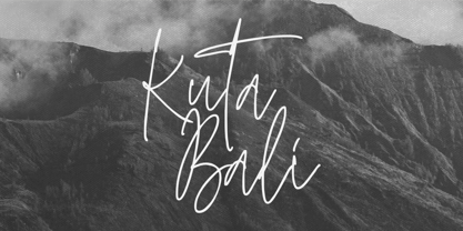 Kuta Bali is an elegant signature script font inspired by the beauty and grace of a beautiful culture. It’s suitable for branding, product packaging, or creating custom logotypes that really stand out. Its unique style strikes a perfect balance between classic and contemporary, adding a touch of sophistication and elegance to any design project. Thank You.
 - Air by NiceType,
$35.00 Air is a clean, contemporary, geometric sans typeface that has been designed for use in minimalist layouts where type is hero, such as those for high fashion magazines, and luxury brands. The rounded face is smooth, subtle, and non-intrusive, even when scaled up so will work effortlessly in editorial layouts when used with or without imagery.
 - Sabinard by Greater Albion Typefounders,
$12.95 Sabinard offers a distinctive form of 'Swash' lettering. It is excellent for poster work, or for headings and titles. Its distinguishing feature is the combination of long ascenders and descenders with a small cap height. It has been designed to compliment Greater Albion's Sabio, but also works splendidly as a 'feature' type alongside any Roman Face.
 - Roxon by Fo Da,
$7.00 Roxon is a sans serif typeface of 4 weights from Extra Light to Bold and can be used as both a headline and text face. Roxon is recommended for using in long-form writing and articles, since a serif is far more readable for longer passages of text. The typeface has a carefully crafted weight range, with ligatures.
 - Dez Petranian by Dezcom,
$40.00 Dez Petranian is a story-telling fantasy friendly family of fonts. It is a warm face that looks like the spoken word, perfect for tall tails, fantasy-world adventure books, creative writing, and poetry. Dez Petranian includes multiple language support, nearly 1,200 glyphs, stylistic sets, and many alternates. Think of it as a warm souvenir of real story writing.
 - Golos by Hiekka Graphics,
$25.00 Golos is a sleek and authentic font face with two styles: regular and italic. Golos is recommended for use as a display typeface.
 - Buddy Parts by PizzaDude.dk,
$15.0052 cool Buddy Parts, each one with it's own goofy looks on his face. Can you tell which one reminds of you? *g* - PL Brazilia by Monotype,
$29.99PL Brazilia from Albert Boton is an elegant extended sans serif face in two weights. Usable in headlines on books, journals and posters. - Blackwood by Alan Meeks,
$40.00 Blackwood is a sans serif headline face with a woodgrain effect. Based loosely on Grotesk, it has strong, solid forms with distinctive style.
 - Monotype Clearface Gothic by Monotype,
$29.99Clearface Gothic first appeared in 1910, designed by Morris Fuller Benton, the world-famously prolific typeface artist. In addition to Clearface Gothic, Benton also designed classics like Franklin Gothic, Century Expanded, and many other types. Clearface Gothic is a sans serif face with light forms displaying the Zeitgeist of the turn of the 20th century. Distinguishing characteristics are the open forms of the a" and "c," the arched "k," and the upward-tilting horizontal stroke of the "e." The relatively narrow typeface, with its open inner white spaces, is extremely legible even in small point sizes. There is no accompanying italic." - Keymer by Talbot Type,
$19.50 Talbot Type Keymer is inspired by Margaret Calvert's Transport typeface, designed for the British road sign system in the early 1960s. Keymer mixes geometric and humanist traits to achieve a modern, clean, elegant appearance. It is a legible and versatile text and display face available in seven weights. Keymer features an extended character set to include old style numerals, accented characters for Central European languages and bespoke characters in the italic for a more flowing look.
 - SF Manchit by Sultan Fonts,
$19.99 Manchit is a typeface dedicated to headlines in newspapers, magazines, advertisement banners, book covers and other printing products, and fits headlines on web pages. The Manchit font contains two styles (regular and bold) suitable for large display sizes, especially in the area of advertising, while still functioning well as a text face. The font includes a matching Latin design and support for Arabic, Persian, Kurdish, and Urdu. Designer: Sultan Maqtari Design date: 2020 Publisher: Sultan Fonts
 - Quietism High by Michael Rafailyk,
$20.00 Quietism High is an experimental subfamily that received a high contrast from Quietism Display and a high x-height from Quietism Text. It's still a Display typeface, albeit more graceful, wide and open. Other subfamilies: https://www.myfonts.com/collections/quietism-font-michael-rafailyk Scripts: Latin, Greek, Cyrillic. Languages: 480+ The promo images used “Sleeping Venus” painting by Giorgione, “The Creation of Adam” painting by Michelangelo, and “The Piazza and Church of Santa Maria Maggiore” painting by Giovanni Paolo Pannini.
 - Delikat by Scholtz Fonts,
$22.00 Delikat is a graceful, finely crafted, slinky, slightly retro, somewhat quirky script font. Perfect for advertising material, clothing tags, restaurant and cafe menus, food labels, music videos, magazine pages, cosmetic branding and so many other uses we lose count! The font contains all upper and lower case characters, punctuation, numerals and mathematical operators, as well as all accented characters used in European languages. Delikat makes use of Opentype features, which enhance the fluidity and legibility of the script.
 - Amici by Greater Albion Typefounders,
$12.00 Amici means 'friends' and the Amici family was conceived as a big friendly Roman typeface for headings, posters, signs and anywhere else that an approachable easy-reading typeface is needed. It's the sort of thing you used to see in Magazine mastheads before everything went boringly sans serif. Three faces are offered within the family, Regular - solid and clear, Bold - with that bit more body and presence and italic - bringing in script elements to its design.
 - Foundry Sterling by The Foundry,
$90.00 Foundry Sterling is a functional and eloquent typeface family that has its origins in the desire to create a modern sans design with a quintessentially English flavour. The letterforms have been designed with particular attention to classical proportion and purity of form, resulting in the creation of a functional yet graceful typeface with elegant beauty. Foundry Sterling is an eminently versatile font with a carefully chosen weight range equally applicable to identity, editorial and signage use.