10,000 search results
(0.039 seconds)
- Sunetta by Linotype,
$29.99An inkstone, a brush, ink, and paper. In China, one speaks of “wenfang sibao” — the four treasures of the scholar’s study. With these centuries-old hand tools, Werner Schneider created a calligraphic type trilogy of the highest aesthetic order; he named this typeface family after Buddha’s stepbrother, Sunetta. Sunetta is an outstanding choice for contemporary display type purposes. Its combination of lively forms overcome sterile text passages, lending them a more personal note and feeling. But Sunetta is not only recommended for documents bestowing distinction and accolades; the fonts are superb for shorter text passages as well. Sunetta’s spirited flow raises it above the fray that so many generic letterforms find themselves mired in, creating an unforgettable impression. Sunetta’s three complementary styles, Sunetta Flair, Sunetta Charme, and Sunetta Magic, offer three varying degrees of calligraphic verve. The family’s base font, Sunetta Flair, harkens back to the showcard lettering styles of the 1950s, while remaining distinctly European in taste. Sunetta Charme has a more swash-type appearance, while Sunetta Magic is joyfully decorative — its brush-written strokes dance across the line. Together, they may help you reach typographic nirvana. - Picastro by URW Type Foundry,
$39.99 Marit Otto about Picastro: The revolutionary typeface. Picastro is a fusion of Picasso and Castro. Don’t be alarmed by the second name! It is no political statement. Both characters represent different qualities in the typeface. The Picasso influence is the artistic, freestyle and frolic part. The Castro influence is the firm, square, perseverant look with a hint of propaganda to it. To combine two opposite inspirational sources (innovative versus persistent) makes the shape a bit edged. This typeface is very suitable for all kinds of graphic design (flyer, posters, CD covers and artworks) but also casual enough for (non academic) letter and text writing.
 - Space Rocks by Wing's Art Studio,
$10.00 Space Rocks! A Retro Sci-Fi Font Inspired by 1950s Television Serials “Oh boy, oh boy, oh boy! The next episode of Space Rocks is on tonight! What’s it about? Well, it’s all to do with this family of astronauts who crash land on Mars and how they survive all sorts of alien creatures and killer storms! The science is really real too! Who needs school!!!” And so goes the story of one young fan whose imagination is captured by the latest offering in a golden-age of TV science-fiction. A brand of 1950s programming that offered a light-hearted and optimistic view of the future full of exploration, discovery and hazardous adventure! Sometimes even a cautionary tale to live on in your nightmares! With Space Rocks I want to capture this vibe with an all-caps design inspired the opening titles of these shows, fully hand-drawn with a range of discretionary ligatures that add a comic (not atomic!) touch. The package includes Regular and Outlined (all hand-drawn) versions with a complete set of alternatives to help maintain the analogue look. This font also includes unique uppercase and lowercase characters, along with numerals, punctuation, language support, underlines and symbols. It’s perfect for movie and television titles, album covers, posters or any design that needs a dramatic, spacey and fun look. Check out the visuals to see it in action.
 - Futurum Parqez by Parquillian Design,
$19.00 Futurum Parqez is the first collaborative font for Parquillian Design. The idea for this font first came to the creator, Jose V Lopez, almost 40 years ago. A couple years ago he shared his concepts and we were gradually able to collaborate on editing the designs and turn them into a working font. The philosophy behind the font is to use a standardized frame format and the fewest strokes possible, while maintaining legibility, to create an original minimalist and modern style.
 - Christmas Surprise by AEN Creative Studio,
$16.00 Christmas Surprise is a joyful and festive display font. It is ideal for holiday-themed greeting cards and for any crafting project so add this font to your designs and make them come alive! This font is PUA encoded which means you can access all of the glyphs and swashes with ease!
 - Sleuth JNL by Jeff Levine,
$29.00 The movie trailer for the1936 film "After the Thin Man" is filled with text lettered in this classic Art Deco condensed typeface. Sleuth JNL seems the appropriate name for this digital revival, as the romantic comedy centers around detective Nick Charles' and his wife Nora's adventures.
 - Mirantz by insigne,
$32.00 Y’all ready for this? Now starting for Insigne: the new serif Mirantz. This rookie all-star plays a precise game every game, cutting at all the right angles to leave your reader impressed and ready to see more. You can always count on Mirantz to lead with solid mechanics and a clean style, but don’t be surprised when the face keeps it real with a little individual flare and creativity. This personal touch is nothing short of elegance in every appearance. So what makes us love this rookie above the other great players in the field? Contrast, for one. Mirantz brings more contrast to the game than most serifs out there. The serifs on this face have a crisp, sharp wedge that naturally draws the reader’s eye. You can’t help but fall in love with its clean, natural style. Mirantz also features a tall x-height and regular proportions that can play a number of positions on the page and still stay strong through the last half of the copy or even the final period. Mirantz is a solid powerhouse player, containing a complete set of small capitals and nine weights from thin to bold. It can play well both down low and up top with its subscripts and superscripts and can move your reader’s eye easily across the copy with its titling capitals, condensed and extended variants, and open style figures. With its options covering more than 72 Latin-based languages, look for this newcomer to have international success in the near future. It you haven’t set your draft picks for this next round of projects, think hard before passing up Mirantz. A capable serif like this one is a guaranteed asset to any team of fonts. Production assistance from Lucas Azevedo.
 - Ribbonetter by Ingrimayne Type,
$5.00 Ribbonetter is an experimental font playing with the calt or contextual alternatives feature of OpenType. This feature alternates letters in ovals with letters in hourglass shapes to create a banner. The letters in the ovals will be determined by the start of the line, whether it starts by typing an upper-case or lower-case letter. Using layers, background color can be added (dot accent and ring characters) or the outline color can be changed (sterling and yen characters). The font may also be useful with the contextual alternatives turned off. Different amounts of character spacing may give interesting results. With default character spacing, ovals with will overlap. If you are typing numbers and want the start to be an oval, switch on OpenType style set 2. In at least one word processor (Pages 5 for Macintosh) the carriage return adds the shape assigned to the space character. If you encounter this, try adding a nonbreaking space (option-space on the Macintosh) before the carriage return.
 - HWT Borders One by Hamilton Wood Type Collection,
$24.95 Wood Type Catalogs of the 19th century often offered tools and accessories alongside alphabets of wood type. Probably the most closely related was wood type borders and ornaments. Decorative Borders were often sold by the foot and accompanied by corner pieces that matched the designs. These borders could be assembled in almost any size dimensions as needed. The digital version uses the same principals of modular assembly to create the exact size border that is needed. Along with the borders, included in this font are a selection of "streamers". These banners would have been made to order with the font designs reversed out along a horizontal banner with decorative end caps. The digital version allows for a modular assembly by selecting choice of end caps and then typing the = as many times as needed to achieve the desired length. 10 styles of 9 piece borders can be created in any size variations as well as 8 styles of streamers in any desired length. Some of the designs can be mixed and matched for unusual contemporary design interpretations of these historic styles. It is recommended that the line height (leading) is set to the same size as the point size setting, this will visually lock all elements together.
 - Penmanship by Essqué Productions,
$9.00 This font was designed with scholastic visuals in mind. Whether advertising for a school event, or creating handwriting worksheets for young children, this font covers all the basics with Latin alphabet languages. Three fonts with identical spacing to make interchangeable. Spacebar adds a regular space between words/sentences. To connect words with ledger lines, use the underscore (_).
 - Mashq by Arabetics,
$29.00 The Mashq script is the oldest documented Arabic Jazm calligraphy style. It was invented by the early Muslims in the Arabian cities of Mecca and Medina, exclusively for writing the Quran and other Islamic religious texts. The Mashq style employed complex ligature and multi-level baseline rules, and therefore it went through a continuous simplification process. Around the time period Mashq was developed, the early Arab Muslims experimented with another short-lived Mashq-like style with heavily slanted vertical stems, which closely resembled the common Ḥijazi style. This style is commonly referred to as the Ma’il (slanted) style. Eventually, the early complex Mashq style was replaced as the main Islamic Arabic script, by a more simplified Mashq-derived calligraphy style that was developed in the city of Kufa, modern day Iraq, which was commonly referred to as Kufi. The Kufic style became the official Arabic script style for centuries before it was replaced by the more developed Naskh, the modern Arabic script style used today. The Mashq font family by Arabetics includes three styles of Mashq. The first is Mashq regular, which closely follows the script style of Musḥaf ‘Uthman (currently displayed in the Topkapi Museum in Turkey) with only the initial and final Haa’ baselines shifting. The second is Mashq Maail, which emphasizes the features of the Ma’il style shared with Mashq. The third is Mashq Kufi, which closely follows the script style in an adequate sample from the Quran manuscripts of the Bergstraesser Archive. All three fonts include two styles, with and without Tashkeel (dots). The Mashq and Mashq Kufi fonts include two more styles, with and without Harakat (soft vowels), and Hamza. Only three soft vowels are implemented along with their Tanween (double) forms. The Sukoon vowel is the default shape before inserting a soft vowel. Hamza was treated as a vowel in the Mashq and early Kufi manuscripts. Kashida is a zero width character. In the Mashq fonts, inserting one Kashida before the final ‘Ayn glyph group will trigger alternative shapes. In the Mashq Kufi fonts, inserting one Kashida (or two) before the final Yaa’, ‘Ayn, and Ḥaa’ glyph groups will trigger alternative shapes. The Mashq font family by Arabetics was designed to be as compatible as possible with the Arabic keyboard and Unicode alphabet used in computers today. Calligraphic variations were implemented only when they marked significant and permanent script features.
 - Giambattista by Wiescher Design,
$39.50 Giambattista is a long-time project of mine finally come to an end. After redesigning all of Giambattista Bodoni's work and then some additional cuts I started a long time ago with this Non-Bodoni Bodoni. The idea came to me while redesigning the original Chancellerosa (chancery). I thought Bodoni just didn't have the right approach to a chancery, this was just not his cup of tea! Maybe that is why he never used the Chancellerosa very much for his own printshop in Parma. So I thought someone has to design a script, that looks like Bodoni could have designed it but is more lively than his. Over the years I have been working on and off on the face and it turned out to become three typefaces which can be freely mixed. Here is my modern version of a script in the style of Giambattista, meant as an hommage, I called it Giambattista. Your modern scribe Gert Wiescher
 - Vtc-NueTattooScript - Personal use only

- Amazing Sweety by Almarkha Type,
$33.00 Amazing Sweety font with a Stylish Script perfect for any creative design. This handmade font will make your design has a beautiful natural touch for each details. It is perfect for any design project as Invitation,logo, book cover, craft or any design purposes. This font is PUA encoded which means you can access all of the magical glyphs and swashes with ease! It also features a wealth of special features including alternate glyphs and ligatures.
 - Morning Sweety by Almarkha Type,
$27.00 Morning Sweety Beautiful Script font with a natural handwritten feel, perfect for any creative design. This handmade font will make your design has a beautiful natural touch for each details. It is perfect for any design project as Invitation,logo, book cover, craft or any design purposes. This font is PUA encoded which means you can access all of the magical glyphs and swashes with ease! It also features a wealth of special features including alternate glyphs and ligatures.
 - Bellamona by Almarkha Type,
$25.00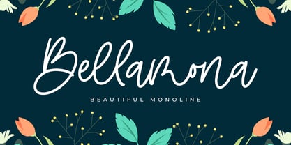 Bellamona is Beautiful Monoline font with a natural handwritten feel. perfect for any creative design. This handmade font will make your design has a beautiful natural touch for each details. It is perfect for any design project as Invitation,logo, book cover, craft or any design purposes. This font is PUA encoded which means you can access all of the magical glyphs and swashes with ease! It also features a wealth of special features including alternate glyphs and ligatures.
 - Bellachia by Almarkha Type,
$23.00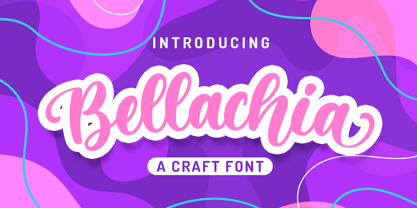 Bellachia font with a natural Script feel , perfect for any creative design. This handmade font will make your design has a beautiful natural touch for each details. It is perfect for any design project as Invitation,logo, book cover, craft or any design purposes. This font is PUA encoded which means you can access all of the magical glyphs and swashes with ease! It also features a wealth of special features including alternate glyphs and ligatures.
 - Hello Beach by Letterara,
$14.00 Hello Beach is a friendly and elegant handwritten font. Its natural and unique style makes it incredibly fitting to a large pool of designs. Its distinct and well interesting letters make this font a masterpiece. Fall in love with its incredibly versatile style and use it to create spectacular designs! This font is PUA encoded which means you can access all of the awesome glyphs with ease! It also features a wealth of special features including ligatures.
 - Sweetie Banana by Almarkha Type,
$23.00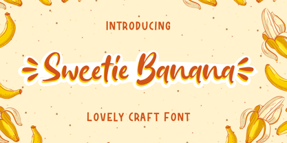 Sweetie Banana - is a Cute & Lovely Craft font with a natural handwritten feel. This handmade font will make your design has a beautiful natural touch for each details. It is perfect for any design project as Invitation,logo, book cover, craft or any design purposes. This font is PUA encoded which means you can access all of the magical glyphs and swashes with ease! It also features a wealth of special features including alternate glyphs and ligatures.
 - Lovely Sweetie by Almarkha Type,
$25.00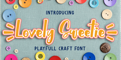 Lovely Sweetie - is a Playful Craft font with a natural handwritten feel. This handmade font will make your design has a beautiful natural touch for each details. It is perfect for any design project as Invitation,logo, book cover, craft or any design purposes. This font is PUA encoded which means you can access all of the magical glyphs and swashes with ease! It also features a wealth of special features including alternate glyphs and ligatures.
 - Milkalotta by Almarkha Type,
$23.00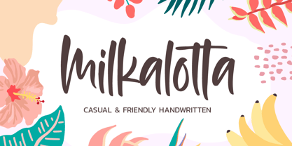 Milkalotta – is a Cute & Authentic Script font with a natural handwritten feel. This handmade font will make your design has a beautiful natural touch for each details. It is perfect for any design project as Invitation,logo, book cover, craft or any design purposes. This font is PUA encoded which means you can access all of the magical glyphs and swashes with ease! It also features a wealth of special features including alternate glyphs and ligatures.
 - YT Just Latin by Yangtype,
$9.00 The reason you purchase this font is because it is ‘special’. The creator of this font was born with a love for geometric patterns. I am fundamentally attracted to forms that have a sense of order and freedom of dispersion. This is a font that I came up with accidentally while working. I think that coincidence combined with consistent effort is ‘special'.
 - Danube Pro by CheapProFonts,
$10.00 This cool techno font is easily recognizable with its quite unique stroke endings. I have increased the ascenders and descenders slightly (so they would work better with the new diacritic letters) and introduced a few alternate letterforms in addition to generally expanding the character set. A totally enjoyable reworking of an original design. Now also with a Bold and a brand new Light variant! Please note that these variants are made by adding/removing from the regular shape, so the letters no longer sits on the baseline. ALL fonts from CheapProFonts have very extensive language support: They contain some unusual diacritic letters (some of which are contained in the Latin Extended-B Unicode block) supporting: Cornish, Filipino (Tagalog), Guarani, Luxembourgian, Malagasy, Romanian, Ulithian and Welsh. They also contain all glyphs in the Latin Extended-A Unicode block (which among others cover the Central European and Baltic areas) supporting: Afrikaans, Belarusian (Lacinka), Bosnian, Catalan, Chichewa, Croatian, Czech, Dutch, Esperanto, Greenlandic, Hungarian, Kashubian, Kurdish (Kurmanji), Latvian, Lithuanian, Maltese, Maori, Polish, Saami (Inari), Saami (North), Serbian (latin), Slovak(ian), Slovene, Sorbian (Lower), Sorbian (Upper), Turkish and Turkmen. And they of course contain all the usual "western" glyphs supporting: Albanian, Basque, Breton, Chamorro, Danish, Estonian, Faroese, Finnish, French, Frisian, Galican, German, Icelandic, Indonesian, Irish (Gaelic), Italian, Northern Sotho, Norwegian, Occitan, Portuguese, Rhaeto-Romance, Sami (Lule), Sami (South), Scots (Gaelic), Spanish, Swedish, Tswana, Walloon and Yapese.
 - Tabac Big Sans by Suitcase Type Foundry,
$39.00 Those who have grown tired of text typefaces insensitively blown up to the size of a poster or a building facade should from time to time try out extreme display styles, which are designed precisely for this purpose. They look best in dimensions from around 32 point out to infinity, and they rise to the occasion when a strong impression is necessary. This is especially true for the extreme weights Hair and Black, which don’t allow for any compromise. The sharp hairline and brutal contrast of the strokes test the most extreme possibilities, without having readability suffer in continuous text, as is characteristic for all the typefaces of the Tabac superfamily. Tabac Big Sans has the distinction of having most of its styles hold up not only in giant sizes, but also in smaller texts, where it’s an obedient little doggie. It actually works like a narrowed linear grotesk with an increased x-height. There’s no limit to fantasy.
 - YT Rain Latin by Yangtype,
$9.00The concept of this letter is ‘pleasure’. The shape of the letters with the rain is refreshing. The hardness of the letters, which can tolerate a certain amount of rain, and the intensity of the strong rain create a sense of pleasure. - ITC Freemouse by ITC,
$29.99ITC Freemouse was designed by Slobodan Miladinov in 1998. It is a fresh font, with the look of a chancery italic. ITC Freemouse's design displays a lively contrast of stroke and curve, which captures the expressiveness of calligraphic writing, combining it with the modern look of a digital typeface. - Copasetic NF Pro by CheapProFonts,
$10.00 Another typical Art Deco font from Nick Curtis. Uppercase only, but with alternate letterforms in the lowercase positions. I have completely redesigned all the diacritics (which were way too flimsy for this robust design) before expanding the character set in the usual fashion. Nick Curtis says: "Back in the Olden Days of Graphic Design B.C. (before computers), type freaks used to wait in anxious anticipation for each new release of the Letraset catalog. The inspiration for this font, Premiere Lightline, was one such release, and probably help spur my interest in Deco designs. The original font was VERY light indeed, suitable only for use in large sizes. My version is beefier, and includes an entire lower case of alternate letterforms, making this (at least) two fonts in one. The name is the 40’s hep talk equivalent of “Cool!”". ALL fonts from CheapProFonts have very extensive language support: They contain some unusual diacritic letters (some of which are contained in the Latin Extended-B Unicode block) supporting: Cornish, Filipino (Tagalog), Guarani, Luxembourgian, Malagasy, Romanian, Ulithian and Welsh. They also contain all glyphs in the Latin Extended-A Unicode block (which among others cover the Central European and Baltic areas) supporting: Afrikaans, Belarusian (Lacinka), Bosnian, Catalan, Chichewa, Croatian, Czech, Dutch, Esperanto, Greenlandic, Hungarian, Kashubian, Kurdish (Kurmanji), Latvian, Lithuanian, Maltese, Maori, Polish, Saami (Inari), Saami (North), Serbian (latin), Slovak(ian), Slovene, Sorbian (Lower), Sorbian (Upper), Turkish and Turkmen. And they of course contain all the usual “western” glyphs supporting: Albanian, Basque, Breton, Chamorro, Danish, Estonian, Faroese, Finnish, French, Frisian, Galican, German, Icelandic, Indonesian, Irish (Gaelic), Italian, Northern Sotho, Norwegian, Occitan, Portuguese, Rhaeto-Romance, Sami (Lule), Sami (South), Scots (Gaelic), Spanish, Swedish, Tswana, Walloon and Yapese.
 - Elbow Grease by Hanoded,
$15.00 Elbow Grease was made with, yes, you’ve guessed it: Elbow Grease! It started off as a grungy font, but it didn’t look right, so I reworked all the glyphs. Then I forgot to save the font, so I had to start all over again. Naming a font was never this easy! Elbow Grease is a didone-ish font with some seriously warped glyphs, a lot of panache and a ‘get-it-done’ attitude. Also comes with a toolkit full of diacritics.
 - Interind Diary by Aminmario Studio,
$20.00 Introducing The new "Interind Diary" script font. A fashionable and super-chilled new handwriting font script with sexy stylish. Interind Diary font was created to look as close to a natural handwritten script as possible by including over 134 ligatures, and lowercase alternates.Comes with two styles of Regular and Italic. Mix and match lowercase regular with several lowercase alternatives to get your new ligature. Perfect for any awesome projects that need hand writing taste. With built in Opentype features, this script comes to life as if you were writing it yourself. It's highly recommended to use it in opentype capable software - there are plenty out there nowadays as technology catches up with design ... Other than Photoshop, Illustrator and Indesign, many standard simple programs now come with Opentype capabilities - even the most basic ones such as Apple's Text Edit, Pages, Keynote, iBooks Author, etc. Even Word has found ways to incorporate it. Thanks for checking out this font. I hope you enjoy it! AminMario
 - Atiku by Twinletter,
$15.00 For the next generation, Atiku is the font of choice. This one-of-a-kind and opulent font family was designed from the ground up with beauty and exoticism in mind. Customers recognize the value, sophistication, and uniqueness of your brand with just one glance. Each style in this impressive collection was created to help you get the most out of your designs: ads, posts, and a slew of other creative projects are all made easier with this lovely typeface. This font can be easily optimized for any project or client thanks to its many OpenType features and 18 different styles. With our newest font family, you’ll be able to create stunning looks in minutes. of course, your various design projects will be perfect and extraordinary if you use this font because this font is equipped with a font family, both for titles and subtitles and sentence text, start using our fonts for your extraordinary projects.
 - Fabiola by Lián Types,
$49.00 -Fabulous, beautiful, friendly, talkative, sweet, caring, a little on the odd side, very desirable by many, good at almost everything- That's the definition of Fabiola according to the slang dictionary of americans. If you were you looking for something delicious, a font that covers a really wide range of uses and always looks amazing, Fabiola should be your choice. Although it may look as another of my scripts with juicy swashes, this time I explored in depth the pairing and interaction with capital letters for more unique results. Why? We are going through some crazy days where the number of people interested in letters is only growing. We see lettering everywhere: I can say that finally our field is shouting out loud; letters are THE protagonist more than ever. Hence the need of combining and pairing different styles is booming. Fabiola Script and Fabiola Caps were done in a way that they seem to need each other. There's nothing better than the above images to prove this. But, how does it work? The big swashes of the Script style were designed so they can surround, wrap and mingle with the Caps styles. The smaller swashes are meant to be used when the Script is alone. Simple, right? I hope you find Fabiola useful on your projects and enjoy using it like I did when making the posters! Have a super fabulous day!
 - Hayes Preston by Rockboys Studio,
$29.00 Hayes Preston is a bold script which is purposely made for logotype. This type of font perfectly made to be applied especially in logo, and the other various formal forms such as invitations, labels, logos, magazines, books, greeting / wedding cards, packaging, fashion, make up, stationery, novels, labels or any type of advertising purpose. This font is PUA encoded which means you can access all of the outstanding glyphs and swashes with ease! It also features a wealth of special features including alternate glyphs and ligatures.
 - Boxcase by Vishnu Sathyan,
$49.00 Boxcase is inspired by pixel fonts from the 20th century. Instead of having sharp corners, which was a limitation back then, Boxcase comes with soft touchable corners. Diagonally chopped pixels/boxes, merges smoothly with the rest of the shape, giving a slide like feel to the letterforms.
 - Hot LBaltimore NF by Nick's Fonts,
$10.00Patterned after cheap neon signage, this face has class, all of it low. Uppercase only, the lowercase positions are filled with an assortment of cheesy neon graphics, intended to be used at twice the point size of the caps. Named after a 70s TV show about a hotel with a defective neon sign. Both versions of this font contain the Unicode 1252 Latin and Unicode 1250 Central European character sets, with localization for Romanian and Moldovan. - Leira by WildOnes,
$10.00 Leira hand drawn typeface is drawn by hand with a thick brush, resulting in really bold characters with some shakiness in line to get that personal touch feel. This typeface will suit for headlines, logo, titles, identities, packaging, posters, cards, quotes, etc. With the uniqueness of the shapes, Leira can definitely attract attention of anyone and be an eye catching font. The bold letters and playfulness of this font makes it stand out from the crowd.
 - Cinema Script by Eclectotype,
$40.00 The early Twentieth Century was a golden age for cinema, and for the artists who lettered the iconic title sequences. Cinema Script is inspired by this lettering style, but has departed substantially from the source material in an effort to be less retro and more in tune with today’s designers' needs. The font will work admirably ‘out of the box’ but to really shine use the advanced OpenType features. Contextual alternates and ligatures should be on by default for the best results. Discretionary ligatures are a little more out there, so use them, ahem, at your discretion. Cinema Script also boasts swash characters, optional oldstyle numerals, plenty of stylistic sets and a nice ordinal feature for 1st, 2nd, 3rd etc. For greater detail, check out the user guide in the gallery section. This is a versatile brush script style font. It seems familiar, with a similar vibe to other brush fonts but without the staid ubiquity. Cinema Script will look great on the big screen, or on your screen, on food packaging, t-shirts, blogs, photobooks, wedding stationery... You get the idea!
 - Seizieme by URW Type Foundry,
$49.99 In 1905 the Parisian typefounders Peignot & Cie. issued their Série 16. This clear roman with a large x-height and an italics soon enjoyed a great popularity. Coen Hofmann’s drawings made for the Seizième follow the original Peignot Série 16 as close as possible. The regular font has the original small caps, while all members of the family are enhanced, next to the ranging ones, with old style figures. Also superior and inferior figures are available. The original series did not have a bold version. This was, however, carefully drawn for this digital rendition. The Série 16 and its versions for the composing machines were much used for the type setting of scientific publications. That is why a comprehensive set of mathematical and sundry characters are added to the Seizième fonts. Next to the accented characters for the several West and East European languages the Seizième was also enhanced with a Cyrillic, also available in regular, italic and bold versions.
 - Fleischmann Gotisch PT by preussTYPE,
$29.00 Johann Michael Fleischmann was born June 15th, 1707 in Wöhrd near Nuremberg. After attending Latinschool he started an apprenticeship as punchcutter in the crafts enterprise of Konstantin Hartwig in Nuremberg, which ought to last six years. For his extraordinary talent Fleischmann completed his apprenticeship after four and a half years, which was very unusual. 1727 his years of travel (very common in these days) began, during which he perfected his handcraft by working in different enterprises as journeyman. First location was Frankfurt/Main where he worked for nearly a year at the renowned type foundery of Luther and Egenolff. Passing Mainz he continued to Holland, where he arrived in November 1728 and stayed till he died in 1768. In Amsterdam he worked for several type founderies, among others some weeks for Izaak van der Putte; in The Hague for Hermanus Uytwerf. Between 1729 and 1732 he created several exquisite alphabets for Uytwerf, which were published under his own name (after his move to Holland Fleischmann abandoned the second n in his name), apparently following the stream of the time. After the two years with Uytwerf, Fleischmann returned to Amsterdam, where he established his own buiseness as punchcutter; following an advice of the bookkeeper and printer from Basel Rudolf Wetstein he opened his own type foundery 1732, which he sold in 1735 to Wetstein for financial reasons. In the following Fleischmann created several types and matrices exclusively for Wetstein. In 1743 after the type foundery was sold by Wetstein’s son Hendrik Floris to the upcoming enterprise of Izaak and Johannes Enschedé, Fleischmann worked as independent punchcutter mostly for this house in Haarlem. Recognizing his exceptional skills soon Fleischmann was consigned to cutting the difficult small-sized font types. The corresponding titling alphabets were mostly done by Jaques-Francois Rosart, who also cut the main part of the ornaments and borders used in the font examples of Enschedé. Fleischmann created for Enschedé numerous fonts. The font example published 1768 by Enschedé contains 3 titling alphabets, 16 antiquacuts, 14 italic cuts, 13 textura- and 2 scriptcuts, 2 greek typesets (upper cases and ligatures), 1 arabic, 1 malayan and 7 armenian font systems, 5 sets of musicnotes and the poliphonian musicnotesystem by Fleischmann. In total he brought into being about 100 alphabets - the fruits of fourty years of creative work as a punchcutter. Fleischmann died May 27th, 1768 at the age of 61. For a long time he was thought one of the leading punchcutters in Europe. A tragedy, that his creating fell into the turning of baroque to classicism. The following generations could not take much pleasure in his imaginative fonts, which were more connected to the sensuous baroque than to the bare rationalism of the upcoming industrialisation. Unfortunately therefore his masterpieces did not survive the 19th century and person and work of Fleischmann sank into oblivion. The impressive re-interpretation of the Fleischmann Antiqua and the corresponding italics by Erhard Kaiser from Leipzig, which were done for the Dutch Type Library from 1993 to 1997, snatched Fleischmann away from being forgotten by history. Therefore we want to place strong emphasis on this beautiful font. Fleischman Gotisch The other fonts by Fleischmann are only known to a small circle of connoisseurs and enthusiasts. So far they are not available in adequat quality for modern systems. Same applies the "Fleischman Gotisch", which has been made available cross platform to modern typeset-systems as CFF Open Type font through the presented sample. The Fleischman Gotisch has been proved to be one of the fonts, on which Fleischmann spent a good deal of his best effort; this font simply was near to his heart. Between 1744 and 1762 he created 13 different sizes of this font. All follow the same principles of forms, but their richness of details has been adapted to the particular sizes. In later times the font was modified more or less sensitive by various type founderies; letters were added, changed to current taste or replaced by others; so that nowadays a unique and binding mastercopy of this font is missing. Likewise the name of the font underwent several changes. Fleischmann himself probably never named his font, as he did with none of his fonts. By Enschedé this textura was named Nederduits, later on Nederduitsch. When the font was offered by the german type foundery Flinsch in Frankfurt/Main, the more convenient name of Fleischmann-Gotisch was chosen. In his "Masterbook of the font" and his "Abstract about the Et-character" Jan Tschichold refered to it as "Duyts" again. To honour the genious of Johann Michael Fleischmann we decided to name the writing "Fleischmann Gotisch PT" (unhyphenated). Developing the digital Fleischman Gotisch I decided not to use one of the thirteen sizes as binding mastercopy, but corresponding to the typical ductus of the font to re-create an independent use of forms strongly based on Fleischmann´s language of forms. All ascenders and descenders were standardised. Some characters, identified as added later on, were eliminated (especially the round lower case-R and several versions of longs- respectively f-ligatures) and others were adjusted to the principles of Fleischmann. Where indicated the diverse characters were integrated as alternative. They can be selected in the corresponding menu. All for the correct german black letter necessary longs and other ligatures were generated. Through the according integration into the feature-code about 85% of all ligatures in the type can be generated automatically. Problematic combinations (Fl, Fk, Fh, ll, lh, lk, lb) were created as ligatures and are likewise constructed automatically. A historically interesting letter is the "round r", which was already designated by Fleischmann; it is used after preceding round letters. Likewise interesting is the inventive form of the &-character, which is mentioned by Tschichold in his corresponding abstract. Nevertheless despite all interpretation it was very important to me to maintain the utmost fidelity to the original. With this digital version of a phantastic texturfont of the late baroque I hope to contribute to a blossoming of interest for this genious master of his kind: Johann Michel Fleischmann. OpenType features: - Unicode (ISO 10646-2) - contains 520 glyphes - Basic Latin - Latin-1 Supplement - Latin Extended-A - Latin Extended-B - Central European Glyhps - Ornaments - Fractions - Standard ligatures - Discretionary ligatures - Historical ligatures - Kerning-Table
 - Big Brush by Canada Type,
$20.00Big Brush is the result of me seeing Brush Script everywhere around me. Toronto signage is full of Brush Script. My last two trips to the West Coast showed me mostly Brush Script. Brush Script must be the most widely overused North American script font of all time. Don't we all know at least one restaurant or bar with its sign made in Brush Script? And aren't you just sick of the weird F, Q and T of Brush Script? Well, out with the old and in with the new. Big Brush was made as a replacement for Brush Script, and then some. While Brush Script has only the single familiar letters we all know, Big Brush comes in two fonts, so you can keep the design fresh the neat and keep them guessing at the same time. The next time you want to design something that calls for strong, fast brush calligraphy, do the world's bored eyes a favor and use Big Brush instead. - Versailles LT by Linotype,
$57.99 The origins of the font Versailles go back to the 19th century in France when, with the introduction of lithography, alphabets could contain freer forms. The basic forms are Modern Face with triangular serifs. The direct influence for Versailles was the writing on the back of the memorial to Charles Garnier, the architect of the Paris Opera. Versailles is a classic font for advertisements, perfect for shorter texts and titles/headlines and it makes an impression of elegance and strength.
