10,000 search results
(0.207 seconds)
- Fette Fraktur by Linotype,
$29.99 This font is one of the most used broken letter fonts today. Fette Fraktur is used to invoke a nostalgic or rustic feeling and found often on restaurants with hearty homemade food’ or breweries who use the good old recipes’ of the founder. The font was designed in the 19th century and from the beginning intended as an advertisement typeface. The lower case letters have a gothic character with only the ornamental flourishes making them broken letters, while the capital letters are more characteristic of broken letter typefaces. One could say Fette Fraktur is a true mix of styles, not unusual for typefaces created at the turn of the 19th century.
 - Slam Normal by Wiescher Design,
$12.00 »SLAM« is my new, very sturdy but elegant slab-serif font family. I designed this font family with body copy in mind and gave it all the glyphs necessary for use with all latin writing languages. I also gave the fonts all kinds of different numerals as well as a complete set of small caps and overall extensive kerning. It comes in eight normal weights with corresponding oblique cuts and it comes in a rounded version and corresponding obliques as well. Enjoy this original font, it is a real work horse!
 - Slam Rounded by Wiescher Design,
$12.00 »SLAM« is my new, very sturdy but elegant slab-serif font family. I designed this font family with body copy in mind and gave it all the glyphs necessary for use with all latin writing languages. I also gave the fonts all kinds of different numerals as well as a complete set of small caps and overall extensive kerning. It comes in eight rounded weights with corresponding oblique cuts and it comes in a normal version and corresponding obliques as well. Enjoy this original font, it is a real work horse!
 - Domina by 4RM Font,
$24.00 Inspired by the of brutalism design, this font is made with an expanded width, with the authenticity of each letter, making this font look strong and brutal, suitable for use in the application of titles, posters, billboards and more.
 - Planetary Steam by PizzaDude.dk,
$15.00 Are you ready for the 1MB processing powerful performance? Step into the future with my wanna-be retro 8-bit powerful performance digital grafitti inspired computer font from the future...or rather...the past! I was inspired by old posters and commercials for old 8-bit computers from the late 70-ies and 80-ies. Despite the lack of powers (compared to computers and phones today) they seemed to be able to both rule the world and ease your everyday jobs. Well, the thought of all that, combined with my love for grafitti and comic text, inspired me to do this font!
 - Givry by TypeTogether,
$49.00 The bâtarde flamande is a style of writing used predominantly in France and present-day Belgium in the 15th century. The style shares an ancestry with other writing styles traditionally grouped as blackletter— fraktur, textura, rotunda, and schwabacher. It had evolved, however, into an æsthetic far removed from its relatives. While high-contrast in nature, the bâtarde flamande is more delicate and dynamic than the austere and condensed fraktur and textura. Quick curves lack the rigidity of the schwabacher and rotunda. Flair through swashes is thematic, as are the variations in letterforms. The flowing rhythm, achieved through a letterform axis that is overall slightly rightward, is most noticable in the hallmark f and long s. Round forms are fused together for economy of space. It is a writing hand that, with its syncopation and fluidity, produces a vibrance uncharacteristic of other blackletters. Givry has been created in the spirit of the bâtarde flamande. It melds the particular traits compiled from the works of the style’s prominent scribes—Jean Fouquet, Loyset Liédet, and Jean Bourdichon. While suitable as an elegant and energetic display face, Givry was conceived for setting continuous text. The result of many refinements and adjustments is the preservation of the style’s irregular nature, as well as a consistency that continuous-text typography requires. Carefully researched and developed in OpenType format for a wealth of typographic features and support for more than forty languages, Givry is neither derivative nor experimental, but historically accurate. Of the many blackletter digital typefaces available, fraktur and all its connotations have become representative. In contrast, the bâtarde flamande is essentially non-existent in digital form, and has until now been overlooked. Givry provides designers and anyone searching for typographic expression a lively, delicate, and striking side to blackletter.
 - BD Gitalona Variable by Balibilly Design,
$139.00 We introduce our Variable Font from the high-complex BD Gitalona font family. Consisting of 3 axes; weight, optical size, and serif, that will give you a different experience extending the family of BD Gitalona. We don't want to mention how many families can be generated from this variable font. During the development process, we got up to more than 50 families and stopped to allow you to continue to play with the slide buttons. And again, BD Gitalona is filled with an explorative and experimental decorative version that we present separately. Figure out the decorative version BD Gitalona Moxa to make the aesthetic appeal of this whole typeface here! Inspiration The world of entertainment moves non-stop. One by one, figures appeared and left. We expect to create something to entertain previous trends with packaging more relevant to the present. More specifically, we admire and are inspired by some of the world's leading and top singers with a segmented nature. We imagine so many figures that can affect every viewer. However, each artist or singer has a segment because almost all of them have characteristics. The Design The basic design of this typeface begins with a transitional serif shape with sharp, shapeless corners. Then in the middle of the invention, there was an opportunity to explore it further from the readability side by adding an optical variable that can adjust the serif thickness when used together between large, medium to paragraph text sizes for editorials. The shift from serif to sans-serif with the contrast initiated by the shift of the serif family form as a different variable also makes this font richer in terms of the features it contains. Parts are expected to add to the user satisfaction with the complexity of this font. The Features BD Gitalona consists of one sub-family intended for body text with nine weights from Thin(100) to Black(900) and four other display sub-families such as Display serif, Flick, Harmony Sans and Contrast Sans. Each consists of four weights Thin(100), Regular Weight(400), Bold(700), and Black(900). And again, there are also retailed separately; the BD Gitalona Variable font, which is designed to accommodate all Subfamily in 1 font file, and BD Gitalona Moxa, an experimental typeface. A total of 700+ glyphs in each style. Advanced OpenType features functionally and aesthetically, such as Case-sensitive forms, small caps, standard and discretionary ligatures, stylistic alternates, ordinals, fractions, numerator, denominator, superscript, subscript, circled number, slashed zero, old-style figure, tabular and lining figure. Supports multi-languages including Western Europe, Central Europe, Southeast Europe, South America, and Oceania.
 - ITC Humana Script by ITC,
$29.99ITC Humana Script font is the work of British designer Timothy Donaldson. He crafted this typeface with a broad-tipped pen on paper before carefully creating the final digital version. ITC Humana Script is the perfect font for anything requiring both clarity and a touch of personality. - Bejo by Twinletter,
$15.00 BEJO is a display font in the Japanese style, with each letter having its own individual personality. This font is appropriate for a wide range of project demands, particularly those involving Asian features. By utilizing this typeface, you will create a project with a gorgeous, original, and elegant appearance that will be remembered by many people. Logotypes, food banners, branding, brochure, posters, movie titles, book titles, quotes, and more may all benefit from this font. Of course, using this font in your various design projects will make them excellent and outstanding; many viewers are drawn to the striking and unusual graphic display. Start utilizing this typeface in your projects to make them stand out.
 - Ducatus by Scriptorium,
$12.00We wanted to make an ultra-thin, tall font with a rough, hand-drawn look and ended up with more than we bargained for. To get the font we wanted we started by developing a source font for the basic letter shapes and we ended up with a whole bunch of variations of the basic style. Thus was born the new Ducatus family of fonts, starting with Ducatus Light which developed into the Medium and Heavy versions, and the Medium weight was ultimately used as the basis for the Ducatus Rough font, which was the goal of the project in the first place. Ducatus Rough was created by modifying Ducatus Medium in Photoshop using Gallery Effects and several other filter packages, and then redoing the outlines from scratch in Fontographer. A lot of work, but the result is just what we wanted. - Bayview JNL by Jeff Levine,
$29.00Around the turn of the 20th Century, the Inland Type Foundry produced a display face named Studley. It was a variation on a design by another foundry called Florentine. A condensed face with a bold, clean look, the design resembled the warmth and feel of a classic wood type. Best applied to headlines and titles, the font reads amazingly well at even 18 point renderings. Jeff Levine had added his own personal touch to his digital version of this old favorite and renamed it Bayview JNL. - Ribbonshoe by Curvature Creations,
$10.00 My font Ribbonshoe is created with Power Point shapes Block Arc and Punched Tape and they resemble ribbons and horse shoes. This font is very unique, stylish and very attractive to the eye.
 - Empire State Deco by Comicraft,
$19.00 Every face tells a story but this font is 77 stories high (1,046 feet with antenna included)! A lofty companion to Empire State Gothic , Empire State Deco is a tall, stately font containing four different styles, sometimes contradictory, united by the desire to be modern. Those familiar with the Exposition Internationale des Arts Décoratifs et Industriels Modernes will notice a post-postmodernism combined with the fine craftsmanship and rich materials for which those awfully nice chaps at Comicraft are known. During its Art Deco heyday, Comicraft represented luxury, glamour, exuberance, and faith in social and technological progress -- this new font recaptures those halcyon days in letter form.
 - Flefixx by Sun Young Oh,
$54.00 Flefixx is a typeface designed to support a project "Flefixx", an idiosyncratic visual language and typeface system that unfolds narratives based on common combinations of letters. In this visual language, just as individual letters come together like puzzle pieces to form different meanings or words based on combinations, the typeface is also constructed from fragmentary elements, each playing a distinct role as if they are individual pieces. The intentional exposure of the intersections of these fragments emphasizes the typeface's creation through interconnected elements. Furthermore, diacritics and dots are strategically positioned as ornaments, enhancing their presence within the gaps between letters. This concept aligns with the theme of composition and connectivity among fragments, allowing strong rhythmic patterns to emerge as letters and symbols blend in a paragraph. Additionally, the prominent and bold punctuation marks serve to provide pauses and clarity within sentences that incorporate both letters and the visual language. They contribute to articulating sentence structure amidst the dynamic flow of sentences with combined characters and visuals.
 - FF DIN Slab Variable by FontFont,
$419.99 FF DIN: the famous, faithful and first revival of DIN 1451. FF DIN originates in the lettering models from the German standard DIN 1451, and is considered the perfect standard typeface due to methodical and engineered design. FF DIN Slab is a robust compliment to the FF DIN family. Designed by Antonia Cornelius and Albert-Jan Pool, it offer designers tools to create greater rhythm and design depth. FF DIN Slab’s proportions have been meticulously aligned with its Sans origins, offering the perfect balance between positive and negative space. The serifs are assertive, sturdy and balanced, they are engineered to emphasis a strong horizontal flow through text, a grounded utility and assurance in headlines. The result of this attention to detail is a typeface that harmonizes beautifully with other FF DIN styles. Pushing font technology to its limits, FF DIN Slab is also available as a Variable font. Allowing creatives to design hyper specific variations which thrive in any design space, and even seamlessly animate movement from one state to the next. FF DIN Slab distinctively carries on its parent’s DNA, speaks the same native language — but with a strong peculiar dialect. It expands the DIN family worthily — independent but integrated — and opens totally new possibilities of uses with the whole DIN family.
 - FF DIN Slab by FontFont,
$50.99FF DIN: the famous, faithful and first revival of DIN 1451. FF DIN originates in the lettering models from the German standard DIN 1451, and is considered the perfect standard typeface due to methodical and engineered design. FF DIN Slab is a robust compliment to the FF DIN family. Designed by Antonia Cornelius and Albert-Jan Pool, it offer designers tools to create greater rhythm and design depth. FF DIN Slab’s proportions have been meticulously aligned with its Sans origins, offering the perfect balance between positive and negative space. The serifs are assertive, sturdy and balanced, they are engineered to emphasis a strong horizontal flow through text, a grounded utility and assurance in headlines. The result of this attention to detail is a typeface that harmonizes beautifully with other FF DIN styles. Pushing font technology to its limits, FF DIN Slab is also available as a Variable font. Allowing creatives to design hyper specific variations which thrive in any design space, and even seamlessly animate movement from one state to the next. FF DIN Slab distinctively carries on its parent’s DNA, speaks the same native language — but with a strong peculiar dialect. It expands the DIN family worthily — independent but integrated — and opens totally new possibilities of uses with the whole DIN family. - Dever by insigne,
$24.00 Dever’s brute, industrial lines are rounded up in this new typeface from Jeremy Dooley. Dever combines plenty of inspirations. It’s the flair of the Wild West melded with a shout out to the sign painters and package lettering artists of the 1800s. Dever’s big, bold, and handy frame moves through all three of the family’s strapping members. First is the sans. No doubts on what this brother’s like. Dever Sans is as straight-forward as you’ll find in this family with its four separate weights and numerous distressed options. The second of the kin’s a bit of half-breed, you might say. Pointed serifs bring a sharpness to this outfit. Rounding out the family is Dever Wedge, a bit of wild rodeo all its own. This poke’s a quick draw with any of its 107 font, and with it’s auto-replacing alternates, no two repeating characters are alike. You’re guaranteed a great show anytime Dever leaves the chute. The route to Dever was long, with many a switchback. The Wedge variant was designed first, shelved, then developed into Plathorn. But I wanted to return to those brutish forms and decided to round out the family with a sans, serif and plenty of other options. Any of the Dever family have an extended character set including Central and Eastern European languages. The strong faces have specially adapted sub-families, too, so they’re bound and determined to have an outstanding impact at whatever size you use ‘em. It’s a hard ride ahead corralling all those words. Be sure and add these able-bodied boys to your posse today!
 - Mauritius by Canada Type,
$29.95 Ten years or so after his unique treatment of Garalde design with Trump Mediaeval, Georg Trump took on the transitional genre with Mauritius, which was to be his last typeface. He started working on it in 1965. The Stuttgart-based Weber foundry published a pamphlet previewing it under the name Barock-Antiqua in 1967, then announced the availability of the metal types (a roman, a bold and an italic) a year later. The global printing industry was already in third gear with cold type technology, so there weren't that many takers, and Weber closed its doors after more than 140 years in business. Subsequently, Trump’s swan song was unfairly overlooked by typography historians and practitioners. It never made it to film technology or scalable fonts. Thus, one of the most original text faces ever made, done by one of the most influential German type designers of the 20th century, was buried under decades of multiple technology shifts and fading records. The metal cuts of Mauritius seem to have been rushed in Weber’s desperation to stay afloat. So the only impressions left of the metal type, the sole records remaining of this design, show substantial problems. Some can be attributed to technological limitations, but some issues in colour, precision and fitting are also quite apparent, particularly in Mauritius Kursiv, the italic metal cut. This digital version is the result of obsessing over a great designer’s final type design effort, and trying to understand the reasons behind its vanishing from typography’s collective mind. While that understanding remains for the most part elusive, the creative and technical work done on these fonts produced very concrete results. All the apparent issues in the metal types were resolved, the design was expanded into a larger family of three weights and two widths, and plenty of 21st century bells and whistles were added. For the full background story, design analysis, details, features, specimens and print tests, consult the PDF available in the Gallery section of this page.
 - Hernandez Bros by Latinotype,
$29.00 Hernández Bros, is a typeface designed by Daniel and Eli Hernández. Born in the year 2021, in the midst of the Covid pandemic, from a collaborative spirit where everything called them to work together as family, in order to obtain better results in such trying times. The Hernández siblings, started a ping pong of drawings based on Bulfinch found in the 1912 ATF catalogue. From this exercise, Hernández Bros was designed, a modern Sans Serif, with 8 weights ranging from Extralight to Black. This is an elegant font, with beautiful and harmonious contrasts, which makes it ideal for titles, brands, editorial design, magazines among others.
 - Indu Xtrial by Scriptorium,
$24.00InduXtrial was developed for a poster project which needed a modern, degenerated look. We actually designed a custom variant of our Savoyard font with some unique characters and a somewhat different look for a number of the characters. We then degenerated the character outlines in Photoshop, ultimately running them through several permutations to produce two different versions of each character for the main font, plus an additional font with stylized initial capitals and customized small caps. Then, just to cap things off we produced a set of drop-cap initials and unique outline characters. The result is just what you need to express the concept of industrial decay in print. - Blackhole PB by Pink Broccoli,
$14.00 A vintage look to the future of type, this funky typestyle with circular cut outs was stylish for its day, and a true novelty for today. Blackhole PB began as a digitization of a film typeface known as Circue Solid by LetterGraphics. This typestyle has such funkadelic appeal to it that it just makes me smile. Definitely not for broad uses, but full of novel flair. This font is the bees knees for anyone with a circle fetish. They are like hidden mickeys in this typestyle, building up curves and counters all over the place. Take it for a spin and have a flashback to wilder times.
 - Josef K Paneuropean by Juliasys,
$38.95 With the Josef K *, Julia Sysmäläinen continues her artistic debate on Franz Kafka’s writing style. This time the designer of FF Mister K is not drawn to Kafka’s literary works created at night but to those the writer produced at daytime as a high-ranking, confident bureaucrat – Dr Franz Kafka. The typefaces Josef K “Paneuropean” and “Strong European” echoe Kafka’s prestigious status at the Workmen’s Accident Insurance Institute of the Austro-Hungarian Empire. Their ductus, originating from a broad-nibbed ink pen combines a clear, self-confident stroke with the calligraphic features so typical for Franz Kafka’s handwriting. While both typefaces are more straightforward and bolder than the wonderfully erratic fonts of the FF Mister K family Josef K Paneuropean is best characterized as a semibold handwriting textface. Josef K Strong European, Sysmäläinen’s latest “K”-accomplishment, provides an ideal complement to it as a distinctly bold display face – great for headlines, product names and branding. It combines perfectly not only with Josef K Paneuropean but also with all the FF Mister K textfaces. Both Josef K Paneuropean and Josef K Strong European have Western, Central European and Extended Cyrillic character sets. With more than 2500 glyphs they support over 100 languages. *Kafka’s persona Josef K is a leading bank officer – reminiscent of the author himself – in the novel The Trial.
 - ITC Stepp by ITC,
$29.99When Hal Taylor saw the 1930 logo for the Stetson Shoe Company of Weymouth, Massachusetts, he didn't run out and buy a pair of loafers. Instead, he seized on this striking example of an Art Deco logotype as the basis for a new typeface design. “I was impressed with the delicate and sophisticated letter forms,” Taylor recalls, “particularly the enlarged cap S -- in any other case it would have seemed unbalanced, but in the context of this logo, it worked perfectly.” All the letters in the original all-caps Stetson Shoe logo were rendered with condensed proportions except the O, which was a perfect circle. While the prominent O added visual interest to the logo, Taylor knew that such a character would limit his typeface to display applications. For versatility's sake, he drew his O for ITC Stepp with the same proportions as the rest of the alphabet. Taylor also gave the logotype's inverted S a more traditional design, but kept the original as an alternate character in the OpenType font. Taylor's toughest challenge during the design process was creating a lowercase. “A good type design tells you what it wants to be,” he says, “and after a little while the Stepp caps began to tell me what the lowercase should look like.” Taylor's lowercase is slightly more conventional than the caps. The jaunty g" and almost upside-down "s" add subtle charm, while the capital letters provide the broader gestures of Stepp's personality. Together, they create a versatile and distinctive typeface design. One of Hal Taylor's first jobs was as a photo-lettering typographer in Philadelphia, setting headlines and creating custom lettering. This was followed by a stint doing finished lettering for John Langdon, whose ambigrams appear in Dan Brown's best-selling novel, Angels & Demons. Today, Taylor works as a graphic designer in the publishing industry, but he still finds time to create an occasional hand-lettered book jacket, and draw handsome typeface designs. ITC Stepp is available in four weights, ranging from Light to Ultra Bold. All four weights have companion italics, and the lightest three weights also offer a suite of small caps." - Dilan Whemsy by Stringlabs Creative Studio,
$29.00 Dilan Whemsy is a delicate, elegant and flowing handwritten font. It has beautiful and well balanced characters and as a result, it matches a wide pool of designs. Add it to your most creative ideas and notice how it makes them come alive! This font is PUA encoded which means you can access all of the cute glyphs and swashes with ease! It also features a wealth of special features including alternate glyphs and ligatures.
 - ITC Musclehead by ITC,
$29.99ITC Musclehead is the work of type designer Timothy Donaldson, a robust, densely packed handwriting typeface. It almost looks like brushwork but was in fact made with a ruling pen which Donaldson had bought from a company in Salem, Massachusetts. He says, The world's gone ruling-pen mad at the moment [late 1990s] and I was beginning to tire of all the skinny splashiness of the letters that most people were making with them. I wanted to do something heavy and robust with the tool, so that's what I did."" - Gearing by Heyfonts,
$15.00 Gearing is a typeface that is widely associated with the extreme music genre of death metal. It is characterized by its dark and aggressive appearance, evoking a sense of brutality and chaos. The font is typically designed with sharp edges, bold and angular letterforms, and intricate or distorted shapes. The death metal font typically features strong upper and lowercase letter variations, often with sharp, exaggerated serifs or thorn-like spikes. These embellishments contribute to its menacing and threatening aesthetic. The letters may also have broken or damaged elements, giving them a weathered or decayed look. Though death metal fonts come in various styles and variations, they often prioritize legibility and impact over ease of reading. This means that certain parts of the letters may be missing or disconnected, making them appear jagged or incomplete. Ligatures, which are unique letter combinations, are sometimes included in the font to add a sense of continuity or artwork to the overall design. In terms of color, death metal fonts are commonly depicted in monochromatic shades such as black, grey, or dark red to maintain their sinister appearance. The color contrast often enhances the sharpness and intensity of the font, making it more visually striking. Due to its association with the underground music scene, the death metal font has become an essential element in album covers, band logos, posters, and merchandise. It effectively conveys the aggressive and rebellious spirit of the genre, becoming instantly recognizable to fans and enthusiasts.
 - Fluire by Lián Types,
$37.00 MAS AMOR POR FAVOR (1) (more love, please) Fluire means -to flow- in Italian and that’s what this font is all about. The story began when a friend of mine asked for a tattoo with the word -Fluir- (to flow in Spanish). She didn't want a tattoo full of swashes and swirls, like I'm used to doing, but something more fluent, soft and minimal. My very first attempts were more related to copperplate calligraphy but I wasn't even close: I discovered that I needed to forget a little bit about the classic contrast and speed of the engrosser's nib and started playing with a tiny flat metal nib. Letters started to flow, and I immediately thought of turning them into a font. Inspired by the tattoo I created and by other tattoos I saw, I started the journey of what would be a very fun process. The result is a very cute, almost monoline font with a wide range of uses. USES If not used for a tattoo (my first ‘target’), the font delivers amazing results in combination with Fluire Caps: These two need each other, they go together, they talk. I designed Fluire Caps Down and Fluire Caps Up so it’s easier to manage their colors. Also there’s Fluire Caps Down Lines, which has a decorative thin line to add yet another dimension. Use the fonts in magazines, book covers, posters, greeting cards, weddings, lettered walls, storefronts! TIPS Since the font is Open-Type programmed, I strongly recommend using it in applications that support that feature. Also, the font looks way better when -contextual alternates- are activated, but it’s your choice :) Try Fluire, and keep flowing. NOTES (1) The phrase alludes to maybe the most tattooed phrase in Latin America.
 - Coriander by Adobe,
$29.00Coriander is the work of British designer Timothy Donaldson. It started out as a doodle one afternoon Donaldson was bored and uninspired. He wrote the word Coriander" and was then distracted by the sun beating through an adjacent window. He taped the writing paper up on the window as a shade. He took it down a few months later, folded it up, and stuck it in his pocket. When the piece of paper fell out of his pocket a week later, he was inspied to draw the rest of the characters, two alphabets in his sketchbook. The final digitized characters were created by Donaldson using a Wacom tablet and later refined on the screen." - Miss Christine by Letterara,
$12.00 Miss Christine is a beautiful script font with lots of authenticities!. It has beautiful and well-balanced characters and as a result, it matches a wide pool of designs. It will turn any design project into a true stand-out. Add it to your most creative ideas and notice how it makes them come alive! This font is PUA encoded which means you can access all of the amazing glyphs and swashes with ease! It also features a wealth of special features including alternate glyphs and ligatures.
 - Heartberry by Letterara,
$14.00 heartberry is a lovely romantic script font with lots of authenticities!. It has beautiful and well-balanced characters and as a result, it matches a wide pool of designs. It will turn any design project into a true stand-out. Add it to your most creative ideas and notice how it makes them come alive! This font is PUA encoded which means you can access all of the amazing glyphs and swashes with ease! It also features a wealth of special features including alternate glyphs and ligatures.
 - SubiktoTwo by Subtitude,
$25.00 The first flower that was created was for a the cover of a cultural magazine in Montréal (Québec). Then we couldn't stop and we've created a whole font with interesting forms of flowers. Please note that this font is unusually detailed and its complexity may exceed the memory limitations of drawing programs such as Adobe Illustrator or Corel Draw.
 - El Grosa by Fateh.Lab,
$15.00 El Grosa, this is an amazing work. Why? ... because this is not just talking about fonts, but more than that, with the spirit of Spain, el grosa invites you to explore with your wild ideas, I'm sure this will really make you feel happy in creating the work that you will wake up to the front. Supported by 3 font choices that are very sweet and also strong, el grosa answers all your difficulties in choosing font support that suits your taste. What are you waiting for, have el grosa as soon as possible. Bella Ciao !!
 - Baby Chipmunk by Stefani Letter,
$14.00 Baby Chipmunk is a cute and sweet handwritten font with an incredibly friendly feel. Get inspired by its playful feel! This font is PUA encoded which means you can access all of the cute glyphs and swashes with ease! It also features a wealth of special features including alternate glyphs and ligatures.
 - Sweet Unicorn by Stefani Letter,
$12.00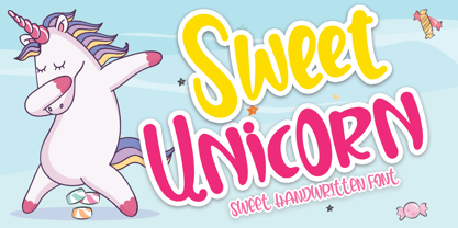 Sweet Unicorn is a cute and sweet handwritten font with an incredibly friendly feel. Get inspired by its playful feel! This font is PUA encoded which means you can access all of the cute glyphs and swashes with ease! It also features a wealth of special features including alternate glyphs and ligatures.
 - Limoncello Recipe by PeachCreme,
$19.00 Savor the perfectly imperfect strokes of "Limoncello Recipe," a handwritten font that embraces the charm of human touch in every line. Just like the handwritten notes of a well-used family cookbook, this font features delightfully uneven lines and a casual, unrefined style that brings an approachable, personal feel to any project. With 84 standard ligatures, "Limoncello Recipe" reflects the natural variations of handwriting, creating connections that are as authentic as they are unique. These connections celebrate the beauty of imperfection, making your text resonate with the warmth and originality of a handwritten letter. The font's assortment of beginning and ending swashes provides a variety of expressive flourishes, giving your words a laid-back elegance. These alternates allow for a playful freedom in your designs, echoing the spontaneous and joyful scribbles found in the margins of a secret family recipe. Ideal for designs that call for a touch of rustic charm and a dash of whimsy, "Limoncello Recipe" is a reminder that beauty often lies in the flaws. Whether you're designing a quirky brand identity, a charming event invitation, or packaging for artisanal products, this font proves that sometimes the best approach is a little bit carefree and wonderfully imperfect.
 - Adelbrook by Vibrant Types,
$36.00 Adelbrook is a dynamic serif typeface that keeps calm. It enriches text with the archaic structure of humanist type, because its characters arrange in a harmonious rhythm with a dynamic stroke, asymmetric serifs and stems that lean in the direction of reading. These characters have gravity and are firmly on the baseline. The tapered stems define a heaviness that end in emphasized foot serifs. Actually all the details are heftier the lower they are. This is particularly evident in a subtle vertical hairline variation, light or unapplied head serifs, and clipped upper dots. The clearness of the semi-serif italics with a brushy nature integrates perfectly in a subtle way. All these details result in a sophisticated text typeface with a sharp contemporary design.
 - Prillwitz Pro by preussTYPE,
$49.00 Johann Carl Ludwig Prillwitz, the German punch cutter and type founder, cut the first classic Didot letters even earlier than Walbaum. The earliest proof of so-called Prillwitz letters is dated 12 April 1790. Inspired by the big discoveries of archaeology and through the translations of classical authors, the bourgeoisie was enthused about the Greek and Roman ideal of aesthetics. The enthusiasm for the Greek and Roman experienced a revival and was also shared by Goethe and contemporaries. »Seeking the country of Greece with one’s soul«. All Literates who are considered nowadays as German Classics of that time kept coming back to the Greek topics, thinking of Schiller and Wieland. The works of Wieland were published in Leipzig by Göschen. Göschen used typefaces which had been produced by until then unknown punch cutter. This punch cutter from Jena created with these typefaces master works of classicist German typography. They can stand without any exaggeration on the same level as that of Didot and Bodoni. This unknown gentleman was known as Johann Carl Ludwig Prillwitz. Prillwitz published his typefaces on 12th April 1790 for the first time. This date is significant because this happened ten years before Walbaum. Prillwitz was an owner of a very successful foundry. When the last of his 7 children died shortly before reaching adulthood his hope of his works was destroyed, Prillwitz lost his will to live. He died six months later. His wife followed him shortly after. The typeface Prillwitz as a digital font was created in three optical styles (Normal, Book and Display). The typeface Prillwitz Press was created especially for a printing in small sizes for newspapers. »Prillwitz Press« combines aesthetic and functional attributes which make written text highly readable. It was originally designed for a newspaper with medium contrast to withstand harsh printing conditions. Its structure is quite narrow which makes this typeface ideal for body text and headlines where space is at premium. For the Normal – even more for the Book – a soft and reader-friendly outline was created through a so-called »Schmitz« and optimized in numerous test prints. The arris character and the common maximal stroke width contrast of the known classicist typefaces (Didot/Bodoni) were edited by the study of the original prints. This was also done in order to reach a very good readability in small type sizes. This typeface is perfectly suited to scientific and belletristic works. Accordingly it has three styles: Regular, Bold and Italic as Highlighting (1). The typeface Prillwitz is a complete new interpretation and continuing development of the conservated originals from 1790. They have been kept in the German Library in Leipzig. It was always given the priority to keep the strong roughness and at the same time optimizing the readability of this striking font. The type family has all important characters for an efficient and typographic high quality work. ----------- (1) Accentuation of particular words or word orders (e.g. proper names, terms etc.). Typographic means for Highlighting could be Italic, SmallCaps or semi-bold.
 - Scurvy Dog by Hanoded,
$15.00 Aye, me lovelies, this be Scurvy Dog, a grand font! The letters were etched into a dead man's chest with a blunt rapier, pickled in brine and covered in spew. Ye could be using this crafty penmanship for yer logs or writing yer dear ol' mothers a letter.
 - Romp by Positype,
$30.00 With all ego aside, Romp was designed and influenced by my daughter, Angel. For some time now, she has wanted me to design a font based on her handwriting. But each time I sit down to do it, I run into more that she needs to do and redo. On a recent attempt, I ran into the same situation again. Instead of moving on to something else, I decided to whip out a sumi brush and start making letters...for me, type design is something a little ‘serious’ and never a time to just have fun. This typeface proved that notion wrong—it really was fun. As a result, each letter encouraged another and the design grew...and grew! The happy result spawned 3 separate sets of letters & numerals (small caps and some ligatures too!). Using the beauty of OpenType, these 3 sets have been fused into one, randomly generating font set. If you are using any type of OpenType enabled application, then the Romp Pro typeface is the way to go. They include everything found in the 3 separate variants for each style as well as entirely expanding offering of additional small cap and ligature sets.
 - Imperfection by LIGHTDESIGNS,
$9.00 IMPERFECTION Is a hand-written san-serif font inspired by human imperfections (mistakes). This is the first font created by LIGHTDESIGNS. It has no consistency in it's design which made the font looks like a lot of mistakes has been made. But this is done with purpose. With these characteristics, the font is given the name "IMPERFECTION', With surprising font and glyph designs, the intent of this font design is to pass a message that says, "SUCCESS IS NOT THE ACHIEVEMENT OF PERFECTION, BUT THE ACCOMMODATION OF IMPERFECTION™ This font design will be a fit in every design project it is utilised like logos, posters, flyers, magazine, card designs e.t.c. This font can be nicely pairs with script fonts & San serif font.