10,000 search results
(0.119 seconds)
- We Love Nature Stems Two by kapitza,
$85.00 We Love Nature Stems Two is a picture font consisting of 52 all new high quality, hand drawn illustrations with clean outlines and a minimum of vector points. Due to the overwhelming success of our flower font We Love Nature Stems, we have created this brand new set of original illustrations. We loved creating these beautiful new flowers and hope that you will love designing with them. Enjoy!
 - TCF Plana by TypeCult Foundry,
$22.00 Very thin fluid strokes and high speed letters form this casual script entitled TCF Plana. TCF Plana is elegant and functional, expressive yet harmonious, with more bounce and irregularity of rhythm than usual formal script typefaces. TCF Plana was executed with a ball-point pen and then digitised so it would convincingly mimic handwriting by using a plethora of contextual alternates which makes the words look much more natural and beautiful.
 - Gleeful Bubble by Insan Perkasya,
$12.00 Gleeeful Bubble, a delightful font that bubbles with joy, featuring a hint of sparkling bubbles in each character. This playful typeface adds a touch of whimsy to your designs, infusing them with a sense of light-hearted cheer. Let Gleeeful Bubble be the choice that brings a burst of happiness and a sprinkle of effervescent charm to your creative projects. If you have any question, please contact us
 - Bougainville by Type Associates,
$29.95 Bougainville was inspired by many of my favorites and has been on the drawing board in excess of ten years. Only this year I decided to expand the original 1994 design to include other weight variants. The quirky Binner Gothic-inspired high axis and its funky g, rounded e, angled stroke endings together with the influence of contemporary designs such as Officina Sans, Din Mittelschrift and MetaPlus, Bougainville exhibits a similar flavor and compactness to Bodega Sans. This typeface family has been named in honor of the renowned eighteen-century French mathematician and explorer Louis-Antoine de Bougainville to whom we owe the naming of South Sea Islands and colorful tropical flora he discovered along his journey. Bougainville makes for effective headings at any size and is equally readable at semi-display sizes.
 - Beneficha by Almarkha Type,
$35.00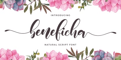 Hello Font lovers, Introducing New Collections Beneficha – Natural Script Font Beneficha – is a Natural Script Calligraphy font with a natural handwritten feel. It has lovely ligatures and alternates that are perfect for any creative design. This handmade font will make your design has a beautiful natural touch for each details. It is perfect for any design project as Invitation,logo, book cover, craft or any design purposes. This font is PUA encoded which means you can access all of the magical glyphs and swashes with ease! It also features a wealth of special features including alternate glyphs and ligatures.
 - Speakeasy by Sudtipos,
$79.00 Speakeasy is a 5-font combo thematically built as a toolset for designing menus and liquor labels as well as coffees, restaurants and signs when the desire is to communicate with style. Originally put together to be used by the most famous speakeasy in Buenos Aires, this set contains a script, a minor (almost flat) wedge serif, a flare serif, a sans serif, and a bold Didone. The seed for the script was found in a German lettering book, and the other fonts reflect the familiar advertising and announcement styles of the early 20th century. The Speakeasy script comes with two different ways to connect the letterforms. Also included are many alternates, swashes, endings and flourishes — all accessible via OpenType features or glyph palettes. Speakeasy Modern and Speakeasy Flare are small cap fonts, and come with a few alternates. Speakeasy Sans and Speakeasy Gothic come with full sets of majuscules and minuscules, but contain small caps and a few alternates as well. A few rules and ornaments are also sprinkled throughout the set. This combination of fonts worked wonderfully for the project that called for it. Hopefully it will work just as well for your project.
 - Mundial by TipoType,
$24.00 Mundial translates as “Worldwide”, this name is a statement: the idea of synthesizing characteristics from different traditions in a single typographic style. Here and there you can see gestures that are clearly associated with different eras and cultures, but not to be confused: the main characteristic of Mundial is the summary, the cohesion and the sum that results in more than each individual part. Mundial is a typeface for this time in which individual identity marks, are the best aid to build a world together.
 - Godfrey Sykes Initials by Celebrity Fontz,
$24.99This illustrative alphabet was inspired by the decorations of Godfrey Sykes, whose work was greatly influenced by that of Raphael and Michelangelo. This tile alphabet follows a Venetian 16th-century tradition of letters decorated with figures symbolizing each initial, a High Renaissance style. Includes one set of A-Z ornamental initials conveniently assigned to both the upper and lower case alphabet characters. Perfect for artistic publications, storybooks, fairy tales, and texts conveying the feel of the apogee of the visual arts in the Italian Renaissance. - Zouk by 38-lineart,
$19.00 “Zouk” is the transformation of the classic blackletter font into the modern world. The blackletter character is very strong and prominent will be the choice for a new style brand. This font consists of 750 glyphs with latin plus diacritics that supports more than 200 languages. We created alternate glyphs in stylistic sets (SS) 01, 02, 03 and 04 for all lowercases including the diacritics. We believe this font style will be a new brand choice that is more prominent and stylish in a classic nostalgic diorama.
 - Ciclamino by TrueBlue,
$16.00 “Ciclamino” is the Italian name for a small, elegant forest flower with a sweet but strong fragrance. This font is inspired by the peculiars characteristics of this flower, to the elegant shapes of the petals and its intense fragrance but sweet and refined. The result is a font with a particularly incisive but elegant layout suitable for high-impact graphic projects with a modern and decisive flavor but with a note of balanced elegance. There are no limits to the situations in which you can use it to give a touch of originality to your graphic creations but there are some project categories in which it could be a choice of great visual impact and help you express all your creativity. The particular can give excellent results in all those situations that have a flavor of modernity, and innovative technology and express innovation and dynamism and decision. At the same time, its decisive and sinuous lines also adapt to situations with a gothic and fantasy relish and even to tribal graphics. But this is just a minimal list of situations in which it can express its potential, it is a very versatile font and you can find a lot of other situations in which its use can make a difference and help you obtain an original result with a great visual impact.
 - FS Lola by Fontsmith,
$80.00 L-O-L-A Like the subject of the Kinks’ song, FS Lola is a little bit of both – a font with a rare combination of masculine and feminine. The font was inspired by the song, which itself was inspired by the night the Kinks’ manager spent dancing drunkenly in a Soho club with a beautiful woman... Or so he’d thought, until her stubble started to show halfway through the evening. Masculine/feminin Phil Garnham’s experience in designing FS Lola was similar to the one related by Ray Davies. Setting out to create a sans serif font, he realised along the way that he was actually dealing with a semi-serif. He went with it, though, and produced a font with the best masculine and feminine qualities: hard edges and corners tempered by shapes of softness and generosity, the outcome of what Phil calls an “organic” design process. “Initially, my designs were very graphic and hard but not very distinctive. By printing and redrawing the letters in pencil I achieved a softer and friendlier alphabet with a strong personality.” Broad Lola, as you’d expect, is very broad-minded. Available in five weights with italics – and fluent in central European languages – FS Lola offers a confident combination of feminine softness and male steeliness to any kind of design. As the song says, “It’s a mixed-up, muddled-up, shook-up world... except for Lola.
 - Anttine by AEN Creative Studio,
$14.00 Anttine is a romantic and sweet calligraphy typeface with characters that dance along the baseline. It will add a luxury spark to any design project that you wish to create! This font is PUA encoded which means you can access all of the amazing glyphs and ligatures with ease!
 - Soulmate by Haksen,
$18.00 Introducing Soulmate - an elegant, luxurious and classy script. Soulmate comes with many alternates so you can create a luxury design. I recommend using Adobe to design with this font. The Glyphs menu contains all the alternates. If you have any questions, please contact me for support at : edhi.sarwo@gmail.com
 - Rutin Tutin NF by Nick's Fonts,
$10.00Schrifti Alphabeti, a delightful collection of Cyrillic typefaces for posters from the former Soviet Union, strikes again, this time with a way-out West (Vladivostok?) theme. Extrabold, extra wide and delightfully different! Both versions of the font include 1252 Latin, 1250 CE (with localization for Romanian and Moldovan). - Sweet Signature by AEN Creative Studio,
$15.00 Sweet Signature is a romantic and sweet handwritten typeface with characters that dance along the baseline. It will add a luxury spark to any design project you wish to create! This font is PUA encoded which means you can access all of the amazing glyphs and ligatures with ease!
 - Balimtha by TM Type,
$12.00 Balimtha is a romantic and sweet calligraphy typeface with characters that dance along the baseline. It will add a luxury spark to any design project that you wish to create! This font is PUA encoded which means you can access all of the amazing glyphs and ligatures with ease!
 - Reepy by The Design Speak,
$100.00 Reepy is a font designed with horror in mind and works for all your scary needs. The design concept was designed with Tim Burton and Jordan Peele's "Us". It is ideal to be used in communicating something a creepy or frightening and this is where the name comes from.
 - Lost City by Tigade Std,
$15.00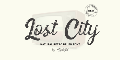 Lost City is a Natural Retro Brush Font. It is a handwritten which can beautifully enhance your design and product with the feel of retro. It's perfect for creating quotes, greeting cards, branding, promotion, advertisements (hello creative people!). This is a complete set comes with the International Characters. Enjoy!
 - Niliya by AEN Creative Studio,
$14.00 Niliya is a romantic and sweet calligraphy typeface with characters that dance along the baseline. It will add a luxury spark to any design project that you wish to create! This font is PUA encoded which means you can access all of the amazing glyphs and ligatures with ease!
 - Varmint PB by Pink Broccoli,
$14.00 Varmint is an offbeat flair serif font inspired by the titling of the early 1970's "Yosemite Sam & Bugs Bunny" comics from Gold Key. Playing up a Capitals and Alt-Capitals character set, with just a few ligatures, this wonderful typeface is funky and fun to type with.
 - Welove by Beary,
$15.00 welove a romantic and sweet calligraphy typeface with characters that dance along the baseline. It will add a luxury spark to any design project that you wish to create! This font is PUA encoded which means you can access all of the amazing glyphs and ligatures with ease!
 - Christmas Energy by Rashatype,
$10.00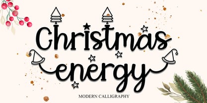 Christmas Energy is a whimsical script font with a relaxed theme, featuring a lovely style. This font is PUA encoded which means you can access all of the glyphs and swashes with ease! Add it confidently to your favorite creations and let yourself be amazed by the outcome generated.
 - Oyukis Ghost by Hanoded,
$10.00 Oyuki's Ghost is a scary typeface made with a steel pen and Chinese Ink. The name comes from a painting by Maruyama Okyo (1733–1795), which depicts his mistress who died young. Maruyama Okyo claimed she haunted him in his sleep. The font comes with extensive language support.
 - Smithalia by Letterena Studios,
$9.00 Smithalia is a romantic and sweet calligraphy typeface with characters that dance along the baseline. It will add a luxury spark to any design project that you wish to create! This font is PUA encoded which means you can access all of the amazing glyphs and ligatures with ease!
 - Betalina by Letterena Studios,
$9.00 Betalina is a romantic and sweet calligraphy typeface with characters that dance along the baseline. It will add a luxury spark to any design project that you wish to create! This font is PUA encoded which means you can access all of the amazing glyphs and ligatures with ease!
 - Figgins Tuscan by HiH,
$12.00 Early in the 19th century, foundries began releasing a variety of decorated ornamental letters based on the Tuscan letterform. Fancy Tuscan letters quickly became so popular, they eventually came to represent the cluttered extremes of Victorian design. Foundries competed with each other to produce most extravagantly decorated letterforms. As often happens, success turned to excess. What is often overlooked is the long history of the Tuscan style. Early examples have been traced back to ancient Rome. Indeed, the characteristic bifurcation may have represented a fishtail to the early Christians, thus sharing in the roll of symbolic identification played by the simple drawing of a fish as a whole. Later. trifurcation was developed as an alternate termination, followed by loops, full fishtails, curls, hooks and other fancy variations. Nicolete Gray provides an extensive history in her Appendix One of NINETEENTH CENTURY ORNAMENTED TYPEFACES. According to Gray, the first metal typeface based on the Tuscan form was the Ornamented of 1817 by Vincent Figgins of London. Thorowgood followed suit in 1821, Fry in 1824 and Caslon in 1830. Each was to re-visit the form many times during the Victorian era. Here we present our interpretation of what Figgins might have produced in a basic, plain Tuscan form - free of the decorative additions. We are pretty safe here because Figgins was very creative. He explored many of the terminal variations listed above and combined them with different decorative devices to produce a constant stream of new faces to meet the demands of the marketplace. Figgins Tuscan ML represents a major extension of the original release, with the following changes: 1. Added glyphs for the 1250 Central Europe, the 1252 Turkish and the 1257 Baltic Code Pages. There are also a few glyphs for Anglo-Saxon, Gaelic and Old Gaelic. Total of 355 glyphs. 2. Added OpenType GSUB layout features: aalt, ornm and liga ˜ with total 34 lookups. 3. Added 351 kerning pairs. 4. Redesigned several glyphs: the comma, quotes, brackets, braces, acute accent, and grave accent. 5. Revised vertical metrics for improved cross-platform line spacing. Please note that some older applications may only be able to access the Western Europe character set (approximately 221 glyphs). The zip package includes two versions of the font at no extra charge. There is an OTF version which is in Open PS (Post Script Type 1) format and a TTF version which is in Open TT (True Type)format. Use whichever works best for your applications.
 - Ambulance Shotgun Pro by CheapProFonts,
$10.00 Another grungy masterpiece from Guillaume - this one with a woodprint touch. I have made the lowercase letters different from the uppercase by removing the cross-shaped counters and flipping where possible. Even the numbers have solid variants - available as OpenType "Stylistic Alts". Enjoy the new flexible possibilities! ALL fonts from CheapProFonts have very extensive language support: They contain some unusual diacritic letters (some of which are contained in the Latin Extended-B Unicode block) supporting: Cornish, Filipino (Tagalog), Guarani, Luxembourgian, Malagasy, Romanian, Ulithian and Welsh. They also contain all glyphs in the Latin Extended-A Unicode block (which among others cover the Central European and Baltic areas) supporting: Afrikaans, Belarusian (Lacinka), Bosnian, Catalan, Chichewa, Croatian, Czech, Dutch, Esperanto, Greenlandic, Hungarian, Kashubian, Kurdish (Kurmanji), Latvian, Lithuanian, Maltese, Maori, Polish, Saami (Inari), Saami (North), Serbian (latin), Slovak(ian), Slovene, Sorbian (Lower), Sorbian (Upper), Turkish and Turkmen. And they of course contain all the usual "western" glyphs supporting: Albanian, Basque, Breton, Chamorro, Danish, Estonian, Faroese, Finnish, French, Frisian, Galican, German, Icelandic, Indonesian, Irish (Gaelic), Italian, Northern Sotho, Norwegian, Occitan, Portuguese, Rhaeto-Romance, Sami (Lule), Sami (South), Scots (Gaelic), Spanish, Swedish, Tswana, Walloon and Yapese.
 - Thanks Summer by Letterara,
$14.00 Thanks Summer is a fresh and sweet handwritten font. Its distinct and well-rounded letters make this font a masterpiece. Its casual charm makes it appear wonderfully down-to-earth, readable, and, ultimately, incredibly versatile. Thanks Summer will look outstanding in any context, whether it’s being used on busy backgrounds or as a standalone headline! This font is PUA encoded which means you can access all of the awesome glyphs with ease! It also features a wealth of special features including ligatures.
 - Kiddiess by Gassstype,
$22.00 Hello Everyone, introduce our new product Kiddiess is a Funny Brush Font Playful Kids with a natural feel. This handmade font will make your design has a beautiful natural touch for each details. It is perfect for any design project as Invitation,logo, Kids,book cover, craft or any design purposes. This font is PUA encoded which means you can access all of the magical glyphs. It also features a wealth of special features including Ligatures glyphs and Alternate glyphs.
 - Retro Checkbook JNL by Jeff Levine,
$29.00 By the 1990s, the availability of font creation software opened the door to an explosion of creativity, experimentation and exploration into the world of digital typography by amateur and professional alike. The undisputed king of the freeware fonts was Ray Larabie through his Larabie Fonts website. It seemed at the time that Ray’s output was endless, and he amassed dozens upon dozens of fonts that ranged from the ridiculous to the sublime. In fact, Ray was the driving force of encouragement and a behind-the-scenes “mentor” who helped Jeff Levine Fonts get underway in January of 2006. As Larabie’s focus changed to higher-quality commercial type design with the launch of Typodermic, Inc., many of his “less than perfect” font experiments were withdrawn and shelved. Ray eventually turned those lost (and sometimes questionable) typefaces into a bundled zip archive released into the public domain through Creative Commons. One particular design “Boron” (circa 1996) featured computer-oriented lettering as if etched onto a circuit board. Running with this idea, and with Ray's approval, the electronic elements were stripped away, the characters cleaned up and modified, and the font reworked in Retro Checkbook JNL, which is available in both regular and oblique versions.
 - MFC Botanical Borders by Monogram Fonts Co.,
$19.95 The inspiration source for MFC Botanical Borders is a collection of border treatments from the 1886 “Spécimens de caractères d'imprimerie” by E. Houpied a Paris. This collection of elegant floral and foliage borders has been put together with their original decorated rules, as well as alternate matching precision rules for added versatility. You can start with a new document or work on a new layer within an existing document. Select MFC Botanical Borders from the font menu. (Some users may have font previewing enabled in the font menu which will cause the font name to appear as border elements, disable this option in order to choose the name) Make certain that the point size of the font is the same as the leading being applied to the font so the borders will meet up properly. While we’ve adjusted this within the font, your program may override these settings. For instance a 12 point font should have 12 points of leading. A PDF guidebook for MFC Botanical Borders is included in the font package. Download and view the MFC Botanical Borders Guidebook if you would like to learn a little more.
 - HWT Showcard Script by Hamilton Wood Type Collection,
$29.95 Described as “An extended script type that lends itself well to fine fashion, ready-to-wear and all quality merchandise” in a marketing blurb pitching Beaufont by the Morgan Sign Machine Company of Chicago for their Line-O-Scribe sign printing system. This advertising script font was originally manufactured exclusively for Morgan Sign under license by the Hamilton Wood Type Manufacturing Company. The source patterns and original artwork for this typeface exist in the archives of the Hamilton Wood Type & Printing Museum, and were used for this fresh digitization of this font. This digital take includes alternate letters as originally designed in the mid-century wood type version, and now includes a full extended latin character set with over 350 characters.
 - Thalweg by Ani Dimitrova,
$35.00 Thalweg serif typeface is a project focused on the digitalization and development of the Thalweg font. The font was originally designed in 1993 by the Bulgarian artist Ivan Kyosev. In 2018 Ani Dimitrova began the revival of the Thalweg font and converted the drawings into a digital form. The existing set of characters required some necessary expansions such as the development of capital letters, alternative symbols and many other functions. Furthermore, some additional weights were developed which aimed to make the font more complete. Thalweg was completed in 2020 with 16 weights ranging from Thin to Black with extra drawn italics and small caps versions, each style containing more than 1100 glyphs. The font comes with an extended coverage of the Latin, Cyrillic and Greek Scripts. All of the weights are specifically equipped for complex, professional typography with Open Type Features. These features include: Small Caps, Ligatures, Discretionary Ligatures, Superscript, Subscript, Tabular Figures, Old-Style Figures, Circled Figures, Arrows, Matching currency symbols and fraction. The Thalweg serif typeface is a perfect choice for body text, branding design, web design, editorial design and more. Ivan Kyosev (1933-1994) was one of Bulgaria’s most famous artists whose work influenced several generations of bulgarian designers. He was born on February 5, 1933, in the city of Burgas. In 1957 he graduated in illustration at the National Academy of Art in Sofia led by Prof. Iliya Beshkov. Mr. Kyosev was a member in the management of the “Graphics and Illustration” section in the Union of Bulgarian Artists, member of the UBA board, artist in the publishing houses “September” and “World”. Together with Boris Angelushev, he worked on the layout design of the “Literary Front” newspaper. Furthermore, in 1963 - 1964 he was the main artist in the publishing house “Prosveta”. Ivan Kyosev excelled in the field of illustration, book design and library layouts in various genres (classics, children's literature, poetry, journalism, memoirs, etc.). He is also the author of many fonts.
 - 1534 Fraktur by GLC,
$38.00 This family was inspired by the early Fraktur style font used circa 1530 by Jacob Otther, printer in Strasbourg (Alsace-France) for German language printed books. Although it is an early Fraktur pattern, it is easy to see the characteristic differences with the Schwabacher style (look at 1538 Schwabacher), like in the small d, o or y... and the capitals (look at the H, K, T...). Frequently, Schwabacher and Fraktur were used together in the same book : Fraktur style for the main and Schwabacher for marginalia and comments. This font contains standard ligatures and German historical ligatures (German double s, long s, ts...) and diacritics (special ummlaut "e superscript" and "∞" instead of dieresis with letters a, o and u,) naturally, we have added numerous letters lacking in the original to permit a contemporary use of the font.
 - Deuterium by Kostic,
$40.00 This versatile font family comprises 10 distinct weights, ranging from the delicate Thin to the bold and distinctive Ultra Heavy. What makes Deuterium special is its approach to the heavy styles. Balancing geometric principles with the challenges of extreme weight, Deuterium manages to preserve the geometric character even when the stems expand to extraordinary widths and the apertures narrow to the size of a dot. In the world of type design, geometric sans-serif fonts are known for their precision and adherence to symmetry. Deuterium deviates from this norm while keeping its geometric essence — it is a thoughtful reinterpretation of the classic style. Whether you’re designing for branding, headlines, or text, Deuterium is a versatile tool that adds a modern touch to your projects. It explores geometry in unconventional heavy styles, making your designs stand out with a subtle yet distinct geometric charm.
 - Harond by Arterfak Project,
$29.00 Introducing Harond font, a bold serif font with a retro touch. Inspired by the dynamic and chubby typography style of the 70s, this font exudes a delightful, playful, yet elegant impression, making it ideal for various design themes, especially in the realm of food-related design. Harond is a display font best suited for larger sizes. Its plump form and tight spacing offer a delightful design experience and captivate attention. It's the perfect choice for use in posters, decals, logos, branding, flyers, promotional materials, motion graphics, packaging, and much more! But that's not all you get with this font. In addition to the standard alphabet, Harond also comes with multilingual support and numerous special characters, making it easier to enhance your designs.
 - Sonny Gothic by W Type Foundry,
$25.00 Sonny Gothic is our most rational-geometric typefamily until so far. It’s inspired by the geometric style of the 70s, specifically by Herb Lubalin’s work. Since we were students, we have been gazing Lubalin’s logos, typefaces and magazines as inspiration that still lives in our subconscious. At first, we made a pure geometrical typeface with modern caps proportion, then we combine those proportions with the 70s traditional caps ligatures. It was at that point that we knew Sonny Gothic was ready to arise. Even though Chile is not the origin of a modern visual culture, for us geometric typefaces and Lubalin’s work are one of the most attractive aesthetics of the creative realm, and therefore, this is our homage. Designed with powerful opentype features, each weight includes alternate characters, ligatures, fractions, special numbers, arrows, extended language support and many more… Perfectly suited for the several areas of graphic design. Learn about upcoming releases, work in progress and get to know us better! On Instagram W Foundry On facebook W Foundry wtypefoundry.com
 - Neonlife by Popskraft,
$19.00 This font comes from the romance of 20th century tube signs that will likely disappear forever. But let's not be upset — the Neonlife font embodies not only the warmth and comfort of neon signs, but also the energy of a modern style. And welcome to New Neon Life! The font family contains 6 sizes to help you choose the best size for different occasions. Neonlife is a unique solution for cool typography, branding, headings, in short, everything that makes our world unique and special. Although this font is not designed for large amounts of text, all characters are perfectly balanced and can be used like any regular font.
 - Hirondelle by JBFoundry,
$18.00 With over 900 characters and with the contextual alternates, Hirondelle offers you a perfectly connected writing. By activating swashes, your texts will take a more remarkable expression. With its four weights, you will have a wide choice for your invitations, advertisements, packaging …
 - 1791 Constitution by GLC,
$42.00 In the year 1791, the 20th of June, the king of France Louis XVI attempted to flight from Paris to the Luxembourg. He was intercepted on the road and taked to Paris again on the 21st. A few month later, in September, the first French democratic constitution was promulgated, transferring the sovereignty from the king to the French people. This font was created inspired from the steady hand of a lawyer writing a farm renting contract a few days after the advent of the new French regime. It is a "Pro" font containing Western (including Celtic) and Northern European, Icelandic, Baltic, Eastern, Central European and Turquish diacritics. The numerous alternates and ligatures allow to made the font looking as closely as possible to a real hand. Using an OTF software, the features allow to vary the characters without anything to do but to select contextual alternates and standard ligatures and/or stylistic alternates options.