10,000 search results
(0.044 seconds)
- HU Garaetteok KR by Heummdesign,
$25.00 It is a cute headline font with straight strokes and rounded ends, giving it a rice cake feel. The initial and final consonants 'ㄹ' were designed differently to give a fun sense of rhythm, and the straight strokes and lively curves added personality to the writing. It contains Hangul, Korean.
 - Begiko 17 by Begiko,
$10.00 Begiko17 is a monoline typeface family which was designed to be a font of ease lecture with features in the rhythm and proportions of school writing. In addition to the standard characters, Begiko17 includes several useful mathematical characters. Its strength relies in the clarity, simplicity and harmony of its traces.
 - Niquitta Mirzani by Arterfak Project,
$17.00 introducing Niquitta Mirzani, a brand new font combination Script and Sans. The script means signature because the letterform created with quick handwriting, wide, signature-like. The sans serif designed with condensed shapes, semi-bold that gives a large space to be combined with the script one. You can mix and match this font with any layout possibilities. top-bottom, left-right, headline-tagline, or side by side. Niquitta Mirzani script carefully crafted with additional alternates and ligatures that allow you to create a natural typographic design. This font duo is perfect for display such as apparel, name cards, headline, logo, packaging, labels, signage, quote, and many more! The versatile design for many themes such as romantic, professional, formal, or playful! Fonts featured : Uppercase Lowercase Smallcaps Numbers & punctuation Multilingual PUA encoded Swashes Stylistic set 01-03 Ligatures.
 - Caribe by Andinistas,
$37.00 Caribe is an expressive typefamily like the blue sky and bright Caribbean sun, designed by CFCG @andinistas. We love to design experimental fonts with a large amount of ligatures and swashes, drawn with special respect and study for what is handmade by ancient artisans. In this context, Caribe is an impressive typefamily of 5 fonts to create logos, posters, book covers, menus, labels, packaging, etc. The 5 Caribbean fonts add up to more than 1500 glyphs that serve to be mixed or independent, functioning as a springboard to encourage your creativity in the design of words, phrases or remarkable headlines of the elements that appear around them. Caribe Script has lowercase letters such as "b d f g h i j k l p q y z" with extremely short ascending and descending strokes achieving generous height x in: "a c e m n o r s u v w x". Caribe Script Produces visual attraction in words and phrases that need lowercase letters with sparing horizontal space width and bold stroke thickness, producing exceptional legibility in headlines or advertising texts. Caribe Script & Caps are based on ancient and multiple letterings from the 40s and 50s that were useful inspiration tools to produce visual pleasure. Caribe Words has more than 60 script words drawn diagonally generating greater intensity within a sentence. Caribe Shields & Digits has more than 50 designs each and they have containers and numbers designed to accompany words, phrases or drawings that serve to harmonize different writings. ENJOY more than 1500 glyphs: + Caribe Script: 743 glyphs + Caribe Caps: 507 glyphs + Caribe Words: 71 glyphs + Caribe Shields: 230 glyphs + Caribe Digits: 40 glyphs
 - Odense by Linotype,
$40.99Franko Luin, Odense's designer, on this typeface: With Odense I entered the field where Optima reigns in royal majesty. The first question I received was, in fact, why I designed another Optima. Look closely: Odense has as much in common with Optima as Garamond with Baskerville. Am I right? Odense Neon is a special variant that can be used for logos or single words. I had the idea for it when I noticed that the neon tubes in a sign over a store only partially followed the characters. The name comes from the Danish town Odense, the town of the famous storyteller Hans Christian Andersen, author of, e.g., 'The Little Mermaid.' Odense is also the place where the first book in the Nordic countries was printed, the 'Breviarium Ottoniense', in 1482. - Blak by Extratype,
$40.00 Blak belongs to the type series designed by Íñigo Jerez for the defunct magazine Suite . This chubby typeface now has a second life in our collection. Use it with confidence for big statements.
 - Modern Elvish by Typelove Fontworks,
$9.00 Modern Elvish is a humanist sans serif typeface created for the Tengwar “English” mode as popularized in the Lord of the Rings books and films. I imagined the famous elves of this lore living in contemporary times and needing a no nonsense modern typeface for their branding, communications and UX design. Use this typeface for your RPG, LARPing or Cosplay needs. This typeface uses advanced font features such as ligatures and contextual alternates to convert any English text. I would recommend typing in English first, then converting to a font of this typeface.
 - Sosa by Khoir,
$15.00 Sosa serif is a classic, elegant font with harmonious thin and bold displays, with exclusive alternatives in each letter and has a unique terminal alternate style making this font the perfect unit for your projects, for poster design, logo design, branding, marcendaise, fashion, clothes and much more. What's included? Uppercase Characters Lowercase Characters Alternates Support 75+ Language FEATURES Sosa So what are you waiting for? immediately purchase this font, feel free to comment, or send me my PM. Thank you for seeing
 - 1756 Dutch by GLC,
$42.00 This family is inspired from the set of two styles, Roman normal and Italic, and the ornaments used by an unknown printer working around East Switzerland, circa 1750's. It is a Dutch style font, slightly bolder than usual Fournier's or Caslon's Roman fonts, with some emphasized serifs and finals parts and special letters as capital "U" for example. A set of initials, fleurons, ornaments and frame elements is joined to the family as a supplement. The two styles, Normal and Italic, are containing standard ligatures, a few alternative characters and titlings (who are more preferable than enlarged capitals). They are "small eye" or "Small x-eight" fonts. The standard characters set is completed with accented or specific characters for Western (Including Celtic) and Central Europe, Baltic, Eastern Europe and Turkish.
 - Mulier Moderne by HiH,
$8.00 Even though the phrase Art Nouveau originated in Paris at the shop of Siegfried Bing, the French preferred to call it Le style moderne. This very sinuous, very Art Nouveau typeface was designed by an E. Mulier around 1894, probably also in Paris. The organic, vine-like curve forms are frequently seen in the art of the period. Examples include the architecture of Victor Horta, the furniture of Henry van de Velde and the jewelry of Max Gradl. Mulier Moderne is an all-cap font with a full Western European character set plus ST and TH ligatures, an alternate ‘E’ and two glyphs of period printer’s cuts. Warning: do not use for extended text. Duh!
 - Wonder Magnolia by Supfonts,
$15.00 Wonder Magnolia is a modern serif with vintage charm, fashionable appearance with a touch of retro Quick access - using the built-in OPEN TYPE functions. Just add "-" or "_" to the letter and instantly get an alternative. This feature works in most applications Font is an open type with clean shapes and precise kerning. It includes ligatures and alternations with a total of 522 characters encoded by the PUA. Also in the package you will find a list of all ligatures and alternatives Language support: All European languages Don't forget to subscribe so you don't miss out on the new awesome fonts Dima
 - Good Song by Ocha Puyaber,
$10.00 Good Song is a cursive font based on the USA's teaching script. It can be written in Carolinian, Sioux, Oʼodham, Southern Athabaskan, Hawaiian, and Samoan from USA. It can also be written in Dutch, Maltese, Aymara, Mapuche, Rapa Nui, and other languages. This font family is cute. The style is wide and rounded. It has wide and open loops. The strokes are drawn with a round cap tool, with no contrast. It is cursive and connected. The form is upright. It is easy to read in the USA. Part H has capitals with High starts. Part L has capitals with low starts.
 - Kathira by Awan Senja,
$14.00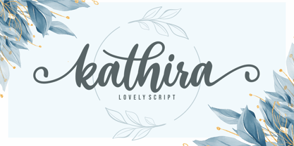 Kathira is a lovely script font. It has a modern and elegant look and is perfect for logos, branding, invitations, photography, wedding stationary, labels, and every other design which needs an unique and luxurious touch. This font is PUA encoded which means you can access all of the cute glyphs and swashes with ease! It also features a wealth of special features including alternate glyphs and ligatures.
 - Pretty Butterfly by Letterara,
$14.00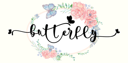 Pretty Butterfly is a sweet and beautiful handwritten font. It has a classy, elegant, and modern look which can be used for logos, branding, invitations, stationery, wedding designs, social media posts, and much more. This font is PUA encoded which means you can access all of the butterfly-themed glyphs and swashes with ease! It also features a wealth of special features including alternate glyphs and ligatures.
 - Fox Diane by Fox7,
$14.00 Fox Diane is a cute and fun color font. This font is your go-to for crafting cute greeting cards that express affection and warmth. Fall in love with its authentic feel and use it to create gorgeous invitations, beautiful stationary art, eye-catching social media posts, and cute greeting cards. 🌺🌺 Please note that the Canva do not support color fonts! 🌺🌺
 - Faulaz by Twinletter,
$13.00 Introducing "FAULAZ Font" - Where Handcrafted Elegance Meets Modern Design. FAULAZ Font is your passport to infuse a personal and distinctive touch into your creative projects. This font seamlessly blends the warmth of handwritten text with a contemporary aesthetic. What’s Included : File font All glyphs Iso Latin 1 Alternate, Ligature Simple installations PUA Encoded Characters – Fully accessible without additional design software. Fonts include Multilingual support
 - Retromax by Debut Studio,
$15.00 Debut Studio Presents The Retromax.... This Script is a special script or typeface in which the emphasis is reversed from the norm: instead of the vertical lines being wider or thicker than the horizontal lines, which is normal in Latin alphabet writing and especially printing, horizontal lines are the thickest. It's quirky and fun, you can use for any project. Retromax is also a Layered Fonts, Layered fonts have letters that appear raised, or stacked in multiple layers of different shades or colors. Some layered fonts actually include multiple files for each layer. With layered font families, we can create novel combinations of 3D with Shade. Features: Uppercase & Lowercase Number & Punctuation Multiple Language & Stylistic Alternate Files Included: Retromax Regular Retromax Offset Retromax 3D Retromax Shade I hope you like my latest product, This collection will be perfect for creating posters, art prints, apparel and t-shirt designs, Instagram and other social media posts, and many more. if you have questions and problems when using it, please leave a message in the comments or via direct message, I will be very happy to reply, Happy Designing!
 - ITC Nova Lineta by ITC,
$29.99The ITC Nova Lineta™ design is the first commercial typeface from Slobodan Jelesijevic. As with many typeface designs, it began as simple sketches. “I was working on a packaging design project,” recalls Jelesijevic, “and wanted an informal, slightly cursive design for the type. I could not find anything that matched my need, so I began sketching.” The preliminary design had an elegant yet fresh quality that, once developed, turned out to be perfect for Jelesijevic’s project. After its first use, however, Nova Lineta lay dormant for over a year. Other projects came and went, and new typeface ideas filled Jelesijevic’s notebook. Although Nova Lineta continued to tickle the creative crevices of his mind, no more work was done on the face. Then, in a period between projects, Jelesijevic began to polish the design – and, in the process, created extended and condensed versions to complement the normally-proportioned original. Born in Gornji Milanovac, Serbia in 1951, Jelesijevic graduated with a degree in graphic communication and lettering from the Faculty of Applied Arts in Belgrade. These days, Jelesijevic is sought out not only as a typeface designer, but also as a graphic designer and illustrator. When not working on design projects, he teaches graphic communication at the Faculty of Art in Niš, Serbia. Although it is a casual and inviting design, Nova Lineta has been carefully constructed and refined. As a result, it performs exceptionally well within a wide range of sizes and in a wealth of applications. An ample x-height, open counters and distinctive character shapes also ensure a high level of legibility. And, although at first glance Nova Lineta may appear to be a sans serif design, subtle serifs make their presence known at large sizes. Nova Lineta emanates warmth when used for extensive text, and it has a fresh quality at display sizes. The small family’s range of proportions also provides added flexibility. The result is a friendly yet powerful communication tool in a remarkably modestly-sized package. - LP Philharmonia by URW Type Foundry,
$35.99 Peter Schmidt, well-known designer from Hamburg, browsed in a fashion magazine on a return flight from the United States. At that time he was thinking about a logo for a philharmonic orchestra. In the magazine, he noticed some interesting typography. He removed the page from the magazine and sent it later to Peter Langpeter. That was the inspiration for the creation of the logo. Since Peter Langpeter really liked the classic aesthetics of the resulting letters, he developed a whole new alphabet of it. Initially, only capital letters. Now he has completed this exceptionally beautiful font.
 - Sugar Pie by Sudtipos,
$79.00 When Candy Script was officially released and in the hands of a few designers, I was in the middle of a three-week trip in North America. After returning to Buenos Aires, I found a few reactions to the font in my inbox. Alongside the congratulatory notes, flattering samples of the face in use, and the inevitable three or four “How do I use it?” emails, one interesting note asked me to consider an italic counterpart. I had experimented with a few different angles during the initial brainstorming of the concept but never really thought of Candy Script as an upright italic character set. A few trials confirmed to me that an italic Candy Script would be a bad idea. However, some of these trials showed conceptual promise of their own, so I decided to pursue them and see where they would go. Initially, it seemed a few changes to the Candy Script forms would work well at angles ranging from 18 to 24 degrees, but as the typeface evolved, I realized all the forms had to be modified considerably for a typeface of this style to work as both a digital font and a true emulation of real hand-lettering. Those were the pre-birth contractions of the idea for this font. I called it Sugar Pie because it has a sweet taste similar to Candy Script, mostly due to its round-to-sharp terminal concept. This in turn echoes the concept of the clean brush scripts found in the different film type processes of late 1960s and early 1970s. While Candy Script’s main visual appeal counts on the loops, swashes, and stroke extensions working within a concept of casual form variation, Sugar Pie is artistically a straightforward packaging typeface. Its many ligatures and alternates are just as visually effective as Candy Script’s but in a subtler and less pronounced fashion. The alternates and ligatures in Sugar Pie offer many nice variations on the main character set. Use them to achieve the right degree of softness you desire for your design. Take a look of the How to use PDF file in our gallery section for inspiration.
 - Basilia by Linotype,
$29.99 Among the countless typefaces available today, the Modern Face style is relatively underrepresented. During the 19th century and then later with the competition from the mechanized hot metal types and film setting, a number of attractive headline types appeared in this style. For text, however, the available types were limited to those based on tried and true classics like Walbaum, Didot and Bodoni, which were created between 1780 and 1830, as well as a few variations from the end of the 19th and beginning of the 20th centuries. The demand for new Modern text types remained nonexistant until the 1960s. Such was the situation when the Haas'sche Schriftgiesserei (Haas Type Foundry) commissioned me to come up with a concept and sketches of a new hot metal type. I was able to convince the director of the foundry that there was a niche to be filled with contemporary Modern typography. Another reason for the production of a new type was of a technical nature: the introduction of a new setting technique should not be limited to existing typefaces, but instead should lead to innovative text types suited to the demands of the new applications. André Gürtler, Basilia's designer: I began to work on the concept and initial designs of the new text type in 1968. I wanted to give the type a classical look, expressed above all in the strong stroke contrast between the robust verticals and fine horizontal strokes and serifs. This is one of the main characteristics of Modern typography.""This new typeface, Basilia, is distinguished by its soft, open appearance as well as a number of details which together mark a departure from historical models. For example, it has nothing of Bodoni's round letters and their angular, narrow spacing, and displays instead round forms with a much softer stroke in the curves. It was very important to me to avoid the Modern characteristic of stiff, vertical, grid-like strokes and to create instead a lighter, more transparent type. I retained the Modern style by using straight horizontal serifs at right angles to the strokes to still give the type its sense of rigidity." Three sketches for Basilia (normal, italic, and bold) were finished in 1973. Only the 9-point size was produced at first. In the following years, basic weights were made and adapted to filmsetting."
 - Old Standard TT - 100% free

- Justus - Unknown license

- Bestiario by Intellecta Design,
$27.50 John Seddon (1644-1700), was a famous english writing master, the leading calligrapher of his time, and master of Sir John Johnson’s Free Writing School in Priest’s Court, Foster Lane. His portrait was drawn by William Faithorne and was engraved by John Sturt as the frontispiece for his copy-books, such as ‘The Ingenious youth’s companion’ of c.1690 and 'The pen-man’s paradise' of c.1695. These were engraved after his work by others. Your extra-rare book - "The Pen-mans Paradise Both pleasent & Profitable OR Examples of all ye usuall hands of this Kingdome. Adorn'd with variety of ffigures an Flourishes done by Command of hand. Each ffigure being one continued & entire Track of the pen most where of may be struck as well Reverse (or to answer bothwayes) as Forward", London (1965). - YES (that is the title of the book) was the starting point to these new extra accurated works of Iza W, a series of revivals of the penmanship Seddon’s artworks, animal and human kingdon inspired penmanship forms in the Bestiario font. On the other hand, his highly ornamented animal kingdon inspired capitals and alphabets in the Seddon Penmans Paradise Capitals typeface. The “SeddonsFleurons” completes the collection. Fantastic choice to elaborated barocque/renaissance inspired and historical accurated layouts.
 - Casual Face by Letter Collective,
$12.00 Casual Face is a display variable font with a natural handwritten feeling. The font supports Latin and Cyrillic uppercase characters, numerals, and the main set of punctuation and symbols. The character of the font is based on the classic sign-painter casual script. The font’s option variability is upright and slanted letters up to 17 degrees. This enables the designer to define the gradient himself and be free to create designs suitable for advertising, packaging, and events. The font is perfect for headlines and personal products with casual characters and the mood conveyed is warm, and relaxed.
 - Mr Tiger by Hipopotam Studio,
$30.00 After the success of our best-selling Mr Black, we decided to once more use my grandfather’s dry transfer lettering sheets. My grandfather was a Polish military cartographer and he left us some used-up sheets. The letters didn't transfer so well but we liked the way they were damaged. Mr Tiger has upper- and lowercase characters with up to four alternate glyphs. First three variations are only slightly damaged but the fourth one is usually more distorted. All of the glyphs have a very high resolution so they can be used in a large scale and they will still look great. One of the best things in Mr Tiger is the OpenType Contextual Alternates feature. It will automatically set alternate glyphs depending on frequency of appearance of the same character. The script doesn’t throw random glyphs. For example in the word “HIPPOPOTAMUS” you will automatically get three different “P” glyphs and two “O” glyphs. It really works great but of course you can always fine tune it by hand.
 - Mingo Gothic SG by Spiece Graphics,
$39.00 This typeface appears to be straight out of a science fiction movie thriller. Mingo is a slightly condensed, somewhat vain gothic with thick vertical strokes proudly tapering downward. Capitals which are normally completely round are now square inside with curving outside corners. Lowercase letters carry the same design traits. And, in the capital A and H, crossbars extend on both sides helping give the face a pronounced retro look. Mingo Gothic is a close cousin to Raleigh Gothic and is an excellent choice for book covers and large display settings. Small caps, fractions, and alternate characters have also been developed for greater layout versatility. Mingo Gothic Bold is now available in the OpenType format. Some new characters have been added to this OpenType version as stylistic alternates, historical forms, small caps, oldstyle figures, ornaments, and f-ligatures. These advanced features work in current versions of Adobe Creative Suite InDesign, Creative Suite Illustrator, and Quark XPress. Check for OpenType advanced feature support in other applications as it gradually becomes available with upgrades.
 - Warp Three NF by Nick's Fonts,
$10.00This face is a bit of a time traveler. It combines the lowercase from a font called simply Square Gothic from the 1888 James Conner’s Sons specimen book with the uppercase of Morris Fuller Benton’s 1932 monocase masterwork Agency Gothic, resulting in a high-tech typeface right at home in the twenty-first Century. Available in three weights. All versions of this font include the Unicode 1250 Central European character set in addition to the standard Unicode 1252 Latin set - San Angelo NF by Nick's Fonts,
$10.00A heavy unnamed Gothic typeface from the 1890 William H. Page Foundry woodtype specimen book provided the template for this bold, brash, no-nonsense face. It's designed to set tight, so your headlines will definitely get noticed. Named for a town in West Central Texas which is noted for being the home of the Buffalo Soliders in the late 1800s. Both versions of this font contain the Unicode 1252 (Latin) and Unicode 1250 (Central European) character sets, with localization for Romanian and Moldovan. - Adriane Swash by Typefolio,
$59.00 The Swash version of Adriane Text features the best characteristics of this lineage, without losing the strong personality and elegant design featuring in your text styles, Adriane Swash brings a fancy look to this classic style. The family comes with a complete character set in Uppercase, Lowercase and Small Caps, and the Swash option can be activated through the OpenType features panel, including glyphs initial, intermediate and final, plus a wide range of stylistic ligatures, alternate glyphs, ornaments and languages.
 - Sacremende by Lauren Ashpole,
$15.00 Welcome to Sacremende, a chunky, slightly messy display font. As the name implies, this font was inspired by the retro California aesthetic and, in particular, old surf rock posters. To highlight the vintage feel, the font package comes with a distressed option for a well-worn effect. This font is all caps but includes unique styles for upper and lowercase letters. Both versions are available as webfonts but for better performance, I would recommend using the regular option for the web.
 - Ozzi Modo NF by Nick's Fonts,
$10.00This double-wide wonder is based on Oswald Cooper’s original drawings for the typeface Cooper Fullface. ATF rejected this offering because they felt that several of the letterforms, and particularly the numbers, were a little too wacky for the mainstream. By now, you know that such an accusation is a "Please don't throw me in the briar patch" plea to yours truly. So, here, proudly and true to their designer’s original intent, are two versions of a really fun font. Both versions of this font include the complete Unicode 1252 Latin and Unicode 1250 Central European character sets. - Statesign by Azetype,
$19.00 Presenting Statesign! A bold script font with clean and casual strokes. This font is made with the perfect combination of each character. It looks original and can be used for all your project needs. Each glyph has its own uniqueness and when meeting with others will provide dynamic and pleasing proximity. This font can be used at any time and on any project. You can see in the presentation picture above, Statesign looks casual and clean on design projects. So, Statesign can't wait to give its touch to all your design projects such as sign painting, quotes, poster design, personal branding, promotional materials, website, logotype, product packaging, etc. WHAT'S INCLUDED? 1. Statesign Regular • The first version comes with uppercase, lowercase, some ligatures, numeral, punctuation, symbols, and Standard Latin Multilingual Support (Afrikaans, Albanian, Catalan, Danish, Dutch, English, French, German, Icelandic, Indonesian, Italian, Malay, Norwegian, Portuguese, Spanisch, Swedish, Zulu, and More). 2. Underline Swashes • Just type c_1 until c_7 to feature all. Thank You Azetype Studio
 - Abesif by Twinletter,
$12.00 Introducing Abesif sans serif font. This font is stretched from the normal theme, it is boring, while different, it seems strange. from there we design the appearance of this font that is not normal so that it is not boring and we display it differently but not look strange. so if you use this font it will look different from the others but it doesn't look strange because it has a normal design. so that it creates an impression that is easy for each of your audience to remember when they first see your project. This font is very suitable as text with displays for various kinds of branding, advertisements, posters, banners, packaging, news headlines, magazines, websites, logo design, banners, social media design and of course you can use a lot more.
 - Wolverhampton by Greater Albion Typefounders,
$12.50 Wolverhampton is a new Neo-Victorian face from Greater Albion Typefounders. It's something of an example of starting with a small idea and running with it. This family of three typefaces (Regular, Small Capitals and Capitals) was inspired by a line of lettering seen on a late 19th Century enamel advertisement made by Chromo of Wolverhampton (hence the family name). The family grew, topsy-like, from a recreation of these initial fifteen capital letterforms to the three complete typefaces offered here. The three typefaces are ideal for advertising and poster work with a Victorian, Edwardian, or 'Steam-punk' theme. They would also be eminently suitable for signage inspired by the same eras or (as we've seen a number of our other typeface families prove very popular) for book covers of period related novels and historical works. Finally, these slender elegant display faces are just plain fun!
 - 8th Avenue by Our House Graphics,
$16.00 Inspired by the strange, blocky lettering on the sides of a set of a set of plastic kitchen containers in my childhood home, 8th Avenue is a sophisticated, somewhat syncopated font with a retro look and feel that at the same time brings a very modern attitude to your design. 8th Avenue works well as display font for packaging, headlines and logos. Those pastel turquoise plastic boxes from the early 1950s, with white screen printed letters reading FLOUR, SUGAR, COFFEE etc. on one side were a simple quiet presence in our home back then and for decades after. Seeing them, even that soft blue-green colour felt like home. SUGAR, the soul survivor of that set has become one of those mundane items of daily life that somehow become simple icons of another time, ripe with memories. Obviously I had to make a font. September 2014
 - Odile by Kontour Type,
$50.00 Odile is a text typeface with bracketed head and bracket-free bottom lower case serifs, a quality that counters rigidness most traditional slab serif typefaces possess. This contemporary design draws inspiration from an experimental typeface named Charter originally designed by the American book and type designer William Addision Dwiggins. It consisted of an informal lowercase alphabet, a narrow seemingly non-inclined vertical letter with script attributes, featuring non-joining letterforms. Dwiggins’ contemplated Charter as the italic companion to Arcadia, Experimental No. 221. The Charter project progressed sporadic stalled during the Second World War and came to a halt in 1955. Charter remained incomplete and was never commercially released. Assessing Charter’s whimsical design, its fragments were rethought and developed into a comprehensive text family. Odile Upright Italic reveals recognizable similarities shared by Dwiggin’s Charter and defines the design approach for the family. The steep calligraphic outstroke and low junctions off the stem as in the upright italic “n” or “r”, for example, are gradually lessened in the italic and moved up for the roman weights. The six optically balanced weights range from the delicate Light to stark Black, accompanied by display variants with feminine flair and ardent Ornaments. Two sorts of Initials, one amplified with interweaving swashes, the other more restrained, both are clearly derived from the Upright Italic. This mid-contrast serif offers a wide range of tools for text and display typographies with a palette of strict to playful. This family shines in magazine, book and display use. The graceful serifed type harmonizes perfectly with Elido, Odile’s sans companion. Sans and serif share the family array and OpenType features in perfect tune. Odile offers an extensive character set, numerous OT features including roman and italic Small Caps, five sets of numerals, alluring ligatures, and many more. OT stylistic variants (with accents) offer a one-story “a” for the roman weights, alternate “g” and “s” designs for the italics, and a variant “s” for the Upright Italic.
 - Hot Salsa by Sudtipos,
$59.00 Hot Salsa is a calligraphic script font inspired by the classic, fairly well-made brush letters from the casual sign painting style, mixed with the fast and gestural tags you can find on walls all around the world. This is a fresh font that allows you to play with its numerous swashes, alternates and ligatures to make it feel more sober or a little flirty depending on your needs. Hot Salsa started with a brush pen and a lot of paper. These were later re-traced onto many layers of tracing paper with the intention of maintaining the brush pen and handmade feeling while making the structure consistent to ensure its readability and performance.
 - Anastalia Script by OldStudioo,
$14.00 Hi ... Introducing the latest styles Anastalia Script with the kind of modern hand scratches, I hope you are interested in this font, if you want to use for your work this font can be used easily and simply because there are a lot of features in it to contain a complete set of letters lower and uppercase letters, assorted punctuation, numbers, and multilingual support. font also contains several ligatures and alternate style Stylistic Sets for those of you who have software that is able to work OpenType (Photoshop / Illustrator / InDesign). Anastalia Script is suitable use for market design developed at this time, this font has a model Trendy, natural and gentle, with this font you can take advantage of the opportunity in every moment of one wonderful way to highlight the celebration of the feast of your best, because this font will be advocates for purposes such as wedding invitations, party, graduation, birthday, gathering, etc. This Font has given PUA unicode (specially coded fonts). Thanks!
 - Dealove Script by OldStudioo,
$14.00 The latest styles Dealove font Script with the kind of modern hand scratches, I hope you are interested in this font, if you want to use for your work this font can be used easily and simply because there are a lot of features in it to contain a complete set of letters lower and uppercase letters, assorted punctuation, numbers, and multilingual support. font also contains several ligatures and alternate style Stylistic Sets for those of you who have software that is able to work OpenType (Photoshop / Illustrator / InDesign). Dealove font Script is suitable use for market design developed at this time, this font has a model Trendy, natural and gentle, with this font you can take advantage of the opportunity in every moment of one wonderful way to highlight the celebration of the feast of your best, because this font will be advocates for purposes such as wedding invitations, party, graduation, birthday, gathering, etc. This Font has given PUA unicode (specially coded fonts).

