10,000 search results
(0.065 seconds)
- Minthe by Graphicxell,
$19.00 **Minthe Ligature Typeface** inspired by the famous minimalist logo perfect for the purposes of designing templates, brochures, videos, advertising branding, logos and more. **What's Included:** + Standard glyphs + Web Font + Ligatures + International Accent + Works on PC & Mac + Simple installations Accessible in Adobe Illustrator, Adobe Photoshop, Adobe InDesign, and even work on Microsoft Word. PUA Encoded Characters - Fully accessible without additional design software. Fonts include multilingual support **Image used**: All photographs/pictures/vectors used in the preview are not included, they are intended for illustration purposes only. **Thank You**
 - Calista by Graphicxell,
$19.00 Calista Ligature Serif Font inspired by the famous minimalist logo perfect for the purposes of designing templates, brochures, videos, advertising branding, logos and more. What's Included: + Standard glyphs + Ligatures + International Accent + Works on PC & Mac + Simple installations Accessible in Adobe Illustrator, Adobe Photoshop, Adobe InDesign, and even work on Microsoft Word. PUA Encoded Characters - Fully accessible without additional design software. Fonts include multilingual support **Image used**: All photographs/pictures/vectors used in the preview are not included, they are intended for illustration purposes only. Thank You
 - Markova by Graphicxell,
$19.00 **Minthe Ligature Typeface** inspired by the famous minimalist logo perfect for the purposes of designing templates, brochures, videos, advertising branding, logos and more. **What's Included:** + Standard glyphs + Web Font + Ligatures + International Accent + Works on PC & Mac + Simple installations Accessible in Adobe Illustrator, Adobe Photoshop, Adobe InDesign, and even work on Microsoft Word. PUA Encoded Characters - Fully accessible without additional design software. Fonts include multilingual support **Image used**: All photographs/pictures/vectors used in the preview are not included, they are intended for illustration purposes only. **Thank You**
 - Bellfort by GRIN3 (Nowak),
$19.00 Bellfort family features 7 different sub-families: Regular, Rough, Press, Shadow, Press shadow, Shadow Only, Script. Each of these sub-families contains up to four font weights. When the font is used in OpenType-savvy applications, the 3 variants of glyphs are automatically alternated to achieve a random-like effect. When not using the Contextual Alternates feature, you can still pick the alternates in the Glyphs palette or use the alternates available from the keyboard upper and lower case. Bellfort Script is a handwritten, fully connected script with ligatures and contextual alternates to help with flow and readability. Language support includes Western, Central and Eastern European character sets, as well as Baltic and Turkish languages.
 - Zapfino Extra Paneuropean by Linotype,
$103.99ZapfinoExtra is an OpenType format typeface available in two versions. The Contextual version contains a treasure-trove of extra contextual features. When created in 2004, this was the most advanced OpenType font released to date. By purchasing the Contextual version, users of OpenType-supporting applications, such as Adobe InDesign, may access all of the features available in the entire Zapfino family through just two fonts, Zapfino Extra LT Pro (Contextual), and Zapfino Forte LT Pro! Unfortunately, most non-Adobe applications currently do not support the contextual features made possible by recent OpenType developments. Users of Quark XPress and Microsoft Office should instead purchase all of the non-contextual fonts of Zapfino Extra Pro family, in order to access all of the Zapfino family's 1676 glyphs. The Zapfino family's character set supports 48 western and central European languages. More Zapfino History: Today's digital font technology allowed the world-renowned typeface designer/calligrapher Hermann Zapf to finally realize a vision he first had more than fifty years ago: creating a typeface that could capture the freedom and liveliness of beautiful handwriting. The basic Zapfino™ font family, released in 1998, consists of four alphabets with many additional stylistic alternates that can be freely mixed together to emulate the variations in handwritten text. In 2003, Herman Zapf completely reworked the Zapfino design, creating Zapfino™ Extra. This large expansion of the Zapfino family was designed in close collaboration with Akira Kobayashi. Zapfino™ Extra includes a cornucopia of new characters. It features exuberant hyper-flourishes, elegant small caps, dozens of ornaments, more alternates and ligatures, index characters, and a very useful bold version-named Zapfino™ Forte. Use Zapfino to produce unusual and graceful advertisements, packaging, and invitations. Zapfino Extra is so joyously abundant that it's tempting to over-indulge, so be sure to check out the tips for working well with the possibilities!" - Vegetability by Hanoded,
$15.00 Vegetability: “The quality or state of being vegetable”. Yes, I know: it’s kinda weird, but I quite like the name of this font! I am trying to become a vegetarian (I am a ‘flexitarian’ right now) and I was trying to find a good veggie recipe for dinner, when this name crossed my mind. Vegetability is a handwritten font with a dash of roughness, a splash of attitude and a pinch of class. Comes with a whole bunch of diacritics and double letter ligatures for the lower case letters.
 - Lionheart by Canada Type,
$24.95Lionheart is the digitization and expansion of Saladin, a neo-gothic typeface designed by Friedrich Poppl, long after he established himself as one of the greatest German designers of all time with some of the most “ausgezeichnet” scripts and text faces to ever come out of Europe. This typeface, though lesser-known among Poppl’s other masterpieces, was one of the first in its genre to abandon blackletter influence and attempt letter variations based strictly on Roman alphabet shapes. Poppl’s idea spawned a whole generation of neo-gothics that can now be found on many a movie poster or book cover where the design must hint at secrets and dark sides. Lionheart succeeds with the idea of gradual curves leading to sharp concave or plano-concave terminals, to effectively build serious letter forms that speak of historical mystique and mystery. This font was was named after Richard I, King of England for a decade in the late 11th century. He reportedly exchanged many gifts of respect with Saladin, even though the two kings were on different sides of the Crusades. Lionheart comes in all popular font formats, with some alternates placed in accessible cells of the character set. - Compagnon by Hanoded,
$15.00 Compagnon is a friend, a partner. This handmade display font will come in super handy when you are working on that book cover, or the packaging of a product. It will shine on posters and websites and it will keep you warm at night. I guess that last bit is an exaggeration… Compagnon comes in three distinct styles: a ‘regular’ version, which is a bit rough around the edges, a ‘dirty’ version, with a juicy eroded look and a polka dot version. All three have their accompanying italics.
 - Aban by Naghi Naghachian,
$95.00 The Aban font family was designed by Naghi Naghashian. It is developed on the basis of specific research and analysis on Arabic characters and definition of their structure. This innovation is a contribution to modernization of Arabic typography, gives the font design of Arabic letters real typographic arrangement and provides more typographic flexibility. This step was necessary after more than two hundred years of relative stagnation in Arabic font design. Aban supports Arabic, Persian, and Urdu. It also includes proportional and tabular numerals for the supported languages. Aban Font Family is available in three weights: Regular, Bold and ExtraBold, a three stings outline font. The Aban design fulfills the following needs: A Explicitly crafted for use in electronic media fulfills the demands of electronic communication. Aban is not based on any pre-digital typefaces. It is not a revival. Rather, its forms were created with today’s technology in mind. B Suitability for multiple applications. Gives the widest potential acceptability. C Extreme legibility not only in small sizes, but also when the type is filtered or skewed, e.g., in Photoshop or Illustrator. Aban’s simplified forms may be artificial obliqued in InDesign or Illustrator, without any loss in quality for the effected text. D An attractive typographic image. Aban was developed for multiple languages and writing conventions. E The highest degree of geometric clarity and the necessary amount of calligraphic references. This typeface offers a fine balance between calligraphic tradition and the contemporary sans serif aesthetic now common in Latin typography.
 - Milescut by Tipos Pereira,
$14.00 Milescut is a display typeface inspired by some seminal covers the graphic designer and photographer Reid Miles created for the Blue Note Records between the 1950s and 1960s. Miles made almost 500 covers for Blue Note in this period, including some using the hand-cut technique that consists basically in doing vertical cuts in capital letters and numerals to create a unique style within the universe he created for Blue Note. Milescut is a tribute to this small “cut” 😬 in his trajectory within the greatest record label of all time. This idea came about while I was working on what will become soon a revival of a wood type that I fell in love with when flipping through a Specimen of the MACHINE CUT WOOD TYPE manufactured by The WM. H. Page Wood Type Co. Milescut has two extra sets of alternates that work cyclically when activated in your OpenType menu and lots of ligatures, pretty cool :)
 - Berkut by Larin Type Co,
$15.00 Berkut This is a military font family inspired by the military and aviation style, including Six styles: regular, rough, printed, stencil, stencil rough, stencil printed. This font is a wide specialization, it will be an excellent option for creating projects in the military style in both modern and vintage versions. It is great for creating logos, labels, branding projects, magazines, mugs, flyers, posters and much more, and it is also perfectly readable in the text. This font is easy to use has OpenType features.
 - Arcus by CarnokyType,
$- Arcus OpenType is a geometrically constructed font. The grounding principle is the round curve. The homogeneous character of this font is guaranteed by using this principle not only in drawings of particular letters but in the shaping of diacritical signs, too. The scope of the typeface weight is from Extra Light to Extra Bold while the complete font family includes 6 weights and their respective, well turned italics. This font contains a wide range of alternative signs, small capitals, lining and oldstyle numerals, fractions, superiors, inferiors, ligatures and discretionary ligatures; all this is within the frame of OpenType functions. This font type is not made for the typography of extensive texts. Best it can be used for headline display typeface or in creating logotypes and corporate identities.
 - Grimnotes by Allouse Studio,
$16.00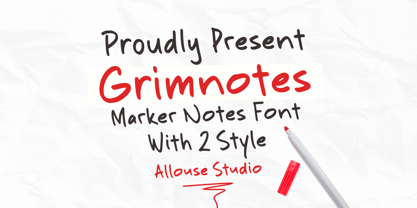 Proudly Presenting, Grimnotes a Marker Notes Font with 2 styles Grimnotes is perfect for any titles, logo, product packaging, branding project, megazine, social media, wedding, or just used to express words above the background. Grimnotes also come with Multi-Lingual Support. Enjoy the font, feel free to comment or feedback, send me PM or email. Thank You!
 - Easy Fleurons by Intellecta Design,
$18.95 Easy Fleurons are highly decorative yet generic enough to add very interesting detail to just about any design.
 - Reslaby by Letterayu Studio,
$19.00 Reslaby is a Vintage Slab Serif font that will make your designs look unique and fun. It's perfect for labels, quotes, posters, DIY projects, branding, packaging, greeting cards, websites, photos, photographic overlays, signs, window art, scrapbooking, tags and more! What's Included : + Standard glyphs + Web Font + Multilingual Accent + Works on PC & Mac + Simple installations Accessible in the Adobe Illustrator, Adobe Photoshop, Adobe InDesign, even work on Microsoft Word. PUA Encoded Characters - Fully accessible without additional design software. Fonts include multilingual support Image used : All photographs/pictures/vector used in the preview are not included, they are intended for illustration purpose only. Thank You
 - National Champion by Kyle Wayne Benson,
$4.00 National Champion is an overly confident geometric slab that comes in four weights. He is best suited for those looking for a well colored, balanced and spaced font in the College genre. He's got a 3/4 cap lowercase, lots of language options, opentype fractions and meticulous hinting for web use.
 - Classica Pro by URW Type Foundry,
$35.99 Classica Pro by Bernd Möllenstädt A real alternative for letterpress printing A masterpiece It was only after many years, shortly before the end of his life, Bernd Möllenstädt brought out these early drafts of his Classica Light and Light Italic from his drawer, and asked me to produce for him on the computer a Bold and Bold Italic, from which we later wanted to interpolate further cuts like Regular and so on. The boldening of letters with an oblique axis and with hairlines which should not grow to the same extent as the general line widths, is hard to cope with perfectly, even for the smartest computer program, and even more so, when it concerns an as complicated set of data as those conceived by Bernd. The automatically generated result could therefore only be a first step that had to be improved manually later. This was about the stage that we had reached when Bernd died in March 2013, leaving me behind with comprehensive corrections on proofs of this automatically generated Bold. Although I was aware that it would mean a lot of work to complete the project, I did not want to leave it unfinished and decided to finalize and publish the Classica, also in Bernd‘s honor. In the course of the two years that I worked on this font family it somewhat naturally became also my own. New details were added and some of the existing changed. A book typeface requires the supreme and forgives rarely, it represents a true masterpiece. My intention and my ambition were to create a real alternative for letterpress printing, with a font family that contains all the typographic options for an excellent typesetting, and is better readable and has a better appearance than other existing typefaces. Whether this was achieved, the reader may decide. Volker Schnebel, Hamburg, december 2014
 - Classic Grotesque by Monotype,
$40.99 Classic Grotesque by Rod McDonald: a traditional font with a modern face. The growing popularity of grotesque typefaces meant that many new sans serif analogues were published in the early 20th century. Setting machines were not compatible with each other but all foundries wanted to offer up-to-date fonts, and as a result numerous different typeface families appeared that seem almost identical at first glance and yet go their separate ways with regard to details. One of the first fonts created with automatic typesetting in mind was Monotype Grotesque®. Although this typeface that was designed and published by Frank Hinman Pierpont in 1926 has since been digitalised, it has never achieved the status of other grotesque fonts of this period. But Monotype Grotesque was always one of designer Rod McDonald’s favourites, and he was overjoyed when he finally got the go-ahead from Monotype in 2008 to update this “hidden treasure”. The design process lasted four years, with regular interruptions due to the need to complete projects for other clients. In retrospect, McDonald admits that he had no idea at the beginning of just how challenging and complex a task it would be to create Classic Grotesque™. It took him considerable time before he found the right approach. In his initial drafts, he tried to develop Monotype Grotesque only to find that the result was almost identical with Arial®, a typeface that is also derived in many respects from Monotype Grotesque. It was only when he went back a stage, and incorporated elements of Bauer Font’s Venus™ and Ideal Grotesk by the Julius Klinkhardt foundry into the design process, that he found the way forward. Both these typefaces had served as the original inspiration for Monotype Grotesque. The name says it all: Classic Grotesque has all the attributes of the early grotesque fonts of the 20th century: The slightly artificial nature gives the characters a formal appearance. There are very few and only minor variations in line width. The tittles of the ‘i’ and ‘j’, the umlaut diacritic and other diacritic marks are rectangular. Interestingly, it is among the uppercase letters that certain variations from the standard pattern can be found, and it is these that enliven the typeface. Hence the horizontal bars of the “E”, “F” and “L” have bevelled terminals. The chamfered terminal of the bow of the “J” has a particular flamboyance, while the slightly curved descender of the “Q” provides for additional dynamism. The character alternatives available through the OpenType option provide the designer with a wealth of opportunities. These include a closed “a”, a double-counter “g” and an “e” in which the transverse bar deviates slightly from the horizontal. The seven different weights also extend the scope of uses of Classic Grotesque. These range from the delicate Light to the super thick Extrabold. There are genuine italic versions of each weight; these are not only slightly narrower than their counterparts, but also have variant shapes. The “a” is closed, the “f” has a semi-descender while the “e” is rounded. Its neutral appearance and excellent features mean that Classic Grotesque is suitable for use in nearly all imaginable applications. Even during the design phase, McDonald used his new font to set books and in promotional projects. However, he would be pleased to learn of possible applications that he himself has not yet considered. Classic Grotesque, which has its own individual character despite its neutral and restrained appearance, is the ideal partner for your print and web project.
 - PG Gothique by Paulo Goode,
$30.00 This is my addition to a long line of traditional gothic typefaces. As you can probably tell, PG Gothique is inspired by classics such as Trade Gothic, News Gothic, Franklin Gothic, Alternate Gothic, and Gothic Gothic. Well, maybe not the last one... But Paulo, we have all those already, why would we want to add PG Gothique to our collection? This typeface has many subtle design nuances that differentiates itself from its historical influences. Also, this is possibly the most comprehensive Latin gothic font family released to date. It has 99 fonts that cover pretty much every style you could ever need, and if you do require more, this family is available as a single variable font that covers all the weights and widths in between. PG Gothique is designed to handle a multitude of applications, from branding projects, to titles, body text, user interfaces, and film poster credits. This type family has a style that will suit the purpose. There are 99 fonts in this family, ranging from Thin to Ultra weights across six widths in both roman and italic*. Activate Stylistic Set 1 and you will get the alternate slab serif-style capital “I” that offers improved legibility when placed adjacent to a lowercase “l”. PG Gothique has an extensive character set that covers every Latin European language. If you would prefer PG Gothique as a single variable font, please choose PG Gothique Variable. Test drive PG Gothique today – both the Regular and Italic fonts are offered as a free download. See full details and hi-res examples at https://paulogoode.com/pg-gothique Key features: 9 Weights 6 Widths 99 Fonts Small Caps Old Style Figures European Language Support (Latin) 600+ Glyphs per font *Compressed weights do not include italics.
 - Mirkwood Chronicle - 100% free

- Bremen by Bitstream,
$29.99Bremen was designed at Bitstream by Richard Lipton and released in 1992. It is based on German poster art from the period between the World Wars. - KG Feeling 22 by Kimberly Geswein,
$5.00 The handwriting of a college student - complete with the whimsical nature of a student jotting down notes to friends or doodling in her journal.
 - Hooking by Canden Meutuah,
$20.00 is a beautiful handwritten font. this font is so simple that i write very carefully. Even though it looks simple, this font still looks cool and stylish. Handwritten script font. This Fonts are perfect for: logos, branding, wedding invitations, business cards, greeting cards, posters, magazines, social media, proliferate fonts, planner prints and websites. Get creative with their unique fun, and use them to brighten up any craft project! Get this font now and boost your creativity with it! If you have any questions, before or after your purchase, don't hesitate to contact us. Thank You
 - Phoen by Canden Meutuah,
$15.00 Phoen is a beautiful handwritten font. this font is so simple that i write very carefully. Even though it looks simple, this font still looks cool and stylish. This Fonts are perfect for: logos, branding, wedding invitations, business cards, greeting cards, posters, magazines, social media, proliferate fonts, planner prints and websites. Get creative with their unique fun, and use them to brighten up any craft project! Get this font now and boost your creativity with it! If you have any questions, before or after your purchase, don't hesitate to contact us. Thank You
 - Waxaw by Canden Meutuah,
$20.00 Waxaw is a beautiful handwritten font. this font is so simple that i write very carefully. Even though it looks simple, this font still looks cool and stylish. This Fonts are perfect for: logos, branding, wedding invitations, business cards, greeting cards, posters, magazines, social media, proliferate fonts, planner prints and websites. Get creative with their unique fun, and use them to brighten up any craft project! Get this font now and boost your creativity with it! If you have any questions, before or after your purchase, don't hesitate to contact us. Thank You
 - Longle by Canden Meutuah,
$15.00 Longle is a beautiful handwritten font. this font is so simple that i write very carefully. Even though it looks simple, this font still looks cool and stylish. This Fonts are perfect for: logos, branding, wedding invitations, business cards, greeting cards, posters, magazines, social media, proliferate fonts, planner prints and websites. Get creative with their unique fun, and use them to brighten up any craft project! Get this font now and boost your creativity with it! If you have any questions, before or after your purchase, don't hesitate to contact us. Thank You
 - Play Kids by Canden Meutuah,
$20.00 is a beautiful handwritten font. this font is so simple that i write very carefully. Even though it looks simple, this font still looks cool and stylish. Handwritten script font. This Fonts are perfect for: logos, branding, wedding invitations, business cards, greeting cards, posters, magazines, social media, proliferate fonts, planner prints and websites. Get creative with their unique fun, and use them to brighten up any craft project! Get this font now and boost your creativity with it! If you have any questions, before or after your purchase, don't hesitate to contact us. Thank You
 - Ruca by URW Type Foundry,
$49.99 Since my first contact with blackletters in 1999, I became more and more fascinated by these artistic looking typefaces. It all started in the USA at the age of 16, when I took an art class. I decided to trace some blackletter typefaces because they looked very interesting. From this point on I was intrigued by blackletter fonts from all over the world. I studied their different body structures and their cultural background as well as the type designers behind it. Full of information and inspiration I started to draw my own blackletter typeface in 2006. While studying in Hamburg I got in touch with the studio of URW++, where I got skilled in type software and development. Creating a type takes an eye for detail and patience but also lots of time and so it took almost 4 years until the project was finished. And so Ruca was born. Ruca is a refined and expanded typeface. When you look at the spines, the tails or the flags you can see the detailed drawing, which makes the font also extremely good looking in very tall letters. The full character set contains over 400 characters, many ligatures, two number sets and all important currency symbols. Over 300 kerning pairs and many OTF-features make the font easy in use for professional type applications. The typeface is very well applicable for strong headlines and mastheads. Because of its unique appearance, Ruca is perfectly suitable professional graphic applications such as fashion design or branding.
 - Moliere by Eurotypo,
$44.00 The life of Molière is a story of struggle, hard work, domestic unhappiness, death and burial in obscurity and almost in shame. Molière left behind a body of work that not only changed the face of French classical comedy, but has also come to influence the work of other dramatists from around the world. Despite his own preference for tragedy, which he had tried to further with the Illustre Théâtre, Molière became famous for his farces, which were generally in one act and performed after the tragedy. Both the comic and the serious drama were powerfully affected by the work of Molière, not only in his own age and country but everywhere and up to the present time. Didot is a name given to a group of typefaces named after the famous French printing and type producing family. The classification is known as modern, or Didone. The typeface we know today was based on a collection of related types developed in the period 1784–1811. Firmin Didot cut the letters, and cast them as type in Paris. Along with Giambattista Bodoni of Italy, Firmin Didot is credited with establishing the use of the "Modern" classification of typefaces. The types that Didot used are characterized by extreme contrast in thick strokes and thin strokes, by the use of hairline serifs and by the vertical stress of the letters. As in the extreme contrasts of the literature of Molière, in Didione's typefaces, thick and thin strokes, straight and curved, are the most relevant characteristic for an era marked by the changes.
 - Fargo Tuscan by Greater Albion Typefounders,
$20.00 Fargo Tuscan is the first of seven typefaces exploring the decorative possibilities of the Tuscan letter form, all of which are releasing in 2017. It’s the most European of the seven- it’s a Mid-Victorian inspired display face which would have been (and is) at home on either side of the Atlantic, unlike some of the others in this batch of Tuscan faces which are distinctly ‘trans-Atlantic’ (we know, that depends on your point of view but we are Greater ALBION Typefounders after all) in flavour. Fargo Tuscan is replete with decorative features, including Swash Capitals, alternate numeric forms and stylistic alternates ideal for the beginning and ending of words. Have some mid-Victorian mid-Atlantic fun with your next design project!
 - Gallardo by Motokiwo,
$23.00 Gallardo is custom brush lettering font with tons of alternates. It's clean, strong, and elegant script that very useful for various projects. It's great for urban style and also for vintage. You can easily customize your words with Gallardo because this font has been PUA Encoded and also support special characters for multilingual. You will also get the Prototype Version, a rough version of Gallardo. Features: Stylistic Alternates Stylistic Sets (ss01, ss02, ss03, ss04, ss05, ss06, ss07, ss08, ss09, ss10) Swash Access All Alternates PUA Encoded
 - Serpentine by Image Club,
$29.99Dick Jensen (USA) designed Serpentine, is a contemporary-looking display font, for the Visual Graphics Corporation in 1972. With the rise of digital typesetting and desktop publishing, this typeface quickly became both popular and ubiquitous. This dynamic, wide, boxy design is identifiable via tiny triangular swellings at the stroke endings - what might be called semi-serifs. Serpentine is available in six different font styles: Light, Light Oblique, Medium, Medium Oblique, Bold, and Bold Oblique. Serpentine" is a greenish rock that sometimes resembles a serpent's skin, and is often used as a decorative stone in architecture. Though this font doesn't seem at all snaky or sinuous, it does have an architectural, stone-like solidity. The subtle, almost non-existent curves and semi-serifs keep it from being too stern or cold. Although the underlying strokes of each weight are similar, the six members of the Serpentine font family all present their own individual personalities. Serpentine Light lends itself well to text for onscreen displays, for instance, while the numbers from typeface's heavier weights are seen around the world on soccer jerseys! Additionally, the oblique styles convey a streamlined sense of speed, furthermore lending Serpentine well to sport and athletic applications (especially the faster, high-speed varieties). Because of its 1970s pedigree, Serpentine has come to be known as a genuine "retro" face. This makes the typeface even more appropriate for display usage, in applications such as logo design, magazine headlines, and party flyers. If you like Serpentine, check out the following similar fonts in the Linotype portfolio: Copperplate Gothic (similar serifs) Eurostile (similar width) Princetown (another "athletic" font) Insignia (similar "techno" feeling)" - Serpentine by Linotype,
$29.00Dick Jensen (USA) designed Serpentine, is a contemporary-looking display font, for the Visual Graphics Corporation in 1972. With the rise of digital typesetting and desktop publishing, this typeface quickly became both popular and ubiquitous. This dynamic, wide, boxy design is identifiable via tiny triangular swellings at the stroke endings - what might be called semi-serifs. Serpentine is available in six different font styles: Light, Light Oblique, Medium, Medium Oblique, Bold, and Bold Oblique. Serpentine" is a greenish rock that sometimes resembles a serpent's skin, and is often used as a decorative stone in architecture. Though this font doesn't seem at all snaky or sinuous, it does have an architectural, stone-like solidity. The subtle, almost non-existent curves and semi-serifs keep it from being too stern or cold. Although the underlying strokes of each weight are similar, the six members of the Serpentine font family all present their own individual personalities. Serpentine Light lends itself well to text for onscreen displays, for instance, while the numbers from typeface's heavier weights are seen around the world on soccer jerseys! Additionally, the oblique styles convey a streamlined sense of speed, furthermore lending Serpentine well to sport and athletic applications (especially the faster, high-speed varieties). Because of its 1970s pedigree, Serpentine has come to be known as a genuine "retro" face. This makes the typeface even more appropriate for display usage, in applications such as logo design, magazine headlines, and party flyers. If you like Serpentine, check out the following similar fonts in the Linotype portfolio: Copperplate Gothic (similar serifs) Eurostile (similar width) Princetown (another "athletic" font) Insignia (similar "techno" feeling)" - Anvil by Tim Rolands,
$29.00 Lend some weight to your words with Anvil! A bold, extended display face, Anvil is ideal for posters and other large design work as well as identity and logo work. This cross-platform OpenType font contains a number of ligatures, fractions, superior and inferior numerals, alternate forms and accented characters -- nearly 300 glyphs in all. Use it with an application like Adobe InDesign to access all the advanced features. Enjoy the future of typography now with this original design!
 - Doorkick by Bogstav,
$16.00 Doorkick is my grungy handmade font with rough lines and a squarish look. Each letter has 5 different versions, which automatically cycles as you type - leaving your text with a super lively and natural/organic look. I'd say that Doorkick is best for short words or shoutouts, but try it out it massive text too! I dare you! :)
 - Hermitage by Larin Type Co,
$15.00 Hermitage is a modern, elegant serif font that includes six typefaces regular, outline, oblique, outline oblique, rough and rough oblique. This font has a light weight and looks amazing in logos, branding, arranging wedding invitations, business cards, packaging, cosmetics, also works perfectly with text, it is very readable and recognizable, book cover, magazine headers, or simply as a stylish text overlay to any background image. This font includes alternates for Uppercase and Lowercase, with them you can make your project more elegant and unique and the slanted style will add dynamics to your design. Use a rough style on the craft paper, it will look great on it and create an atmosphere of handwriting. This font is easy to use has OpenType features.
 - Slash Roller by Colllab Studio,
$19.00 "Hi there, thank you for passing by. Colllab Studio is here. We crafted best collection of typefaces in a variety of styles to keep you covered for any project that comes your way! Introducing, Slash Roller, it marks a new era in graffiti font. The slashing zig zag tape gives it an authentic DIY feel. The slashed tape is prominent but not overdone, adding an interesting layer to the blocky rough letters. Slash Roller is an attempt to create a lettering style that seems like it was made with a spray can and a brush, but keeps the appearance of a slightly imperfect and distorted typeface. It looks like the work of a vandal, but the slashed typography is actually intentional. A Million Thanks Colllab Studio www.colllabstudio.com
 - Ramenson by Larin Type Co,
$15.00 Ramenson is a vintage collection of fonts that includes serif, script, and sans serif, each of them has five styles - Clean, Rough, Pressed, Shadow, Rough Shadow. Also for the script includes Alternates and Swashes. This collection was inspired by vintage signage, beer labels, logos, scout patch. These fonts are perfectly suitable for any vintage project and will make it at a high level. This font is easy to use has OpenType features.
 - Cronisse by Almarkha Type,
$35.00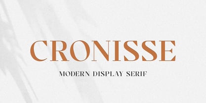 Introducing Cronisse – Modern Display Serif inspired by the famous minimalist logo, perfect for the purposes of designing templates, brochures, videos, advertising branding, logos and more. What’s Included : + Standard glyphs + Web Font + International Accent + Works on PC & Mac + Simple installations Accessible in the Adobe Illustrator, Adobe Photoshop, Adobe InDesign, even work on Microsoft Word. PUA Encoded Characters – Fully accessible without additional design software. Fonts include multilingual support Image used : All photographs/pictures/vector used in the preview are not included, they are intended for illustration purpose only. Cheers! Thank You
 - Waluxe by Almarkha Type,
$27.00 Introducing Waluxe – Luxurious Roman Sans inspired by the famous minimalist logo, perfect for the purposes of designing templates, brochures, videos, advertising branding, logos and more. What’s Included : + Standard glyphs + Web Font + International Accent + Works on PC & Mac + Simple installations Accessible in the Adobe Illustrator, Adobe Photoshop, Adobe InDesign, even work on Microsoft Word. PUA Encoded Characters – Fully accessible without additional design software. Fonts include multilingual support +Image used : All photographs/pictures/vector used in the preview are not included, they are intended for illustration purpose only. Cheers! Thank You
