10,000 search results
(0.045 seconds)
- Mixed Tape Rough by Ksenia Belobrova,
$29.00 Mixed Tape Rough is a simplified version of the Mixed Tape font family. It’s a rough calligraphic font duo which includes 2 Styles: Regular and Capitals. It doesn’t have as many alternates as Mixed Tape and supports more languages. Mixed Tape Rough is a dynamic calligraphic font so it can be used for posters, t-shirts, menus, packaging, headlines, etc.
 - Rough Riders Redux by FontMesa,
$35.00Rough Riders Redux along with our Rough Riders font, got its start from a small sample of letters used in the logo for the Beach Creek Railroad Co. dating back to the early 1860’s. I studied the design for one year before drawing the letters. Rough Riders and the Redux version are simply the most Wildest Western looking fonts you'll find. The Rough Riders fill font is not meant to be used as a stand alone black typeface, the fill font is designed to be layered behind the regular Rough Riders font. - Cal Uncial Rough by Posterizer KG,
$19.00 Cal Uncial Rough is a calligraphic font based on sketches written with cane calligraphy pen and ink on coarse-textured paper. Because of the fact that the Uncial don't have lowercase letters, there are small capitals instead of the lowercase. As the Latin version of the Uncial was created from the Greek Uncial script (translating the Bible from Greek into Latin), in addition to the standard Latin graphemes, the font contains the Greek alphabet (and also the Cyrillic letters (Ustav), derived from the Greek Uncial too). Regardless of the stylistic connection, there is a difference between the morphology of related Greek, Latin and Cyrillic letters. Most of the graphemes are based on traditional roman and insular uncial calligraphy. Cal Uncial Rough is suitable for the preparation of calligraphic sketches as well as an application in typography that should bring us closer to historical topics (European literature, quotes, history, film ...).
 - Ginza Display Rough by Positype,
$22.00Sometimes you get an idea stuck in your head and the only way to get rid of that demon is to put something down on paper. A year later the doodles became a skeleton, and then the skeleton had a body, then the body had a name, then the name got a personality. What was left was a clean set of ten fonts that encompass a very simple skeleton with a lot of visual appeal. During the process, I saw ways to expand the typeface's display capabilities by producing inline styles as well as a down-and-dirty rough set. Each font has a full set of glyphs that include Central European and Small Cap characters. - Replica Rough SG by Spiece Graphics,
$39.00 Here’s an edge-tattered, slightly distorted typeface that was developed from hand stamping using ink. You’ll find it ideal for both display and text situations where legibility is a big concern. This version holds up in very small sizes. Replica Rough SG Regular and Bold are now available in the OpenType format. This OpenType version includes stylistic alternates, discretionary ligatures, small caps, petite caps, ornaments and oldstye figures. Advanced features currently work in Adobe Creative Suite InDesign, Creative Suite Illustrator, and Quark XPress. Check for OpenType advanced feature support in other applications as it gradually becomes available with upgrades.
 - Rough Beauty Script by Pedro Teixeira,
$14.00 Rough Beauty Script, with its alternate lowercase letters, gives a personalized feeling to your work. The textured appearance gives a nice impression on beautiful pictures as backgrounds, or in contrast, with really flat backgrounds.
 - FF Brokenscript Rough by FontFont,
$41.99 - Novecento Slab Rough by Synthview,
$22.00 Novecento Slab Rough adds a letterpress / analog effect to its Slab Serif parent. Each letter has a different pattern and gives you a truly realistic effect. Even accented variants of any base character are all different. This font has also a built-in feature that automatically displays a texture variant for the 2nd occurrence of a letter or a number when they appear close one to each other. For instance: AA OO TT ÜÜ. But also: AOA NON TXT etc. And don't forget alternate glyphs design such as N I J Q Y and all other features present in the Novecento mega family: 32 styles, 76 latin languages supported, 590 glyphs and 16 stylistic opentype features for advanced typography.
 - Artica Rough Pro by Green Type,
$46.00 Artica Rough Pro is an elegant display typeface. It was inspired by classic Roman letterforms. Artica Rough Pro supports Latin, Cyrillic, modern Greek and Armenian scripts, and includes swash initial, final forms, stylistic alternates and ligatures.
 - Klein Rough Gemein by TypoGraphicDesign,
$19.00 The typeface Klein Rough & Gemein(e) is designed from 2020 for the font foundry Typo Graphic Design by Inga Luft and Manuel Viergutz. The display font based on original old german rubber stamps and is inspired in the past and present. 4 font-styles (Rough, Rougher, Roughest, Rough Mix) + 1 icon-style with 432 glyphs (Adobe Latin 2) incl. 100+ decorative extras like icons, arrows, dingbats, emojis, symbols, geometric shapes, catchwords, decorative ligatures (type the word #LOVE for ❤ or #SMILE for ☺ as OpenType-Feature dlig) and stylistic alternates (7 stylistic sets). For use in logos, magazines, posters, advertisement plus as webfont for decorative headlines. The font works best for display size. Have fun with this font & use the DEMO-FONT (with reduced glyph-set) FOR FREE! ■ Font Name: Klein Rough & Gemein(e) ■ Font Weights: 4 + 1 (Icons) + DEMO (with reduced glyph-set) ■ Font Category: Display for headline size ■ Font Format:.otf (Mac + Win, for Print) + .woff (for Web) ■ Glyph Set: 432 glyphs (Adobe Latin 2) incl. 100+ decorative extras like dingbats ■ Design Date: 2020 ■ Type Designer: Manuel Viergutz und Inga Luft
 - Le Havre Rough by insigne,
$19.00 Le Havre Rough. It’s high-resolution, hand-crafted letterpress to the core. Based on insigne’s popular Le Havre typeface, this new heat-treated, weathered face of all caps joins the realism and appeal of the top-quality Le Havre family. Rough’s eroded, printed look is extremely customizable, offering eleven distressed choices that appear fantastic even at large output sizes. Go ahead. Try it on, say, a billboard. Maybe even Times Square. The font includes hand-printed texture and distinctive shadow choices, too. Options include three inline versions, two shadow layers, and a clean primary version. Combine and match the options easily as you need, layering normal and shadow variations to alter appearance and texture. You can activate Art Deco alternates by using OpenType contextual alternates. Rough has an extra-large character set for many languages. Additionally, the typeface offers 62 extra ornaments like arrows, emblems, numbers & lines. Use its full texture and grit to capture the classic, genuine print feel that you need in your project. A few suggestions for use: - In Photoshop, jigger with various 'anti-aliasing' options for best outcomes. Smooth or strong is generally best. - In Illustrator, the shadow layer occasionally doesn't align when using the regular layer. To fix the alignment, open the type drop-down menu and choose Area Type Options > Em Box Height. Learn more about the using layered type styles on this informative video.
 - Garamond Rough Pro by Elsner+Flake,
$59.00 With its animated contours, and set in an appropriate size, the Garamond Rough typeface attempts to simulate printed hot metal typesetting. Its roughened edges make it appear softer and less crisp, and, thus, takes the harshness out of the type image. The size of the offered type complement as well as the number of its affiliated symbols makes it ideal for differentiated text setting. Furthermore, its display types make surprising visual accents possible. The origins of the design of Garamond Rough go back to the middle of the 16th century. They are ascribed to Claude Garamond who was one of the first typographers who designed typefaces specifically for the setting of books. During the course of the past centuries and decades, many different variations and new design interpretations of the Garamond typeface were developed to accommodate the most diverse typesetting and printing practices in many different countries. As such, today’s designers can take advantage of a comprehensive digital repertoire for text and display applications. Translation Inga Wennik
 - Rough Cut NF by Nick's Fonts,
$10.00An old Art Nouveau typeface named "Daphne" provided the inspiration for this decidely different font. This version is upright, but the linocut treatment employed visually suggests the slight rightward slant of the original typeface. Bold, unusual and distinctive. Both versions of the font include 1252 Latin, 1250 CE (with localization for Romanian and Moldovan). - Boardwalk Avenue Rough by Fenotype,
$30.00 Boardwalk Avenue Rough is a textured version of Boardwalk Avenue. It’s a robust type collection of three styles and two weights of each. It’s divided into Boardwalk Pen, Boardwalk Antiqua and Boardwalk Serif. Boardwalk Avenue’s core is a connected mono linear script that works fantastic when paired with either of the impressive serif styles. All the fonts work great on their own but try putting them all together for a complete display font setup for a project. Here’s a short introduction on what’s included: Boardwalk Avenue Rough Pen is a connected Script. It’s great for headlines, quotes or in packaging. It has a casual hand drawn vibe to it but it’s clean and legible. It’s equipped with automatic Contextual Alternates that keep the connections smooth and versatile. For instance when you type double letter another of them will automatically change to add variation. Or if you type “i” for example, as a first letter after space or after capital letter the code will add starting point to the letter to keep the letterforms more balanced. If you need more ambitious letterforms you can try Swash or Titling Alternates -there’s alternates for every standard letter and seek for even more alternates from the glyph palette. Boardwalk Avenue Rough Antiqua is a high contrast serif with strong character. It’s great for glamorous headlines or as a logotype. Boardwalk Avenue Rough Serif is a low contrast serif with bulky character. It’s great for strong and sturdy headlines or as a logotype.
 - Chimera Tail Rough by Gleb Guralnyk,
$14.00 Hello! Presenting a vintage dark font "Chimera Tail". It's a wide textured typeface with automatically replaceable initial and final extended characters. Also a clean version without texture is included.
 - Display Brutal Rough by Gerald Gallo,
$20.00 Display Brutal Rough is a rough version of my font Display Brutal . It is a display font not intended for text use. It was designed specifically for display, headline, logotype, branding, and similar applications. Display Brutal Rough has an uppercase alphabet, numbers, and punctuation.
 - This Man This Monster by Comicraft,
$19.00 Half Man, Half Monster, Comicraft’s latest variable font hybrid is not only your burly, hard-edged, upfront and blunt buddy, it’s also your rough-hewn, tough and grim, rocky-featured pal! Not just Two-in-One, our latest offering brings together Four Fantastic Faces!
 - No Mystery - Unknown license

- No Reklamo - Unknown license

- No consequence - Unknown license

- No Problem - Unknown license

- No Clocks - Unknown license

- Synthetique OT - Unknown license

- NT Gagarin by Novo Typo,
$26.00 Anna Gagarin is the loving matriarch of the Gagarin Family. Her life was full of love and passion. She had several affairs with Futurist and Contstructivist artist in the beginning of the 20th century. She was in love with the Russian poet Vladimir Majakovski (born on July 19th, 1893 and died in Moscow on the April 14th, 1930). She gave birth to his son Boris. She called him 'a cloud with trousers'. After this love story, Anna Gagarin met the designer and artist Gustav Klucis in Italy. His radical and political ideas were much too childish for her. After a period of love and passion Anna gave birth to his son. At that time they were in Italy, which explains his italic forms. After her return to Moscow in the beginning of the 1920's Anna was introduced by Alexander Rodchenko. They were heavenly in love but Ilja Stepanova was very jealous on her husband. Anna once said that 'Alexander fills mine construction with love...' That phrase can be an explanation for the term Constructuvism as an art movement. Alexander was the great love of Anna. She gave birth to their love-baby Dimitri Gagarin. That night Alexander designed his most famous poster. A decade before that Anna told it was 'a time for a change'. In a local bar in Sint Petersburg she met Gregory Rasputin. At that time Rasputin was a well known person and a respected member of the Sint Petersburg upper class.His diabolic character influenced Anna and after several months she gave birth to their son Kurt. He inherited the main characteristics of his father. The Gagarin Family wants to give love and wants be loved...
 - NT Zkumavka by Novo Typo,
$26.00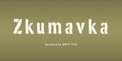
- Oxida OT by Sudtipos,
$79.00 The unmistakable hand of Angel Koziupa and the technical expertise of Alejandro Paul brings us once more the kind of calligraphy that reads softly yet commands attention. This time around, Angel's statement adds a slightly coarse and rusty aura to the usual elegance, which makes Oxida an indispensable typeface for use at large sizes, particularly in poster design, book covers and culinary packaging.
 - Oh,no by Vladislav Ivanov,
$15.00Oh,no - Oh, yes.. here is the new font "oh, no". The design of the letters is suitable both for implying the elegance of old times and the uniqueness of modern world. One of the greatest advantages of the font is that its style makes it good for expressing different ideas, so it can suit anything you could possibly use it for! - Cynapse OT by Positype,
$29.00 Several years ago I was faced with a project that required very small type to be used in a directory. In general, there was a need for a lot of 'fine print'. Faced with this, all of the tests I was making with existing faces were producing too much bleed of the individual glyphs...Cynapse was born. It evolved into this pseduo-techy looking type that standardized and glorified the ink trap (the small, tiny allowances of white space that reduces the amount of ink hitting the page, and in effect, reducing the appearance of bleed). The results was promising. The new OT version contains additional OpenType features that include expanded ligature sets, fractions, 5 sets of numerals as well as small caps and Central European diacritics.
 - Amorinda OT by Sudtipos,
$59.00 Amorinda is a connected script that manages to be wild and disciplined at the same time. It can scream wildly within a design or smoothly blend in to make it more human. With its versatile character and a complete set of alternates, Amorinda is the perfect display face for everything from product branding to signage. This 2007 version of Amorinda is now available in OpenType format to expand possibilities of use with lots of alternates when used with OpenType-aware applications such as Adobe Creative Suite.
 - NT Sjiq by Novo Typo,
$26.00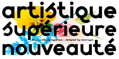
- Emporia OT by Bean & Morris,
$42.00 Emporia OT Roman and Italic, a classic, elegant font with upper and lower case, swash alternatives lining and old style figures, ligatures and small caps. Includes more than 500 glyphs supporting more than 80 latin-based languages. Suitable for both display and text settings it will enhance and preserve Roman history with sheer elegance, grace and style.
 - No Remorse by Vozzy,
$10.00 Introducing vintage label font named No Remorse. This font has a multilungual and cyrillic characters support (check out all available characters on previews). The font family has six styles: Regular, Inline, Shadow, Inline FX, Shadow FX and Aged. This font will look good on any vintage styled designs like a poster, T-shirt, label, logo, etc.
 - No Help by Jadatype,
$15.00 No Help is an all caps display font that comes with a scary-dark-black-halloween style. suitable for tshirt, branding, social media, and so on. contains standard English letters, numbers, punctuation, and several accents that support multilingualism.
 - NT Fest by Novo Typo,
$26.00 Fest is a highly detailed, ornamental unicase typeface for display use. Designed by Novo Typo - (typo)graphic designers from Amsterdam - The Netherlands. Fest is perfect for designing sophisticated logos, fashionable headings or other beautiful display typography. The glyph set of Fest contains a lot of extra elegant glyphs, swooshes and ligatures.
 - NT Plakaty by Novo Typo,
$26.00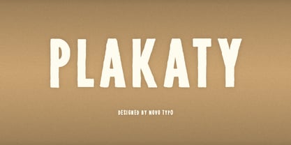
- FineArt OT by John Moore Type Foundry,
$10.00 FineArt OT is a casual typeface, created by brush, as an emulation of a conventional typography, however, comes with alternative FineArt Opentype OT for exploring other radical forms of expression. Thus FineArt offers 4 styles in a single font.
 - No Manners by Bráulio Amado,
$22.00 Out of step with the world. What was the inspiration for designing the font? Brasilian street art Pixacao. What are its main characteristics and features? strange M and N. Usage recommendations: headlines, caps, hate letters
 - Reverie OT by District,
$20.00 Reverie is a cheerful band of letters that bounce across the page and get together to create words in four weights. Generous spacing and a modest x-height project an airy typeface that's open but not frail. Quirky without being too whimsical. Use the regular weight for surprisingly readable text or put the light and heavy weights to use for decorative headlines and titles. Reverie OT is the follow-up to the popular Reverie. This version comes loaded with new features: ligatures, small caps, swash caps, a larger numeral set, more language glyphs, and a fourth, heavy weight. This all adds up to a vastly more functional and flexible family of fonts.
 - Areaman OT by AdultHumanMale,
$20.00 Areaman OT is a fun chunky ALL CAPS display font. I wanted it to look blocky and loud, So it can scream from Posters and Headlines. It has over 300 glyphs, several variations on the standard alphabet and all those extra pesky foreign features. It also has various letter pairing with extra ligatures and flourishes available through OpenType or your Glyphs palette. This upgraded version is now coded with OpenType features to create a randomised bespoke look and feel to your copy.
 - No Liming by chicken,
$17.00 A chunky, laid-back typeface inspired by a hand-painted notice on the doors of a mechanic's workshop in Plymouth, Tobago. Two different mostly-uppercase alphabets in one font help to keep things loose. 'Liming'? hanging out, drinking rum, shooting the breeze...


