10,000 search results
(0.074 seconds)
- Nomina by Tokotype,
$40.00 Nomina is a family of sans serif fonts for use from large to small sizes. The weights of the family itself contain 16 styles plus italic, ranging from ExtraLight to Black. The font family takes was inspired by classic Grotesk typefaces such as Venus and Akziden Grotesk. Unlike any other modern Grotesk typefaces, the details of the contrast in this font family are quite subtle and yet still harmonize while standing in between another character, the open apertures help them to increase the quirkiness accompanied by the sharp terminals on each rounded glyphs. The Nomina family is well equipped with lots of selective alternates and OpenType features, and the main usage of this font is universal, this means this can use it any design style as long as the look and feel keep match with its characteristics.
 - Sagarana by Eller Type,
$35.00 Sagarana is an elegant display typeface rooted in the style of romantic or didones letterforms; however, it is a sans serif with a cleaner appearance. The contrast and the vertical stress maintain the modern style, while the terminals, the finials, the proportions and the narrow look enhance its stylish personality. It could be suitable for editorial projects such as magazines, books or even for sophisticated environments, let’s say, fashion, department store, perfumes, cosmetics and so on. Sagarana was initially inspired by a Brazilian book cover from 50’s. The name itself combines the words “saga” (as in the English sense of “story”) and “rana,” a Tupi word (Indigenous language) that roughly means “showing similarities”.
 - KOGAMA by Twinletter,
$15.00 Introducing Kogama, our newest Japanese-style inspired font, which was created specifically to carry the Asian font concept and will make your project look beautiful and appealing. Start utilizing this typeface to make your project stand out and be well received. Logotypes, food banners, branding, brochure, posters, movie titles, book titles, quotes, and more may all benefit from this font. Of course, using this font in your various design projects will make them excellent and outstanding; many viewers are drawn to the striking and unusual graphic display. Start utilizing this typeface in your projects to make them stand out. Caps only fonts.
 - Alecko by Evolutionfonts,
$- Alecko is a distinctive didone-style typeface, which is strongly influenced by calligraphy, but is at the same time drawn with mathematical precision. Its advantages are summarized in its slogan: “One typeface, many possibilities”. Once you decide to use it, you can alter its look in a variety of ways: Should the contrast between the horizontal and vertical strokes of the glyphs be high or low? Is it appropriate to apply engraving to the letters (and what color?). Should the glyphs be connected to one another? Alecko is equipped with a lot of alternative characters, which are automatically inserted as you type, in order to achieve a “handwritten” look, however, it can also work without them. Each of these options is appropriate depending on the design context and we want to encourage you to explore every one of them, which is why we sell the whole family for a considerably smaller price, than the combined price of all weights. And If you don't feel like spending money at all, just download the free weight. Have fun.
 - Biro Script Plus by Ingo,
$50.00 An authentic script from the tip of the ball point pen. This hasn’t been seen yet: A typeface which truly looks as if it were handwritten. Calligraphy is, actually, the art of fine writing. And actually, written scripts as typeface for the computer are 100% nonsense. And yet, an obvious thought: Create a typeface which truly derives from everyday handwriting. And since we, if we write at all, utilize practically only a ball point pen anymore, then a modern cursive writing form must look like just that. As a counterpart to the artistic ”handwritings“ which have long been available as typeface, the thought of digitalizing a truly ”ugly“ handwriting is appealing. After all, time and again there is the need for a text to look ”handwritten“. Biró Script is written freehand with a ball point pen. Finally a truly individual script! Biró Script includes more than 300 authentic ligatures in addition to the customary alphabet. By the way, the most convincing effect is obtained with a font size of about 18 to 22 points, at which the thickness of the stroke is now about the same as that of a real ball point pen. There's a difference between the anglo-american forms of some characters (esp. the numerals 1 and 7, but also capitals I and F) and how it's written in the rest of the world. For those of us who aren’t used to the world-wide usual forms, Biró Script includes a US version with the appropriate characters.
 - Alpha One by Wiescher Design,
$18.00 »AlphaOne« is my newest addition to the experimental Alpha-font-collection. I just had to do this one! It is based on Paul Renners fonts, but has got nothing to do with them, I just took the widths and some basic forms. No – or hardly no – optical corrections were made to the glyphs. I wanted the pure geometric forms to come to life. This was a lot of fun to design, I especially like the »Q« with the negative tail. I did make four weights, but nothing is normal with this font, so weight doesn’t really mean anything. Have fun!
 - Englewood by Lipton Letter Design,
$19.00 Richard Lipton’s inspiration for Englewood came from the calligraphic hand of Philip Grushkin. Lipton has always admired his somewhat loose but disciplined hand and felt that it was worthy of keeping this style alive in a typeface that could be a somewhat accurate emulation of the warmth and life found in these letterforms. Spontaneity is a challenge to capture in a type treatment but with Englewood, Lipton hopes to honor Mr. Grushkin with a design that works especially well for an invitation, a menu, or in any display setting that calls for an informal calligraphic hand. This single weight display script includes small caps — somewhat of a rarity for a handwritten script — for flexible typesetting, along with 42 alternates that include 18 contextual ligatures to simulate the appearance of spontaneous writing.
 - Ving Smith by Stringlabs Creative Studio,
$25.00 Ving Smith is a Script Font with Handwritten Style. The Ving Smith font made with digital brush pen strokes that making this font look authentic. This font is perfect for fashion brand, wedding invitation, business card, logo brand, signature, and then calligraphy.
 - Shiny Aisyah by Stringlabs Creative Studio,
$25.00 Shiny Aisyah is a Script Font with Handwritten Style. The Shiny Aisyah font made with digital brush pen strokes that making this font look authentic. This font is perfect for fashion brand, wedding invitation, business card, logo brand, signature, and then calligraphy.
 - Hysteria by Stringlabs Creative Studio,
$25.00 Hysteria is a Script Font with Stylish Textured Brush Style. The Hysteria font made with digital brush pen strokes that making this font look authentic. This font is perfect for fashion brand, wedding invitation, business card, logo brand, signature, and then calligraphy.
 - Santy Ehisa by Stringlabs Creative Studio,
$25.00 Santy Ehisa is a Stylish Script Font with Handwritten Style. The Santy Ehisa font made with digital brush pen strokes that making this font look authentic. This font is perfect for fashion brand, wedding invitation, business card, logo brand, signature, and then calligraphy.
 - Pejuang Cinta by Stringlabs Creative Studio,
$25.00 Pejuang Cinta is a Script Font with Handwritten Style. The Pejuang Cinta font made with digital brush pen strokes that making this font look authentic. This font is perfect for fashion brand, wedding invitation, business card, logo brand, signature, and then calligraphy.
 - Funky Yard by Prioritype,
$19.00 Funky Yard - SVG Groovy Font + Extras. Presenting this latest hand drawn font. Funky Yard is a groovy display font with 2 styles, namely: Solid and Brush. There is an additional hand-drawn in the font file to further vary your design. Great for merchandise design, posters, branding, covers etc. *Note: To access extras, just type: underscore + underscore + numeral (1-15). Standard ligatures activated. Features: Uppercase, Lowercase, Numeral, Punctuation, Multilingual & Ligatures. Multilingual contained: Afrikaans, Albanian, Asu, Basque, Bemba, Bena, Breton, Catalan, Chiga, Cornish, Danish, Dutch, English, Estonian, Filipino, Finnish, French, Friulian, Galician, German, Gusii, Indonesian, Irish, Italian, Kabuverdianu, Kalenjin, Kinyarwanda, Luo, Luxembourgish, Luyia, Machame, Makhuwa-Meetto, Makonde, Malagasy, Manx, Morisyen, North Ndebele, Norwegian Bokmål, Norwegian Nynorsk, Nyankole, Oromo, Portuguese, Quechua, Romansh, Rombo, Rundi, Rwa, Samburu, Sango, Sangu, Scottish Gaelic, Sena, Shambala, Shona, Soga, Somali, Spanish, Swahili, Swedish, Swiss German, Taita, Teso, Uzbek (Latin), Volapük, Vunjo, Zulu. Thanks :)
 - Spring Heart by Yoga Letter,
$14.00 This font is called "Spring Heart" which combines spring and a cozy heart. This font is a very beautiful, unique, and very easy to use calligraphy font. The embellishments on the letters are very easy to use, and besides that, there are instructions on how to use them as well. This font is perfect for spring, wedding, mother day, father day, patrick day, easter, earth day, and other projects.
 - Macklin by Monotype,
$50.99 Designed by Malou Verlomme of the Monotype Studio, Macklin is a superfamily, which brings together several attention-grabbing styles. Macklin is an elegant, high contrast typeface that demands its own attention and has been designed purposely to enable brands to appeal more emotionally to modern consumers. Macklin comprises four sub-families —Sans, Slab, Text and Display— as well as a variable. The full superfamily includes 54 fonts with 9 weights ranging from hairline to black. The concept for Macklin began with research on historical material from Britain and Europe in the beginning of the 19th century, specifically the work of Vincent Figgins. This was a period of intense social change--the beginning of the industrial revolution. A time when manufacturers and advertisers were suddenly replacing traditional handwriting or calligraphy models and demanding bold, attention-grabbing typography. Typographers experimented with innovative new styles, like fat faces and Italians, and developed many styles that brands and designers continue to use today, such as slabs, serifs, and sans serifs. Verlomme pays respect to Figgins’s work with Macklin, but pushes the family to a more contemporary place. Each sub family has been designed from the same skeleton, giving designers a broad palette for visual representation and the ability to create with contrast without worrying about awkward pairings. With Macklin, Verlomme shows us it’s possible to create a superfamily that allows for complete visual expression without compromising fluidity. Macklin™ font field guide including best practices, font pairings and alternatives. Featured in: Best Fonts for Websites
 - Nagel by ParaType,
$40.00 Nagel is a contemporary uniwidth display sans serif for headlines and short texts. It’s a closed low-contrast typeface with an emphasis on stroke joints. The length of the line set in Nagel remains the same in all weights. Nagel has all the advantages of monospaced typeface graphics, but none of their functional disadvantages. Characters in Nagel are made monospace-like wide, as opposed to traditionally narrow characters of proportional fonts, and often have slab serifs. Letters of monospaced fonts that have to be narrowed down considerably, have the usual width here. The scope of Nagel is branding and identity of IT companies, infographics, scientific and technical documentation — any areas where a technical, modern typeface with distinctive graphics may be required. The typeface includes three upright styles — Regular, Medium, Bold; two sets of 11 and 18 slanting degrees and a variable version with two axes: Weight and Slant. The character set includes extended Cyrillic and Latin alphabets, arrows, triangular bullets, index numbers and fractions. Designed by Alexander Lubovenko.
 - Pinguino by Sudtipos,
$49.00 Angel Koziupa's familiar brush goes upright and narrow with Pinguino. Koziupa's approach to condensed brush fonts makes use of the same elements that have always distinguished his calligraphy from any other. With Pinguino, however, we see him softening his corners and adding a distinctly feminine touch to his exotic brush. Pinguino would feel at home on sobering coffee packaging just as it would on a bouncy mixed-fruit juice bottle. Try Pinguino for your next packaging project, and tell your client an Angel told you to use it.
 - Banquet SCF by Scholtz Fonts,
$21.00Banquet SCF is a rough-and-ready brush font with a "warts and all" appearance. Is has a simple, unsophisticated "believable" look. Use it when you want to make your message more honest, more homespun and more real. Use it in menus, invitations and advertisements. When I created it, I was designing a simple brush-written invitation to a medieval banquet. Hence the name: "Banquet". It has a full character set with all upper and lower case, special and accented characters. All characters have been letterspaced and kerned. - Cattus by Craft Supply Co,
$15.00 Cattus is a handwritten script font based on the expression of real handwriting. Cattus will work perfectly for fashion, e-commerce brands, trend blogs, wedding boutiques or any business that wants to appear upscale and chic. Cattus is also suitable for logos, greeting cards, quotes, posters, branding, name cards, stationary, design titles, blog headers, art quotes, typography, art, modern envelope lettering or book design, happening style like hand-drawn design or watercolor design themes, craft design, any DIY project, book titles, or any purpose to make your art/design project look pretty and trendy.
 - Bluehonest by Allouse Studio,
$16.00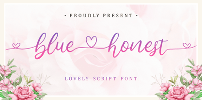 Lovely Script Font. Bluehonest come with many stylistic-alternates to fulfill your need. Lovely Alternates Uppercase, Regular and Lovely Beginning and Ending Swash, Big Love ending swash to pairing initials/name/anything, Multi-Lingual Support. We highly recommend using a program that supports OpenType features and Glyphs panels like many of Adobe apps and Corel Draw, so you can see and access all Glyph variations. Bluehonest is perfect for any tittles, logo, product packaging, branding project, megazine, social media, wedding, or just used to express words above the background.
 - Corso by Dominik Krotscheck,
$7.99 Corso is a clean condensed sans serif font family. It comes in upright, slanted and italic, in six weights each. It includes useful typographic features such as fractions, ligatures and case sensitive forms. Also included are double- or single-storey versions of a and g, you can switch via stylistic OpenType sets. Other letters with alternative forms accessible the same way are ß and ampersand. Corso works especially great for larger size uses such as signage, headlines or posters. But that doesn’t mean that it isn’t also useable for short texts.
 - Thankmom by Stefani Letter,
$12.00 Thankmom is a stylish font that incredibly exudes elegance and class. Incredibly versatile, this font fits a wide pool of designs, elevating them to the highest levels. Thankmom comes with alternate, titling, swashes, and ligatures for fully customizable designs. This font is PUA encoded which means you can access all of the glyphs and swashes with ease!
 - Hodgepodge by Outside the Line,
$19.00 Hodgepodge is a confused mixture of letters that somehow work together. While I know this has been done before I create fonts that I need. And I occasionally have found a need for this. And it was not there, so now it is. There is a mixture of light and dark, bold and regular, caps and lower case but not where you would expect them to be. Since this is a headline font you can set the headline and then easily go back and change a letter here or there to get the best-looking combination. Hodgepodge was in the 2011 Typodarium Page-A-Day Calendar on 7-17-2011.
 - Zamenhof by CastleType,
$59.00 Zamenhof is a family of five fonts that can be used singly or in combination to create a variety of bold, yet elegant, display styles. Inspired by Russian hand-lettering that appears to have been based on Jakob Erbar’s Phosphor, Zamenhof is essentially a Latin interpretation (with Cyrillic and Greek) of a Cyrillic interpretation of a Latin type design, with many changes along the way. (For example, all the Latin-only letters are quite different between the two designs: D, F, G, J, K, N, Q, R, S, U, V, W, Y, Z.) The Inline and Inverse styles of Zamenhof are the basic fonts and can be used effectively on their own. The Plain and Outline fonts — which I recommend using only in combination with the main designs — were created specifically to be combined with Inline and Inverse, as underlay and overlay layers, respectively. (You will need an application that supports layers, such as Adobe InDesign or Photoshop.) Zamenhof supports most European languages as well as modern Greek, and of course, Russian and other languages that use the Cyrillic alphabet. Needless to say, as Zamenhof is named after the father of Esperanto, it also supports Esperanto (as do all fonts from CastleType).
 - Mandrel Didone by insigne,
$24.00 A new family has sprung from the world of insigne. Mandrel Didone is his name. The face is well-liked by those with whom it seeks an audience because of its courtly demeanor and exquisite look. Mandrel Didone conducts itself beautifully in front of each set of eyes with a confident attitude, never wavering or tripping in its polished step. But, despite it’s gentility, this exquisite family is not weak in the face of adversity. Mandrel Didone is a powerful and conspicuous typeface that has towering x-heights, great contrast, confident bends, and sharp serifs. It is well-crafted for high-impact resistance. It uses its sharp serif ends deftly, cutting through opponents' clumsy clutter in the battle for the reader's attention. This noble family consists of nine weights and their matching italics, ranging from Thin to Black. Mandrel Didone also comes with a plethora of OpenType options to let you embellish your text. The family's 500 glyphs and support for more than 70 languages are accompanied with ligatures, old-style figures, and stylistic sets. Raise your glass in honor of the new Mandrel Didone! This champion, with its powerful serifs and great contrast, is ready to take on your challenge in many tests to come.
 - Memorial by Solotype,
$19.95The Fredrick Ullmer Co. in London acted as agent for many typefoundries, and this was one of their offerings. Some of the letters were rather outlandish, so we fearlessly decided to improve them. The result is this dated but pleasant font. The original didn't have a lowercase, so we added it. - Black Friday by Girinesia,
$11.00 Hello guys… We proud presenting our new font. It’s name Black Friday Font . It’s a ‘crunchy’ comical sans serif, inspired by pop art style comic font. This special creative font is a fun that can be used for comics, manga, anime or any other design project. Good choice for project purpose, for creating logo, packaging, posters, headers, wall arts, cafe banner, t-shirt design, advertisements, kids stuff, social media posts and much more! Features: All Uppercase Numerals & Punctuations Multilanguage Works on PC & Mac Fonts include Multilingual Support for; Afrikaans, Albanian, Catalan, Danish, Dutch, English, Icelandic, Italian, Spanish, Portuguese, German, Swedish, Norweigen, Polish, Indonesian, ZuluInclude
 - Intelo by Kastelov,
$25.00 Intelo was created with the single idea of redefining what makes a functional grotesque typeface nowadays. Its large x-height and letterforms with subtle elliptical finish create a distinctive look that can help brands cater to an increasingly design savvy audience. To top it off, Intelo comes in two versions - an attention-grabbing original cut and an additional version with flat endings for a more streamlined effect. The family weights range from thin to extrabold with matching italics making it a versatile choice and perfectly suited for digital applications including web and interaction design as well as printed media such as editorial and corporate materials. When it comes to Opentype features, Intelo is loaded with stylistic alternates, tabular figures, fractions, ligatures, and more. In addition, the font family has an extended language support featuring Western, Eastern and Central European languages. To sum it up, the friendly and inviting letterforms of Intelo came as a solution to the need for more human fonts in our technology-oriented environment.
 - Monticello by Linotype,
$40.99 Linotype Monticello was designed by C.H. Griffith in 1946. Its design is based on James Ronaldsons Roman No.1 and Oxford Typefaces from American Type Founders and was revised by Matthew Carter while he was working at Linotype between 1965 -1981.
 - Sound Board by Jesse Tilley,
$19.95 I felt an urge to create a font that used the bars seen in an equalizer; Sound Board is that font. If you're going to use it, you will need to put the size up much more then a normal font, this font is very skinny and tall.
 - Scirocco by Wiescher Design,
$39.50 Scirocco is a hot and humid wind that blows from the Sahara over to France and Italy. It crosses the mediterranean sea and carries lots of fine desert dust with it. Once it hits the coast of Provençe one can feel it grinding ones teeth and see it as fine dust covering every car. It makes people go nuts! Scirocco, the typeface has that same hot moving character and the finer hairlines giving it a kind of Arabic touch. If you use it too much, it will make you go nuts. Your pretty crazy Gert Wiescher
 - Maggot by Malgorzata Bartosik,
$10.00 Maggot is crazy geometric display typeface. First 36 characters were designed during #36daysoftype 2021. Each letter of the typeface fits into a square composed of 49 modules. Maggot contains 112 letters - Basic Latin, Western, Central and South Eastern European diacritics. Each character that contains a mark has two versions: regular, where the mark is above or below the height of the character and alternate, where character with mark is the same height as characters without marks. Maggot is a display typeface, it works best as short inscriptions, for example on vinyl and book covers, posters, T-shirts, packaging.
 - Bookkeeper JNL by Jeff Levine,
$29.00 Bookkeeper JNL is based on the lighter weight version of R. Hunter Middleton's 'Karnak', produced in 1936 for Ludlow. "Karnak" itself was based on the geometric slab-serif "Memphis", designed in 1929 by Dr. Rudolf Wolf and released originally by the Stempel Type Foundry of Germany. According to Wikipedia, "Karnak" "was named after the Karnak Temple Complex in Egypt, in reference to the fact that early slab serifs were often called "Egyptians" as an exoticism by nineteenth-century type founders." Available in both regular and oblique versions, Bookkeeper JNL serves well as both a headline and text type face.
 - Tabulamore Script by Tabular Type Foundry,
$25.00 Tabulamore is a monospaced script typeface with two goals: to make a script face that looks as natural as possible within the limitation of monospace, and to offer better all-cap solution where many script typefaces fail to address. The typeface style is generally a loosely spaced casual script, whose spacing allows big letters like M W m to fit comfortably. The automatic small cap part is based on so-called Architect�s Casual style, and shows up automatically depending on the context. As the name suggests, it is perfect for someone who likes to express their love in monospace format.
 - Mayfair by Canada Type,
$24.95The long awaited and much requested revival of Robert Hunter Middleton's very popular classic is finally here. Mayfair Cursive was an instant hit for Middleton in 1932, and it went on being used widely until late into the 1970s, in spite of it never having crossed over to film type technology. Like a few of its contemporary designs, most notably the work of Lucien Bernhard, Mayfair is a formal script that is somewhat based on traditional italic forms with swash uppercase, but also employs subsidiary hairline strokes in some of its lowercase as an emphasis to the script's cursive traits. Why these gorgeous letters never made the leap into photo typesetting is a mystery to us. But here they are now in digital form, almost three quarters of a century since they first saw the light in metal. Mayfair was redrawn from original 48 pt specimen. It also underwent a major expansion of character set. Plenty of swash characters and ligatures were added. An alternate set of lowercase was also made, in order to give the user a choice between connected and disconnected variations of the same elegant script. Mayfair ships in all popular font formats. While the Postscript Type 1 and True Type versions come in two fonts (Mayfair and Mayfair Alt), the OpenType version is a single font containing all the extra characters in conveniently programmed features that are easily accessible by OpenType-supporting software applications. We are quite sure today's graphic designers will be appreciative of having access to the face that all but defined menus, romance covers, wine and liquor labels and chocolate boxes for almost two 20th century generations. - Big Chuck by Proportional Lime,
$1.99 Charlemagne, one of the great rulers of the Middle Ages, was instrumental in the reestablishment of formal education in the West. This font was inspired by the notion that he felt the need to protect his communications from people with the ability to read; a rare skill then. Did he really command such a script to exist? He did instigate the development Carolingian minuscule script. Here are two different systems that are both attributed to him. Does it provide any real security? No, but it is fun to think about how such a system might have been used.
 - Conversation Hearts by Harald Geisler,
$- Conversation Hearts are inspired by the sweethearts and conversation hearts that can be found all over the US and Britain, but not in Germany. A source of endless fun and surprise. As a typographer to me they are also a surprising document of written communication. Most people complain that nowadays the inscriptions are not as sweet as they used to be. While they used to held romantic and promising inscriptions like “Be True” “Sweet Talk”, today they carry “Tweet me” “Ur Hot” and “Party Girl”. So i took this as a motivation to work with conversation sweetheart on a conceptial inspirational and typographical level. The obvious: every letter pressed on the keyboard brings out a conversation heart that starts with the letter - i.e. L = Loverboy, H = Heartless but what to write? Since i didn't want to reproduce the old “Fax me” and “Email me” I had to come up with something new. Something with a personal relation and of course something that I Love - what else could i write in the shape of the heart? So I tried to access my upper subconsciousness and looked for two words for every letter in the alphabet. One for the capital letter pressed and one word for the lowercase letter. Resulting in a Kurt Schwitters worthy assemblage of vocables "Post-office" “Internship” “Zebra” “Answers” etc. It is not easy to read a text set in Conversation Hearts but easier as a text set in Zapf-Dingbats. To sparkle the visual appearance uppercase letters are filled hearts with “carved” inscription, while lowercase letters are an outlined heart with written inscription. Conversations Hearts is a part of the Light Hearted Font Collection that is inspired by a recording of Jean Baudrillard with the title, "Die Macht der Verführung" (The Power of Seduction) from 2006. Further inspiration came from the article, "The shape of the heart: I'm all yours". The heart represents sacred and secular love: a bloodless sacrifice. by British writer Louisa Young printed in EYE magazine (#43) London, 2002.
 - Kreis by Kateryna Korolevtseva,
$19.00 KREIS is a modular typeface created by Ukrainian designer Kateryna Korolevtseva. KREIS has a modern sharp character inspired by the shape of an old-school CD disk. It consists of three simple modules with the roots in square and circle shapes. Letterforms create a geometric typographic pattern, but at the same time, it remains readable. KREIS works best in headings, logos, and strong messages. If you want to look strong — use KREIS. If you want to protest — use KREIS. If you want to be heard — use KREIS.
 - Narevik by ParaType,
$30.00 Narevik consists of 7 styles -- 4 uprights (including black) and 3 italics. It’s a type of dynamic low contrast design with slightly rounded triangle serifs and drops which conveys to it a certain peculiarity. The vertical strokes have gentle intasis that brings additional softness to the shapes. The family was created by Armenian designer Manvel Shmavonyan and got its name after his daughters Nare and Arevik. It can be used in text composition as well as in display matters. Released by ParaType in 2011.
 - Zulia Pro by Sudtipos,
$59.00 Zulia is located in the west of Venezuela and it is the state in where Joluvian grew up. It is a region of sunshine, high temperatures, oil and cheerful people, although we choose the name to honor his mother who is from there (zuliana) and who is proud of her land and everything that it represents the area. Zulia is also his first typographic project. It is based on two of his favourite calligraphic styles: italic and brush pen. He started with simple and contrasted strokes on paper with brush and marker. After that he developed the full alphabet and its various options for each letter, starting from a set of handmade forms that could be connected in different ways according to the user needs. What motivates him to involve this style was to create a differentiation with his daily work by generating a heavier type, contrasted and low rise. Zulia finally got life of its own with the participation of Alejandro Paul and a feedback of techniques and skills that were generated with the duo work. Zulia is not just a typeface, Zulia is his love of letters.