10,000 search results
(0.077 seconds)
- Tuesday Jingle by Attype Studio,
$13.00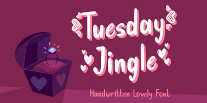 Tuesday Jingle is an exquisite font for Valentine theme design, with dingbats heart on character "{}[]" Fall in love with it and bring your projects to the highest levels! Tuesday Jingle is perfect for branding, logo, invitation, stationery, social media post, product packaging, merchandise, blog design, game titles, cute style design, Book/Cover Title and more. What's Included : - Tuesday Jingle.otf - Heart dingbats on character "{}[]" - Multilingual Support --- Hope you enjoy with our font! Attype Studio
 - Pixel Promise by PizzaDude.dk,
$18.00 Pixel Promise is my wannabe pixel font. Yes, it is not a pixel font…but it is handmade and the “pixels” are deliberately off here and there. Nevertheless, when typing with Pixel Promise, you get that retro gaming feeling, and before you know it, you feel like you just want to insert another coin, press 1 or 2 players and complete that level! :) I have added 5 different versions of each letter and multilingual support
 - Mohair Sam NF by Nick's Fonts,
$10.00A collision between some stylin' caps from legendary lettering artist Samuel Welo and a lowercase loosely based on ATF’s Romany Script yields this curious little wonder. Named after a 70s song which averred that all it took to be “the coolest guy what is what am” is to talk fast, walk slow and look good wearing that 'hair. Please note that, due to the exaggerated overhang of the many of the uppercase characters, this font has been optimized for upper- and lowercase uses. Both versions of this font contain the Unicode 1252 (Latin) and Unicode 1250 (Central European) character sets, with localization for Romanian and Moldovan. - TG Aqsa Grotesque Pro by Tegami Type,
$30.00 TG Aqsa Grotesque Pro is the latest version of the font that was previously released in 2017, TG Aqsa Grotesque. In this latest version there are several optical fixes on each glyphs. In this latest version also added 2 new weights namely black and ultra black so that TG Aqsa Grotesque Pro has 6 fonts of different weights. Still maintaining the sans serif grotesque style coupled with the improvement of the letter form make TG Aqsa Grotesque Pro have a good level of readability when applied as a body text. And this version also has extended latin which will support more than 90+ different languages.
 - Tropical Punch by Missy Meyer,
$12.00 I am shocked to my very core that the name "Tropical Punch" hasn't been used for a font yet. What a delight, that my very first name choice is available, and I can grow my collection of fonts named after delicious food and drink! Tropical Punch is a retro-tropical font with a ton of variety: I've included nearly 200 multi-letter ligatures with nesting letters, to add quirky and fun variety to all of your projects. There are also a few alternate vowels, plus a few dingbats to add jazzy pizzazz; and 10 smaller catchwords like THE, AND, WITH, and more! I've also made an outline version--Tropical Punch Outline--which surrounds the solid letters beautifully, so you have even more options! Of course, both versions have my usual 300+ extended Latin characters for language support. And I've included a set of uppercase Greek letters as well! And everything, as always, is fully PUA-encoded so all characters are easy to access.
 - Zapanese by Nocturnal Workspace,
$15.00 The first version of the Zapanese font has been published since 2019 under the name Zapan Script, and can be downloaded for free on the dafont website. At first this font was just a learning project from the 3rd type font and because we saw the enthusiasm of the downloaders, we developed it into a duo font with extra japanese elements. 2 versions Support Glyphs Basic Hiragana & Basic Katakana PUA Encode Characters, fully accessible without additional design software. Includes a range of multilingual characters. Zapanese is suitable typeface for various purposes like logotype, signage, label, poster, dropcap, titles, letterhead, book cover and etc. Thank you!
 - Sylfaen by Microsoft Corporation,
$49.00Sylfaen was designed for Microsoft in 1998 by John Hudson and W. Ross Mills of Tiro Typeworks, and Geraldine Wade of Monotype Typography. Sylfaen is a Welsh word meaning foundation"; an apt name since the font stemmed from research into the typographic requirements of many different scripts and languages. This version of Sylfaen supports the WGL4.0 character set, for Pan-European language coverage. In addition to Latin, Greek and Cyrillic letterforms, the font contains the characters necessary for support of the Armenian and Georgian languages. Font Designer: John Hudson, W. Ross Mills, Geraldine Wade. The Sylfaen font contains 729 glyphs including Latin 1, WGL Pan-European, Armenian and Georgian." - Toverheks by Hanoded,
$15.00 A Toverheks in Dutch means 'witch' - well, actually it means 'magic witch' (it doesn't translate well). The reason for this kind of weird name is the nature of the font: it reminded me of a book of spells - the kind witches use. Toverheks is a didone-ish style font with some jagged edges and curly curls. It would be ideal for books (about witches, say) or posters or even postcards! Toverheks will leave you spellbound and bewitched. Comes with a kettle full of diacritics.
 - Sobek by Thinkdust,
$10.00 Sobek, the Egyptian crocodile god, comes to life in this font as a striking and impressive set of characters. Somewhat alien and dangerous, Sobek uses sharp corners, excessive lines and geometrically circular curves to create a font that looks both organic and crafted at the same time. Use Sobek when you want your words to stand out from the crowd, and convey the feeling of something Other. Sobek even has support for numerous languages, so you can create interesting forms in many different dialects.
 - Loppemarked by PizzaDude.dk,
$17.00 Loppemarked is Flea market in danish, and that’s where I got the inspiration to do these fonts from! Headline - chunky serifs here and there, and some are missing! No attempt to get it right…anywhere! Text - The letters are scribbled quickly, leaving not much attention to accuracy. Sans - With this font, there has been some effort to hit the same width of strokes, but it is still off here and there. All in all, the sweet innocence in these letters…I love it! <3</p>
 - Linotype Typo American by Linotype,
$29.99Mark Stanczyk designed Linotype Typo American in 1999. The font is an excellent revival of American style typewriter type. As most of us can remember from our childhood years, or through old stories and movies, everyone used to type with typewriters before the invention of computers. Unlike computers, most individual typewriters only had one typestyle, or font, to chose from. To make matters worse, the letters in a typewriter font would wear down with use. Over time, text typed out on a typewriter would look more and more corroded, old, and uneven. Stanczyk has captured exactly these features in this “revival” font! Also like most older typewriter styles, Linotype Typo American’s letters are all mono-spaced, i.e., the letter i is the same width as the letter w. Typewriter letters also all tended to be cast in the same size, around 12 points or so. When using typewriter-style fonts, it is best to keep setting your text in similar sizes. (Of course, you can set really large and fun headlines with Linotype Typo American, too; if anything the unevenness of the design will come even more across in these applications.) - Bill of Fare JNL by Jeff Levine,
$29.00 A 1942 menu cover for the restaurant at the Biltmore Hotel in Los Angeles features its name in a stylized Art Deco serif design. This is has been turned into the digital typeface Bill of Fare JNL, and is available in both regular and oblique versions.
 - English Monarchs by Celebrity Fontz,
$24.99 English Monarchs is a unique font collection with accurate digital replicas of 84 signatures of English and British monarchs from Richard II through Elizabeth II, including many of the royal consorts. Also included in this font are the Stuart pretenders and Mary Queen of Scots and her consort. A must-have for autograph collectors, desktop publishers, history buffs, fans, or anyone who has ever dreamed of sending a letter, card, or e-mail "signed" as if by one of these famous nobles. This font behaves exactly like any other font. Each signature is mapped to a regular character on your keyboard. Open any Windows application, select the installed font, and type a letter, and the signature will appear at that point on the page. Painstaking craftsmanship and an incredible collection of hard-to-find signatures go into this one-of-a-kind font. Comes with a character map. This font includes signatures from the following noble figures: Richard II, Henry IV, Henry V, Henry VI, Margaret of Anjou, Edward IV, Elizabeth Woodville, Edward V, Richard III, Henry VII, Elizabeth of York, Henry VIII, Catherine of Aragon, Anne Boleyn, Jane Seymour, Anne of Cleves, Catherine Howard, Catherine Parr, Edward VI, Lady Jane Grey, Mary I Tudor, Elizabeth I, James I, Charles I, Henrietta Maria of France, Oliver Cromwell, Richard Cromwell, Charles II, Catherine of Braganza, James II, William III, Mary II, Anne, Prince George of Denmark, George I, George II, George III, George IV, William IV, Victoria, Prince Albert, Edward VII, George V, Edward VIII, Wallis Warfield Simpson, George VI, Elizabeth II, Prince Philip, Prince Charles, Princess Diana, Camilla Duchess of Cornwall, Prince James Edward Stuart, Prince Charles Edward Stuart, Mary Queen of Scots, Henry Stuart Darnley, Francis II of France.
 - Sumatra by Trim Studio,
$15.00 Introducing **Sumatra Font** - **The Beauty Handwritten Script** **Sumatra** is create using digital pen art, we also try a couple of letter to mix and match it, we try to make it flow as smooth as possible and express the rapid handwriting type we can use this for for branding name, signature, wedding designs, social media post, advertisements, and more projects that express beauties and luxurious ---
 - Showbiz by Studio K,
$45.00 An all singing, all dancing performer, Showbiz is the perfect font for those who want to sprinkle a little stardust on their typography and give a sense of occasion to their special announcements. It's an in-line version of Studio K's Red Top, Export Drive and Soft Rock, with which it shares the same basic outline and metrics. Mix and match them to stunning effect!
 - Woodrow by Chank,
$49.00If Mister Frisky is a bit too kooky for your project, try Woodrow. The big floppy serifs and hand-drawn strokes give this font very "Chanky" characteristics. Woodrow is bold, bouncy, fun and legible like Mister Frisky, but it is also a little more traditional and structured. Chank created Woodrow in 1997. It was named in honor of The Chank Company's first office assistant, Scott "Woodrow" Macdonald. - Lisboa Tamil by Vanarchiv,
$85.00 Lisboa Tamil is a humanist sans-serif typeface based on the same design as the original Latin version (2005). Originally designed for small sizes, this font family can work as display typeface where there own calligraphic style gives elegant low contrast personality between organic and solid design approach. Tamil is an Indic script, spoken in southern India, Sri Lanka and Singapore. Latin transliteration characters were also included.
 - Poppin by Kustomtype,
$20.00 Poppin is a playful font-type that you can comfortably use in all kinds of styles, from modern to old school. A combination of a few names on an old movie poster is what triggered the creation of this font type. Because it had such a strong rock and roll character, I decided to dedicate a font-type to it. The Poppin font is completely hand-drawn and then digitized. It results in being an extremely user-friendly, complete and modern font that you can use in all your graphic applications. Poppin is a font from the subculture that has been updated to a hip and classy font, ideal for eye-catching designs. Poppin comes in 4 styles, regular, bold , round & bold round. Poppin makes everyone smile!
 - Alda by Emigre,
$59.00 The original idea for Alda came from exploring an alternative approach to generating different typeface weights by adapting the characteristics of physical objects. I was interested to find out how far this could be pushed before the letters became a parody of what they referenced. Initially I took this treatment very literally, with the boldest weight expressing the tension of bent steel, and the lightest being as spineless as a rubber band. This allowed me to infuse each weight with unique characteristics, where the bold is robust and angular, and the light is delicate and soft.
 - Farmer's Market PW by Patty Whack Fonts,
$24.00Farmer's Market PW is suitable for display use for titles, as well as paragraphs of text. This font contains tons of characters. Uppercase, lowercase, numerals, foreign characters, fractions, lots of alternates and ligatures as well as punctuation. Farmer's Market PW is available in OpenType and TrueType format which are both included in the same package. - ITC Kabel by ITC,
$40.99 The first cuts of Kabel appeared in 1927, released by the German foundry Gebr. Klingspor. Like many of the typefaces that Rudolf Koch designed for printing use, Kabel is a carefully constructed and drawn. The basic forms were influenced by the Ancient Roman stone-carved letters, which consisted of just a few pure and clear geometric forms, such as circles, squares, and triangles. Koch also infused Kabel with some elements of Art Deco, making it appear quite different from other geometric modernist typefaces from the 1920s, like Futura. Linotype has two versions of Kabel in its library. Kabel has a shorter x-height, with longer ascenders and descenders, making it a bit truer to Koch's original design than the second version, ITC Kabel, which was designed by Victor Caruso. This version, also known in the United States as Cable, has a larger x-height, shorter ascenders and descenders, more weights ,and a diamond shaped i-dot. Typefaces in the same oeuvre include Avenir Next, ITC Avant Garde Gothic, Metrolite, Metromedium, Metroblack, and Erbar, just to name just a few."
 - Ellyshabeth by DLetters Studio,
$13.00 Ellyshabeth Signature Script Font is perfect for Logo, Signature, Social Media Posts, Advertisements, Magazine, Product Packaging, Label, Sticker, Photography, invitation, Business Cards, and any projects that need handwriting taste. Each basic character (“A”) is followed by Unicode variants of the same character (Á, Ä…), then OpenType variants (small caps, alternates, ligatures, Swash…). This way you can see all the variations on a single character in one place. Thanks for your support, please kindly send us a message for any question about our product. Hope you like it.
 - Arupala Grotesk by Jetsmax Studio,
$15.00 Arupala Grotesk is a Grotesk font this versatile typeface will grab readers’ Attention. This font was inspired by a character named H. Aroepala. This font is suitable for both formal and informal events and is also suitable for various types of print and digital media.
 - Diablo by Monotype,
$29.99Jim Parkinson's Diablo typeface is a single weight display design. The look comes from samples found in early 20th century books on hand-lettering books, as well as general poster lettering styles from that same of the period. Diablo has a touch of the Arts and Crafts" movement in its appearance, and it also looks rather heavy. It is a unicase design, in that there is no real "lowercase." Some glyphs on the uppercase keys are alternates to the capital-style forms found on the lowercase keyboard, like A, E, F, H, J, K, M, N, Q, R, V, W, and Z. In fact, the uppercase itself is a bit more decorated and round than the lowercase. Nevertheless, the upper and lowercase letters may be freely interchanged with each other to create the best possible image for the text. The name of the typeface, Diablo, is another term for the devil, or Satan." - Dorniela by Gholib Tammami,
$15.00 Introducing Dorniela, a charming and delightful font that brings a whimsical touch to your creative projects. With a name that evokes the magic of fairy tales and the essence of all things cute, Dorniela is your ticket to a world of adorable design possibilities.
 - Homage Script by GarageFonts,
$49.00 Graceful, elegant, and at times eccentric, Homage Script was inspired by James Hellmuth’s hand-lettered design for the cover of “Homage to the Alphabet” — a gigantic tome produced in 1980 to provide full-showings of photolettering fonts available for traditional typesetting at Phil’s Photo.
 - Orange Baroon by Attype Studio,
$14.00 Orange Baroon - Inspired by typeface on 70s era, Orange Baroon has the vintage font & retro with stencil look. with 2 font style, It's super easy to use stencil effect with Orange Baroon family font. Two style Font: Regular & Display Orange Baroon is perfect for vintage & retro style product, branding, logo, invitation, stationery, product packaging, merchandise, monogram, blog design, game titles, cute style design, Book/Cover Title and more. Features : - Orange Baroon Family Font - Ligatures - Multilingual Support --- Hope you enjoy with our font! Attype Studio
 - Black Thone by Attype Studio,
$12.00 Introducing Black Thone - Inspired by typeface on 70s era, Black Thone has the vintage font & retro font style. with 3 font style, It's super easy to use 3D effect wint Black Thone family font. Three style Font: Regular, Display & Extruded Black Thone is perfect for children product, branding, logo, invitation, stationery, product packaging, merchandise, monogram, blog design, game titles, cute style design, Book/Cover Title and more. Features : - Black Thone.otf - Black Thone Extruded.otf - Black Thone Display.otf - Multilingual Support --- Hope you enjoy with our font! Attype Studio
 - Playful JNL by Jeff Levine,
$29.00 Playful JNL takes its name from the obviously playful lettering found on the title of a piece of 1940s sheet music.
 - Hardwired by FadeLine Studio,
$20.00 Hardwired a new handmade script with a style elegant, sweet and simple. Made with great care to provide the natural and modern elements. This font has many advantages although it looks ordinary. The great thing about this font is you can find some style when you use it, examples such as natural handwriting style, unique, simple, elegant and bold. With a style like this, this font will be suitable in use for logo's, branding projects, homeware designs, product packaging, mugs, quotes, posters, shopping bags, logo's, t-shirts, book covers, name card, invitation cards, greeting cards, and all your other lovely projects.
 - Kryptonite by Elemeno,
$10.00Designed to be the ultimate grunge font, Kryptonite and Kryptonite Bizarro are nearly illegible at small sizes, but can't be touched at large sizes. The Kryptonite family has a limited character set and is named for the element capable of killing Superman (with all due respect). Not for the faint of heart. - Lakone by Locomotype,
$20.00 Lakone is a modern serif font that brings a touch of sophistication to your designs. With its narrow character and sleek aesthetics, Lakone is the perfect choice for titles and headlines that demand attention. But Lakone offers more than just good looks. With its extensive set of Opentype features, including dozens of ligatures, swashes, and alternatives, this font empowers you to unleash your creativity and elevate your typography game. These features provide you with endless possibilities to customize your designs and add that extra touch of elegance. Stand out from the crowd with Lakone. Whether you're designing a magazine cover, a logo, or a website, this font will captivate your audience and leave a lasting impression. Don't settle for ordinary typography when you can have the allure and versatility of Lakone. Get ready to elevate your design projects and make a bold statement with this modern serif font.
 - ITC Temble by ITC,
$29.99ITC Temble was designed by Andreu Balius and draws influences from the European mediaeval period of King Arthur. The characters combine the angular qualities of mediaeval metallurgy with a modern tempo and the symbols included in the font exhibit the same stylistic forms. ITC Temble is perfect for work which should have a mediaeval or mystical appearance. - Meatball by Parkinson,
$25.00 Meatball is a fat and happy display font based on some lettering on a mid-20th century poster for the movie Bringing Up Baby. The lettering for the names of the stars, AudryHepburn, Cary Grant and Charles Ruggles, was the basis for Meatball. The sample was all caps and as it evolved, a lower case started to appear, etc.
 - Pistol Twelve JNL by Jeff Levine,
$29.00Pistol Twelve JNL is a novelty version of Jeff Levine's Twelve Oaks JNL wood type font, with the addition of random bullet holes in the upper case characters. The font design was suggested by fellow type designer Ray Larabie. Pistol Twelve JNL is a two-fold pun. Initially, this conveys the obvious fact that the design is a variation of Twelve Oaks JNL with bullet holes... but the name is also a play on an old, old joke. One person asks the other: "Would you care to join the Pistol Club? You drink 'til twelve and..." Well, you get the picture! - Balgin by Studio Sun,
$12.00 Balgin brings back the nostalgic era of 90's. The 90’s were a magical time – a time of the Docs, Game Boys, and Cartoon. As everything that was once old is new again, the 90’s are making a come back. The basic of typeface are from geometric/basic shapes (Triangle, Square, Circle) form. Some character in Display font are modified, like 'R'K' stroke are more dynamic. and the tail of 'g' are more generic. Balgin are available in 3 Flavour Typefaces (Display - Normal - Text) and have 6 different weights (For Normal are available on 5 Widths). Available with Variable Fonts on Balgin Display & Balgin Normal
 - Maglift by suhadidesign,
$17.00 Maglift serif 200+ ligature collections Hi ladies and gentlemen! Due to the popularity of the market for modern fonts, I created a serif font that suits your needs. The Maglift font is a modern serif font with 200+ ligatures. is here to become a market favorite. We made this font look elegant, classy, easy to read, stylish, attractive and easy to use. Maglift Font is a great choice for magazine designs, newspapers, fashion, classy designs, newspapers, modern, books, brand names, branding and other projects. The Maglift font is here to enhance the quality of your designs. Follow us for the next classy font creation :) Feature: • Uppercase • Lowercase • Multilingual Support • Numbers and punctuation • 200+ Ligature collections
 - MFC Peony Monogram by Monogram Fonts Co.,
$19.95 The inspiration source for Peony Monogram was a unique stackable monogram design with floral accents from a vintage embroidery publication. Originally intended to adorn handkerchiefs, this simple pattern has so many design possibilities, from colorizing to formatting options. You can really play around with this monogram font! Peony Monogram can create one, two, or three letter monograms, even basic titling due to its unique design. Because of Peony's unique stackable monogram formatting, make certain that the point size of the font is the same as the leading being applied to the font in order to minimize gapping between stacked forms. While we've adjusted this within the font, your program may override these settings. Download and view the MFC Peony Monogram Guidebook if you would like to learn a little more.
 - Austral Sans by Antipixel,
$15.00 Austral Sans is a hand-drawn layered font designed by Antipixel. Based in the Slab version, it is part of the Austral type family. This sans makes your work unique & noteworthy, because the possibilities of combinations of textures & styles create distictive results. Austral Sans comes in three weights, Regular, Light & Thin, which all share the same crooked look with irregular strokes and outlines. For these reasons this font can be used in a vast variety of projects, such as logos & branding, stationery, book covers, magazine design, clothing prints & tags, packaging, animated videos, and many more! Austral Sans has three sets of alphabets in uppercase and lowercase to avoid repeating the same character pattern, and giving the font a more natural handwritten feel. This is included in the Open-Type Contextual Alternates, which applies an automatic substitution of glyphs as long as the Open-Type features are activated. Also, Austral Sans offers other Open-Type features such as Stylistic Alternates, Ligatures, Discretionary Ligatures, Fractions, Superscript, Subscript, Denominator, Numerator, Scientific Inferiors & Kerning. This font has a very large glyph coverage and can be used in a wide range of languages, including English, Spanish, Italian, French, German, Polish, Czech, Vietnamese, Finnish, Icelandic, among many others. The style Maplines Thin is offered Free for commercial & personal use! Check Austral Slab!
 - Periodico by Emtype Foundry,
$69.00 Periódico (newspaper in Spanish), was originally commissioned by the Spanish daily newspaper ABC. Inspired by old Spanish typographic engravings, mostly from the second half of the 18th Century, we picked out the most relevant details of Spanish typography as the source of that inspiration, and instead of making a revival or an interpretation of these models, we started from scratch to create a truly original font family. The goal was to achieve a very distinctive family, functional and versatile at the same time, and reminiscent of old Spanish typography. Although we have borrowed many details from the old Spanish typography, like the nail, which is present in the letters U, G, or J, which we worked and evolved in order to be applied on other letters, we have also left behind several others. One example is the tilde of the ñ engraved by Gerónimo Gil, a very distinctive element of Spanish typography that was intentionally omitted for being too atypical to be used in a contemporary font. The letters a and g are probably the most distinctive of the Periódico family. The shape of the bowl in the letter a, with the top arch in diagonal position, is very characteristic of old Spanish types. In Periódico, we emphasized this detail by applying it to many other letters (such as g, j, and t) up to a point that it became the leitmotiv of this family. The formal finish of serifs and terminals is something that gives great personality to any typeface, so we came up with plenty of alternatives in order to find the exact shape we wanted: sober, elegant, and contemporary. Even though the serifs are geometric, the upper terminals have a curve with a dynamic very similar to the arch in the a or the notch in the j. The terminals in the capitals follow the same style, but, in this case, the inspiration comes from Pradell’s Missal, which on the other hand has been influenced by the types engraved by Johann Michael Fleischman in the Netherlands. Eighteenth-Century types were mostly used for printing books. Therefore, they had very generous proportions (large ascendents and descendants) and high contrast, but today, these characteristics do not work well in newspapers because of the worldwide demand for more space-saving fonts. The adaptation of the type’s proportions to be used for a newspaper was one of the most interesting parts of the project, specially the time taken to find the perfect balance between the x height\ and legibility. Periódico is presented in 30 different styles, for a total of 30 fonts—10 for text (from Light to Bold) and 20 for display sizes (from Thin to Ultra Black); this family results in an extensive system capable of solving all the needs of a large publication.