10,000 search results
(0.035 seconds)
- Thought Police - Unknown license

- Polias by Esintype,
$23.00 Polias is an all-caps uniwidth typeface inspired by an ancient inscription carved on a monoblock stone in hybrid characters — between no-contrast linear sans to low-contrast flared serif. The inspiring inscription is the dedication by Alexander the Great, discovered in the Temple of Athena Polias in the ancient Ionian city of Priene. Stanley Morison mentioned this inscription in one of his lectures: “The distinctive feature of this inscription consists of a consistent thickening towards the ends of perpendiculars and horizontals.” … “We have not the right to say that the serif was invented for Alexander the Great's inscription, only that this is its first datable appearance.” The letter proportions are almost identical to the original, but the stroke features have been reinterpreted and characterized. Serif-like nodes at the end of the strokes are subtle extensions that serve to accentuate rather than break its monoline elegance. With an analogy, they are not flowers, but like blooming buds. Polias is a flared sans typeface which is closer to sans-serif forms on the spectrum between sans and serif. It’s especially light looking by design to convey rather thin and white typographic color of its original monumental look. It comes in eight weights and a variable font, scaled from Thin to Bold. It is multiplexed, so the weights do not affect text lengths. Light weights are closely based on the actual carving of the inscription. Thicker weights can be used on smaller typesettings to compensate for the weight difference of larger letters’ strokes, and to keeping the monoline appearance of the entire text block intact. This method can be used for any purpose, such as setting a hierarchy between the lines or to justify their lengths. Some of the original letterforms have been preserved and stylistic alternatives such as Ionic four-bar Sigma, dotted Theta, palm Y are provided as open type feature. Some of the other ancient forms, such as the three-bar Sigma (S), the pointed U, were also added for both the Greek and Latin scripts. Polias is preferable for big type settings such as logos and headlines as a modern representation of perennial classical forms. Its a fine fit for product branding, movie posters, book covers, packaging materials, and more, which require an epic look to attracting attention with a distinctive elegance. Polias can be considered for distinctiveness wherever Roman Capitals work. As a noun, Polias is one of the epithets of Athena / Minerva, and in this case referring to her role as the protector of the city of Priene. Polias is one of the seven typeface designs in Esintype's ancient scripts of Anatolia project, Tituli Anatolian series.
 - Polites by Artisan Studio,
$8.00 Polites is a millennial generation serif font family, made with a very soft touch and it comes in 12 upright weights. Polites works great in any branding project, for logos, magazines, films. The different weights give you a full range of applications, while the outlined fonts give a real modern feel to any project. Multilingual support for various languages, including: French, German, Spanish, Portuguese, Italian, Dutch, Finnish, Swedish, and more. OpenType features can be accessed by using OpenType smart programs such as Adobe Photo Shop, Adobe Illustrator, Adobe Indesign, Corel Draw and Microsoft Office. They can also be accessed through the character map.
 - Through The Ivy - 100% free

- Kitchen police - Unknown license

- Mars Police - Personal use only

- Mars Police - Personal use only

- BN Police - Unknown license

- Byte Police - Unknown license

- Police JNL by Jeff Levine,
$29.00Police JNL was modeled from one of the many fonts created by the late Alf Becker exclusively for Signs of the Times magazine during the 1930s through the 1950s. This was a bit of a difficult design to translate into a digital font file, because the individual characters did not follow a formal structure as to the width and length of the cast shadows or the letter shapes—such is the way of the hand-lettered alphabet. Special thanks to Tod Swormstedt of ST Publications (and curator of the American Sign Museum in Cincinnati) for providing the archival material to work from in creating this font. Police JNL has a limited character set. The basic A-Z character is on the upper and lower case keys, along with numbers, some punctuation and the dollar and cents signs. - Poly by Schriftlabor,
$34.00 Poly is a serif typeface inspired by vintage travel guides keeping the naïf style typical of those publications. It has spiky serifs and a retro style. It will shine in headlines and packaging, for example, but it’s versatile. It can bring a lot of personality to brands and warmth to communication.
 - Thoughts by Jelloween,
$20.00Thoughts comes in Truetype, Windows PostScript and Opentype format. - Thought by Scholtz Fonts,
$15.00 Thought, with its versatile five styles, is ideal for contemporary display work. It has style, flair, legibility, and interesting, flowing letter shapes. The Family: -- REGULAR - of medium weight - clear and legible; -- BLACK - for bolder statements and best readabilty; -- LINEAR 25 - light weight, mono width line -- LINEAR 45 - medium weight, mono width line -- ZEST - variable line, casual, exaggerated appearance Use a combination of styles for product branding, book covers, invitations, greeting cards. Thought has not been designed to be used in "ALL CAPS". The best effects for headings and subheads are obtained with an initial upper case letter followed by lower case characters. If you are using upper and lower case then it is not necessary to use kerning. Thought contains over 250 characters - (upper and lower case characters, punctuation, numerals, symbols and accented characters are present). It has all the accented characters used in most European languages.
 - Policy Gothic by E-phemera,
$20.00 Policy Gothic is derived from the boilerplate on a vintage insurance policy, and in a former life may have been Engraver's Gothic or something like it. A rough all-caps sans serif, it's great for designing forms and other "official" paperwork with a vintage feel. The font features a full international character set including various currency and other commercial symbols
 - Sunday Popice by Nathatype,
$29.00 Sunday Popice is a delightful display font that brings a dose of cuteness and whimsy to your designs. With its rounded shapes and high contrast, this typeface exudes a unique charm that is perfect for adding a touch of playfulness to any project. Designed with love and attention to detail, Sunday Popice captures the essence of childlike joy and innocence. Each character is carefully crafted with rounded edges, creating a friendly and approachable appearance. The high contrast between thick and thin strokes adds a dynamic and lively quality to the font, making it truly stand out. This font's rounded and soft shapes evoke a sense of warmth and coziness, reminiscent of a Sunday afternoon spent in the company of loved ones. Because of the unique style, for the best readability use this font at large text sizes. Enjoy the available features here. Features: Multilingual Supports PUA Encoded Numerals and Punctuations Sunday Popice fits in children's books, product packaging, greeting cards, headlines, logos, and any design project that requires a touch of whimsical elegance. Find out more ways to use this font by taking a look at the font preview. Thanks for purchasing our fonts. Hopefully, you have a great time using our font. Feel free to contact us anytime for further information or when you have trouble with the font. Thanks a lot and happy designing.
 - Polias Varia by Esintype,
$140.00 Polias Varia is an all-caps uniwidth variable weight typeface inspired by an ancient inscription carved on a monoblock stone in hybrid characters — between no-contrast linear sans to low-contrast flared serif. The inspiring inscription is the dedication by Alexander the Great, discovered in the Temple of Athena Polias in the ancient Ionian city of Priene. Stanley Morison mentioned this inscription in one of his lectures: “The distinctive feature of this inscription consists of a consistent thickening towards the ends of perpendiculars and horizontals.” … “We have not the right to say that the serif was invented for Alexander the Great’s inscription, only that this is its first datable appearance.” In Polias Varia, the letter proportions are almost identical to the original, but the stroke features have been reinterpreted and characterized. Serif-like nodes at the end of the strokes are subtle extensions that serve to accentuate rather than break its monoline elegance. With an analogy, they are not flowers, but like blooming buds. Polias Varia is a flared sans typeface which is closer to sans-serif forms on the spectrum between sans and serif. It’s especially light looking by design to convey rather thin and white typographic color of its original monumental look. It comes in eight weights and a variable font, scaled from Thin to Bold. It is multiplexed, so the weights do not affect text lengths. Light weights are closely based on the actual carving of the inscription. Thicker weights can be used on smaller typesettings to compensate for the weight difference of larger letters’ strokes, and to keeping the monoline appearance of the entire text block intact. This method can be used for any purpose, such as setting a hierarchy between the lines or to justify their lengths. Some of the original letterforms have been preserved and stylistic alternatives such as Ionic four-bar Sigma, dotted Theta, palm Y are provided as open type feature. Some of the other ancient forms, such as the three-bar Sigma (S), the pointed U, were also added for both the Greek and Latin scripts. Polias Varia is preferable for big type settings such as logos and headlines as a modern representation of perennial classical forms. Its a fine fit for product branding, movie posters, book covers, packaging materials, and more, which require an epic look to attracting attention with a distinctive elegance. Polias Varia can be considered for distinctiveness wherever Roman Capitals work. As a noun, Polias is one of the epithets of Athena / Minerva, and in this case referring to her role as the protector of the city of Priene. Polias (family) is one of the seven typeface designs in Esintype’s ancient scripts of Anatolia project, Tituli Anatolian series.
 - Polin Sans by Borutta Group,
$39.00 For several years I have been thinking about the design of a type family that explores, on the one hand, the modernist aesthetic that we know, from the Alphabet "a.r." designed by Władysław Strzemiński, and on the other, to the multiscript pre-war Warsaw. This is how the idea of creating the Polin Sans typeface was born. After researching on geometric variants of the Cyrillic alphabet, I was inspired by the text "Towards an open layout: A letter to Volodya Yefimov". I was intrigued by the fact that circular forms, which we are mostly familiar with in the Bulgarian Cyrillic, can be implemented in the classical version, without disrupting the reading process. At the same time, while working on typoteka.pl, I was fascinated by the Hebrew typeface jaffa, published by the Idźkowski & Sk-a foundry, which at some points looks like the Hebrew equivalent of the Alphabet "a.r.". Ben Nathan from Israel joined the project and was responsible for creating his native script. The idea of creating a multiscript family expanded to include Greek and Vietnamese. As a result, Polin Sans is a historical journey through the nooks and crannies of Polish modernism, which was created by people with diverse cultural backgrounds. The Polin Sans family was designed by Mateusz Machalski and Ben Nathan with the support of Michał Gorczyca and Małgorzata Bartosik.
 - Return Policy by Hanoded,
$15.00 I bought something online, but when I received it, it wasn’t exactly what I had hoped it would be. So I read the return policy and sent it back. And… came up with this font and its name in the process! Return Policy is a hand drawn slab serif, inspired by a bunch of slab serifs from the early 20th century. Return Policy has been given a ‘grunge’ overhaul, making it ideal for sturdy products, websites with an industrial look and manly posters.
 - Poly Anna by Prototype Fonts,
$25.00A modern western serif display font. - Punto Poly by Fontador,
$24.99 Punto Poly is the layered type system of Punto for cromatic typesetting. Endless effects can be created by 11 stackable layers and different colors. The dots of Punto Poly are not made up of grid-based dots, they are optical corrected and there is always the same distance between the dots, with the aim to create more harmonic letterforms. The dots also vary gradually in size to reflect the thickening and thinning of strokes, giving the letterforms a sophisticated overall look. Punto Poly comes up with 11 layer system and is perfectly suited for logos, posters, brands and magazines. The language support includes Western, Central and Eastern European character sets, as well as Baltic and Turkish languages.
 - KR Thoughts - Unknown license

- Thoughtful Pathways by Letterhanna Studio,
$19.00 "Introducing 'Thoughtful Pathways,' a captivating handwritten font that captures the essence of introspection and mindful exploration. With every stroke, it whispers the wisdom of a thousand quiet moments, guiding you through the intricate trails of your thoughts.
 - Random Thoughts by PizzaDude.dk,
$20.00 Random Thoughts is a selection of of quite simple handmade capital letters. They are legible, almost mono-lined, handmade and they are a bit jumpy - but never the less, they suit a headline that needs a catchy look very fine! I've included 4 different versions of each letter. One lowercase, one uppercase and two contextual alternates. These 4 different versions automatically cycle as you type, leaving your text quite random - but still very clear and legible! And, of course, there is multilingual support!
 - Shallow Thoughts by Dumadi,
$18.00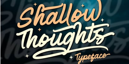 Shallow Thoughts is a modern script typeface created to enhance your designs. This font offers a simple yet stunning style with support Uppercase, Lowercase, Number, Symbol, Ligature, Multilingual, Alternative Style, SS01, ss02, ss03, and ss04. Shallow Thoughts very suitable for event titles, t-shirt design, posters, web, banner, book covers, social media, and other designs. Compatible with design studios such as Photoshop, Affinity Design, Adobe Illustrator or Silhouette. It makes it great for creative projects, Thank you, Toni Dzulham - Dumadistyle
 - Through Brush by Realtype,
$16.00 Through Brush consists of sophisticated handwriting, elegant, classy and modern. With a little bit of dirty curves it is made from the new trend typefaces now to look as close as possible to the natural brush writing, Through Brush is perfect for adding a modern and classy touch to your project.
 - Political Graft Fill - Unknown license

- Political Graft Outline - Unknown license

- Political Trend JNL by Jeff Levine,
$29.00 An ad in the May 27, 1939 issue of "Motion Picture Herald" for the film "Young Mr. Lincoln" featured the film's title hand lettered in a squared, bold pen lettering with rounded terminals along with an incised 'engraving' line. This formed the basis for Political Trend JNL, which available in both regular and oblique versions.
 - Political Poster JNL by Jeff Levine,
$29.00 Inspired by the hand lettering on a 1940 campaign poster for Franklin Delano Roosevelt, this condensed, casual sans serif design is now available as Political Poster JNL – in both regular and oblique versions.
 - Tough Cookie by Hanoded,
$15.00 Tough Cookie is a handmade font that looks like it has been cut out. It comes in three varieties that work together really well. Use it for your book covers and product packaging, or (if you’re a tough cookie) for your christmas cards…
 - Tough Talk by Comicraft,
$29.00 What's that, bub? Looking for a whole train full of whupass? A six pack of adamantium shred? Listen, are you talking to me or chewing a brick? Either way you're gonna get all your teeth broken. And if you think that's all just Tough Talk, make your move, bub. (Our new font, ToughTalk, put the words in Wolverine's mouth in the pages of Steve Skroce's WOLVERINE: BLOOD DEBT, but don't tell the short Canadian over there, he's likely to get upset at the mere suggestion that people put words in his --) What? No, I didn't, uh, say you were -- ulp -- short...
 - Tough Dude by Celebrity Fontz,
$24.99The Tough Dude font is a confident, devil-may-care, tough-guy font with attitude that screams "I don't need no stinkin' penmanship." It conveys a self-assuredness that does not preoccupy itself with trying to be necessarily legible or easy on the eyes but rather pragmatic, fast-flowing, and interested in scribbling the message out fast and moving on to the next task. We're confident you will enjoy it. - Is This The End by Intellecta Design,
$19.90 Is This the End has three different ornamental endpieces ready to use in end chapters, final pages in books, magazines and several artistic representations. Each endpiece may be used in different languages like German, Bulgarian, Croatian, Danish, Spanish, Finnish, French, Dutch, Italian, Norwegian, Polish, English and Portuguese. Intellecta Design researched these endpieces from the very rare Richard Gans type catalogue from 1882.
 - Blessings through Raindrops - Personal use only

- Brainless Thoughts Compact - Unknown license

- Train Of Thought by Pesic,
$29.00 Train of thought is a decorative font based on vintage and retro posters of the 19th and 20th centuries. Contains all Latin and Cyrillic glyphs. It is very modern, and it is intended for the use of creating logos and T-shirt designs as well as highlighting the essential elements on billboards, magazines, etc. Today's digital designers can use these stencil patterns to embellish text set in other alphabet stencils or by themselves to evoke the feeling of rustic Americana. Train of the thought is extremely detailed, and looks good in both small and large dimensions. It also contains a set of symbols, which you can use to further emphasize the essential elements.
 - Square Line Icons Politics by Howcolour,
$17.00 The square icons focus on maximizing the meaning by minimizing the symbols. Let your viewers understand your data without disorientation. Use a metaphorical icon library, designed for fast, intuitive human recognition.
 - The Rickon - Personal use only

- the Incredibles - Unknown license

- the DEEPER - Personal use only


Page 1 of 250Next page