10,000 search results
(0.089 seconds)
- GoGipsy by Latinotype,
$32.00 GoGipsy is a script font based on Coto Mendoza's modern calligraphy works created with the technical assistance of Luciano Vergara. GoGipsy is inspired by a magical journey—full of love, art and nature—through the Mexican Caribbean. GoGipsy tries to capture such incredible blend through gestures and calligraphy strokes, conveying freedom, expressiveness, strength and spontaneity. The family consists of four versions: regular, italic, drop and italic drop plus a set of ornaments based on the visual appealing Mexican textile art and embroidery full of colour and beauty. GoGipsy's baseline emphasises movement and rhythm. Have fun with OpenType features, swashes, ligatures and a wide array of initials. Go Gipsy! Each journey, new inspiration...
 - Trivia Humanist by Storm Type Foundry,
$53.00 I decided to draw the Regular style of Trivia Humanist not too light and the Bold not too dark. Delicate anatomy and moderate contrasts of serifed humanist typefaces aren’t usually born by interpolating between extremes, but rather by meticulous care for each individual letter. A delicious blend of a trace of punchcutter’s tool and calligrapher’s hand with as few historical reminiscences as possible. It stays away from any strong aesthetic colorations as well, which is a common feature of the Trivia family system. I wanted a clear and majestic typeface for book jackets, LP cover designs, posters, exhibition catalogues and shorter texts. But at the end it turned out excellent for largest books as well.
 - Artenoir Display by FoxType,
$15.00 Artenoir Display is a Brand New Elegant Typeface with 4 Variants. It has a dependable and uncompromising style, with controlled letterforms and modern touches. It looks amazing in logos, magazines, and movies. Artenoir Font would be perfect for branding, headlines, Captions, paragraphs, and posters. The various weights allow you to experiment with a wide range of applications. It's created to make an impression without sacrificing its beauty and readability. It's shown a clean, warmth, quirky, yet still purposed to be versatile. The Typeface includes Four Weights -Regular, Medium, SemiBold and Bold. Numerals and Extended Punctuation (248 Glyphs). Clean and Modern Glyphs Expert Kerning and Quality Crafting. Thank you for taking the time to look into the font.
 - Selini Display by Eliezer Grawe,
$9.00 Selini Display is a font that incorporates the classic and the modern: “mathematical” curves, classic proportions, thin body, needle-like serifs. It brings the lightness and modernity present in the Didot style, with more classic and wide forms. It is composed of capitals and small capitals, and an extensive set of ligatures, initial and terminal swashes. It came in five widths: condensed, semi condensed, regular, semi expanded and expanded. Selini Display is a thin, elegant and light font ideal, for luxury-related designs, traditional events, fashion magazines and brands and any material that needs a delicate, light and refined touch. Its use is recommended for large sizes and short texts, such as titles, logos, banners and posters.
 - Monroe by Latinotype,
$39.00 Monroe was designed in 2010, but in 2013 the font’s designer stopped selling it. Eight years after its initial release, Monroe returns in a new and upgraded version—with improved drawing and spacing—which includes more weights as well as alternate glyphs. Each font style has 819 glyphs and the whole set contains 394 characters which support 207 Latin-based languages. Monroe also includes 5 stylistic sets that offer a wide range of signs, swashes and discretionary ligatures, all specially made to add aesthetic value to your designs. The family comes in 5 weights: Thin, Ultra Light, Light, Regular and Bold. Monroe was designed by Daniel Hernández with the collaboration of Alfonso García.
 - Coverto Display by FoxType,
$12.00 Coverto Display is a Brand New Elegant Typeface with a powerful font family. It has a dependable and uncompromising style, with controlled letterforms and modern touches. It looks amazing in logos, magazines, and movies. Coverto Font would be perfect for branding, headlines, Captions, paragraph, and posters. The various weights allow you to experiment with a wide range of applications. It's created to make an impression without sacrificing its beauty and readability. It's shown a clean, minimalist, warmth, quirky, yet still purposed to be versatile The Typeface includes four Weights - Regular, Medium, SemiBold, and Bold All offer wide language support Uppercases and Lowercases. Numerals and extended punctuation. Thank you for taking the time to look into the font
 - Provan Formal by Matteson Typographics,
$19.95 Provan is a contemporary humanist sans serif with roots in calligraphy and incised letters. These timeless inspirations result in a typeface family that transcends fashion and adds a strong sense of authenticity to brands. The regular version of Provan has angled stem endings and oblique stress in curved shapes which add to its friendly and legible warmth. Provan Formal straightens these stroke endings to bring a more refined alignment of letters. The typefaces include swash capitals, small capitals, old style figures and special Celtic capital variants. The Inline version of Provan is useful for drop capitals, book covers and posters. Provan bucks the ubiquitous neutrality of geometric typefaces and exudes a sense of humanity, craftsmanship and warmth.
 - Ottenburg Display by FoxType,
$14.00 Ottenburg Display is a Brand New Elegant Typeface with a powerful font family. It has a dependable and uncompromising style, with controlled letterforms and modern touches. It looks amazing in logos, magazines, and movies . Ottenburg Font would be perfect for branding, headlines, Captions, paragraph, and posters. The various weights allow you to experiment with a wide range of applications. It's created to make an impression without sacrificing its beauty and readability. It's shown a clean, minimalist, warmth, quirky, yet still purposed to be versatile The Typeface includes Nine Weights - Regular, Medium, SemiBold, Bold. All offer wide language support numerals and extended punctuation. Thank you for taking the time to look into the font.
 - Fellbaum Grotesk by Vintage Type Company,
$15.00 Fellbaum Grotesk is a condensed typeface with both grotesque and cursive/humanist attributes. Fellbaum Grotesk Regular presents a clean, “grotesk” exterior, while the Italic version features faint slab-style flourishes. These characteristics, combined with a subtle stroke contrast and slightly extended x-height make for a distinct, and artisanal appearance. The family was inspired by the condensed & sterile, yet quirky, sans serifs found on a lot of vintage apothecary labels & municipal street signage. Both styles in the family are modest enough to work as secondary fonts, but also sport enough character to work as a primary sans face for wordmarks, logos, headers, etc. Fellbaum Grotesk Features: • 14 Fonts, 7 Weights, 2 Styles • OpenType Support • Adobe CE Language Support • Dingbats
 - Morganhand by Morganismi,
$9.00 Morganhand is a very individual typeface based on the handwriting of Finnish outsider artist Heikki Morgan Hämäläinen. Its economical lines make it very serviceable for numerous uses like cards, notes, prints, comics and so on. Morganhand Outline is based on Morganhand Regular, a handwritten font imitating the writing of Finnish outsider artist Heikki Morgan Hämäläinen. Every drawn line of each glyph is outlined giving a fun expression. The two fonts can be used separately or mixed together. Mightly usable in cards, notes, prints, comics etc. Morganhand Outline supports many European languages. Morganhand supports many European languages. The font works fine with its sister Morganhand Outline which is kind of a modification of it.
 - Grosse Pointe Metro by GroupType,
$19.00GP Metro® is a faithful version of the Dwiggins 1930 urban classic: Metrolight, Metromedium, and Metroblack. In 1929, English type designer, William Addison Dwiggins, (WAD) was commissioned by the Merganthaler Type Foundry to design a warmer, more humanistic, and less mechanical sans to effectively compete with Futura, a highly-popular geometric sans designed by Paul Renner in 1927 and first released by Meganthaler's arch-rival, the Bauer Type Foundry in Germany. FontHaus has licensed from GroupType updated files with additional styles including 2 rough versions and a soft together with the classic Regular styles and weights. These new styles will offer designers a wider range of options to design with these amazing classics. - Rodetta by Grezline Studio,
$8.00 Rodetta is hand drawn vintage sans font that I drawn very carefully, it is an all-caps font. Perfectly match to use for any branding design that needs a handcrafted touch feel. Rodetta is a font that you can use to make a vintage logo for branding, typography design, magazine or book cover, website header, product packaging, t-shirt design, label poster and many more.
 - Munrolane by madeDeduk,
$14.00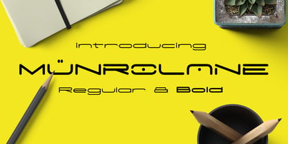 Hello I'm really excited to introduce Munrolane. It is a minimal modern and clean font family. suitable to create any branding, product packaging, invitation, t-shirt, label, poster, logo etc. Whats Included? - Munrolane.otf - Munrolane Italic.otf - Munrolane bold.otf - Munrolane bold Italic.otf Features - UPPERCASE - lowercase - Number & Symbol - International Glyphs - Alternative UPPERCASE and lowercase If you need anything else just shoot me an email at: dedukvic@gmail.com
 - Monique Sans BF by Bomparte's Fonts,
$40.00 Monique Sans features an unconventional thick/thin stroke weight pattern, that creates a fresh, unique appearance throughout. Aside from being a superb choice for a diverse variety of applications in headline and display, Monique Sans is remarkably legible and distinctive in short passages of mid-range text (10 pt to 14 pt). Wherever your design project requires a stylish, sophisticated look, Monique Sans is sure to shine!
 - Astegra by Great Studio,
$19.00 Astegra is a modern serif font with a unique ligature style, a high contrast and light font perfect for feminine logo signs, fashion heads & editorial designs, branding projects, Clothing Branding, packaging, magazine headings, advertising, T-shirts, postcards and much more. Astegra is also included full set of: Uppercase and lowercase letters Automatic ligatures for Uppercase and Lowercase Stylistic Alternates Multilingual characters Numerals Punctuation Thank you!
 - Espadrille by Atlantic Fonts,
$21.00 Step into your next project with comfort. Espadrille is handmade, clean, and friendly, without being loud. Appealing for a casual, but style conscious crowd - whether brightening t-shirts, posters, packaging, or publications, its one-height upper and lower case make it fun for creative blocks of text and mixing cases at will. It features double-letter discretionary ligatures as well as a few extras.
 - Hill Stone by Bal Studio,
$14.00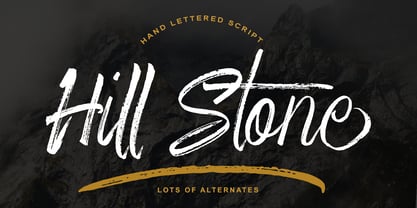 Hill Stone is a textured brush font, a contemporary approach to design, naturally handmade and with underscores. It also has alternatives and ligatures that make your design more attractive. Suitable for use in title design such as clothing, invitations, tittle books, stationery designs, quotes, branding,brand projects, logos, greeting cards, t-shirts, packaging designs, poster, product packaging, news, blogs, everything including personal charm and more.
 - Asian Sumi by Mvmet,
$15.00 Asian Sumi is a beautiful and playful sumi brush ink on paper handmade font. You can use it for anything ranging from t-shirts, book designs, and greeting cards to stickers and posters, packaging designs or anything that needs a casual touch, it will be your perfect font to pick. Fall in love with its incredibly versatile style, and use it to create lovely designs!
 - Brosley by RCKY Studio,
$18.00 Brosley is a beautiful hand-painted font, a contemporary approach to design and unique in each letter. Suitable for use in title designs such as clothing, invitations, book titles, stationery designs, quotes, branding, logos, greeting cards, T-shirts, packaging designs, posters, and more. Brosley contains a complete set of lowercase, uppercase, alternative, binder, punctuation, numbers, and multi-lingual support. Thank you for your purchase!
 - Bardella by IM Studio,
$19.00 Bardella is designed in a natural handwriting style, and has a modern and unique writing form. It includes Alternative Styles and Contextual Alternatives. Bardella be used for various purposes such as posts, logos, wedding invitations, t-shirts, letterheads, signage, labels, news, posters, badges, etc. To enable OpenType style changes, you need a program that supports OpenType features such as Adobe Illustrator CS, Adobe Indesign & CorelDraw X6-X7.
 - Mitchell Wesley by Fargun Studio,
$18.00 Mitchell Wesley is a beautiful Handwritten Font, A beautifully handcrafted font combined with brush style that’ll make your guests sing and elevate your projects! Every stroke, and curve was created to entice happiness and elegance. It suitable for wedding invitation, greeting cards, T-Shirt, Logo or any design that you create. Comes with a complete set of standard characters, Alternates, Ligatures, Punctuation & International glyphs
 - Agoesa Display by Mega Type,
$16.00 Agoesa is a modern display font with a positive character that is bright, unique and elegant. Its curves give off a friendly and fun personality. Perfect for creating a welcoming atmosphere in any design. -Multilingual Support -Free future updates Have fun using Agoesa Display!!! I really hope you enjoy it! Feel free to follow, like and share. Thank you so much for checking out my shop!
 - Costiera by Almarkha Type,
$28.00 Introducing Costiera – Elegant Handbrush is a brush script that is written casually and quickly. Letters are made with brushes on paper. Then scanned and carefully drawn into vector format. That is why Costeria has charming, authentic and relaxed characteristic,has 2 styles of regular and slant variations with a more natural look to your text with a more natural look to your text. You can activate Ligature OpenType panel to make these two styles. It also has many alternatives and underlines that make your text and design more interesting. Costiera is perfect for homeware designs,branding projects, Logo design,Quotes roduct packaging Works on PC & Mac Simple installationsAccessible in the Adobe Illustrator, Adobe Photoshop, Adobe InDesign, even work on Microsoft Word. PUA Encoded Characters – Fully accessible without additional design software. Fonts include multilingual support Image used : All photographs/pictures/vector used in the preview are not included, they are intended for illustration purpose only. Cheers! Thank You
 - Hydrargyrum by Type Minds,
$15.00 Hydrargyrum is the Latin form of a Greek word meaning "liquid silver" - mercury. The Hydrargyrum typefaces are designed with characteristics both of a metal and a liquid. The basic shapes of the letters are generally rigid and rectangular (particularly in style C), but the forms are enhanced by fluid curves and gently rounded corners. Hydrargyrum is not recommended for use at small sizes or in lengthy passages of text. It performs best in display-sized settings. Hydrargyrum consists of three styles, each in medium and semibold weights with matching obliques. The A style features solid, standard letterforms including the two-story a and g. Style B substitutes the a, g, M, and N (and related glyphs including numero and trademark symbols) for alternate shapes. The third subfamily takes the rectangular theme to an extreme, eliminating as many slanted strokes as possible from the letterforms. This makes some C-style letters ambiguous with one another, such as the U's and V's. As such, the C style is best used carefully even at larger sizes. The Hydrargyrum fonts are style linked within each style subfamily with, for example, Hydrargyrum A Medium as the regular style, Hydrargyrum A Medium Oblique as the italic, Hydrargyrum A SemiBold as the bold option, etc.
 - TA Fabricans by Tural Alisoy,
$25.00 TA Fabricans graphic presentation at Behance TA Fabricans font is based on Film Fiction Semi Expanded font. The font also supports the Hebrew alphabet. The Display version comes only in the Latin alphabet. I tried to prepare the font carefully. I specifically searched for the Hebrew alphabet. I benefited from my Israeli colleagues. I believe that my font will be successful. Please check and if you have any additional requests or complaints, please write to me. t@taft.work TA Fabricans works great for branding, magazines, headers, logos, TV, UI, web, badge, packaging, headlines, posters, t-shirt/apparel etc. TA Fabricans offers you options to explore a whole host of applications and gives a real modern feel to any project. Family overview: 36 fonts, 9 weights (from Thin to ExtraBlack) + Condensed, Expanded, Display Latin, Hebrew Display font without Hebrew Multilingual 4 free font Localized Forms with NLD, PLK OpenType Features: Localized Forms Contextual Alternates Tabular Figures Subscript Scientific inferiors Superscript (Superiors) Numerators Case Sensitive Forms Standard and Discretionary Ligatures Stylistic Alternates Kern Ordinals
 - Syntachron by Mofr24,
$11.00 Syntachron is an extraordinary monospaced font that stands out with its futuristic and mecha-inspired design. What sets this font apart is its unique ability to combine simplicity, modernity, and boldness, resulting in a visually captivating typeface. It is the perfect choice for those seeking to create impactful posters, eye-catching marketing materials, captivating logos, attention-grabbing headlines, and engaging book and magazine layouts. One of the distinguishing features of Syntachron is its compatibility with the Cyrillic alphabet, offering versatility and style for a wide range of design projects. Whether you're working on international branding campaigns or multi-language publications, this font seamlessly integrates with the Cyrillic characters, ensuring consistency and cohesiveness across different languages. In terms of typeface pairing, Syntachron harmonizes exceptionally well with related families and typefaces that share its sleek aesthetics and futuristic vibe. It complements and enhances other fonts, enabling designers to create stunning combinations that amplify the impact of their designs. Beyond its striking appearance, Syntachron excels in its functional aspects. The font comes in a variety of styles, allowing for versatility in design choices. Its monospaced nature ensures consistent character widths, making it ideal for code snippets, technical documentation, and typewriter-style layouts. Furthermore, Syntachron offers a comprehensive character set with special features, enabling the seamless creation of diverse and engaging designs. The design concept behind Syntachron was to capture the essence of a futuristic world and merge it with the mechanical elements of mecha-inspired aesthetics. The result is a font that exudes a sense of cutting-edge technology and boldness, empowering designers to create visually striking and impactful designs that captivate their audience. Syntachron was meticulously created to fulfill the need for a font that seamlessly merges modern simplicity with futuristic design elements. Its purpose is to provide designers with a versatile tool that sparks creativity and enables them to craft stunning visual experiences. With its sleek aesthetics, support for the Cyrillic alphabet, and functional aspects, Syntachron is an indispensable asset for any design project seeking to embrace the future.
 - Mauritz Sans by Mans Greback,
$49.00 Mauritz Sans is a brush script typeface. A cartoony brush handwriting, Mauritz was drawn and created by Mans Greback in 2021 to be the ultimate set of wild-style scripts for logotypes and branding. This calligraphy family consists of nine high-quality fonts in a variety of weights and styles: Mauritz Sans Light, Regular and Bold, plus each style is provided in the additional styles Upright and Italic. The font is built with advanced OpenType functionality and has a guaranteed top-notch quality, containing stylistic and contextual alternates, ligatures and more features; all to give you full control and customizability. It has extensive lingual support, covering all Latin-based languages, from North Europe to South Africa, from America to South-East Asia. It contains all characters and symbols you'll ever need, including all punctuation and numbers.
 - Great Monday by Designova,
$23.00 Great Monday is unique, fresh and beautiful handwritten font for branding / logo design / logotypes / greeting cards / promotional graphics and anything in between. Great Monday is completely handmade with passion, perfection as well as aesthetics at it's level best. Unique Ligatures We have created 14 unique ligatures to make sure the font looks beautiful and professional. Extended Character Sets Along with the basic Latin character set, we have added Western European, Central European, South Eastern European character sets for your convenience. The font contains a total of 336 glyphs. Advanced Kerning We have performed advanced, in-depth kerning for all possible letter combinations. What You Get This font being a handmade typeface, comes with only single weight (Regular). CREDITS: Font designed by Lis at Fontastica, produced by Fontastica, distributed by Designova. Created with ProCreate and Fontself on iPad Pro.
 - Ganesha Script by Lettersams,
$16.00 Ganesha Script is modern calligraphy design, including Regular. This font is casual and pretty with swashes. Can used for various purposes. such as logo, product packaging, wedding invitations, branding, headlines, signage, labels, signature, book covers, posters, quotes and more. Ganesha Script features OpenType stylistic alternates, ligatures and International support for most Western Languages is included. To enable the OpenType Stylistic alternates, you need a program that supports OpenType features such as Adobe Illustrator CS, Adobe Indesign & CorelDraw X6-X7, Microsoft Word 2010 or later versions. Ganesha Script is coded with PUA Unicode, which allows full access to all the extra characters without having special designing software. Mac users can use Font Book , and Windows users can use Character Map to view and copy any of the extra characters to paste into your favourite text editor/app.
 - Mamute by PintassilgoPrints,
$18.00 Mamute is a block rockin' family with a cool letterpress look. Its upper- and lower-case slots hold glyphs with slightly different textures for a natural look. Numbers and punctuation marks also have alternate versions. Just trigger the Contextual Alternates feature to easily cycle the alternate glyphs, preventing double letters from displaying the same texture. Mamute is a highly decorative typeface available in 2 widths, regular and condensed, each also offered as a layered font, a handy and playful way for adding shades to your composition. There’s also a generous ornaments font and a catchwords one to spice up your designs. Mamute is based on Aldine wood type spirit (as there were many incarnations of it!), from circa 1870. Please note that this family has a limited character set and doesn't bring diacritics nor accented characters. But yet it does rock, you bet!
 - Sangoma by Scholtz Fonts,
$19.00I named the font "Sangoma" after the traditional healers of the Southern African tribes. Sangomas often work by "throwing bones". The shapes of the bones have suggested the shapes of the characters in the Sangoma font. The font is useful for creating designs or producing text that has an African look. Typified by an African angularity the characters reflect the ethos of Africa. The Sangoma font contains the full range of upper and lower case characters, all punctuation and special characters as well as the accented characters used in the major European languages. - Gutenberg C by Alter Littera,
$25.00 A slightly roughened version of The Oldtype “Gutenberg B” Font, simulating irregularities and ink spreads associated with old metal types, papers and parchments. Apart from its rough appearance, which will be clearly noticed only at large point sizes, the font is identical to The Oldtype “Gutenberg B” Font. Specimen, detailed character map, OpenType features, and font samples available at Alter Littera’s The Oldtype “Gutenberg C” Font Page.
 - Labour Brusher by IbraCreative,
$17.00 Labour Brusher is a captivating natural brush font that seamlessly merges the untamed beauty of nature with the charm of handwritten text. Inspired by the organic strokes of a brush, Labour Brusher brings a touch of authenticity and warmth to any design. Each letter exudes a natural flow and a sense of imperfect elegance, capturing the essence of a brushstroke on paper. With its textured appearance and irregular shapes, Labour Brusher adds a rustic and handmade feel to logos, packaging, and creative projects. This font beautifully combines the ruggedness of nature with the versatility of brushwork, making it a versatile choice for designs that seek to evoke a sense of earthiness and artistic flair.
 - MonsterPie by Marc Lohner,
$28.00 Say hello to MonsterPie. This font brings the funny appearance of irregular designed characters together with the classic look of the Didone typefaces from the 18th century – that makes it a good choice for theme parks, movie posters, games, greeting cards and kid’s products. A large database and plenty of alternate characters work in the contextual alternates feature to keep your headlines bouncing all the time. Other implemented Opentype features are case sensitive forms, ligatures, arbitrary fractions and many more. On top, MonsterPie has a set of nice arrows, two different ampersands and extensive support for south-eastern, central and western european languages, as well as for Pīnyīn to offer. Designed by Marc Lohner in 2016.
 - Macaw by Unio Creative Solutions,
$4.00 “Macaw” is a welcome addition to our library, a modern serif typeface with roots in classical typography. Its forms are sober and delicate in its lightest weights and as the width increases to the boldest, it unleashes a powerful and distinctive emphasis on your project. Developed in a range of four weights with a matching set of true italics, the design of Macaw takes its inspiration from the Italian newspaper market at the beginning of last the century, a time where roman typography was predominant. In fact, the main purpose of this typeface is to preserve versatility and legibility, to prescind from any text size. A multilanguage serif family with a unique fluidity to modern and classic projects. Particularly useful for any editorial need and seamlessly adaptable to any destination of use such as corporate identity, web design, and social feeds. Specifications: - Files included: Macaw Light, Macaw Regular, Macaw Medium, Macaw Bold with corresponding italics - Formats:.otf - Multi-language support (Central, Eastern, Western European languages) Thanks for viewing, Unio.
 - Mido by Design Eva Wilsson,
$30.00 Mido is designed with the aim to recreate all the power of the early 19h century slab serifs, but without their geometric monotony. The ambition was to make a humanist slab serif that would function both in smaller sizes, as headlines, and poster size. Careful attention has been payed to the spaces within and inbetween letters – they show slight irregularities to create dynamic negative spaces, which in turn makes the letters sit solidly together as words and sentences. Mido is suitable for packaging, posters, book covers, identities and headlines, as well as type set in smaller sizes. It comes with both upper- and lower case figures. The typeface Mido is an ongoing design project of which the first font is now released.
 - Escuela by Cuchi, qué tipo,
$9.95 Escuela typeface is born in an attempt to reflect so many current influences of modern grotesque fonts that are trying to better reflect the values of today's world. Its compact proportions and high x-height, but at the same time with sort kind of modulation and open inktraps, propose a visual game that is worth enough to use it many places; Escuela can be striking and ideal for headlines in large text and heavy weights, but at the same time serious and readable in smaller bodies or regular and fine weights. Its wide range of characters, which includes a set of emoticons ideal for signage, work and evaluation documents, as well as inclusive, is ideal for educational centers, whether they are more playful (schools) or more pragmatic (universities). In fact, "Escuela" means “School” in English. For this reason, Escuela is your best ally when it comes to preparing texts that transcend students through a contemporary and different, but functional, character. Designed by Carlos Campos www.cuchiquetipo.com Dummy text from wikisource.org (1911 Encyclopædia Britannica/Universities).
 - Reina Neue by Lián Types,
$29.00 Hey! See Reina Neue in action here! INTRODUCTION When I designed the first Reina¹ circa 2010, I was at the dawn of my career as a type designer. The S{o}TA, short for the Society of Typographic Aficionados, described it as complex display typeface incorporating hairline flourishes to a nicely heavy romantic letterform². And it was like that; that’s what I was pursuing at that time since I was very passionate about ornaments and accolades of Calligraphy. Why? I felt that Typography, in general, needed more of them. These subtle flourishes could breathe life into letters. Maybe, I thought it was the only way I could propose something new into the field of type. However, after some years, I came across a very interesting quote: –Beautiful things don’t ask for attention– Wow! What did this mean? How could something be attractive if it’s not actually showing it. Could this be applied to my work? Sure. I think every type-designer goes through this process (aka crisis) regarding his or her career. At the beginning we love everything. We are kind of blind, we only see the big picture of a project. And that’s not because we are lazy. We actually can’t see the small mistakes nor the subtleties that make something simpler beautiful. We are not able. But, the small subtleties… They are actually everything: With experience, one puts more attention into the details and learns that every single decision in type has to be first meticulously planned. Here I am now, introducing a new Reina, because I felt there was a lot of it that could be improved, also the novelty of Variable Fonts caught my attention and I had to take that to my type library. THE FONT A thing of beauty is a joy forever Now, a decade later, I’m presenting Reina Neue. This font is not just an update of its predecessor: –A thing of beauty is a joy forever– is the first line of the poem ‘Endymion’ by John Keats, and despite the meaning of “beauty” may vary from person to person, and even from time to time (as read in the last paragraph), with Reina I always wanted to bring joy to the eye. In 2010, and now, in 2020. I believe the font is today much better in every aspect. It was entirely re-designed: Its shapes and morphology in general are much more clean and pure. The range of uses for it is now wider: While the old Reina consisted in just one weight, Reina Neue was converted into a big family of many weights, even with italics, smallcaps and layered styles. The idea behind the font, this kind of enveloping atmosphere made out of flourishes, is still here in the new Reina. This time easier to get amazing results due to the big amount of available alternates per glyph and also more loyal from a systemic point of view. However, and as read in the introduction -Beautiful things don’t ask for attention-, if none of the flourishes are activated the font will look very attractive anyway. Reina Neue is ready to be used in book covers, magazines, wedding cards, dazzling posters, storefronts, clothing, perfumes, wine labels and logos of all kind. Like it happened with the previous Reina, I hope this new font satisfies every design project around the world if used, and can be a joy forever. SOME INSTRUCTIONS Before choosing the right style for your project, hear my advice: -Reina Neue Display was meant to be used at big sizes. If you plan to print the font smaller than 72pt, I suggest using Reina Neue, not Display. Otherwise, if the font will be BIG or used on a digital platform, Reina Neue Display should be your choice. For even smaller sizes, use Reina Neue Small. This style was tested and printed in 12pt with nice results. (Note for variable fonts: Print them in outlines) -Reina Italic is not a slanted version of the roman, and this means some flourishes are different between each other. The Italic version has other kind of swirls. More conservative, in general. -All the styles of Reina Capitals have Small Capitals inside. -Reina Capitals Shine should be used/paired ONLY with Reina Capitals Black. The engraved feeling can be achieved if Reina Capitals Black and Reina Capitals Shine are used as layers, with the same word. Variable fonts instructions: -For more playful versions, choose Reina Neue VF, Reina Neue Italic VF or Reina Neue Capitals VF: With them you can adjust between 3 axes: Weight (will change the weight of the font) – Optic Size (will thicken/lighten the thin strokes and open/close the tracking) – Accolades (will modify the weight of the active flourishes). SOME VIDEOS OF REINA NEUE VF https://youtu.be/8cImmT5bpQM https://youtu.be/1icWfPmKAkg https://youtu.be/YC9GkJDL1a8 NOTES 1. The original Reina, from a decade ago: https://www.myfonts.com/fonts/argentina-lian-types/reina/ 2. In 2011, Reina received an honourable mention by S{o}TA. “Great skill is shown in the detailing, and an excellent feel for the correct flow of curves and displacement of stroke weight.” https://www.typesociety.org/catalyst/2011/ Reina was featured in the “Most Popular Fonts of the year” in MyFonts in 2011 https://www.myfonts.com/newsletters/sp/201201.html In 2012, the font was also selected in Tipos Latinos, the most prestigious competition of type in Latinoamerica. https://www.tiposlatinos.com/bienales/quinta-bienal-tl2012/resultados Also, chose as a “Favorite font of the year” in Typographica. https://typographica.org/typeface-reviews/reina/
 - Lust Text by Positype,
$29.00 Yes, finally. This one took the most time and the most restarting. Years went into imagining what Lust Text should look like and how it should structurally behave in order to truly improve upon a setting that includes any of the Lust typefaces. I approached it as much from the side of the type designer, as I did a potential user. The flow, the warmth, the personality needed to be there, but all of the excess had to be removed responsibly. In the process, and in need of inspiration, I looked backward to historical artifacts and precedent. In each early Lust Text approach, the solution was lackluster and/or vanilla and not actually a ‘Lust’ typeface. The exercise was not in vain though. By exploring past examples, I found my footing drawing for media now and how it might be used later—all the while, producing seamless, elegant curves and restrained indulgence (that sounds almost silly to say, but I like it). The Lust Collection is the culmination of 5 years of exploration and development, and I am very excited to share it with everyone. When the original Lust was first conceived in 2010 and released a year and half later, I had planned for a Script and a Sans to accompany it. The Script was released about a year later, but I paused the Sans. The primary reason was the amount of feedback and requests I was receiving for alternate versions, expansions, and ‘hey, have you considered making?’ and so on. I listen to my customers and what they are needing… and besides, I was stalling with the Sans. Like Optima and other earlier high-contrast sans, they are difficult to deliver responsibly without suffering from ill-conceived excess or timidity. The new Lust Collection aggregates all of that past customer feedback and distills it into 6 separate families, each adhering to the original Lust precept of exercises in indulgence and each based in large part on the original 2010 exemplars produced for Lust. I just hate that it took so long to deliver, but better right, than rushed, I imagine.
 - Hello Blushberry Script by Great Studio,
$14.00 Allow me to introduce Hello Blushberry - Font Duo is a playful script containing many choices of alternative characters to choose from as well as ligatures that look natural to add to the authenticity of letters. A collection of strange and initial swash tips is also included to add finishing touches or fill the design space in your type design. Hello Blushberry a modern handwriting fonts, loaded with awesome opentype features, and full alternative upper and lower case character sets. make custom letters a dream thanks to all the extra decorative choices you can enter for beautiful and unique customizations - swash, endings, alternative letters and ligatures all make it the prettiest little thing since tutus and tiara. Designed to work harmoniously, this duo font consists of super fine and casual signature scripts and a complete and clean set of all sans serif letters. Sans Serif fonts consist of two outline fonts of different weights, and a regular version. Layer them with different colors and turbidity to get a million different views. This font is perfect for branding, logos, web and editorial design, branding, prints, invitations, crafts, quotes, and more. Includes Files: • Hello Blushberry Script • Hello Blushberry Script Capitals Need help? If you need help or advice, please contact me by e-mail at Greatstudio92@gmail.com.