10,000 search results
(0.035 seconds)
- Epica Pro by Sudtipos,
$49.00 Epica is a contemporary interpretation of the Venetian Renaissance types. A humanist type family with a contemporary design. This family encompasses different typographic scenarios with emphasis in style and functional equilibrium. Its letterforms show the visual richness of Epica that includes some calligraphic reminiscences perfectly legible in small and display sizes. Its strong personality makes it distinguish, because it perfectly combines the elegance of antique typographies and the forcefulness of contemporary ones. This family has been designed in two different moments. Epica Serif, which have a more classical design, was finished 5 years ago in its first version. The first sketches were drew 8 years ago during the Master of Type Design at the University of Buenos Aires. Through the years was re design in several times to the point of reaching its current version. On the other hand, Epica Sans was completed in 2020 and is the counterpart of Epica Serif. A complementary system designed to enrich the serif version and give new options for hierarchy and composition. This is a versatile type family perfectly fit for books, editorial, and usage in print and on screens. It possesses great legibility in body texts, which makes it ideal for extended reading and supports a variety of languages.
 - Kaylar by Letterhend,
$14.00 Kaylar Script & Serif is a pair of elegant typeface consist of script and serif font. The beauty script and the condensed serif perfectly matched and bring a luxury and classy feel. What makes it even more special is its unique opentype feature which allows you to enable the swash ornament in a very simple way.
 - Figgins Sans by Shinntype,
$79.00 The first sans serif types were made in London in the early 19th century. They were severely modern, all caps and bold. The Figgins foundry, inventor of the term sans serif, showed a ?ne example in its specimen of 1836. The extra bold weight of Figgins Sans is a close revival of the original, with the addition of a lower case which retains its partly geometric, partly grotesque quality. The family is rounded out with other weights and an italic, and extended into Cyrillic and Greek, all executed in what is assumed to be as authentic a manner as possible, given the hypothetical nature of the exercise. Together with Scotch Modern, comprises The Modern Suite of matched fonts.
 - Frusta by District,
$20.00 Frusta is an earnest family of slab-serifs softened by tapered serifs and slightly squared curves that give it a warmth often absent in other slabs. Monoline and with a geometric foundation, this three-weight family includes true italics that can be their own headline face. The airy, yet sturdy construction makes this perfect for small text, infographics, and headlines of all sizes.
 - Fatkat by HansCo,
$15.00 Fat Kat is a bold retro serif fonts that feels clean and fun an incredible modern retro aesthetic. This font features a ligature feature on capital letters which allows the font to look unique with a wavy style. Use this Fat Kat serif font to add that special modern retro touch to any design idea you can think of! Enjoy!
 - Ratfern by Muksal Creatives,
$10.00 Raftern is a unique and modern family of Sans serif fonts. Simply Conception has 10 families Regular font, starting from the small thin to the largest Heavy. This typeface is versatile and can be used successfully in magazines, posters, branding, websites.
 - Questya by Patria Ari,
$15.00 Questya is a modern and elegant decorative serif with combination of curvy and edgy form. The upper form of glyphs chopped and the lower form/shape curved. This font suitable for projects related to wedding, crafts, branding, or aesthetical preview.
 - Stencil Chamfer JNL by Jeff Levine,
$29.00 The packing information stenciled on an antique wooden crate included a slab serif type style with chamfered corners. This design has now been re-drawn as the digital typeface Stencil Chamfer JNL, which is available in both regular and oblique versions.
 - Chatara by Saxofont,
$25.00 Chatara is an elegant and charming sans serif font. Fall in love with it and bring your projects to the highest levels! This font is PUA encoded which means you can access all of the glyphs and swashes with ease!
 - Retrade by Muksal Creatives,
$14.00 Retrade is a unique and modern family of Sans serif fonts. Simply Conception has 9 families Regular font, starting from the small thin to the largest Black. This typeface is versatile and can be used successfully in magazines, posters, branding, websites.
 - Victorah Gaerioa by Letterena Studios,
$9.00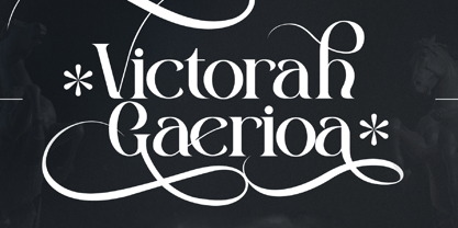 Victorah Gaerioa is a lovely and timeless serif font. It is the best choice for creating eye catching logos, branding and quotes. This font is PUA encoded which means you can access all of the glyphs and swashes with ease!
 - French Film JNL by Jeff Levine,
$29.00 Hand lettering found in the September, 1936 issue of the French film publication “La Cinématographie Française” is rendered in a lovely Art Nouveau serif type style. This is now available digitally as French Film JNL, in both regular and oblique versions.
 - Magefin by Muksal Creatives,
$10.00 Magefin is a unique and modern family of serif fonts. Simply Conception has 9 families Regular font, starting from the small thin to the largest Black. This typeface is versatile and can be used successfully in magazines, posters, branding, websites.
 - Wichittra by Jipatype,
$17.00 Wichittra is a high-contrast serif condensed font. The name of this font is derived from the common Thai women's name, meaning 'beautiful' or ‘Elegant’. It is suitable for use in text headlines, sub-headlines, packaging, posters, and other print media.
 - Wine Vat Stencil JNL by Jeff Levine,
$29.00 An image of a vintage metal stencil for the French wine region Côteaux du Tricastin [now Grignan-Les Adhemar] served as the inspiration for Wine Vat Stencil JNL. This condensed sans serif design is available in both regular and oblique versions.
 - Lamiran by RagamKata,
$14.00 Lamiran is a Distorted Wavy Font . You're not going to write a novel with this font, I will tell you that but... if you want something seriously psychedelic thats part art and part font, then this is the font for you. Using it sparingly to mix and match with a clean sans serif or go all out for a good time. Thanks, Have a wonderful Day. Ragamkata
 - Faber Sans Pro by Ingo,
$42.00 A classic-modern sans serif appearing in two forms — ”standard“ and a ”stylistic alternate“ with uncial script-orientated characters which give the font a completely different ”look.“ Faber Sans is a sans serif in the classic-modern style of type creations of the early 20th century — godfathered by Futura from Paul Renner and Gill Sans from Eric Gill. Unlike classic sans serifs, Faber Sans includes a ”true“ italic. Faber Sans Pro will perfectly pair with the accompnying Roman Faber Serif Pro.
 - Quadon by René Bieder,
$25.00 Quadon was designed to fill the gap between traditional serifs and the lasting trend of using sans serif fonts for contemporary design. The result is a modern, clear and infinitely flexible interpretation of slab serif fonts. The open shapes and a large x-height keep the font legible in small sizes while the short descender supports the compact heart and strength of a slab serif. Quadon has a wide range of typographic features and alternative glyphs to create your own and unique version of it. It comes in nine different weights with matching italics. From the sensitive but sharp thinner weights to the punchy and powerful heavy weights, Quadon is well-suited for a wide range of versatile tasks.
 - Garalda by TypeTogether,
$49.00 Type designer Xavier Dupré’s Garalda is a charming 21st century family that renews a legacy of finesse. As paragraphs on a page, Garalda’s overall impression is of a workaday personality, committed to the main purpose of the job: easy long-form reading. But setting it in display sizes proves something different: This reinvented Garamond is anything but basic. The Garalda story begins with the serendipitous finding of a book typeset in a rare Garalde, called Tory-Garamond, with which Dupré was not immediately familiar. This Garamond was used in bibliophile books in the decades surrounding 1920, but after that it became déclassé for an unknown reason. Dupré found the italic styles especially charming and discovered the family was probably the mythical Ollière Garamond cut from 1914. He obtained low resolution scans of the typeface and used them, rather than high resolution scans, as the basis for his new type family. This allowed Dupré the mental freedom to experiment and remix as he saw fit, culminating in a contemporary family with heritage. As seen in the simplistic rectangular serifs, Garalda is a humanist slab serif, but with a mix of angles and curves to give the classic shapes a fresh, unorthodox feeling. While almost invisible in paragraph text, these produce a graphic effect in display work. The set of ligatures in the roman and italics lend themselves to unique display use, such as creating lovely logotypes. In the italics, some swashes inspired by different historic Garamonds are included, sometimes breaking their curves to be more captivating. Just look at how the italic ‘*-s’ ligatures create ‘s’ with a cursive formation rather than merely a flowing slant. And how the roman ‘g’ link swings as wide as a trainer’s whip. These are all balanced by squared serifs in the roman to keep an overall mechanised regularity. The Garalda family comes in eight styles, includes some of the original arrows and ornaments, and speaks multiple languages for all typesetting needs, from pamphlets to fine book printing. The complete Garalda family, along with our entire catalogue, has been optimised for today’s varied screen uses.
 - CHILD & MOMSKY by Rhd Studio,
$15.00 Style and Grace personified - say Child Momsky. This typeface has two main styles, Regular and Italic, that are designed to work elegantly in unison and apart. The serif has a boldy different ' f', which sets it apart from regular serifs.....as Child Momsky likes to stand out from the rest. A regular 'f' is included in its alternates, and a extra font style with a regular f is included for projects that require a more staid elegance. The Italic style is dreamy, sultry and light-footed - a perfect partner for the more serious serif. Use them together or apart for stylish, stand-out type designs and projects. For those of you who do not have access to Opentype Software, such as Canva Users, a separately available 'extra letters' font set will be available for purchase soon. Language Supported : Danish, English, French, German, German (Switzerland), Italian, Low German, Luxembourgish, Norwegian Bokmål, Norwegian Nynorsk, Portuguese, Swedish, Swiss German. Enjoy
 - TextFace Type by Forme Type,
$9.99 The idea for this font family, derived from SMS text message faces (Emojis) and found photographs of faces collected over the last ten years. The concept for this project was to a create text-face characters using only the glyphes found in a standard version of a Sans Serif typeface. There are 36 different Textfaces. Available in three weights, Regular, Bold and a Stencil version.
 - Centavel by Ilhamtaro,
$27.00 CENTAVEL is a vintage bold serif typeface, with a strong and unique character, the center of the letter has a cavity to add to the vintage impression. This font is perfect for headlines or titles. This font is an all caps font. To enable the OpenType Stylistic alternates, you need a program that supports OpenType features such as Adobe Illustrator CS, Adobe Indesign & CorelDraw X6-X7. Cheers!
 - Nayuki by Asenbayu,
$15.00 Nayuki is a unique new serif display font. The Nayuki font provides a unique collection of glyphs that are bold and curved but they also have a strong geometric outline. This font will bring you an amazing new visual experience. You can use this font in retro, vintage and modern designs. This font also has alternate and ligature features which are perfect for completing various projects such as logos, brands, products, labels, websites, posters, and many more. The font includes uppercase, lowercase, numbers, symbols, alternates, ligatures and multilingual support.
 - Baroty by Twinletter,
$17.00 Baroty is a modern sans serif font that we made with great care to make your project beautiful and perfect, to make your project look unique and different from the rest. By using this typeface, you may anesthetize the entire audience, allowing them to remember your project easily and firmly. of course, your various design projects will be perfect and extraordinary if you use this font because this font is equipped with a font family, both for titles and subtitles and sentence text, start using our fonts for your extraordinary projects.
 - Gron by Larin Type Co,
$15.00 Gron this is an amazing decorative display serif font. Charming, elegant and attractive, Gron can also be even more expressive thanks to the alternatives that are included in this font. You can play with them and get a beautiful and harmonious result. Gron is perfect for logos, templates, invitations, greetings, book and magazine covers, business cards, branding for your business and much more. Also included in this font are several illustrations that can set the idea for your project. Gron is easy to use and has OpenType features.
 - Vernacular Sans by jpFonts,
$19.95 The Vernacular trilogy was designed by Swiss designer Hans-Jürg Hunziker, who had worked for Adrian Frutiger in Paris for many years. Based on the concept of a transitional Linear Antiqua, he has developed a colorful bouquet of typefaces that contain the entire spectrum of typefaces for book design and corporate identity. Thanks to his "Swiss school" and his outstanding skills, he has succeeded in giving the typefaces a particularly noble and sympathetic expression. In addition to the Sans family, there is a Serif family and a Clarendon family, each of which, including the separately drawn italics, is equipped with 12 font weights that are finely tuned to one another. Each of the 3 font styles develops its own character, but thanks to a concept that brings the different font styles closer together, they also work well together and complement each other perfectly. Sans and Clarendon have a vertical axis and similar endings in contrast to the Serif, which has a traditional diagonal axis and horizontal endings. The straight stems and the proportions are used as an element to stress the closeness of the typeface-trilogy. They thus share a comon feature. All fonts contain tabular and proportional figures as well as old style figures. Small caps and small cap figures are also available in all fonts. In addition, some fonts have alternative characters available via style set, such as «g», which can be used to further vary the typeface. Vernacular offers all the options for well-kept typesetting for print and web - for small and large orders.
 - Vernacular Clarendon by jpFonts,
$19.95 The Vernacular trilogy was designed by Swiss designer Hans-Jürg Hunziker, who had worked for Adrian Frutiger in Paris for many years. Based on the concept of a transitional Linear Antiqua, he has developed a colorful bouquet of typefaces that contain the entire spectrum of typefaces for book design and corporate identity. Thanks to his "Swiss school" and his outstanding skills, he has succeeded in giving the typefaces a particularly noble and sympathetic expression. In addition to the Sans family, there is a Serif family and a Clarendon family, each of which, including the separately drawn italics, is equipped with 12 font weights that are finely tuned to one another. Each of the 3 font styles develops its own character, but thanks to a concept that brings the different font styles closer together, they also work well together and complement each other perfectly. Sans and Clarendon have a vertical axis and similar endings in contrast to the Serif, which has a traditional diagonal axis and horizontal endings. The straight stems and the proportions are used as an element to stress the closeness of the typeface-trilogy. They thus share a comon feature. All fonts contain tabular and proportional figures as well as old style figures. Small caps and small cap figures are also available in all fonts. In addition, some fonts have alternative characters available via style set, such as «g», which can be used to further vary the typeface. Vernacular offers all the options for well-kept typesetting for print and web - for small and large orders.
 - Small Heath by Putracetol,
$22.00 Small Heath - Slab Serif Font. Small Heath is a slab serif inspired by vintage american poster but made flexible enough for everyday use. Small Heath is unique font because the difference "slab" of each character. This serif is very beauty, so it makes Small Heath look amazing great. Small Heath best uses for title, invitation, heading, cover, poster, logos, quotes, product packaging, merchandise, social media & greeting cards and many more The alternative characters were divided into several Open Type features such as Swash, Stylistic Sets, Stylistic Alternates, Contextual Alternates, and Ligature. The Open Type features can be accessed by using Open Type savvy programs such as Adobe Illustrator, Adobe InDesign, Adobe Photoshop Corel Draw X version, And Microsoft Word. This font is also support multi language.
 - Sunkist Agness by Alit Design,
$15.00 Introducing Sunkist Agness Typeface The Sunkist Agness inspired by chill and playful street font combined with stencil font style. this font have rough and distorted shape which is become its own characteristic and uniqueness. Designed with 3 characters: Slab Serif, Sans Serif, and Serif, Sunkist Agness font is suitable to be combined into a playful and interesting combinations, not to mention the alternates from each characters that will add more uniqueness to your design! The "Sunkist Agness" are very easy to apply to any design, especially those with an retro and classic, army, playful and retro concept, besides that this font is very easy to use both in design and non-design programs because everything changes and glyphs are supported by Unicode (PUA).
 - Derpache by Edignwn Type,
$18.00 The Derpache Font is inspired by authentic typefaces in old labels. This font collections contain script and serif font. Every font comes with 4 style typefaces (regular, rounded, rough and stamp). Derpache gives more extras nautical and pirate in one pack illustrations. This script font includes some alternates. The Derpache matches apply in some designs such as the logo, poster, label, badge, packaging, t-shirt, branding, quotes and more custom design. Derpache features : 4 style typefaces (regular, rounded, rough and stamp) Uppercase, lowercase, numeral, symbol, punctuation and alternate in script font All-caps, numeral, symbol and punctuation in serif font Multilingual PUA Encoded Derpache includes : 9 fonts (script, serif and dingbat) 26 hand-drawn illustrations in dingbat Check out Duhline which is a great pair for Derpache.
 - Winden by Latinotype,
$26.00 Winden is a geometric slab serif typeface based on the bestselling font Isidora https://www.myfonts.com/fonts/latinotype/isidora/ and inspired by early 20th century famous classic slab-serif typefaces. Characteristic features such as trapezoid shape serifs give Winden a modern, contemporary touch and the rounded edges of the Alt version make it look unique and special. This font consists of two subfamilies: Winden —classic, simple and functional— and Winden Alt (playful and contemporary), ideal for display use. Each version comes in 7 weights, ranging from Thin to Black, and includes matching italics— 28 fonts in all. Winden is the perfect choice for headlines, logos, branding, packaging, publications and websites. The full set contains 615 characters that support over 200 Latin-based languages.
 - Mailton by Alit Design,
$19.00 🍃Introducing Mailton typeface🍃 The Mailton Serif typeface is an elegantly themed font that has a dynamic serif style. The details of the shape of the "Mailton Serif Elegant typeface" are very smooth and flow to create unique and beautiful curves. Elegant Serif typefaces such as “Mailton typeface” are very easy to apply to any design, especially those with an elegant and smooth concept, besides that this font is very easy to use both in design and non-design programs because everything changes and glyphs are supported by Unicode (PUA). The Mailton typeface contains 750 glyphs with many unique and interesting alternative options. Language Support : Latin, Basic, Western European, Central European, South European,Vietnamese, In order to use the beautiful swashes, you need a program that supports OpenType features such as Adobe Illustrator CS, Adobe Photoshop CC, Adobe Indesign and Corel Draw. but if your software doesn't have Glyphs panel, you can install additional swashes font files.
 - AW Conqueror Std Slab by Typofonderie,
$59.00 Slab serif with a 70’s aesthetic A version of AW Conqueror Sans, AW Conqueror Slab draws inspiration from geometrical slab serifs of the 1930s, of which Rockwell is a perfect example. Lubalin Graph, a reworking of the genre, came out in the wake of the Avant Garde wave of the early 70s. In recent years, ‘slabs’ have made a comeback in the graphic design world. AW Conqueror Slab advances the cause quite happily. AW Conqueror superfamily AW Conqueror Didot is part of a larger family, who include 4 others subfamilies with great potential: They’re but based on same structure, with some connection between them (width for example), to offer a great & easy titling toolbox to any designers, from skillful to beginner. Each of the members try their best to be different from the others because of their features. They should work harmoniously in contrast. Club des directeurs artistiques Prix 2010 European Design Awards 2011
 - Art Materials JNL by Jeff Levine,
$29.00 The cover of the 1930s-era “Catalog of Artists’ Materials” from Ernst H. Friedrichs, Inc. (New York) has the words “Artists’ Materials” hand lettered in a stylized Art Deco sans serif type style. This unique design is now the digital font Art Materials JNL, which is available in both regular and oblique versions.
 - Helvetica by Linotype,
$42.99 With the name Helvetica (Latin for Swiss), this font has the objective and functional style which was associated with Swiss typography in the 1950s and 1960s. It is perfect for international correspondence: no ornament, no emotion, just clear presentation of information. Helvetica is still one of the best selling sans-serif fonts.
 - Revue by ITC,
$29.99Revue is a display face originally designed for Letraset. The heavy sans serif letterforms of this font are ideal for use in signage, on posters and in advertising display. - Hogar Slab by Latinotype,
$39.00 Hogar Slab, based on the Hogar typeface, is the result of combining a script and a slab serif into a single type system. The system has a monolinear style composed of a slab serif and a script slab serif version that share similar proportions, weight interpolations and details. Hogar Slab is basically a slab serif with script gestures and a script with slab serif shapes. In order to make the system more complete, I included an italic version, which represents a transition between both main styles. Additionally, I developed a set of patterns including some furniture designs by well-known architects.
 - Hoosier Daddy by Parkinson,
$20.00 Hoosier Daddy is based on Foundry Type samples from various mid-19th century specimen books. This shaded slab serif was made by conforming several different cuts of the styles, filling out the character set, and adding a few contemporary touches for freshness. This is a display face. Use it big.
 - Burger by Lián Types,
$25.00 Inspired in the world of the fast-food, my aim with Burger was to achieve a sexy slab serif font. Since it's not very common to see slabs with swashes I consider this project as an experiment with interesting results. In order to mantain an even weight on the written word, all the glyphs including the swashy ones had to look like compact blocks: This makes the font work much better used with almost no leading, as seen in posters above. Despite the formal look of its genre, this slab serif is also very playful and unique. (Maybe unhealthy food deserves better fonts already, right?) Taste Burger, come on, give it a try! On a more personal note: Why I made this font? Some months ago I started the gym and with it, an strict diet to see some results faster... Maybe my temptation is being, in Lacanian terms, "sublimated" by making delicious and unhealthy fonts.
 - Gill Sans MT by Monotype,
$45.99 Gill Sans is a humanistic sans serif family that, while is considered by many to be quintessentially British in tone and concept, has been used in virtually every country and in nearly every application imaginable. Gill Sans has reached this level of near-ubiquity for one simple—and very good—reason: it is an exceptionally distinctive design with a potential range of use that is almost limitless. This toolkit family includes a wide range of styles including the standards such as Light—which is open and elegant—and a Regular that, with its flat-bottomed d, flat-topped p and q and triangular-topped t, has a more compact and muscular appearance. Its Bold styles tend to echo the softer, more open style of the light while the extra bold and ultra bold have their own vivid personalities, but each of them would make for an eye-catching headline. Take into account the family’s many weights, including condensed and extra condensed designs, and extended language support and you have yourself a tool you’ll be thrilled to return to, time and again. Gill Sans was designed by Eric Gill: a versatile, brilliant, and prolifically successful designer of the early part of the last century. One of the main reasons for the enduring success of his namesake design is that it is based on Roman character shapes and proportions, making it unlike virtually any other sans serif out there. Gill also worked his own warmth and humanity into his design, resulting in a typeface in which each weight retains a distinct personality of its own. Pair with serif fonts like Gill's own Joanna; or more modern offerings like Frutiger® Serif, Malabar™, Syntax® Serif, FF Scala®, or DIN Next™ Slab.