10,000 search results
(0.374 seconds)
- II Increments Sans by Increments,
$19.00 Informed by classic grotesk proportions and principles within musical theory, II Increments Sans results in a rhythmic and composed sans-serif. Set within a structured grid, the intonation and harmony between its functional principles and emotive characteristics allow for use at both text and display sizes.
 - Katerina by NicolassFonts,
$25.00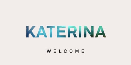 Katerina is a modern versatile sans-serif typeface. What differentiates Katerina from the other fonts is an exceptionally distinctive design. It is brilliantly suited for graphic design and display use and perfect for logotypes, t-shirts, packaging, brand identity, books, magazines, newspapers, posters, billboards, and advertising.
 - Woodpecker by profonts,
$41.99 Woodpecker is a self-confident, sturdy caps-only sans serif design imitating grained wood created and digitized by German type designer Ralph M. Unger for the profonts library. Woodpecker is perfectly suited for any graphic work around timber, lumber, prperty markets, carpenter, furniture and so on.
 - Letter Gothic by Monotype,
$29.99Letter Gothic font was designed by Roger Roberson for IBM sometime between 1956 and 1962. Inspired by Optima, the typeface originally had flared stems. A monospaced sans serif font designed for use on an IBM Selectric typewriter, Letter Gothic font is a good choice for tabular material. - Egosta by skillyas studio,
$15.00 EGOSTA is a complete sans serif family. The letterform and sharp variations characterize a bold and playful typeface in a graphic layout, making it perfect for modern and futuristic visual needs, EGOSTA complete family contains 10 styles with two axes; Weight and Width, from Thin to Bold.
 - LGSH Davit by Edik Ghabuzyan,
$30.00 LGSH David has 7 upright weights and their Italics. The typeface supports Latin, Armenian and Cyrillic alphabet systems. It is an easily readable two side easily readable serif font. LGSH David is a contrast style font with very delicate lines which are quite bright and clear.
 - Qubicles by Mevstory Studio,
$25.00 Qubicles Sans is a modern sans serif font designed with calligraphy style for a wide range of need. The font is suitable for any branding project like logo, t-shirt printing, sporting design, and many more. It will look assertive in a wide range of contexts.
 - Basic Nouveau JNL by Jeff Levine,
$29.00 The 1913 sheet music for "You’ll Be Welcome When You Get Back Home" had its title hand lettered in a simple, yet attractive Art Nouveau sans serif design which has been preserved as digital type. Basic Nouveau JNL is available in both regular and oblique versions.
 - Grut Stuph by PizzaDude.dk,
$20.00Grut Stuph is a weird breed between serif and graffiti, and on top of that a good portion of comic! Comes in Open Type with different alternate letters and is full of fun! Note: you will need to use OpenType supporting applications to use the autoligatures. - Gvardia by ParaType,
$30.00 Type family of two weights was designed in 2000-2001 by Oleg Karpinsky and licensed by ParaType. Similar to Ariergard face in letterforms but differs from it by slab serifs, which always project to the center of an em square. For use in advertising and display typography.
 - Moneta by Monotype,
$35.99 Moneta is an elegant transitional serif with high contrast. Its morphology is based on the study of traditional broad-edge pen script. It comes in 4 different weights (Light, Regular, Bold and Black) and has variable features. Designed by Santi Rey and launched on January 2020.
 - Houschka Rounded by G-Type,
$72.00 Houschka Rounded is the companion family to Houschka Pro, featuring CE, Baltic, Turkish & Cyrillic language support plus small caps, stylistic sets, contextual alternates, ligatures and 4 sets of numerals. Houschka Rounded may be a softer & cuter sans serif than her big sister but she's equally versatile.
 - Oleragie by Hishand Studio,
$15.00 Introducing Oleragie, a classic modern serif with an aesthetic look inspired by the Egyptian and middle east atmosphere. Perfect for those who need a touch of elegance, stylish, classy, beautifully thin, and modernity for their design. Complete with ligatures alternates regular italic icon kerning multilingual support
 - Gacor by Din Studio,
$29.00 Gacor is urban sans serif font. Made for any professional project branding. It is the best for branding, printing, and quotes. Every letter has a unique and beautiful touch. Features: PUA Encoded Multilingual Support Numerals and Punctuation Thank you for downloading premium fonts from Din Studio
 - RBNo2.1 by René Bieder,
$25.00 RBNo2.1 is a condensed sans serif typeface with a technical and geometric appearance. The family includes 2 versions (RBNo2.1a and RBNo2.1b) and has 7 weights with matching italics. RBNo2.1 feels comfortable in technical surroundings with short text passages, in brochures, catalogs, magazines, posters, websites headlines and logos.
 - Arabetics Aladdin by Arabetics,
$34.00 Arabetics Aladdin is a monoshape font family with a fixed single shape per each Arabic Unicode character. Glyphs are designed to incorporate the traditional Arabetic visual characteristics found in all four varying shapes, isolated, initial, medial, and final, for each letter. The overall design also emphasizes the line-like (khat) horizontal look and feel of the Arabetic scripts without sacrificing legibility. This font family supports all Arabetic scripts covered by Unicode 6.1, and the latest Arabic Supplement and Extended-A Unicode blocks, including support for Quranic texts. It includes two weights: regular and bold, each of which has normal and left-slanted (Italic) versions. The design of this font family follows the Arabetics Mutamathil style design principles utilizing varying x-heights and no glyph substitutions. The Mutamathil type style was introduced by the designer more than 18 years ago. The Arabetics Aladdin font family includes all required Lam-Alif ligatures in addition to all soft vowel diacritics (harakat), which are selectively positioned with most of them appearing on similar high and low levels—top left corner—to clearly distinguish them from the letters. The Tatweel or Kashida lengthening character is a zero-width glyph.
 - Crescendo by Canada Type,
$29.95 A year after the tremendous success of Memoriam in the "Lives They Lived" issue of the New York Times magazine at the end of 2008, Patrick Griffin and Nancy Harris Rouemy teamed up once more to tackle the same project for the 2009 issue. This time the magazine's design concept revolved around a typeface they created specifically for custom vertical malleability, and that can play just as well in single- or multi-color environments. The result was another iconic commemorative issue that shows exotic tri-line letters merging, swashing, extending and flourishing in stunning gold, silver and blue on black on the cover, and in black on white on the inside pages. Just like in the previous year, the issue won multiple publication design and typography awards. Crescendo is that typeface, finally issued for retail by public demand. Just turn your setting into outlines in your favorite vector program, grab single strands and extend away, and do your best alternating colours between strands. Crescendo comes with a limited punctuation set, but accented characters for Western Latin languages are included, and there many, many alternates and ligatures in there as well. This typeface is best used in large display sizes.
 - Minimela Tm by Mustafa Demirel,
$30.00 "It is hard to believe, but they won't be able to give up on us" The story of this font has started with a little suitcase actually. These characters were trying to do something for minimela kitchen which it named.After that, they looked that they was wanting to be that font beautiful writings written with it, belonging to it, special to it and reminding it to everybody. These cute monsters that have shaped themselves were a piece of a whole, of a little whole. They were totally believing to beautiful and long ways that have being waited them. They have given a sincere promise they will continue with little steps on that ways. "It is hard to believe, but they won't be able to give up on us" while telling this, we were totally talking about that
 - ITC Humana Script by ITC,
$29.99ITC Humana Script font is the work of British designer Timothy Donaldson. He crafted this typeface with a broad-tipped pen on paper before carefully creating the final digital version. ITC Humana Script is the perfect font for anything requiring both clarity and a touch of personality. - Kingthings Trypewriter Pro by CheapProFonts,
$10.00 I have made this font properly monospaced (all characters are the same width) as that is how an old typewriter worked. In addition to correcting and expanding the character set, of course. Keving King says: "Kingthings Trypewriter is a deconstructed typewriter face. I have always loved decayed fonts, this is the first of mine - and yes, I know there are lots of these around - this one is MINE". ALL fonts from CheapProFonts have very extensive language support: They contain some unusual diacritic letters (some of which are contained in the Latin Extended-B Unicode block) supporting: Cornish, Filipino (Tagalog), Guarani, Luxembourgian, Malagasy, Romanian, Ulithian and Welsh. They also contain all glyphs in the Latin Extended-A Unicode block (which among others cover the Central European and Baltic areas) supporting: Afrikaans, Belarusian (Lacinka), Bosnian, Catalan, Chichewa, Croatian, Czech, Dutch, Esperanto, Greenlandic, Hungarian, Kashubian, Kurdish (Kurmanji), Latvian, Lithuanian, Maltese, Maori, Polish, Saami (Inari), Saami (North), Serbian (latin), Slovak(ian), Slovene, Sorbian (Lower), Sorbian (Upper), Turkish and Turkmen. And they of course contain all the usual "western" glyphs supporting: Albanian, Basque, Breton, Chamorro, Danish, Estonian, Faroese, Finnish, French, Frisian, Galican, German, Icelandic, Indonesian, Irish (Gaelic), Italian, Northern Sotho, Norwegian, Occitan, Portuguese, Rhaeto-Romance, Sami (Lule), Sami (South), Scots (Gaelic), Spanish, Swedish, Tswana, Walloon and Yapese.
 - Bamida Faux by Twinletter,
$15.00 BAMIDA is a Japanese-themed display font that uses the most natural fonts to create a stunning, natural, and elegant visual presentation. If you select this typeface, your project will have a graphic presentation that your audience will enjoy. It will be striking, well-known, and easy to recall. Logotypes, food banners, branding, brochure, posters, movie titles, book titles, quotes, and more may all benefit from this font. Of course, using this font in your various design projects will make them excellent and outstanding; many viewers are drawn to the striking and unusual graphic display. Start utilizing this typeface in your projects to make them stand out.
 - Toneri by Twinletter,
$15.00 TONERI is a Japanese-style display font with thick and strong characters, giving it a valiant appearance. If you use this font, your project will automatically become strong and conspicuous in the various media you use, your project will appear elegant, have a distinct character, and always stand out. Logotypes, food banners, branding, brochure, posters, movie titles, book titles, quotes, and more may all benefit from this font. Of course, using this font in your various design projects will make them excellent and outstanding; many viewers are drawn to the striking and unusual graphic display. Start utilizing this typeface in your projects to make them stand out.
 - Hogata by Twinletter,
$15.00 Present Hogata, our newest font. A typeface with a Japanese theme and an Asian subtlety is ideal for projects with Asian cultural nuances, as well as all projects that require a different and unique impression while remaining pleasing to the eye. To create a beautiful graphic look, use this font. Logotypes, food banners, branding, brochure, posters, movie titles, book titles, quotes, and more may all benefit from this font. Of course, using this font in your various design projects will make them excellent and outstanding; many viewers are drawn to the striking and unusual graphic display. Start utilizing this typeface in your projects to make them stand out.
 - Gayana Faux by Twinletter,
$15.00 GAYANA is a faux-Japanese font featuring traditional Japanese features. By incorporating traditional Japanese culture and style into this typeface, your project will be unique, easy to comprehend and recall by a large number of people, ensuring that the great opportunity will be entirely yours. Your project must be unique, exquisite, and opulent! Logotypes, food banners, branding, brochure, posters, movie titles, book titles, quotes, and more may all benefit from this font. Of course, using this font in your various design projects will make them excellent and outstanding; many viewers are drawn to the striking and unusual graphic display. Start utilizing this typeface in your projects to make them stand out.
 - MotionBats by Victor Garcia,
$28.00 MotionBats are a sort of movable type otherwise. It is a symbol font type family integrated by 9 styles. The idea behind designs is to give to typographic pictograms –static for definition– the dimension of motion. In pursue of this spirit, each font shows a complete motion sequence. MotionBats are inspired on the photographic work of Eadweard J. Muybridge [1830-1904] –a talented multi-faceted Englishman– who worked in USA by the second half of the 19th century. In those early times of photography, he started –almost by chance– taking a comprehensive and impressive photographic sequential series of human and animal locomotion. This way, he placed himself more than a decade ahead from the beginning of cinematography. This type design family points to pay a humble and certainly incomplete homage to such a pioneering and amazing Muybridge's work.
 - Sugar Pie by Sudtipos,
$79.00 When Candy Script was officially released and in the hands of a few designers, I was in the middle of a three-week trip in North America. After returning to Buenos Aires, I found a few reactions to the font in my inbox. Alongside the congratulatory notes, flattering samples of the face in use, and the inevitable three or four “How do I use it?” emails, one interesting note asked me to consider an italic counterpart. I had experimented with a few different angles during the initial brainstorming of the concept but never really thought of Candy Script as an upright italic character set. A few trials confirmed to me that an italic Candy Script would be a bad idea. However, some of these trials showed conceptual promise of their own, so I decided to pursue them and see where they would go. Initially, it seemed a few changes to the Candy Script forms would work well at angles ranging from 18 to 24 degrees, but as the typeface evolved, I realized all the forms had to be modified considerably for a typeface of this style to work as both a digital font and a true emulation of real hand-lettering. Those were the pre-birth contractions of the idea for this font. I called it Sugar Pie because it has a sweet taste similar to Candy Script, mostly due to its round-to-sharp terminal concept. This in turn echoes the concept of the clean brush scripts found in the different film type processes of late 1960s and early 1970s. While Candy Script’s main visual appeal counts on the loops, swashes, and stroke extensions working within a concept of casual form variation, Sugar Pie is artistically a straightforward packaging typeface. Its many ligatures and alternates are just as visually effective as Candy Script’s but in a subtler and less pronounced fashion. The alternates and ligatures in Sugar Pie offer many nice variations on the main character set. Use them to achieve the right degree of softness you desire for your design. Take a look of the How to use PDF file in our gallery section for inspiration.
 - Dealers by Gumpita Rahayu,
$20.00 Back to the past when the old building and the beauty of a old store decorated by distinctive signage. With a clear feels of authentic historical value and the today's needs must be balanced in order to create the nostalgic feels. Introducing an authentic touch based on old fashioned signage developed into the wood type feels, and it's called Dealers. Dealers is a development of the classic taste wood type to form a solid blocked shapes, modern serifs, and with all caps based characters and slightly condensed. With specific characteristics, dealers font is intended for coffee shops, stores, restaurant menu that you want to create the impression of a classic and harmonious. With the addition of catchwords in the OpenType features, allowing you to be more creative to meet the requirements on the design you create.
 - Berkin by Craft Supply Co,
$20.00 Berkin – Display Font is a captivating sans-serif typeface that breaks free from monotony with its playful and eye-catching design. Its stems and letterforms carry a dynamic and non-uniform style that instantly grabs attention, making it perfect for display purposes. Berkin’s unique design adds a sense of energy and spontaneity to your projects, ensuring that they stand out in a crowd. Whether you’re creating eye-catching headlines, signage, or branding materials, Berkin injects a distinctive and lively personality. This font is like a burst of creativity in the world of typography, making it an exceptional choice for projects that demand a playful and attention-grabbing aesthetic. Berkin’s playful and non-conformist approach ensures your designs are unforgettable and exude an enthusiastic and dynamic vibe.
 - Selectric Century by Indian Summer Studio,
$45.00 Also known as Schoolbook. 900+ glyphs. After Linn Boyd Benton's and Morris Fuller Benton's 1894 lower contrast version of Scotch Modern, Didone. The part of the large project on revival and further development (by drawing many additional glyphs) of the 20th century’s typewriters’ fonts. And especially the most famous, versatile and beautiful typewriter: IBM Selectric’s golfball fonts, lost for the civilization for many decades after ‘80s, not being created since then in digital vector form. This new sub-project started in July 2018 for the restoration of the most beautiful classical typefaces, used during the 20th century on the extremely rare now IBM Selectric Composer typewriters / desktop publishing systems. Together with Nick Hamze and the Right Reverend Theodore Munk, the collectors of old typewriters. IBM showed the perfect taste by developing these best historical book typefaces of the human civilization for typewriters. So people could type then using both the real book faces, and the famous classical ones.
 - Harry Pro by Red Rooster Collection,
$60.00This revival of Harry is based on the original design by Marty Goldstein (and C.B. Smith). Goldstein, born in Chicago in 1939, was the co-founder of the groundbreaking Creative Black Book. He graduated from the Pratt Institute in 1960. Harry, first published by VGC in 1966, was named for his father. ITF has added four new weights to the original six. - Technobaby JF by Jukebox Collection,
$32.99 Technobaby is a funky futuristic font done with modular letterforms. This typeface arose from playing around with the basic rounded rectangle shape. Jason wanted to see how many different letters he could create by simply changing the locations of the slots cut into the rectangles. Overall it lends the font a very cohesive and unique look. Get your "mod" on with Technobaby!
 - Chateau by Wilton Foundry,
$29.00 On the one hand Chateau is almost palatial but at the same time it has a quite earthy personality as represented by the stenciled strokes. However, this stencil effect serves to refine the strokes by creating the illusion of a completed thin stroke. Chateau is more of a hybrid roundhand script with its contrasting ornate capitals. Originally a fortified residence in France was called a Chateau. Today there are many estates with true Chateaux on them in Bordeaux, but it is customary for any wine-producing estate, no matter how humble, to prefix its name with "Chateau". This is true whether the building itself is a magnificent palace or a shack. The distinctive chateau architecture was in inspiration for the name of this script. Chateau is ideal for packaging design, invitations, announcements, headlines, brochures, menus, weddings, scrapbooking, etc. Chateau is available in Opentype, Postscript and Truetype for Macs and PCs.
 - Orotund by Canada Type,
$24.95 This is the digitization and considerable expansion of the cheeky and enormously popular film type Eightball, one of the most widely used faces of the 1970s and 1980s. Round and happy like a bouncy ball, these are letters after a sign maker’s own heart. Seen everywhere in its film version, from bingo and pool hall parlor signs to comic books, now this computer version opens the door for the happy roundness to be used on a much larger scale by anyone who designs layouts on a computer. The original film type included a few alternates. We included them, but we added many more as well. So make sure to check out the various OpenType features in your program while using this font. Eightball is great for a variety of applications, including signage, rubber stamps, poster design, titling, cartoons, comics, and pretty much anything where happy and round fit in.
 - Carloti by Din Studio,
$29.00 Are you trying to make an elegant, modern, and stylish statement with your invitations, social media, website, or printed materials? Ready to enchant your audience and enhance your branding? Introducing Carloti-A Sans Serif Font Carloti is a gorgeous uppercase sans serif font that will whisk you away to a place of style! We are hoping that through this elegance and passion edged font, you can maximize your designs, reign in sales or make lasting impressions. The ideal font for social media banners; posts, and ads, printed quotes, t-shirt designs, packaging, or even as a modern text overlay to any background image. Carloti includes Multilingual Options to make your branding globally acceptable. Features: Standard Ligatures Multilingual Support PUA Encoded Numerals and Punctuation Thank you for downloading premium fonts from Din Studio
 - Thawilak Slab by Jipatype,
$27.00 ขอแนะนำ "Tawilack Slab" ฟอนต์ serif แบบ slab ที่แสดงถึงความแข็งแกร่งและความมั่นคง ทวีลักษณ์ สลับ มีรูปทรงกว้าง แข็งแรงและมั่นคง คอนทราสต์ต่ำทำให้เกิดความกลมกลืนระหว่างเส้นหนาและเส้นบาง ทำให้ได้แบบอักษรที่สวยงามและอ่านง่าย ด้วยรูปลักษณ์ที่โดดเด่น ทวีลักษณ์ สลับ จึงสมบูรณ์แบบสำหรับโปรเจ็คที่ต้องการความชัดเจนและมั่นใจ ไม่ว่าจะใช้พาดหัว หรือสร้างแบรนด์ Thawilack Slab ก็สร้างความประทับใจได้ไม่รู้ลืมด้วยรูปลักษณ์ที่แข็งแกร่งและมั่นคงดึงดูดความสนใจ แบบอักษรนี้เป็นตัวเลือกอเนกประสงค์ที่สามารถปรับเข้ากับบริบทการออกแบบต่างๆ ได้อย่างลงตัว ทำให้เป็นคู่หูที่ยอดเยี่ยมสำหรับทั้งสิ่งพิมพ์และสื่อดิจิทัล - Introducing "Thawilack Slab," a captivating slab serif font that exudes strength and stability. Thawilack Slab boasts a wide and sturdy shape, radiating strength and stability. Its low contrast creates a harmonious flow between the thick and thin strokes, resulting in a visually pleasing and easily readable typeface. With its commanding presence, Thawilack Slab is perfect for projects that require a bold and confident touch. Whether used for headlines, or branding materials, Thawilack Slab leaves a lasting impression. Its strong and stable appearance captures attention. This font is a versatile choice that adapts seamlessly to various design contexts, making it an excellent companion for both print and digital media.
 - Linotype Franosch by Linotype,
$29.99Linotype Franosch™ is a three weight display typeface designed by artist/graphic designer Max Franosch. Around the time of making the initial sketches, Franosch was looking a lot at Arabic newspaper and magazine headlines. He was drawn to their bold and very graphic" type. A common feature was the "floating" dots which added a rhythmic quality to the text. This came to influence the use of dots in Linotype Franosch™. Apart from this influence, Linotype Franosch also has a very clean and futuristic feel to it, due mainly to the highly geometric nature of the characters and the uniform stroke weight. More about the usability of this typeface can be seen at the Font of the Week of Linotype Franosch. Linotype Franosch is perfect for party flyers, headlines, and internet banner ads. All three faces in the Linotype Franosch family are part of the Take Type 4 collection from Linotype." - Grace by Linotype,
$29.99Grace was designed by Elisabeth Megnet and appeared with Linotype in 1992. The font is a part of the package Calligraphy for Print, which also contains Ruling Script and Wiesbaden Swing. Calligraphy for Print 2 completes the set. These packages offer modern calligraphy fonts particularly well-suited to use in posters, magazines and advertisements. The basic style of Grace is based on the Gothic miniscule of the 13th century. It represents a modern philosophy held by Andre Guertler, Professor of Typography in Basel with whom Megnet once studied. With this philosophy, calligraphy is not to be seen as a decorative art, and fonts created according to this tenet have far fewer ornamental strokes. They are eccentric, drawn out and almost bulky. Like Gothic forms, one of the predecessors of this font, Grace gives vertical lines a particular emphasis. This font is not meant for long texts but makes a distinctive impression in shorter texts or headlines. - Sincerely Yourz by Outside the Line,
$19.00 Sincerely Yourz is another font in the Love Letters series from Outside the Line. It is a hand-printed font with extra letter spacing. All the letters have about the same height. All vowels are lower case whether they are caps or not. This font has a fresh contemporary hand-lettered look. While it can be used as a headline font it is really designed for body copy.
 - Christmas Doodles by Outside the Line,
$19.00 The newest addition to the Outside the Line collection of picture Doodle fonts... Christmas Doodles. The perfect font for that quickie Christmas party flyer. It includes gifts, gift tags, gingerbread man, gingerbread house, candy canes, hot cocoa, bow, crackers, 2 kinds of trees, poinsettia, jingle bell, ornaments, snowflakes and a star. This font works well with Holiday Doodles and Holiday Doodles Too which have some Christmas icons in them.
 - Piambis by Aga Silva,
$24.99 Piambis Family has been featured in "Slanted #28 Contemporary Typefaces 2016/17" This handwritten font family that boasts great variety of glyphs - many of which are fancy alternates for standard letters (click on text written in Piambis below, then click on “Glyphs”). This font is designed so the letters are available via standard programs ie. Word. It is recommended however that you use professional software such as Photoshop or Illustrator to make your work easier as there are over 1600 glyphs in each of the fonts included in Piambis family. About the family: The chief difference between the files in the family are finishes to the capital letters (in all languages) and appearance of the lowercase “f”. The fonts support all languages that use latin script - yes - Vietnamese (Tiếng Việt) and Pinyin is also available.