10,000 search results
(0.061 seconds)
- Wright by Latinotype,
$39.00 Wright is a sans-serif geometric typeface inspired by the lettering found on modernist building plans. An elegant small x-height, tall ascenders and wide capital letters make the font look great in titles and short paragraphs. Wright consists of 4 subfamilies, each in 6 weights plus italics—48 fonts in all. Its wide range of alternates and ligatures make it an ideal workhorse suitable for a variety of projects and give your designs a stylish appearance and unique look. As you would expect from Latinotype, this font comes with a standard set of 800 characters and supports over 200 Latin-based languages.
 - Rotundus Rounded by dayflash,
$35.99 Rotundus Rounded is a rounded sibling of Rotundus, an elegant sans serif typeface based on geometric shapes. Precise lines and accurate curves with soft edges are the main characteristics of this fresh and modern font family. While unconventional letterforms give Rotundus Rounded its distinctive appearance, a tall x-height and a condensed width provide good legibility and nice readability even at smaller sizes. With its contemporary feel, Rotundus Rounded is suitable for almost any type of analogue and digital application. The Rotundus Rounded font family includes unique letterforms, exclusive ligatures and extensive OpenType features. Rotundus Rounded comes in six weights with matching italics.
 - Latte by Font Kitchen,
$9.99Cozy up with a warm cup of Latte! This friendly typeface uses the highest quality hand-roasted glyphs blended with some wonderful rounded serifs and ball terminals to create a bold, earthy flavor that can't be beat. Available in 14 robust styles, including true italics, Latte is a great way to give your next project a warm, friendly, and natural feel. You’ll pick up on subtle notes of OpenType features like stylistic alternates (on 41/52 Latin characters+diacritics), fractions, ligatures, oldstyle and lining figures, and more. Latte is the perfect ingredient to bring a kind, peaceful feeling to your next project. - Sirenik by VP Creative Shop,
$12.00 Introducing Sirenik - Elegant serif font Sirenik is creative and sophisticated font with multilingual support. It's a very versatile font that works great in large and small sizes. This font is perfect for branding projects, home-ware designs, product packaging, magazine headers - or simply as a stylish text overlay to any background image. FEATURES Uppercase, lowercase, numeral, punctuation & Symbol regular and italic versions Multilingual support No special software is required to type out the standard characters of the Typeface. Canva friendly Feel free to contact me if you have any questions! Mock ups and backgrounds used are not included. Thank you! Enjoy!
 - Lupa Slim 1 by Melli Diete,
$50.00 Lupa Slim 1 – a warm and handsome family, giving texts a harmonic and pure, human atmosphere. Lupa's kind manners deliver clear and female qualities in Sans Serif environment. The family has a tiny handwritten touch. It can be used in any application, where feeling good and pleasant is necessity. This can be in daily business life, but also in kids surroundings, health, mood, spa, mothers, dads … Do spread some soft qualities! The 10 weights plus true Italics allow a fine tuning and include smallcaps, variable numbers, fractions, fleurons plus some other extras. Lupa Slim 1 is highly legible.
 - Lion Parade by Letterhend,
$19.00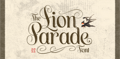 The Lion Parade Font is a unique and classic display font. It's a serif font with swashes! This font perfectly made to be applied especially in logo, and the other various formal forms such as invitations, labels, logos, magazines, books, greeting / wedding cards, packaging, fashion, make up, stationery, novels, labels or any type of advertising purpose. Features : uppercase & lowercase numbers and punctuation multilingual ligatures alternates PUA encoded We highly recommend using a program that supports OpenType features and Glyphs panels like many of Adobe apps and Corel Draw, so you can see and access all Glyph variations.
 - FF Suhmo by FontFont,
$68.99 German type designer Alex Rütten created this serif and slab FontFont in 2010. The family has 8 weights, ranging from Light to Black (including italics) and is ideally suited for advertising and packaging, film and tv, editorial and publishing, logo, branding and creative industries as well as web and screen design. FF Suhmo provides advanced typographical support with features such as ligatures, small capitals, alternate characters, case-sensitive forms, fractions, and super- and subscript characters. It comes with a complete range of figure set options – oldstyle and lining figures, each in tabular and proportional widths. In 2011, FF Suhmo received the TDC2 award.
 - White Mint by Innire,
$20.00 White Mint - is an elegant serif font that combines strict, refined forms and playful elements inspired by natural motifs. This versatile, easy-to-use font is perfect for branding, business card design, wedding invitations, social network pages, and much more. Ligatures will help you create original text that is easy to read at the same time. Multilingual support allows you to use the font not only on Latin glyphs -— Features : - Uppercase and Lowercase - Numerals - Punctuations (OpenType Standard) - Multilingual Characters - Ligatures - Stylistic Alternates for glyphs "I" :) -— If you have any questions, suggestions, or adjustments, be sure to write to me! Thanks for your attention
 - Quiet Sans by Dharma Type,
$29.99 Quiet Sans is a super geometric sans-serif family for text designed by Ryoichi Tsunekawa and the whole family consists of 6 weights from ExtraLight to ExtraBold and their matching Italics. The basic concept of this family is not only to make crisp, sharp and strong impact by geometric letter form but also to be legible and readable even on small size screen by their sophisticated design. Quiet Sans supports almost all European languages: Western, Central, South Eastern Europeans and afrikaans. And proportional figures, superior figures, inferior figures, denominators, numerators, fractions, ordinals and case-sensitive-forms can be accessed by using OpenType features.
 - Alpas by VP Creative Shop,
$12.00 ntroducing Alpas - soft serif typeface Alpas is rounded and soft font with multilingual support. It's a very versatile font that works great in large and small sizes. This font is perfect for branding projects, home-ware designs, product packaging, magazine headers - or simply as a stylish text overlay to any background image. FEATURES Uppercase, lowercase, numeral, punctuation & Symbol regular and italic versions Multilingual support No special software is required to type out the standard characters of the Typeface. Canva friendly Feel free to contact me if you have any questions! Mock ups and backgrounds used are not included. Thank you! Enjoy!
 - Madre Rose by Letterhend,
$17.00 Madre Rose is a sophisticated sans serif with 3 weight style to choose from, bold, thin and regular. It has many beautiful ligatures which you can play around to match your project, whether for a standout headline, or for a tagline, you name it. The unique letterform makes this font one of a kind! Perfectly to be applied to the other various formal forms such as invitations, labels, logos, magazines, books, greeting / wedding cards, packaging, fashion, make up, stationery, novels, labels or any type of advertising purpose. Features : 3 weight style uppercase & lowercase numbers and punctuation multilingual alternates & ligatures PUA encoded
 - Grotica by Runsell Type,
$24.99 Grotica is a versatile geometric sans serif contains 7 weights from Thin to Bold. IIt's inspired by the beautiful logotype on old labels and by exploring the Retroica font we've created in 2020. This font is suitable for movies, TV, advertising, packaging, logos, posters, music, branding, posters and so on with a modern design style. With over 600 glyphs per style, Grotica supports around 150 languages in Latin and Cyrillic script. Grotica OpenType Features including alternate glyphs, fractions, contextual alternates, oldstyle and lining (proportional and tabular) numerals, numerators/denominators, superiors/inferiors, and a variety of symbols.
 - Merlovaz by Ilhamtaro,
$14.00 MERLOVAZ is a bold, vintage-style font that has beautiful curves. This font is basically a classic serif font that is thick and has a slightly beautiful feature because the strokes have beautiful bends so that even though it is sturdy it still has a beauty side, it is very suitable for vintage designs such as a brand logo badge, liquor label, but also can for more modern designs like magazine headlines. To enable the OpenType Stylistic alternates, you need a program that supports OpenType features such as Adobe Illustrator CS, Adobe Indesign & CorelDraw X6-X7. Cheers!
 - Archee by KaryAmo Studio,
$4.99 Introducing Archee™ - Display Sans Serif Font Archee™ is a typeface that inspired by modern architecture. Designed for screen and medium sizes. It has 3 different weights and this font also featured with ligatures. Archee cover more than 20 languages including russian and greek. **FEATURES** - Uppercase & Lowercase letters - Numbering and Punctuations - Ligatures - Multilingual Support - Works on PC or Mac - Simple Installation - Support Adobe Illustrator, Adobe Photoshop, Adobe InDesign, also works on Microsoft Word. **All images on the demo is just for preview purpose only and not actually included on the files** Hope you Like it. Thanks.
 - Peralta Pro by Stiggy & Sands,
$29.00 Our Peralta Pro was inspired by egyptian slab serif letterforms, yet have a haywire disregard for classic balance. You'll find that Capitals and Lowercase have opposite weight distributions, as well as an all-around offbeat nature, and yet it all works to create a delightfully comic typeface. The SmallCaps and extensive figure sets help to offer a little more serious of a persona to this otherwise wild child typestyle. Opentype features include: - SmallCaps. - Full set of Inferiors and Superiors for limitless fractions. - Tabular, Proportional, and Oldstyle figure sets (along with SmallCaps versions of the figures). - Stylistic Alternates for Caps to SmallCaps conversion.
 - Grandecort by Ingrimayne Type,
$9.95Grandecort is derived from the OakPark family. It has lost the serifs, and has moved to a more traditional look. The upper case letters are a bit heavier than the lower case letters, but overall the letter shapes are fairly conventional for a bold, display face. In later 2018 the family was expanded to 9 fonts. GrancMitStripes was reworked to make four new faces: GrancAllStripes, GrancTopStripes, GrancBottomStripes, and GrancCaps. The last can be used as a background layer for the others. Also, The interior of GrandecortShadow was separated out to form GrandecortShadowInside. It has the same shapes as Grandecort-Regular but the spacing of GrandecortShadow and can be layered with the shadowed style to easily create bi-colored letters. - Nulato by Stefan Stoychev,
$29.88 NULATO is a sans serif font inspired by the great Alaskan outdoors and the clean shapes of the horizon. The font represents a modern and slick approach to a minimalist trend behind the core of great brand identity practices. Nulato took a year to develop, from the first sketches to the final 700+ glyphs the process took a significant amount of research and variables. The letters, specific ligatures, and symbols are a full stack. It was specifically designed with the classic approach to balance and appearance, but with a strongly advocated contemporary characteristic of font design and marks. NULATO evokes the perception of something familiar, but with that extra, needed for inspiring the new.
 - Kismet by Linotype,
$29.99Kismet has the look of a modern, ornamental alphabet, but looks are deceiving: the typeface was designed by John F. Cumming in 1879. The basic forms are strictly constructed, most based on the form of a circle, a shape which also appears again and again in the ornamentation. Cumming decorated his figures generously with spiral elements and tiny circles in the middle of the letters. Characteristics which suggest the beginning of the Jugendstil are the floral designs and some individual forms, for example, T, M or P. Small, pointed serifs add a sobering element to all the flowery, oriental decoration. Used sparingly in headlines, the extravagant Kismet will be sure to attract attention. - Backspacer by Emigre,
$39.00 Years ago, by happenstance, designers Nancy Mazzei and Brian Kelly found an old decrepit typewriter in an abandoned lot with tall grass in Brooklyn. They kept it around their apartment for two years. Then one day they decided that it was time to move and they planned to throw the old typewriter away. But it was so beautiful they wanted to keep at least a part of it. So they decided on keeping the keys. They kept the keys in a brown bag until one fine day the keys were introduced to a camera. It was a match made in heaven that resulted in some beautiful quirky images of typewriter keys. These images were the inspiration for Backspacer. They were scanned, traced and turned into a working typeface by Zuzana Licko.
 - NaNa Arabic by Naghi Naghachian,
$75.00 NaNa Arabic is a new creation of Naghi Naghashian. It was developed in 2012/2013 on the basis of specific research and analysis of Arabic characters and definition of their structure. This innovation is a contribution to the modernisation of Arabic typography, giving the font design of Arabic letters real typographic arrangement and providing greater typographic flexibility. This step was necessary after more than two hundred years of relative stagnation in Arabic font design. NaNa Arabic supports Arabic, Persian and Urdu. It also includes proportional and tabular numerals for the supported languages. The NaNa Arabic Font Family is available in four weights: Thin, Light, Regular and Bold. The design of this font family is inspired by two classic scripts: Kufic and Naskh. The quasi-geometric character of Kofic melds with the calligraphic grace of Naskh, which was invented by Iben Moghleh, an Iranian savant of the ninth century. He lived in Baghdad and was assassinated at the instigation of an Abbasid caliph. He was a polymath and a renowned scholar. I dedicate the design of this font family to the memory of this great man.
 - VLNL Gindicate by VetteLetters,
$30.00 The alcoholic beverage Gin is drunk around the world, as far back as the 13th century. Originally distilled as a medicine, it draws its main flavour from juniper berries. Gin is colourless itself but – due to its smooth taste – a major ingredient in a long list of famous colourful cocktails. Gimlet, Singapore Sling, Negroni, Charlie Chaplin, French 75, Vesper, Tom Collins, White Lady, Aviation, Monkey Gland, Southside, Gin Gin Mule and New Orleans Fizz are but a few of them. That made us decide it simply cannot be missing from the Vette Letters font collection. Vette Letters designer Henning Brehm originally designed VLNL Gindicate for the 2015 action movie Hitman: Agent 47. It was specifically used for the logo and signage of the maverick ‘Syndicate International’ organisation in the film. It lay dormant in a folder for a while, when it was reworked into this flashy 5 weight family. VLNL Gindicate is a rounded modern sans serif family, suitable for a multitide of applications, corporate or otherwise. It has somewhat of a warm sci-fy feel, without being overtly techno-ish. In the family are 3 regular weights (Light - Regular - Bold), but also an Inline and Multiline weight for extra design possibilities. Company logos, brand identities, music flyers or posters, you name it. VLNL Gindicate will spice up any design. Bottom’s up!
 - Warrior of World by Wildan Type,
$10.00 Introducing new typeface!!! Warrior of World is a display modern serif. it has unic construction. The simplicity and smoothness of its forms is combined with the sharpness and suddenness of the details. There are two style hollow and regular. The font is intended for short inscriptions and texts and is adapted for use on the screen. Warrior of World perfectly used for movie poster, product presentation, elegant logo design, packaging or invitation cards or heading text. Features Two style/ Numbers & Punctuation / Extensive Language Support
 - Brilliant Grunge by Java Pep,
$17.00 Introducing stylish modern sans serif font. The font builds with many stylistic alternates for forming beauty stylish sans. The font is called Brilliant Grunge font, every glyph or letter builds with more than 3 alternates sets for access to the alternate font you must use compatible software like Adobe Illustrator, Adobe Photoshop, Corel, Affinity, Procreate, Inkscape 01. or the newest and etc. If you are not using compatible software you can use and Install character maps software you can see the tutorial https://www.youtube.com/watch?v=KV7n5nxmsLs .
 - Bell Gothic by ParaType,
$30.00 The Bitstream version of Bell Gothic designed by Chauncey H. Griffith in 1938 for telephone directories of the Bell Telephone Company. It is a good sans serif choice for listings, catalogues and directories as its design is very space saving. The weight of the line is moderate and uniform. Being a clear and easy-to-read font, Bell Gothic is popular now for display and magazine advertising. Cyrillic version by Isabella Chaeva was released by ParaType in 1999. Italic styles added in 2009 by the same designer.
 - Nastarkib by Arabetics,
$39.00 An isolated typeface design with a calligraphic flavor. The Nastarkib font family employs visual features from the Urdu Persian Nastaliq Calligraphy. Visual connectivity is accomplished by overlapping glyphs with downward slopes. This font family has four members including normal and bold weights with two styles each, regular and left-slanted italic styles. This font family design follows the guidelines of Mutamathil Taqlidi type style with one glyph for every basic Arabic Unicode character or letter, as defined in the latest Unicode Standards, and one additional final form glyph, for the freely-connecting letters in traditional Arabic cursive text. Nastarkib employs variable x-height values. It includes only the Lam-Alif ligatures. Soft-vowel diacritic marks, harakat, are selectively positioned. Most of them appear by default on the same level, following a letter, to ensure that they would not interfere visually with letters. Tatweel is a zero-width glyph. Keying the tatweel key before Alif-Lam-Lam-Ha will display the Allah ligature. Nastarkib includes both Arabic and Arabic-Indic numerals, in addition to standard punctuations.
 - Carlino by Pío Pío,
$17.00 Carlino is named after the cutest dog on earth. Why? Because it’s the cutest font ever made. Especially intended for stationery use, it’s loaded with lots of alternates and ligatures, not only in the lowercase but in the uppercase. All of them are Open-Type programmed, so the possibilities of having something unique are endless. Following nowadays trend, Carlino is a multi-layered font: shades, holes and dots were made to work alone or all together with fantastic results! The way it works is so easy that It’s impossible not to enjoy it: Just type a word; then the same one set in another style and voilà! The font has also a lot of sweet ornaments to embellish your projects. Find inside: hearts, fleurons, party icons, flags, and the funniest animals. To accompany Carlino, there’s nothing better than Carlino Capitals. Its cute flavor makes everything more lovely. Have fun with Carlino and oh! don't forget to feed this little pug or it will bark all day long! Special thanks to Maximiliano Sproviero, whose advice helped me make this dream come true.
 - Rahere Sans by ULGA Type,
$18.98 Rahere is a humanist sans with subtle features that give the typeface a distinctive, warm appearance without distracting the reader. Legible at large and small sizes, Rahere is a versatile family suitable for a wide range of applications such as annual reports, advertising, brochures, catalogues, information signage, screen text and visual identities. For projects that need to convey a sense of authority or credibility, this is the ideal sans serif to use. The family consists of six weights ranging from light to extra bold with corresponding italics and the character set covers most of the major European languages. Each weight contains lining & non-aligning numerals in both proportional & tabular spacing. The tabular numerals share the same width across all weights and styles – a must for financial tables in annual reports. Spirited and lively, the italic lowercase is more cursive and calligraphic than the roman, although it harmonises perfectly, displaying enough character to create emphasis without looking out of place. When used on its own, for pull-out quotes or poetry, the italic exudes a charm that draws attention to the text. The typeface is named after Rahere, a 12th-century Anglo-Norman priest, who founded St Bartholomew's Hospital, London in 1123. I will always be indebted to Barts (as it is now commonly known) because in 2007 I was successfully treated for relapsed testicular cancer. Way back in 1992 I designed my first sans serif, Charlotte Sans, and although it was relatively successful, I was never really satisfied with the end result: not enough weights & italics, a small character set, lack of accented characters, and my design skills were still in their infancy. Whilst Rahere shares many common elements with Charlotte Sans, it is much more than just a reworking; it represents over 20 years of accumulated knowledge and experience as a designer.
 - Clear Sans by Positype,
$29.00 Clear Sans™ is a… wait for it… rational geometric sans serif. It is intended to fill a niche… to provide an alternative to the somewhat based-on-vernacular signage, somewhat geometric sans. I hear the word vernacular thrown around too much and too loosely. If a typeface is based in the vernacular, based on hand-painted or hand-crafted signage, then it should be based on the movements of the hand, retain that warmth and not on a pretty geometric model. For me, clean, geometric and precise doesn't have to be cold and expressionless. The original skeleton was hand-painted in 2008 to help determine and inform my decisions going forward. The typeface was completed shortly afterwards at the behest of an old friend for their identity. As usual, I expanded it, but considered retiring it since there were so many things similar out there. Years later, I had a chance to rediscover it and came to the conclusion that it could be improved, expanded in a logical and useful way, and introduced. I would be lying if I didn't admit that the rise of webfonts and embedded type in applications influenced many of the decisions I made about reworking Clear Sans™. Completely new Text and Screen fonts were developed that utitlize larger x-heights, space-saving widths, logical (and simplified) weight offerings… to name a few alterations. Even the pricing of each variant was considered to produce a more reasonable and simple solution for the developer, designer, professional and novice. Clear Sans™ is a departure from my previous sans serifs, but the influences of Aaux Next, Akagi Pro and Halogen are evident. Enjoy a light-hearted mini-site devoted to Clear Sans™
 - Clear Sans Text by Positype,
$25.00 Clear Sans™ is a… wait for it… rational geometric sans serif. It is intended to fill a niche… to provide an alternative to the somewhat based-on-vernacular signage, somewhat geometric sans. I hear the word vernacular thrown around too much and too loosely. If a typeface is based in the vernacular, based on hand-painted or hand-crafted signage, then it should be based on the movements of the hand, retain that warmth and not on a pretty geometric model. For me, clean, geometric and precise doesn't have to be cold and expressionless. The original skeleton was hand-painted in 2008 to help determine and inform my decisions going forward. The typeface was completed shortly afterwards at the behest of an old friend for their identity. As usual, I expanded it, but considered retiring it since there were so many things similar out there. Years later, I had a chance to rediscover it and came to the conclusion that it could be improved, expanded in a logical and useful way, and introduced. I would be lying if I didn't admit that the rise of webfonts and embedded type in applications influenced many of the decisions I made about reworking Clear Sans™. Completely new Text and Screen fonts were developed that utitlize larger x-heights, space-saving widths, logical (and simplified) weight offerings… to name a few alterations. Even the pricing of each variant was considered to produce a more reasonable and simple solution for the developer, designer, professional and novice. Clear Sans™ is a departure from my previous sans serifs, but the influences of Aaux Next, Akagi Pro and Halogen are evident. Enjoy a light-hearted mini-site devoted to Clear Sans™
 - Clear Sans Screen by Positype,
$21.00 Clear Sans™ is a… wait for it… rational geometric sans serif. It is intended to fill a niche… to provide an alternative to the somewhat based-on-vernacular signage, somewhat geometric sans. I hear the word vernacular thrown around too much and too loosely. If a typeface is based in the vernacular, based on hand-painted or hand-crafted signage, then it should be based on the movements of the hand, retain that warmth and not on a pretty geometric model. For me, clean, geometric and precise doesn't have to be cold and expressionless. The original skeleton was hand-painted in 2008 to help determine and inform my decisions going forward. The typeface was completed shortly afterwards at the behest of an old friend for their identity. As usual, I expanded it, but considered retiring it since there were so many things similar out there. Years later, I had a chance to rediscover it and came to the conclusion that it could be improved, expanded in a logical and useful way, and introduced. I would be lying if I didn't admit that the rise of webfonts and embedded type in applications influenced many of the decisions I made about reworking Clear Sans™. Completely new Text and Screen fonts were developed that utitlize larger x-heights, space-saving widths, logical (and simplified) weight offerings… to name a few alterations. Even the pricing of each variant was considered to produce a more reasonable and simple solution for the developer, designer, professional and novice. Clear Sans™ is a departure from my previous sans serifs, but the influences of Aaux Next, Akagi Pro and Halogen are evident. Enjoy a light-hearted mini-site devoted to Clear Sans™
 - Cíclope by Andinistas,
$19.95 Cíclope is a typeface family designed by Carlos Fabián Camargo in 2012 and used to write the headlines. Its idea is based on an army of stone soldiers that with their size and strength cause earthquakes. Under this concept he obtained stencil and sans serif letters with monstrous shapes and torn counterforms. Its usefulness as well as readability consists in imitate rocks with scars and cracks. For that reason, Cíclope family has three sizes, each with their respective italics distributed at different levels of corrosion. In addition, each file contains 260 glyphs useful for designing words and phrases with systematically eroded treatments for advertisement material. Thus Cíclope works as a raw material in the exploration of new graphic design. Finally, Cíclope concept has grotesque, geometric and humanistics letters roots that seem disastrous but each and every detail has been planned with high definition drawing. Most importantly, it expresses a big amount of grunge style with cracked edges and medium contrast between thin and thick strokes. In that sense, the writing seems impaired and special for design of logos, posters, flyers, brochures and worn, crusty or demolished graphic design.
 - Dawned by Twinletter,
$14.00 Dawned is our san serif font created with a sweet and enchanting imagination which we applied to this font design. every arch we make is dramatic and dazzling. start using this font to get the perfect work in your project. Not limited to that, the bold calligraphy font is designed to keep paying attention to the beauty of each letter, there are alternate options for the letters which are certainly easy for you to access, so you can automatically customize the letters you want to enhance the visual appearance of your design project. This charming font also offers the beauty of abstract typography harmony for a wide variety of design projects, including digital natural handwriting for designs, quote designs, for social media business designs, advertisements, trademarks, food and beverage promotion banners, text, posters, a signature, and all designs require handwriting or whatever design you want. ============================================================================================================ What’s Included : Standard glyphs Ligature Works on PC & Mac Simple installations Accessible in Adobe Illustrator, Adobe Photoshop, Adobe InDesign, even work on Microsoft Word. PUA Encoded Characters – Fully accessible without additional design software. Fonts include multilingual support for; Afrikaans, Albanian, Croatian, Czech, Danish, Dutch, English, Estonian, Finnish, French, German, Hungarian, Italian, Norwegian, Polish, Portuguese, Slovak, Slovenian, Spanish, Swedish Thank you for your purchase! Hope you enjoy our font!
 - Incus by VladB,
$20.00 Incus is a modern sans serif geometric font, includes upper and lower case characters, Latin, Cyrillic, Latin Eastern Europe, Turkish, Baltic and other. The Incus family consists of 6 fonts, divided into 2 subgroups (according to the type of style - St, Cut), and have the 3 types of thickness in each subgroup. Incus fonts will be useful in developing a brand, creating posters and other graphic products, and for word processing
 - Lucky Fellas by Nicky Laatz,
$10.00 A rough-and-ready hand-brushed script, with edgy lines and awesome character! It includes opentype features - stylistic alternates for the lowercase letters, and a comprehensive set of natural looking Ligatures to add to the realistic nature of the typeface. Lucky Fellas font family includes a complimentary textured titling sans serif font, and some super sexy swashes and splatters font to add some finishing touches to your designs.
 - Yefimov Sans by ParaType,
$30.00 Yefimov Sans is a sans companion for Yefimov Serif . It is one of the last original faces by Vladimir Yefimov. It has contemporary design, squarish shapes of the round letters and legible proportions. Thanks to open aperture, it works well in small point sizes, and its distinctive letterforms make it good also for display purposes. The typeface was completed by Maria Selezeneva and Alexandra Korolkova. Released by ParaType in 2015.
 - Laureen Zaza by Zaza type,
$29.00 Laureen zaza is an Arabic typeface that has a very particular appearance. It combines the characteristics of different genres; most notably the contrast of serif faces. While its design is influenced by Kufic and the Naskh style. Laureen zaza consists of two typefaces, text and display, and 4-weights. It’s a perfect choice for bold headlines, oversize typography, fashion logos, branding, identity, website design, album art, covers, posters, advertising, etc.
 - Lazycat by VladB,
$28.00 Lazycat is a modern sans serif geometric font, includes upper and lower case characters, Latin, Cyrillic, Latin Eastern Europe, Turkish, Baltic and other. The Lazycat family consists of 8 fonts, divided into 2 subgroups (according to the type of style - St, Rg), and have the 4 types of thickness in each subgroup. Lazycat fonts will be useful in developing a brand, creating posters and other graphic products, and for word processing.
 - Decima Mono Round by TipografiaRamis,
$39.00 Decima Mono Round – another addition to the Decima fonts family. Decima Mono Round is a modern monospaced condensed sans serif family with classic geometric design, built in three weights and six styles. The letterforms in roman style are techno (engineered) in appearance, while italics remind one of elegant handwriting balanced with Roman geometry. The typeface is released in OpenType format with extended support for most Latin languages, as well as Cyrillic.
 - Lokko by VladB,
$20.00 Lokko is a modern sans serif geometric font, includes upper and lower case characters, Latin, Cyrillic, Latin Extended symbols and other. The Lokko family consists of 8 fonts, divided into 2 subgroups (according to the type of style - St, Cut), and have the 4 types of thickness in each subgroup. Lokko fonts will be useful in developing a brand, creating posters and other graphic products, and for word processing.
 - Scratch by ITC,
$29.99Scratch was designed by Andrew Smith in 1995. It looks as thought many fine lines were drawn next to and over each other with a felt-tipped pen. Small bits of white peek out among the strokes and give the font its dynamic character. Flexible and sketchy, the forms are based on those of a classic sans serif cursive typeface. Scratch is meant exclusively as a headline or display font.