10,000 search results
(0.125 seconds)
- FranklinGothicHandBold by Wiescher Design,
$39.50 FranklinGothicHandBold is another part of a series of hand-drawn fonts from way back in time – before computers changed the way we worked in advertising. When I was in advertising – before computers – a very time consuming part of my daily work was sketching headlines. I used to be able to sketch headlines in Franklin Gothic, Times, Futura, Helvetica and several scripts. We had a kind of huge inverted camera – which we called Lucy. We projected the alphabet onto a sheet of transparent paper, outlined the letters with a fineliner and then filled them in. It was very tedious work, but the resulting headline had its own charm and we had a permanent race going on who was best and fastest. I won most of the time! They used to call me the fastest "Magic Marker" this side of the Atlantic. Great days, just like today! Your sentimental type designer from the past Gert Wiescher
 - Aviano Future by insigne,
$24.99 The Aviano series returns with a vigorous and futuristic sans serif. Aviano Future’s powerful squared forms lend intensity and authority to your designs. Aviano Future’s extended forms give the face strength and muscle. Aviano Future is a versatile new addition to the Aviano titling series. Aviano Future comes in six different weights with “fast” Fasts and is packed with OpenType features. Want to use more traditional rounded forms? Need swash forms? Art Deco alternates? Aviano Future includes 390 alternate characters. Eleven style sets are available, two sets of art deco inspired alternates, small forms, tough swash, constructivist titling and traditional stylistic alternates. Aviano Future also includes 40 discretionary ligatures for artistic typographic compositions. Please see the informative .pdf brochure to see these features in action. OpenType capable applications such as Quark or the Adobe suite can take full advantage of the automatically replacing ligatures and alternates. This family also includes the glyphs to support a wide range of languages. Aviano Future is a great choice for a professional designer that wants to achieve a technological, futuristic or epic look. Be sure to check out the rest of the Aviano series which can be used as complementary faces, including Aviano, Aviano Serif, Aviano Sans, Aviano Didone, Aviano Flare and Aviano Slab.
 - Marmaris by Larin Type Co,
$15.00 Marmaris this is a soft and elegant serif font. It carries a bold weight, round shapes it is well readable and works well in headlines and with text. This font is suitable for a wide variety of projects such as: logos, labels, branding projects, magazines, homeware designs, product packaging, mugs, quotes, posters and much more. It can also be more expressive and playful, thanks to the many alternatives and ligatures that are harmoniously combined in this font and make it more attractive and versatile. Try to change the alternatives, ligatures and you will get a lot of options for your project that will make it unique.
 - Monten by Gatype,
$14.00 Monten is a script font whose letters are designed a bit bold, almost similar to the Sans Serif font. A great choice if you want to add a retro look to your designs. Perfect for titles, logos, or anything your creative brain can think of. This customizable font will look great on a variety of design ideas such as Christmas themes, valentines, posters, invitations, weddings, branding projects, social media posts, magazines, book covers and more! This will add a fun and friendly touch to any of your projects! This font is PUA encoded which means you can access all the glyphs and sweeps easily.
 - Koelle Ornaments by insigne,
$21.99The Koelle Ornaments series is based on the etchings of Chris Koelle of Portland Studios. This is the second collaboration between insigne and Portland Studios; the first yielded the inky and active script Blue Goblet. Chris has a unique style where he "frames" his work with small icons related to the story or subject. These are now available as Koelle ornaments. Koelle Ornaments have a gritty, used appearance, and have a late 70's stylistic feel to them. There are 145 highly detailed illustrations in the entire pack, separated into four different fonts. These illustrations can be resized without any loss of quality, and can be easily converted to outlines and modified. Some of the ornaments have a Christian theme, while others are more generic. To view what ornaments are available and the keys they map to, please view the sample .pdf. The sample .pdf is an excellent reference guide, and we encourage you to print it out to quickly refer to your favorite ornaments. - Bordonaro Spur by Estudio Calderon,
$35.00 Bordonaro Spur - Bordonaro Script’s partner - is a typography strongly influenced by old beer labels and includes some serifs based on Frederic W. Goudy’s Copperplate, but with some softened spurs adding an elegant and soft texture to the text. It is ideal to be used on large bodies and has a set of special ligatures ideal to be used in branding. Psss...Check out the NEW Bordonaro Spur with Rounded corners , same version but soft! FEATURES Co = company1 Co = company2 Estd = established Inc = incorporated Ltd = limited Mc = mac Rd = Road St = street And also from Adobe CC you can activate Style Sets (SS) and get ideal ligatures for ordinal numbers: 1st = st 2nd = nd 3rd = rd 4th = th Bordonaro Script and Bordonaro Spur are two typographic styles that were designed under the same characteristic features with the idea of combining them to obtain better results, for that reason, we recommend merging them in a creative way and you will realize everything you can design with them. The banners designs are based on old brands of beer labels, coffee packaging, sports logos and in some cases we use Copperplate Gothic but only as a complementary font in order to harmonize the layout of the elements in each banner.
 - Emilio by Narrow Type,
$35.00 Emilio is a modern serif family available in 14 styles. It's an elegant typeface with friendly and warm personality which seeks a balance between traditional and modern. Emilio is inspired by the visuality of the 1980s and the typefaces that were widely used in advertising at the time, such as Times and Garamond. However, Emilio offers a contemporary take on the serif font family, adding new elements such as reductive, calligraphy-inspired details or the "K" and "R" legs shape. If you want a more traditional look, you can achieve it with the stylistic alternatives available. Of course, the typeface also provides standard and discretionary ligatures and many other Open Type features. In addition, it offers support for most Latin languages. The big headlines and titles are where Emilio shines the most, but due to large x-height and decent contrast will work for smaller text as well. Emilio is the ideal typeface for editorial design, posters, covers, branding and much more.
 - Lagosi by Jetsmax Studio,
$- Lagosi is a pointed serif typeface inspired by the features on the lagosi fabric found in wajo. They range in weight from light cuts that are bold and elegant to black and strong. Packed with more sets of Italic gestures and other custom bindings, this typeface is perfect for adding sparkle and elegance to your designs. What’s Included: Ligature & Unique Works on PC & Mac Simple installations Accessible in the Adobe Illustrator, Adobe Photoshop, Adobe InDesign, even work on Microsoft Word. PUA Encoded Characters – Fully accessible without additional design software. Fonts include multilingual support for; Afrikaans, Albanian, Catalan, Danish, Dutch, English, French, Hungarian, Icelandic, Italian, Spanish, Portuguese, German, Swedish, Norwegian, Polish, Indonesian, Turkish, Zulu Lagosi is very suitable for branding projects and many designs purpose like advertising, posters, invitations, branding, logos, magazines, merchandise, presentations, etc. Get Free one weight from the Lagosi family for Free! Apply to your amazing projects and enlarge your creative tools by adding the complete Lagosi family to your font library.
 - Griggs by Seniors Studio,
$140.00 Griggs is a variable type family with six-axis. Available as both static and variable font built to maximize versatility. This is a single variable font that can morph between a wide range of stylistic variations with each of its axes: Weight, Serif, Grade, Stylistic Set 1, Stylistic Set 2 and Slant. Also offer a variable subtle grade axis for slight weight adjustments, to user different preferences. For slant axis will automatically apply stylistic set 2 or set custom values on each axes for more options. A multi-purpose sans serif and serif typeface with high contrast, inktraps, sharp form, clean cuts and playful details, to convey the impression of opulence, elegance with a distinctive look. It comes in 3 distinct individual cuts within the Sans, Flare, and Serif subfamilies. Allows for many variations across its subfamilies, weights and styles. Each typeface contains with a warm personality and contemporary look. With different stylistic sets, you can choose the best-desired result for your design. You can change the feel of your design from more delicate, to bold to its sharpest most style. Griggs family with various styles will be an handy tool for a wide variety of designs. Excellent for text large and small. It’s a brilliant choice for branding, identity design, editorial design, logo design, display and packaging design etc. Typeface Features: * 325 Glyphs * 3 Subfamilies: Sans, Flare, Serif ( Each 8 Styles + Slant ) * 6 Weight: Thin, Light, Regular, Semi Bold, Bold, Black * Complete Collection: 144 Styles + Variable Font * Opentype Features: Stylistic Set 1, Stylistic Set 2 * Latin Language support including * Kerning * Autohinted Thank You.
 - Bamboo by Solotype,
$19.95Even the original founder, Barnhart Bros. & Spindler, thought this was a freaky font, and indeed they called it "Freak" when they introduced it in 1889. It was reintroduced in 1925 under the somewhat more elegant name of "Bamboo," and is one of the prizes that the collectors of antique metal types seek. - Guadalupe by Rodrigo Navarro Bolado,
$32.00 Article to appear on the font family page: According to the Catholic faith, a well known náhuatl story called "Nican Mopohua" (translated as "Here it's narrate") about the Marianas apparitions on the Tepeyac's hill, to the north of the actual Mexico City. After four apparitions, La Virgen de Guadalupe (LVG) told Juan Diego (JD) that he must introduce himself to the first Bishop of Mexico. JD took in his "ayate" some roses (that aren't natives to Mexico's barren territories) and when he dropped them in front of the bishop, the image of LVG appeared in front of him with indigenous features. I’ve worked a lot in this font that appears to came out of nowhere, just like the image of LVG itself, the fact is that I started first sketching some flowers, because I wanted to do something related to this mexican story, so, taking some features from this flowers I started sketching some letters, for example “r” and “i” and the counter forms for some letters like “a” and “o” (that I didn’t use by the way) and the punctuation marks, all inspired by this leaf forms. Lighter weight coming soon! Hope you like it. Any comments: rodrigonabo@gmail.com
 - Canilari by W Type Foundry,
$35.00 Canilari is a post-modern type family inspired by Diaguita pottery and contemporary serif typefaces. The Diaguita culture—developed from 10th century A.D. until 16th century A.D.—settled in the area of the present-day north Chile and northwest Argentina. Surviving cultural expressions of the Diaguita people are reduced to just a few pieces of beautifully decorated pottery of high technical quality. Canilari itself is a scream of identity with an incomparable tone that borrows elements from native America and proudly show them to the world. The intense and consistent personality of Canilari makes it a functional font for a wide range of uses: from continuous text in the most challenging environments to pithy, high-impact headlines. Canilari is well-suited for publishing: newspapers, magazines, books, etc. Its flashy look and angular shapes also make it an excellent choice for posters, logotypes, and advertising. The family consists of 2 sets: one standard and one pro, each in 4 weights plus italics. Canilari also includes a set of ornaments and illuminated caps. Together, the Std set (369 characters) and Pro (710 characters) support 219 different languages. This typeface was selected at the Bienal Tipos Latinos 2014.
 - Blacker Pro by Zetafonts,
$39.00 Blacker Pro is the revised and extended version of the original wedge serif type family designed by Cosimo Lorenzo Pancini and Andrea Tartarelli in 2017. Blacker was developed as a take on the style that Jeremiah Shoaf has defined as the "evil serif" genre: typefaces with high contrast, oldstyle or modern serif proportions and sharp, blade-like triangular serifs. Due to the high contrast in the design - slightly reminescent of didone typefaces - Blacker has been developed in two optical subfamilies. The display version offers tighter tracking, higher contrast and sharper corners for maximum effect at big sizes, while the text variant offers better readability and screen rendering at smaller sizes, with lower contrast and looser spacing. In the pro version, two additional condensed variant families have been added (condensed display and condensed text) allowing for more freedom and versatility in typesetting where space constraints are present. Also, three titling uppercase-only variants have been added, with a slightly extended feel, and two decorative subfamilies (inline and diamond). Each of these seven variants has been developed in six weights from light to heavy, with matching italics, for a total of 69 styles covering a wide range of editorial and advertising uses. All Blacker Pro feature a revised and extended character set covering over two hundred languages using the latin, cyrillic and greek alphabets. Open type features include small caps, positional numerals, fractions, superior & inferior figures, alternate forms, and an extended set of standard and discretionary ligatures. With its bold personality, Blacker aims to be a modern classic used for bold statements and self-conscious brands, making your text look great both on paper and on the screens.
 - Seabright Monument by Device,
$39.00 During a ‘type walk’ at the 2007 AtypI conference in Brighton, typographer Phil Baines pointed out what he considered to be a particularly egregious example of over-decorative art nouveau lettering on a war memorial. This made me determined to use it as the basis for a font. Released in Opentype, it now features ligatures, swashes and alternates. It’s not certain if the curved top bars on the E and F are a feature of the original design or due to climbers using them as footholds, but I incorporated them anyway. It has recently been used for invitations and supporting print material for formal charity dinners at the House of Lords.
 - Nicolaus Kesler by Proportional Lime,
$12.99 Nicolus Kessler was a printer of Incunabula in Basel, Switzerland. He produced numerous ecclesiastical works, Bibles, and an edition of the Golden Legend. This particular font is derived from one of his many typefaces. It has the virtue of both being at once fancy and elegant yet retaining a surprisingly easy to read property to it. This font has over 900 glyphs for modern usage and also includes a few of the more common historical abbreviations that were then present in printing.
 - Eixample Dip by Type-Ø-Tones,
$55.00 The Eixample project is inspired by modernist signage of various examples found in the Eixample neighbourhood in Barcelona. The name of each subfamily is related to its location or to specific elements of the original sign. Dip is the abbreviation for Carrer Diputació (Diputació Street), where the original sign spells Farmacia Específicos Diputación. The reference taken from the pharmacy sign is a curious model, where sans-serif lowercase letters coexist with script uppercase. This fundamentals create the system that we have introduced in Eixample Dip. The capitals are built with contained decoration to achieve maximum compatibility between letters. The script capitals are the default uppercase but we have also included alternative capitals, a slab style that can be combined with the scripts. The narrow influence of the original sign is correlated with the Narrow styles of the Dip family. But for more versatility, Eixample Dip explores normal widths and weights as well. Furthermore an Inline version was added to the suite.
 - Versailles LT by Linotype,
$57.99 The origins of the font Versailles go back to the 19th century in France when, with the introduction of lithography, alphabets could contain freer forms. The basic forms are Modern Face with triangular serifs. The direct influence for Versailles was the writing on the back of the memorial to Charles Garnier, the architect of the Paris Opera. Versailles is a classic font for advertisements, perfect for shorter texts and titles/headlines and it makes an impression of elegance and strength.
 - Legal Eagle JNL by Jeff Levine,
$29.00 The lettering on the cover of the sheet music for 1919's "The World is Waiting for the Sunrise" was set in a decorative sans serif with an engraved line adorning each character. Reminiscent of the headlines of legal documents, way bills, stock certificates and the like, the digital version of the design was given the name Legal Eagle JNL and is available in both regular and oblique versions. A companion font without the engraved lines is also available as Junior Clerk JNL.
 - Capri Pro by Floodfonts,
$49.00 Capri is an expressive constructed sans serif typeface in the tradition of Kabel and Avant Garde. The proportions of the letters and the overall impression are modern and contemporary but also retain the crude charme of the constructivist concept. The design is based on basic forms as square, circle and triangle and was developed by drawing not writing. The dominant diagonal forms and the vertically cut endings of the curved strokes give the font its sharp-edged look and its puristic elegance.
 - Dom Loves Mary by Correspondence Ink,
$39.99 Dom Loves Mary has a baby brother! Check out Fratello Nick here: http://www.myfonts.com/fonts/correspondence-ink/fratello-nick/ The DomLovesMary font family has all you need to create unique, custom stationery products. THE INSPIRATION BEHIND THE DOMLOVESMARY FONT FAMILY: DomLovesMary is named in memory of Dominic and Mary Sementelli, Debi’s in-laws. Dom and Mary were opposites who were truly “made for each other”. A snazzy dresser, Mary was feisty, loved to dance, sing, and be the life of the party. Dom was cool, calm and collected and was happy to shine the spotlight on the love of his life. They balanced each other out in a really great way. Going through some of her in-laws old photos, Debi found their wedding album. She was struck by the beautiful look on their faces as they got ready to start their life together. She saw the excitement, joy and anticipation of them envisioning “Una Bella Vita!” (A beautiful life!) She decided to create a hand-lettered font with them in mind represented by two totally different lettering styles that were, like Dom and Mary, “made for each other”. It’s her way of honoring them and sharing their beautiful life with all of the couples just starting theirs together. They truly had “Una Bella Vita” and we hope you do too. WHAT'S UNIQUE ABOUT THE DOMLOVESMARY FONT FAMILY: The SCRIPT & TEXT FONTS are lettering styles that were made to compliment each other. With a vintage, classic feel, they will add elegance to your design, while the TEXT serves to offer support with easy to read simplicity. In addition to the standard character set, each of the uniquely styled script fonts includes a collection of flourished ornaments. Use them to create corners, headers or other embellishments to complete the look. And if you really want to fancy things up, we offer two sets of 72 additional flourishes that were specifically made to add to upper and lower case letters for easy customization. Dress them up with one, two or more. It’s like choosing simple pearls or piling on the glitz! Or combine several to create unique flourished ornaments of your own. To add even more panache, we're pleased to present our ready made set of most frequently used ADD-ON WORDS. Created with the wedding client in mind, this set of 66 includes envelope friendly titles: Mr and Mrs, Mr, Mrs, Miss, Ms, Doctor, the Doctors, as well as words to fill out your invitation suite: RSVP, Respond, Save the Date, Accommodations, Directions and more! Easily create Bride and Groom signs or Thank You cards or tags with the click of a key. Or use angled words like “and, at, to, on, for, from and of” to add a special touch to your large groups of copy. PACKAGES: We are pleased to have a variety of customers. From professional invitation designers to DIY brides, publishing companies and website / blog designers among others. So we've created packages to help fit their diverse needs. Purchase just one of our beautiful DomLovesMary SCRIPT fonts, each with its collection of included flourishes or the PRO VERSION complete with ALL THREE script fonts and a combined total of over 100 flourished ornaments. Add our TEXT font, a set of FLOURISHES or ADD-ON WORDS. Love the idea of customizing your letters with all the possible combinations? We offer a special price when you purchase both sets of flourishes. Or choose our Accoutrements Package containing both sets of FLOURISHES for letter customization as well as our ADD-ON WORDS. Want to have it all? The “DomLovesMary Total Design” package is for you. Each of these packages are offered at a 25% savings. WHAT PROGRAM WILL YOU USE?: All of the font options come in both Pro and Standard format fonts. For those with programs that can take advantage of OpenType features (click on the link to see if the program your using is one of them) the Pro fonts are for you. http://www.typotheque.com/fonts/opentype_feature_support/ For others without the ability to use Open Type features, we provide all of the script fonts that comprise the Pro Version as separate versions (Regular, Contextual and Stylistic). If you are using a program like Microsoft Word, and want all three script fonts, you can still purchase the Pro Version (a $50.00 savings), and install the individual fonts bundled in the Standard Fonts folder. We have set it up so they will appear separately as DomLovesMary, DomLovesMary Contextual and DomLovesMary Stylistic in your fonts list. Exciting news! In an effort to help our customers access all the goodies that are normally only available in Open Type Capable programs (like the flourished ornaments that come with our script fonts), we have found a simple application that allows you to do just that. For this reason, we've made sure to unicode all of our characters and glyphs so that they will work in this type of program. There may be others, but we checked this one out and found that it works. Check out PopChar
 - Tropea by Larin Type Co,
$18.00 Tropea is a elegant ligature serif font This font has a regular weight and looks amazing in logos, branding, arranging wedding invitations, business cards, packaging, titles and much more, it is very readable and recognizable. This font includes alternates for Uppercase and Lowercase, with them you can make your project more elegant and originality. Also, this font has many ligatures for upper and lower case, they will add charm and uniqueness to your project This font is easy to use has OpenType features. Font includes: Full alphabet with Uppercase and Lowercase A-z Numbers, fractions Punctuation and symbols Alternates for Uppercase and Lowercase Ligatures for Uppercase and Lowercase
 - Flicket by IbraCreative,
$17.00 Flicket is a contemporary display serif font that seamlessly blends sophistication with a touch of whimsy, making it an ideal choice for modern design projects. With its clean lines and subtle flourishes, Flicket exudes a timeless elegance that captures attention while maintaining readability. The typeface strikes a harmonious balance between classic serif elements and a contemporary aesthetic, making it versatile for a range of applications, from editorial design to branding. Flicket’s distinctive letterforms showcase a refined yet approachable style, allowing it to convey both professionalism and creativity in a single glance. This modern display serif font, with its unique personality, adds a distinctive flair to any project, making it a standout choice for those seeking a perfect blend of tradition and innovation in typography.
 - NorB Sans Expanded by NorFonts,
$32.00 NorB Sans Expanded is my first sans serif font, it's a friendly smooth sans serif font with 3 weights: Regular, Medium and Bold each with italic version. It includes over 1000 glyphs + OpenType features (Access All Alternates, Small Capitals From Capitals, Case-Sensitive Forms, Discretionary Ligatures, Denominators, Fractions, Historical Ligatures, Kerning, Standard Ligatures, Localized Forms, Numerators, Ordinals, Small Capitals and Superscript.) This font would be perfect for both texts and titles, and pairs beautifully with other fonts already in your library, especially handwritten and serif fonts. The resultant texture is lively but not intrusive, and makes for a friendly and readable text. You may use it in everything from logotypes to social media posts, website and magazine layouts to poster designs.
 - Grindale by Pixesia Studio,
$23.00 Introducing Grindale - Modern Classic Serif Font Grindale is a modern take on the classic serif font that combines timeless elegance with a contemporary edge. This font is perfect for creating elegant headlines, logos, and other design elements that demand attention. With its clean lines and classic serifs, Grindale is a versatile font that will add a touch of sophistication to any project. Its modern design makes it a great choice for a wide range of projects, from branding and advertising to editorial design and more. FEATURES - Stylistic Alternates - Ligatures - PUA Encoded - Uppercase and Lowercase letters - Numbering and Punctuations - Multilingual Support - Works on PC or Mac - Simple Installation - Support Adobe Illustrator, Adobe Photoshop, Adobe InDesign, also works on Microsoft Word Hope you Like it. Thanks.
 - Raldo RE by URW Type Foundry,
$49.99 Quite unusual, Musenberg started his Raldo design with the italic. However, he managed to preserve the temperament and vividness of the italic in the roman without questioning the stability of the individual characters. Raldo is a modern Sans Serif family already quite popular in Germany. The German IGEPA group chose Raldo as corporate typeface family. Now, Marc Musenberg redesigned and extended his Raldo typeface family. The new Raldo RE Pro comprises 10 styles, 5 roman and 5 corresponding italics. All fonts now include the complete Latin character set plus fractions, different sets of figures and fractions as well as small caps and small caps figures for Raldo RE Pro Text, Regular, Semibold and Bold. Raldo RE Pro has been chosen to be part of the URW++ SelecType.
 - Kalyna by 2D Typo,
$36.00 The Kalyna font is interesting with its stylistic implementation through asymmetrical serif. Such design is characteristic for the Ukrainian style. The drawing of the font is based on the sketches of a famous Ukrainian graphic artist of early 20th century Heorhiy Narbut. His work set the whole school in the Ukrainian graphic art and is still very influential nowadays. The font is capital and also includes a set of ornaments in addition the standard set of symbols.
 - Glastone by Craft Supply Co,
$15.00 Glastone is a modern serif typeface that seamlessly blends beauty and a feminine touch, infusing a sense of class and contemporary sophistication. Its graceful lines and modern aesthetic make it the perfect choice for projects seeking a balance of elegance and modernity. This typeface is ideal for greeting card, packaging, brand identity, poster, or any purpose to make your design project look eye catching and trendy. Feel free to play with this typeface!
 - Blonden by Craft Supply Co,
$15.00 Introducing Blonden: A condensed sans-serif font that fuses modernity with streamlined efficiency. Blending style and compactness, Blonden brings a dynamic edge to any design. Experience the sleek versatility of Blonden's condensed form, perfect for making bold statements in tight spaces. This typeface is ideal for greeting card, packaging, brand identity, poster, or any purpose to make your design project look eye catching and trendy. Feel free to play with this typeface!
 - Mogista Couture by Mordex Studio,
$18.00 Mogista Couture is a bold vintage-style serif font with strong character and soft features. Mogista Couture comes with binder alternatives and to help you create something spectacular every time. This font is PUA encoded, which means you can access all the glyphs and sweeps easily. This font is perfect for fashion design projects, logo designs, branding designs, wedding designs, product packaging designs, advertisements, products, labels, photography, social media and other products.
 - Humble Manford Font Duo by Jinan Studio,
$12.00 Humble Manford Font Duo is an excellent choice for logo design, branding, packaging, business card, and adventure-themed designs. Its combination of script and sans serif styles, along with the textured and solid options, provides ample creative opportunities for designers to explore and create stunning visual identities and marketing materials. Thank you a million times for buying and using this font for your projects. Enjoy this font and happy creating! Jinan Studio
 - Monteci by Pista Mova,
$14.00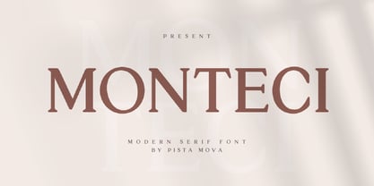 Monteci is a modern display serif font. Minimalist and classic typefaces are suitable for logos, quotes, branding, or editorial designs. Monteci has a unique character by combining geometric shapes with organic curved details. This is a unique typeface for your personality. This font is PUA encoded which means you can access all of the amazing glyphs and ligatures with ease! Feel free to contact us if you have any questions :) Thank you!
 - Amstir by Craft Supply Co,
$15.00 Amstir is a timeless classic among serif typefaces, perfectly tailored for editorial use. With its elegant lines and refined presence, Amstir brings an air of sophistication to your content. Elevate your editorial projects with the grace and tradition of Amstir's distinguished design. This typeface is ideal for greeting card, packaging, brand identity, poster, or any purpose to make your design project look eye catching and trendy. Feel free to play with this typeface!
 - Blastatic by Remedy667,
$18.00 Blastatic! is a highly versatile and unique sans-serif display typeface, but still desires an offbeat, modern style. Blastatic!, new from Remedy667, has the power to turn your designs into masterpieces. With ligatures, extended glyphs, and complimentary alternates, this typeface can do it all. Whether you’re designing for a Jazz Album, Godzilla Movie, or Hot Rod Magazine, Blastatic! will give you an irresistible style. Saul Bass fans take note, this stuff’ll give you vertigo.
 - LOUIS felligri by Jolicia Type,
$20.00 LOUIS felligri is a modern display serif. This font is a variable typeface for weight By using the variable sliders in your design software you have a range of weight options in compatible software like Adobe Illustrator. Play around with individual letters to give your type a unique look. Included in this family are alternate characters to add even more styling options. Features: - Multilanguange - Alternates - PUA Encoded - Font Family totals 14 fonts - Variable font
 - NS Bullsmith by Novi Souldado,
$35.00 Bullsmith font collection, inspired by old style letterhead print, beer label, certificate, billhead, lithographic design and sign store. This font came with 3 styles, script, decorative and serif. With the combination from 3 fonts this is perfect to create label design, headline, logo types, signage, poster, certificate, all types of merchandise, book cover and many more application. what you get : 130+ Stylistic Alternate Standard & Discretionary Ligatures Uppercase & Lowercase Numerals & Punctuation OTF file
 - Altertypo by Popskraft,
$12.00 Altertypo, a font family on a never-ending quest for the "perfect" sans-serif style. Inspired by the early 20th-century pioneers like Gill Sans and Johnston Sans, Altertypo seamlessly blends their classic elegance with contemporary flair. This unique typeface is your passport to creative freedom in graphic design, serving a multitude of purposes from editorial and corporate to web and interaction design. This font allows you to craft compelling designs that transcend the ordinary, providing the versatility and innovation you seek. It invites you to explore a world of creative possibilities, where every character is thoughtfully placed to ensure a smooth, organic flow of words. Step into the realm of Altertypo, and leave behind the constraints of conventional fonts. It's your gateway to exceptional design, where each letter harmonizes effortlessly to deliver a captivating visual experience. Say goodbye to the limitations of standard fonts and embrace the boundless potential that Altertypo offers.
 - Beckan by Valentino Vergan,
$16.00 Beckan is a retro inspired typeface, which leans towards the Art Nouveau style. The Beckan typeface has a high-contrast and a thin hairline, this gives the typeface a bold and modern retro look. The Beckan typeface comes in two styles, Regular and Oblique. The Beckan typeface can be paired with a minimal sans serif or light script font, this combination will give your next project a unique look. The Beckan typeface is very versatile and can cover a wide range of project such as: branding, mastheads, magazines, logos, facebook banners, Instagram posts, websites, blog posts, pull quotes, product packaging, advertisements and much more. If you are looking for something bold and retro for you next project, Beckan is the font for you. WHAT YOU GET: Beckan Regular Beckan Oblique BECKAN INCLUDES A FULL SET OF: Uppercase and lowercase letters. Numbers. Punctuation. Multilingual symbols. We hope you enjoy using the Beckan typeface.
 - Corporate S by URW Type Foundry,
$180.99 The Corporate ASE typeface trilogy was designed by Prof. Kurt Weidemann, a well-known German designer and typographer, from 1985 until 1990. This superb trilogy consisting of the Corporate A (Antiqua), Corporate S (Sans Serif), and Corporate E (Egyptian) is a design program of classical quality, perfectly in tune with each other. Weidemann says: “My ASE trilogy, quite like triplets, is in perfect harmony and covers all needs of modern typography!” Initially exclusively designed for DaimlerChrysler as a corporate font, the ASE trilogy may be now licensed and used without restriction. URW++ digitized the ASE for DaimlerChrysler and Prof. Weidemann and is the exclusive licensing agent for this outstanding and extremely popular typeface program. Meanwhile, URW++ enhanced the Corporate ASE family in regular, bold, italic, and bold italic by Greek, Cyrillic, and all additional Latin characters to cover Eastern Europe including the Baltic Rim, Romania and Turkey. Corporate ASE in regular, bold, italic, and bold italic is now available in the WGL 4 character complement.
 - Corporate S WGL by URW Type Foundry,
$210.99 The Corporate ASE typeface trilogy was designed by Prof. Kurt Weidemann, a well-known German designer and typographer, from 1985 until 1990. This superb trilogy consisting of the Corporate A (Antiqua), Corporate S (Sans Serif), and Corporate E (Egyptian) is a design program of classical quality, perfectly in tune with each other. Weidemann says: “My ASE trilogy, quite like triplets, is in perfect harmony and covers all needs of modern typography!” Initially exclusively designed for DaimlerChrysler as a corporate font, the ASE trilogy may be now licensed and used without restriction. URW++ digitized the ASE for DaimlerChrysler and Prof. Weidemann and is the exclusive licensing agent for this outstanding and extremely popular typeface program. Meanwhile, URW++ enhanced the Corporate ASE family in regular, bold, italic, and bold italic by Greek, Cyrillic, and all additional Latin characters to cover Eastern Europe including the Baltic Rim, Romania and Turkey. Corporate ASE in regular, bold, italic, and bold italic is now available in the WGL 4 character complement.
 - Corporate A WGL by URW Type Foundry,
$210.99 The Corporate ASE typeface trilogy was designed by Prof. Kurt Weidemann, a well-known German designer and typographer, from 1985 until 1990. This superb trilogy consisting of the Corporate A (Antiqua), Corporte S (Sans Serif), and Corporate E (Egyptian) is a design program of classical quality, perfectly in tune with each other. Weidemann says: "My ASE trilogy, quite like triplets, is in perfect harmony and covers all needs of modern typography!" Initially exclusively designed for DaimlerChrysler as a corporate font, the ASE trilogy may be now licensed and used without restriction. URW++ digitized the ASE for DaimlerChrysler and Prof. Weidemann and is the exclusive licencing agent for this outstanding and extremely popular typeface program. Meanwhile, URW++ enhanced the Corporate ASE family in regular, bold, italic, and bold italic by Greek, Cyrillic, and all additional Latin characters to cover Eastern Europe including the Baltic Rim, Romania and Turkey. Corporate ASE in regular, bold, italic, and bold italic is now available in the WGL 4 character complement.