10,000 search results
(0.056 seconds)
- Nanotech by VType,
$12.00 Nanotech is a clean sans-serif font with a strong visual impact. This font is perfect for logos, business cards, magazine layouts, headers, product design, large-scale artwork and more.
 - Audrey Mirages by Sarid Ezra,
$15.00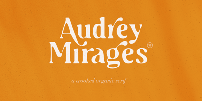 Audrey Mirages is a crooked styled serif that will make your design feels more organic and handmade. This font contains alternates and ligatures. It is also PUA Encoded. Happy Creating!
 - Minty March by Angele Kamp,
$24.00 Minty March is an adorable handwritten font that is perfect for cards, invites, birthday invitations and more. This condensed, serif also works well when combining it with a script font.
 - Virtus Sans by Andrew Footit,
$20.00 This clean sans-serif typeface brings your designs and layouts together in one great looking typeface, uncomplicated and legible large or small. VIRTUS SANS has 4 weights each with italics.
 - Arkhania by Adorae Types,
$16.00 Light the fire and get your spells ready for Halloween with this witchy font, Arkhania. This display family offers three different styles from which you can pick the one that best describes the atmosphere and mood of your composition: Striped, fun and wicked, Regular, a more strong and classical look, and Hollow, old styled and classy. All three typefaces inspired by the Triple Moon Goddess and its phases: Maiden, Mother, & Crone. Arkhania family features: 423 glyphs 3 styles 84 icons, drawings, swashes and flags Standard ligatures Alternate characters Contextual alternates Swashes more... In addition, there is Arkhania Sigils, a style filled with swashes, icons, drawings and symbols. Play with them, combine a few, choose from different beginnings and endings and create your own swashes, underlines and frames. You can also find flags and boxes along with common connectors. Tips for a clean and modern look: Combine this typeface with a sans serif, light or thin font, like Aeonian (Aeonian Light was used for these images), and let Arkhania cast a spell on the viewer.
 - Zanna by Valentino Vergan,
$16.00 Zanna is a modern typeface with lots of style and elegance. The Zanna typeface was inspired by the high contrast Didot look, which has been synonymous with fashion for decades. The Zanna typeface also has a very thin hairline and short non-bracketed serifs, which gives it a nostalgic and modern look. The Zanna typeface comes in two styles Regular and Stencil, each style has an oblique version. The Zanna typeface has over 140 ligatures and alternate characters, this makes it perfect for creating modern and elegant feminine logos. With so many ligatures and alternates characters to choose from, you can definitely create stunning designs for your brand or clients. The Zanna typeface can be paired with a beautiful minimal sans serif or light script font, this combination will make your next project look elegant and classy. The Zanna typeface is very versatile and can cover a wide range of project such as: fashion branding, mastheads, magazines, feminine logos, facebook banners, wedding invitations, Instagram posts, websites, blog posts, pull quotes, editorials, product packaging, trendy social media posts, advertisements and much more. If you are looking for something modern, nostalgic and chic for you next project, Zanna is the font for you. What you get: Zanna Regular.otf Zanna Oblique.otf Zanna Stencil.otf Zanna Stencil oblique.otf Zanna includes a full set of: Uppercase and lowercase letters. Numbers. Punctuation. Ligatures. Alternate characters. Small Caps. Multilingual symbols. We hope you enjoy using the Zanna typeface.
 - Tatline Neue by Groteskly Yours,
$12.00 Tatline Neue is a serif font family of 14 fonts encompassing a wide range of weights — from Thin to Heavy. Tatline Neue was modelled after the original Tatline display font, but this major overhaul resulted not only in updated and tweaked shapes and smother curves, but also in addition of 13 new weights, making Tatline Neue a perfect tool for designers and typographers alike. Each font contains 450 glyphs, multiple sets of numbers, stylistic alternatives for certain glyphs, ligatures, numerators, denominators, old style figures, and other symbols. Tatline Neue can be freely used across Western European, Central European, South Eastern European languages. Tatline Neue was designed from the scratch to keep glyphs consistent across all weights. Thinner fonts are more uniform, with little to no variation in the weight of the strokes. Bolder fonts, on the other hands, are chunky and somewhat comic —in a good way. Tatline Neue was born out of a display font, losing none of its original quirkiness and vibe. While serif fonts are often seen as vintage and orthodox, Tatline Neue strikes a livelier note: one of cheekiness, bizarreness, quirkiness, and expressiveness. Thanks to a wide range of weights, Tatline Neue is a great tool for a variety of projects: whether it's used for plain text in a larger body of text or as a headline font, or even as a key element in a logo creation or brand identity. Tatline Neue is a serif font for those who are tired of seeing the boring in the typography and design; it's a font for explorers, for adventurers, for those who seek to find their own voice.
 - Abrakadabra by Tolya Doodko,
$18.00 Abakadabra is a headline typeface inspired by sans-serifs of the first half of the twentieth century, as well as by the tricks of fakirs, illusionists and charmers. The gently playful manner of the font can be exaggerated to a more pretentious and grimacing one, or can alternatively be calmed to a neutral appearance. Abrakadabra supports most European languages and has thematic emoji symbols. The text can be customized by using stylistic sets or the Swashes and the Stylistic Alternates buttons in the OpenType panel.
 - Heptal by deFharo,
$11.00 - Heptal is a typeface family with five weights including true italics. The geometry of the characters is neo-gothic and the serifs are polygonal concave or inverted Tuscan. - Heptal fonts offer a complete set of lowercase alternatives and advanced open type functions. - The proportions, the metrics and the Kerning are meticulously configured so that the texts are shown fluid and the graphic stain is compensated. - These fonts have a wide table of characters (530 glyphs) with support for all the languages derived from Latin.
 - Mobern Fashion by Nirmana Visual,
$22.00 Mobern Fashion Unique& playful sans serif serif family with 5 Weights Mobern Fashion offers beautiful typographic harmony for a diversity of design projects, including logos & branding, social media posts, advertisements & product designs.
 - Karina by Flawlessandco,
$9.00 Introducing "Karina" is a modern playful font. Step into a world of contemporary charm with "Karina," a font designed to infuse your projects with a perfect blend of modern aesthetics and playful whimsy. Karina doesn't just bring letters to life; it introduces a dynamic trio of styles — regular, extrude, and fun — adorned with patterns in fun styles that add an extra layer of delight to your designs. There's some connected letters and some alternates that suitable for any graphic designs such as branding materials, t-shirt, print, business cards, logo, poster, t-shirt, photography, quotes .etc This font support for some multilingual. Also contains uppercase A-Z and lowercase a-z, alternate character, numbers 0-9, and some punctuation. If you need help, just write me! Thanks so much for checking out my shop!
 - Aceisida by JB Design,
$9.00 ACEISIDA is a font that supports over 100 languages from around the world. Basic and some Extended Cyrillic, Basic, Additional and Extended Latin, Basic Greek, and some newly added characters recently entered into use in everyday life. ACEISIDA is a font that elegantly combines the timelessness of antique design with the modernity of the grotesque. The absence of serifs results in a universally readable and sophisticated format. It was designed to focus on the main text, complementing other design fonts without disrupting them. This font is perfect for those who appreciate minimalism and refinement, and its smooth lines make it suitable for various design projects. It adds understated elegance to any design, making it the ideal choice for those who value simplicity, modernity, and sophistication. The font includes many glyphs for the Kazakh language, catering to the ongoing transition to the Latin script and accommodating various spellings. It also features a basic set of characters and glyphs with accents for the Greek language and an uppercase version of the letter “eszett” for German.
 - Marmaris by Larin Type Co,
$15.00 Marmaris this is a soft and elegant serif font. It carries a bold weight, round shapes it is well readable and works well in headlines and with text. This font is suitable for a wide variety of projects such as: logos, labels, branding projects, magazines, homeware designs, product packaging, mugs, quotes, posters and much more. It can also be more expressive and playful, thanks to the many alternatives and ligatures that are harmoniously combined in this font and make it more attractive and versatile. Try to change the alternatives, ligatures and you will get a lot of options for your project that will make it unique.
 - Monten by Gatype,
$14.00 Monten is a script font whose letters are designed a bit bold, almost similar to the Sans Serif font. A great choice if you want to add a retro look to your designs. Perfect for titles, logos, or anything your creative brain can think of. This customizable font will look great on a variety of design ideas such as Christmas themes, valentines, posters, invitations, weddings, branding projects, social media posts, magazines, book covers and more! This will add a fun and friendly touch to any of your projects! This font is PUA encoded which means you can access all the glyphs and sweeps easily.
 - Zeit by Fenotype,
$35.00 While fashions come and go, style is eternal. True to its name, Zeit is an ageless serif font family, distinct yet reassuringly familiar and trustworthy. From magazines to mobile apps, branding to advertising, Zeit covers everything with poise. The font family is equipped with many handy and carefully thought features. Small capitals and small capital figures, old style figures, subscript and superscript figures and fractions are intrinsic to the design. For a bit of flair, look for the swash alternates included in the italics – along with variants of the characters g and y. Look no further, Zeit is rigorously designed from head to toe – as only true quality can stand the test of time.
 - Fontanella by Latinotype,
$29.00 Fontanella is a typeface designed by Coto Mendoza, which emerged from calligraphy and manual drawing exploring the skeleton and classic proportions of Roman capital letters. This initial process later gave rise to a sans serif family composed of 8 pesos and its italic variants. It also includes small caps, old numbers and width variants in the set of alternates. The slightly enlarged x-height makes it perfect for composing short texts in editorial, fashion, branding, magazine, television, window display and other media projects. Fontanella a classic spirit reinterpreted in a contemporary language. We especially thank Alfonso García for his impeccable work on the digital edition and Nicolás Tobar for the art direction on the specimens.
 - Cartes by insigne,
$39.00 Cartes has a bit of a strange origin story, as far as fonts go. It’s a combination of ideas from 1920’s advertising and hand-painted letters from the 1500s. The typeface was designed to flow with elegance and speed yet retain a sense of the handmade. The serifs flow with indentations implying movement and terminate with inky globules that lend your copy a sense of gravitas. This typeface can be used for headlines, short texts, posters, logos, headlines, headlines in big sizes or just as easily for ad text. At large sizes, pen strokes can be seen that give the typeface a touch of humanity and vigor. At smaller sizes the type is still unique, but readable.
 - Applied Sans by Monotype,
$57.99 The Applied Sans™ family is a reinterpretation of the first sans serif typefaces used in what was then called, “jobbing or trade” work – typefaces like Venus and Ideal Grotesk. While built on the foundation of these late 19th and early 20th century designs, Applied Sans adds to it all the required features for modern typographic communication. The design benefits from a large x-height, open counters, generous apertures and a subtle modulation in stroke weight. These ensure character legibility and make for a design that is inviting and easy to read. Applied Sans family’s wide range, precise gradation of weights and extensive language support guarantees the design’s effectiveness in a wide and varied range of uses.
 - Tzimmes by Dada Studio,
$29.00 Tzimmes is a tasty morsel for those who love tasty letters. The fleshy serifs combined with the subtle references to calligraphy create a distinctive character that will turn every text into a feast for the eyes. The family consists of 22 weights including true italics. This will allow you to freely compose even the most demanding projects. Book? Magazine? Logotype? Everything available à la carte! Light and bold weights, due to their strong personality, are perfect for display uses. At the same time, Regulars create a harmonious structure that provides good legibility in long texts. Tzimmes covers all latin languages and cyrillic. It contains a wide set of numerals, small capitals, fractions, ligatures and other OpenType goodies. Bon appetite!
 - Orange Glos by Gatype,
$10.00 aIntroducing Orange Glos - a bold classic serif with more hand-illustrated alternatives, and preserved textures, for a unique, yet modern vintage feel. Each letterform has a slightly grainy exterior that works beautifully to enhance the conventional and soft details of the Orange Glos. This versatile display typeface has enough character for logos and branding, as well as headlines, apparel, bridal and more. Keep it classic, or decorate it with ornate alternatives to uppercase and lowercase glyphs! To access the alternatives, you must have access to an older version of Photoshop to copy/paste the glyphs from the included PSD, OR the Glyphs Panel, which can be found in Photoshop CC or any Version of Adobe Illustrator. Enjoy!
 - VVDS Sunshine Bridge by Vintage Voyage Design Supply,
$12.00 Sunshine Bridge is a retro modern font family, featuring a retro brush script with an artistic modern bold sans serif. They complement each other perfectly. You can use the Sans as main and Script as additional, or vice versa. This family gives you a modern look with a vintage mood. So, you can use it both as in vintage-look projects - Beer bar or Brewery logo etc, or as Modern magazine headline or any modern print. It includes a lot of OpenType Features in Script with Swashes and Alternates to give you a little more hand-touch look. The family includes: Clean and Pressed versions Well Kerned Multilingual Support OpenType Features Modern / Vintage look
 - Novecento Slab Rough by Synthview,
$22.00 Novecento Slab Rough adds a letterpress / analog effect to its Slab Serif parent. Each letter has a different pattern and gives you a truly realistic effect. Even accented variants of any base character are all different. This font has also a built-in feature that automatically displays a texture variant for the 2nd occurrence of a letter or a number when they appear close one to each other. For instance: AA OO TT ÜÜ. But also: AOA NON TXT etc. And don't forget alternate glyphs design such as N I J Q Y and all other features present in the Novecento mega family: 32 styles, 76 latin languages supported, 590 glyphs and 16 stylistic opentype features for advanced typography.
 - Cosan by Adtypo,
$45.00 The idea was to find common intersections between the humanistic and the neo-grotesque model of sans. This variable font offers everything from the world of sans serif in one place – a broad range of weights, adjustable contrast, and a lot of alternative glyphs. As a bonus, you can choose the “cold” or “warm” impact of the text. The Cosan Cold variant has closed apertures and minimal tension in the manner of Helvetica, and the Cosan Warm is open, more dynamic, and airy. Cosan is very suitable for a parallel bilingual setting, as both types are equivalent in their proportions and text color. Like Yin and Yang, each has a piece of the other in him. The Warm version is not totally dynamic, nor is the Cold version totally rigid.
 - Simoncini Garamond by Linotype,
$29.99Opinion varies regarding the role of Claude Garamond (ca. 1480–1561) in the development of the Old Face font, Garamond. What is accepted is the influence this font had on other typeface developments from the time of its creation to the present. Garamond, or Garamont, is related to the alphabet of Claude Garamond (1480–1561) as well as to the work of Jean Jannon (1580–1635 or 1658), much of which was attributed to Garamond. In comparison to the earlier Italian font forms, Garamond has finer serifs and a generally more elegant image. The Garamond of Jean Jannon was introduced at the Paris World’s Fair in 1900 as “Original Garamond”, whereafter many font foundries began to cast similar types. Simoncini Garamond was designed by Francesco Simoncini to be true to the Original. - Navigator by Andrew Footit,
$12.00 The Navigator family is inspired by the early explorers, the early sailors with their old-style tattoos and the cowboys in the old west. I mashed up these to styles to create the Navigator display family. It has a vintage feel with a more modern day approach. Use the regular styles to give your artwork a more clean look and feel or the rough styles to take on the more vintage old-style. This family is great for display use on posters, packaging, editorial and logos. It is created with the designer in mind to have some fun and mix up some great looking Upper / Lower case combinations. The Navigator hand font is an informal, rounded sans-serif that works perfectly with the Navigator display fonts to create beautiful logo and type lockups.
 - Fortezza by Eurotypo,
$22.00 Fortezza is a family of fonts inspired by the great masters who have created the Modern Roman style: Firmin Didot (1764 -1836) and Giambattista Bodoni (1740 -1813) Both typefaces can be similar, but a trained and close vision, show clear differences in the final result, like its weight and the degree of transition of the strokes. The type of Didot suggests greater warmth and elegance, they are characterized by extreme contrast in thick strokes and thin strokes, by the use of serifs very thin and by the vertical stress of the letters. while the Bodoni type conveys a greater robustness and hardness. Fortezza brings together the elegance and spirit of both types, but proposes a contemporary vision, establishing a distance with certain features typical of the baroque that was manifested at that time.
 - Rail Bum JNL by Jeff Levine,
$29.00 Morris Fuller Benton's Hobo [designed in 1910] is one of a number of fonts which have been so over-used that many designers shy away from it altogether. However, Jeff Levine had often wondered what the design might look like it given a serif treatment. The result is Rail Bum JNL, named for the hobos and transients who hitched along on freight cars to ride the rails across the country during the years when trains were the mainstay of American transportation.
 - Saffran by CAST,
$45.00 Saffran is a project of Erasmo Ciufo and Alessio D’Ellena. Saffran is a clear sans-serif with big x-height, short ascenders and descenders, that works well both for headlines and main bodies of text. The objective of the design is to improve readability of small size texts, by clearing the junctions and enlightening the structure of each letter as a consequence. The broken junctions, inspired from the hebrew alphabet, turn into spiky endings that connect to the flat sides only under 7pt.
 - Binner Gothic by Monotype,
$29.99Binner Gothic is a very narrow sans serif thought to have been cut by the Bruce Typefoundry, in New York, around the turn of the century. The capitals are rather heavy with an elongated appearance, accentuated by the high-waisted treatment of characters such as B E F H M N P and R. The lowercase ascenders and descenders of the Binner Gothic font are cut at an angle. Binner Gothic is a display face particularly useful where space is at a premium. - Aegipti 7 by 2D Typo,
$28.00 Aegypti 7 is a digital revival of Font No.7 or Egyptian Narrow - a Soviet display face cast for hand composition. I settled on the 12pt version as a basis for my digital version, as larger sizes added too much contrast to an otherwise quite orderly slab serif. The Soviet Font No.7 itself was based on an older Semi-Egyptian narrow cut before the revolution.
 - Honest by W Type Foundry,
$28.00 Honest draws inspiration from the serif fonts prevalent in print media during the 1970s and 1980s. Its letter shapes are well-suited for prominent uses like logos and striking headlines due to their distinctive style. The font's large x-height makes it suitable for tight leading in headlines. Honest offers a variety of options, including seven different weights and two styles: Standard and Italic.
 - Cheddar Gothic Rough by Adam Ladd,
$25.00 Cheddar Gothic Rough is a hand-drawn, textured display all-caps typeface with condensed proportions. The uppercase characters add distinction with extended crossbars and chiseled terminals, while the lowercase provides a more classic sans serif appearance. Carefully drawn for quality and readability, but still rough enough to exhibit the handmade details. Cheddar Gothic Rough is great for display, branding, packaging, advertising, food, sports, titles, and more.
 - Mayak by ParaType,
$30.00 Mayak is a geometric sans serif inspired by the Soviet constructivist fonts of the 1920s-1930s. It contains traditional upper and lower case characters as well as small caps and a great number of stylistic alternates. The font comes in 12 styles: 4 weights in 3 widths. Mayak was designed by Yana Nosenko with contributions from Dmitry Kirsanov and released by ParaType in 2017.
 - Regatta Condensed by ITC,
$29.00Regatta is a bold, narrow sans serif designed by Alan Meeks in 1987. Its strong, robust figures makes it a particularly good font for headlines in larger point sizes. Regatta is distinguished by its diamond shaped dots on i and j as well as the slanted strokes of several figures. These characteristics relax the closed, static image of Regatta and let the font seem cheerful and friendly. - Lanetta by RVM Creative,
$9.00 Lanetta is the perfect mixture between a blackletter and serif font. It's narrow characters give it stylistic appeal that you just can't get anywhere else. It's the perfect font for the fall/winter seasons, too. Perfect for use in letters and documents, branding and logos, websites, book and album design, themed projects, and anything else that could use edgy elegance. Glyph count: 440. Supports most western languages.
 - Furius by Typogama,
$29.00 Furius is a display typeface inspired by the split serif style of woodcut or chiseled letters found in roman inscriptions and later popularized by the western genre in the United States. Created as a display typeface, Furius combines a host of Opentype features and equally incoporates a full extended latin and cyrillic character set to provide a versatile and complete design solution for titles or display settings.
 - Herbit by Lafontype,
$25.00 Herbit is a handwritten sans serif font designed with the principle "Irregularity in regularity" so that herbit produces different shapes on each side of the character but looks in harmony and still maintain readability. The family contains 7 weights from Light to black with multilingual support and is ideally suited for branding, logo, advertising and packaging needs, editorial and publishing, as well as web and screen design.
 - Quentin Sonata by Rillatype,
$15.00 Quentin Sonata is a pair of modern serif and classy handwritten script with LOTS of ligatures that carefully created to fit on each other. its a versatile font that works perfectly for branding projects, logo design, product packaging, headline, quotes, etc. to access the underline on Quentin Sonata Script just simple type _(number 1-6) in the middle of the word, for example _1 _2 _3 etc
 - Pen Sans Rounded by Jeff Levine,
$29.00 Many alphabet style examples from the Speedball Textbook on pen lettering have offered amateurs and professionals a source of inspiration since its first publication in 1915. A 1940s edition presented a simple sans serif design rendered with the style ‘B’ round nib pen point, and has been recreated as the digital type face Pen Sans Rounded JNL, which is available in both regular and oblique versions.
 - EFCO Songster by Ilham Herry,
$20.00 Inspired by the Vintage Song Sheet Cover from the 19th Century. Thick n thin with a serif typeface, Comes with 2 style All-caps (Regular and Line Shade) and is also available with pair font and ornament extras. OpenType features support stylistic alternate characters to give a unique personality to the typography composition. Suitable for display needs such as signage, poster, logo, label, headline, cover design, etc