10,000 search results
(0.04 seconds)
- Visage LP by LetterPerfect,
$39.00 Visage is a contemporary text family designed by Garrett Boge in 1988. Its delicate serifs, subtly tapered stems, and generous proportions offer both distinction and readability to the text at any size. The family consists of five weights - Light, Book, Medium, Bold and Black, with corresponding oblique styles.
 - Roundup by Ingrimayne Type,
$10.00 The Roundup family was inspired by fonts from the late 19th century, though it is not based on any one of them. Roundup-Caps was the first of the group to be constructed. It has two sets of upper-case letters that have minor differences. It has reverse contrast, that is, the verticals are thinner than the horizontals. Unlike most of the "Old-West" fonts with reverse contrast, the serifs are not square but have an odd, rounded shape. Roundup-Regular replaced the second set of caps with lower-case letters. A bold style strengthens the vertical elements so that it no longer has reverse contrast. Both the regular and bold styles have matching oblique styles. Finally, there is a hollow version with a shadow to the lower right. This shadowed style has had its inside taken out, creating RoundUp-ShadowInside. The spacing is the same as RoundUpShadowed so it can be layered over RoundUpShadowed to easily create two-colored lettering.
 - Le Grand by Calamar,
$10.00 Le Grand is an elegant & modern typeface that uses ligatures to smoothly link letters. It's perfect for logos, wedding monograms or pull quotes. Flip through the previews above to get some inspiration and to see what you can make with this font. Le Grand Typeface includes regular, italic and bold versions. Also for more easier usage I've created Ligature and Capital Serifs. All gorgeous ligatures in these versions turn on automatically and you don't need any special programs to use them. This font has 42 ligatures as well as alternate characters, numerals and punctuation making it super flexible.
 - Beckos by Mokatype Studio,
$24.00 Beckos is an experimental font inspired by Vintage typography and modern serif font. This font is developed to look elegant and classy. This font is built with alternate, ligature that can be used in any design need that wants to look elegant, classy, and luxurious. Works on PC & Mac, simple installations, accessible in Adobe Illustrator, Adobe Photoshop, Adobe InDesign, and even works on Microsoft Word. PUA Encoded Characters - Fully accessible without additional design software. Fonts include multilingual support Image used: All photographs/pictures/vectors used in the preview are not included, they are intended for illustration only. Thank You
 - Debira by Nasir Udin,
$25.00 Debira is a contemporary display wedge-serif typeface. Its sharp and longer serif makes Debira a versatile type family that can be used in many different themes of design projects, from classic style to modern. It comes in seven weights from thin to bold with matching italics. Its mixture of weights provide a wide range of styles that will help you find the best vibe for your projects, for headlines or a short paragraph. The set of special ligatures can be perfect mates for your brand. It is well suited for book covers, editorial, branding, advertising and more.
 - Revolage by FallenGraphic,
$15.00 Revolage. Revolage is a vintage sans serif and script including Rough, & Clean versions as well as Oblique versions . Revolage is a versatile sans serif and script typeface that gives a vintage aesthetic. With it’s unique & distinct characteristics it sets itself apart, while also maintaining a strong timeless appeal overall. Textured versions allow Revolage to be a complete set without the need for 3rd party effects to create a printed look, eliminating a step in the process of finalizing your piece FEATURES : Character Set A-Z Numberal Accents (Multilingual characters) PUA encode Alternates Ligature MULTiLINGUAL ACCENT žŠŒšŸÀÁÂÃÄÅÆÇÈÉÊËÌÍÎÏÐÑÒÓÔÕÖØÙÚÛÜÝßàáâãäåæçèéêëìíîïðñòóôõöøùúûüýÿ
 - Motgan by FallenGraphic,
$14.00 Introducing Motgan – Vintage Fonts Motgan is a vintage sans serif family including Textured, & Clean versions as well as Oblique versions of each. Motgan is a versatile sans serif typeface that gives a vintage aesthetic. With it’s unique & distinct characteristics it sets itself apart, while also maintaining a strong timeless appeal overall. Textured versions allow Motgan to be a complete set without the need for 3rd party effects to create a printed look, eliminating a step in the process of finalizing your piece FEATURES : Character Set A-Z Numberal Accents (Multilingual characters) PUA encode Alternates Ligature MULTiLINGUAL ACCENT žŠŒšŸÀÁÂÃÄÅÆÇÈÉÊËÌÍÎÏÐÑÒÓÔÕÖØÙÚÛÜÝßàáâãäåæçèéêëìíîïðñòóôõöøùúûüýÿ
 - Horse Pro by Studio Fat Cat,
$14.00 Horse Pro is another popular sans-serif typeface. Horse Pro was designed by Atok Khoirudin and released through the Studio Fat Cat Type foundry. It is characterized by its bold and uppercase letters, giving it a strong and impactful appearance. Horse Pro is perfectly used in various design contexts, such as headlines, posters, logos, and banners, where a bold and modern look is desired. The font family includes different weights and styles, allowing for flexibility in design projects and have become go-to choices for many designers looking for a bold and stylish sans-serif font for their projects.
 - Margo by Jen Wagner Co.,
$17.00 Margo is a playful font duo that includes a signature script and a hand-drawn serif – already matched up and ready to be used together for your next design! You can see how Better Homes and Gardens used Margo throughout their October 2019 issue. FEATURES: Margo Script includes: • 108 ligatures, which will help make your text look even more hand-written • Alternate letters to help avoid duplicating letters in your words • Foreign language accents & characters for the international designer Margo Serif includes: • Alternate letters (the lowercase letters function as alternates of each uppercase letter!) • Foreign language accents & characters
 - Meguro Sans by GT&CANARY,
$27.00 Meguro Sans has a modern-styled boxy shape that achieves clean, industrial yet friendly style lends itself well to brand building. Its mono-line oriented and very high X-height ensure that it is extremely legible and creates a strong impression. Meguro Sans is Sans serif version of Meguro Serif. The Meguro sans font family is comprised of 10 styles with 5 different weights from light to black, along with matching italics offering possibilities for use in web, print, package and sign design, all with the goal of building an established look for brands in wide range of industries.
 - Androgy by Letterhend,
$19.00 Androgy Display is a sophisticated serif with two style in one font. It has unique combination with script uppercase and serif as the lowercase. Perfectly to be applied to the other various formal forms such as invitations, labels, logos, magazines, books, greeting / wedding cards, packaging, fashion, make up, stationery, novels, labels or any type of advertising purpose. Features : Two style in one font numbers and punctuation multilingual alternates PUA encoded We highly recommend using a program that supports OpenType features and Glyphs panels like many of Adobe apps and Corel Draw, so you can see and access all Glyph variations.
 - Voger by Jafar07,
$14.00 VOGER is a work of art in the form of a modern serif font, with a design that exudes a clean, timeless elegance. With its upright and meaningful serif lines, "Voger" combines classic elements with a subtly refreshing modern aesthetic. Its enduring beauty meets a gentle touch of luxury, making "Voger" an ideal choice for various exclusive design projects. The simplicity and clarity in its design ensure that your message always appears clearly, regardless of size or medium. Moreover, "Voger" comes with a variety of unique alternate letters and ligatures, providing richness and creative flexibility in all your design creations.
 - Aduana by Fabio Ares,
$- Aduana is the first typographic product of argentine-chilean typographic archeology project called "Valpo. Ciudad de Letras" (Fabio Ares & Karin Thiers, since 2016). Based on the letter located on the front of the Customs building (Valparaíso, Chile). The resultant family can be described as display type and modern renaissance style, with geometric shapes and serif and mild line modulation. The proceeds from the sale of the fonts will be used to finance the project.
 - Diotima Classic by Linotype,
$29.99Diotima Classic is a total upheaval for the 21st century of Gudrun Zapf von Hesse's mid-20th-century Diotima, one of the most beautiful types ever cast in metal. Its roots lay in a calligraphic sheet written by Gudrun Zapf von Hesse. The text was the Hyperion to Diotima" by Friedrich Hölderlin; Diotima is the name of a Greek priestess in Plato's dialogue about love. In the philosopher's imagination, she should appear slim and beautiful. In 1948, Gudrun Zapf von Hesse finished the typeface's Roman. The Diotima family was released as a metal typeface for hand setting by D. Stempel AG in 1951-53. This original Diotima is a festive design particularly suited to invitations, programs, and poems. The delicate Italic drew attention to text passages that should be emphasized. Linotype's previous digital Diotima only had one weight, which looked great in display sizes, but was too thin for text setting. Diotima Classic has four weights. The new Regular has more robust serifs and thicker hairlines, making it more appropriate for text sizes. The Diotima variation with finer serif remains under the name Light. Gudrun Zapf von Hesse also took the opportunity in 2008 to add an extremely heavy weight to the family. In comparison to the old Diotima, letterforms of the Diotima Classic are more harmonious and balanced. The rhythm of the Italic letters in Diotima Classic is more consistent. The lining figures of the Diotima Classic align with caps, and the letter spacing of the tabular lining figures in Diotima Classic is significantly better. The forms of the figures have been improved as well." - Langith by Twinletter,
$12.00 Introducing Langith font, a very simple and clean san serif family, there is artistic value in this font, both from the width of the letters, corners, and spacing between letters, this font is also equipped with ligatures. start creating incredible designs with this font This font is perfect for games, sporting events, branding, banners, posters, movie titles, book titles, quotes, clothing, logotypes, and more. of course, your various design projects will be perfect and extraordinary if you use this font because this font is equipped with a complimentary font family, both for titles and subtitles and sentence text. start using our fonts for your amazing projects.
 - Film Event JNL by Jeff Levine,
$29.00 The August 11, 1929 issue of “The Film Daily” carried an ad for Tiffany-Stahl Productions’ presentation of a special film release featuring a wrestling match between “Strangler” Lewis and Gus Sonnenburg. The hand lettering for the ad was rendered in an Art Deco sans serif style, and is now available digitally as Film Event JNL in both regular and oblique versions.
 - Costaville by Invasi Studio,
$19.00 Inspired by the Luggage Labels from the 19th Century. Thick n thin with a condensed serif typeface that comes in an all-caps style. The OpenType feature supports stylistic alternate characters, which gives the typography composition a unique personality. Supports Latin-based multi-languages as well. Suitable for display needs such as signage, poster, logo, label, headline, cover design, etc
 - Astoria Classic Sans by Alan Meeks,
$45.00 The latest addition to the Astoria Range, Astoria Classic Sans has the same basic Characteristics as Astoria but with vertical stress. A sans-serif companion to Astoria Sans. Unlike Astoria, but like Astoria Classic, the Italics in form are old style yet with a modern look. Designed specificaly as a text face it still works very well as a headline font.
 - Libran by Bean & Morris,
$35.00 The Libran font family consists of Libran Regular, Libran Italic, Libran Antique and Libran Small Caps. The broad open counters make for easy reading with a touch of classic roman clarity. The diminutive serifs add a suggestion of the hand crafted origins without obstructing Its clean, contemporary lines. Libran’s generous x-height and short ascenders have been carefully proportioned to maximise reproduction qualities.
 - Comenia Sans by Suitcase Type Foundry,
$75.00Comenia Sans was designed in the framework of a unique typographic project for all types of schools. It is a complementary face for Comenia Serif, released by our friends at Storm Type Foundry. Comenia Sans has a lot in common with its serif sister: the height of both upper and lower case, the length of ascenders and descenders, and the general weight. This makes the two perfect partners which work well even when set side by side in a single line of text. Comenia Sans does, however, lack all serifs, ornamental elements and stroke stress variation. All these elements freshen up the feel of long texts, but for shorter texts use, they are not necessary. Despite that, Comenia Sans retains the soft, friendly character of its big sister, as well as a few tiny details which lend it its unique character without compromising legibility or utility. Open counters give all letters an airy feel and permit enough variation in construction. This is why the face works well even in multiple-page texts. All its letters are easily distinguished from each other, so the reader's eyes are not strained. Diacritics and punctuation harmonize with both upper and lower case. As usually, all diacritical marks fully respect conventional shapes of accents and they are perfectly suitable for Czech, Slovak, Polish and other Central European languages, where a lot of diacritics abounds. Similarly to the renaissance italics which refers to the cursive forms, Comenia Sans introduces novel shapes of some characters drawing from the hand-written heritage. This is most apparent in the single-bellied a, the simplified g, and the stem of f which crosses the baseline and ends with a distinct terminal. In the text, emphasized words are thus distinguished not only by the slant of letters, but also by the shapes of the letters themselves. All twelve styles contain set of small caps, suitable for the names, in the indexes or the headlines in longer texts. Legibility in small sizes under 10 points was at the center of designers' attention, too. This is why the counters of a, e and g are large enough to prevent ink spread in small sizes, both on-screen and in print. After all, the font was specifically optimized for screen use: its sober, simple forms are perfectly fit to be displayed on the computer screen and in other low-resolution devices. When used in the context of architecture, the smoothness of all contours stands out, permitting to enlarge the letters almost without limit. A standard at the Suitcase Type Foundry, each style of Comenia Sans boasts a number of ligatures, an automatic replacement of small caps and caps punctuation, a collection of mathematical symbols, and several types of numerals which make it easy to set academic and other texts in an organised, well-arranged way. For the same purpose, fractions may come in handy, too. Apart from the standard emphasis styles, the family also contains six condensed cuts (each set has the same number of characters), designated for situations where space is limited or the need for striking, poster-like effect arises. Comenia Sans is the ideal choice for the setting of magazines, picture books, and navigation systems alike. Its excellent legibility and soft, fine details will be appreciated both in micro-typography and in poster sizes. Although it was designed as a member of a compact system, it will work equally well on its own or in combination with other high-quality typefaces. - Oz Handicraft BT WGL by Bitstream,
$50.99Oswald Cooper is best known for his emblematic Cooper Black™ typeface. Although he was responsible for several other fonts of roman design, Cooper never drew a sans serif typeface. But that didn’t stop George Ryan from creating one. Ryan saw a sans serif example of Cooper’s lettering in an old book and decided that it deserved to be made into a typeface. Ryan’s initial plan was to make a single-weight typeface that closely matched the slender and condensed proportions of the original lettering. While the resulting Oz Handicraft™ typeface proved to be very popular, Ryan was not satisfied with the limited offering. So, between other projects – and over many years – Ryan worked on expanding the design’s range. The completed family includes light, semi bold and bold weights to complement the original design, plus a matching suite of four “wide” designs, which are closer to normal proportions. Fonts of Oz Handicraft include a Pan-European character set that supports most Central European and many Eastern European languages. - Karita by Nathatype,
$29.00 Your design project is your brand’s introduction to the public, so it is crucial to do it in the right way. An inappropriate font can totally change your messages and damage your work. For that reason, Karita is here to assist you with your needs. Karita is a classic, elegant, professional display serif font to increase the product and brand values promoted. This font looks more prominent than the others and shows strong, yet elegant impressions to attract customers. Continuity elements on every little scratch of the letters’ edges lead your eyes to follow one letter to another in line with serif font characters. Besides, this font type has thick lines and strong contrasts to attract customers and to show firm impressions. For a legibility reason, you can use this font for big text sizes. You can enjoy the available features here as well. Features: Stylistic Sets Ligatures Multilingual Supports PUA Encoded Numerals and Punctuations Karita fits best for various design projects, such as brandings, posters, banners, headings, magazine covers, quotes, invitations, name cards, printed products, merchandise, social media, etc. Find out more ways to use this font by taking a look at the font preview. Thanks for purchasing our fonts. Hopefully, you have a great time using our font. Feel free to contact us anytime for further information or when you have trouble with the font. Thanks a lot and happy designing.
 - Bethany Elingston by Attract Studio,
$20.00 Bethany Elingston is a serif font with contrasting characters inspired by old-style serifs and condensed serifs. Has dozens of great Alternatives and Binders to combine in creating Labels, signage, titles, logos and many other creative projects. Including: 2 Weights Alternatives & Ligatures OpenType support Multilingual PUA encoded.
 - Brewery No 2 Paneuropean by Linotype,
$103.99An entry in the Second Linotype Design Contest, Linotype Brewery, designed by Gustavs Andrejs Grinbergs, became part of the TakeType Collection in 1997. Brewery No 2 represents a significantly improved version of its precursor, and the typeface has been both extended and enhanced. When asked about prototypes, Grinbergs cites German typefaces of the early 20th century. It is thus not surprising that the characters of Brewery™ No 2 are based on geometrical forms. However, this is no mere synthetic Grotesque-derived typeface. It has significant contrasts in line thickness and triangular line terminals that are not unlike serifs, placing it in the middle ground somewhere between a Grotesque and serif font. The contrast between the features of a synthetic Grotesque and an Antiqua gives the characters of Brewery No 2 their distinctive charm and is the distinguishing attribute of this contemporary typeface. Additional vibrancy is provided by bevelled line endings (as in the case of the 'E' and the 'F'), the circular punctuation marks and the slight curve of the descending bar of the 'k'. Thanks to a generous x-height and its open counters, Brewery No 2 is also highly legible in small point sizes. Only in its bolder versions is another aspect of Brewery No 2 apparent; Grinbergs has here made the linking elements more rectangular and has emphasized the counters, so that the Bold variants of Brewery No 2 exhibit elements typical of a broken typeface. Brewery No 2 is available in seven finely graduated weights, ranging from Light to Black. Every variant has a corresponding, slightly narrower Italic version. In addition, the lowercase 'a' is given a closed form, the 'e' is more rounded and the 'f' has a descender. The character sets of Brewery No 2 leave nothing to be desired. In addition to small caps and ligatures, there are various numeral sets with old style and lining figures for setting proportional text and table columns. In its most extensive form (the Pan-European variant), Brewery No 2 can be used to set texts in many languages that employ the Latin alphabet and also texts in international languages that use Cyrillic or monotonic Greek orthography. Although some of the features of Brewery No 2, such as the tiny serifs, are only evident in the larger point sizes, this typeface is not just at home when used to set headlines. Brewery No 2 also cuts a good figure in short or medium length texts. This contemporary typeface with its formally elegant quality looks good, for example, on posters, in newspapers and promotional material. It can also be used for websites as it is also available as a web font. - Brewery No 2 by Linotype,
$40.99 An entry in the Second Linotype Design Contest, Linotype Brewery, designed by Gustavs Andrejs Grinbergs, became part of the TakeType Collection in 1997. Brewery No 2 represents a significantly improved version of its precursor, and the typeface has been both extended and enhanced. When asked about prototypes, Grinbergs cites German typefaces of the early 20th century. It is thus not surprising that the characters of Brewery™ No 2 are based on geometrical forms. However, this is no mere synthetic Grotesque-derived typeface. It has significant contrasts in line thickness and triangular line terminals that are not unlike serifs, placing it in the middle ground somewhere between a Grotesque and serif font. The contrast between the features of a synthetic Grotesque and an Antiqua gives the characters of Brewery No 2 their distinctive charm and is the distinguishing attribute of this contemporary typeface. Additional vibrancy is provided by bevelled line endings (as in the case of the 'E' and the 'F'), the circular punctuation marks and the slight curve of the descending bar of the 'k'. Thanks to a generous x-height and its open counters, Brewery No 2 is also highly legible in small point sizes. Only in its bolder versions is another aspect of Brewery No 2 apparent; Grinbergs has here made the linking elements more rectangular and has emphasized the counters, so that the Bold variants of Brewery No 2 exhibit elements typical of a broken typeface. Brewery No 2 is available in seven finely graduated weights, ranging from Light to Black. Every variant has a corresponding, slightly narrower Italic version. In addition, the lowercase 'a' is given a closed form, the 'e' is more rounded and the 'f' has a descender. The character sets of Brewery No 2 leave nothing to be desired. In addition to small caps and ligatures, there are various numeral sets with old style and lining figures for setting proportional text and table columns. In its most extensive form (the Pan-European variant), Brewery No 2 can be used to set texts in many languages that employ the Latin alphabet and also texts in international languages that use Cyrillic or monotonic Greek orthography. Although some of the features of Brewery No 2, such as the tiny serifs, are only evident in the larger point sizes, this typeface is not just at home when used to set headlines. Brewery No 2 also cuts a good figure in short or medium length texts. This contemporary typeface with its formally elegant quality looks good, for example, on posters, in newspapers and promotional material. It can also be used for websites as it is also available as a web font.
 - Febila by Craft Supply Co,
$20.00 Febila – Elegant Serif Font is a typeface that exudes timeless sophistication and luxurious vibes, tailor-made for captivating and opulent display purposes. With its gracefully crafted serifs and impeccable letterforms, Febila embodies the epitome of refined typography. This font is the embodiment of elegance, designed for projects that demand a touch of luxury and exclusivity. Whether you’re crafting high-end branding materials, event invitations, or editorial layouts, Febila effortlessly elevates your work with an air of timeless beauty. Its attention to detail and meticulously balanced design make it the perfect choice for those seeking to convey an aura of grace and prestige. Febila is your go-to font when you want to make a bold statement with an unmistakable touch of luxury and sophistication. Choose Febila to ensure your display materials radiate a sense of opulence and elegance, leaving an indelible mark of class and refinement.
 - Billy Magie by Sarid Ezra,
$17.00 Introducing, new font, Billy Magie - a stylish stencil serif with ligatures and alternates! Billy Magie is a stylish and bold stencil serif with a bunch of ligatures and alternates that will make your presentation looks amazing and sophisticated! This font will make your project looks more clean and modern. You can use this font for logo, poster, event, or your social media post. Billy Magie also support Multi Language. and already PUA Encoded!
 - Marclane by Ironbird Creative,
$10.00 Marclane is a hand drawn slab serif typeface. This item consist of 4 fonts in various styles which you can play around with it and also come with MARCLANE DINGBAT to make better design. This typefaces is perfect for people looking for vintage aesthetic and organic feel or design needs with a touch of classic western. What Will You Get : Marclane Slab Serif Marclane Dingbat If you have any questions, please contact (ironbirdcreative@gmail.com)
 - Sageyl by Sealoung,
$25.00 Proudly present Sageyl Typeface created by Sealoung, A serif modern and classic typeface that his own unique style & modern look. It loops and swoops in a delicate dance that is never boring. Use this dainty serif as a memorable logotype or header and pair it with something contrasting and clean. This typeface is perfect for an elegant & luxury logo, book or movie title design, fashion brand, magazine, clothes, lettering, quotes, and so much more.
 - Manky by DYSA Studio,
$19.00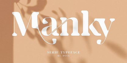 Manky is Serif Typeface Font. This another collection of Serif is perfect for your next personal branding project, excellent for your brand. Manky have a smooth edges, so this font gives an authentic handcrafted feel style. Manky is perfect choice for people looking for clean, modern, minimalist, elegant, beauty design styles. Suitable for almost any graphic designs such as logo, branding materials, business cards, gift cards, t-shirt, cover, thumbnail, print, poster, photography, quotes .etc
 - Arkarna by Gatra Std,
$10.00 Introducing a cute handwriting "ARKARNA" Simple Sans-Serif Font! If you are needing a touch of casual modern San-Serif for your designs, this font was created for you! What's Included: Uppercase and Lowercase Number and Punctuation Support Language This font works best in a program that supports OpenType features such as Adobe Indesign, Adobe Illustrator CC and CS, or Adobe Photoshop CC and CS also CorelDraw Multilingual Support is included for Western European Languages
 - Diamond Bridge by Sarid Ezra,
$15.00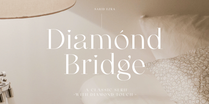 Introducing, Diamond Bridge - a classy serif with diamond touch! Diamond Bridge is an elegant and classy serif with a beautiful details that will make your presentation, logo or your wedding invitations more stunning and classy! You can use this font for several purposes such as a wedding invitations or even your own branding! This fonts support Multi Language and already PUA Encoded! Features Uppercase & Lowercase Number & Symbol Multi language PUA Encoded Thank You!
 - Almefia by Keristyper Studio,
$14.00 Proudly present Almefia Signature, a handwritten script font based on the expression of real handwriting. This font is good for logo design, Social media, Movie Titles, Books Titles, short text even long text letters, and good for your secondary text font with sans or serif. **Featured:** * Standard Uppercase & Lowercase * Numeral & Punctuation * Multilingual : ä ö ü Ä Ö Ü ß ¿ ¡ * Alternate & Ligature * PUA encoded We recommend programs that support the OpenType feature and the Glyphs panel such as Adobe applications or Corel Draw. so you can use all the variations of the glyphs. Hope you enjoy our fonts!
 - Mellofian by Keristyper Studio,
$14.00 Proudly present Mellofian a romantic script font Inspired by drama and love story. This font is good for logo design, Social media, Movie Titles, Books Titles, short text even long text letters, and good for your secondary text font with the script, sans, or serif. Featured: Standard Uppercase & Lowercase Numeral & Punctuation Multilingual : ä ö ü Ä Ö Ü ß ¿ ¡ Alternate & Ligature PUA encoded We recommend programs that support the OpenType feature and the Glyphs panel such as Adobe applications or Corel Draw. so you can use all the variations of the glyphs. Hope you enjoy our fonts!
 - Flawless Flygirl PB by Pink Broccoli,
$16.00 Flawless Flygirl is a quirky sans-serif font inspired by the titling sequence from the 1964 film, "The World of Henry Orient". Fun and full of personality, it is one of those lettering styles that was a joy to flesh out and make into a typeface filled with double letter ligature alternates to keep the typesetting weird and wonderful. With a pseudo unicase character set, and offbeat letter weighting, Flawless Flygirl is fun to typeset, with ligature combinations that are pleasant surprises. You’ll find this Flawless Flygirl is ready to dance to the beat of your designs.
 - Kuunari by Melvastype,
$16.00 Kuunari is structured square sans type family of 42 fonts. It has three widths and 7 weights in both upright and italic versions. The base form is a round cornered rectangle and this form constructs the glyphs throughout the fonts. Kuunari is a straightforward sans serif. It doesn't make any fuss about itself, it just does the job proudly and with confidence. It is very versatile; it can be used for titles and logos to make a statement or more delicately for body text and lead paragraphs. All in all you can achieve diverse and rich typography with the Kuunari type family.
 - Strong Display by XdCreative,
$29.00 The "Strong Display Font" is a derivative of the Clinto slab serif font, originally designed by. Faldy Kudo. This font is specifically crafted to exude strength and impact, making it an ideal choice for display and headline usage. It incorporates the unique typographic feature of ink traps, enhancing its readability even at larger sizes. The font family comprises 6 distinct styles: "Normal, Normal Rounded, Medium, Medium Rounded, Condensed, and Condensed Rounded.” offering versatility in design choices. Additionally, the font provides multi-language support, ensuring that it can be effectively used for a wide range of global content and projects.
 - Peronas by Keristyper Studio,
$14.00 Proudly present Peronas a new display font Inspired by American circus and carnival typography. This font is good for logo design, Social media, Movie Titles, Books Titles, short text even long text letters, and good for your secondary text font with the script, sans, or serif. Featured: Standard Uppercase & Lowercase Numeral & Punctuation Multilingual : ä ö ü Ä Ö Ü ß ¿ ¡ Alternate & Ligature PUA encoded We recommend programs that support the OpenType feature and the Glyphs panel such as Adobe applications or Corel Draw. so you can use all the variations of the glyphs. Hope you enjoy our fonts!
 - Graphemic by Picatype,
$18.00 Inspired by the medieval print design, the look of the sans serif typeface is strong and beautiful. It brings charming curves and satisfying patterns to traditional thick fonts. I like to use this font for printed material and titles - the height attracts attention and creates a visually attractive modern medieval feel. Graphemic fonts include two fonts - Regular and Light. Graphemic offers broad language support, upper and lower case letters, extended numbers and punctuation. Specifically suitable for: Posters, Blockbusters, films, trailers, headlines, titles, logos, branding, scripts, display & bold 'goods'. Thank you for viewing! (and more thanks for the purchase)
 - Chelopace by Keristyper Studio,
$14.00 Introducing Chelopace, a classic retro blend between clean and vintage-themed type work, inspired by the old advertisement letters. This font is good for logo design, Social media, Movie Titles, Books Titles, short text even long text letters, and good for your secondary text font with sans or serif. **Featured:** * Standard Uppercase & Lowercase * Numeral & Punctuation * Multilingual : ä ö ü Ä Ö Ü ß ¿ ¡ * Alternate & Ligature * PUA encoded We recommend programs that support the OpenType feature and the Glyphs panel such as Adobe applications or Corel Draw. so you can use all the variations of the glyphs. Hope you enjoy our fonts!