10,000 search results
(0.045 seconds)
- Vary by Monotype,
$50.99 Vary by Olli Meier is a geometric sans serif typeface inspired by Bulgarian Cyrillic. Vary is fun and adaptable and was built with three feelings (variations): classic, modern, and loopy, offering an opportunity for designers to be playful in their creations. The inspiration in Bulgarian Cyrillic is seen mostly in the character “g,” which was inspired by a very uncommon handwritten “?” spotted by the designer in a shop window in Sofia, Bulgaria. When he flipped this design in 180°, the Latin character ‘g’ was born for Vary Another example is the “R” in the modern stylistic set, which was inspired by the handwritten Cyrillic character “?”. Vary is available as a variable font and also comes with 10 preset instances from Hairline to ExtraBlack.
 - Crox by NumidiaType,
$25.00 Crox™ is a sans-serif professional typeface inspired by crude geometry, creativity, and art. In the font family, there are 19 styles, including upright and italic, It is constructed of big lowercase letters with a maximum x-height for excellent optical reading. English letters are supported as a numerator and denominator set, this feature may aid in the creation of fractions using letters and numbers, as well as for sophisticated scripting and various scientific fractions forms. All weights support over 25 professional OpenType features within each style, with extensive coverage of western languages. These features were originally planned for personal and professional use, including multi-alternative characters in Styles: 1, 2, 4, 10, 11. Operational styles 6, 7 are enhanced with some scientific forms, to write the fit derived (SI units' expressions). Otherwise, it supports a wide range of professional factory pricing styles for business and marketing, as well as retail pricing styles in Sets 5, 8, and 9, with ligatures, old-style numerals, ordinals, swashes... Crox™ is enhanced with a poster weight like the fantastical type to fulfill your creative needs in three styles: poster, poster oblique, and poster italic for ADS and web design, branding, or product design. Glyphs: More than 970 glyphs, including those accessible with OpenType features. Powerful OpenType features: Standard Ligature, Alternate access, Automatic ordinals (English, French...), Case sensitive, localized forms, Numerator set, Denominator set, Subscript, Superscript, Swash, Stylistic alternate, Styles 1,2,3,4,5(Pricing style 1), 6(Derived Units),7(Advanced Fractions for Scientific units, Derived Units Vulgar Form), Set 8 (Pricing Style 2), Set (Pricing Style 3), Proportional Old-style, Tabular Old-style, Proportional Lining, Tabular Lining, Zero with slash, Fractions (Default, Automatic). Suitable for: logo and modern branding, web design, packaging, Product packaging, Articles, scientific document, Product user guides, multiple works in the Media, Design, ADS... Specimen Crox™ is a trademark of Yassine Abdi.
 - Hoofer by Scholtz Fonts,
$15.00 Light and flexible, slightly retro, casual and readable, Hoofer combines 28 brush script, mono line script and sans-serif styles with ornaments into one Mega-Family. The different styles of the Hoofer Mega-family have been chosen to work together and to harmonize in a pleasing way. The Hoofer Mega-Family of fonts can be divided into three sub-families: Hoofer BRUSH subfamily: An eclectic group of five fonts. These are mainly joined scripts. Hoofer LINE subfamily: Seven mono-line scripts with joined letters in a number of weights, widths and styles. Hoofer SANS subfamily: Sixteen casual, Sans-Serif fonts. They are very readable and in a variety of weights & styles The mood of the Hoofer mega-family is light and flexible, slightly retro, casual and readable. It combines script and many sans-serif styles with ornaments into one Mega-Family. The different styles of the Hoofer Mega-family have been chosen to work together and to harmonize in a pleasing way. The Brush Sub-Family is designed for titling, packaging and display purposes, The Line Sub-Family can also be used for titling, packaging and display, however, it is less “showy”, and conveys an air of informality. The Sans Sub-Family is designed to shine as sub-heads and as body text. The wide range of Hoofline styles gives you, the designer, great flexibility in creating just the mood or impression that you want. Most of the fonts can use one or more OpenType Features. These can be accessed in a number of ways. The reason for this is that the major software producers provide different (and often conflicting) ways of accessing OpenType Features. In some cases such software manufacturers provide NO way of accessing certain OpenType Features. We have tried to remedy this by providing a highly flexible family of fonts. OPENTYPE (these OpenType features are only available in the “otf” fonts and not in the “ttf” fonts.) OpenType features that Hoofer makes use of are: Swashes (Word-Begin and Word-End Features); Alternate Numerals; and True Small Caps. ORNAMENTS In addition the Hoofer family has a font containing 94 ornaments. ALTERNATE NUMERALS You can access two sets of figures (numbers) in Hoofer Sans fonts. Both sets are tabular and lining but they differ in the height (but not the width) of the figures. The height of the alternate figures has been chosen so that they are compatible with the small caps. However, these alternate figures are available in ALL Hoofer Sans fonts, whether they feature small cap fonts or not. Hoofer has all the features usually included in a fully professional font. Language support includes all European character sets, Greek symbols and all punctuation. Opentype features include automatic replacement of some characters and discretionary replacement of stylistic alternatives.
 - Arian by Linotype,
$187.99 For decades, the Persian-born Naghi Naghashian has been working as a graphic designer and illustrator in Germany. Arian™ is his first commercial Arabic typeface. Named after his mother, Naghi created the Arian typeface family after years of systematically analyzing the Arabic script. The Arian design is sought to fulfill the many needs and was developed for multiple languages and writing conventions. It's extremely legibilitable not only in small sizes, but also when the type is filtered or skewed. This typeface offers a fine balance between calligraphic tradition and the contemporary sans serif aesthetic now common in Latin typography.
 - Amasis by Monotype,
$40.99 Amasis is a slab serif design which has been drawn with a humanist approach, rather than the traditional geometric construction associated with this style of letter. The result is a typeface that has an affinity with the Ionics, although in character it belongs to the latter decades of the twentieth century. The Amasis italic fonts, rather than being sloped roman or cursive in nature, are related more to the Old Style italics. Amasis works particularly well in small sizes where readability is important. Amasis has proved excellent for use on low resolution printers and for facsimile transmissions.
 - Librum by Hackberry Font Foundry,
$24.95 This is the serif text family for the book design group of font families which David designed in the process of writing "Practical Font Design With FontLab 5". The letterspacing is set wide for body copy use. The main purpose is readability and reading comfort. There are several whimsical graphics, plenty of OpenType features: oldstyle figures [tabular and not], small cap figures, lining figures [tabular and not], discretionary ligatures, small caps, and so on. The feature set is limited for the italic and bold versions. It produces an exceptional book. See Librum Book Design Group for a package containing all fifteen fonts,
 - Hoban by District,
$40.00 The light and the bold. The thick and the thin. Laverne and the Shirley. Peanut Butter and the Jelly. Hoban is about contrast. Hoban wants to be noticed, but only after a second glance. A friend of a friend to the didones, it has smaller, tapering serifs, slightly calligraphic traits, and spindly little terminals that go where they please. It’s a headline face. Period. Set it big and bold. Or light and airy. But preferably next to something with flair. Cuff links, canapés, or corvettes–it’s up to you. Distinct ligatures, ornaments, and swashy alternates provide plenty of character to tailor your style.
 - VVDS Organum by Vintage Voyage Design Supply,
$10.00 Elegant and easy to use serif font family with contrast in vertical and horizontal strokes. Its variety of weights provides a range of choices that will help you to find the best typographic look. Use all caps to get the classic serif look, like Didones, or use it normally for a playful serif look. Normal and Medium widths are good for text blocks and Thin and Light, or Bold and Black are perfect for Headliners. Every letter in a word looks like as if written specially next to each other, as in hand lettering. You can use it in gentle and minimal projects, and also in projects with bold and heavy typographic base. Also, for more individuality, Organum comes with discretionary ligatures and few stylistic alternates for every caps and some lowercase letters.
 - Artifex Hand CF by Connary Fagen,
$35.00 Artifex Hand is a humanist sans-serif with subtle calligraphic overtones. Designed for flowing, easy-to-read text, its softened details, moderate contrast, and subtle flare give the typeface a clean and warm tone. A near-upright italic adds emphasis and urgency with elegance. Artifex Hand also doubles as a handsome display typeface, scaling gracefully to any size with understated detail and charm. Artifex Hand CF pairs nicely with bold, clean sans-serifs, such as Greycliff CF and Visby CF. Artifex Hand also has a sibling typeface, Artifex CF, cut from the same cloth, but with a classically serifed design. All typefaces from Connary Fagen include free updates, including new features, and free technical support.Check out Visby Round CF which is a great pair for Artifex Hand CF.
 - SK Selanik by Salih Kizilkaya,
$12.99 SK Selanik is a double weight geometric sans serif font family. It is named after Thessaloniki, one of the largest cities in Greece. This font, which depicts the historical texture of Thessaloniki with modern forms, is a synthesis of the past and today's design understanding. This font family includes a total of 40 fonts and 35,720 glyphs. It offers full support for the Latin, Greek and Cyrillic alphabets and supports hundreds of different languages. In this way, it contains all the typographic elements you will need. You can easily use it in all areas and sizes you need, from headings to body texts. You can visit my Behance account by clicking here to view more detailed project images.
 - Lanche by pentagonistudio,
$19.00 Lanche Is An Modern Elegant Serif Font Inspired By Elegant Serif Typeface FAQ's : Where are the OTF's? They are included in a download link( in a text file) in your main download file. 1 user 2 computers installation (Desktop License) You may NOT use for broadcast or Cinema/Motion Picture. You may NOT resell this font in any platform without further permission from designer. Do NOT embed font files in app/game/e-pub (for desktop license) You may NOT use the fonts in templates for sale/free. ( web/print/app ) For other license use please contact us. SOFTWARE REQUIREMENTS : Fonts and alternate : No special software required they may be used in any basic program /website apps that allows standard fonts That's it folks! You can go ahead and get cracking :) Follow My Shop For Upcoming Updates Including Additional Glyphs And Language Support. And Please Message Me If You Want Your Language Included or If There Are Any Features or Glyph Requests, Feel Free to Send me A Message. Have a Good Day !
 - Bisco Condensed by Galapagos,
$39.00Bisco Condensed is a small capital design inspired by hand lettered memorial wall art from the Harlem section of New York City. As a memorial, this design is dedicated to a type design colleague who lost his long battle with cancer. This font is a tribute to his strength and his liveliness. The original idea for Bisco Condensed was to capture the energy of those unique "streetforms" in a text/display design and encapsulate them into a lively & fluid type design with a high level of readability at all point sizes. Bisco Condensed is an excellent type for expressive display layouts. It works well as an independent design or a long with contemporary sans serifs that complement Bisco's irregular contours, weighting and bounce. - Aurelux by Andfonts,
$16.00 Just imagine, You are searching for the font that should be modern and elegant at the same time, which is not possible with typical sans or serif fonts. So, Aurelux is what You need. This font in your library can be with you for decades, because it is useful and It's open border to create graphic designs that require "modern but elegant touch". : cafe, bar, theatre, spa, hotels, overall entertainment industry, travel, vintage, retro signs. Font is gender neutral. But, when You see Bold and black styles You understand that this font can be in the design of some industrial companies, factories, construction companies that want to show that they have history and heritage. You can contact me if You need questions: andfontscontact@gmail.com
 - Hwaiting Handwriting by Konstantine Studio,
$20.00 Inspired by the emerging Korean culture that grabbing the worldwide actuation in so many realms of the industry. To bridge the vibes and to make it easier to consume, we found the gap to fill with simple things in life that are useful for it, and yes, it’s a new day it’s a new font. So without any further ado, please welcome Hwaiting Handwriting. 1/3 series of Korean vibes typefaces. It’s handwriting-based fonts with the reference of the ancient style ink and brush strokes but make it modern. Crafted with deep research about Korean traditional letters, shaped up with the approach of universal Latin letters. This is the first drop of 3 series from the Hwaiting family. So stay tuned for the upcoming release.
 - Cocogoose Classic by Zetafonts,
$39.00 Download PDF Specimen Created as a display typeface in 2012 by Cosimo Lorenzo Pancini, Cocogoose is one of Zetafonts most loved typefaces. A sans serif typeface of geometric proportions, with very low contrast and slightly rounded corners, it was the first typeface to be produced in the Coco series, an ongoing research on the design variation in gothic typefaces through the ages. Cocogoose extreme x-height and ultrabold weight (with regular being comparable to heavy weights of other typefaces), have since then made it very popular for effective display and logo use, also thanks to decorative versions like Cocogoose Letterpress. Since 2016, Andrea Tartarelli has been improving the typeface expanding the original glyph set to include cyrillic and greek and adding extra weights, widths, and italics to the original family range, and bringing Cocogoose to an impressive count of 52 variants. In 2019, Francesco Canovaro has teamed with Andrea Tartarelli and Cosimo Lorenzo Pancini to create a new variant subfamily: Cocogoose Classic, featuring 8 weights and matching italics. Cocogoose Classic keeps the original design for uppercase characters while developing a new design for lowercase, with a smaller x-height, round dots and expanded open-type features, including positional numerals, alternate forms, and extended ligatures and bringing the glyph count to over 1000 characters.
 - Pitmaster by FontMesa,
$29.00 Pitmaster was designed with summertime barbecue in mind, with its straight pointed spurs Pitmaster is sure to get attention for any project western and BBQ related. Included in Pitmaster are a few alternates such as a half slab "A" and slab serif "I", also you'll find alternate "O, o" with spurs removed on one side or the other, this is useful when typing two O's together, you'll have the option of selecting one or both O's with the spurs removed between them for a closer fit on the letters. There's also alternate "D" with the right spur removed for a tighter fit with other letters if needed. Opentype case sensitive forms are also available. To all of you Pitmasters out there Keep On Smokin'
 - Sevenfold by Letterara,
$21.00 Introducing "Sevenfold," a modern sans serif font that effortlessly blends bold with a touch of uniqueness. With its distinctive serifs and clean lines, this font achieves a perfect balance between contemporary style and classic aesthetics. It is a versatile choice for any design project that requires a hint of sophistication, be it editorial design, branding, or advertising. Sevenfold shines equally in both digital and print media, adapting seamlessly to various platforms and applications. With its PUA encoding, accessing a wide range of glyphs and swashes is a breeze, allowing for easy customization and adding a personal touch to your designs. Experience the legibility and international appeal of Sevenfold, ensuring that your messages resonate with audiences across the globe. Elevate your designs with the modern charm of Sevenfold and unlock its potential to enhance your visual communication.
 - Thronemy by Invasi Studio,
$19.00 This elegant condensed serif display typeface is perfect for designs that require a touch of class and nostalgia. Inspired by ancient concepts and the nostalgic classic era, Thronemy Font adds a timeless and sophisticated look to any design project. The condensed serif design of Thronemy Font is both elegant and easy to read, making it perfect for headlines, titles, and other design elements that need to be easily understood. Plus, its retro style is perfect for creating logos and headings that will make your designs stand out from the rest. Thronemy Font is a versatile font that can be used in a variety of design projects such as invitations, posters, book covers, packaging, magazine layouts, and more. No matter what your project requires, Thronemy Font can help you achieve a timeless and sophisticated design that will leave a lasting impression.
 - Welcome Ramadhan by Letterara,
$16.00 Welcome Ramadhan is an Arabic-styled display typeface. This font features irresistible characters which make this font unique because it looks like the standard Arabian alphabet or is written in Arabic style. This Islamic Ramadhan Arabic font is perfect for any graphic design related to the Islamic style. Using this font, you will get an Arabic feel for every text you type. Made with serif characters so that it can be read internationally and does not have to be able to read by Arabic characters It is PUA encoded which means you can access all of the glyphs and swashes with ease! Add it confidently to your projects, and you will love the results.
 - Malven by Craft Supply Co,
$15.00 Malven is a modern serif features thin stroke, low-contrast modulation, with small serif that make it elegant and classy. It can be used to create almost all types of design projects like print materials. Just use your imagination and your project will become more alive and look great than ever with this typeface.
 - Grimalda by Hikhcreative,
$20.00 Grimalda is an elegant serif typeface with taste of modern and simplicity. It is perfectly for magazine cover, headline, wedding invitations, logo, brand, and many more. Grimalda have more than 100 characters of ligatures and alternates. You can create any imagination with this serif font. What's included? - Uppercase & Lowercase Characters - Multilingual support - Ligatures & Alternates Characters
 - Magical Signature by Zeenesia Studio,
$19.00 Magical Signature are Font duo that includes a serif typeface and signature script. Display Serif inspired by famous logo, This typeface has been made carefully to make sure its premium quality and luxury feel. suitable for your design project business, like logo branding, wedding invitation, typhography wedding, quotes text, magazine, or anything do you want.
 - Ambient by IHOF,
$24.95 “When you push the stage props of the life aside, there will remain the truth ...” Ambient is a deconstructed sans-serif font, which captures the essence of basic Roman letterforms... with a few twists. Gabor Kothay was born July 19th, 1962. He works as a graphic designer and teaches second-form art students. Typeface design was a hobby for many years but it has become an everyday routine with Fontmunkasok and Fontana Type Foundry. He lives with his wife and two daughters in a suburb of Szeged, a sunny southern Hungary town that lies on the banks of the Tisza river.
 - Ristretto Slab Pro by Mint Type,
$- Ristretto Slab Pro is a slab-serif companion to Ristretto Pro. It’s an extremely narrow display slab-serif font family with asymmetrical serifs available in 8 weights. It features rich language support, 6 sets of figures and small caps.
 - Quickly Freehand by Cititype,
$12.00 Quickly Freehand is a sans serif font in a casual handwriting style, this is an alternative font for when you get bored with the formal atmosphere. Comes with two versions, regular and italic, to complement your design needs. You can use this font for product labels, taglines, children's craft, prints on t-shirts, paper bags, headlines, cheerful quotes and even long text writing. This font can be used in various graphics software, even in Microsoft Word. Supports 27 languages allowing Quickly Freehand to be used in the wider world.
 - Seiston by Skinny Type,
$19.00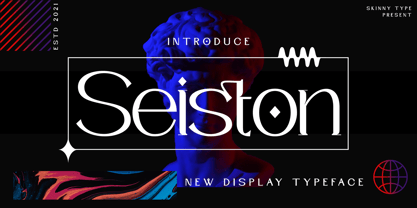 Seiston is the New Modern Typeface. This other Serif collection is perfect for your next branding project, great for your business. Gallient has smooth edges, so this font gives this style an authentically handcrafted feel. Seiston also features: - Lowercase - Uppercase - Numbers and punctuation marks - Multilingual Seiston is the perfect choice for people looking for a clean, modern, minimalist, elegant and beautiful design style. Suitable for almost any graphic design such as logos, branding materials, business cards, gift cards, t-shirts, covers, thumbnails, prints, posters, photography, quotes .etc Happy Designing
 - Gazeta by Vanarchiv,
$21.00 This typeface was designed for editorial purposes (text sizes), where the letterforms contain short serifs (more economical). This font family contains different weights (from Extra Light until to Extra Bold) to create an simple and sequential typographic hierarchy scale. There are two different weights and options designed specifically for text sizes (Regular and Text). The design is classical but contain some contemporary details, which are not distractive for reading, it's simple and clean at small sizes. This font family include italics, small caps, ligatures, old style and tabular figures.
 - Guhly by Ingo,
$35.00 A modern Sans Serif — prosaic, designed geometrically, beautiful in large sizes All the dimensions of the font are based on Factor 10. The general principle of construction leads to slim forms and nearly equally wide characters. So the font appears very solid but is actually difficult to decipher in longer texts. Along with the ”normal“ Guhly Regular there are also the two versions Guhly Light and Guhly Bold, whereas in each only the vertical strokes [Guhly Light] or horizontal [Guhly Bold] have been changed in strength. The result is a very individual decorative effect which slightly reflects old circus and western scripts. The lower case characters in the version Guhly Book are, therefore, optimized to be suitable for longer texts in smaller font sizes — because after all, sometimes you should read a bit more than just the headline… The design of a shampoo bottle stands behind the creation of this sans serif display font. Prominent, clearly constructed forms with circular arcs define its appearance. This is a font primarily designed for use with capital letters — for all sorts of advertising purposes, headlines and titles. But lower case letters also belong to a good functional font; so, of course, Guhly includes them and ligatures for the more ”critical“ letter combinations as well as stylistic alternates for the letters K (or k), V (v) and o. As a decorative “encore”, the Guhly family also contains the “normal” weight in two variants: on the one hand the Guhly Cutout – these are letters without counter, as if the letters were cut out and the internal surfaces fell out; and on the other hand the Guhly stencil – as the name suggests, a stencil font with the typical bars that give a stencil the necessary cohesion.
 - Thorowgood Sans by HiH,
$8.00 A three-dimensional all-cap font for title use, Thorowgood Sans Shaded was released by the Fann Street Foundry of W. Thorowgood & Co. in 1839. Interestingly, it more closely resembles Figgins' Four-Line Emerald Sans-Serif Shaded of 1833 than Fann Street’s own Grotesque Shaded of 1834 (with light and shadow reversed). The idea of a shaded font is of an outline font whose letters have each been extruded through a die and then viewed from the lower right to reveal the third dimension. That third dimension has also been referred to as a shadow. Vincent Figgins' 1815-release of a shaded serif typeface was the first known of many shaded faces, as the other foundries rushed to bring out their own versions. Thorowgood Sans Shaded may be gainfully used today as a eye-catching headline font, just as it was so popularly used in the early nineteenth century. To assist with the usual all-cap letter-spacing problem, the following pre-kerned pairs are included: AT, AV, AW and AY. Be sure to download the Type Specimen showing the full character set, as well as a sample text. Live large - use it boldly.
 - Compote by Factory738,
$15.00 Compote is a fashionable sans serif font that is both retro and sophisticated. The sans serif font pays homage to tradition, while the smooth curves evoke a 70s groovy vibe. Compote is the ideal complement to vintage bringing it up and logos. There are numbers, punctuation, and multilingual letters, as well as a distinct lower and uppercase. The ligature and italic fonts will be useful for anything your imagination can dream up! 5 Weights (Light, Regular, Semibold, Bold and Black) 2 Styles (Regular and Italic) Basic Latin A-Z and a-z Numerals & Punctuation Stylistic Ligatures Multilingual Support for ä ö ü Ä Ö Ü ... Free updates and feature additions Thanks for looking, and I hope you enjoy it.
 - Royal Tropic by Tom Chalky,
$18.00 Proudly Introducing ‘Royal Tropic‘ – An expressive, quick dry stroke, signature style brush script font. With multilingual support, ligatures, and an extra slanted style. Royal Tropic is great for when you want to grab attention, especially within print design; Packaging, branding, posters, book cover design, etc. The goal was to create a fast-flowing, legible script font with enough personality to take center stage and shine, and I think the end result has delivered exactly that! TIP: Through trial and error, I feel Royal Tropic works best with clean serif/sans-serif fonts. Any other 'handwritten' fonts can disturb the rough/clean contrast, taking with it some of the impact of your design.
 - Acklebury by Studio Buchanan,
$32.00 Acklebury is a chunky, reverse contrast, slab-serif typeface available in two styles. It has heaps of personality, plenty of open type features, and a whole host of special characters and dingbats. Although it's drawn from historical sources, Acklebury is not a straight revival, rather more of an homage to the many, varied, extended lining figures of the late 1800's. Acklebury celebrates the once labelled 'hideous' combination of wide rounded forms and hard slab serifs. Only using modern type technology to fix the spacing and kerning issues that would of been impossible with metal or wooden type. Acklebury is not a French Clarendon, neither is it really an Italienne... but it is phat, wide and hella funky.
 - Lemands by Arterfak Project,
$18.00 Lemands is a strong-sharp serif font in condensed height. Designed with medium contrast and inspired by the modern-classic typography and the High Octane Rock genre. The serif is quietly sharp and has assertive lines and curves, giving the letterform looks solid and strong as a display font. Lemands is a display typeface that is perfect for many purposes such as a headline, sub-headline, logo, and short body text for magazines, books, fashion, quotes, youth t-shirt, signboards, logos, and many more! Available in 4 weights: Regular - Book - SemiBold - Bold. A great choice for a brave concept! Zip file featured: Uppercase Lowercase Numbers Symbols Punctuation Standard ligatures Accents : ÀÁÂÃÄÅÆÇÈÉÊËÌÍÎÏÐÑÒÓÔÕÖØÙÚÛÜÝÞßàáâãäåçèéêëìíîïñòóôõöøùúûüýþÿ ĀāĂ㥹ĆćĈĉĊċČčĎďĐđĒēĔĕĖėĘęĚěĜĝĞğĠġĤĥĦħĨĩĪīĮįİıIJijĴĵĹ弾ĿŀŁłŃńŇňŌōŎŏŐőŔŕŘř ŚśŜŝŞşŠšŤťŦŧŨũŪūŬŭŮůŰűŲųŴŵŶŷŸŹźŻżŽžẀẁẂẃẄẅ Thank you, Ramz
 - Corporate E WGL by URW Type Foundry,
$210.99 The Corporate ASE typeface trilogy was designed by Prof. Kurt Weidemann, a well-known German designer and typographer, from 1985 until 1990. This superb trilogy consisting of the Corporate Antiqua, Corporte Sans Serif, and Corporate Egyptian is a design program of classical quality, perfectly in tune with each other. Weidemann says: My ASE trilogy, quite like triplets, is in perfect harmony and covers all needs of modern typography! Initially exclusively designed for DaimlerChrysler as a corporate font, the ASE trilogy may be now licensed and used without restriction. URW++ digitized the ASE for DaimlerChrysler and Prof. Weidemann and is the exclusive licencing agent for this outstanding and extremely popular typeface program.
 - Corporate A by URW Type Foundry,
$180.99 The Corporate ASE typeface trilogy was designed by Prof. Kurt Weidemann, a well-known German designer and typographer, from 1985 until 1990. This superb trilogy consisting of the Corporate Antiqua, Corporte Sans Serif, and Corporate Egyptian is a design program of classical quality, perfectly in tune with each other. Weidemann says: My ASE trilogy, quite like triplets, is in perfect harmony and covers all needs of modern typography! Initially exclusively designed for DaimlerChrysler as a corporate font, the ASE trilogy may be now licensed and used without restriction. URW++ digitized the ASE for DaimlerChrysler and Prof. Weidemann and is the exclusive licencing agent for this outstanding and extremely popular typeface program.
 - Lilette by Elyas Beria,
$5.00 This elegant typeface came out of a quick, back-of-the-napkin, sketch I did for a different typeface. After toiling on that typeface I looked back at the sketch and realized that I had lost some of the elegance and playful character of my original sketch. So, it was back to the drawing board and Lilette was born. Lilette is fun but also serious. Playful but elegant. Personal yet also industrial. That’s the power of a slab serif. Perfect for magazine headlines, wedding invitations, signs, posters, slides, promotions, product design, branding, logos, and so much more. Make this versatile typeface with 10 styles yours.
 - Lisboa Sans by Vanarchiv,
$35.00 This humanist sans-serif typeface was exhaustively designed, full-featured typeface family that reveals its character and distinctiveness in complex settings. It features a large complement of ligatures, lining and old-style figures, expert characters, dingbats (arrows, brackets, and symbols for both Regular weights). Lisboa Sans lacks the hook-head terminals, but its structure and proportions are the same. The simplicity of the sans weight created very strong readability at small sizes. After ten years from the first version publication, this new version (0.2) is available with Latin (Western, Central Europe) and Cyrillic alphabets. It was selected by Our Favorite Fonts of 2005 (Typographica).
 - Corporate E by URW Type Foundry,
$179.99 The Corporate ASE typeface trilogy was designed by Prof. Kurt Weidemann, a well-known German designer and typographer, from 1985 until 1990. This superb trilogy consisting of the Corporate Antiqua, Corporte Sans Serif, and Corporate Egyptian is a design program of classical quality, perfectly in tune with each other. Weidemann says: My ASE trilogy, quite like triplets, is in perfect harmony and covers all needs of modern typography! Initially exclusively designed for DaimlerChrysler as a corporate font, the ASE trilogy may be now licensed and used without restriction. URW++ digitized the ASE for DaimlerChrysler and Prof. Weidemann and is the exclusive licencing agent for this outstanding and extremely popular typeface program.
 - Roseva by Keristyper Studio,
$14.00 Roseva was inspired by the France art decade between art nouveau to art deco which combines classic typography with awesome features to bring a classic touch to this decade. This font is good for logo design, Social media, Movie Titles, Books Titles, short text even long text letters, and good for your secondary text font with sans or serif. **Featured:** * Standard Uppercase & Lowercase * Numeral & Punctuation * Multilingual : ä ö ü Ä Ö Ü ß ¿ ¡ * Alternate & Ligature * PUA encoded We recommend programs that support the OpenType feature and the Glyphs panel such as Adobe applications or Corel Draw. so you can use all the variations of the glyphs. Hope you enjoy our fonts!
 - Anthrope by Ilhamtaro,
$23.00 ANTHROPE is a serif font with a grunge style so it feels like a retro font, with a thick body that makes this font very manly. This font is perfect for designs related to male hobbies such as motorbikes. Besides that, this font is an all caps font, so this will add to the manly impression. All caps here still have the difference between Uppercase and Lowercase, which have different heights and different letter shapes. To enable the OpenType Stylistic alternates, you need a program that supports OpenType features such as Adobe Illustrator CS, Adobe Indesign & CorelDraw X6-X7. Guides to access all alternates glyphs : http://adobe.ly/1m1fn4Y Cheers!