10,000 search results
(0.046 seconds)
- Koala by Linotype,
$40.99Koala was originally designed in 1999 by Eric de Berranger with an individual, independent character. A distinguishing characteristic of this sans serif font is its marked stroke contrast, typical of Modern Face fonts. The open, airy forms are reminiscent of ancient Roman capitals. The lower case letters display traits similar to those often seen on posters and in advertisements of the 1930s and 1940s. The lively Koala is particularly good for shorter texts and headlines in larger point sizes and combines well with fonts with little stroke contrast. - Gaming Sporty by Graphicxell,
$19.00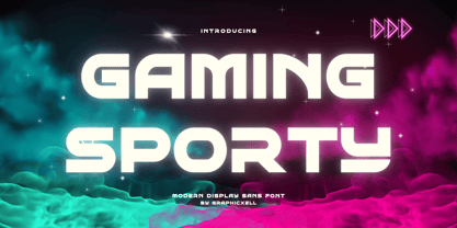 Gaming Sporty futuristic Display Sans serif Font inspired by the famous minimalist logo perfect for the purposes of designing templates, brochures, videos, advertising branding, logos, invitation, layout design, elegant crafting, beauty design and other What's Included : + Standard glyphs + International Accent + Works on PC & Mac + Simple installations Accessible in the Adobe Illustrator, Adobe Photoshop, Corel Draw. PUA Encoded Characters - Fully accessible without additional design software. Fonts include multilingual support Image used : All photographs/pictures/vector used in the preview are not included, they are intended for illustration purpose only. Thank You
 - BB Hilda by Bartosz Bugaryn,
$10.00 Hilda is an ode to countryside. This typeface is inspired by the peace that comes with escaping the city and drinking a cup of coffee while listening to the chirping of birds. The name comes from a cartoon series “Hilda” based on comic series by Luke Pearson. I describe it with 2 words - elegant and playful. It is an all caps, display font that can be used for titles and short texts. Hilda is multilingual and if it gains enough recognition I am willing to add more weights and styles!
 - Cadora Woods by Hanoded,
$15.00 Last year I walked half of Offa’s Dyke path, a long distance trail on the Welsh/English border. Walking the trail, I came across a beautiful stretch of forest with a lovely name: Cadora Woods. Cadora Woods font was made with a Japanese brush pen. It sort of looks medieval and a friend of mine suggested it would be the font of choice for maps of ‘The Shire’. I guess that is true, but I am convinced you can come up with some innovative uses for this font!
 - Oskal by Pesotsky Victor,
$15.00 "OSKAL" is a font that appeared as an experiment to cross the neutral grotesque and antique. The idea is to make a strange hybrid out of a simple grotesque. The serifs are added in non-standard places and make this font unusual for perception. It's a sharp and active font that you can shout at or break down walls with. OSKAL supports Basic Latin and Extended Latin, Cyrillic — in total about 90 languages are supported. The font has one Regular weight, uppercase and lowercase, punctuation. OSKAL font was designed by Viktor Pesotsky.
 - FF Mark Paneuropean by FontFont,
$79.00Geometric sans fonts in the Bauhaus tradition were the inspiration for the design of FF Mark®, for example the Universal font by Herbert Bayer, Erbar® Grotesk, Kabel®, Neuzeit Grotesk and of course Paul Renner's Futura®. From an aesthetic point of view, FF Mark is a descendant of these classics of German typeface design that intends to meet the needs of modern communication. Hannes von Döhren and Christoph Koeberlin had the support of the entire FontFont Type Department in the design of FF Mark, including Erik Spiekermann, who took over the artistic direction of the project. The teamwork resulted in carefully planned, balanced forms, which are responsible for the harmonious overall impression of the font. The capitals are not based on Roman square capitals; rather, they have a uniformly wide letter form in a comfortable ratio to the x-height. Thanks to the x-height, which is significantly larger compared to the historical models, FF Mark is also very legible in small sizes. This makes it a very flexible font in terms of its range of applications. A contrast in the stroke width is barely noticeable. At the same time, light modulation supports readability, especially in the bold styles in small sizes. The uniform line ends are obvious for a contemporary sans family nowadays (unlike some of the historical precedents, which evolved over years). Other details from the predecessors are consciously maintained and provide for added individuality in FF Mark. For example, the limbs in the uppercase "K" and "R" are offset slightly from the stem. Alternative characters with crossbars are available for the numbers "0", "1", "7" and the uppercase "Z" and the lowercase "a" also has an alternative with an open form. German typesetters have the option of uppercase umlauts with points that are set lower, as well as a long "s" from the Fraktur. And last but not least, FF Mark has the very characteristic ft-ligature of Futura. FF Mark is available in ten finely tuned weights ranging from Hairline to Black. A Book style for text setting further emphasizes the well-rounded features of this contemporary typeface. When the font was published, it also included ten carefully designed cursives for all weights. Users also have the option of various numeral sets with old-style and uppercase numbers as well as small capitals. FF Mark also has some geometric shapes and arrows based on the features of Futura. FF Mark is a modern, full-featured, geometric sans serif that you can use without hesitation for large projects in headlines as well as in texts. FF Mark's design is a nod to the historical models and transports their charm, elegance and in some cases unusual design applications into a modern font family equipped with the most current typographical features. NEW: the new FF Mark W1G versions features a pan-European character set for international communications. The W1G character set supports almost all the popular languages/writing systems in western, eastern, and central Europe based on the Latin alphabet and also several based on Cyrillic and Greek alphabets. - Orliet Pro by Arttype7,
$15.00 Elevate Your Designs with Elegant Luxury Orliet Pro is a meticulously crafted serif font designed to add a touch of elegance and luxury to your visual creations, especially ideal for enhancing the sophistication of logos. This font stands out for its uniqueness, boasting over 50 ligatures and alternative characters with artistic flair. Its well-designed script optimizes your designs, ensuring a seamless integration into your projects. Key Features: Versatile Ligatures and Alternatives: With over 50 ligatures and alternative characters, Orliet Pro provides a wide range of design possibilities. Each character exudes a unique artistic charm, allowing you to customize your text in a myriad of ways. Elegance in Every Detail: The design of Orliet Pro aims for elegance. The serif style adds a touch of class to your projects, making it perfect for creating logos that exude luxury and simplicity simultaneously. Seamless Font Families: Each member of the Orliet Pro font family complements one another effortlessly. Whether you choose the Orliet Pro script or Orliet Pro icons, they work harmoniously to enhance your overall design. Enhanced Design Flexibility: Orliet Pro script and Orliet Pro icons contribute to the ease of design integration. The script is thoughtfully designed to optimize your creative process, while the icons provide additional elements for a professional touch. Cyrillic Alphabet Inclusion: For an added layer of versatility, Orliet Pro includes the Cyrillic alphabet in regular, italic, bold, and bold italic styles. This ensures that your designs can reach a broader audience with diverse language preferences. Optional Details: Design Concept: Orliet Pro was conceptualized to bring an air of sophistication to your designs, with a focus on creating an elegant and timeless serif font. Creation Inspiration: The font draws inspiration from classic design elements, aiming to provide a timeless aesthetic that resonates with a modern audience. Historical Context: While not a revival, Orliet Pro pays homage to the timeless elegance of serif fonts, adding a contemporary twist to meet the demands of today's design trends. Elevate your designs with the timeless elegance of Orliet Pro. Explore the possibilities of serif and script styles, accompanied by convenient font icons, all seamlessly integrated into one versatile font family. Embrace luxury and simplicity in every character.
 - Mehdi Mutamathil by Arabetics,
$32.00 The Mehdi Mutamathil type family follows the guidelines of the Mutamathil type style. It has only one glyph for every basic Arabic Unicode character or letter. The Mehdi Mutamathil family includes all required Lam-Alif ligatures and selected marks positioning so it does use limited glyph substitutions or forming. Mehdi Mutamathil employs variable x-height values. Text strings composed using typefaces of this family are non-cursive with stand-alone isolated glyphs. The Mehdi Mutamathil family includes both Arabic and Arabic-Indic numerals, all required diacritic marks, Allah ligature, in addition to all standard English keyboard punctuations and major currency symbols. The fonts in this family support the following scripts: Arabic, Persian, Urdu, Pashtu, Kurdish, Baluchi, Kashmiri, Kazakh, Sindhi, Uyghur, Turkic, and all extended Arabic scripts.
 - Gridiron Glory by Hipfonts,
$17.00 Gridiron Glory is a modern and elegant font that stands tall as a tribute to the world of sports. This dynamic display typeface captures the power and energy of athletic competition with its strong, bold letterforms and sharp angles. Inspired by the lines and precision of a football field, Gridiron Glory exudes a sense of strength and determination. Its clean and structured design, reminiscent of a gridiron play, brings a sense of order and professionalism to sports-related designs. Whether used for team logos, jerseys, or sports event promotions, Gridiron Glory makes a bold statement and evokes a sense of excitement and anticipation. Embrace the spirit of the game with this font that embodies the glory and fierce competition found on the field.
 - Atlan by Latinotype,
$29.00 Atlan—a Latin ‘spin-off’ of classic geometric sans typefaces. Remembering typefaces like ‘Kabel’ by Rudolf Koch, while paying attention to current design needs, was the starting point for ‘Atlan’—a simple, elegant and appealing font. This typeface is based on highly expressive sans-serif geometric fonts of the 1920s. We challenged ourselves to reinterpret these characteristics, without losing expressiveness, in order to create a functional and versatile design. This process resulted in a font with display features, well-suited for light, uniform-coloured texts. The family offers a variety of styles from the elegant Thin weight—ideal for publishing and corporate websites—to the Heavy variant (perfect for logotypes and packaging), which reveals the stylistic elements of the typeface.
 - Lucaria by Jehoo Creative,
$19.00 Lucaria is a modern serif typeface that combines classic design with contemporary details. The most distinctive feature of Lucaria is its strong shape on the edges, which gives the font a bold and commanding presence. This design element is complemented by the wide characters, which provide ample space for legibility and readability. The combination of these features makes Lucaria a great choice for displays and headlines. This versatile font family is available in seven weights, including Light, Regular, Medium, Semibold, Bold, Extrabold, and Black, as well as a variable font for added flexibility. The variable font option allows designers to customize the weight makes Lucaria an ideal choice for a range of design projects, including branding, packaging, and editorial layouts.
 - Lotto by Canada Type,
$24.95 Designed by expert ad artist Herbert Thannhaeuser for East German foundry Typoart in 1955, Lotto was until now one of the long lost gems of European sign and brush lettering faces. Unlike in Kurier (Thannhaeuser’s other brush face digitized by Canada Type as Puma), the forms’ brush construct uses a series of strokes that are mostly sudden, whimsical, and at times even look like great genius being born out of simple afterthought or straight-forward idiosyncracy. For instance, check out the simple brush pause that is the top of the f, the confident yet welcoming serifs on the T, the similarly-themed C/E and O/Q relationship, and much more. Lotto comes with over 400 glyphs, contains a few alternates and ligatures sprinkled throughout the character set, and includes support for the majority of Latin languages.
 - Bestiario by Intellecta Design,
$27.50 John Seddon (1644-1700), was a famous english writing master, the leading calligrapher of his time, and master of Sir John Johnson’s Free Writing School in Priest’s Court, Foster Lane. His portrait was drawn by William Faithorne and was engraved by John Sturt as the frontispiece for his copy-books, such as ‘The Ingenious youth’s companion’ of c.1690 and 'The pen-man’s paradise' of c.1695. These were engraved after his work by others. Your extra-rare book - "The Pen-mans Paradise Both pleasent & Profitable OR Examples of all ye usuall hands of this Kingdome. Adorn'd with variety of ffigures an Flourishes done by Command of hand. Each ffigure being one continued & entire Track of the pen most where of may be struck as well Reverse (or to answer bothwayes) as Forward", London (1965). - YES (that is the title of the book) was the starting point to these new extra accurated works of Iza W, a series of revivals of the penmanship Seddon’s artworks, animal and human kingdon inspired penmanship forms in the Bestiario font. On the other hand, his highly ornamented animal kingdon inspired capitals and alphabets in the Seddon Penmans Paradise Capitals typeface. The “SeddonsFleurons” completes the collection. Fantastic choice to elaborated barocque/renaissance inspired and historical accurated layouts.
 - Change Serif by Borutta Group,
$39.00 Change Serif is a typeface family designed as a part of Mateusz Machalski's PhD project, carried out in 2015-2021. The main goal was to create a typeface allowing for the typesetting of complex humanistic texts, containing many historical letterforms. The starting point was the preparation of most of the glyphs provided in unicode for Latin, Cyrillic and Greek. From the formal point of view, the Change family is based on Renaissance proportions with contemporary details. Classic upright version is paired with expressive and calligraphic italics, inspired by the works of Robert Granjon. Each of the styles contains about 4,000 characters, allowing for a broad range of typesetting capabilities – multiscript publications, historical translations, and texts transcription. The crucial aspect was to treat all scripts equally. All OpenType features, such as swashes, final forms, decorative ligatures, can be found in Latin, Cyrillic and also Greek. The name of the typeface refers to the design process in which there are constant changes and corrections. On the other hand, it means to convey how this project influenced my perception of typography and allowed me to embrace it as a medium of artistic expression. Due to its similar proportions, Change works perfectly with the Gaultier typeface.
 - Zinc Boomerang - Unknown license

- Boncaire Titling by insigne,
$22.00 Inspired by the type elements of 17th century Dutch mapmaking, Boncaire Titling provides you with a historic yet adventurous look for your library. This addition from insigne found its muse in a map of Curacao by Dutch cartographer Gerard Van Keulen, a member of the prosperous Van Keulen family from Amsterdam, who were engaged in the manufacture of maps for seafaring. Much thanks on this project goes to The Norman B. Leventhal Map Center, housed at the Boston Public Library. Through the centers kindness, I was able to view a number of period maps in person and to meet with curators, who explained more about the Van Keulen family and the way maps of the period were created. While I studied the maps, I narrowed in on some of the original types unique idiosyncrasies. For instance, the long, exaggerated serifs, which give the forms a sense of stability, aid in the faces legibility--largely a byproduct of the engraving method that was used to create the metal plates for manufacturing these maps. In creating Boncaire Titling, I decided to capture these unique idiosyncrasies, embracing the character of the engravings rather than removing them entirely through over-refining the forms. The result is an elegant family with far more than seafaring potential. This font has a full range of six weights, from thin to black. It also includes a wide variety of OpenType alternates. All insigne fonts are fully loaded with OpenType features. Boncaire Titling is also equipped for complex professional typography, including alternates, smaller titling caps and plenty of alts, including normalized capitals and lowercase letters. There are over 30 autoreplacing ligatures, and the face includes a number of numeral sets, including fractions, old-style and lining figures with superiors and inferiors. OpenType capable applications such as Quark or the Adobe suite can take full advantage of automatically replacing ligatures and alternates. You can find these features demonstrated in the .pdf brochure. Boncaire Titling also includes the glyphs to support a wide range of languages, including Central, Eastern and Western European languages. In all, Boncaire Titling supports over 40 languages that use the extended Latin script, making the new addition a great choice for multi-lingual publications and packaging. Maps are fascinating; they come with the promise of treasure to be uncovered. Examining the map itself, too, you can find great wealth in the details so artfully condensed to that single piece of paper--details carried over into this new insigne font. For your next project, explore the imagination potential in Boncaire Titling.
 - Emy Slab by Latinotype,
$29.00 Emy Slab is a slab serif based on the classical proportions of Egyptian typefaces but with soft terminals that give the font a more friendly and modern look. Emy Slab consists of two subfamilies of 7 weights, ranging from Thin to Black with matching italics, resulting in a total of 28 fonts. The standard version is ideal for editorial design, tiles, books, magazines, corporate design and all types of publications. The Alt version—due to its display features, asymmetric shapes and contemporary appearance—is well suited for logotypes, branding, packaging, and use on web and Tv. Emy Slab contains a set of 440 characters that support 208 different languages.
 - Fungis by Ivan Petrov,
$30.00 Fungis is a somewhat �brother� of Fungia. These two typefaces were conceived simultaneously as an experiment on designing typeface based on natural shapes. In both cases it was mushrooms. Of course the main theme of these typefaces is not mushrooms itself (it was just a start point) but the interaction between form and counterform. In spite of unquestioning individuality the font has some associations with wood typefaces from wild west, typefaces from circus posters of 19th century and even slight feeling of gothic. The font can be useful in different cases: posters, titles, book covers, billboards, street signs, magazine spreads and all situations that demand expressive typography.
 - Mrs Ant by Hipopotam Studio,
$20.00 Hand drawn serif typeface designed for one of our books. It has upper and lowercase characters with up to three alternate glyphs. Build in OpenType Contextual Alternates feature will automatically set alternate glyphs depending on frequency of appearance of the same character (even in web font but only in HTML5 browsers). The script doesn’t throw random glyphs. For example in the word “HIPPOPOTAMUS” you will automatically get three different “P” glyphs and two “O” glyphs. It really works great but of course you can always fine tune it by hand. Mrs Ant has an older brother. Mr Anteater was designed for headers for the same book.
 - Exo Soft by Polimateria,
$35.00 Exo Soft. Technology meets humanity. The geometric design got organic with carefully crafted smoothed edges. Exo Soft is a contemporary sans-serif font with a warm and humane feeling. It has an extended language support (both in Latin and Cyrillic) and an handful set of Opentype features. The 9 weights plus correspondent italics give Exo Soft a huge versatility. Because aesthetics are not everything Exo Soft was fine tuned in order to perform well both in screen and in print. The large x-height and open counters makes it function well even on small font sizes but the full potential of Exo Soft will be seen on headlines, branding and advertising.
 - Osbourne by Latinotype,
$39.00 Osbourne is a display typeface with titles based on a refresh, a revival of Salem, originally designed by Keystone Type Foundry. A font with elevated x-height and condense proportions. Visibly “sharp.” In addition to the default version, it has two other versions: one that is sharper and another with wide alternatives to the circular characters. Between these and its five weights, Osbourne has a range of personalities to fit a designer’s needs. Think titles, branding, short texts, whatever you want to make look good. Yet another font in the Latinotype arsenal that covers more than 200 languages within the Latin alphabet and basic Cyrillic.
 - Francker by Linotype,
$29.99 Francker is a sans-serif, based on clean and simple design principles that betray its Danish origin. Its curves are based on the “super ellipse”, a mathematical shape about half-way between an ellipse and a rectangle. Francker’s lowercase lettershapes a, b, n, and u, have no spurs, emphasizing the simplicity of their construction. The Francker family is available in two widths, normal and condensed, each in nine weights, from extra light to extra black. Use Francker for signage, posters, magazines, advertisements, or corporate identity projects—wherever an industrial, contemporary look is needed. The Francker type was developed and designed by Anders Francker, an engineer and designer living in Denmark.
 - Guess What by Resistenza,
$39.00 Guess What? A new hand-drawn font family has arrived! 5 different sets of letters were sketched using a felt tip marker on paper to get a realistic handmade feeling. The magic comes activating the Opentype features, the letters will randomly combined by an advance code creating a more human feeling. More than 1500 glyphs available to customize your text. Guess what is also a font system, composed by four styles; Regular, Inline, Shadow and Papercut. All styles can be easily overlapped. Works perfectly for many purposes adding a casual natural mood to the text. Try it on a book cover, digital ads, kids stuff, comics, branding, advertising, packaging...
 - Cithally by Gatype,
$10.00 introducing a new font Cithally Handwritten Font is a handwritten font with a distinctive and sharp brush texture. Cithally was handwritten on paper with a coarse type brush, resulting in a consistent texture. You can customize Cithally to create a unique style when multiple characters of the same letter meet, because Cithally has alternative lowercase letters in different styles. The Cithally handwritten font can also be used for projects such as stationery invitations, social media, logos, weddings, branding, graphic designs with the addition of some binding and strokes. and can be combined with various types of serif fonts to perfect the project you want to work on.
 - Morandi by Monotype,
$50.99 Morandi is the first commercial sans serif font created by Jovica Veljović – a much-awarded designer who's been creating typefaces for over thirty years. The product of years of crafting letterforms, Morandi is supremely graceful. Each detail has been carefully refined for legibility, with open counters and generous apertures, and the bottom of round strokes slightly flattened. Not just elegant in appearance, Morandi is an efficient design, versatile enough to work in print and digital environments, including on-screen applications. The family offers three weight ranges and includes a large multi-national character set – making it a practical choice, as well as an aesthetic one.
 - Cantoni by Debi Sementelli Type Foundry,
$59.99 I have a new baby sister! Check her out in her crib: Cinque Donne The Cantoni Font family is a hand lettered font with a variety of standard and alternate characters that play together well. And with a total of 1265 glyphs, you can play for as long as you like. Now Cantoni and Cantoni Pro also come in BOLD! Additional features include: Roman numerals, Fractions, Ordinals, Ornate and Old Style numbers, Greek symbols, a set of Flourishes, Ornaments and DIY Wedding Words and Images. It also includes Western and Central European, Romanian and Turkish language support. Named after my large Italian family, the unique variety of letters based on my own fluid upright style of brush lettering, reminds me of every family I know. There are creative and conservative siblings, crazy in a good way cousins, affable aunts and corny joke telling uncles who somehow come together and form one cohesive unit. In the same way, using the Open Type features to insert a “wild t”, begin a name with a “flashy f” or end a word with a “rambling r”, the font comes to life. The party starts. The fun begins. And soon they're all laughing and dancing up and down the baseline. Like a family gathering to celebrate a special occasion, there is a palpable sense of joy expressed through the letters and images, not unlike the sharing of good food, memorable stories and lots of laughter. While Cantoni Basic gets the party started, the Cantoni Font Family Total Design offers a complete package of options for your unique creations. On behalf of the whole Cantoni family, thanks for joining in the fun. I'll see you on the dance floor. Enjoy! Debi Check out my other script fonts Belluccia and Dom Loves Mary offered through the Correspondence Ink Foundry here at MyFonts!
 - Initial - Unknown license

- Antimony Blue - Unknown license

- Tom's Headache - Unknown license

- Gore Girl by Remedy667,
$18.00 Are you ready for a scream? Gore Girl is your one-stop font for all the horror your heart desires. Inspired by teenage horror novels from the 90s, Gore Girl will keep you on the edge of your seat. Unleash your creativity and give your designs an unforgettable look with Gore Girl! Our Doubles Elimination feature is great for vintage posters, t-shirts, logos, and more - with menacing letterforms and spooky numbers that are sure to make a statement. Get ready to bring some horror to your designs - Gore Girl is here! Give your projects the splatter of life your fans love. Step into the darkness and show off your love for horror with Gore Girl today!
 - Amorino by Eurotypo,
$34.00 Amorino is a new casual and organic calligraphic font. Is the perfect blend of elegant and casual. With the total number of 889 glyphs, is equipped with plenty of OpenType features. Uppercase letters can alternate between at least four different forms and lowercase letters have up to thirteen choices more to avoid repetition. These effects include start and end forms words. To activate the optional glyphs you may click on Swash, Contextual, Standard Ligatures, Stylistic or Discretionary Ligatures buttons in any OpenType savvy program or manually choose the characters from Glyph Palette. Amorino font might be the choice to use on creating headlines, logos & posters for branding and packaging purposes. Hope you enjoy.
 - FT Massachusettz by Foxys Forest Foundry,
$9.00 FT Massachusetts is a dense, hand-drawn sans-serif typeface with uneven edges and a dancing baseline. It creates a vivid impression, feels friendly, playful, and communicative. The font is full of alternate letters, symbols, and graphics. It easily adapts, confidently engages with the customer, and transforms slightly depending on the space and purpose. Change letters to alternates for the uniqueness of spellings. For convenience, alternative characters are used when typing in lowercase, and normal letters are used when typing in uppercase. Additionally, you can always switch letters to additional alternative ones and insert symbols. Furthermore, to add visual interest, the font is equipped with auto-replacements for prepositions and word endings.
 - Stitchin Crochet Pro by Adriprints,
$6.00 StitchinCrochet Pro is the third font in the Stitchin Family following StitchinCrochet and StitchinKnit. Unable to find a stylish and easy-to-use crochet symbol font, I decided to make one! StitchinCrochet offers incredibly legible, intuitive symbols that are easily accessible without special numerical codes on the keyboard. StitchinCrochet Pro has updated crochet symbols (compared to StitchinCrochet) and are newly re-drawn, scaled, and have corresponding increase and decrease symbols ranging from single crochet to double treble crochet. StitchinCrochet Pro also includes an updated QWERTY keyboard key, better symbol layout, and symbol guide for both U.S. and U.K. crochet terminology! Choose the “manual install” method to access the .PDF guides and symbol guides.
 - Fuse V.2 by W Type Foundry,
$25.00 Fuse Vol 2 is an extension to our popular Fuse type family. All of the corners of the typeface’s character are rounded, making Fuse Vol 2 friendlier and more amiable variant of the original Fuse. Designed with a powerful OpenType features in mind. Each weight includes alternate characters, ligatures, fractions, special numbers, arrows, extended language support , small caps and many more.. Perfectly suited for graphic design and any display / text use. The 32 fonts are part of the larger Fuse super family. We’re proud to introduce: Fuse Vol 2. Learn about upcoming releases, work in progress and get to know us better! On Instagram W Type Foundry On facebook W Type Foundry wtypefoundry.com
 - No. Seven by Fenotype,
$35.00 No. Seven is a bold brush style script family of three weights, ornament set and a block capital "small caps" font. No. Seven is equipped with plenty of OpenType features: To activate the alternates click on Swash, Contextual, Stylistic or Titling Alternates or Discretionary Ligatures, Tabular or OldStyle Lining in any OpenType savvy program or manually select the characters from Glyph Palette. Always keep on Standard Ligatures for the best outcome. Combine No. Seven with No. Seven Ornaments and No. Seven Small Caps to complete your designs. No. Seven is an effective font for creating ambitious headlines, logos & posters with a custom-made feeling. For the best price purchase the complete No. Seven Family.
 - Face Your Fears II by Hanoded,
$15.00 When I created Face Your Fears some years ago, it was an instant hit. I have seen it on Gangsta Rap albums, metal albums, books and on movie posters. It has been used for T-shirts, websites and, believe it or not, for a beer label as well. I have always toyed with the idea of redoing the original font, as some of the glyphs were a bit off. Face Your Fears II is similar in nature to the original font, but comes with a lot of improvements, has slightly altered glyphs and (probably) better kerning. But maybe, just maybe, it isn't your cup o' tea. In that case, you can always just go for the original!
 - Bo Diddlioni Stencil NF by Nick's Fonts,
$10.00A new take on the classic font Bodoni, revealing the structural elements of the font, and adding a little sparkle with a pseudo-stencil treatment. The font is named in honor of its original designer and also the undisputed king of the two-chord song. Both versions of the font include the 1252 Latin and 1250 CE character sets (with localization for Romanian and Moldovan). - Crestview Six JNL by Jeff Levine,
$29.00The hand lettering found on a small catalog sheet for decorative decals from the 1930s-1940s era was the perfect source material for Crestview Six JNL. Handmade typefaces or signage from past decades offer a wonderfully humanistic change from the perfectly-crafted designs of printer's type (or digital type in the modern era). The font's name comes from the old alpha-numerical phone exchanges of the past. - Lisboa Hebrew by Vanarchiv,
$52.00 Lisboa Hebrew is humanist sans-serif typeface base on the same design as the original Lisboa (2005). The main structure is more close to the Sephardic proportions, where the letterforms contains reverse contrast and the terminals following the same calligraphic approach (Humanist). There are some characters and figures designed as small caps which have the same proportions from Hebrew. Latin transliteration characters were also included.
 - General Chang JNL by Jeff Levine,
$29.00General Chang JNL is one of a number of fonts redrawn by Jeff Levine from the creative output of the late Alf R. Becker. Becker's alphabets were a monthly feature of Signs of the Times Magazine from the 1930s through the 1950s. Thanks to Tod Swormstedt of ST Media (who also is the curator of the American Sign Museum in Cincinnati, Ohio) for the resource material.


