10,000 search results
(0.051 seconds)
- Payzant Pen NF by Nick's Fonts,
$10.00The inspiration for this exuberant exercise in penmanship was found in Frank H. Atkinson's A Show at Sho-Cards: Comprehensive, Complete, Concise, published in 1918, executed with the then-state-of-the-art Payzant Reservoir Pen. It retains its quaint charm, even after almost a century. Both versions of this font contain the complete Unicode 1252 (Latin) and Unicode 1250 (Central European) character sets, with localization for Romanian and Moldovan. - Core Sans R by S-Core,
$20.00 The Core Sans R Family is a part of the Core Sans Series, such as N, NR, N SC, M, E, A, D. and G. This font family has closed and square letter shapes, and overall rounded finishes provide a soft and friendly appearance. Simple shapes with a tall x-height make the text legible and the spaces between individual letter forms are precisely adjusted to create the perfect typesetting. The Core Sans R Family consists of 7 weights (Thin, Light, Regular, Medium, Bold, Heavy, Black) and Italics for each format. Core Sans R supports complete Basic Latin, Cyrillic, Central European, Turkish, Baltic character sets. Each font includes proportional figures, tabular figures, oldstyle figures, numerators, denominators, superscript, scientific inferiors, subscript, fractions and case features.
 - URW DIN by URW Type Foundry,
$49.99 The digital outline fonts, DIN 1451 Fette Engschrift and Fette Mittelschrift were created by URW in 1984 and are the basis for all DIN font families. Both typefaces were designed for the URW SIGNUS system and were mainly used for the production of traffic signs. They have since become so popular in other areas that we have developed a complete DIN font family with 48 styles in OpenType Pro: URW DIN. It is semi-condensed, which is unique among the DIN fonts, so it has a broad spectrum of typographic uses. Its large x-height makes it perfect for use in e-publishing (web, apps, e-Books etc) and its adjusted stroke width between the regular and bold weights enhances its quality and distinguishability in print.
 - Norden Display by Asgeir Pedersen,
$19.99 The name Norden means “the Nordic”, as in the geographical area or its countries. Inspired by the simplicity of Nordic and Scandinavian design, the Norden fonts give you clarity of expression, beyond the usual geometric look and feel of traditional sans-serifs. Open and spacious, the shapes of the glyphs play both with and against each other. Round and soft versus square and solid, a basic curve versus a straight line, creating a detached yet distinct style of expression, from the light-as-air Hairline to dark and Bold. The Display variant has diagonal as well as slightly rounded ends, similar to the Standard version but with and edge, so to say. As its name suggests, this font is intended for use in headlines and/or for small chunks of text at medium and large sizes. Norden comes in three variants: Standard, Round and Display.
 - Osaka-Sans Serif - Unknown license

- Satyr - 100% free

- Nocker - Unknown license

- How To Consume Oxygen by Vic Fieger,
$8.99How To Consume Oxygen was created with the plan of emulating words written on a fluted-steel 'warehouse'-type door in advanced state of rusting. - Dog Tag by Funk King,
$5.00 Dog Tag is inspired by dog tags. It provides a modern stencil font and the metal-works to create fun and usable dog tag signage.
 - Belliza by Rockboys Studio,
$26.00 The Belliza is a natural handwritten brush font. It’s ideal for branding and decorating your projects, creating wedding invitations, book covers, marketing, and much more!
 - Alovetha by Rockboys Studio,
$26.00 The Alovetha is a natural handwritten brush font. It’s ideal for branding and decorating your projects, creating wedding invitations, book covers, marketing, and much more!
 - Aghitta by Rockboys Studio,
$26.00 The Aghitta is a natural handwritten brush font. It’s ideal for branding and decorating your projects, creating wedding invitations, book covers, marketing, and much more!
 - Etch A Sketch by JOEBOB graphics,
$9.00 I finally managed to create a font from the characters I wrote on my Etch A Sketch board. A bit grungy, but definitely something else.
 - Sheepdog by Aaron Design,
$9.95Sheepdog is a whimsical handwriting font originally created for use in greeting cards and to combat the propagation of ! Use it to your hearts content. - Stampede by FontMesa,
$25.00Stampede was created from a small sample of letters found on an old document dating back to 1902 from the Chicago, Indiana & Eastern Railway Co. - TT Norms Std Condensed by TypeType,
$35.00 TT Norms® Std Condensed useful links: Specimen | Graphic presentation | Customization options TT Norms® Std Condensed is the logical development of our bestselling TT Norms®. Since the release of TT Norms®, we received a bunch of requests to create its narrow version and even managed to make several custom projects of the narrow TT Norms® before we decided to start creating a full-fledged commercial version of the typeface. At the very beginning of the project, we did some research and tested several options for the possible width of the typeface. Despite the fact that TT Norms® Std Condensed has narrower proportions than the original family, it inherited the classic proportions of characters, attention to detail and meticulous elaboration of each character in the typeface. The TT Norms® Std Condensed font family consists of 18 faces (9 upright and 9 italics). Each style includes a sufficient set of characters that allow you to solve most of the problems that arise in the field of graphic design, branding, packaging design or website design.
 - Novelia Pro by Joelmaker,
$20.00 Novelia Pro & Novelia Pro Small Cap is a multi purpose serif font, with a swirly blend that is very spoiled in the eyes, unique and elegant, and ready to accompany and play around with you in preparing the next design project. Novelia can be used for various purposes such as posters, logos, t-shirt, signage, business card, magazines, book cover, wedding invitation, greeting cards etc. Novelia Pro & Novelia Pro Small Cap allow you to create custom dynamic text. You can access by turning on; Stylistic Alternates, Titling,Swash, as well as ligatures in Photoshop, Adobe Illustrator, Adobe InDesign or through a panel of glyphs such as Adobe Illustrator, Photoshop CC, Let's switch from the regular character into character alternative to get the text with the layout of your dreams. Novelia Pro also includes glyphs, punctuation, numbers, and multilingual. Novelia Pro & Novelia Pro Small Cap features +1000 glyphs and has given PUA encoded (specially coded fonts), with tons of alternate characters. The pack can be accessed in full by any crafter or designer, without the requirement for extra design software, COMPATIBLE WITH SILHOUETTE & CRICUT DESIGN SPACE.
 - Streetscript Redux by Eclectotype,
$40.00 Streetscript Redux is an update to the now discontinued Streetscript. In the original version, it seems a lot of users didn't like the s’s in the font, and after seeing them redrawn (not always with the best results!) a few times, I decided to make a new version of the font with less idiosyncratic s’s, and this is the result, Streetscript Redux. (I should have listened to my other half - “those s’s look like fives,” she said) All other features of the original Streetscript are intact (barring a couple of s-ligatures no longer necessary). There’s been a little tweaking of some outlines, and slight changes with spacing too, but for the most part, all I've done is redraw those pesky five-like s’s, so that you don't have to.
 - Lemon Lies by PizzaDude.dk,
$20.00A square but fair font, or as they say in Germany "kradratisch, praktisch, gut". Because of the simpleness in this font, I decided add two styles less square to the family: funky and zit. - Schoolblock by Wiescher Design,
$39.50 Schoolblock is the typeface German schoolchildren learn to imitate when they are taught the printed letters. I just had to do this one for use in a German schoolbook. Your education-designer, Gert Wiescher
 - FS Millbank by Fontsmith,
$80.00 A sign of something better When designer Stuart de Rozario surveyed the fonts used in signage on London’s public transport systems, he reached a dead end. They seemed staid, sterile, lacking in personality, and ill-suited to use by modern brands. He was pointed in another direction entirely. ‘The driving force behind my thoughts was to design something more current and fresh without compromising legibility and clarity. A font with both personality and function, that’s versatile and large and small sizes, and effortless to read, but which also says something new.’ Speed reading Late for a meeting and can’t find your way? Trying to catch a flight? Lost in a hospital? Reading signs is a different business to reading a book or a newspaper. Text on signs needs to be deciphered quickly and effortlessly. So the legibility criteria for signage letterforms are different to those for normal reading, too. Throughout FS Millbank’s uppercase and lowercase alphabets, characters have been given features for extra definition, including: wide ink traps on the A, K, M, V, W, X and Y; a serifed i, accentuated spurs on the a, d, l u; and different x-height shapes on the b, g, p and q. Distinctive forms and generous, open internal shapes all help the quick reading of sign text, and wide, open terminals and counters allow similar letter shapes to be distinguished easily when viewed at different angles. Running down a corridor, maybe... Positive/negative Standard type tends to glow on the kind of dark backgrounds often used for signage, and look heavier than its true weight. To correct the imbalance caused by this optical trick, special weights of the typeface have to be drawn for these ‘negative’, light-on-dark applications. These are lighter than their comparable positive weights to overcome the ‘glow’ effect. After extensive tests of the negative weights, at all sizes, we achieved the right optical balance. Glowing, glowing, gone. Icons This wouldn’t be a signage typeface without its own set of icons, or symbols, to help people find what they’re looking for. So, to sit alongside the positive and negative fonts, we’ve created a comprehensive set of 172 icons, covering a wide range of applications from transport and user interface to information and directional. Designed within the typeface capital height, they sit on the baseline and are spaced centrally.
 - Anger & Wrath by Omaikraf Studio,
$10.00 Introducing "Anger Style": Unleash the Power of Emotion Are you ready to harness the raw energy of emotions and bring them to life in your designs? Look no further than "Anger Style," an electrifying and dynamic font that will leave a lasting impact on your audience. Designed by our team of expert font designers, "Anger Style" is a captivating blend of intensity, power, and expressiveness. Possible Design Uses: "Anger Style" is a font that excels in making a bold statement. Its commanding presence and fiery nature make it perfect for various design applications, including: Headlines and Titles: Grab your audience's attention and make a lasting impression with powerful headlines that demand to be noticed. Logos and Branding: Infuse your brand identity with passion and intensity, creating a memorable and distinct visual presence. Posters and Flyers: Advertise events, concerts, or special promotions with eye-catching designs that embody rebelliousness and energy. Book Covers: Create striking covers that captivate readers and convey the emotional depth of your story or message. Apparel and Merchandise: Add an edgy touch to your clothing designs, making a statement that resonates with your target audience. Unique Qualities: What sets "Anger Style" apart from other fonts is its ability to evoke a wide range of emotions, not just anger. It transcends its name, allowing you to express passion, determination, and rebellion through your designs. Its versatility lies in its bold strokes and sharp edges, which convey a sense of intensity and power. By choosing "Anger Style," you gain access to a font that embodies the very essence of raw human emotion. Font Pairing: "Anger Style" pairs exceptionally well with other fonts that complement its intensity and create harmonious combinations. Consider combining it with: "Bold Sans Serifs": The clean lines and strong presence of a bold sans serif font can enhance the impact of "Anger Style," creating a balanced and eye-catching composition. "Elegant Script Fonts": To add a touch of contrast and sophistication, pairing "Anger Style" with an elegant script font can create a visually engaging and dynamic design. Functional Aspects: "Anger Style" offers a range of functional aspects designed to enhance your creative possibilities: Styles: "Anger Style" is available in bold and regular styles, allowing you to emphasize different levels of intensity within your designs. Character Sets: The font includes an extensive character set, covering uppercase and lowercase letters, numbers, punctuation marks, and special characters. This ensures versatility and legibility across various design projects. Special Features: "Anger Style" includes stylistic alternates and ligatures, providing you with additional design options and allowing you to create a truly customized and unique look.
 - Absurdies by Typephases,
$25.00 Absurdies is a trilogy of pictorial typefaces with lots of mischief, fun, weirdness, black humour and amusement. It includes 143 digitized illustrations. You will find many inexplicable behaviours, madmen, strange occupations, absurd and chaos-loving characters, and general whimsy. This little crowd can be used in many ways, from spot illustration to big illustration work or graphic designs, taking advantage of the vectorial format of the font file. The characters in Absurdies (together with their kin, the Illustries, Whimsies, Ombres, Bizarries and Genteta dingbats) are drawings from the sketchpad of Joan M. Mas, drawn from imagination and with no reference, except in a handful of cases pulled from historical photography. He wanted an easy-to-use format to collect his hundreds of imaginary ink drawings and he realized a digital typeface was an ideal solution. Having the illustrations gathered in a font file means you can use them instantly in any program you like. You may choose to use the images out of the box, or further customize them with colours and textures. The possibilities are endless.
 - Extreme Junction by Elemeno,
$10.00Extreme Junction was created for use in designing logos, signs and letterheads and has a limited character set. The uppercase letters are outline versions of the plain lowercase letters. Characters can be overlapped or merged to indicate movement or direction. - Tower by Fenotype,
$19.95 Tower was originally created as a school assignment at the University of Industrial Art & Design Helsinki in 2006. Tower is an experimental dingbat font. Try writing different kind of towers: set font size and leading the same and start experimenting!
 - Plance by Hsan Fonts,
$16.00 Plance is a font for simplified logo design. The font is suitable for creating headlines, logos, text and advertising tags All alternate options for characters are included in each font. You can use the alternatives in most major photo editors.
 - Altogether Ooky by Comicraft,
$19.00 It’s Creepy and it’s Kooky, it’s Altogether Ooky! Created by Comicraft’s Festering Fontmeister, John Roshell, for “The New Addams Family” TV series, Altogether Ooky is just The Thing you'll be looking for when Gomez and Morticia come knocking at your door.
 - Afterbutler by WNGSTD,
$15.00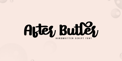 After Butler is a lovely and timeless handwritten font. It is the best choice for creating eye catching logos, branding and quotes. After Butler is PUA encoded which means you can access all of the glyphs and swashes with ease!
 - Thinkerbery by Mightyfire,
$15.00 Need a semi-formal yet unique font? Thinkerbery is the answer! The look of Thinkerbery is like a digital typing style but still has its uniqueness. We bring a strong looks for your text. Enjoy in creating unique arts using Thinkerbery! :)
 - Monster by Fenotype,
$19.95 Monster was originally created as a school assignment at the University of Industrial Art & Design Helsinki in 2006. Monster is an experimental dingbat font. Try writing different kind of monsters: set font size and leading the same and start experimenting!
 - Mr. Mamoulian by Comicraft,
$19.00 “In some way I was Mr Mamoulian, and someone else was writing and drawing this stuff. He kept sending me these pages. I had to sign my name and pass them off as my own. I had no choice. He was holding my aged mother hostage, you see. I told him when the pages were due and he somehow got them to me. Sometimes he left them in secret locations. I don't remember them at all.” -- Brian Bolland Mr. Mamoulian has four weights with automatic alternating uppercase letters, Crossbar I Technology, and European, Vietnamese & Cyrillic language support.
 - Eragu by Twinletter,
$15.00 ERAGU is a display typeface that is unlike any other, both in terms of shape and the impression it gives when used in words or sentences. It also has a new and unusual appearance that makes it truly unique and quirky. All of your projects will be unique in the market if you use this font; it will pique the interest of everyone who sees it, and it will be simple to remember every message you will convey to the audience because, in just a few seconds, everyone will be interested in the appearance of your project if you use this font. Logotypes, food banners, branding, brochure, posters, movie titles, book titles, quotes, and more may all benefit from this font. Of course, using this font in your various design projects will make them excellent and outstanding; many viewers are drawn to the striking and unusual graphic display. Start utilizing this typeface in your projects to make them stand out.
 - Stay Calm by Nathatype,
$29.00 A typography can often be a deniable, yet crucial factor in designs’ displays and nuances. Additionally, it may be hard to find prominent, elegant, catchy fonts, whereas customers can easily forget designs without the right typography and remember nothing about your brands. Even the most interesting designs will look dull and too ordinary with inappropriate fonts. Therefore, we would like to introduce you to the Stay Calm, the perfect font option to create prominent designs. Stay Calm is an elegant, prominent display serif font to attract everybody's attention. It has bigger and thicker font proportions than the other ordinary serif fonts as its character to ease people to see it in big text sizes. Such unique characters as curvy thin lines and big, protruding dots, make this font suitable to create unique, interesting designs and applicable for bigger text sizes. You may also enjoy the available features here. Features: Ligatures Multilingual Supports PUA Encoded Numerals and Punctuations Stay Calm fits best for various design projects, such as brandings, posters, banners, headings, magazine covers, quotes, invitations, name cards, printed products, merchandise, social media, etc. Find out more ways to use this font by taking a look at the font preview. Thanks for purchasing our fonts. Hopefully, you have a great time using our font. Feel free to contact us anytime for further information or when you have trouble with the font. Thanks a lot and happy designing
 - Nouveau Days JNL by Jeff Levine,
$29.00 The basic design style for Nouveau Days JNL was inspired by the hand lettering on the sheet music cover for "Linger Longer Letty". This tongue-twisting song title comes from the 1919 musical comedy of the same name. Some of the characters originally had tiny spur serifs, but they were omitted in the digital version to keep the overall design consistent. The font is available in both regular and oblique versions.
 - Flanker Ruano by Flanker,
$18.00 The typeface Ruano was inspired from “Lettera cancelleresca formata” by the Vatican calligrapher Ferdinando Ruano, carved and cast in 1926 by Nebiolo of Turin on the advice of Raffaello Bertieri who designed the capital letters and numbers, missing in the original. The difficulty of the design of this chancery font lies in its original vertical layout, bending the calligraphic harmonies to the Gothic style, thus distinguishing it from contemporary cursive alphabets.
 - Adventure Island by Larin Type Co,
$12.00 Adventure Island this is a stunning font family that consists of two types of fonts, script and sans serif, and each has 8 weights (Regular, Rough, Halftone, Pressed, Bold, Bold rough, Bold halftone, Bold pressed,). With their help, a lot of options are opened for you to create your projects, both in vintage and in modern style. These fonts are like twin brothers, they fit perfectly and complement each other. The Script type has flowing shapes and is made to shine and lively for the full hand-signature effect. Sans serif type is also made in monoline and has rounded corners and smooth lines. The script style has alternatives for uppercases and many alternates for lowercaes, with them you can make your design more expressive, varied and playful, change them and you will see how many options you can get for your design, also use swashes touches to complement your design. Enjoy using! The font includes 8 script fonts and 8 sans serif fonts (Regular, Rough, Halftone, Pressed, Bold, Bold rough, Bold halftone, Bold pressed,) Full alphabet with Uppercase and Lowercase A-z for script Full alphabet with Uppercase for sans serif Numbers, fractions for all fonts Punctuation and mathematical symbols for all fonts Alternates Uppercase and Lowercase also ampersand for script Swashes for script Multilingual support all fonts
 - Daytona by Monotype,
$50.99 The Daytona™ typeface family grew out of a desire to provide improved fonts for use in televised sporting events. Jim Wasco drew the design as sturdy squared letters based on humanist shapes and proportions. Letters were kept narrow for economy of space, and inter-character spacing was established for easy reading. While televised sporting events may have initially been his target, the design considerations he incorporated into the Daytona family also enabled it to perform well in a variety of other video and on screen environments. Daytona Variables are font files which are featuring two width axes and have a preset instance from Thin to Fat.
 - Machinas Typeface by Gian Studio,
$16.00 The Machines Typeface is a retro and classic typeface inspired by the 70s - 90s designs with more unique explored styles like swosh and alternate characters. This font is made from a manual sketch with many many scratches then finished with the font. there are 493 glyphs, so many options that you can use for your projects, Make your designs project with this font and extras illustration to give more superb. This font is also suitable to design like logos, stickers, tees design, banners, posters, sign, display design, packaging, and more superb designs! Enjoy our product and feel free to contact us for support! Features : Full set of Upper & Lowercase Character Number & Punctuation Swosh Alternate Extras Illustration Multilingual Language PUA encoded Opentype Features Thank You for your purchase!
 - Sassoon Sans US by Sassoon-Williams,
$48.00 North American version for teaching children’s first letterforms With dots and arrows these print script fonts have no ‘exit stroke’ found in the European version. An upright typeface family developed to meet the demand for letters to produce pupil material for handwriting as well as for reading. Upright letters with extended ascenders and descenders are ideal on screen. They facilitate word recognition. Teachers can print desk strips, charts of letter families and alphabet friezes, as well as consistent material across the curriculum. Together these typefaces provide a valuable resource for special needs teachers. Free to download resources How to access Stylistic Sets of alternative letters in these fonts
 - Gomme Sans by Dharma Type,
$29.99 Gomme Sans is a wide and masculine sans-serif family for text designed by Ryoichi Tsunekawa and the whole family consists of 6 weights from ExtraLight to ExtraBold and their matching Italics. The basic concept of this family is not only to make an impact by masculine, squarish letter form but also to be legible and readable even on small size screen by the sophisticated design, and their large x-heights. Gomme Sans supports almost all European languages: Western, Central, South Eastern Europeans and afrikaans. And proportional figures, superior figures, inferior figures, denominators, numerators, fractions, ordinals and case-sensitive-forms can be accessed by using OpenType features.


