10,000 search results
(0.114 seconds)
- EQuity by Nathatype,
$29.00 Are you looking for a serif font? Do you dream of creating headings that stand out and inspire creativity, imagination, and endless fun? Wait no more, we will give you the best choice. EQuity-A Serif Font EQuity is a modern, luxury, but still authentic serif font. This font is perfect for branding, logos, wedding stationery, cards, gift designs, photography, watermark, product packaging and quotes. You won't get cute, whimsical, funny logos with this font. Only high-end, upscale, sophisticated Branding Design. Our font always includes Multilingual Support to make your branding reach a global audience. Inspire your audience, clients, or guests with this beautiful, statement font. Features: Alternates Ligatures Swashes PUA Encoded Numerals and Punctuation Thank you for downloading premium fonts from Natha Studio
 - Million Smiles by Subectype,
$17.00 Introducing our newest font, "Million Smiles", a casual bold script font with hand-letterred style. Million Smiles is an upgraded version of our previous font, "Billion Dreams". In this new version, we've rounded the edges a bit for a softer look, compared to the sharp edges of the old one. This enchanting font is the perfect choice for design projects that aim for a fun, urban, and classy vibe. It adds a touch of cool to your creativity without losing its elegant charm.
 - Lateman by Dumadi,
$25.00 Lateman is a casual font built with apps. with freestyle and natural make this font look friendly to the project you are working on. Lateman only consists of uppercase letters, but if it collaborates with other fonts, it will feel more striking like the preview example above. This font was created for superhero movie titles and is perfect for movie titles, superheroes, action, animation, war, and more. You can see the sample preview above for comparison, stay the center of attention and classy!
 - Klandestin by Dryy Type,
$18.00 Klandestin Typeface An aesthetic font that has a unique and elegant character to use. Klandestin is a beautiful and elegant serif Font with script for alternate. This font I created is meaningful & very versatile, it goes well with a variety of designs, elevating them to the highest level. Add this font to your favorite creative ideas and watch how it becomes real! Features : Uppercase, Lowercase, Numerical, Alternates, Ligatures & Multilingual Support There it is! I really hope you enjoy it
 - Goosebumps by Comicraft,
$19.00 Here's a font that'll send shivers down your spine, stand your hair up on end and turn your skin into gooseflesh. Hand lettered by rotten old Richard Starkings after we locked him up in the attic one dark, stormy night, these stressed out characters are a real scream!
 - Abesif by Twinletter,
$12.00 Introducing Abesif sans serif font. This font is stretched from the normal theme, it is boring, while different, it seems strange. from there we design the appearance of this font that is not normal so that it is not boring and we display it differently but not look strange. so if you use this font it will look different from the others but it doesn't look strange because it has a normal design. so that it creates an impression that is easy for each of your audience to remember when they first see your project. This font is very suitable as text with displays for various kinds of branding, advertisements, posters, banners, packaging, news headlines, magazines, websites, logo design, banners, social media design and of course you can use a lot more.
 - Jazz Script by Fenotype,
$35.00 Jazz Script is a groovy font family of two weights of the Script, a vivid set of Caps and Extras to spice up your designs or create custom letters with extra swashes. Inspired by 50s and 60s American lettering but polished with sharp but smooth vector expression Jazz Script is a powerful tool for creating iconic headlines, packages, or logos. Each Script version contains more than 750 glyphs and is equipped with several OpenType features to easy up your access for all the goodies: turn on Swash, Contextual or Titling Alternates or manually select from the Glyph Palette from even more Alternates to compose elegant word images. Jazz Script also has plenty of Automatic Ligatures that keep the text flowing and then there’s Proportional Oldstyle for more bouncy numerals. Jazz Script Family has four versions: #1 is regular, #2 has inline and #3 and 4 have different styles of carefully designed printed texture on them. For the very best price purchase the complete set that has all versions of Jazz Script and go wild with the flow!
 - Distill by MADType,
$19.00 Distill draws its inspiration mainly from Theo van Doesburg's De Stijl era lettering. The type he designed for the Aubette Café, De Stijl Magazine, etc was used as a starting point and then expanded upon. While this typeface was inspired by historical references, it also has the ability to invoke a contemporary feel under the right conditions. Distill will work hard whether you are designing a neo-constructivist poster or a futuristic website. Distill is a family of 12 fonts: 4 weights, each containing condensed, regular, and expanded widths. It also features several alternate characters.
 - Green Fairy by Maria Montes,
$39.00 Green Fairy is a chromatic font family highly ornamented for display purposes. Green Fairy’s characters have been specifically designed to accommodate its loops and ornaments following a modern typeface structure. Green Fairy has four chromatic weights: 1. Green Fairy Outline 2. Green Fairy Dots 3. Green Fairy Stencil 4. Green Fairy Full The outline weight has been created as the base or structure for the other weights. You can combine these weights as well as add colours to obtain multiple effects and type styles. Green Fairy has also three combined weights (combos) to simplify your work flow, for these occasions when you only want to use one single colour in your font: 5. Green Fairy Dots Combo 6. Green Fairy Stencil Combo 7. Green Fairy Full Combo GREEN FAIRY ORIGINS The origin of this typeface is the lettering I designed in October 2015 as part of my illustrated cocktail artwork called “Absinthe. La Fée Verte (The Green Fairy)”. Originally, this lettering only featured eight letters “AB·SINTHE” vector drawn in Illustrator. Right after creating the full-colour artwork, I designed a fountain-letterpress print version of it, in collaboration with Ladies of Letters, A.K.A. Carla Hackett and Amy Constable from Saint Gertrude Fine Printing. At the beginning of 2016 –and thanks to the project @36daysoftype– I found the motivation, and most importantly the deadline, to draw the rest of the twenty-six letters of the uppercase alphabet using Illustrator. I started 2017 having my first two calligraphy courses sold out, so I took this amazing opportunity to devote myself to Green Fairy for a few months. In February 2017, I purchased the font software Glyphs and I started to re-draw all twenty-six letters of the uppercase alphabet again. PRODUCTION PROCESS Green Fairy started being one weight, but quickly turned into a layered/chromatic font. Things were going more or less fine till I arrived to the Dots weight: 1) I started drawing squares following a grid; 2) Then, the squares turned into diamonds following the same grid; 3) Then, the grid wasn’t working so well on the round letters so I tried randomising the position of the diamonds but it didn’t work; 4) So I went back to the grid, and this time scaled down the size of the diamonds creating a visual half-tone effect. I spent over four weeks working on the Dots weight and I felt like I was in the middle of a very long tunnel and I couldn’t see the light at the end. I encountered many other problems along the way but by June 2017, I felt I was back on track again. I kept working, tweaking, re-drawing and re-adjusting, and then the diacritics came on board… And then more re-drawing, re-tweaking, re-adjusting and then numbers… And then spacing, symbols, and currencies… And then more spacing, kerning, contextual kerning for triplets… In September 2017 I told myself “that’s it, I’m going to finish it now!” But guess what? More re-tweaking, testing, hinting, testing, rendering, testing… For those of you not familiarized with typeface design, it is extremely time consuming and it requires a lot of hard work, focus and determination. This project could not have been possible without the help of these generous professionals: Jose Manuel Urós, typeface designer based in Barcelona and my teacher twice in the past; Jamie Clarke, freelance letterer and typeface designer who has released a couple of chromatic fonts recently; Troy Leinster, Australian full-time typeface designer living and working in New York City; Noe Blanco, full-time typeface designer and hinting specialist based in Catalonia; And Nicole Phillips, typographer currently relocating from Australia to New Zealand. To all of you: THANK YOU VERY MUCH!
 - Synthica by Volcano Type,
$35.00 Synthica is the advanced version of a geometrically constructed typeface – designed for a thesis project in summer 2010 in Pforzheim. In the context of electronic music and the profound analysis of its parameters, this typeface is primarly based on a strict modular grid. Additionally, the ascender, descender and the x height had slightly been increased in order to even out a visual difference in size between the glyphs. The name „Synthica“ dervives from a basic principle in electronic sound synthesis. Sinus, triangle and square are some of the basic waveforms in the synthesizers’ oscillator section and were thus used as geometric modules for the grid. The modularity and geometry also derive from different structures of electronic music. The strong emphasis on diagonal lines creates a rhythmic typeface that connotates electronic music patterns with highly recognisable glyphs. The contrast between digital and analog is another basic idea of this typeface: while Synthica Outline has a more synthetic and fragile character, the filled version Synthica Black serves as the analog counterpart.
 - Kitami by Talbot Type,
$19.50Talbot Type Kitami is a minimal, geometric, stencil display font, inspired by Herbert Bayer’s Universal Typeface, created at the Bauhaus in the 1920s. Each character is created from a single continuous stroke, or combination of strokes. - ITC Korinna by ITC,
$40.99New York designers Ed Benguiat, Victor Caruso, and the staff at Photo Lettering, Inc. developed the ITC Korinna typeface family during the 1970s. ITC Korinna is based on an older German design that was originally cast at the beginning of the 20th century. That ITC Korinna was created speaks to the status that Art Nouveau had for designers during the 1960s and 70s. Thanks to their keen reviving of this ever-popular style, computer users can still use this type style today. ITC Korinna is perfect for display and advertising typography, as well as for headlines in newsletters and magazines. - EmBauhaus by Emboss,
$25.00 EmBauhaus is a display typeface, geometric in style, inspired by the face named after the world changing Bauhaus School. To aid readability I rethought the original typeface and closed all of the voids cut out of the strokes. We also modified the upper case to make it a more traditional design. An example of this is the upper case L, where a 90 degree angle was added. This typeface was designed to be used judiciously in a layout, to draw focus to words and headlines, using stark angles, radii and geometry to create visual rhythm and gestalt.
 - Payu by Twinletter,
$15.00 Payu display font is a unique, intriguing, and quirky typeface that we present to all of you. This font was created to satisfy the demands of beautiful and quick graphics, allowing you to quickly produce attractive and elegant projects. Take a look at the font’s harmony and harmony; your project will shine like a prima donna. This graffiti font is great for product logos, poster titles, headlines, packaging, film titles, logotypes, gorgeous writing, and trendy graffiti designs, among other things. Of course, if you utilize this font in your numerous creative projects, they will be perfect and outstanding. Use this typeface right away for your one-of-a-kind and remarkable projects.
 - Winter Day by Larin Type Co,
$10.00 Winter Day is a strong and playful script with a streak and a solid version, as well as a fun handwritten sans serif in a regular and bold style. Inspired by winter beauty and Christmas mood. Fall in love with its charm and take any craft to a new level! Create templates with Winter Day, invitations, book covers, magazines, stationery, children's books, logo design, emphasize your individuality in the blog and social media and much more.
 - Hunitek by Gatype,
$15.00 The Hunitek Display is stylish with extreme cuts, sharp corners and interactive straps. Characters that seem solid are spread across each replacement letter, with different styles and maximum personality. Bold character separation and considered binding standards create a type that is sturdy, modern and attractive. suitable for logos, emblems, magazines, quotes etc. Hunitek is a modern Display font, each letter is carefully crafted to make your text look unique. Feel free to message me if you have any questions!
 - Zapfino Extra Paneuropean by Linotype,
$103.99ZapfinoExtra is an OpenType format typeface available in two versions. The Contextual version contains a treasure-trove of extra contextual features. When created in 2004, this was the most advanced OpenType font released to date. By purchasing the Contextual version, users of OpenType-supporting applications, such as Adobe InDesign, may access all of the features available in the entire Zapfino family through just two fonts, Zapfino Extra LT Pro (Contextual), and Zapfino Forte LT Pro! Unfortunately, most non-Adobe applications currently do not support the contextual features made possible by recent OpenType developments. Users of Quark XPress and Microsoft Office should instead purchase all of the non-contextual fonts of Zapfino Extra Pro family, in order to access all of the Zapfino family's 1676 glyphs. The Zapfino family's character set supports 48 western and central European languages. More Zapfino History: Today's digital font technology allowed the world-renowned typeface designer/calligrapher Hermann Zapf to finally realize a vision he first had more than fifty years ago: creating a typeface that could capture the freedom and liveliness of beautiful handwriting. The basic Zapfino™ font family, released in 1998, consists of four alphabets with many additional stylistic alternates that can be freely mixed together to emulate the variations in handwritten text. In 2003, Herman Zapf completely reworked the Zapfino design, creating Zapfino™ Extra. This large expansion of the Zapfino family was designed in close collaboration with Akira Kobayashi. Zapfino™ Extra includes a cornucopia of new characters. It features exuberant hyper-flourishes, elegant small caps, dozens of ornaments, more alternates and ligatures, index characters, and a very useful bold version-named Zapfino™ Forte. Use Zapfino to produce unusual and graceful advertisements, packaging, and invitations. Zapfino Extra is so joyously abundant that it's tempting to over-indulge, so be sure to check out the tips for working well with the possibilities!" - Tuna by Ligature Inc,
$49.00 Tuna is simply a contemporary body text font. It is contemporary, meaning the merge of charming broad-nibbed calligraphic style with optimized readability on screen – showing that the roots of writing and typesetting are still in charge when reading “Anna Karenina” on your Kindle till 4 o’clock in the morning. Tuna has a natural fit for cross-media use because the design is based on forms characterized by different conditions of constancy, stability and good readability. Well-defined shapes and distinctive details only become apparent when used in larger sizes, making Tuna a true all-rounder. With more than 700 glyphs in 10 styles created with a maximum of consideration, it has all the qualities of a modern OpenType font serving the needs of today's communication. If you would like to read more about the Typeface please visit our promo site.
 - Faber Gotic by Ingo,
$21.00 A ”modern“ Gothic – designed according to principles of modern form in three variations Faber Gotik is a reminiscence of Gutenberg’s first script from around 1450. The heavily broken forms allow further development in the direction of a modern, strongly geometric and less formal type. It should be possible to push the principle of design so far to the limit that a type is created which, from the very start, extinguishes reminders of a dark past. The characters are composed of squares which are lined up straight or in a more or less slanted manner. The resulting corners similar to serifs were removed so that a sans serif type in the true sense without up and down strokes was created. The principle of ”breaking“ was applied according to the historical model. Even the form of the characters is based on the model from the Middle Ages. Only the characters which cannot be created with the principle described were modeled on today's forms. Faber Gotik includes three variations: - Faber Gotik Text — most similar to the historical model - Faber Gotik Gothic — pushes the applied principle of form the furthest - Faber Gotik Capitals —; a Gothic upper case font, contrary to tradition. 555 years after Gutenberg, interest in black-letter typefaces is nearly extinct. They are especially looked down upon in German-speaking countries because they are still associated with ”Nazi“ scripts. But yet, the very forms of blackletter, Gothic, Schwabacher and especially cursive have enormous potential with regard to the development of new advanced font forms.
 - Cantarell - 100% free

- Brandon Text Office by HVD Fonts,
$40.00 Brandon Text is the companion of the famous Brandon Grotesque type family. It has a higher x-height than the Grotesque version and is optimized for long texts, small sizes and screens. This special Office version of Brandon Text is especially for all Microsoft Office applications (Word, Excel, Powerpoint …). It contains just the 4 basic styles which are style-linked and can be easily accessed by the “I” or “B” button in Office. The fonts are manually hinted so their appearance is also optimized for these applications.
 - Announcement Board JNL by Jeff Levine,
$29.00 Many decades back, churches, schools and other buildings with a need to display an outdoor message often chose a sign making system utilizing characters silk screened onto metal pieces in a block chamfer style. Each piece had a crimp in the top of the metal which formed a hook to fit over the existing rails of a message panel. This allowed for a finished sign to be displayed within minutes, and a quick change of information was not very time-consuming. A popular version of these signs provided white letters and numbers on black backgrounds. This was the model for Announcement Board JNL, which is available in both regular and oblique versions. There are two different width blank panels on the broken and solid bars for those who wish to kern the letters tight to form a ribbon, however they were designed to have slight spacing in order to emulate the hand assembly of those vintage sign panels.
 - Fontoddler by CozyFonts,
$20.00 Fontoddler Font Family, This font was created with the personality, in mind, of my two-and-a-half-year-old granddaughter Chloe Bella. I believe strongly that fonts have personalities that’s why we refer to their members as ‘characters’ or to be more accurate, ‘glyphs’. This font is playful, bold, colorful in form and design, a bit irregular, a bit informal, a bit irreverent, a bit humorous, a bit sassy, and a bit independent just like my little one. When used in color Fontoddler sings. She’ll be writing and creating visual words in just the nick of time. At 2 she started recognizing many colors and identifying people, places, animals, and objects and now she’s recognizing letters. I can’t wait for her to understand that this font was designed and named after her. Fontoddler currently exists in 3 styles, Medium, Heavy, and Heavy Outline. Naturally Heavy and Heavy Outline are congruous, ie. They are fitting together. I hope you enjoy and use this 24th font family from Cozyfonts Foundry. It will fit well with greeting cards, signage, birthday parties, holiday occasions, invites, stationary, headlines, logos, posters, cartoons, animation titles, movie titles and even sports events and sports logos. Have fun with this one. Tom Nikosey
 - SP Isis by Remote Inc,
$39.00They say the Nile has many secrets and she was the most sacred of them all. Isis. I met her in a small tavern outside of Edfu, hidden like a jewel between Luxor and Aswan. I had journeyed to Egypt to study the mating habits of homosexual hippos. I had no idea it was the journey that would teach me the true nature of love. - VVDS Big Tickle by Vintage Voyage Design Supply,
$15.00 To the sound of smooth jazz 50's and incendiary Rock'n'Roll dance of 60's Im glad to Introduce you the new product in my Vintage Voyage — The Big Tickle Font Family! Absolute useful collection! Firstly is playful serif. The range of weights can be used to maintain an even colour across different sizes. Use it normally or all caps and play with baseline, give more bounce to composition. Or try to use Caps alternates and get really bouncing letters. Alternates has every uppercase letter. Also, for more variety I add a few versions for decoration: Inner hatched and Offset with Shadow. Okay, folks! The second one is Script. I really love them, they look like was signed with true brush. It can be perfectly used both independently and in tandem with the serifs. And the last one is Retro Graphic! Authentic collection of typical design elements of 50's and 60's style of Poster, Books or Ads. You can create awesome retro patterns or use them individually. 124 graphic elements total. A-Z; a-z; 0-9. Multilingual. Grab this stuff and have a good time with Mid Century Modern Adventure!
 - Libertat by Elyas Beria,
$9.00 In a not-too-distant future, humanity was ruled by a powerful, technologically advanced empire known as the Synod. The Synod controlled all forms of communication, and through this, they controlled the minds of the people. But a small group of rebels, known as the Resistance, had managed to evade the Synod's surveillance and formed a secret underground movement. They were determined to overthrow the Synod and restore freedom to the people. One of the Resistance's key members was a young artist named Trystån. He had a unique talent for creating powerful, visually striking posters that captured the spirit of the Resistance's message and spread it to the masses. Trystån had just completed a new poster, one that would be critical to the Resistance's plans. It depicted a single, outstretched hand holding a traditional Kimarii laser staff, with the words "Libertat!" emblazoned across the top. The poster featured a striking and powerful font that perfectly captured the spirit of the Resistance's message. The font was a combination of bold lines, elegant confident curves, and strong angles, giving it a sense of strength and determination. The lettering was large and prominent, filling up much of the poster, making it hard to miss. The letters seemed to be almost carved into the surface, giving the impression of something that was permanent and unshakable. The font was colored in dark shades, and was a sans serif typeface, that gives the message a very modern and current feel yet also feels vintage and retro, connecting the present with the struggles of the past. And with multilingual support, the typeface ensured that the message of the Resistance could be disseminated in every language on the planet. The background was minimalistic and in contrast, with a neutral palette, with just a hint of a sand-like color, representing the harsh conditions of the land that the people were fighting for their rights. The focus was all on the lettering, and how it conveyed the message. The poster was indeed a moving piece of graphic design, with its strong, striking font, and powerful imagery. It was clear that Trystån had put a lot of thought and care into its design. The poster, he hoped, would connect with people on an emotional level and inspire them to rise up against the oppression of the Synod Empire. The poster was set to be distributed at a major rally in the capital, where the Resistance was hoping to gain the support of thousands of citizens. But the Synod was not about to let this happen. They had long suspected the existence of the Resistance and had been working to infiltrate their ranks and discover their plans. The night before the rally, the Synod launched a surprise raid on the Resistance's hideout, capturing Trystån and several other members of the Resistance. Trystån was thrown into sand pits and interrogated by the Synod's top agents. They wanted to know everything about the Resistance's plans, including the details of the poster and the rally. Trystån, knowing the importance of the poster, refused to give in, even under the harshest of conditions. Meanwhile, the rally was drawing near, and the Resistance was desperate to get the poster out to the public. They knew that it was their only hope of gaining the support they needed to overthrow the Synod. They came up with a plan to smuggle the poster out of the hideout, but it would be a risky endeavor. As the rally began, the Resistance made their move, slipping the poster into the hands of the crowd. Trystån's poster had made a big impact in the rallies, and soon it became the symbol of hope for the resistance, and the visual representation of their struggle for freedom. The poster had become the catalyst for the revolution, and it would be remembered for many years to come as the symbol of the fight for freedom and democracy. The image of the outstretched hand holding the Kimarii laser staff struck a chord with the people, and they began to rise up against the Synod's oppression. Trystån, still locked away in the sand pits behind a stasis feild, could only imagine the scene unfolding outside. But he knew that his work had helped to spark a revolution, and he felt a sense of pride and accomplishment. The Resistance, with the help of the rally, was able to overthrow the empire, and Trystån was released, celebrated as a hero and hailed as the artist who helped to bring about the new era of freedom and democracy. The poster Trystån had designed had become the symbol of a new era, and it would hang in museums and public places as a reminder of the power of resistance and art, in the face of oppression. Features: regular and light weights numbers and punctuation multilingual characters
 - Wild Thing by ITC,
$29.99Wild Thing was created by British designer Martin Wait and appeared in the ITC library in 1995. The forms look as though they are normal alphabet figures viewed through swirling water, wavy and irregular. Wild Thing is a font which is always moving and is perfect for fresh new designs. - Capcay Spicy by Asd Studio,
$10.00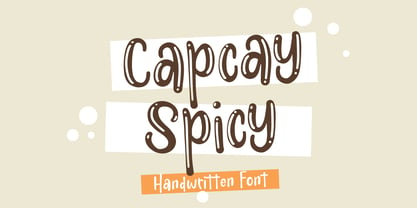 ntroducing Capcay Spicy, created by Asd Studio is a quirky and relaxed handwritten font. Whatever the topic, this font will be a wonderful asset to your font library, as it has the potential to enhance any creation. What's Included? :: Uppercase & Lowercase :: Numbers & Punctuation :: Multilingual Support Enjoy our font, thank you.
 - Melted Cheese by Asd Studio,
$10.00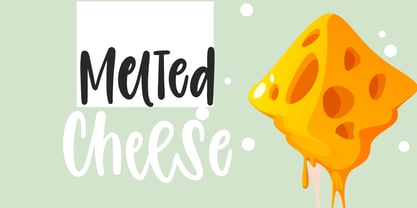 Introducing Melted Cheese, created by Asd Studio is a quirky and relaxed handwritten font. Whatever the topic, this font will be a wonderful asset to your font library, as it has the potential to enhance any creation. What's Included? :: Uppercase & Lowercase :: Numbers & Punctuation :: Multilingual Support Enjoy our font, thank you.
 - Lovely Summer by Sakha Design,
$12.00 Lovely Summer is a romantic and sweet calligraphy typeface with characters that dance along the baseline. It will add a luxury spark to any design project that you wish to create! This font is PUA encoded which means you can access all of the amazing glyphs and ligatures with ease!
 - Juwitha by Letterafandi Studio,
$14.00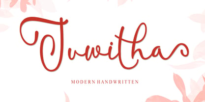 Juwitha is a modern handwitten font featuring charming, playful characters that seem to dance along the baseline. It will add a luxury spark to any design project that you wish to create! This font is PUA encoded which means you can access all of the glyphs and swashes with ease!
 - Delmonte Belarina by Letterena Studios,
$9.00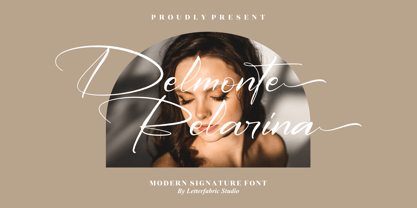 Delmonte Belarina is a romantic and sweet calligraphy typeface with characters that dance along the baseline. It will add a luxury spark to any design project that you wish to create! This font is PUA encoded which means you can access all of the amazing glyphs and ligatures with ease!
 - AT Move Straw by André Toet Design,
$39.95 STRAW The inspiration for this capital alphabet came from those beautiful haystacks you see in summer and the old fashioned Mikado game! We wanted to create a light, fragile and airy typeface with an optical effect. And here it is ... it’s just STRAW ! Concept/Art Direction/Design: André Toet © 2017
 - Stayling Quarters by TM Type,
$12.00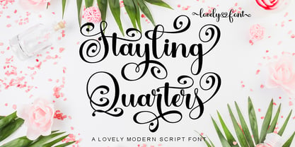 Stayling Quarters is a romantic and sweet calligraphy typeface with characters that dance along the baseline. It will add a luxury spark to any design project that you wish to create! This font is PUA encoded which means you can access all of the amazing glyphs and ligatures with ease!
 - Febriella by Letterafandi Studio,
$12.00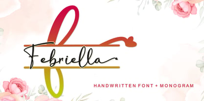 Febriella is a lovely script font featuring charming, playful characters that seem to dance along the baseline. It will add a luxury spark to any design project that you wish to create! This font is PUA encoded which means you can access all of the glyphs and swashes with ease!
 - P22 Dichromate by IHOF,
$29.95 Dichromate is a modular-based display font system from UK based designer/writer Will Hill. This display typeface is comprised of two ‘interlocking’ fonts. These may be used independently as eccentrically broken designs, or overlaid enabling the two sets of the letter-shapes to combine to create chromatic color combinations.
 - Ilerda ND by Neufville Digital,
$29.60 Also referred to as ‘Champs Elysées’ in France. This is the first typeface created by Crous-Vidal in the field of Grafía Latina. It is a character that expresses strength, and energy yet retains a certain elegance and even a touch of flirtatiousness. Ilerda is a Trademark of BauerTypes SL
 - Farbe by Bonez Designz,
$35.00Farbe is a contemporary hand created brush script font. A dry brush with minimal medium was used to create the nature textured look. Farbe is an all capitals font covering the full latin script (including diacritics and Greek) along with the Cyrillic script, numbers and punctuation. A specimen book for the typeface is available HERE - King Throne by Nathatype,
$29.00 King Throne is a regal display font that exudes an air of grandeur and elegance. With its high contrast characters and distinctive swinging letter ends, this typeface commands attention and captivates the viewer with its majestic presence. The high contrast design of this font creates a striking visual impact. The stark difference between the thick and thin strokes adds a sense of drama and sophistication to each letter, making them stand out with a commanding presence. The font's weight distribution captures the eye and draws focus to the exquisite details of its letterforms. What sets King Throne apart is the captivating swinging ends of the letters. With a gentle curve and a flourish, these decorative elements add a touch of movement and grace to the font. The swinging letter ends contribute to the font's regal aesthetic, evoking images of royal script and elegant calligraphy. They elevate the font's overall appearance, transforming it into a true symbol of authority and power. For the best legibility you can use it in the bigger text. Enjoy the available features here. Features: Stylistic Sets Ligatures Multilingual Supports PUA Encoded Numerals and Punctuations King Throne fits in headlines, logos, attention-grabbing titles, product packaging, branding materials, editorial layouts and website headers. Find out more ways to use this font by taking a look at the font preview. Thanks for purchasing our fonts. Hopefully, you have a great time using our font. Feel free to contact us anytime for further information or when you have trouble with the font. Thanks a lot and happy designing.
 - Clipwave by Typodermic,
$11.95 In a world where typography can often feel stale and unremarkable, Clipwave bursts onto the scene like a futuristic comet streaking across the sky. With its laser-trace letterforms and robot floor cleaner tracking patterns, Clipwave is a quirky, offbeat display typeface that’s sure to make a bold statement. But Clipwave is more than just a pretty face. Thanks to its OpenType ligatures, this font is able to shuffle permutations of alphanumeric characters to create a pseudorandomized effect that adds an extra layer of creativity and dynamism to your designs. Whether you’re looking to create eye-catching headlines, attention-grabbing logos, or just want to inject some personality into your typography, Clipwave is the perfect tool for the job. This font will help you communicate your message in a distinctive, creative voice that’s sure to set you apart from the crowd. So why settle for boring, conventional typography when you can embrace the bold, unconventional spirit of Clipwave? Give your designs the edge they deserve and experience the future of typography today. Most Latin-based European writing systems are supported, including the following languages. Afaan Oromo, Afar, Afrikaans, Albanian, Alsatian, Aromanian, Aymara, Bashkir (Latin), Basque, Belarusian (Latin), Bemba, Bikol, Bosnian, Breton, Cape Verdean, Creole, Catalan, Cebuano, Chamorro, Chavacano, Chichewa, Crimean Tatar (Latin), Croatian, Czech, Danish, Dawan, Dholuo, Dutch, English, Estonian, Faroese, Fijian, Filipino, Finnish, French, Frisian, Friulian, Gagauz (Latin), Galician, Ganda, Genoese, German, Greenlandic, Guadeloupean Creole, Haitian Creole, Hawaiian, Hiligaynon, Hungarian, Icelandic, Ilocano, Indonesian, Irish, Italian, Jamaican, Kaqchikel, Karakalpak (Latin), Kashubian, Kikongo, Kinyarwanda, Kirundi, Kurdish (Latin), Latvian, Lithuanian, Lombard, Low Saxon, Luxembourgish, Maasai, Makhuwa, Malay, Maltese, Māori, Moldovan, Montenegrin, Ndebele, Neapolitan, Norwegian, Novial, Occitan, Ossetian (Latin), Papiamento, Piedmontese, Polish, Portuguese, Quechua, Rarotongan, Romanian, Romansh, Sami, Sango, Saramaccan, Sardinian, Scottish Gaelic, Serbian (Latin), Shona, Sicilian, Silesian, Slovak, Slovenian, Somali, Sorbian, Sotho, Spanish, Swahili, Swazi, Swedish, Tagalog, Tahitian, Tetum, Tongan, Tshiluba, Tsonga, Tswana, Tumbuka, Turkish, Turkmen (Latin), Tuvaluan, Uzbek (Latin), Venetian, Vepsian, Võro, Walloon, Waray-Waray, Wayuu, Welsh, Wolof, Xhosa, Yapese, Zapotec Zulu and Zuni.
