10,000 search results
(0.034 seconds)
- Retrade by Muksal Creatives,
$14.00 Retrade is a unique and modern family of Sans serif fonts. Simply Conception has 9 families Regular font, starting from the small thin to the largest Black. This typeface is versatile and can be used successfully in magazines, posters, branding, websites.
 - Victorah Gaerioa by Letterena Studios,
$9.00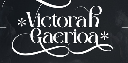 Victorah Gaerioa is a lovely and timeless serif font. It is the best choice for creating eye catching logos, branding and quotes. This font is PUA encoded which means you can access all of the glyphs and swashes with ease!
 - Premiere California by Letterena Studios,
$9.00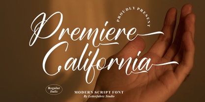 Premiere California is a lovely and timeless handwritten font. It is the best choice for creating eye catching logos, branding and quotes. This font is PUA encoded which means you can access all of the glyphs and swashes with ease!
 - Smile Hana by Beary,
$15.00 Smile Hana is a romantic and sweet calligraphy typeface with characters that dance along the baseline. It has a casual, yet elegant touch. This font is PUA encoded which means you can access all of the glyphs and swashes with ease!
 - Love seed by Aestherica Studio,
$12.00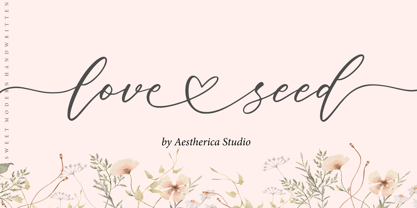 Love Seed is perfect for product packaging, branding project, magazines, social media, weddings, or just used to express words above the background. This font is PUA encoded, which means you can access all of the glyphs and swashes with ease!
 - Chivel Mind by Stringlabs Creative Studio,
$29.00 The Chivel Mind is a new vintage font. The combination of class and a nostalgic, retro feel make this font a true standout. It’s inspired by old-school caps and labels, and will turn any design project into a historical masterpiece.
 - Magefin by Muksal Creatives,
$10.00 Magefin is a unique and modern family of serif fonts. Simply Conception has 9 families Regular font, starting from the small thin to the largest Black. This typeface is versatile and can be used successfully in magazines, posters, branding, websites.
 - Hallery by Carpiola Studio,
$12.00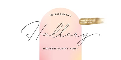 Hallery is a lovely and timeless handwritten font. It is the best choice for creating eye catching logos, business card, branding and quotes. This font is PUA encoded which means you can access all of the glyphs and swashes with ease!
 - Pasquale by Monotype,
$39.00Pasquale was designed by Tony Stan. The Pasquale font family has short ascenders, and the lowercase and caps A, B, D, E and Q are open. This versatile warm design is suitable for advertising, magazines, brochures, letterheads and text work. - Bodihel by Sealoung,
$15.00 Bodihel is a cute and chunky charactered display font. Add this colorful and bold display font to each of your creative ideas and notice how it makes them come alive! Get inspired by its authentic feel and use it to create gorgeous wedding invitations, beautiful stationary art, eye-catching social media posts, and cute greeting cards. I highly recommend using a program that supports OpenType features and Glyphs panels such as Adobe Illustrator, Adobe Photoshop CC, Adobe InDesign, or CorelDraw, so you can see and access all Glyph variations. FEATURE: ALL CAPS We hope you enjoy the font, please feel free to comment if you have any thoughts or feedback. Or simply send me a PM or email me. Thank you!
 - VLNL Bonen by VetteLetters,
$30.00 While sketching for a music project logo, Donald DBXL Beekman looked at several wood type alphabets as a starting poing. One of these was No.120, patented in 1880 by William Hamilton Page. With its distinct diagonally cut serifs and round shapes cut off at top and bottom, it bore just the right feel for the project. DBXL digitized the alphabet, adding all characters needed for a full set. During this process all shapes were widened, tweaked and streamlined to enhance consistency and rhythm along the whole font. VLNL Bonen is an all-caps display font with a very specific western cowboy or circus look. For instance burger or barbecue grill restaurants would do well with this one. We can easily see it shine on a festival flyer or poster as well, and not just country & western festivals. VLNL Bonen is suitable for any ‘big’ use that needs to stand out of the crowd. Bonen is the Dutch word for beans, a world wide source of nutrition and proteins it comes in a multitude of shapes, colours and sizes. Beans are also the most eaten foods in a cowboy’s diet along the trail. Available in abundance and easily preserved and transported, many recipes on the cattle drives in the American Wild West used beans. Think of chili, mashed beans with biscuits and bean soups. “Keep them doggies movin’, cowboy!”
 - Weiss Rundgotisch by Linotype,
$67.99The German designer Emil Rudolf Weiss originally created Weiss Rundgotisch for the Bauer typefoundry in 1937. In their catalog for the typeface, Bauer began with this quote from Leonhard Wagner: The round gothic (rundgotisch) script is the most beautiful kind of script; she is called the mother and the queen of all the rest." While designing Weiss Rundgotisch, Weiss was inspired by Renaissance types cut by the Augsberg printer Erhard Ratdolt. Ratdolt had spent some time in Venice, which is most likely where he became familiar with round gothic letters. This sort of letterform was never as popular in Germany as Fraktur or Gotisch may have been, but round gothic types were used there for centuries to represent arts and craft feelings, as well as old-fashioned handwork. For a blackletter typeface, Weiss Rundgotisch is very similar to normal serif and sans serif designs, especially its uppercase letters, which seem to have some uncial influence in them as well. Therefore, Weiss Rundgotisch is more legible for contemporary readers, making this an excellent choice for anyone looking to set text, logos, or headlines with in blackletter. Weiss Rundgotisch was apparently quite a difficult typeface to design, even for a master designer like Weiss. He began work on the face in 1915; Weiss Rundgotisch's development took over 20 years to complete." - Aquiline by GroupType,
$24.95 Handsome, adventurous, legible and elegant, this script has the feel of practical handwriting from past centuries. Aquiline is based on a cursive italic style influenced by the 16th century European writing masters. The Aquiline design team turned to Ludovico degli Arrighi, the great 16th century writing master, for period ideas on how to improve, strengthen and add grace to the font. Aquiline has strokes and gestures that seem very like the writing of Arrighi and Mercator, such as the flamboyant balloon of a flourish on the cap A; the graceful flourishes on the cap B, D, and L; and the compact lowercase with tall ascenders. Aquiline has a strong personality and is historically correct.
 - Wood Heinz No. 2 by astype,
$50.00 Wood Heinz No.2 - the close friend of Wood Heinz No.4 The Regular font style offers up to four »printed look« variations of all the Latin base letters and figures. An OpenType letter rotator is build into the font to emulate the randomness of wood type printing. You can switch manually to the alternate letters by using the Stylistic Sets 1–4. Stylistic Set 5 will activate the more common look of the capital letter R with a straight leg. The New font style has clean outlines and of course the alternate letter R. Wood Heinz No.2 and No.4 working seamlessly with each other. You can both mix them easily. PDF Specimen
 - Examors by Kulokale,
$15.00 Examors is an ultimate sports display font, and with a style that is very different from the others. This font comes in four styles, Regular, Outline, Oblique and Oblique Outline Version. Examors is well-suited for posters, social media, headlines, magazine titles, clothing, large print formats - and wherever you want to be seen. Inspired by the style of design that is currently popular, and this is the answer to all the needs of every idea that you will pour in this modern era. We highly recommend using a program that supports OpenType features and Glyphs panels such as Adobe Illustrator, Adobe Photoshop CC, Adobe InDesign, or CorelDraw, so you can see and access all Glyph variations. This font is encoded with Unicode PUA, which allows full access to all additional characters without having special design software. Mac users can use Font Book, and Windows users can use Character Map to view and copy one of the extra characters to paste into your favorite text editor / application. Thank You.
 - Phoska Dangers by Kulokale,
$16.00 Phoska Dangers is an sports sans serif display font, and with a style that is very different from the others. This font comes in four styles, Regular, Outline, Oblique and Oblique Outline Version. Phoska Dangers is well-suited for posters, social media, headlines, magazine titles, clothing, large print formats - and wherever you want to be seen. Inspired by the style of design that is currently popular, and this is the answer to all the needs of every idea that you will pour in this modern era. We highly recommend using a program that supports OpenType features and Glyphs panels such as Adobe Illustrator, Adobe Photoshop CC, Adobe InDesign, or CorelDraw, so you can see and access all Glyph variations. This font is encoded with Unicode PUA, which allows full access to all additional characters without having special design software. Mac users can use Font Book, and Windows users can use Character Map to view and copy one of the extra characters to paste into your favorite text editor / application. Thank You.
 - Bustor Rhikan by Kulokale,
$22.00 Bustor Rhikan is a stylish, clean, and linear slab serif font, with style that is very different from the others. This font comes in two styles, Regular and Oblique Version. Bustor Rhikan is well-suited for posters, social media, headlines, magazine titles, clothing, large print formats - and wherever you want to be seen. Inspired by the style of design that is currently popular, and this is the answer to all the needs of every idea that you will pour in this modern era. We highly recommend using a program that supports OpenType features and Glyphs panels such as Adobe Illustrator, Adobe Photoshop CC, Adobe InDesign, or CorelDraw, so you can see and access all Glyph variations. This font is encoded with Unicode PUA, which allows full access to all additional characters without having special design software. Mac users can use Font Book, and Windows users can use Character Map to view and copy one of the extra characters to paste into your favorite text editor / application. Thank You.
 - Alexis Rody by Kulokale,
$17.00 Alexis Rody is a stylish, clean, and modern condensed sans font, with style that is very different from the others. This font comes in four styles, Regular, Oblique, Outline and Oblique Outline Version. Alexis Rody is well-suited for posters, social media, headlines, magazine titles, clothing, large print formats - and wherever you want to be seen. Inspired by the style of design that is currently popular, and this is the answer to all the needs of every idea that you will pour in this modern era. We highly recommend using a program that supports OpenType features and Glyphs panels such as Adobe Illustrator, Adobe Photoshop CC, Adobe InDesign, or CorelDraw, so you can see and access all Glyph variations. This font is encoded with Unicode PUA, which allows full access to all additional characters without having special design software. Mac users can use Font Book, and Windows users can use Character Map to view and copy one of the extra characters to paste into your favorite text editor / application. Thanks and have fun!
 - Arise by Monotype,
$30.00 Arise is a humanist typeface designed for both text and display purposes. Its an understated type family with enough subtle nuances and personality to add distinction to your own typographic compositions. As can be seen in the /a/c/f/g/r/y/ glyphs, hooked terminals are a key feature of this typeface. These terminals are blade-like in appearance, defining a distinctive character that is unusual, yet balanced and refined. Practical features include 38 capital swash alternates for intial and final forms that can be particularly effective when used in titling and branding situations. Small caps are also included (along with matching diacritics) – these are designed to harmonise with regular lowercase forms so that you may easily achieve unicase-style typography. There are 18 fonts altogether, with 9 weights from ExtraLight to Ultra in both roman and italic. Arise has an extensive character set that covers all Latin European languages. Key features: 9 Weights Roman & Italic Small Caps 38 Alternates Old Style Figures European Language Support (Latin) 700+ Glyphs per font.
 - Throws by Tomatstudio,
$10.00 This is not an ordinary fonts, this is how the real throw up graffiti come into fontype! if you want real throw ups style graffiti fonts, this is the answer! because this is pure from my real graffiti eperiences around the streets. Kerning, spacing i adjust more tight, similar with the real throw up in the streets. The intersection between letter also you can erase it or leave it collide, depends of whats your styles, see our tutorial in the picture slides. I hope you guys like it, cheers!
 - Novera by René Bieder,
$29.00 The Novera family is a sharp geometric sans in ten weights plus matching italics, available in two versions – Modern and Classic. It has a contemporary, approachable and multifunctional yet characteristic design, that comes with an extensive glyphs set of 1000+ glyphs per font, meeting all typographic demands. The Design Vertical terminals, circular shapes and angular apexes – Novera truely breathes geometry! But the concept goes beyond the application of rational geometry. The intension was to create a highly legible family suitable for every day usage inspired by the work of Paul Renner, Eric Gill or Jakob Erbar, combining the geometric with the human and the functional with the unconventional. Although Novera is inspired by the past, its appearance is unmistakingly modern. Modern vs Classic Novera is available in two versions - Modern and Classic - born from the same source file but with different characters set as default. This creates subtle but effective distinctions such as the double-storey a (Novera Modern) which is optimized for legibility in longer text paragraphs, as opposed to the single-storey a (Novera Classic) which allows a purely geometric appearance. Another distinguishing feature are the ascenders on Novera Mondern, which extend above the cap height for an elegant presence, compared to the ascenders on Novera Classic, ending at the cap height, for a compact and helvetica-flavored look. Novera Modern was intended for usage in body copy, whereas Novera Classic was planned for headlines, short paragraphs or logos, but both versions can be used vice versa too, of course. Alternate Characters To maintain neutrality and a modern appearance, the standard character set largely dispenses with idiosyncratic forms. This is in contrast to the alternative forms with the gill-like lowercase letters g and t as well as a traditional shape of S and the German ligature t/z, which traces back to old German spellings. Also inspired by German poster designs from the early 20th century are the elongated i-dots and dieresis-dots that can create eye-catchers in headlines or logos. By the way, both versions, Novera Modern and Classic, can be created via stylistic set 1, 17 and 18. Opentype Features and Symbols The family comes with many opentype features to support modern typesetting. This includes ligatures, different number sets or alternative shapes for texts set in all caps. If you like arrows and other shapes, you will love Novera! The family has a built-in extensive symbols-set including 48 different arrows and various geometric shapes or icons. Weights With its 40 styles and 1000+ glyphs per font, the Novera family covers all thinkable design scenarios from branding to web, app or editorial usage. It blends in perfectly in text heavy paragraphs with its mid-weights like Light, Regular, Medium or Bold or stands out like a monument in headlines and posters with its extreme weights like Thin, ExtraLight, Black or Ultra. Testfonts If you like to test the fonts before buying the full version, please follow the link below. Please note, all test fonts are available for evaluation purposes only and contain a limited character set! A commercial license for the full version must be purchased separately. Please send a mail to contact@renebieder.com for more information. Download the test fonts here: https://www.renebieder.com/test-fonts
 - Brush Of Zeuxis by nasirbaradari,
$15.00 Brush of Zeuxis is a font inspired by the ancient painter Zeuxis, this really cool-looking brush stroke font is here to make your designs look way better and cooler. This font can be used for as many things as you want, it can be used on a thriller poster or a music album, this font will look very cool in a rock album, and many, many more!
 - Lastari by Mantra Naga Studio,
$20.00 Lastari – a Bold Slab Serif Display Typeface. This typeface has many alternatives with swashes that can make your lettering/logotype more attractive. This font is suitable for logos and various other formal forms, such as invitations, labels, logos, magazines, books, greeting/wedding cards, packaging, fashion, makeup, stationery, novels, labels, or advertising. This font is PUA encoded, which means you can access all of the glyphs and swashes with ease!
 - Honest Punch by Sarid Ezra,
$15.00 Honest Punch is a bold and strong quotable font that you can use for any purposes. This font is very suitable for tagline and branding. With readability and clear looks, this font is perfect for quote. Honest Punch contains unique lowercase and uppercase that you can use at the same times in a word that will make your design more attractive. This font also contains ligature, underline, and support multilingual.
 - Terminax by Monotype,
$29.99Terminax™ is a highly legible monospaced sans serif font with an extensive character set. Unlike other monospaced fonts, Terminax has a personality all its own. Terminax is a futuristic and assertive font which is popular with titles, and headings. Why a Small Caps font you may ask? While most word processing and page layout software offer a small cap feature - this merely distorts the letterforms and creates squashed, uneven results. Terminax features small caps that were designed so their weight matches the upper case letters, providing a clean, attractive appearance. - Glyphic Neue by Typeco,
$29.00Glyphic Neue was inspired by the Op Art style of lettering in the United States that ran rampant in many photo type houses in the 1960's and 1970's. The Glyphic Series from the Franklin Photolettering group was an influence and spring board for this family of fonts, hence it's name. But Glyphic Neue departs from its unicase Franklin influence in several ways. Firstly the designer created both upper and lower case forms. The lowercase has been designed with barley protruding ascenders and descenders and with an x-height equivalent to the cap height, so that upper and lower can be exchanged indiscriminately for a quirky effect. Some of the letters take a cue from the original Glyphic series but many have been redesigned entirely to fit the designers vision. The italic forms differ enough from the upright version making it almost an entirely different display alphabet. Glyphic Neue is a versatile family of 6 fonts -- 3 widths, each with an accompanying italic that look equally at home when used on a party flier or a sports team visual identity. - Hybi5 by Hybi-Types,
$12.50 The Hybi5 font family can be described as a “crossover” between Antiqua, Grotesque and Brushscript with characteristics from all of this genres. My aim was to design friendly and versatile fonts, which can be used for headlines or slogans as well as for some longer texts. To make the fonts useful for as many languages as possible, I added a lot of exotic accents. All styles contain the whole “Adobe Latin 3 (CE)” character set plus a few letters from “Adobe Latin 4”. A lot of ligatures prettify the look of the fonts. Alternate uppercase letters in the script style might do the same. If you are a professional designer, you will surely appreciate the thousands of kerning pairs within each style, which will make your work easier. I recommend to set Kerning to “metric” and spacing to “zero” in your layout app. Back in 2015 I worked on the first sketches of “Hybi5” using Adobe Illustrator. “Fontself Maker”, an extension for Illustrator, was used to convert the drawings into font-files. This tool can only create “OTF” font files. For this reason there are no “TTF” versions. It’s not the first font I have ever made, but the first to be distributed commercially.
 - Vallassina by Wilton Foundry,
$29.00 Vallassina is named after Vallassina, a village in the valley of the upper tract of the river Lambro in northern Italy. The most important settlement in the area is the town of Asso, from which the valley takes its name. Spasell is a slang of Insubric language, spoken until 19th century by inhabitants of Vallassina, when they used to go out from the valley for business and they didn't want to be understood by the people. What makes this valley unique is that the locals use a unique whistle language to communicate to each other. Vallasina is confidently irreverent yet curiously attractive. How many ways can you use Vallassina to whistle to your neighbors? Vallasina is available in OpenType format.
 - Minea by Bistatype,
$35.00 A characteristic of the Minea font family is the achievement of the calligraphic handwriting effect. In addition to basic, simple letter forms, it contains a large number of additional stylistic alternatives and ligatures that, by combining and changing without repetition, give the effect of calligraphic writing. Some of these characters can be changed by automatically turning on a particular OpenType function, when ligatures replace the combination of letters that are part of them, the letter is replaced by a certain alternative when found in a given context, and capital letters are replaced with decorative initials. Letter swap functions can be used in all programs that support OpenType programming. Minea is an attractive font that is sleek, clean, feminine, sensual, glamorous, simple and very easy to read. The Minea font family, based on original calligraphic sketches, contains a total of six weights. Thin, regular and medium weights have ligatures and alternate letter shapes, which help make the syllable look like an authentic calligraphic print. Semi-bold, bold, and black weights contain only basic letter shapes. The font family contains Latin and Cyrillic. Includes Russian and Serbian alternative letter forms. The family of calligraphic fonts Minea can be used on various occasions, and is intended for use in print and online. Can be used in the realization of certain tasks, unusual advertisements, packaging and invitations, diplomas ... as well as for all purposes where this type of letter is needed.
 - Eveningnews by Wiescher Design,
$39.50 Since many years I live in Munich and read the daily newspaper Abendzeitung. One morning they had redesigned the paper, using Eric Gill's Joanna for the body copy and a tweaked version of Franklin Gothic for the headlines. Since both typefaces are my all-time favorites, I was very pleased. The old hand-lettered title lettering designed by in-house designer Ernst Friedrich Adler around 1947 or 48 was untouched as it always was. Adler had worked for the newspaper an incredible 47 years! Ernst Friedrich Adler celebrated his 100th birthday in the summer of 2007 looking very healthy. But someone had adapted his title lettering for use in the chapter headings, and I did not like the way that was done. Every morning I saw those letters and thought "one day I have to clean that up". About 15 years later I finally did it! Being at it, I designed the whole typeface and added a second fancy cut. And, what do you know, the people at the Abendzeitung called me up and said they liked what I did and started using it. So since that day in 2005 I can read my morning paper without having to wonder about the chapter headings. Well maybe one day they will do another redesign and maybe they will use another one of my fonts. Your editorial typeface designer, Gert
 - Qudro by Creative17studio,
$10.00 Qudro is a new font aimed at minimalist logo projects. Besides, this font is also suitable for other design projects such as movie titles, branding, taglines etc. Use alternative letters from this font to make your logo / design more attractive. Qudro contains: – Standard character font – Numeral & punctuation – Alternate each letter character standard – Supports multi languages Qudro has 3 styles: Regular, Outline, and Oblique Make this font has many options in its use according to the design project you need. To access additional characters, you can use major editing software (example: Illustrator) and find it in the glyph menu, or it can be in the character-map setting (Windows) / character viewer (Mac).
 - Ghoust by Cititype,
$12.00 Ghoust is a graffiti style handwritten font. It includes three variations to give you the ultimate package. You can mix these three styles to create an authentic graffiti look. Please see this tutorial: https://youtu.be/vLS1BDq3rTQ The Solid version has revised kerning to be used as single layer text, working well for crafting designs. If you use the Outline version you have to set glyph tracking. We make tutorial for this setting: Adobe Illustrator: https://youtu.be/-CeXXEEXaaA Word: https://youtu.be/dMcHIaNE-Vw This makes a great addition to your collection of handwriting and display fonts. You can use it for posters, celebration, fun events and cute crafts.
 - Area51 by Comicraft,
$29.00 The characters in this font are the key players in a global conspiracy reaching down into the lives of every man, woman and child on the planet. The Information Agency known as "Active Images" has been shut down. The availability of this font is now restricted to comicbookfonts.com operatives only. Information Agents have been instructed to deny the existence of any UFO* activity in the pages of CABLE, GEAR STATION or LEGION LOST. Trust no one. *Unauthorized Font Operation
 - Haettenschweiler by Microsoft Corporation,
$39.00Haettenschweiler™ is a very condensed, very bold alphabet. Haettenschweiler was derived from a more condensed typeface, called Schmalfette Grotesk, first shown in the early 1960s in a splendid book called Lettera by Walter Haettenschweiler and Armin Haab. Haettenschweiler became popularized by the Paris Match magazine. Use this distinguished face in large sizes for headlines. Character Set: Latin-1, WGL Pan-European (Eastern Europe, Cyrillic, Greek and Turkish). - TC Brixton by Tom Chalky,
$19.00 Meet TC Brixton (The Handmade Version of my Brixton Pro font family!), a family of 16 fonts that blends professionalism and timeless elegance with a touch of authenticity. Not all handmade fonts need to be wild, wacky, or bursting with eccentricity. Classic fonts, like Brixton, can be enhanced by the introduction of those perfectly imperfect elements that only hand-drawn fonts can offer! This combination offers reliability and organic charm.
 - Rodchenko by ParaType,
$30.00 Designed at ParaType in 1996-2002 by Tagir Safayev. Inspired by works of Russian Constructivists of the 1920s and 30s: Alexander Rodchenko, Varvara Stepanova, Vladimir and George Stenberg, Gustav Klutsis and others. A geometrical, caps and small caps only, sans serif design. The glyphs are formed using straight lines only. Totally simplified, this face is perceived as a symbol of Russian Avant Garde. For use in advertising and display typography.
 - Materia Pro by Elsner+Flake,
$79.00 Minimal, modular, modern—at first glance, Materia shows a contemporary flair, combining pure, strong geometrical form with a subtle, distinct appearance. Actually, the design was inspired by lettering from the turn of the 19th to the 20th century that still can be found in the East of France. While its formal origins date back as far as this, revived e. g. by the constructivists into the nineteen twenties and later on by Dutch information designer Wim Crouwel in the nineteen-sixties, the visual language of Materia still speaks of the »future«. Following a minimalistic concept the font is formally built on a grid. Wherever optical curves are needed for a smoother, more comfortable shape of letters than a simple rectangular block, diagonals cut off the egdes – like a diamond is cut to achieve more beauty. Thus headlines and texts set in Materia are given a certain »egdy« feeling, whereas their tonality is still kept well-balanced, keeping concentation all on information in a nonconfomist way. Materia comes in eight styles, from elegant Thin to attention-forcing Ultra. Even a regular Italic is available, following the classic type-set-principle. Two of the styles are explicitly designed for display use, Shadow and Code. Both are ready for combinations with Bold or each other respectively, the layering of Shadow and Code e. g. allows astonishing effects or highlighting within the letters. For OpenType-users Materia is a real Pro, containing accented Latin letters for over 70 languages, small caps, old style, tabular and lining figures and special condensed titling all caps for cases in which space is all that counts. How useful all of the above mentioned is may be seen in the book David Lynch – Lithos, designed by Koma Amok, published in 2010 by item éditions, Paris, and Hatje Cantz, Germany, which was typeset completely in Materia.
 - Justine Garden by Attract Studio,
$12.00 -INTRODUCING- Justine Garden Script is a beautiful modern calligraphy typeface, I hope you will be interested in this font, if you want to use it for your work. This font can be used easily and simply because there are many features in it. contains a complete set of lowercase and uppercase letters, assorted punctuation, numbers, and multilingual support. Justine Garden is very suitable for market designs being developed today, this font has a stylish, trendy, natural and soft font, with this font you can take advantage of opportunities every moment is a great way to highlight the celebration of the best of the party, because this font will be an advocate for the purposes such as wedding invitations, branding, parties, graduations, birthdays, gatherings, etc. Thank you, Attract Studio
 - Los Lana Niu by Latinotype,
$45.00 Los Lana Niu was designed by Bruno Jara and Luciano Vergara. The typeface is based on Los Lana (2007). Along with the redesign, the font has increased from 1 to 24 different styles. This new version preserves the rustic aesthetics of the original typeface, but it lacks of curves and it visually looks as if it was a nirregular font. Los Lana Niu comes with a wide range of ligatures included in every weight: from Thin to Black. In order to offer a wide array of uses, the typeface has been structured by adding acomplete family of small caps, which makes this font well-suited for headlines, posters, branding and publishing design. Los Lana Niu comprises 3 subfamilies: Los Lana Niu Essential (392 glyphs) – including both regular and alt versions, Los Lana Niu Small Caps (392 glyphs) and Los Lana Niu (820 glyphs), which includes a variety of OpenType features such as stylistic ligatures, contextual alternates and small caps.
 - Epilogus by Artisticandunique,
$9.00 Epilogus - Serif font family - 18 Styles - Multilingual supports Epilogus is an elegant serif font family with different alternative character designs. This font provides flexibility in all your projects with the alternatives it offers you with its multiple language options, 18 styles and rich glyph options. You will have the opportunity to enrich the content of your projects with alternative characters. According to the purpose of use in typographic compositions that you will create with the aesthetic structure of alternative characters; You can enrich your titles in books or magazines, and your logos in branding. You can benefit from the elegant structure of standard characters in your plain texts. Especially for editorials, magazines, books, branding, packaging, logo design, web design, headlines, movie titles etc. If you're looking for a font with stylistic alternatives, Epilogus serif font might meet your needs. With this font you can create your unique designs. If you have a question, please contact me. Have a good time.