10,000 search results
(0.034 seconds)
- Cift by Graptail,
$15.00 Cift Serif is inspired by the work of charming lettering artists with a combination of Old Style Display Bold. Each letter is modified so that the distance, width and weight can give the beauty of the alternates given. A passionate curve gives a touch of beauty to this font.
 - Ailey Display by Graptail,
$15.00 Ailey Display is inspired by the work of charming lettering artists with a combination of Old Style Display Bold. Each letter is modified so that the distance, width and weight can give the beauty of the alternates given. A passionate curve gives a touch of beauty to this font.
 - AndrewAndyCollege by Ingrimayne Type,
$13.95 AndrewAndyCollege is an outlined font derived from the Ingrimayne font AndrewAndreas, a san-serif face. In 2018 the inside and the middle ring were separated out and made independent fonts. They can be used alone, or layered with the original to produce letters with two or three colors.
 - Zebraw by Ingrimayne Type,
$6.95 This face was part of a continuing evolution of an almost unreadable typeface. There are two styles, one with stripes and one without. The striped style can be placed in a layer above the unstriped style to give the letters two colors. Zebraw was derived from the typeface Porker.
 - Taio by Nantia.co,
$14.00 Taio Handwritten Greek Font is a handwritten display font. 100% handcrafted with a marker, digitized, and turned into a font. Of course, the font supports a full set of Greek characters and an extended Latin character set with diacritics. Τhis typeface can be your next typeface for your graphic design needs. From “hand-written” quotes to product packaging, merchandise, and branding projects, this font is so easy to use that it can cover them all. Also, it can be used on social media content, for branding, poster design, for “hand-written” quotes and any other kind of product packaging.
 - Garrigos by Underground,
$- Set of ornaments based on the decorative motifs used by the first typographic workshop in Buenos Aires: “Imprenta de Niños Expósitos”, between 1780 and 1824. This set is the product of an extensive historical research that aims to identify the type that came from Europe to the City during colonial times, and during the first years of Argentina’s independence. This group has a lot of diversity, which fluctuates between organic baroque forms and geometric neoclassical. Its characters can be used in editorial design along with Roman typefaces, they work individually or grouped to form different figures, guards or frames. It was baptized in honor to the first printer who worked in the workshop: the Spanish Agustín Garrigós.
 - Ideal Gothic by Storm Type Foundry,
$44.00At the turn of the 20th century monolinear alphabets were often despised for their dullness. Typographers, therefore, took great pains to breathe some kind of individuality into the monotonous sans-serif scheme. They started with subtle differentiation in the thickness of vertical and horizontal strokes and finished by improving details. By this they arrived at a more decorative appearance of the type face which thus became more regardful of the eye of the bourgeoisie. Ideal Gothic is no exception. It is characterized by a correct stiffness which will improve the morals of every idea printed by this type face. The awkward curves of the italics are a little suggestive of openwork iron products or the bent iron of the decorative little railings in a Prague park. The so-called "hidden" and, furthermore, curved serifs complete the inconspicuous "charm" of this type face. All its above-mentioned features, however, suddenly turn into advantages when we need to design a magazine, a brochure or an annual report, in short whenever illustrations dominate. It is not by accident that the basic design of "Ideal Gothic" has such a light tonal value - it competes neither with fine pencil sketches, nor with sentimental landscapes. It is very suitable for business cards and corporate identity graphics. - Book Jacket by Canada Type,
$24.95 Book Jacket is arguably the most famous of all typefaces done in the Typositor era. Designed by Ursula Suess over an entire year, and published in 1972, Book Jacket became an instant success story that lasted well into the 1980s (even though it was copied by Phil Martin who published it under the name Bagatelle shortly after its release). Almost 40 years later, Ursula Suess and Canada Type consolidate their talents to bring you a revised, improved and expanded digital version of this film type classic, including small caps, additional swashes and new alternative forms. Book Jacket is available as a 4-font package in Mac PostScript and universal TTF format, or a single Pro OTF which includes features for small caps, swashes, caps to small caps, stylistic alternates, and class-based kerning.
 - Royal Glamour by Fikryal,
$22.00 Royal Glamor is a modern serif font with a luxurious and elegant feel. With its thin, bold serif lines, this font can convey a professional and profound impression, while still looking friendly and inviting. The “Royal Glamor” font has a clean, regular Typeform, with symmetrical and proportionate parts. This makes them easy to read and suitable for use with a variety of media types, such as brochures, magazines and logo designs. With the right color, this font can provide a strong contrast effect, giving a design an exclusive and luxurious impression. Perfect for projects that require a serious feel, but are still modern and elegant. Features: Multilingual Support If you have any questions please don’t hesitate to contact me follow my Instagram: @fkryall Thank you
 - Dartybe Script by Tebaltipis Studio,
$15.00 Introducing new latest from TebTipsudio, Dartybe is a script typeface with personality. You can use it as a logo, badge, insignia, packaging, headline, poster, etc The alternative characters in this font were divided into several OpenType features such as Stylistic Alternates, Stylistic Sets, and Ligature. The OpenType features can be accessed by using OpenType program such as Adobe Illustrator, Adobe Photoshop, and Adobe InDesign.
 - Hackie Script by Tebaltipis Studio,
$15.00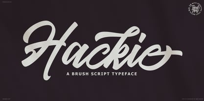 Introducing new latest from TebTipsudio, Hackie Script is a typeface with personality. You can use it as a logo, badge, insignia, packaging, headline, poster, etc The alternative characters in this font were divided into several OpenType features such as Stylistic Alternates, Stylistic Sets, and Ligature. The OpenType features can be accessed by using OpenType program such as Adobe Illustrator, Adobe Photoshop, and Adobe InDesign. Thank you!
 - Kelsey Script by Tebaltipis Studio,
$15.00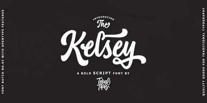 Introducing new latest from TebTipsudio, Kelsey is a script typeface with personality. You can use it as a logo, badge, insignia, packaging, headline, poster, etc The alternative characters in this font were divided into several OpenType features such as Stylistic Alternates, Stylistic Sets, and Ligature. The OpenType features can be accessed by using OpenType program such as Adobe Illustrator, Adobe Photoshop, and Adobe InDesign.
 - Artukge Script by Tebaltipis Studio,
$15.00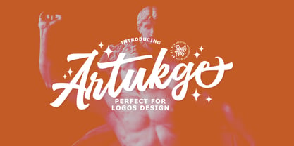 Introducing new latest from TebTipsudio, Artukge Script is a typeface with personality. You can use it as a logo, badge, insignia, packaging, headline, poster, etc The alternative characters in this font were divided into several OpenType features such as Stylistic Alternates, Stylistic Sets, and Ligature. The OpenType features can be accessed by using OpenType program such as Adobe Illustrator, Adobe Photoshop, and Adobe InDesign. Thank you!
 - Kiwiberri by Melonaqua,
$10.00 Introducing Kiwiberri, a fun and playful handwritten font that you can use for your home or work projects. You can put it on shirt designs, mug designs, printable chalkboards, printable planners, websites, note-taking apps, wall art, greeting cards, and many more. The sky is the limit. This is multilingual so it is compatible with other languages. Kiwiberri is created to showcase handwritten fonts using brushes.
 - Vriegbe Script by Tebaltipis Studio,
$15.00 Introducing new latest from TebTipsudio, Vriegbe Script is a typeface with personality. You can use it as a logo, badge, insignia, packaging, headline, poster, etc The alternative characters in this font were divided into several OpenType features such as Stylistic Alternates, Stylistic Sets, and Ligature. The OpenType features can be accessed by using OpenType program such as Adobe Illustrator, Adobe Photoshop, and Adobe InDesign. Thank you!
 - Versica by Letrasupply Typefoundry,
$25.00 Versica is a handcrafted display font. This font family consists of multiple style fonts that can be used either as authentic individual fonts or can be combined to get cool layered type. The package is completed with swashes, shadow and serif font. Don't forget to play with stylistic alternates character that featuring the font. You may get a perfect font for any advertise or editorial work issues.
 - Technical Stencil VP by VP Type,
$24.00 Technical Stencil VP is the stenciled version of Technical Standard VP and the two typefaces can be used either on their own or together seamlessly. The initial inspiration for their design came from examining the various types of precisely machined labels on tools from cameras to cars, which need to be perfectly legible at all sizes. The unique streamlined look such processes achieve was carefully reinterpreted and the resulting fonts are at the same time robust and stylish, both universal and unique. Technical Stencil VP includes ten distinct styles, offering great versatility. All styles in this family include an extensive Latin character set, the Greek alphabet, multiple sets of numerals, a large set of punctuation marks, and other symbols. With 1120 glyphs in each style, it guarantees full support for all Latin languages. To make the family even more powerful, twenty OpenType features are included, such as multiple vertical positions, diagonal fractional forms, optional slashed zeros, separate old-style and lining figures, small capitals, and contextual alternates.
 - Vaccine by ParaType,
$30.00 Vaccine is a slab serif font family with a mixture of the usual and one-sided serifs. We call it ‘semi semi slab serif’. Serifs and terminals have soft rounded shapes, but stem junctions on the contrary use hard constructions. Such combination of basic design features makes the font distinct and strong in a setting and delicate and soft in appearance. This design peculiarity, together with low contrast and strong serifs, produces the qualities needed for using the font in small sizes, in low quality print, and in bad reading conditions. Vaccine got modern stylish design and has a prominent place in the set of popular faces. The family consists of 10 members - five weights with the corresponding italics. It can be used in a wide range of applications - magazines, advertising, corporate identity, urban navigation, packaging, children books, etc. Design by Manvel Shmavonyan with the help of Gayane Bagdasaryan as a consultant. Released by ParaType in 2013.
 - Syaipul by Mightyfire,
$15.00 Syaipul is font that looks like Arabic letter. The ornament of each letter make the font is unique but still easily to read. This font perfectly suit for calligraphy, Islamic book, headline title, poster, Arabic ornament and many more. We're honored and hope this font can be the part of your special works. Thank you.
 - Sil Vous Plait NF by Nick's Fonts,
$10.00Morris Fuller Benton's 1917 typeface named Invitation provided the pattern for this elegant and endearing face. Classic Engravers Roman style caps are exquisitely balanced with a sinewy lowercase, adding warmth and charm. All versions of this font include the Unicode 1250 Central European character set in addition to the standard Unicode 1252 Latin set. - Durham Abbey NF by Nick's Fonts,
$10.00 This graceful charmer is based on a Victorian-era typeface called "Romanesque". It takes its name from a cathedral in England considered by many to be the finest example of Romanesque architecture in the British Isles. The Opentype version of this font supports Unicode 1250 (Central European) languages, as well as Unicode 1252 (Latin) languages.
 - Bintan by Rezastudio,
$9.00 Bintan is a dazzling script font. This font is neatly crafted and highly detailed. Whatever the topic, this font will be a wonderful asset to your font library, as it has the potential to enhance any creation. Bintan is PUA encoded which means you can access all of the glyphs and swashes with ease!
 - Trochilida NF by Nick's Fonts,
$10.00This Albert Auspurg offering from 1915 for the German foundry Schelter & Giesecke was originally called Kolibri, or Hummingbird. The design combines formal elegance with a carefree, wide stance, making it a perfect choice for inviting headlines. Both versions of this font include the complete Unicode Latin 1252, Central European 1250 and Turkish 1254 character sets. - Bookman Old Style by Monotype,
$40.99 The origins of Bookman Old Style lie in the typeface called Oldstyle Antique, designed by A C Phemister circa 1858 for the Miller and Richard foundry in Edinburgh, Scotland. Many American foundries made versions of this type which eventually became known as Bookman. Monotype Bookman Old Style roman is based on earlier Lanston Monotype and ATF models. The italic has been re drawn following the style of the Oldstyle Antique italics of Miller and Richard. Although called Old Style, the near vertical stress of the face puts it into the transitional category. The Bookman Old Style font family is a legible and robust text face.
 - Bookman Old Style Paneuropean by Monotype,
$92.99The origins of Bookman Old Style lie in the typeface called Oldstyle Antique, designed by A C Phemister circa 1858 for the Miller and Richard foundry in Edinburgh, Scotland. Many American foundries made versions of this type which eventually became known as Bookman. Monotype Bookman Old Style roman is based on earlier Lanston Monotype and ATF models. The italic has been re drawn following the style of the Oldstyle Antique italics of Miller and Richard. Although called Old Style, the near vertical stress of the face puts it into the transitional category. The Bookman Old Style font family is a legible and robust text face. - ITC Coconino by ITC,
$29.99ITC Coconino is the work of Serbian designer Slobodan Miladinov. His original inspiration for this monostroked typeface was the idea of translating certain auditory impressions into type, in this case, the surprising and confusing music of the Serbian hip hop musician Voodoo Popeye." Miladinov is an art director in Belgrade and created Coconino using a "freemouse" technique with Adobe Illustrator and sees his work as "computer calligraphy which allows for a specific directness and immediacy in notation." The strokes of this font are simple and abrupt with a studied irregularity. The forms can look either cheerful and lighthearted or chaotic and subtly disturbing. Coconino was named for the home of hte Krazy KAt comics and even includes a few additional characters from the strip." - Margon by ParaType,
$30.00 Margon is a serif font family with a temperate design -- small serifs, moderate contrast, tiny roundings on the corners make it calm and serene. The Margon font family consists of 18 members divided into 4 groups of different proportions marked by indexes 360, 380, 400, 430. These values correspond to densities of sets -- 360 is the widest style, 430 is the most narrow one. The peculiarity of Margon family is a rather small difference in proportions of characters between neighbor groups, it’s less than 10%. Such tiny step gives possibility to select the font that gives the best result in combination of capacity and readability. Margon can be used in book, magazine and newspaper design.
 - Affair by Sudtipos,
$99.00 Type designers are crazy people. Not crazy in the sense that they think we are Napoleon, but in the sense that the sky can be falling, wars tearing the world apart, disasters splitting the very ground we walk on, plagues circling continents to pick victims randomly, yet we will still perform our ever optimistic task of making some little spot of the world more appealing to the human eye. We ought to be proud of ourselves, I believe. Optimism is hard to come by these days. Regardless of our own personal reasons for doing what we do, the very thing we do is in itself an act of optimism and belief in the inherent beauty that exists within humanity. As recently as ten years ago, I wouldn't have been able to choose the amazing obscure profession I now have, wouldn't have been able to be humbled by the history that falls into my hands and slides in front of my eyes every day, wouldn't have been able to live and work across previously impenetrable cultural lines as I do now, and wouldn't have been able to raise my glass of Malbeck wine to toast every type designer who was before me, is with me, and will be after me. As recently as ten years ago, I wouldn't have been able to mean these words as I wrote them: It’s a small world. Yes, it is a small world, and a wonderfully complex one too. With so much information drowning our senses by the minute, it has become difficult to find clear meaning in almost anything. Something throughout the day is bound to make us feel even smaller in this small world. Most of us find comfort in a routine. Some of us find extended families. But in the end we are all Eleanor Rigbys, lonely on the inside and waiting for a miracle to come. If a miracle can make the world small, another one can perhaps give us meaning. And sometimes a miracle happens for a split second, then gets buried until a crazy type designer finds it. I was on my honeymoon in New York City when I first stumbled upon the letters that eventually started this Affair. A simple, content tourist walking down the streets formerly unknown to me except through pop music and film references. Browsing the shops of the city that made Bob Dylan, Lou Reed, and a thousand other artists. Trying to chase away the tourist mentality, wondering what it would be like to actually live in the city of a billion tiny lights. Tourists don't go to libraries in foreign cities. So I walked into one. Two hours later I wasn't in New York anymore. I wasn't anywhere substantial. I was the crazy type designer at the apex of insanity. La La Land, alphabet heaven, curves and twirls and loops and swashes, ribbons and bows and naked letters. I'm probably not the very first person on this planet to be seduced into starting an Affair while on his honeymoon, but it is something to tease my better half about once in a while. To this day I can't decide if I actually found the worn book, or if the book itself called for me. Its spine was nothing special, sitting on a shelf, tightly flanked by similar spines on either side. Yet it was the only one I picked off that shelf. And I looked at only one page in it before walking to the photocopier and cheating it with an Argentine coin, since I didn't have the American quarter it wanted. That was the beginning. I am now writing this after the Affair is over. And it was an Affair to remember, to pull a phrase. Right now, long after I have drawn and digitized and tested this alphabet, and long after I saw what some of this generation’s type designers saw in it, I have the luxury to speculate on what Affair really is, what made me begin and finish it, what cultural expressions it has, and so on. But in all honesty it wasn't like that. Much like in my Ministry Script experience, I was a driven man, a lover walking the ledge, an infatuated student following the instructions of his teacher while seeing her as a perfect angel. I am not exaggerating when I say that the letters themselves told me how to extend them. I was exploited by an alphabet, and it felt great. Unlike my experience with Ministry Script, where the objective was to push the technology to its limits, this Affair felt like the most natural and casual sequence of processions in the world – my hand following the grid, the grid following what my hand had already done – a circle of creation contained in one square computer cell, then doing it all over again. By contrast, it was the lousiest feeling in the world when I finally reached the conclusion that the Affair was done. What would I do now? Would any commitment I make from now on constitute a betrayal of these past precious months? I'm largely over all that now, of course. I like to think I'm a better man now because of the experience. Affair is an enormous, intricately calligraphic OpenType font based on a 9x9 photocopy of a page from a 1950s lettering book. In any calligraphic font, the global parameters for developing the characters are usually quite volatile and hard to pin down, but in this case it was particularly difficult because the photocopy was too gray and the letters were of different sizes, very intertwined and scan-impossible. So finishing the first few characters in order to establish the global rhythm was quite a long process, after which the work became a unique soothing, numbing routine by which I will always remember this Affair. The result of all the work, at least to the eyes of this crazy designer, is 1950s American lettering with a very Argentine wrapper. My Affair is infused with the spirit of filete, dulce de leche, yerba mate, and Carlos Gardel. Upon finishing the font I was fortunate enough that a few of my colleagues, great type designers and probably much saner than I am, agreed to show me how they envision my Affair in action. The beauty they showed me makes me feel small and yearn for the world to be even smaller now – at least small enough so that my international colleagues and I can meet and exchange stories over a good parrilla. These people, whose kindness is very deserving of my gratitude, and whose beautiful art is very deserving of your appreciation, are in no particular order: Corey Holms, Mariano Lopez Hiriart, Xavier Dupré, Alejandro Ros, Rebecca Alaccari, Laura Meseguer, Neil Summerour, Eduardo Manso, and the Doma group. You can see how they envisioned using Affair in the section of this booklet entitled A Foreign Affair. The rest of this booklet contains all the obligatory technical details that should come with a font this massive. I hope this Affair can bring you as much peace and satisfaction as it brought me, and I hope it can help your imagination soar like mine did when I was doing my duty for beauty.
 - Vatican by Alan Meeks,
$45.00 Vatican is a calligraphic face. The lower case is influenced by the lettering of Arthur Baker but the caps are more formal, the shape of the Cap V reminded me of a Bishops Mitre which led eventually to the name. The lighter weight works particually well in small text pieces
 - Overnight Oats by Hanoded,
$11.00 I recently walked part of the South West Coast Path in the UK. A couple of days in the hike, I came across a small cafe and I decided to have an oat latte (I am lactose intolerant). Since it was early in the morning, the breakfast menu was out and one of the items I noticed was ‘Overnight Oats’. I normally cook my oats with some lactose free milk and water, but apparently you can soak them overnight, add fruit and nuts and eat it like that. I tried it, it’s ok, but I think I prefer the cooked version. Overnight Oats is a bit of an odd font: it is very higgledy piggledy, yet legible and unique. If you want something out of the ordinary, then this may be your font!
 - Winkle Picker JNL by Jeff Levine,
$29.00 A 1963 movie poster for an Italian documentary called “Sexy Nudo” had its title lettering in a free form spur serif design reminiscent of cut paper. This inspired Winkle Picker JNL, which is available in both regular and oblique versions. Despite the subject matter of the film documentary, the lettering on the poster is fun and playful, which meant the digital font deserved a fun name as well. It was named for a shoes and boots with sharp and long pointed toes which first gained popularity in the 1950s.
 - Kinstag by Alphabet Agency,
$15.00 Kinstag is a all caps serif display font. The typography was originally developed during work on a country rock music project. The initial characters were then evolved into a workable font for use in rural, rustic, vintage, outdoor and adult beverage related themes. The thick serif with an angled edge is a key characteristic of the font; pairing fantastically well with the thick stems and spurs protruding from them. These elements all work together to give the font a strong bold expression as well as a unique look.
 - Planet Express by Estudio Calderon,
$29.99 Family type designed by Felipe Calderón. This type is a display with a modern style and a different and innovative concept. The development of this type was a challenge because it was set out from the begining as a script font with ornaments and complements, where the round shapes do not have prominence in the result. Planet Express is an interesting job from the aesthetic point of view, it works for big scale texts and contains little shadow-cuts in each character to give it more personality and stand out among other fonts from this gender. I hope this new project works to solve issues in design. Planet Express is composed of Regular & Italics, it has 250 intelligent ligatures to produce the best signs in big scale, it is perfect for branding and works very well with the geometric complements. It is designed with programming in opentype: Ligatures, Discretionary ligatures, Stylistic Alternates, Stylistic set 01, Stylistic set 02, Stylistic set 03, Stylistic set 04, Stylistic set 05, Stylistic set 06, Stylistic set 07, Stylistic set 08 & Stylistic set 09, multiple language support and a complete set of extras like arrows, catchwords, flags, emblems, hands, fleurons & crossed elements. Planet Express can be used in different ways, each character pretends to cover the needs in any circumstance where it is used. It is funny to write words and play with the complements. It also works with current concepts in graphic design like sports, cars, hip hop, music, social network, skateboarding and more. Everybody can use this font, it works with different languages like italian, french, portuguese, danish, german and so forth. See specimen and samples here. Enjoy it!
 - Librum by Hackberry Font Foundry,
$24.95 This is the serif text family for the book design group of font families which David designed in the process of writing "Practical Font Design With FontLab 5". The letterspacing is set wide for body copy use. The main purpose is readability and reading comfort. There are several whimsical graphics, plenty of OpenType features: oldstyle figures [tabular and not], small cap figures, lining figures [tabular and not], discretionary ligatures, small caps, and so on. The feature set is limited for the italic and bold versions. It produces an exceptional book. See Librum Book Design Group for a package containing all fifteen fonts,
 - Tattooflash Fingers by Otto Maurer,
$15.00 Tattooflash Fingers is a special Font for Finger-Tattooing. The Glyphs come in 3 Sizes for short fingers, normal fingers and long fingers. The Font is made for the little Space on a Human Finger. You can make your own Tattooflash! To Color your Tattooflash take the PART version!. After Install the Fonts you can use the part-version in Photoshop or better in Affinity Photo or Affinity Designer to color your Flash. Use the Swashes to make your tattoo flash better, make your own TattooDesign! You are a Tattooartist? This Fonts are made for YOU!
 - Point Panther by Sarid Ezra,
$13.00 Introducing, A NEW POWERFUL BOLD FONTS WITH ALTERNATES, Point Panther! Point Panther is a headline font with super bold style that contains up to 6 Alternates each characters! You can make a unique branding with this fonts. this powerful bold fonts also included italic and outline style! This fonts suitable to use for poster, branding, merchandise, and any street art style! Also support multilingual. What will you get: Point Panther Regular (Regular, Italic ) Point Panther Bold (Bold, Bold Italic) Point Panther Outline Regular (Regular, Italic ) Point Panther Outline Bold (Bold, Bold Italic) How to access the alternates! If you use PS/AI you can see the tutorial in this : https://helpx.adobe.com/illustrator/using/special-characters.html You can use the PUA for software design that not support Opentype. For another questions, please send a mail to saridezra@gmail.com. Thank You!
 - RB Monsters by RockBee,
$15.00 This typeface was drawn to create short headlines (quickly) for one of my projects (a set of illustrations featuring The Evil Rat, imagined character). Each character (here I mean "glyph") has it's own personality, mostly evil one (jokingly) — that is why the font is called "The Monsters". The font was drawn on paper, then scanned and traced. It has both Latin and Cyrillic sets, since it was used with both. Monsters are good for short notes of comic or ironic style.
 - WILD2 Ghixm by Fontry West,
$15.00 Accidents happen. Things go where they don't belong, get changed - remade. Something new crawls out of the murky depths. Ghixm is a retrospective of the horror comics and movie posters of the 1960s and the 1970s. It's fluid forms harken to watery graves and tentacled unnameable horrors. These twisted shapes are reminiscent of titles that will make your skin crawl. It’s already warped and twisted, so don't hesitate to abuse it. This face can take it and still deliver its chaotic message.
 - Papercute Inline by S&C Type,
$9.00 Papercute Inline is a cute layered hand-drawn font designed by Fanny Coulez & Julien Saurin in Paris. Inspired by paper cutting, this font is easy to read, and easy to play with 8 different styles, including 3D, outline, full or dotted line, that you can use alone or together. To do so, you can simply superimpose them with a compatible software like Photoshop, then choose a color for each, making your works charming and unique. This font, finely designed for cards, book titles, headlines or any artworks is the Inline version of Papercute . Just click on our foundry name to see it! You could follow us on our Instagram: instagram.com/sc.type We hope you will enjoy our work. Merci beaucoup!
 - Sikat Rusak by Azetype,
$59.00 Presenting Sikat Rusak! A Dry Brush Font with a stylish alternate and extra 9 swashes. This font made with the perfect combining of each character. You can type by Mix & Match with alternate version to get a unique combining. It looks original and can be used for all your project needs. Each glyph has its own uniqueness and when meeting with others will provide dynamic and pleasing proximity. This font can be used at any time and any project.