10,000 search results
(0.045 seconds)
- Zaptron by Patria Ari,
$15.00 Zaptron is a modern sci-fi fonts with different shapes on uppercase and lowercase. With this difference, you can explore different combinations, also with more than 100 discretionary ligatures you can access by hit capslock/uppercase. This logo perfect for logotype especially on technology, construction, automotive, and more.
 - Lagarto by Sudtipos,
$39.00 Some years ago, a good friend and typophile, Gonzalo García Barcha, approached me with the idea of designing a typeface for his editorial project Blacamán Ediciones. He had just came across an hitherto unknown manuscript by Luis Lagarto, a colonial illuminator and scribe, working in Mexico City and Puebla in the late 1500s. The manuscript calligraphy was incredible and stunningly original. It featured three different hands by the scribe, intermingled in the text: a kind of baroque «Roman» roundhand; a very ornate, lively «Italic»; and some sort of irregular, playful, even funny «small caps». All imbued with an eccentric, convoluted zest and vivacious rhythm. Lagarto is the final result of translating these extraordinary hands into a digital type family. Since the manuscript had no numerals, math signs and many other characters now in use, part of the fun of the job was to infer them from the stylistic peculiarities of Luis Lagarto's calligraphy. Lagarto received an Award of Excellence at the Type Directors Club of New York annual competition.
 - Championship Inline by Device,
$39.00 A punchy heavy sans suitable for headlines that require impact with character. The inline imparts a celebratory tone reminiscent of sport jerseys, car marques or ice-cream parlors.
 - H74 Lucky's Flash by Hydro74,
$20.00 Lucky's Tattoo Flash is a unique tattoo styled font with sharp edges and a mean streak that can only be defined by the amount of whiskey it consumes.
 - Noki by ActiveSphere,
$30.00 The new release is called Noki. A font family Ideal for flyers, label, logos, magazine, product branding, corporate branding, signage, posters and certainly in advertising. Check it out !
 - Skulduggery by Hanoded,
$15.00 I was playing around with some brushes and ink, and out came Skulduggery. Use it for any project you can apply the term ‘skulduggery’ to. Or not. Whatever.
 - Daiquiri by Wiescher Design,
$39.50 Daiquiri is a revival of a handlettered font in two weights, from an ad for Puerto Rico Rum dating back to the forties or fifties. I found the ad on a French antique market on my last visit for Mardi Gras in Nice. The ad read "Breeze through the heat, be a Daiquiri fan". That's why they had this "fan" in the illustration! Did they want you to rotate like a fan when you had enough Daiquiris? Or did they just do it for that little "Jeu des mots"? Anyway I found the handlettering very pretty, so I took those few letters and made a whole font out of them. I think Daiquiri has that touch that brings those happy and uncomplicated times back when advertising was still fun. I started something like 20 years later in advertising and things had gotten more stringent. We already had to satisfy those marketing guys with their scholarly attitude. They have taken all the fun out of the job, for the creators as well as for the consumers. I would like to see more uncomplicated ads like this again, yours Gert Wiescher
 - Kingthings Spike Pro by CheapProFonts,
$10.00 You gotta love this extreme take on the "gothic" blackletter traditions! Roger Nelsson edited a few letters, drastically improved the spacing - and then gave it the usual large CheapProFonts character set. Fun! Kevin King says: "Kingthings Spike was made because Buffy has one, I made Willow... Xander is yet to come. Oh and because I hate Engravers Old English! Pugin, eat my shorts! Sorry!" Kingthings Spikeless is a toned down version of Kingthings Spike. Kevin King says: "Kingthings Spikeless was requested by those who actually want to read text... well I call that tedious, but if you must, here it is no flourishes, just my small homage to black-letter." ALL fonts from CheapProFonts have very extensive language support: They contain some unusual diacritic letters (some of which are contained in the Latin Extended-B Unicode block) supporting: Cornish, Filipino (Tagalog), Guarani, Luxembourgian, Malagasy, Romanian, Ulithian and Welsh. They also contain all glyphs in the Latin Extended-A Unicode block (which among others cover the Central European and Baltic areas) supporting: Afrikaans, Belarusian (Lacinka), Bosnian, Catalan, Chichewa, Croatian, Czech, Dutch, Esperanto, Greenlandic, Hungarian, Kashubian, Kurdish (Kurmanji), Latvian, Lithuanian, Maltese, Maori, Polish, Saami (Inari), Saami (North), Serbian (latin), Slovak(ian), Slovene, Sorbian (Lower), Sorbian (Upper), Turkish and Turkmen. And they of course contain all the usual "western" glyphs supporting: Albanian, Basque, Breton, Chamorro, Danish, Estonian, Faroese, Finnish, French, Frisian, Galican, German, Icelandic, Indonesian, Irish (Gaelic), Italian, Northern Sotho, Norwegian, Occitan, Portuguese, Rhaeto-Romance, Sami (Lule), Sami (South), Scots (Gaelic), Spanish, Swedish, Tswana, Walloon and Yapese.
 - Deckissa by Mokatype Studio,
$24.00 Deckissa is a reverse contrast serif font that is suitable for headlines and logos. Deckissa is built with a light stem, simple design, and nice curve that makes this font look elegant and luxurious. This font includes some ligature that you can combine to create a Headline, poster, or logo. Works on PC & Mac, simple installations, accessible in Adobe Illustrator, Adobe Photoshop, Adobe InDesign, and even works on Microsoft Word. PUA Encoded Characters - Fully accessible without additional design software. Fonts include multilingual support Image used: All photographs/pictures/vectors used in the preview are not included, they are intended for illustration only. Thank You
 - Daisy Lovers by Sarid Ezra,
$15.00 Introducing, Daisy Lovers, a tall handwritten sans! Daisy Lovers is a sans font with handwritten touch. This font will make your project or your design more human. You can use this font for your brands, quotes, book covers, etc. With unique lowercase, Daisy Lovers can make your project more stand out! This font also support multi language. Happy Creating!
 - Migel by Eotype,
$14.00 Migel is a thick display typeface that has rounded edge and soft characteristics. This font can give your designs a playful and friendly impression. You can use this font for retro, vintage and urban designs. This font comes with alternative style and ligature features which are suitable for various projects such as logos, product labels, posters and many more.
 - Malden Sans by Monotype,
$49.00 Malden Sans is a mischievous grotesque sans serif with charming details that gives designers a solid typographic voice. It was created by Michele Patanè with regular and condensed widths, as a utilitarian typeface family for print and digital environments. It was originally designed as part of a type system for cinema magazines, and embodies the devil-may care attitude of the silver screen. Designer Michele Patanè looked back to an earlier era of typography to create the typeface, embracing unusual details, rather than ironing them out. “There is a very naive way of using typography in the 30s and 40s, something not as clean as how it’s used in the late 50s and 60s when everything passed through a rationalisation of the typographic palette,” he explains. “In film magazines you can still see a bit of roughness, and I like that.” This is a design that’s desperate to be used in editorial environments, and has been created to stand up to lower quality paper. It would be equally at home on posters, packaging, and even in digital environments where designers are looking for something more expressive than another geometric sans serif. Malden Sans includes a Normal and Condensed range, with 7 weights in the normal and 6 in the Condensed, both including italics.
 - Kage by Balibilly Design,
$12.00 Welcome to the old version of Kage. "Old does not mean obsolete" In April 2022, we updated whole letterforms. We redrew all glyphs and refined the nodes, corners, rounded shapes, flowing tails, etc. Of course, you can still use the update of an older version of Kage, although we highly recommend you move to the Pro version for the full benefits. Kage Pro has massive development, puts forward experimentation on alternate letters, and applies an oblique style to provide diverse style choices. Come with tons of swirly ligatures and advanced opentype features include case-sensitive forms, small caps, standard and discretionary ligatures, stylistic alternates, ordinals, fractions, numerator, denominator, superscript, subscript, circled number, slashed zero, old-style figure, tabular and lining figure. Learn more about Kage Pro here: Kage Pro 2.0 | Type Specimen About Kage The Inspiration: The radical exploration world of fashion inspires us. It leads our minds to the Neo-classical type style created during the age of enlightenment in the 18th century. It has a reasonably extreme contrast from the previous serif style, making the impression that it is emitted more expensive and classy. Organically, this Neo-Classical typeface is closely related to the fashion world, especially in Europe, and even spread across the globe. Fashion and this typeface reflect each other. After, we boldly observed Japanese fashion designer Rei Kawakubo. Famous for radical & deconstructive fashion, which makes the world of fashion more flexible and dynamic. The Design: As well as the typeface that we made, we started it with a cultural foundation of the Didone typeface. We tried to deconstruct the appearance. The decoration that better reflected the dynamic of fashion implemented in the fashionable alternate and calligraphical stylistic set ended with ball terminals. The versatile impression created is like taking off a scarf on the model's hair during a fashion show. The deconstructive image is combined with a legibility structure like the appearance of the Neo-Classical style. Kage is designed to visualize a costly and exclusive image of a thing, product, world clothing brand, famous fashion magazine, etc. The modern transitions of each letterform are softer, so when repositioning and escalating the size of this font, it will remain beautiful without injuring other elements. So, Kage is a bold choice on headlines and more prominent media with a portion of 50% even more. The Feature: Kage has 11 styles, from thin to black; all family-style consist of one variable font with two axes. The total number of glyphs is 748 in each style. She comes with tons of swirly ligatures and stylistic alternates in Advance OpenType features, including: discretionary ligatures, stylistic alternates, ordinals, fractions. Support multi-language including Western European, Central European, Southeastern European, South American, Oceanian, Vietnamese.
 - Italiano Fushion New by RM&WD,
$35.00 Italiano Fushion is part of an expanding project on which we have been working for several years and which we are committed to in the future. Like the first two, this one too starts from the study of the great Futurist adventure of the early 1900s by great artists such as DEPERO and MARINETTI, who twisted the world of typography with shapes and colors. Italian Fushion is made up of almost 2,000 glyphs for each weight and in addition to hundreds of alternatives mainly, such as initials and endings of each word but also different alternatives for the letters I, J, Y. Thanks to the characteristics of Open Type, you can change them in automatic many of the alternatives, use it as a simple text font by changing only the I's and J's that have the typical capital dot, and giving the text a more fun breath to the composition. Italiano Fushion is suitable for large texts and to get the most out of it it is compulsory to transform the text into UPPERCASE text using the tabs of graphic applications such as Illustrator, or activate the Alternavive tabs and the various options of SS. Ideal for creating Logos, Head Lines, Web Titles, Posters, Epub Covers, Tatoo Projects, T-Shirts, Drink Labels ... Thanks
 - Stars Stripes RH by Enrich Design,
$-The recent tragedies in America have resulted in a tremendous need for donations. This new font was created to benefit the victims in New York. This font is a great opportunity for artists, designers and computer users to show their support. The font needs to be big, 36 points or higher is recommended. It can be used at smaller point sizes, but there is little detail at smaller sizes. I felt a need to do something, ever since I saw those two beautiful buildings collapse in New York. You see, I went to school in New York, and I learned so much there. I truly love New York, and this is a way for me to show my support to the Big Apple. A $20.00 donation to the Twin Towers Fund is requested for those who download this font. Please send the donation to: Twin Towers Fund General Post Office P.O. Box 26999 New York, NY 10087-6999 Special thanks to those who reviewed my font and offered advice on what needed to be done to complete the font. - Sachiko - Personal use only

- Amelia by Linotype,
$29.99American designer Stanley Davis created the font Amelia™ in 1965. What sets Linotype Amelia apart from all the rest are its unusual inner spaces. Their teardrop forms lead the readers eye through the line of text. These teardrop shapes can also be seen in the contours of the characters themselves, making the letters look rounded and flexible. Amelia speaks the language of the digital age. The flowing strokes and round forms give it an uncomplicated and lively look. - Coventry Garden NF Pro by CheapProFonts,
$10.00 I have improved and added diacritics to this elegant alphabet, and generally cleaned it up to a professional standard. It is well suited to logos, menus, invitations and other things wanting a touch of elegance. Nick Curtis says: "I came across this particular treatment for swash caps in an old book on letterhead design. The original had been handlettered, but I though it might be convenient to have a ready-made font to accomplish the same effect, and here it is. As an extra added feature, the “§” sign is an ampersand with a long tail." ALL fonts from CheapProFonts have very extensive language support: They contain some unusual diacritic letters (some of which are contained in the Latin Extended-B Unicode block) supporting: Cornish, Filipino (Tagalog), Guarani, Luxembourgian, Malagasy, Romanian, Ulithian and Welsh. They also contain all glyphs in the Latin Extended-A Unicode block (which among others cover the Central European and Baltic areas) supporting: Afrikaans, Belarusian (Lacinka), Bosnian, Catalan, Chichewa, Croatian, Czech, Dutch, Esperanto, Greenlandic, Hungarian, Kashubian, Kurdish (Kurmanji), Latvian, Lithuanian, Maltese, Maori, Polish, Saami (Inari), Saami (North), Serbian (latin), Slovak(ian), Slovene, Sorbian (Lower), Sorbian (Upper), Turkish and Turkmen. And they of course contain all the usual “western” glyphs supporting: Albanian, Basque, Breton, Chamorro, Danish, Estonian, Faroese, Finnish, French, Frisian, Galican, German, Icelandic, Indonesian, Irish (Gaelic), Italian, Northern Sotho, Norwegian, Occitan, Portuguese, Rhaeto-Romance, Sami (Lule), Sami (South), Scots (Gaelic), Spanish, Swedish, Tswana, Walloon and Yapese.
 - Knopa by Larin Type Co,
$10.00 KNOPA This is a fun and playful font family, which will perfectly fit into children's projects or funny modern designs and logos, with it you can make playful designs by changing styles and combining them with each other. This font has three weights ( light, regular, and bold ) and an outline style for each weight.
 - Fresh Hansler by Struggle Studio,
$11.00 Fresh Hansler contains a script style, a capitals style as well as a set of extras. They are made with brushes and so they look modern, organic, dynamic, and energetic. This family can be used for various purposes such as titles, signatures, logos, correspondence, wedding invitations, letterhead, signage, labels, bulletins, posters, badges, and more.
 - Madela by Letterena Studios,
$10.00 Madela is a bold and thick lettered serif font. It is PUA encoded which means you can access all of the glyphs and swashes with ease! Add it confidently to your favorite creations and let yourself be amazed by the outcome generated.
 - Paleos by Scriptorium,
$12.00For Halloween season, we thought we'd better trundle out a nice, crude prehistoric font to meet the growing need. Paleos features many different versions of almost every character so you can give it the natural variety of lettering hand-carved by a troglodyte. - Natural Blues by PizzaDude.dk,
$17.00 Natural Blues is my laid back handwriting font, and it is also the name of a song by Moby. Maybe I was inspired by that song … I can’t tell. But what I can tell is that having the blues is a natural thing!
 - Brossard by Greater Albion Typefounders,
$13.95 Brossard is a slab serif face redolent of French atmosphere and the design ethos of the 1920s. Use it for headines and posters that need that distinctive élan or where a Continental feel is called for. Regular and outline faces are offered.
 - Balencia by Mchcrafter,
$18.00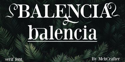 Balencia is an assertive and authentic serif font. It is PUA encoded which means you can access all of the amazing glyphs and ligatures with ease! Add it confidently to your favorite creations and let yourself be amazed by the outcome generated.
 - Lino Cut by ITC,
$29.99Lino Cut is the work of British designer Bob Anderton, who was inspired by the strong effect of linocut images. Capitals and lowercase letters should be set closely. Lino Cut can bring its unique, eye-catching style to a variety of display applications. - Eklekt by Yinon Ezra,
$9.00 The Magical look of Eklekt is not made by chance, it is created with the combination of graphic-sharp shapes and a flow curves that looks a bit like it is written by hand. Can be used for logos, headlines and short text.
 - Kunze by Kitchen Table Type Foundry,
$15.00 Kunze font was inspired by the work of German graphic artist Carl Kunze (Minden, 1884). Kunze is a fat display font; a little rough around the edges, a little wonky in places, but very distinguishable and useful. Comes with extensive language support.
 - Gaby Pro by RMU,
$35.00 Inspired by the 1947 Weber font Gabriele, Gaby Pro is a freshly designed versatile and everyday cursive font that can be used for a wide range of printed products and for web design as well. The font was carefully extended for multilingual use.
 - Absentia Display by DR Fonts,
$19.00 This modern display typeface expands the Absentia collection with an impactful option for headlines, titles and logos. Graced with the geometric DNA of its distinctive lineage, the new addition emerges as a refreshing alternative for large size typesetting. Absentia Display borrows design attributes from the Sans and Slab families, in the form of slanted finials (‘a’, ‘e’, ‘C’) and one-sided serifs (‘b’, ‘F’, ‘H’). But in contrast to its relatives' measured restraint, it distinguishes itself with uninhibited boldness. Featuring stencil face breaks, basic glyph components are either abridged or completely omitted, as the shoulder of lowercase ‘m’ or the diagonal stroke of capital ‘W’. Modular letterforms set this typeface apart with a stylish appearance; round diacritic dots (‘i’, ‘Ü’) and curved transitions (‘E’, ‘L’) breathe a lighthearted attitude. Designers can scale up and go loud with Absentia Display, available in ten weights with matching italics and two variable fonts. From the refined Hairline to the robust Black, this versatile family serves a wide range of needs and styles.
 - Acto by DSType,
$40.00 Acto is a type system designed as the sans serif counterpart of the previous released Acta. Both type families were designed in 2010 for the redesign of the Chilean newspaper La Tercera, but unlike some of our previous fonts (i.e., Leitura) Acto doesn't exactly match Acta in terms of structure, so they can live on their own. Acto is our first sans where the uppercase has the same height as the ascenders, so we decided to avoid common problems like the confusion between the I and the l, by drawing a curved l. We kept that spirit by removing the spurs on the b, g and q, resulting on a more warm typeface than Prelo, for instance. In the end it's a very powerful sans family, with eleven weights with matching italics, for editorial and corporate design.
 - Bremer Presse by Schraube,
$29.00 As most successful German private press, «Bremer Presse» has strongly influenced German book art. It was founded 1911 in Bremen to print and produce books in perfection. The role model of the press’ typeface was the english Doves Press. Willy Wiegand drew three versions of the «Bremer Presse» antiqua font, starting with the regular weight in 16 pt and adding later the regular weights in 11 and 12 pt. The revival of this beautiful font is based on the 12 pt weight. During the design process, the focus was laid on finding the elegance and strength of original prints. As it was designed to print books, the typeface is optimally used for texts. And with the revival’s new weights «medium» and «bold» and OpenType features like ligatures or old style figures, you can design sophisticatedly typographical compositions.
 - ITC New Veljovic by ITC,
$57.99 Thirty years after its first appearance, Jovica Veljović has produced ITC New Veljovic Pro, a completely revised edition of his first typeface, ITC Veljovic (1984). Prof. Veljović has tapped into all the experience he has garnered over the past decades; by carefully adjusting the proportions of the characters he has provided the new typeface with a more harmonious presence. The serifs have been subtly curtailed and the letters made slightly more condensed. Some new features of ITC New Veljovic are the double-story “g” with its completely closed loop and the more open forms of the “c” and “e”. In the italic variants, the latter is much rounder. Thanks to Veljović’s outstanding work, the optimized ITC New Veljovic can now be used in all contemporary applications. The new Condensed style saves considerable space when it comes to setting longer texts. The Display versions show off the striking, crystal-clear shapes of the design at their best in larger point sizes.
 - Mochon by Typodermic,
$11.95 Introducing Mochon, the perfect typeface for architects and designers looking for a touch of personality in their projects. Hand-lettered and inspired by the incredible work of Donald Mochon, the former dean of the RPI School of Architecture, this typeface brings a charming, erudite/hilarious feel to your designs. With Mochon, you can add a touch of wild energy to your work, infusing it with the same creative flair that Don Mochon was known for. This typeface is perfect for designers who want to capture the essence of architectural design in their work. Mochon features automatic shuffling of alphabetic variations, giving your designs a bouncy feel that is both unique and visually interesting. In addition, the letter “I” automatically sprouts serifs in initials and possessive use, adding a touch of elegance to your designs. For those who love to explore stylistic alternatives, Mochon also offers an alternate letter “S” that is accessible through apps that enable OpenType. This means that you can fully customize your designs, giving them a personalized touch that truly stands out. Incorporating Mochon into your design projects is a great way to pay homage to the great Don Mochon while infusing your work with his creative energy. So why not give Mochon a try and see how it can take your designs to the next level? Most Latin-based European writing systems are supported, including the following languages. Afaan Oromo, Afar, Afrikaans, Albanian, Alsatian, Aromanian, Aymara, Bashkir (Latin), Basque, Belarusian (Latin), Bemba, Bikol, Bosnian, Breton, Cape Verdean, Creole, Catalan, Cebuano, Chamorro, Chavacano, Chichewa, Crimean Tatar (Latin), Croatian, Czech, Danish, Dawan, Dholuo, Dutch, English, Estonian, Faroese, Fijian, Filipino, Finnish, French, Frisian, Friulian, Gagauz (Latin), Galician, Ganda, Genoese, German, Greenlandic, Guadeloupean Creole, Haitian Creole, Hawaiian, Hiligaynon, Hungarian, Icelandic, Ilocano, Indonesian, Irish, Italian, Jamaican, Kaqchikel, Karakalpak (Latin), Kashubian, Kikongo, Kinyarwanda, Kirundi, Kurdish (Latin), Latvian, Lithuanian, Lombard, Low Saxon, Luxembourgish, Maasai, Makhuwa, Malay, Maltese, Māori, Moldovan, Montenegrin, Ndebele, Neapolitan, Norwegian, Novial, Occitan, Ossetian (Latin), Papiamento, Piedmontese, Polish, Portuguese, Quechua, Rarotongan, Romanian, Romansh, Sami, Sango, Saramaccan, Sardinian, Scottish Gaelic, Serbian (Latin), Shona, Sicilian, Silesian, Slovak, Slovenian, Somali, Sorbian, Sotho, Spanish, Swahili, Swazi, Swedish, Tagalog, Tahitian, Tetum, Tongan, Tshiluba, Tsonga, Tswana, Tumbuka, Turkish, Turkmen (Latin), Tuvaluan, Uzbek (Latin), Venetian, Vepsian, Võro, Walloon, Waray-Waray, Wayuu, Welsh, Wolof, Xhosa, Yapese, Zapotec Zulu and Zuni.
 - Zeit by Fenotype,
$35.00 While fashions come and go, style is eternal. True to its name, Zeit is an ageless serif font family, distinct yet reassuringly familiar and trustworthy. From magazines to mobile apps, branding to advertising, Zeit covers everything with poise. The font family is equipped with many handy and carefully thought features. Small capitals and small capital figures, old style figures, subscript and superscript figures and fractions are intrinsic to the design. For a bit of flair, look for the swash alternates included in the italics – along with variants of the characters g and y. Look no further, Zeit is rigorously designed from head to toe – as only true quality can stand the test of time.
 - Fontanella by Latinotype,
$29.00 Fontanella is a typeface designed by Coto Mendoza, which emerged from calligraphy and manual drawing exploring the skeleton and classic proportions of Roman capital letters. This initial process later gave rise to a sans serif family composed of 8 pesos and its italic variants. It also includes small caps, old numbers and width variants in the set of alternates. The slightly enlarged x-height makes it perfect for composing short texts in editorial, fashion, branding, magazine, television, window display and other media projects. Fontanella a classic spirit reinterpreted in a contemporary language. We especially thank Alfonso García for his impeccable work on the digital edition and Nicolás Tobar for the art direction on the specimens.
 - Aretha by Lafontype,
$25.00 Aretha is a classy and beautifully designed sans serif. The main idea of Arteha is to combine the sans serif humanist font style with traditional styles so as to provide a pleasant atmosphere for the reader. The horizontal side of Aretha is designed with a slightly thinner so that the counter can look wider and also looks stiff in some parts to give a firm impression on the letters. Not only for display size, Aretha also works well in text size. Represents multilingual and is equipped with several Open Type features such as tabular figures and stylistic alternates in letters a, g, t and y, so this is very suitable to complement your various design needs.
 - Adorn Smooth by Laura Worthington,
$29.00 What can be more lovely than a wedding, an invitation or a gift from the heart? One whose presentation uses the warm and welcoming family of typefaces, Adorn. With a modern and sometimes quirky twist on the staid, almost corporate look of formal invitations, this family of hand lettered typefaces arms designers with a breathtakingly large number of fonts that work harmoniously, despite the distinctiveness of each. Adorn offers seven display fonts, four script designs, monograms, ornaments, illustrations, banners, frames, and catchwords. See what’s included! http://bit.ly/2jcakXO These fonts have been specially coded for access of all the swashes, alternates and ornaments without the need for professional design software! Info and instructions here: http://lauraworthingtontype.com/faqs/
 - Dip Pen JNL by Jeff Levine,
$29.00 Answer Songs have been around for [probably] just as long as there have been songs. 1917's "If I Catch the Guy Who Wrote Poor Butterfly" was the answer to the 1916 hit "Poor Butterfly" [by Raymond Hubbell and John Golden], which in turn was inspired by the Puccini opera "Madame Butterfly". "Poor Butterfly" was so popular that this "answer" tune had as part of its lyrics "That melody haunts me in my sleep; it seems to creep." Nonetheless, the sheet music for William Jerome and Arthur Green's comic lament had the title hand lettered with an oval nib lettering pen and is now availably as a digital type face called Dip Pen JNL.
 - Applied Sans by Monotype,
$57.99 The Applied Sans™ family is a reinterpretation of the first sans serif typefaces used in what was then called, “jobbing or trade” work – typefaces like Venus and Ideal Grotesk. While built on the foundation of these late 19th and early 20th century designs, Applied Sans adds to it all the required features for modern typographic communication. The design benefits from a large x-height, open counters, generous apertures and a subtle modulation in stroke weight. These ensure character legibility and make for a design that is inviting and easy to read. Applied Sans family’s wide range, precise gradation of weights and extensive language support guarantees the design’s effectiveness in a wide and varied range of uses.
