10,000 search results
(0.057 seconds)
- Better Kamp by Ingrimayne Type,
$6.00 BetterKamp was originally constructed in 1995-6. It was not constructed to meet any specific purpose but out of curiosity, to see what the result would be if two quite different faces were blended. KampIngriana is the offspring of BetterTypeRight, which has characteristics of a typewriter face without the monospacing, and KampFriendship, which mimics a serifed face drawn by hand. The original blending had many oddities that I did not clean up until 2020 when I also added the semi-bold weights. BetterKamp lacks polish and elegance, but it is very readable at small point sizes.
 - Boopee by Typodermic,
$11.95 Today, we’re here to talk about Boopee, a font that’s unique in every way. You may have noticed its flaws, but let us tell you, those imperfections are what make Boopee so charming. Boopee is a personable typeface that’s messy yet easy to read. Its quirky shapes and uneven lines give it a human touch that’s hard to find in other fonts. Despite its playful appearance, Boopee remains legible and functional, making it a versatile choice for various design applications. One of Boopee’s best features is its custom ligatures. With unique letter combinations that add a touch of personalization to your designs, you can truly make Boopee your own. Whether you’re creating logos, posters, or social media graphics, Boopee has got you covered. Plus, Boopee comes in both standard and bold versions, giving you even more flexibility in your designs. Use the standard version for a subtle, playful touch or go bold for a more impactful statement. In summary, Boopee may not be perfect, but its imperfections are what make it stand out. Its personable, messy yet legible style and unique custom ligatures make it a font worth exploring. Give Boopee a try and see how it can bring a touch of charm to your designs. Most Latin-based European writing systems are supported, including the following languages. Afaan Oromo, Afar, Afrikaans, Albanian, Alsatian, Aromanian, Aymara, Bashkir (Latin), Basque, Belarusian (Latin), Bemba, Bikol, Bosnian, Breton, Cape Verdean, Creole, Catalan, Cebuano, Chamorro, Chavacano, Chichewa, Crimean Tatar (Latin), Croatian, Czech, Danish, Dawan, Dholuo, Dutch, English, Estonian, Faroese, Fijian, Filipino, Finnish, French, Frisian, Friulian, Gagauz (Latin), Galician, Ganda, Genoese, German, Greenlandic, Guadeloupean Creole, Haitian Creole, Hawaiian, Hiligaynon, Hungarian, Icelandic, Ilocano, Indonesian, Irish, Italian, Jamaican, Kaqchikel, Karakalpak (Latin), Kashubian, Kikongo, Kinyarwanda, Kirundi, Kurdish (Latin), Latvian, Lithuanian, Lombard, Low Saxon, Luxembourgish, Maasai, Makhuwa, Malay, Maltese, Māori, Moldovan, Montenegrin, Ndebele, Neapolitan, Norwegian, Novial, Occitan, Ossetian (Latin), Papiamento, Piedmontese, Polish, Portuguese, Quechua, Rarotongan, Romanian, Romansh, Sami, Sango, Saramaccan, Sardinian, Scottish Gaelic, Serbian (Latin), Shona, Sicilian, Silesian, Slovak, Slovenian, Somali, Sorbian, Sotho, Spanish, Swahili, Swazi, Swedish, Tagalog, Tahitian, Tetum, Tongan, Tshiluba, Tsonga, Tswana, Tumbuka, Turkish, Turkmen (Latin), Tuvaluan, Uzbek (Latin), Venetian, Vepsian, Võro, Walloon, Waray-Waray, Wayuu, Welsh, Wolof, Xhosa, Yapese, Zapotec Zulu and Zuni.
 - Frenchute by Tipo Pèpel,
$22.00 France 1727, the book Le chemin Royal de la Croix is published. Centuries later the historical publication comes into the hands of Josep Patau, who uses its printed pages as a reference for a new digital typeface. Previously created for printing, those shapes adapt now to the screen and show the sophistication and authenticity of true Garalde types. Frenchute is a multipurpose typeface with 3 optical sizes. All the shapes were modified to cover different typographic needs. The diagonal axis and the moderate stroke contrast are taken further in the italics letterforms, where the design is far more expressive. The character set includes decorative forms and italic capitals with swashes, so the text looks prettier.
 - Atocha by Sudtipos,
$49.00 It was expected that Joluvian’s third type font would be inspired by the city where he currently resides: Madrid, Spain. His previous creations had originated in Venezuela (Zulia) and The Philippines (Salamat), both, places where he had once lived. Joluvian believes “now is the time to pay tribute and show gratitude towards a city that has bestowed me with so many fortunes.” He considers that Madrid’s people, streets, scents, flavor and sounds are gift enough to awaken the creative urgency in any artist. This time around, it is being expressed through the crafts of the Typographic industry. Since his arrival in Spain, Joluvian has been attached to the city’s central area, specifically to the renowned Atocha Street and its railroad station. It was precisely on that street that Joluvian and Mauco Sosa, his friend and partner, decided to establish the Patera Studio: a charming creative space that birthed the concept for this new font which they proudly named Atocha Script. The artists where still in the final phases of their previous script, Salamat, when the idea for Atocha came about. This dynamic is actually very typical of the artistic process, in which every finished product spawns the need to create its next level offspring. “Working on Atocha and Atocha Caps has been a very pleasant journey. We have given our best efforts, for we wanted to offer a typeface that was both versatile and user-friendly on a number of applications, showing a wide scope of alternatives in our glyphs,” says the artist. The illustrations were created by Mauco, to ensure visual integration that would showcase the work of both members of the Patera Studio and their complementing aesthetic voices. Atocha, as Salamat and Zulia before, was digitized by Alejandro Paul.
 - Cowling Sans AOE by Astigmatic,
$24.95 Cowling Sans AOE is a charming Art Deco architectural style typeface. It is the cleaned-up, refined revival and elaboration of a lettering design from “Lettering for Commercial Purposes” by Wm. Hugh Gordon published in 1918. What began as a basic character set of Capitals, lowercase, and two styles of ampersand has been expanded to a full character set including unlimited fractionals, superiors & inferiors, ordinals, tabular, proportional, and oldstyle figures, and an expanded language glyph set, all with a smallcaps and Caps to Smallcap set to match. This lettering style exudes the charm of its era with every word set in it by way of the small details that set it apart from other sans typestyles.
 - Castelan Hispane by Ixipcalli,
$35.00 La tipografía Castelan Hispane es una tipografía inspirada en documentos y textos antiguos históricos españoles del siglo XVI. Los trazos semi-medievales - cursivos, le dan una apariencia antigua pero también moderna para los proyectos en los que se desee utilizar la tipografía. Cuenta con seis estilos y tres pesos, ligera, regular y negrita. Cada peso contiene también su forma “itálica”. The Castelan Hispane typeface is a typeface inspired by ancient Spanish historical documents and texts from the 16th century. The semi-medieval - cursive strokes give it an ancient but also modern appearance for projects in which you want to use typography. It has six styles and three weights, light, regular and bold. Each weight also contains its “italic” form.
 - Wedding Monograms by Kaer,
$19.00 Wedding monograms is a font family in elegant historical style. This family of two character monograms was inspired by “Course of women's needlework” published in 1887. You’ll get the set includes Wide and Narrow capitals, so you can make your own monogram, by combining letters you want. --- Please note, you should use graphic applications such as Adobe Illustrator or Photoshop, but not Microsoft Word. All you need is put Narrow initial on the top of Wide. You can use color fonts in PS CC 2017+, AI CC 2018+, ID CC 2019+, macOS 10.14 Mojave+ Please note that the Canva & Corel & Affinity doesn't support color fonts! --- Please feel free to request any help you need: kaer.pro@gmail.com Best, Roman.
 - MFC Carson Monogram by Monogram Fonts Co.,
$24.95 The source of inspiration for Carson Monogram is a letter set from the book, Art Monogram and Lettering by J.M. Bergling, Vol. 1, Fifth Edition published in 1912. This elegant historical style was simply labeled, "New Antique 53". Carson Monogram can create one, two, or three letter monograms as well as basic headline and titling settings. By default, Carson Monogram types in a horizontal format, but by utilizing OpenType Contextual Alternates, you can typeset in a three smallcap diagonal format as well! It is a refined look that is perfect for a wide array of classic personalization settings. Download and view the MFC Carson Monogram Guidebook if you would like to learn a little more.
 - Sana Sans by Latinotype,
$29.00 Sana Sans is a humanist functional typeface with a modern feel. It is intended to be a face well-suited for multiple purposes, especially in publishing. Sana Sans looks perfectly legible and clean in long texts, and neat and simple in headlines. Thanks to its versatility, this font is also ideal for both screen and print usage. Sana Sans consists of 32 styles and 8 weights—ranging from Thin to Heavy—italics, small caps and an alternative family. The alternative family offers slight variants in many glyphs, some of which include the lowercase a, e, l, q, y and uppercase G, L, and Q. Sana Sans was designed by Felipe Sanzana, under the supervision of Latinotype Team.
 - Lady Boss Cyrillic by Ira Dvilyuk,
$18.00 Just a few days ago, it was cold, but today it feels like spring is almost here. With these tender feelings, I want to present you Lady Boss Cyrillic script a delicate, feminine thin modern handwritten font. Lady Boss script font contains the Cyrillic glyphs too. Its hand look style makes it perfect for use in all your design projects be it logos, signatures, labels, packaging design, blog headlines. Also, it will look great in mugs, cards, gorgeous typographic designs, wedding stationery and much more. Lady Boss script contains a full set of uppercase and lowercase letters, - which can be used to create a handwritten look. The Cyrillic part of the font contains the uppercase and lowercase letters and 9 letters with long tails. Also Cyrillic part of the font contains 10 Cyrillic ligatures. Lady Boss _symbols is a font with over 50 unique, hand-drawn illustrations and elements that can help you to make your design unique and matchless. Combine and merge swashes and illustrations to create your own designs and make borders, frames, dividers, logos, and more (just use A-Z and a-z keys in the included Lady Boss symbols font). A different symbol is assigned to each uppercase or lowercase standard character, so you do not need graphics software, just type the letter you need. Multilingual Support for 31 languages: Latin glyphs for Afrikaans, Albanian, Basque, Bosnian, Catalan, Danish, Dutch, English, Estonian, Faroese, Filipino, Finnish, French, Galician, Indonesian, Irish, Italian, Malay, Norwegian Bokmål, Portuguese, Slovenian, Spanish, Swahili, Swedish, Turkish, Welsh, Zulu. And Cyrillic glyphs support for Russian, Belorussian, Bulgarian, and Ukrainian languages.
 - Ongunkan Proto Bulgarian Runic by Runic World Tamgacı,
$70.00 Kъnig – the old Bulgar runes The writing kъnig emerged in the places of ancient Thraco-Bulgarian migrations in ante-deluvial times and developed in stages paralleling the other ancient writings. There have been many interactions and loanings between kъnig and these other writings. The root of the word kъnig (OBg: кънигъı) comes from the Old Chinese k'üen 'scroll' (ModCh: 纸卷 zhǐjuǎn) [57]. The word was loaned directly in the Bulgar language (*kün'ig > *küniv) restoring two individual Old Chuvash forms: 1. *k'ün'čьk > кўнчěк kind of ornament on a woman's garment; *k'ün'-gi / *k'ün'-üg > k'ün'iv book, codex, which is evidenced by the Hungarian könyv book and Mordvinian konov paper borrowings; 2. *k'ün'i- > *k'ün'i-gi > к'әn'iγь > кънигъı. This word has been preserved in Sumerian as kunuku (inscription) and kəniga (writing, knowledge). It is inherited from Bulgar to Slavic: книга (Bulgarian and Russian), књига (Serbian, Croatian and Slovenian), kniha (Czech and Slovak), książka (Polish), and non-Slavic: könyv (Hungarian) languages. Kъnig letters (kъni) have been known from archeological finds for more than 100 years already; however, until recently, no attempt has been made to decipher them, find their phonological value, or connect them to their natural successors: the Glagolitic and Cyrillic alphabets. The oldest mention on the Bulgar runes is found in the mid-9th c. AD work On the Letters by the Bulgarian writer Chernorizets Hrabъr. Being already a Christian, he wrote pejoratively about the pagan Bulgars
 - Neo Tech by Monotype,
$29.00 Neo Sans began as an intriguing assignment from a branding agency. The agency’s client wanted an “ultra modern” type family that was "futuristic without being gimmicky or ephemeral.” When a bureaucratic decision cancelled the project, Monotype staff designer Sebastian Lester decided to finish the design on his own. “I was left with a sketchbook full of ideas,” he said, “and thought it would be a shame not to see what came of them.” Lester decided that the principal ingredient of an "ultra modern" typeface was simplicity of character structure: a carefully drawn, monoline form, open letter shapes and smooth, strong curves. By further amplifying these qualities, he crossed the line from modern to futuristic. Two highly functional and versatile typefaces emerged. These are Neo Sans and Neo Tech, designs Lester describes as "legible without being neutral, nuanced without being fussy, and expressive without being distracting." Both the Neo Sans and the more minimalist Neo Tech families are available in six weights, ranging from Light to Ultra, with companion italics. Neo Tech offers a suite of alternate characters.
 - Nolan by Kastelov,
$55.00 The idea behind Nolan is to create emotional response due to its inviting character and legibility. It is ideal for headlines, presentations, product signage and bespoke logotypes. Due to the structure of the letters, Nolan can also stand its ground in body text, although this is not its primary purpose. Nolan is created slightly wider than what is to be expected from a typical sans font, yet not to the point of being considered a wide typeface. This uniqueness lends the family an air of originality while adhering to already established standards in the creation of contemporary sans typefaces. Nolan has a large x-height, so as to deliver a better punch and be legible at a glance . Its clean and modern lines are reminiscent of architectural aesthetic.
 - Berenjena by PampaType,
$40.00 Berenjena is a captivating font family designed by type designer Javier Quintana Godoy in Santiago de Chile. Berenjena has the right combination of comfort in reading and a lyric spirit. This helps keep readers in the delicate atmosphere in which novels and tales can display all their charm. Most typefaces created for books cannot reach this. Either they are too expressive so they tire the eyes of the reader, or they are dull and reading becomes a tedious task. Berenjena was designed for text use bearing in mind this concept of subtle balance. Berenjena (Spanish for aubergine or eggplant) gives your text that spicy environment in which words shapes are easy to read while letterforms maintain their capricious feeling. It comes in roman and cursive declined in four weights: Blanca, Fina, Gris, Negra. All Berenjena character sets include extensive diacritics coverage for more than 200 languages plus the usual contextual features. The Berenjena Pro fonts (available at PampaType.com) include smalls caps, elegant ligatures, cute swashes, every kind of figures, and all contextual sorts. Berenjena will give your design a very individual character. It wears captivating details of calligraphic poetry which link subtlety to vernacular sign painting from Santiago de Chile. See a pdf of Berenjena here http://origin.myfonts.net/s/aw/original/306/0/156716.pdf or visit PampaType.com for more information.
 - Verily Serif Mono - Unknown license

- Andrade by DSType,
$19.00Andrade is a new typeface designed by Dino dos Santos in 2005. This typeface was inspired in the typographic work of Manoel de Andrade de Figueiredo (b.1670-d.1735), Nova Escola para Aprender a Ler, Escrever e Contar, printed in 1722 at Offcina de Bernardo da Costa de Carvalho. This is one of the most important books, and almost forgotten, about Portuguese calligraphy and typography, and the work of Andrade de Figueiredo is among the most amazing examples of type design of the Eighteenth Century. His work inspired Ventura da Silva, a Portuguese typographer, who in 1803 published a book named Regras Methodicas, where he redesigns some of Figueiredo's type specimens. But Ventura's purpose was to create a more elegant and readable typeface than Didot and Bodoni. This kind of typeface used to be called leitura and is a transition between the baroque and modern typography. Andrade is a brilliant text typeface and is available in Regular, Italic, Bold, Bold Italic, Ligatures, Ligatures Italic, Swashes and Ornaments. Andrade is my tribute to Portuguese typography and to the work of Manoel de Andrade de Figueiredo in particular. - De Rotterdam by Roland Hüse Design,
$20.00 This font is a clean, modern sans serif bold. Named after “De Rotterdam”* this huge and super cool building (read the story below). Great for headlines, Posters, Flyers but also well legible at small size in large texts. Contains All European language accents and characters. --- The Story --- *This complex is located in the Kop Van Zuid district of Rotterdam, on Wilhelminapier. I was lucky to see this building from the beginning (2009) growing up (2013) That time when I was working and living here. I was always amazed by the design and how huge it is every time I took a look at it while driving or walking on the Erasmus Bridge. When I was going to work or just hiking around the city. It has a special meaning and message for me: I started creating fonts in my free time in 2010 when I came to this city to work. I was factory worker, dishwasher etc. I grew together with this amazing construction from brick to brick, step by step. By the time its construction finished, I was able to quit my day job and become a full time freelance designer.
 - Liberta TA by Elsner+Flake,
$40.00 Between 1958 and 1961, Herbert Thannhaeuser developed the typeface Liberta for Typoart as a broadly conceived newspaper type which established itself quickly. Its positive adaptation by publishing houses and printing companies was based, next to its agreeable and reader-friendly general impression, also on a relatively robust typeface character which does not sacrifice its power of impression and elegance even when confronted with poor paper and printing qualities. In the 1970s, a bullish and robust design style took over the area of consumer goods which then required a corresponding advertising face. Harald Brödel re-worked the Liberta Ultra for phototypesetting, and, with great sensitivity, designed a matching cursive variation. Both types work especially well as an attention getter for advertising and for emphasis purposes.
 - Cold Brew by Fenotype,
$29.00 Cold Brew is a swift brush script family of three weights and a set of extras. Cold Brew is based on hand drawn letters polished with care to retain the vivid appearance of ink brush. Cold Brew is equipped with OpenType features to give you tools for custom-looking design: turn on Stylistic Alternates or Swash in any OpenType savvy program for flashier letters or manually select from even more Alternates from Glyph Palette. Cold Brew Extras is a set of brush strokes and swashes designed to support the font. You can for example easily create custom letters by combining the swash shapes from Extras with the letters. Combine Extras with uppercase letters or use them as underline or just plain extra strokes to emphasise your words.
 - Moho Script by John Moore Type Foundry,
$24.95 Moho Script introduces a decorative modern geometric of Japanese, sometimes german flavor for an unconventional script. It breaks the mold of the usual fonts to create a new visual impact of absolute contemporaneity with a retro touch. Moho Script, as all typefaces of this extended family, comes in five weights and an inline style, and it's been provided with a complete set of glyphs for languages of the Eastern and Western Europe. With the OpenType feature Swash you can make words with letter "t" that overlap to achieve what no meet in others typefaces. Moho Script is a perfect font for headlines display, menus, deals, logos, labels, outdoor advertising and publishing design, great for architecture, fashion, music, aviation and social affairs.
 - Pradock Sans by Genesislab,
$100.00 Pradock The newest geometric Sans-Serif font for a family is easy to use almost anywhere on your website, be it in the header or as smaller text with the Variable concept. A font with a bold aesthetic that is energetic and youthful, this is an excellent choice for the millennial demographic - which is why it is so well suited to use by digital and creative agencies. - 18 Font +1 Variable Fonts Family, Opentype Feature - Free updates and added features - Multilingual support for various languages including: French, Spanish, Swedish, German, Italian, Portuguese, Dutch, and more ... Software support (Adobe, MS Word, Pages, etc.). if you want to take advantage of additional OpenType features and style alternatives, use OpenType-savvy software (such as Adobe applications etc.).
 - Orittish by Hanzel Space,
$25.00 Orittish - Lettering Brand Font Introducing our font Orittish, we have finished the font project we made for your company's branding needs. The character of this font is that it has characters that are not connected to each other, we deliberately made it that way so that it is more flexible when it will be paired in a product branding for your business. Orittish comes with upper and lowercase characters, punctuation, numerals,supports international languages and OpenType features with Stylistic Alternates,watshot type is very best choice fonts for : ,quotes, Posters, Logos, Print Ads, Digital Ads, Promotion Product, video bumper, etc. Stylistic alternates for key lower case characters are also available, accessible in the Adobe Illustrator Glyphs panel, or under Stylistic Alternates in the Adobe Photoshop OpenType menu.
 - Press Gothic by Canada Type,
$24.95 Press Gothic is a revival of Aldo Novarese's Metropol typeface, released by Nebiolo in 1967 as a competitor to Stephenson Blake's Impact (designed by Goeffrey Lee). Though Metropol enjoyed a few short months of popularity and use in Italy, Germany and France, Impact won the technological outlasting battle by moving on to film type then to computer outlines bundled with mainstream software, while Metropol never made it past the metal state until now. Too bad really, since this is one of the few faces that could have played well with all the horrendous stretch'n'squeezing of the 1970s. Just like its inspiration, Press Gothic aims to be a fresh alternative to big economical poster fonts with clear sans serif forms and an urgent, strong, yet elegant design appeal. In the summer of 2008, Press Gothic underwent a major linguistic and aesthetic reworking for an international publishing company. The result of this on the retail side are new small capitals and biform/unicase additions to the main font, as well as expanded language support that includes Cyrillic, Greek, Turkish, Baltic, Central and Eastern European, Maltese, and Esperanto. Press Gothic Pro, the OpenType version, combines all three fonts into one, taking advantage of the small caps feature, and the stylistic alternate feature for the biform shapes.
 - ITC Garamond Handtooled by ITC,
$34.99Claude Garamond (ca. 1480-1561) cut types for the Parisian scholar-printer Robert Estienne in the first part of the sixteenth century, basing his romans on the types cut by Francesco Griffo for Venetian printer Aldus Manutius in 1495. Garamond refined his romans in later versions, adding his own concepts as he developed his skills as a punchcutter. After his death in 1561, the Garamond punches made their way to the printing office of Christoph Plantin in Antwerp, where they were used by Plantin for many decades, and still exist in the Plantin-Moretus museum. Other Garamond punches went to the Frankfurt foundry of Egenolff-Berner, who issued a specimen in 1592 that became an important source of information about the Garamond types for later scholars and designers. In 1621, sixty years after Garamond's death, the French printer Jean Jannon (1580-1635) issued a specimen of typefaces that had some characteristics similar to the Garamond designs, though his letters were more asymmetrical and irregular in slope and axis. Jannon's types disappeared from use for about two hundred years, but were re-discovered in the French national printing office in 1825, when they were wrongly attributed to Claude Garamond. Their true origin was not to be revealed until the 1927 research of Beatrice Warde. In the early 1900s, Jannon's types were used to print a history of printing in France, which brought new attention to French typography and the Garamond" types. This sparked the beginning of modern revivals; some based on the mistaken model from Jannon's types, and others on the original Garamond types. Italics for Garamond fonts have sometimes been based on those cut by Robert Granjon (1513-1589), who worked for Plantin and whose types are also on the Egenolff-Berner specimen. Linotype has several versions of the Garamond typefaces. Though they vary in design and model of origin, they are all considered to be distinctive representations of French Renaissance style; easily recognizable by their elegance and readability. ITC Garamond? was designed in 1977 by Tony Stan. Loosely based on the forms of the original sixteenth-century Garamond, this version has a taller x-height and tighter letterspacing. These modern characteristics make it very suitable for advertising or packaging, and it also works well for manuals and handbooks. Legible and versatile, ITC Garamond? has eight regular weights from light to ultra, plus eight condensed weights. Ed Benguiat designed the four stylish handtooled weights in 1992." In 1993 Ed Benguiat has designed Handtooled versions. - Diesel Rudolf by Ingo,
$82.00 Write like the inventor of the diesel engine — it’s possible with the Diesel Rudolf Script (patterned after the original handwriting of Rudolf Diesel)... In 2008 the city of Augsburg and the MAN Group celebrated the 150th birthday of Rudolf Diesel, inventor of the diesel engine which was named after him. With the help of a few preserved original letters, it was possible to create a convincing digital version of Rudolf Diesel’s personal handwriting. The engineer and inventor Rudolf Diesel was born in Paris in 1858 and also went to school there. In1870 his family moved to England and Rudolf was sent to relatives in Augsburg where he continued going to school. Later, after completing his studies in Munich, he began working as an engineer in the machine factory Linde. Alone this part of his life makes clear why Rudolf Diesel’s handwriting was so ”jerky,“ hesitant and inconsistent. He learned to write according to the French style, that is, Latin cursive — completely different from the very correct and neat German handwriting taught at that time which he had to learn at 13 years of age. These circumstances explain why his handwriting is ”messy“ (especially for those days) with its mixtures of letter forms within a text, even within individual words. Plus, he obviously did not attach much importance to ”pretty writing.“ Sometimes the characters are wide, then narrow, sometimes large and clear and then again crammed and primitive. The individuality is emphasized with characteristics derived from quill and ink. The diversified images of the font Diesel Rudolf Script make more than 80 ligatures and stylistic alternates possible which can be selected with help from the OpenType functions Ligatures and Discretional Ligatures.
 - Ragazza Script by Latinotype,
$79.00 Ragazza Script isn’t just another display typeface. It honors the greatest handwriting skills but in a different way. Although It doesn't represent any traditional calligraphy style, it is still part of that expressive world. With more than 1000 glyphs, and taking advantage of the Opentype features, Ragazza is full of personality. When in use, it gives a feel very close to ornamental Copperplate mixed with some kind of modern 'high-contrast' typeface. Lots of alternates, swashes and initial capitals are the spine of this face, assuring almost infinite combination possibilities. The early forms that would eventually lead to what Ragazza is today, began as a college project –around 2006– in the context of the 'Hyperfuente' exercise developed during Typography 2, chair E. Longinotti, at the University of Buenos Aires. But that seed would never stop growing. Since then a lot of work had been made to take that initial project to a professional quality level. Ragazza Script is perfect for headlines and short phrases. It is the brand new modern script, designed by Guille Vizzari and published by Latinotype.
 - Kristall Now Pro by Elsner+Flake,
$49.00 The design of Kristall Grotesk Now is based on a cut by Wagner & Schmidt, Leipzig, from the 30s of the last century as well as the digital version Kristall Grotesk MdK, created for the Stiftung Werkstattmuseum für Druckkunst. The implementation of the Kristall Grotesk MdK, a headline font, was deliberately created as a replica to create a faithful reproduction of the original. The design of the complete family Kristall Grotesk Now is based on the one cut Kristall Grotesk Buchschrift by Johannes Wagner GmbH, 1937, with its function as a text family. Designer: in parts Johannes Wagner GmbH, Redesign Elsner+Flake, Hamburg Designdate: 1937, 2009 Publisher: Elsner+Flake Design Owner: Elsner+Flake Original Foundry: in parts Johannes Wagner GmbH
 - LLT Good Vibes by Latam Type Foundry,
$10.00 A good typography created with love for you, can be used in logos, posters, postcards, graphic arts in general. Good vibes is created from a brush stroke from there its effect finished brush type. Good vibes for you. Thank you! Good Vibes includes several extras to speed up your creative process by opening the glyphs in any vectorization program, Adobe Illustrator, Freehand, Corel Draw and others.
 - Economica by TipoType,
$19.90 Typography created in Montevideo, Uruguay. The project's development typography Economica covered much of 2007 and received assistance of colleagues from all over Latin America. Economica has four basic versions: normal, bold, italic and bold italic. It was inspired by saving space for publishing texts without loss of height. Includes a comprehensive set of characters that lets you deal with diverse languages in its four variants.
 - Minimalist Stylish by Java Pep,
$15.00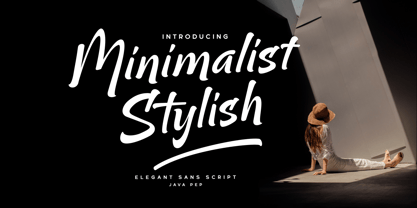 Proudly present the newest product Minimalist Stylish font. That font is inspired by brush script and modern sans, Minimalist Stylish font already has a feature in alternate, ligature, swash, and multilingual support. Minimalist Stylish font is perfect for headlines, logotypes, taglines, quotes, publishing, apparel, etc. Package includes Minimalist Stylish Minimalist Swash Uppercase, lowercase, punctuation, and numeral PUA encoded Multilingual Support in more than 25 languages
 - Gawain's Hand by Just My Type,
$25.00 Gawain Douglas was my co-worker and eventually my boss when I worked for the Tucson Citizen. He’s director of production and design for a children’s book publisher now, a very talented and creative guy and Gawain’s Hand is what his writing looks like. A shame, isn’t it? Just kidding, Gawain; I wouldn’t have featured it, if I hadn’t liked it. Really. No, really. :-)
 - Calps Sans by Typesketchbook,
$55.00 Calps Sans is a variant of the original Calps typeface. Import to be more corporate, Calps Sans family use flat corners instead of rounded corners (Calps). “Calps Sans” is a prominent, eye-catching and unique typeface. It comes with 9 weights and Slim version in order to suit for a multifunctional usage, especially for cooperative work, such as website, magazine, editorial, publishing , as well as packaging.
 - Boodle by Ckhans Fonts,
$34.00 • Support for 28 languages: Afrikaans Albanian Catalan Croatian Czech Danish Dutch English Estonian Finnish French German Hungarian Icelandic Italian Latvian Lithuanian Maltese Norwegian Polish Portugese Romanian SlovakSlovenian Spanisch Swedish Turkish Zulu Swedish Turkish Zulu • Contains OpenType features with alternates or substitutes • Tabular Figures • Ordinal numbers • 74 icons (It will keep updating.) • 72 graphic patterns for designer (It will keep updating.) • 27 arrows glyphs • 0-20 line circled glyphs • 0-20 solid circled glyphs • A-Z line circled glyphs • A-Z solid circled glyphs Boodle is a modern sans serif with a geometric touch. It comes in 8 weights, 17 uprights and its matching italics, patterns, so you can use them to your heart’s content. Designed with powerful opentype features in mind. Each weight includes extended language support, fractions, tabular figures, arrows, ligatures, icons and patterned. Boodle family consists of 17 styles (8 weights, 8 Italics and 1 patterns), in each of which there are more than 744+ glyphs. In the typeface, each weight includes extended language support, fractions, tabular figures, arrows, ligatures and more. Perfectly suited for graphic design and any display use. It could easily work for web, signage, corporate as well as for editorial design. documents and folders, mobile interface. Useful links: Gravitica PDF Type Guide and Specimen (You can know how to use icons and arrows, other glyphs.)
 - Gridink by Ckhans Fonts,
$34.00 Description Features: • Support for 28 languages: Afrikaans Albanian Catalan Croatian Czech Danish Dutch English Estonian Finnish French German Hungarian Icelandic Italian Latvian Lithuanian Maltese Norwegian Polish Portugese Romanian SlovakSlovenian Spanisch Swedish Turkish Zulu Swedish Turkish Zulu • Contains OpenType features with alternates or substitutes • Tabular Figures • Ordinal numbers • 74 icons (It will keep updating.) • 72 graphic patterns for designer (It will keep updating.) • 28 brand symbols (It will keep updating.) • 27 arrows glyphs • 0-99 line circled glyphs • 0-99 solid circled glyphs • A-Z line circled glyphs • A-Z solid circled glyphs Gridink is a modern sans serif with a geometric touch. It comes in 9 weights, 18 uprights and its matching italics, patterns, so you can use them to your heart’s content. Designed with powerful opentype features in mind. Each weight includes extended language support, fractions, tabular figures, arrows, ligatures, icons and patterned. Gridink family consists of 19 styles (9 weights, 9 Italics and 1 patterns), in each of which there are more than 940+ glyphs. In the typeface, each weight includes extended language support, fractions, tabular figures, arrows, ligatures and more. Perfectly suited for graphic design and any display use. It could easily work for web, signage, corporate as well as for editorial design. documents and folders, mobile interface. Useful links: Gravitica PDF Type Guide and Specimen (You can know how to use icons and arrows, other glyphs.)
 - Gravitica Rounded by Ckhans Fonts,
$34.00 Features: • Support for 28 languages: Afrikaans Albanian Catalan Croatian Czech Danish Dutch English Estonian Finnish French German Hungarian Icelandic Italian Latvian Lithuanian Maltese Norwegian Polish Portugese Romanian SlovakSlovenian Spanisch Swedish Turkish Zulu Swedish Turkish Zulu • Contains OpenType features with alternates or substitutes • Tabular Figures • Ordinal numbers • 74 icons (It will keep updating.) • 28 brand symbols (It will keep updating.) • 27 arrows glyphs • 0-99 line circled glyphs • 0-99 solid circled glyphs • A-Z line circled glyphs • A-Z solid circled glyphs Gravitica is a modern sans serif with a geometric touch. It comes in 6 weights, 13 uprights and its matching rounded, italics, patterned, so you can use them to your heart’s content. Designed with powerful opentype features in mind. Each weight includes extended language support, fractions, tabular figures, arrows, ligatures, icons and patterned. Gravitica family consists of 13 styles (6 weights, 6 Italics, 1 patterned), in each of which there are more than 940+ glyphs. In the typeface, each weight includes extended language support, fractions, tabular figures, arrows, ligatures and more. Perfectly suited for graphic design and any display use. It could easily work for web, signage, corporate as well as for editorial design. documents and folders, mobile interface. Useful links: Gravitica PDF Type Guide and Specimen (You can know how to use icons and arrows, other glyphs.)
 - Gravitica Slab by Ckhans Fonts,
$34.00 Features: • Support for 28 languages: Afrikaans Albanian Catalan Croatian Czech Danish Dutch English Estonian Finnish French German Hungarian Icelandic Italian Latvian Lithuanian Maltese Norwegian Polish Portugese Romanian SlovakSlovenian Spanisch Swedish Turkish Zulu Swedish Turkish Zulu • Contains OpenType features with alternates or substitutes • Tabular Figures • Ordinal numbers • 74 icons (It will keep updating.) • 72 graphic patterns for designer (It will keep updating.) • 28 brand symbols (It will keep updating.) • 27 arrows glyphs • 0-99 line circled glyphs • 0-99 solid circled glyphs • A-Z line circled glyphs • A-Z solid circled glyphs Gravitica Slab is a modern serif with a geometric touch. It comes in 6 weights, 12 uprights and its matching italics, so you can use them to your heart’s content. Designed with powerful opentype features in mind. Each weight includes extended language support, fractions, tabular figures, arrows, ligatures, icons and patterned. Gravitica Slab family consists of 12 styles (12 weights, 12 Italics), in each of which there are more than 940+ glyphs. In the typeface, each weight includes extended language support, fractions, tabular figures, arrows, ligatures and more. Perfectly suited for graphic design and any display use. It could easily work for web, signage, corporate as well as for editorial design. documents and folders, mobile interface. Useful links: Gravitica PDF Type Guide and Specimen (You can know how to use icons and arrows, other glyphs.)
 - Biblia Serif by Hackberry Font Foundry,
$24.95 This all started with a love for Minister. This is a font designed by Carl Albert Fahrenwaldt in 1929. In the specimen booklet there’s a scan from Linotype’s page many years ago. They no longer carry the font. I’ve gone quite a ways from the original. It was dark and a bit heavy. But I loved the look and the readability. This came to a head when I started my first book on all-digital printing written from 1994-1995, and published early in 1996. I needed fonts to show the typography I was talking about. At that point oldstyle figures, true small caps, and discretionary ligatures were rare. More than that text fonts for book design had lining OR oldstyle figures, lowercase OR small caps—never both. So, I designed the Diaconia family using the Greek word for minister. It was fairly rough. I knew very little. I later redesigned and updated Diaconia into Bergsland Pro—released in 2004. It was still rough (though I impressed myself). Now, with 4-font Biblia Serif family 13 years later, I’ve cleaned up, made the fonts more consistent internally, added more functional OpenType features, and brought the fonts into the 21st century. I used the 2017 set of features: small caps, small cap figures, oldstyle figures, fractions, lining figures, ligatures and discretionary ligatures. These are fonts designed for book production and work well for text or heads. Finally, in 2021, I went over the fonts entirely and remade them in Glyphs.
 - Malutzki Initials by Spirit & Bones,
$15.00 In 1980, Peter Malutzki, Heidi Hübner-Prochotta and Manfred Prochotta founded the FlugBlatt-Presse and began producing broadsheets, which they called FlugBlätter and which also gave their press its name. They were mostly woodcuts or linocuts, combined with hand-set typography. When they finished the series in 1984 there were 67 FlugBlätter. During a Frankfurt Book Fair in the 1980s the collector Rob Saunders acquired FlugBlatt No. 37 along with other prints. Later they became part Letterform Archive, a non-profit museum and special collection library in San Francisco, which Rob Saunders founded in 2014. In 2021, Letterform Archive posted the FlugBlatt No. 37 on social media, where type designer Lena Schmidt saw it, immediately fell in love with it, and developed the plan to bring it into the digital world. After contacting Peter Malutzki – who is still working as a book artist today – and in close consultation with him, Schmidt translated the letterforms into a font series, Malutzki Initials. The three fonts can be used for black (single-color) text using the Regular style, or for multicolor text by applying different colors to the Letter Layer and Figure Layer styles.
 - Perola by IKIIKOWRK,
$17.00 Introducing Perola - Fancy Type, created by ikiiko. Perola means "pearl" and comes from spanish language. This letter has a distinctive feature on its hook, which is in the form of a unique and dynamic curve. This letter is suitable if you want to show a cheerful impression or playful design with solid color. This typeface is perfect for an cute branding, pop art design, packaging product, food & beverages, quotes, or simply as a stylish text overlay to any background image. What's included? Uppercase & Lowercase Number & Punctuation Multilingual Support Works on PC & Mac Enjoy our font and if you have any questions, you can contact us by email : ikiikowrk@gmail.com
 - FS Silas Sans by Fontsmith,
$80.00 The great enigma There are hidden depths to FS Silas Sans. First impressions are of a functional, multi-purpose typeface with a cool, edgy, angular character. Gaze into its eyes a little longer, though, and you'll detect a more nuanced, colourful personality, with full, open, satisfyingly squarish forms balancing the abruptness of the sharply-angled terminals and ascenders. Authoritative, official and stern on the outside; amiable and welcoming on the inside. You’re so Dane The designers, led by Phil Garnham, were trying to capture something straight-talking, authentic, and a little... Scandinavian. ‘We were thinking about some of the characters in Danish dramas that were on in the early stages of the font’s development, like The Killing and The Bridge,’ says Phil. ‘The police officers, that is, not the psychopathic killers. Smart and a bit cool, but with a warm heart.’ For a good Danish name, we settled on Silas. It was that or Hans-Christian. The finer points Silas Sans rewards close inspection. Study, if you will, its amply squarish forms, the roomy ‘o’ and ‘e’, in particular. Observe the angular ascenders and terminals of, for example, the ‘L’, ‘I’, ‘d’ and ‘i’, inferring the movement and lift of a pen. Consider the cuts to the ‘A’ and ‘v’ that create harmony with adjacent letters. And scrutinise the subtle ink traps set within the ‘A’ and ‘Y’ for reproduction at small sizes. A fine subject, we think you’ll agree, and available in a versatile range of weights to make (with FS Silas Slab) a typographic system with a comprehensive hierarchy.
