10,000 search results
(0.053 seconds)
- Vendetta by Emigre,
$69.00 The famous roman type cut in Venice by Nicolas Jenson, and used in 1470 for his printing of the tract, De Evangelica Praeparatione, Eusebius, has usually been declared the seminal and definitive representative of a class of types known as Venetian Old Style. The Jenson type is thought to have been the primary model for types that immediately followed. Subsequent 15th-century Venetian Old Style types, cut by other punchcutters in Venice and elsewhere in Italy, are also worthy of study, but have been largely neglected by 20th-century type designers. There were many versions of Venetian Old Style types produced in the final quarter of the quattrocento. The exact number is unknown, but numerous printed examples survive, though the actual types, matrices, and punches are long gone. All these types are not, however, conspicuously Jensonian in character. Each shows a liberal amount of individuality, inconsistency, and eccentricity. My fascination with these historical types began in the 1970s and eventually led to the production of my first text typeface, Iowan Old Style (Bitstream, 1991). Sometime in the early 1990s, I started doodling letters for another Venetian typeface. The letters were pieced together from sections of circles and squares. The n, a standard lowercase control character in a text typeface, came first. Its most unusual feature was its head serif, a bisected quadrant of a circle. My aim was to see if its sharp beak would work with blunt, rectangular, foot serifs. Next, I wanted to see if I could construct a set of capital letters by following a similar design system. Rectangular serifs, or what we today call "slab serifs," were common in early roman printing types, particularly text types cut in Italy before 1500. Slab serifs are evident on both lowercase and uppercase characters in roman types of the Incunabula period, but they are seen mainly at the feet of the lowercase letters. The head serifs on lowercase letters of early roman types were usually angled. They were not arched, like mine. Oddly, there seems to be no actual historical precedent for my approach. Another characteristic of my arched serif is that the side opposite the arch is flat, not concave. Arched, concave serifs were used extensively in early italic types, a genre which first appeared more than a quarter century after roman types. Their forms followed humanistic cursive writing, common in Italy since before movable type was used there. Initially, italic characters were all lowercase, set with upright capitals (a practice I much admire and would like to see revived). Sloped italic capitals were not introduced until the middle of the sixteenth century, and they have very little to do with the evolution of humanist scripts. In contrast to the cursive writing on which italic types were based, formal book hands used by humanist scholars to transcribe classical texts served as a source of inspiration for the lowercase letters of the first roman types cut in Italy. While book hands were not as informal as cursive scripts, they still had features which could be said to be more calligraphic than geometric in detail. Over time, though, the copied vestiges of calligraphy virtually disappeared from roman fonts, and type became more rational. This profound change in the way type developed was also due in part to popular interest in the classical inscriptions of Roman antiquity. Imperial Roman letters, or majuscules, became models for the capital letters in nearly all early roman printing types. So it was, that the first letters in my typeface arose from pondering how shapes of lowercase letters and capital letters relate to one another in terms of classical ideals and geometric proportions, two pinnacles in a range of artistic notions which emerged during the Italian Renaissance. Indeed, such ideas are interesting to explore, but in the field of type design they often lead to dead ends. It is generally acknowledged, for instance, that pure geometry, as a strict approach to type design, has limitations. No roman alphabet, based solely on the circle and square, has ever been ideal for continuous reading. This much, I knew from the start. In the course of developing my typeface for text, innumerable compromises were made. Even though the finished letterforms retain a measure of geometric structure, they were modified again and again to improve their performance en masse. Each modification caused further deviation from my original scheme, and gave every font a slightly different direction. In the lower case letters especially, I made countless variations, and diverged significantly from my original plan. For example, not all the arcs remained radial, and they were designed to vary from font to font. Such variety added to the individuality of each style. The counters of many letters are described by intersecting arcs or angled facets, and the bowls are not round. In the capitals, angular bracketing was used practically everywhere stems and serifs meet, accentuating the terseness of the characters. As a result of all my tinkering, the entire family took on a kind of rich, familiar, coarseness - akin to roman types of the late 1400s. In his book, Printing Types D. B. Updike wrote: "Almost all Italian roman fonts in the last half of the fifteenth century had an air of "security" and generous ease extremely agreeable to the eye. Indeed, there is nothing better than fine Italian roman type in the whole history of typography." It does seem a shame that only in the 20th century have revivals of these beautiful types found acceptance in the English language. For four centuries (circa 1500 - circa 1900) Venetian Old Style faces were definitely not in favor in any living language. Recently, though, reinterpretations of early Italian printing types have been returning with a vengeance. The name Vendetta, which as an Italian sound I like, struck me as being a word that could be taken to signifiy a comeback of types designed in the Venetian style. In closing, I should add that a large measure of Vendetta's overall character comes from a synthesis of ideas, old and new. Hallmarks of roman type design from the Incunabula period are blended with contemporary concerns for the optimal display of letterforms on computer screens. Vendetta is thus not a historical revival. It is instead an indirect but personal digital homage to the roman types of punchcutters whose work was influenced by the example Jenson set in 1470. John Downer.
 - Mrs Eaves XL Serif by Emigre,
$59.00 Originally designed in 1996, Mrs Eaves was Zuzana Licko’s first attempt at the design of a traditional typeface. It was styled after Baskerville, the famous transitional serif typeface designed in 1757 by John Baskerville in Birmingham, England. Mrs Eaves was named after Baskerville’s live in housekeeper, Sarah Eaves, whom he later married. One of Baskerville’s intents was to develop typefaces that pushed the contrast between thick and thin strokes, partially to show off the new printing and paper making techniques of his time. As a result his types were often criticized for being too perfect, stark, and difficult to read. Licko noticed that subsequent interpretations and revivals of Baskerville had continued along the same path of perfection, using as a model the qualities of the lead type itself, not the printed specimens. Upon studying books printed by Baskerville at the Bancroft Library in Berkeley, Licko decided to base her design on the printed samples which were heavier and had more character due to the imprint of lead type into paper and the resulting ink spread. She reduced the contrast while retaining the overall openness and lightness of Baskerville by giving the lower case characters a wider proportion. She then reduced the x-height relative to the cap height to avoid increasing the set width. There is something unique about Mrs Eaves and it’s difficult to define. Its individual characters are at times awkward looking—the W being narrow, the L uncommonly wide, the flare of the strokes leading into the serifs unusually pronounced. Taken individually, at first sight some of the characters don’t seem to fit together. The spacing is generally too loose for large bodies of text, it sort of rambles along. Yet when used in the right circumstance it imparts a very particular feel that sets it clearly apart from many likeminded types. It has an undefined quality that resonates with people. This paradox (imperfect yet pleasing) is perhaps best illustrated by design critic and historian Robin Kinross who has pointed out the limitation of the “loose” spacing that Licko employed, among other things, yet simultaneously designated the Mrs Eaves type specimen with an honorable mention in the 1999 American Center for Design competition. Proof, perhaps, that type is best judged in the context of its usage. Even with all its shortcomings, Mrs Eaves has outsold all Emigre fonts by twofold. On MyFonts, one of the largest on-line type sellers, Mrs Eaves has been among the 20 best selling types for years, listed among such classics as Helvetica, Univers, Bodoni and Franklin Gothic. Due to its commercial and popular success it has come to define the Emigre type foundry. While Licko initially set out to design a traditional text face, we never specified how Mrs Eaves could be best used. Typefaces will find their own way. But if there’s one particular common usage that stands out, it must be literary—Mrs Eaves loves to adorn book covers and relishes short blurbs on the flaps and backs of dust covers. Trips to bookstores are always a treat for us as we find our Mrs Eaves staring out at us from dozens of book covers in the most elegant compositions, each time surprising us with her many talents. And Mrs Eaves feels just as comfortable in a wide variety of other locales such as CD covers (Radiohead’s Hail to the Thief being our favorite), restaurant menus, logos, and poetry books, where it gives elegant presence to short texts. One area where Mrs Eaves seems less comfortable is in the setting of long texts, particularly in environments such as the interiors of books, magazines, and newspapers. It seems to handle long texts well only if there is ample space. A good example is the book /CD/DVD release The Band: A Musical History published by Capitol Records. Here, Mrs Eaves was given appropriate set width and generous line spacing. In such cases its wide proportions provide a luxurious feel which invites reading. Economy of space was not one of the goals behind the original Mrs Eaves design. With the introduction of Mrs Eaves XL, Licko addresses this issue. Since Mrs Eaves is one of our most popular typefaces, it’s not surprising that over the years we've received many suggestions for additions to the family. The predominant top three wishes are: greater space economy; the addition of a bold italic style; and the desire to pair it with a sans design. The XL series answers these requests with a comprehensive set of new fonts including a narrow, and a companion series of Mrs Eaves Sans styles to be released soon. The main distinguishing features of Mrs Eaves XL are its larger x-height with shorter ascenders and descenders and overall tighter spacing. These additional fonts expand the Mrs Eaves family for a larger variety of uses, specifically those requiring space economy. The larger x-height also allows a smaller point size to be used while maintaining readability. Mrs Eaves XL also has a narrow counterpart to the regular, with a set width of about 92 percent which fulfills even more compact uses. At first, this may not seem particularly narrow, but the goal was to provide an alternative to the regular that would work well as a compact text face while maintaining the full characteristics of the regular, rather than an extreme narrow which would be more suitable for headline use. Four years in the making, we're excited to finally let Mrs Eaves XL find its way into the world and see where and how it will pop up next.
 - Molto by TypeTogether,
$49.00 Xavier Dupre’s Molto font family is a tonal master, creating tenderness in a slab serif and tempering toughness with flourishes. Slab serifs created their original niche by their ability to grab attention and overwhelm, which caused them to be seen as strong, dominant, and desired fonts, especially in advertising. Slab serifs are the result of placing defined edges on something meant to take up an inordinate amount of space, rather than meant to be graceful. Molto updates this concept to allow a greater, and gentler, range in the lighter weights. Molto’s nine weights are defined by their intended use. The two extreme weights (Hair and Fat) act as display partners for magazines, titles, and posters. The Hair weight is runway ready with its sturdy serifs, breathy internal space, and stable lettershapes that were designed both to perform and impress. Molto’s Fat weight packs maximum punch in a believable way. Its wide and deliberate curves contrast against thin connections and landing strip stems. Molto can be put to perfect use in a fashion magazine using swashy Hair headlines set against its darkest weight. Molto’s seven intermediate weights, with their classic and legible shapes, are meant for texts of all sizes. The notches on diagonals, distinct numerals, and acute terminals grant benefits from caption sizes up to headings. Molto’s refined light weights and punchy heavy weights set the stage for a swashy surprise — alternate capital letters act as refined garments laid atop its concrete skeleton. The Molto font family rejects saving space in favour of intensifying shapes, placing maximum weight on the edges for better legibility and impact. Latin-based digital and printed designs will benefit from Molto’s design voice and breadth. This means UI, video, and online text, and print materials like dictionaries, packaging, advertising, and branding can all put Molto’s robust forms to multipurpose use. Molto successfully creates balance in a slab serif design: an opinionated and striking type family, stalwart in captions and exuberant in display, thanks to swashes which add some originality to the slab category.
 - FS Rome by Fontsmith,
$50.00 Trajan The original template for this one-weight, all-caps font was the inscription on Trajan’s Column, carved in AD 113 to celebrate the emperor Trajan’s victory in the Dacian Wars. College student Jason Smith copied the stone lettering from the cast on display in London’s Victoria & Albert Museum. In Roman times, the signmaker would paint letters onto stone with a wide brush for the stone mason to chisel out later. The signwriter would end each stroke with a flick of his brush, which the mason would also carve into the stone. Ecce (as they would have said in Rome): the serif was born. Hand-crafted “I first drew this typeface when I was 17,” says Jason. “I drew it with a very sharp 9H pencil on polydraw film. “Then, using a Rotring pen, I inked the letters in and scraped back the serifs so they were perfectly sharp. These letters were then reduced on a PMT camera. I’d designed my first typeface, although it wasn’t digitised till much later.” Digitised Years after Jason had drawn the original typeface, its transfer into digital form made further refinements necessary. The serifs and weights needed thickening slightly, creating a crisp, new version whose delicate elegance is best appreciated in larger sizes. A classically-inspired font, timeless and perfectly-proportioned, to reflect the refinement of premium brands.
 - 99 Names of ALLAH Kids by Islamic Calligraphy75,
$12.00 We have transformed the “99 names of ALLAH” into a font. That means each key on your keyboard represents 1 of the 99 names of ALLAH Aaza Wajal. The fonts work with both the English and Arabic Keyboards. We call this Calligraphy "Kids" because it looks as if a child is writing the names. The first "Alef" has a "hamzit wasel", this indicates that the name can be pronounced both as "AR-RAHMAAN" or "R-RAHMAN" (in the zip file you will find a pdf file explaining the differences in the "harakat", pronunciation and spelling according to the Holy Quran). Some of the letters in the calligraphy are unusually big, they look as a child is writing them. No decorative letters are used in this calligraphy. Purpose & use: - Writers: Highlight the names in your texts in beautiful Islamic calligraphy. - Editors: Use with kinetic typography templates (AE) & editing software. - Designers: The very small details in the names does not affect the quality. Rest assured it is flawless. The MOST IMPORTANT THING about this list is that all the names are 100% ERROR FREE, and you can USE THEM WITH YOUR EYES CLOSED. All the “Tachkilat” are 100% ERROR FREE, all the "Spelling" is 100% ERROR FREE, and they all have been written in accordance with the Holy Quran. No names are missing and no names are duplicated. The list is complete "99 names +1". The +1 is the name “ALLAH” 'Aza wajal. Another important thing is how we use the decorative letters. In every font you will see small decorative letters, these letters are used only in accordance with their respective letters to indicate pronunciation & we don't include them randomly. That means "mim" on top or below the letter "mim", "sin" on top or below the letter "sin", and so on and so forth. Included: Pdf file telling you which key is associated with which name. In that same file we have included the transliteration and explication of all 99 names. Pdf file explaining the differences in the harakat and pronunciation according to the Holy Quran.
 - Robert Moore by Harvester Type,
$15.00 Robert Moore is a font that was specially designed for comics. A lot of work has been done. At first, glyphs were drawn manually using different markers, then they were transferred to the font. The font was tested on real printing and digital comics. The world of fonts for comics is big and I wanted to create even more variability for authors with one family, which is why a variable version was created containing two axes: weight and italics. This gives you more options. A large number of glyphs, multilingualism, ligatures, and a capital give even more scope for work and creativity. The name was created from the names of the authors of the comics Robert Kirkman and Alana Moore, so the Robert Moore font turned out. Although the font was made for comics, it is not limited to them. Posters, logos, covers, text, headings, prints, product design, web, interfaces are not all options for using the font.
 - Sybilla Multiverse by Karandash,
$28.00 Take a deep dive into the Sybilla Multiverse with this unique 294 style multi-versatile type family – a further creative exploration of the capabilities offered by our original warm and friendly slab design. Encompassing one body and six display sub-families, Sybilla Multiverse is a unique attempt to create a never before seen symphony of text and decorative type that spans in multiple usable widths and weights. Each sub-style consists of seven weights in three widths with complimentary true italics. Sybilla Multiverse is ideally suited for advertising and packaging, editorial and publishing, logo, branding and creative industries, poster and billboards, small text and signage as well as web and screen design. Every one of the styles offered (body or display) provides a broad range of advanced typographical features such as small caps, case-sensitive forms, fractions, scientific inferiors, super- and subscript characters. It comes with a complete figure range set of oldstyle and lining figures, each in tabular and proportional widths. Sybilla Multiverse has extensive multilingual support, covering more than 70 Latin-based languages and specially designed Cyrillic that works harmoniously with its Latin counterparts – a perfect choice for projects that need both writing systems running side by side.
 - Hamlet by Canada Type,
$24.95Based on a specimen of an obscure and uncredited old face called Kitterland, Hamlet is one of those curiosities hardly ever noticed in the world of modern fonts, the kind that infuses a variety of historic Blackletter and calligraphy traits in an otherwise Roman alphabet. Such typefaces, what few of them exist, are almost always classified by typophiles as traditional decorative Roman alphabets. We beg to differ. We think such hybrids are fascinating enough to deserve a classification of their own. And we think today's aspiring letterers and type designers would benefit from paying special attention to this kind of hybrid alphabet, not only because it has much more hand than machine in it, but also because it is a prime example of how to succeed in mixing different lettering techniques into one self-contained and distinctly functional alphabet. As in any efficient mixture of lettering methods, Hamlet ended up with characters that are uniquely its own, such as the cupped A, M, V, W and Y, the very luscious and inviting curves on the arms of E, F, L and T, both single- and double-story forms of the a, and the humblest, friendliest g and y ever. A dozen alternate characters are sprinkled throughout the character set, so check out the map for a few pleasant surprises. We also made the Handtooled and Headstone styles because we thought these friendly forms were just crying out for such treatments. The Handtooled version turned out quite lovely, if we may say so ourselves, perhaps even better than the main font. The Headstone version is available as a free bonus to those who purchase the complete Hamlet package. All Hamlet styles come with lining figures as well as old style ones. Hamlet comes in all popular font formats. The OpenType fonts contain push-button swapping alternates and figures, which come in handy in software programs that support this kind of thing. - FranklinGothicHandLight by Wiescher Design,
$39.50 FranklinGothicHandLight is part of a series of hand-drawn fonts from way back in time – before computers changed the way we worked. When I was in advertising – before computers – a very time consuming part of my daily work was sketching headlines. I used to be able to sketch headlines in Franklin Gothic, Times, Futura, Helvetica and several scripts. We had a kind of huge inverted camera – which we called Lucy. We projected the alphabet onto a sheet of transparent paper, outlined the letters with a fineliner and then filled them in. It was very tedious work, but the resulting headline had its own charm and we had a permanent race going on who was best and fastest. I won most of the time! They used to call me the fastest "Magic Marker" this side of the Atlantic. Great days, just like today! Your sentimental type designer from the past Gert Wiescher
 - FranklinGothicHandDemi by Wiescher Design,
$39.50 FranklinGothicHandDemi is part of a series of hand-drawn fonts from way back in time – before computers changed the way we worked. When I was in advertising – before computers – a very time consuming part of my daily work was sketching headlines. I used to be able to sketch headlines in Franklin Gothic, Times, Futura, Helvetica and several scripts. We had a kind of huge inverted camera – which we called Lucy. We projected the alphabet onto a sheet of transparent paper, outlined the letters with a fineliner and then filled them in. It was very tedious work, but the resulting headline had its own charm and we had a permanent race going on who was best and fastest. I won most of the time! They used to call me the fastest "Magic Marker" this side of the Atlantic. Great days, just like today! Your sentimental type designer from the past Gert Wiescher
 - Urban Barbarian by Comicraft,
$19.00 He’s been mixing one part artist and one part barbarian since 2005. Brutal, ruthless, cutthroat, he moves through the concrete jungle, unsheathing his, um, sword, taking what he wants without care or remorse. He follows no rules. He is the URBAN BARBARIAN. The Spoils of Battle Await Him! Is he Conan? Roger ‘Mad Men’ Sterling? No, he’s Dan Panosian. Artist. Author. Lover of fine women, drinker of fine scotch, drawer of fine pictures. This is his fine font. Well, one of them. See the families related to Urban Barbarian: Dan Panosian Features: Two fonts: all-uppercase GIANT and upper/lowercase DWARF.
 - Allumi Std by Typofonderie,
$59.00 Technology in mind in 12 fonts Allumi is a different font. Different from anything Jean François Porchez has designed in the past. Allumi is a sleek typeface designed with technology in mind. It’s a perfect font family for any communication concerning design, robotics, or functionality. Pushed to its extreme limits, the Allumi shapes are neither perfectly round or geometrically square. It’s a human design with a high tech touch. Allumi can be described as the Eurostyle (designed by Aldo Novarese in 1964) of the new century, mixed with Frutiger. Allumi is a serious typeface because of the unique design and sturdy form. The pure shapes can create a global presence today with an eye on the world of tomorrow. Two widths The Allumi family has been built around two series of widths, standard and extended. Italics have been carefully designed as slanted roman with all necessary optical and human corrections to create a perfect and neat italic. I Love Typography 2009
 - Chez Moustache by PintassilgoPrints,
$29.00 Based on Irma La Douce film opening titles, Chez Moustache is a very eye-catching display font loaded with cool special effects. It is a unicase typeface with 2 versions for each letter, each easily accessible through upper and lower case keys. To prevent double letters from displaying the same glyph, just type the alternate glyph, or use the neat OpenType feature to make things even easier: just turn on the contextual alternates in any OpenType aware program and it's all done before you can say Jack Robinson. Did you push the stylistic alternates button instead of the contextual one? Voilà, so you've got a pocketful of flowers! There's a complete set of sweet stylistic alternates to instantly flourish your way. And it's not over yet: check out the cool initial and terminal forms for that extra twist. Pick your choices with a glyphs palette or just turn on the OpenType swash feature. Now go ahead, there's a lot to do Chez Moustache. But that's another story...
 - Cadho Toys by Alit Design,
$20.00 Introducing CADHO TOYS, an exciting and playful bubble display font that will add a touch of whimsy to your designs. This font features a unique alternate ligature style that combines bubbles and letters, creating a fun and engaging visual experience. With its lively appearance, CADHO TOYS is perfect for various design projects, especially those aimed at children, toys, games, or anything that requires a cheerful and vibrant aesthetic. This font is carefully crafted with 707 characters, ensuring versatility and multilingual support. Whether you’re designing in English, French, Spanish, German, or any other language, CADHO TOYS has got you covered. The font includes special characters, punctuation marks, numerals, and a wide range of glyphs, allowing you to express your creativity without limitations. One of the standout features of CADHO TOYS is its support for PUA Unicode. This means that you can access the font’s extensive character set through private use area codes, giving you even more freedom to customize and personalize your designs. Let your imagination run wild as you combine different characters and ligatures to create captivating typographic compositions. CADHO TOYS will bring joy and excitement to any project it graces. Whether you’re designing posters, logos, packaging, websites, or any other creative endeavor, this bubble display font is bound to make a lasting impression. Its alternate ligature style adds a touch of uniqueness and flair, setting your designs apart from the crowd. So why wait? Get your hands on CADHO TOYS today and unlock a world of creativity, fun, and boundless possibilities. Let this font take your designs to new heights and bring smiles to the faces of your audience. Language Support : Latin, Basic, Western European, Central European, South European,Vietnamese. In order to use the beautiful swashes, you need a program that supports OpenType features such as Adobe Illustrator CS, Adobe Photoshop CC, Adobe Indesign and Corel Draw. but if your software doesn’t have Glyphs panel, you can install additional swashes font files.
 - Kamasunday by Alit Design,
$21.00 Introducing Kamasunday Dynamic Blackletter, a typeface that seamlessly blends the timeless elegance of blackletter script with a modern, dynamic twist. This font is a perfect fusion of tradition and innovation, offering an impressive array of 837 meticulously crafted glyphs, ligatures, and alternates that will elevate your designs to new heights. Key Features: Dynamic Wave Design: Kamasunday Dynamic Blackletter features a captivating wave-like design that adds a sense of movement and energy to your text. Each character flows seamlessly into the next, creating a visually stunning and cohesive text. Modern Elegance: This font embodies the essence of modern elegance, making it perfect for a wide range of design projects, from branding and packaging to invitations and posters. Extensive Glyph Set: With a whopping 837 glyphs at your disposal, you have access to a vast selection of characters, including uppercase and lowercase letters, numerals, punctuation, and a variety of special characters, ensuring your design needs are met with versatility. Ligatures: Kamasunday Dynamic Blackletter includes an extensive set of ligatures, allowing you to achieve a more fluid and natural look in your text. These ligatures create seamless connections between characters for a polished and sophisticated appearance. Alternates: The font offers an abundance of alternate characters and swashes, giving you the creative freedom to experiment and customize your text. These alternates add an extra layer of uniqueness to your designs. Versatile Usage: Whether you're designing a vintage-inspired logo, a Gothic-themed poster, or a contemporary Music event poster, Kamasunday Dynamic Blackletter adapts beautifully to various design contexts. Timeless Appeal: While embracing modernity, this font retains the timeless charm of traditional blackletter script, making it a versatile choice for projects that demand a touch of history and sophistication. Elevate your design projects with Kamasunday Dynamic Blackletter, where the past and present merge into a harmonious typographic masterpiece. This font promises to breathe life into your creative visions, making your designs stand out with its unique style and extensive character set.
 - Admiral by Greater Albion Typefounders,
$12.00 Admiral was inspired by and extrapolated from the Art Nouveau lettering incised into the facade of a local hostelry. This gave us some inspiration for the capitals 'A', 'B', 'C', 'E', 'H', 'I', 'L', 'O', 'S', 'T' and 'U'; we then had great fun extrapolating the rest! The source of the name Admiral can be spotted if you look at characters such as 'A', 'H' and 'N'. Admiral's distinctive charm and humour lends it to projects with a 1900s Art Nouveau theme, be they book covers, posters, signage, invitations, cards, or anything else you enjoy!
 - Futurum Parqez by Parquillian Design,
$19.00 Futurum Parqez is the first collaborative font for Parquillian Design. The idea for this font first came to the creator, Jose V Lopez, almost 40 years ago. A couple years ago he shared his concepts and we were gradually able to collaborate on editing the designs and turn them into a working font. The philosophy behind the font is to use a standardized frame format and the fewest strokes possible, while maintaining legibility, to create an original minimalist and modern style.
 - Odisean by deFharo,
$24.00 Odisean Fonts and its 3 styles (One, Tech & Small Caps) are ideal for graphic design, editorial, logos and posters. Its rounded finish and marked contrast between antlers evoke the charm of bygone eras. In addition, it has a collection of retro icons accessible through OpenType: Small Caps. Letter proportions are multiples of 8, ensuring exceptional visual harmony, while metrics and kerning use values multiples of 8 for impeccable legibility and aesthetics. Discover Odisean and revive retro nostalgia in your designs. Each Odisean variant comes loaded with a set of alternative letters that allow you to customize and adapt each project to your liking. In addition, you will be able to access an exclusive collection of retro icons through the OpenType feature: Small Caps, adding even more versatility and charm to your creations. - Odisean One will transport you to a bygone era with its retro charm, offering you alternative lyrics that evoke the aesthetic of the golden and happy years. - Odisean Tech for those who love technology and innovation, the font is full of graphic elements and retro transportation icons, which will immerse you in a futuristic world of the past. - Odisean Small Caps bring elegance and versatility to your designs with their small capital letters.
 - Evoque by Monotype,
$40.00 Evoque is a humanist serif type family designed for both text and display purposes. Its appearance is crisp and modern while echoing a classical Garamond heritage. The inspiration for Evoque came after reminiscing over Apple’s advertising of the eighties and nineties that utilised incredibly tightly-spaced headlines set in Apple Garamond. I wanted to create a typeface that evoked nostalgia of those times and that distinctive typographic style. A number of swash alternates and discretionary ligatures enhance Evoque, giving you the opportunity to add more flair and personality to your title and branding designs. Simply activate Stylistic Sets to start adding these flourishes to your typography. Other useful features include Small Caps at the click of a button, and Old Style Figures are an option to the default proportional figure style. There are 36 fonts altogether, with 6 weights in roman and italic from Thin to Heavy weights across Condensed, Narrow, and Regular widths. Evoque has an extensive character set (900+ glyphs) that covers every Latin European language. Please also take a look at Evoque Text which is specifically designed for the publishing sector. Key features: 6 weights in both roman and italic 3 widths – Regular, Narrow, Condensed 80 Alternates 26 Ligatures Small Caps Full European character set (Latin only) 900+ glyphs per font.
 - Salvador by Homelessfonts,
$49.00 Homelessfonts is an initiative by the Arrels foundation to support, raise awareness and bring some dignity to the life of homeless people in Barcelona Spain. Each of the fonts was carefully digitized from the handwriting of different homeless people who agreed to participate in this initiative. A biography/story of each homeless person captures their story, to help raise awareness and bring some dignity to the life of homeless people. Monotype is pleased to donate all revenue from the sales of Homelessfonts to the Arrels foundation in support of their mission to provide the homeless people in Barcelona with a path to independence with accommodations, food, social and health care. Salvador was born in a small village in the province of Seville, Spain where he lived until 2002. During many years he worked in restaurants, construction, and in the fields, until he decided to go try his luck in Palma de Mallorca. There he worked in hotels and in construction, until the economic crisis erupted and he was left without work or benefits of any kind and he began to live in the street: “The street has few good things, but it teaches you to be more selfless, to share with others what you have, even if it isn’t much.” In 2006, a friend encouraged him to come along to Barcelona and bought his plane ticket. Once there, things did not go much better and he had to continue living in the street. A year ago he left behind that life and now he explains his experience in guided tours to school groups: “I like it because I see that many of them are interested and they ask questions. It is good that they learn.”
 - Nusaibah by Eyad Al-Samman,
$20.00 “Nusaibah” is the first name of an early convert woman to Islam, and the first female to fight in defense of the Islamic religion. Her full name is Nusaibah bint Kaíab Al-Maziniyyah and she took part in the Battles of Uhud, Hunain, Yamama and the Treaty of Hudaibiyah with Islam’s prophet Muhammad (pbuh). Nusaibah is best known for her brave and heroic feat during the Battle of Uhud - fought on March 19, 625 - when she entered the battle carrying a sword and a shield to protect the prophet Muhammad (pbuh) from the arrows of the enemy, and she accordingly received several wounds while fighting and these wounds were not healed until the following year. The prophet Muhammad (pbuh) mentioned her distinct courage by saying that in whichever direction he turned in the battlefield, he could see her defending and protecting him. "Nusaibah" is a modern, geometric, and headline Arabic display typeface. The main trait of this typeface is the novel symmetrical design of its letters which renders it as one of the modern stylish typefaces used for headlines and titles. This is can be noticed in its letters such as “Theh”, “Jeem”, “Ain”, “Sheen”, and others. Moreover, “Nusaibah” font has a character set which supports Arabic, Persian, Urdu, and Latin letters and numerals with a limited range of specific Arabic and Latin ligatures. This font comes in two weights (i.e., regular and bold) with nearly 643 distinctive glyphs. Due to its geometric and linear design, “Nusaibah” typeface is appropriate for heading and titling in Arabic, Persian, and Urdu magazines, posters, and surfaces of different equipment. It is also elegantly suitable for signs, books’ covers, advertisement light boards, products’ and services’ names, and titles of flyers, pamphlets, novels, and books of children. “Nusaibah” typeface is one of the Arabic typefaces that has a novel and modern-day design which can be used in versatile graphic, typographic, and artistic works in different languages for diverse cultures.
 - Jekatep by ActiveSphere,
$30.00 Jekatep is a sans-serif display font and works best in text and display applications, such as posters, headline, magazine, logos, titles, product branding, corporate branding and publishing. Jekatep font has three weights; light, regular, and bold, each available in italic, making a total of six styles. Each style has a full upper and lower-case, accents, punctuation and a selection of monetary symbols. Currently Available for Mac and PC, in Open Type, PostScript or TrueType.
 - Hamis by Fo Da,
$4.00 Hamis is a display font of a single weight " Regular ", ideally suited for advertising and packaging, festive occasions, editorial and publishing, logo, branding and creative industries, posters and billboards as well as web and screen design. Hamis provides advanced typographical support with features such as ligatures, case-sensitive forms, fractions, super and subscript characters, and stylistic alternates. It comes with a complete range of figure set options – oldstyle and lining figures, each in tabular and proportional widths.
 - Bart Script No 1 by 066.FONT,
$9.99 Bart Script No 1 is a display font in which each letter has been handwritten, giving it an authentic and original character. It exudes a varied and extravagant style, and with its daring and sophisticated letterforms, Bart Script No 1 attracts attention and gives projects a touch of nonchalance. It is ideal for creative projects such as posters, invitations or branding materials, where a striking and distinctive text finish is sought that stands out. Remastered in 2022.
 - Devil Tail by Attype Studio,
$14.00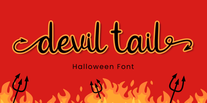 Devil Tail is a delicate and incredibly distinct handwritten font. Fall in love with its incredibly versatile style and use it to create spectacular designs! Devil Tail is perfect for branding, logo, invitation, stationery, social media post, product packaging, merchandise, blog design, game titles, cute style design, Book/Cover Title and more. What's Included : - Devil Tail.otf - Beginning & Ending Swash - Multilingual Support (Afrikaans, Albanian, Catalan, Danish, Dutch, English, Estonian, Finnish, French, German, Icelandic, Italian, Norwegian, Portugese, Spanisch, Swedish, Zulu)
 - Wildcats by Blankids,
$25.00 Wildcats Typeface is a vintage sexy calligraphy style. Wildcats inspired from vintage labels, signage and packages. Wildcats is good for logotype, tattoo typograph, signage, wedding invitation card design and any more. Wildcats have 453 Glyphs and many alternative character so you can mix and match like a you want, also you can get ornament pack on EPS file. 17 Mutilingual Support (Afrikaans, Albanian, Catalan, Danish, Dutch, English, Estonian, Finnish, French, German, Icelandic, Italian, Norwegian, Portugese, Spanisch, Swedish, Zulu)
 - Entsha by S.P.M.H,
$20.00 Entsha is a gorgeous sans-serif typeface that is both classically elegant and inherently modern. Create beautiful wedding invitations, use it as an elegant solution for your next magazine layout, or choose Entsha for any graphics that require a sleek look with a vintage flair. Entsha is based on classic letterforms for publishing and display graphics, so you can give your text a classic, elegant feel with Entsha's clean, high-contrast lines and alternating thick and thin strokes.
 - BR Firma by Brink,
$30.00 BR Firma is a geometric sans serif consisting of 8 weights ranging from Thin to Black with matching italics. It supports an ‘Extended Latin’ character set that covers over 200 latin based languages. BR Firma provides advanced typographic support with features such as case sensitive forms, fractions and slashed zeros. It comes with multiple figure sets and is ideal for print, advertising, publishing, branding, software and gaming as well as being optimised for web and screen design.
 - FF DIN Paneuropean Variable by FontFont,
$629.99 FF DIN: the famous, faithful and first revival of DIN 1451. FF DIN originates in the lettering models from the German standard DIN 1451, and is considered the perfect standard typeface due to methodical and engineered design. FF DIN Variable offers you more FF DIN than ever before. Pushing font technology to its limits, Variable fonts provide creatives a tool to dial in hyper specific variations which thrive in any design space. FF DIN Variable take bold steps in engineering, which the typefaces behaviour which brings in FF DIN’s technical look-and-feel into the smooth and almost organic world of Variable Fonts. Available in both upright and italic styles, there is a lot more FF DIN to discover with new era of type technology. FF DIN Italic is a sloped roman style, however it is optically corrected – slightly thinner, slightly narrower. As a result, FF DIN Italic stands out subtly. FF DIN Variable stays faithful to its parent’s DNA, the utmost care was taken to ensure that the new instances of FF DIN Variable remained consistent with all the well-known weights. Precision is the mantra of FF DIN, the FF DIN Variable is no exception to this design philosophy. Produce exquisitely fine-tuned typography and expressive animated headlines for any design. Infinite styles, intelligent, and powerful.
 - FF DIN Paneuropean by FontFont,
$92.99FF DIN: the famous, faithful and first revival of DIN 1451. FF DIN originates in the lettering models from the German standard DIN 1451, and is considered the perfect standard typeface due to methodical and engineered design. FF DIN Variable offers you more FF DIN than ever before. Pushing font technology to its limits, Variable fonts provide creatives a tool to dial in hyper specific variations which thrive in any design space. FF DIN Variable take bold steps in engineering, which the typefaces behaviour which brings in FF DIN’s technical look-and-feel into the smooth and almost organic world of Variable Fonts. Available in both upright and italic styles, there is a lot more FF DIN to discover with new era of type technology. FF DIN Italic is a sloped roman style, however it is optically corrected – slightly thinner, slightly narrower. As a result, FF DIN Italic stands out subtly. FF DIN Variable stays faithful to its parent’s DNA, the utmost care was taken to ensure that the new instances of FF DIN Variable remained consistent with all the well-known weights. Precision is the mantra of FF DIN, the FF DIN Variable is no exception to this design philosophy. Produce exquisitely fine-tuned typography and expressive animated headlines for any design. Infinite styles, intelligent, and powerful. - Quase Display by DSType,
$40.00 Quase is a very free interpretation of the types found in the “Specimen of Printing Types” by William Caslon from 1785. We didn’t want to follow any of the models introduced in the Specimens, but rather gather a series of typographic aspects that we found useful and interesting from the several sizes and styles available and then give them consistency and new proportions so they could fit our very own purpose. We wanted to start with Caslon and then transform it into an editorial typeface, hence the increase of the x-height and the radical reduction of the ascenders and descenders. Despite the Display, Headline and Text fonts we also wanted to make a single weight Poster version with, inspired by the mechanical script introduced in the Double-Pica Script, to be used in magazines or as a complementary display typeface.
 - Quase Poster by DSType,
$40.00 Quase is a very free interpretation of the types found in the “Specimen of Printing Types” by William Caslon from 1785. We didn’t want to follow any of the models introduced in the Specimens, but rather gather a series of typographic aspects that we found useful and interesting from the several sizes and styles available and then give them consistency and new proportions so they could fit our very own purpose. We wanted to start with Caslon and then transform it into an editorial typeface, hence the increase of the x-height and the radical reduction of the ascenders and descenders. Despite the Display, Headline and Text fonts we also wanted to make a single weight Poster version with, inspired by the mechanical script introduced in the Double-Pica Script, to be used in magazines or as a complementary display typeface.
 - Quase Headline by DSType,
$40.00 Quase is a very free interpretation of the types found in the “Specimen of Printing Types” by William Caslon from 1785. We didn’t want to follow any of the models introduced in the Specimens, but rather gather a series of typographic aspects that we found useful and interesting from the several sizes and styles available and then give them consistency and new proportions so they could fit our very own purpose. We wanted to start with Caslon and then transform it into an editorial typeface, hence the increase of the x-height and the radical reduction of the ascenders and descenders. Despite the Display, Headline and Text fonts we also wanted to make a single weight Poster version with, inspired by the mechanical script introduced in the Double-Pica Script, to be used in magazines or as a complementary display typeface.
 - Quase Text by DSType,
$40.00 Quase is a very free interpretation of the types found in the “Specimen of Printing Types” by William Caslon from 1785. We didn’t want to follow any of the models introduced in the Specimens, but rather gather a series of typographic aspects that we found useful and interesting from the several sizes and styles available and then give them consistency and new proportions so they could fit our very own purpose. We wanted to start with Caslon and then transform it into an editorial typeface, hence the increase of the x-height and the radical reduction of the ascenders and descenders. Despite the Display, Headline and Text fonts we also wanted to make a single weight Poster version with, inspired by the mechanical script introduced in the Double-Pica Script, to be used in magazines or as a complementary display typeface.
 - Ed McGuinness by Comicraft,
$39.00 Fighting American and all around Superman Ed McGuinness joins our Masters of Comic Book Art with a font inspired by his gamma ray saturated handwriting! Ed is officially a friend of Comicraft and a big smile in Hulk form! Now a small slice of this Jolly Green Giant is available as an alphabet waiting for puny humans to arrange in words of no more than two syllables.
 - Campcraft by Our House Graphics,
$- Remember those plastic Popsicle sticks that clicked together and you could make things from them with your sticky little fingers? Things like... camp crafts. Well, no� Of course you don't. You were too young. That�s why there is Campcraft. This is a fun loving dot-matrix font, or it would be a fun loving dot-matrix if the vertical and horizontal grid lines didn't pile up at the intersections. Then again, it wouldn't be any fun if they didn't pile up at the intersections, would it? Strictly a display type... Campcraft is excellent for what the name suggests. I goes well with Christmas sweaters, beaded jackets and purses and that time when we were all happy children with sticky little fingers.
 - Iwan Stencil by Linotype,
$40.99 Iwan Stencil is a new revival of an old display typeface. Based on type originally designed by Jan Tschichold in 1929, the style was revived by Klaus Sutter in 2008. The letterforms in this peculiar design are very high contrast; all of the thin bits are much thinner than the thick parts. They have a modern, upright axis. All in all, the creation has a bit of a Bodoni-gone-crazy touch. The thin elements are the unique part of the design that binds this face together. They almost naturally fade away in the stencil gaps (or pylons), making you wonder if you are really looking at a stencil face at all. These thins contribute greatly to the typeface's overall serif-style, making the design at least a semi serif typeface, if not a full serif one. The lowercase n, for instance, has no serifs of its own, but many of the other letters have clear ones, or serif-like terminals. A serif stencil face is a peculiar variety, especially in this day and age, but in the past they were much more common, if not the norm, The Iwan Stencil typeface has only one weight. Naturally, this is just for display. Use Iwan Stencil to cut real stencils, or only to create the effect of stenciled type in your design work. Ivan Stencil includes all of the characters that you have come to expect in a font. Just because this design was originally made in 1929 does not mean that is has a 1929 character set. Instead, it includes a 21st century, with extended European language support Jan Tschichold, who we have to thank for today's Iwan Stencil inspiration, was a man of many faces. A trained calligrapher who went on to codify the New Typography, would go on to become a teacher, a classical book designer, and the creator of the Sabon typeface. Like all young designers, he was occasionally in need of money. Before his emigration from Germany in 1933, he took on many kinds of commissions. In the late 1920s, a time full of waves of economic turmoil within Germany and across the world, he began designing a typefaces for different European companies, mostly display things like this. For a time during the mid-1920s, Jan Tschichold went by the name Iwan" "
 - Cirkus Fantastiko by PizzaDude.dk,
$17.00 The other day I was at a market with my kids and they had this really retro kind of circus thing. The signs and posters there, were designed in a really sloppy and poor manner - but they all had a lot of naive charm! I was really fascinated by all these uneven letters and I was immediately inspired to do a font like that! And out of the magic hat comes...ta-da-da-da...Cirkus Fantastiko! Planning on throwing a party with a circus theme? Then Cirkus Fantastiko is ready to play the juggling clown while riding the elephant! Play around with the 3 different layers to create that low budget hand painted cirkus posters! :)
 - Sealt by Michael Rafailyk,
$9.00 Sealt Typeface is inspired by the oldest saltworks in Eastern Europe, founded in 1390 in Drohobych. Sealt means salt in Old English, so most letters are rough and sharp like salt crystals and seem to be carved out of the rock. View PDF Specimen: https://michaelrafailyk.com/typeface/specimen/Sealt.pdf Variable font: Sealt VF has weight axis and includes hundreds of weights ranging from Light (300) to Bold (700), so feel free to choose the most accurate weight that you need, using a slider. Localized Forms: 47 character substitutions for Azeri, Bulgarian, Catalan, Dutch, German, Kazakh, Moldavian, Polish, Romanian, Tatar, Turkish. Glyph Composition/Decomposition (Diacritics): Full Latin and based Vietnamese set of diacritics (561 characters). Precomposed. Ordinals: adehnorst. Superscript, Subscript, Numerator, Denominator: 0123456789. Fractions: ¼½¾⅐⅑⅒⅓⅔⅕⅖⅗⅘⅙⅚⅛⅜⅝⅞⅟ (precomposed). Any other fractions (even those typed through a slash) will also be displayed correctly, with the automatic replacement to Numerator + fraction + Denominator. Slashed Zero: All 0 figures, including Lining, Superscript, Subscript, Numerator, Denominator, and Fractions. Contextual Alternates: ΆΈΉΊΌΎΏ. Greek uppercase accented characters lose their tonos accent and retain only dieresis in All Caps mode. Turned on by default. If you need tonos accents in All Caps then turn off Contextual Alternates (calt) feature. Standard Ligatures: OO TT tt fi. Turned on by default. Language count: 480+. Kerning Class pairs: 4295. The promo images used photos of Albin Berlin, Hervé Piglowski, Karolina Grabowska, Scott Webb from Pexels and Dollar Gill from Unsplash.
 - Dodo by Indian Summer Studio,
$49.00 Modern antiqua (Victorian, Scotch Roman) «Dodo», 2008–2019. Named so as a portmanteau of Bodoni – Didot. XIX-th century fonts, especially Victorian antiquas, were almost excluded from the modern use by their XX-th century's descendants. And these new books had lost too much of their former beauty, elegance. Their old noble spirit. This project, «Dodo» was started in 2008 year as the first then modern revival for the Old Imperial Russian book scotch antiqua, used 120–170 years ago in almost every printed book. Still keeping the spirit of the Steam æra.