10,000 search results
(0.033 seconds)
- Copperplate Classic Medium by Wiescher Design,
$49.50 Copperplate was the classic nineteenth century engravers typeface, consisting of capitals and small caps only. Among others (for example Deberny & Peignot) F. W. Goudy's cut for ATF around 1901 is probably the most widely known. Copperplate typefaces are traditionally used for business cards and all that "serious" stuff. My Copperplate Classic is a completely new design, based on some old samples. To make it look more up-to-date and elegant, I gave it some extra swings here and there. The old fonts were all designed with clogging corners or points that can break off in the minds of its designers. Today we do not have those problems any longer, so I could give my Copperplate Classic real sharp pointed serifs. To give you more choice I now added this medium cut in three variations, medium, sans and rounded! Enjoy! Gert Wiescher
 - Copperplate Classic Light by Wiescher Design,
$88.00 Copperplate was the classic nineteenth century engraver's typeface, consisting of capitals and small caps only. Among others (for example Deberny & Peignot) F. W. Goudy's cut for ATF around 1901 is probably the most widely known. Copperplate typefaces are traditionally used for business cards and all that "serious" stuff. My Copperplate Classic is a completely new design, based on some old samples. To make it look more up-to-date and elegant, I gave it some extra swings here and there. The old fonts were all designed with clogging corners or points that can break off in the minds of its designers. Today we do not have those problems any longer, so I could give my Copperplate Classic real sharp pointed serifs. To give you more choice I now added this light cut in three variations, light, sans and rounded! Enjoy! Gert Wiescher
 - Indie by Lián Types,
$37.00 A FEW THOUGHTS Indie is a trendy script, result of the wide range of possibilities that can be achieved using a pointed brush. (1) “You Only Live Once” say The Strokes, (to me, symbols of indie music) so, what would represent that sensation of volatility better than a brush? As you may already know, this time inspiration came from hipsters and indies around us: We may sometimes criticise them, we may sometimes want to be like them, but the truth is that the universo gráfico they generated these past years is gigantic, full of colour and variations. (2) Brush lettering and Sign painting are fields I've been fond of since I started as a designer. Nowadays, these styles are getting a lot of attention and maybe it’s due to the undeniable mark of life that is materialised when using a brush. This tool is so expressive that shows the passions and fears of the artist, and materialises that idea of “living the present”, so popular in this era. When you see Indie, you think of skaters, rollers, surfers, hiphop dancers, street artists, summer, and why not? California beaches. So if you feel life is only one, it’s high time you got Indie into your fonts' collection! STYLES Indie comes in 4 styles plus another one which consists only in capitals. Indie; Indie Shade; Indie Shade Solo; Indie Inline are all open-type programmed and have exactly the same glyphs and metrics, so you can combine them without probem. (I.E. You may use Indie Inline, then write the same word using Indie Shade Solo, and finally put them together). In applications such as Adobe Illustrator, the font has nice results when fi ligatures is activated. However, if you want a more casual look, activate the contextual and the decorative ligatures. NOTES 1. After several years of practicing calligraphy I can say that to me, there’s nothing more satisfying than being able to create fonts out of your own handlettering. I owe a lot of this brush-style to Carl Rohrs. He was the very first calligrapher who taught it to me. His style is unique and what he can do with a brush is truly marvelous. I'm serious. 2. In spite of some particular cases, I can say I'm happy to live in a present in which Typography is living a kind of Renaissance along with Lettering. Like it happened with W. Morris a hundred years ago, handcrafts are being revalued/reborn, and some of this may be happening thanks to these indie designers that, trying to be unique, gave new/fresh air to different areas of graphic design.
 - 1550 Arabesques by GLC,
$15.00 Font inspired by the decorative elements and opening capitals frequently in use in the early 1500s, under Geoffroy Tory’s book “Champfleury” influence, especially in Lyon (France). It is an entirely original design. It is used to embellish texts, such as posters, greetings, invitations, gastronomic menus and much more... This font easily supports enlargement to 48, 60, 72 points and more, as it is made for those sizes!
 - Shynta by Malindo Creative,
$10.00 Shynta is a modern hand-based typography, This font is made up of irregularly flowing letters, both between top-down and with subsequent letters, which makes it suitable for Logotype, posters, businness cards, merchandise, wedding invitations, greeting cards, banners blogs, clothing, water-based paint designs / prints, correspondence, quotes and more! This Font Equipped: -Uppercase -Lowercase -Figures & Punctuation -Accented -Stylistic Alternatives -Ligatures -Additional currency symbols To enable the OpenType Stylistic alternates, you need a program that supports OpenType features such as Adobe Indesign, Adobe Illustrator CS & CorelDraw X6-X7, Microsoft Word 2010 or later versions. -This font is PUA encoded which means you can access all of the glyphs and swashes with ease! -If you have any questions, please contact me at. malindocreative@gmail.com. -Thanks for Support -Feel free to contact me if you have any questions, I am happy to help you.
 - Zauberer by Scriptorium,
$24.00The Scriptorium got its start in the early days of personal computers with a few font designs for the Commodore 64, and the very first font which we did back then in the early 1980s was a gothic calligraphy font. That style of fonts - the medieval, gothic and black letter genre - has always been the backbone of our collection, but with recent releases we've stayed away from them to introduce a bit more variety. Well, with our new Zauberer font the antique, medieval and gothic look is back with a vengeance. Zauberer isn't a true medieval calligraphy style. It's based on early printed type from Germany which combines calligraphic elements with decorative embellishments from the woodcut printing era. The result is decorative and antique looking and rather appealing. The name comes from the German word for a magician or illusionist. - Cirkus Fantastiko by PizzaDude.dk,
$17.00 The other day I was at a market with my kids and they had this really retro kind of circus thing. The signs and posters there, were designed in a really sloppy and poor manner - but they all had a lot of naive charm! I was really fascinated by all these uneven letters and I was immediately inspired to do a font like that! And out of the magic hat comes...ta-da-da-da...Cirkus Fantastiko! Planning on throwing a party with a circus theme? Then Cirkus Fantastiko is ready to play the juggling clown while riding the elephant! Play around with the 3 different layers to create that low budget hand painted cirkus posters! :)
 - Ergonomix - Unknown license

- Ergonome - Unknown license

- Argento by Librito.de,
$10.00 The design for this typeface is based upon four sheets of an old latin book I purchased in Hanover (Germany) a couple of years ago. The letters preserve the rough edges of the original printing, I just added a few missing letters and some ligatures.
 - November Starlight by Set Sail Studios,
$14.00 Thanks for checking out November Starlight! A lovingly hand-painted script font, fantastically elegant & eccentric with a sprinkle of carefree fun. November Starlight doesn't play by the rules - with extra bouncy characters, long vertical brush strokes and authentic hand-painted edges, it's bound to make a bold statement on anything from greeting cards and invitations, to personalised logos and handwritten quotes. November Starlight consists of 4 fonts; November Starlight • A cursive font containing upper & lowercase characters, numerals and a large range of punctuation. November Starlight Alt • This is a second version of November Starlight, with a completely new set of lowercase characters. If you wanted to avoid letters looking the same each time to recreate a custom-made style, or try a different word shape, simply switch to this font for an additional layout option. November Starlight Clean & Clean Alt • Totally clean versions of each of the November Starlight fonts, with all rough brush textures removed. Perfect for specialised printing techniques such as laser & vinyl cutting, or simply for a silky smooth finish to your text. Special Characters are also available for several lowercase letters, with added beginning & end swashes - please see the character map image for a full list. These characters are accessible via software with a glyphs panel, e.g. Photoshop CC, Adobe Illustrator.
 - Bravecho by ahweproject,
$10.00 Bravecho is a highly detailed and distinct display font. Use this serif display font to add any design idea you can think of! Masterfully designed to become a true favorite, this font has the potential to bring each of your creative ideas to the highest level! This font is PUA encoded which means you can access all of the glyphs and swashes with ease!
 - Somatype Skwosh by ArtyType,
$10.00 Somatype Skwosh was born out of a desire to ignore traditional rules for condensed character forms in favour of contrasting vertical and horizontal thicknesses and the interesting shapes produced by re-scaling along only one axis. Somatype Bold was the starting point.
 - Renova Pro by Elsner+Flake,
$40.00 Renova was designed by Elsner+Flake in the late 90s as a contractual work. The font family comes as a typical Office pack in EuropePlus layout for at least 72 Latin languages. It is optimized for good legibility in small point sizes.
 - Linotype Projekt by Linotype,
$29.99Linotype Projekt was created by German type designer Andreas Koch with both a well-defined inspiration and goal. It occurred to me that typefaces like Helvetica and Univers seemed to have a higher quality in hot-metal composition as with modern digital typesetting. They are stronger and livelier. This is in part due to the printing process, which presses the characters onto paper, and in part to the forms of the letters, which differ from the PostScript version of the same typeface. An important aspect of printing is the slight increase in character width resulting from the pressure which also serves as an optical correction to the forms. (True exact squares appear slightly barrel-formed to the eye.) I wanted to revive this peculiarity, not because of a nostalgic feeling, rather just because it is more attractive." The result is Linotype Projekt, a text font which is harmonious, clear and extremely legible. Koch lives in Bielefeld, Germany, and is a freelance book and type designer." - Surfoid by astroluxtype,
$20.00 Surfoid is a bold, soft, hazy, lazy and sleepy font-dude that is most happy under an umbrella at the beach holding a drink with an umbrella in the glass. It’s fun, fun, fun until daddy takes the T-Bird away because of the problems that too much fun creates. It’s a rounded off, a little blurry on the lazy edges and would never want to be a serif font. Serif is not the style of Surfoid. Dressed up and sophisticated, this font never wants to be in a suit and tie. Happy is to be in tie dye t-shirt…with its feet dug deep into the cool sand. This is a display headline font best seen at sizes greater than 36 points. It is a full glyph set with upper and lowercase forms. Very Stoked.
 - ITC Verkehr by ITC,
$29.99ITC Verkehr was designed by Mott Jordan, who based its forms on those of narrow sans serif typefaces but also chose a departure from the tradition to set the font apart from the rest. The upper half of each character is heavier than the lower half, although this is usually the other way around. Diagonal strokes, like the horizontal of the lower case e, relax the otherwise regular, bar-like look of the font. ITC Verkehr is suited exclusively for use in headlines and display in larger point sizes. - Unique Wood by Solotype,
$19.95Wood type maker W. H. Page designed this in 1870. Caps, figures and points only. A great decorative for old-timey poster work. - Kartago by DSType,
$35.00Kartago was inspired by the inscriptions in the Roman ruins in the city of Cartago in Tunisia. Designed with plenty of uppercase ligatures for better design possibilities. - Athelas by TypeTogether,
$65.00 An attempt to go back towards the beauty of fine book printing, inspired in Britain's literary classics. Athelas takes full advantage of the typographic silence, that white space in the margins, between the columns, the lines, the words, the lettershapes and finally, within the characters themselves. It is also intended to take advantage of the great advances and technical developments made in offset printing. Athelas shows its best side in finely crafted book editions and good printing conditions. Athelas has a large character set that covers most of the languages that use the Latin script. Although inspired in British literature, this typeface respects the cultural values behind different languages, where diacritic marks have an utterly important role. Athelas features four weights and about 800 characters per weight, including small caps, discretionary ligatures, fractions, a complete range of numerals for every use and a set of ornaments and arrows.
 - Snow Atisen by Differentialtype,
$10.00 Snow Atisen is a festive and fun handwritten font. Perfect for adding a touch of holiday magic to Christmas cards, New Year's decorations, winter designs and other fun projects. Comes with 3 styles that you can mix and match. This font has the potential to become your favorite font of choice, whatever the occasion, spread the joy of the season with this unique font.
 - Heyosan by Balevgraph Studio,
$12.00 Heyosan is a bold, vintage styled slab serif font. No matter the topic, this font will be an incredibly asset to your fonts’ library, as it has the potential to elevate any creation. What's Included? Uppercase & Lowercase Ligatures & Alternates Numbers & Punctuation Regular & Italic Multilingual Support PUA Encoded
 - Lemonilla by Asd Studio,
$10.00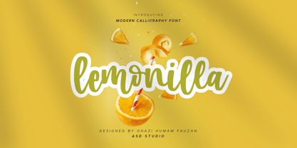 Introducing Lemonilla by Asd Studio Lemonilla is a calligraphy font. Whatever the topic, this font will be a wonderful asset to your font library, as it has the potential to enhance any creation. What's Included? :: Uppercase & Lowercase :: Numbers & Punctuation :: Multilingual Support Enjoy our font, thank you.
 - Kapelka New by ParaType,
$30.00 Kapelka New is a soft and friendly display face based on the principles of writing with a soft pointed brush. Kapelka is suitable for packaging design, children's books headlines and any other domestic and informal purposes. The typeface was designed by Zakhar Yaschin and released by ParaType in 2015. Inspired by the sweetie paper and soft pointed brush writing Zahar Yaschin designed the first version of Kapelka in 2001. It wasn’t on the shelf all these years and even served some time as a corporate identity of “Domashniy” TV channel. But with the benefit of hindsight the author decided to improve, modernize and extend Kapelka. The result was even better than you would expect. The font became even more soft and gentle and also gained some inward nobility due to more evident calligraphic base.
 - Altrincham by URW Type Foundry,
$39.99 Back when shop window decoration was done with a brush, every window designer had his own style. In this vein the sans serif Altrincham was created. But even as a text font, it has stood the test of time, since it is very easy to read even in smaller point sizes, thanks to its relatively large x-height. With the Altrincham Condensed and Altrincham Wide Bold two other fonts have been created to perfectly complement the font family.
 - ITC Aftershock by ITC,
$29.99Bob Alonso’s Aftershock was designed to resemble woodcut or linocut lettering; its irregular shapes make it stand out from its background. Dominant features of this typeface are its generally square forms and its emphasized horizontal strokes. The strong, heavy alphabet makes an overall regular impression in spite of the idiosyncracies of its individual characters. To emphasize the unique contours of the forms, it is best to use Aftershock in larger point sizes and exclusively in headlines. - Onyon by Ingrimayne Type,
$9.00 Onyon is a bizarre typeface with vertical stems that thicken in the middle and narrow at the ends. It was created as an experiment to see what a typeface would look like if the vertical stems were diamond or rhombus shaped. The letters are angular with unusual triangular serifs and they have no curves. It is a harsh, cruel typeface that will make your eyes water if you use it at small point sizes for text.
 - Pausefisk by Bogstav,
$18.00 I wanted to mix the handmade look with both comic and grafitti, but leaving an organic laid back feeling. The result is this: Pausefisk. A font with smooth, handdrawn curves and a total of 6 different versions of each letter. Pausefisk is actually something from my childhood: when the TV-programs where finished (yes, there were no TV after midnight!) the only thing to see was a camera pointed at a fishtank...and that went on for hours!
 - Shababa by Okaycat,
$24.50 Shababa is a hand-drawn 3-D font. The linework is fairly relaxed, mostly smooth with some distressed edges. There is lots of texturing from the pen strokes which becomes more evident at larger point sizes. This looseness enhances the smooth technicality of the properly extruded forms. With extended codepages for Cyrillic, Romanian, Turkish, Baltic & Central Europe, Shababa is suitable for multilingual environments & publications. It also features West European diacritics, ligatures & a sprinkling of dingbats for extra fun!
 - Linotype Zurpreis by Linotype,
$29.99Linotype Zurpreis is a family of two typefaces created by the Swedish designer Bo Berndal in 1999. The letterforms in these faces are made up almost entirely of curves, giving them a slightly handmade, inky, or psychedelic appearance. The round characters dance and bounce along their baseline, lending a fun and uneven quality to text set with the fonts. Linotype Zurpreis is best used in sizes above 12 points, either for short passages of text, or headlines. - Elixir by Fenotype,
$25.00 Elixir is a strong display pack of five styles and total eleven fonts. Elixir fonts are designed to act together but they also work just fine by themselves. Elixir Script is a monoline Script with plenty of OpenType features: Contextual Alternates helps to keep letter connections smooth whereas Swash, Stylistic or Titling Alternates can be used to add flavour to your words! Elixir Brush is a smooth brush script with Contextual Alternates, Swash and Titling Alternates. Elixir Sans is a sturdy all caps font with wider uppercase letters. Elixir Circus is a circus style version of Elixir Sans. Elixir Serif is a rounded slab serif. Elixir Print is a rugged version of Elixir with rough outlines and worn-out print texture.
 - Margit Variable by Schriftlabor,
$324.00 Margit Variable is the single font file of the type family Margit. Containing two-axis, one for setting the weight and another for the italic, this convenient single font file allows you to explore and mix endless typesetting combinations. You can now precisely choose a unique combination using the two-axis sliders, fitting your exact needs. The complete family is included in Margit Variable, containing all the characters and features in Margit, including Latin and Cyrillic scripts, supporting over 200 languages. Margit's letterforms have a contemporary style with pointy edges and friendly curves inspired by old wood-type specimens. Its bold and unapologetic design will be great to use in poster design, giving the content a stronger voice. This font family can bring a unique look to your packaging projects and modern branding solutions. Explore the extensive range of styles and weights that make this typeface ultra-versatile.
 - VLNL Bint by VetteLetters,
$35.00 Kornelis de Vries, a headmaster from the Dutch province of Friesland, cultivated new potato breeds that he named after pupils in his school. In the early 1900s he came up with the tasty Bintje (a Frisian girl’s name) and it became a big success – in Belgium and France it has remained the most popular potato for french fries to this day, more than a century since its introduction. Donald Roos took 10 kilos of fresh Bintje potatoes and cut the Bint typeface by hand with a short, sharp knife. He then inked each character once and printed it twice; the second, lighter printing is accommodated in the lower case alphabet. The Bint family offers a script to make the letters bounce up and down the baseline; with OpenType functionality the font randomly chooses each character from the upper- or lowercase alphabet. ‘Tabular lining figures’ will activate a series of negative numerals in boxes; ‘Discretionary ligatures’ activates specially designed letter combinations like ‘www’ as well as arrows and stars. Bint has a distinct, slightly rough handmade appearance, making it useful for a wide range of designs.
 - Frantic Pace JNL by Jeff Levine,
$29.00 Frantic Pace JNL is based on hand lettering found on the lid of a late 1950s or early 1960s edition of the Print Craft alphabet printing set once manufactured by the Superior Marking Equipment Company of Chicago. The free-form spurred serif lettering is fun and casual; giving the impression of movement or action.
 - Mimeograph Lettering JNL by Jeff Levine,
$29.00 Mimeograph Lettering JNL is based on one of the numerous plastic lettering templates once manufactured by the A.B. Dick Company of Chicago and is available in both regular and oblique versions. The mimeograph utilized a porous drum which inked the backside of a waxed stencil sheet. Unlike traditional stencils which have cut out areas that are directly inked or painted, a mimeo stencil has the area to be printed scratched away by removing the wax coating with a stylus. The resulting image allows the ink from the drum to seep through the sheet and transfer to the blank paper. As with a companion font (Mimeograph Template JNL), the character shapes follow the routed letters of the template, complete with rounded terminals. A previous font release [designed with flat terminals and some alternate characters] is available as Interoffice Memo JNL.
 - Drescher Grotesk BT by Bitstream,
$50.99 Mr. Gogoll's successful revival of Arno Drescher’s Super Grotesk was awarded the 1999 Kurt Christians Award. The Drescher Grotesk family consists of seven roman weights, including a version designed for use at small point sizes. Drescher Grotesk is a classic German geometric design, complete with the original “angled” brackets.
 - Sales Event JNL by Jeff Levine,
$29.00 Sales Event JNL is an inline sans that was modeled from examples of old wood type. Its casual, cheerful style well suits point-of-sale signage or banners, fun headlines and relaxed themes. The font is available in both the regular inline version and the black (solid) version.
 - Arequipa by Alan Meeks,
$45.00 Arequipa is a Latin font with serifs generally top left. The style is influenced by Aztec and Inca designs the Bold weight is excellant for Headline and the lighter weights work well in limited text. The geometric shape of the serifs, ij dots, full point, comma and cap Q give the font an unusual and distinctive look.
 - Digital Delivery by Comicraft,
$49.00 No, we’re not referring to the strange phenomenon of babies who are born pinkies first, and we’re not talking about downloading oven-fresh loaves of bread byte by byte! If you have any UNDERSTANDING of the name of this font then you’re in good shape, because we won’t be REINVENTING it any time soon. Created by John Roshell for the incomparable Scott McCloud to letter REINVENTING COMICS, this friendly & easy-to-read pen style later appeared on the letters pages of ELEPHANTMEN.
 - Paksa by Jipatype,
$17.00 Paksa is a decorative sans-serif typeface. The name of this typeface is derived from the Thai word that means “bird.” It is suitable for use in text headlines, sub-headlines, packaging, posters, and other print media.

