10,000 search results
(0.046 seconds)
- Austten by Wacaksara co,
$20.00 Austten is a bold connected script font with a clear style and dramatic movement this font is great for your next creative project such as logos, printed quotes, invitations, cards, product packaging, headers, Logotype, Letterhead, Poster, Apparel Design, Label, and etc. Austten comes with uppercase, lowercase, numerals, accents (Multilingual characters), punctuations and so many variations on each characters include opentype alternates, common ligatures and also additional swash to let you customise your designs.
 - Super Love Christmas by Prioritype,
$15.00 Here comes a special Christmas font with a beautiful and unique shape equipped with various alternative characters and of course there are extra bonuses. This font makes it easy for you in various projects that you create. Can be applied to print and digital media such as invitations, clothes, crafts, packaging, and there is still so much to explore. For reference, see preview. Features: -Uppercase -Lowercase -Numeral -Punctuation -Multilingual -Ligature -Alternate -Extra Bonus
 - Howling Wolf by Invasi Studio,
$19.00 Howling Wolf is all caps aggressive dirty brush font special for your Display Design. With a bold aggressive style, it adds a bold touch to your projects and will inspire you to create something bold for your project. Besides that, this font is also equipped with Alternative Characters, Standard Ligatures, and multi-language support. Howling Wolf is ideal for headings, flyers, greeting cards, product packaging, book covers, printed quotes, logotype, and album covers.
 - Relaxy by HIRO.std,
$11.00 Relaxy is a Brush Handwritten Script. This font describes about funny, dynamic, informal, humanist, easy going, and will bring a good combination for your works. FEATURES - 3 alternates Uppercase and Lowercase letters - Numbering and Punctuations - Multilingual Support - Works on PC or Mac - Simple Installation - PUA Encoded Characters USE Relaxy works great in any poster, book, magazine, typeface, quotes, print, social media posts, e-book , and any projects that need semi casual and informal taste.
 - Molard Two by Putracetol,
$20.00 Molard - Modern Various Font. This sans-serif typeface offers a diverse range of styles, featuring two distinct weights and versions – clean and textured. With a selection of three texture levels, Molard presents a total of eight fonts in its collection. Its contemporary and robust aesthetic adds an assertive touch to your projects. Perfectly suited for logo creation, branding, labels, quotes, printing, magazines, posters, film titles, and more, Molard empowers your creativity to flourish.
 - Sparkling by Olivetype,
$18.00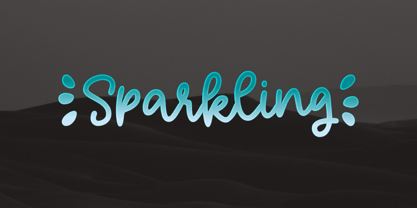 Sparkling is a relaxed, fashionable, and cute monoline script font. It looks great on a variety of designs, such as print design, stickers, wedding invitation, apparels, logos, and so on This font is supporting multi languages, which includes: Afrikaans Albanian Catalan Danish Dutch English Estonian Finnish French German Italian Norwegian Portuguese Spanish Swedish Zulu. You will get : Basic Latin A-Z, a-z, numbers, symbols, and punctuations. Accented Characters : ÀÁÂÃÄÅÆÇÈÉÊËÌÍÎÏÑÒÓÔÕÖØŒŠÙÚÛÜŸÝŽàáâãäåæçèéêëìíîïñòóôõöøœšùúûüýÿžß Thank you
 - Monley by Flawlessandco,
$9.00 Monley is a groovy retro font in a bold design, so it fits any retro design project. There's a few connected letters and also alternate characters suitable for any graphic designs such as branding materials, t-shirt, print, business cards, logo, poster, photography, quotes, etc. This font has multilingual support, and besides uppercase A-Z and lowercase a-z, it contains alternate characters, numbers 0-9, and punctuation. If you need help, just write me!
 - Byassa by Gassstype,
$23.00 Hello Everyone, introduce our new product Font Byassa it is Quick Brush Font.This is a Textured Natural Style and classy style with a clear style and dramatic movement. This font Byassa is great for your next creative project such as logos, printed quotes, invitations, cards, product packaging, headers, Logotype, That is has charming, authentic and relaxed characteristic more natural look to your text. You can activate 4 Ligatures glyphs and 9 Alternates glyphs OpenType panel.
 - Branch by Peliken,
$15.00 Branch font with Cyrillic support is perfect for branding, Slavic motives, Russian menu design and many more Font includes a full set of gorgeous uppercase and lowercase letters, numbers, a large selection of punctuation. You can use this font for design logos, quotes prints on t-shirts and other. Ethnic serif font. Authentic slavic stylized alphabet bold symbols. Creative minimal latin character set. Please NOTE - Mock ups and photo are NOT included.
 - Fabitha Script by stiplinestudios,
$11.00 Proudly Present .. Fabitha Script Fabitha Script goes with Modern and Natural Calligraphy, ready to give your design project with Fresh and Fabulous Style. This font have an 177 Standard Glyph + 109 Glyph Alternate in Open Type Standard Format. Suitable for various purpose such as digital lettering, headings, logos, wedding invitation, t-shirt, letterhead, signage, lable, news, posters, badges, branding materials, t-shirt, print, business cards, quotes, logo, poster, and suitable for any graphic design project.
 - Ronet by yasireknc,
$10.00 It can be tricky to find typefaces that can convey the feeling of personal warmth that comes from a handwritten note, custom brandings, special series of products, especially as we type more and more and write with a pen or pencil less and less. To add some more of that warmth to a font, I’ve made Ronet. A duo font based on the my handwriting. Double eponymous styles of the font —Ronet and Ronet Alternative— each have a unique flavor with its own rhythm and character. It can be used on branding designs, product labels, invitation cards, social purposes which is bloggers, influencers but they were capable of so much more, and I’m happy to share them for general use. Ronet has extraordinary alternative characters, that makes these fonts so impressive. These two styles have dynamic substitution, alternates, and beautiful kerning! Nevertheless, they each support an impressive range of languages using the Extended Latin alphabets and because they were designed to work well in a simple tool, a rare feature of these fonts is that they look just as good no matter where you use them. LOTS of writing, and then even more care once I developed and refined digital outlines from the samples. Ronet and Ronet Alternative each wrote pages and pages of letters to produce lots of examples for comparison and selection, in order to get the most authentic overall texture that captured the spirit of my left hand.. Ronet feels friendly and personal, like a neighbor or local shopkeeper who always seems happy to see you. This will perk up your social feeds in a snap. Start with Ronet and just add in your design to make it perfect. What started with a simple pen and paper has become a diverse and ever-expanding creative outlet that blends hand-drawn creativity with cutting-edge technology — and the end results are popping out everywhere, from advertising to design and decor to art and DIY.
 - Winter Glows by Fargun Studio,
$14.00 Thanks for checking out Winter Glows! A fabulously fun yet elegant script font with tons of energy, allowing you to create beautiful hand-made typography in an instant. With extra bouncy curves & loops, Winter Glows is guaranteed to make your text stand out - perfect for logos, printed quotes, invitations, cards, product packaging, headers and whatever your imagination holds. What's really awesome is that Winter Glows comes with a complete set of lowercase alternates, which allows you to create even more authentic custom-feel text. Another great feature is the bonus ornaments font, which allows you to add some really unique and elegant finishing touches to your script text. Winter Glows Family includes 5 font files; Winter Glows • A handwritten script font containing upper & lowercase characters, numerals and a large range of punctuation. Winter Glows Alt 1 • This is a second version Winter Glows, with a completely new set of both lower and uppercase characters. this versions do not contain as many glyphs as the Regular style. If you wanted to avoid letters looking the same each time to recreate a custom-made style, or try a different word shape, simply switch to this font for an additional layout option. Winter Glows Alt 2 • This is a second version Winter Glows, with a completely new set of both lower and uppercase characters. this versions do not contain as many glyphs as the Regular style. If you wanted to avoid letters looking the same each time to recreate a custom-made style, or try a different word shape, simply switch to this font for an additional layout option. Winter Glows Alt 3 • This is a second version Winter Glows, with a completely new set of both lower and uppercase characters. this versions do not contain as many glyphs as the Regular style. If you wanted to avoid letters looking the same each time to recreate a custom-made style, or try a different word shape, simply switch to this font for an additional layout option. Winter Glows Extras • A set of hand-drawn swashes & doodles, the perfect finishing touch to underline your Winter Glows text & doodles for perfect lettering logos. Simply install this as a separate font, select it from your font menu and type any A-Z, a-z & 0-9 character to create a swash & Doodles. Standard Ligatures • Are also available for several lowercase characters (double-letters which flow more naturally). Ligatures will automatically replace the standard letter pairs whenever available, when using any OpenType capable software.
 - Horse Drawn Carriage JNL by Jeff Levine,
$29.00 Picture if you will, a balmy autumn evening in Manhattan during the 1930s and a well-dressed couple out on the town. They hail one of the hansom cabs located near Central Park and climb in for an old-fashioned romantic ride around the green. Such are the type of images the stylized Art Deco hand-lettering comprising Horse Drawn Carriage JNL evokes. The inspiration for this font was the title card for a 1935 Bette Davis feature entitled "The Girl from 10th Avenue".
 - Shiver by Comicraft,
$29.00 Is your character vibrating slightly or feeling shuddering feverishly, as if from fear or excitement? Is he or she a warm-blooded animal experiencing the early onset hypothermia? Is your protagonist experiencing a pleasurable sensation of anticipation or maybe he/she has a fragment or splinter of glass or stone in the tip of his/her finger. Any which way, Comicraft now has the font for you to effectively convey the way your characters are feeling to comic book readers everywhere... It'll be just like they're listening to a track by Coldplay while trying to shake off the flu in a haunted house. See the families related to Shiver: Shake.
 - StageDive - Unknown license

- Takhie by Nantia.co,
$8.00 The Takhie Pro Multilingual Brush Font is a 100% hand-drawn decorative font with which you can achieve a handwritten-type lettering feeling. T This typeface is a multilingual lettering font with Greek (of course), Latin characters and diacritics. The style of the font is perfect for your modern graphic design needs. Also, the font has a really nice flow so you use it in a large text if you want to give them a touch of personality. In addition, this typeface can be used on social media content, for branding or packaging. Also, this font is perfect for crafting and invitations material.
 - Duck Footprint by AaAAaAlena,
$10.00 This font looks like a natural gel pen handwriting. It supports both uppercase and lowercase Cyrillic and Latin alphabets, numeral, punctuation, symbols, currencies. The story of creating is short: I made a font that would support the concept of the website. And then it seemed to me that this font could have more uses, so I decided to share it. You can use it for any creative project, I’m not going to list examples not to limit you. I am sure that with this font you will convey the vibe you want. Just use imagination, and your masterpiece will look perfect)
 - Spathe Pro by DBSV,
$10.00 About family “SpathePro” Spathe(Sword) the guy… There are many versions of the expression spathe, some of them are: A guy who says things by name we say is a sword, is correct in explaining a situation or an event. Sometimes we say again that a woman is beautiful and has a body like a sword!! It is one of the four versions of the pack of cards for example "ace sword". We also say of someone that he won a case with his sword (his sword), with transparency and knowledge of the case. It is also one of the oldest weapons used by humans in wars, sometimes used by the defendants to resolve their differences or for reasons of honor. While even today it is an Olympic game as fencing. This is a font as sharp as a swordfish… This series is composed and includes ten fonts with 630 glyphs each, with true italics, true Sloping and supports of course: Latin, Greek & Cyrillic.
 - Giambattista by Wiescher Design,
$39.50 Giambattista is a long-time project of mine finally come to an end. After redesigning all of Giambattista Bodoni's work and then some additional cuts I started a long time ago with this Non-Bodoni Bodoni. The idea came to me while redesigning the original Chancellerosa (chancery). I thought Bodoni just didn't have the right approach to a chancery, this was just not his cup of tea! Maybe that is why he never used the Chancellerosa very much for his own printshop in Parma. So I thought someone has to design a script, that looks like Bodoni could have designed it but is more lively than his. Over the years I have been working on and off on the face and it turned out to become three typefaces which can be freely mixed. Here is my modern version of a script in the style of Giambattista, meant as an hommage, I called it Giambattista. Your modern scribe Gert Wiescher
 - Fundstueck by Ingo,
$12.00 Inspired by a find a coarse but decorative font was created. "Fundstueck" ist the German term for it. Fonts can be so simple. That is what I was thinking as my attention was turned to this rusty piece of metal. Only a few centimeters in size, I couldn’t imagine which purpose it might truly serve. But my eyes also saw an E, even a well-proportioned E: a width to height ratio of approximately 2/3, black and fine strokes with a 1/2 proportion — could I create more characters on this basis? Thought it, did it. The form is based on a 5mm unit. The strikingly thick middle stroke of E suggests that the emphasis is not necessarily placed on the typical stroke, and likewise with the other characters. But if the font is going to be somewhat legible, then you cannot leave out slanted strokes completely. Eventually I found enough varying solutions for all letters of the alphabet and figures. A font designed in this way doesn’t really have to be extremely legible, which is why I forwent creating lower case letters. Nevertheless, Fundstueck still contains some diverse forms in the layout of upper and lower case letters. Thus, the typeface is a bit richer in variety. By the way — the “lower” letters with accents and umlauts stay between the baseline and cap height. And with that, you get wonderful ribbon-type lines.
 - Vallassina by Wilton Foundry,
$29.00 Vallassina is named after Vallassina, a village in the valley of the upper tract of the river Lambro in northern Italy. The most important settlement in the area is the town of Asso, from which the valley takes its name. Spasell is a slang of Insubric language, spoken until 19th century by inhabitants of Vallassina, when they used to go out from the valley for business and they didn't want to be understood by the people. What makes this valley unique is that the locals use a unique whistle language to communicate to each other. Vallasina is confidently irreverent yet curiously attractive. How many ways can you use Vallassina to whistle to your neighbors? Vallasina is available in OpenType format.
 - Flefixx by Sun Young Oh,
$54.00 Flefixx is a typeface designed to support a project "Flefixx", an idiosyncratic visual language and typeface system that unfolds narratives based on common combinations of letters. In this visual language, just as individual letters come together like puzzle pieces to form different meanings or words based on combinations, the typeface is also constructed from fragmentary elements, each playing a distinct role as if they are individual pieces. The intentional exposure of the intersections of these fragments emphasizes the typeface's creation through interconnected elements. Furthermore, diacritics and dots are strategically positioned as ornaments, enhancing their presence within the gaps between letters. This concept aligns with the theme of composition and connectivity among fragments, allowing strong rhythmic patterns to emerge as letters and symbols blend in a paragraph. Additionally, the prominent and bold punctuation marks serve to provide pauses and clarity within sentences that incorporate both letters and the visual language. They contribute to articulating sentence structure amidst the dynamic flow of sentences with combined characters and visuals.
 - Guyon Gazebo by Alifinart Studio,
$19.00 Introducing Guyon Gazebo, the luxurious display font that will elevate your designs to new heights. Get ready to make a bold statement with its unique style, perfect for captivating headlines, branding that stands out, eye-catching promotional materials, or adding a touch of elegance as a stylish text overlay to any background image. With its high contrast strokes, slender stem, and pointed terminals, Guyon Gazebo exudes sophistication and charm. Let your creativity flow as you explore the extensive collection of standard and discretionary ligatures, ensuring your designs are irresistibly attractive and visually stunning. Embrace the jovial spirit of "Guyonan" as this font's name suggests, originating from the Javanese language. Inspired by the traditional rural gazebo, where locals gather to exchange jokes, Guyon Gazebo infuses a sense of lightheartedness into your designs. Included in the package are Guyon Gazebo Regular and Italic styles, along with a full set of basic Latin characters, ligatures, numerals, and punctuation marks, providing you with all the tools you need to bring your vision to life. Don't miss out on this opportunity to enhance your design projects with Guyon Gazebo. Take your typography to the next level and let your creativity shine. Get Guyon Gazebo today and unlock a world of endless possibilities. Ready to make a statement? Purchase Guyon Gazebo now and let your designs speak volumes! What’s included: Guyon Gazebo Regular & Italic Full set of basic Latin+ Ligatures Numeral & punctuation Multilingual Support: Afrikaans, Albanian, Basque, Bemba, Bena, Breton, Catalan, Chiga, Colognian, Cornish, Croatian, Czech, Danish, Dutch, Embu, English, Esperanto, Estonian, Faroese, Filipino, Finnish, French, Friulian, Galician, German, Gusii, Hungarian, Indonesian, Irish, Italian, Kabuverdianu, Kalaallisut, Kalenjin, Kamba, Kikuyu, Kinyarwanda, Latvian, Lithuanian, Lower Sorbian, Luo, Luxembourgish, Luyia, Machame, Makhuwa-Meetto, Makonde, Malagasy, Maltese, Manx, Meru, Morisyen, North Ndebele, Norwegian Bokmål, Norwegian Nynorsk, Nyankole, Oromo, Polish, Portuguese, Quechua, Romanian, Romansh, Rombo, Rundi, Rwa, Samburu, Sango, Sangu, Scottish Gaelic, Sena, Serbian, Shambala, Shona, Slovak, Soga, Somali, Spanish, Swahili, Swedish, Swiss, German, Taita, Teso, Turkish, Upper Sorbian, Uzbek (Latin), Volapük, Vunjo, Walser, Zulu. Typeface Story: The name "Guyon" derives from the Javanese language and is often associated with humor or joking. In rural areas, there is a traditional gazebo called "Cakruk" where locals gather in the afternoon or evening to exchange jokes (known as "guyonan"). This font's name pays homage to the jovial atmosphere found in these communal spaces. Thank you for choosing Guyon Gazebo! If you have any questions or need assistance, feel free to reach out to us. ------------------------------ Alifinart Studio alifinart@gmail.com www.alifinart.com Instagram | Behance
 - Architectuur NF by Nick's Fonts,
$10.00Letterpress type, crafted by H. Th. Wijdeveld, founding editor and chief designer of the legendary Dutch art and architecture magazine Wendingen, provided the inspiration for this typeface. The original design graced a 1925 issue examining the work of Frank Lloyd Wright, and Wijdeveld created his typeface by assembling bits of standard brass rules. This version features several of the meanders typical of Wijdeveld’s graphic design in the dagger, double dagger, ASCII tilde and ASCII circumflex positions. Both versions of the font include 1252 Latin, 1250 CE (with localization for Romanian and Moldovan). - Affair by Sudtipos,
$99.00 Type designers are crazy people. Not crazy in the sense that they think we are Napoleon, but in the sense that the sky can be falling, wars tearing the world apart, disasters splitting the very ground we walk on, plagues circling continents to pick victims randomly, yet we will still perform our ever optimistic task of making some little spot of the world more appealing to the human eye. We ought to be proud of ourselves, I believe. Optimism is hard to come by these days. Regardless of our own personal reasons for doing what we do, the very thing we do is in itself an act of optimism and belief in the inherent beauty that exists within humanity. As recently as ten years ago, I wouldn't have been able to choose the amazing obscure profession I now have, wouldn't have been able to be humbled by the history that falls into my hands and slides in front of my eyes every day, wouldn't have been able to live and work across previously impenetrable cultural lines as I do now, and wouldn't have been able to raise my glass of Malbeck wine to toast every type designer who was before me, is with me, and will be after me. As recently as ten years ago, I wouldn't have been able to mean these words as I wrote them: It’s a small world. Yes, it is a small world, and a wonderfully complex one too. With so much information drowning our senses by the minute, it has become difficult to find clear meaning in almost anything. Something throughout the day is bound to make us feel even smaller in this small world. Most of us find comfort in a routine. Some of us find extended families. But in the end we are all Eleanor Rigbys, lonely on the inside and waiting for a miracle to come. If a miracle can make the world small, another one can perhaps give us meaning. And sometimes a miracle happens for a split second, then gets buried until a crazy type designer finds it. I was on my honeymoon in New York City when I first stumbled upon the letters that eventually started this Affair. A simple, content tourist walking down the streets formerly unknown to me except through pop music and film references. Browsing the shops of the city that made Bob Dylan, Lou Reed, and a thousand other artists. Trying to chase away the tourist mentality, wondering what it would be like to actually live in the city of a billion tiny lights. Tourists don't go to libraries in foreign cities. So I walked into one. Two hours later I wasn't in New York anymore. I wasn't anywhere substantial. I was the crazy type designer at the apex of insanity. La La Land, alphabet heaven, curves and twirls and loops and swashes, ribbons and bows and naked letters. I'm probably not the very first person on this planet to be seduced into starting an Affair while on his honeymoon, but it is something to tease my better half about once in a while. To this day I can't decide if I actually found the worn book, or if the book itself called for me. Its spine was nothing special, sitting on a shelf, tightly flanked by similar spines on either side. Yet it was the only one I picked off that shelf. And I looked at only one page in it before walking to the photocopier and cheating it with an Argentine coin, since I didn't have the American quarter it wanted. That was the beginning. I am now writing this after the Affair is over. And it was an Affair to remember, to pull a phrase. Right now, long after I have drawn and digitized and tested this alphabet, and long after I saw what some of this generation’s type designers saw in it, I have the luxury to speculate on what Affair really is, what made me begin and finish it, what cultural expressions it has, and so on. But in all honesty it wasn't like that. Much like in my Ministry Script experience, I was a driven man, a lover walking the ledge, an infatuated student following the instructions of his teacher while seeing her as a perfect angel. I am not exaggerating when I say that the letters themselves told me how to extend them. I was exploited by an alphabet, and it felt great. Unlike my experience with Ministry Script, where the objective was to push the technology to its limits, this Affair felt like the most natural and casual sequence of processions in the world – my hand following the grid, the grid following what my hand had already done – a circle of creation contained in one square computer cell, then doing it all over again. By contrast, it was the lousiest feeling in the world when I finally reached the conclusion that the Affair was done. What would I do now? Would any commitment I make from now on constitute a betrayal of these past precious months? I'm largely over all that now, of course. I like to think I'm a better man now because of the experience. Affair is an enormous, intricately calligraphic OpenType font based on a 9x9 photocopy of a page from a 1950s lettering book. In any calligraphic font, the global parameters for developing the characters are usually quite volatile and hard to pin down, but in this case it was particularly difficult because the photocopy was too gray and the letters were of different sizes, very intertwined and scan-impossible. So finishing the first few characters in order to establish the global rhythm was quite a long process, after which the work became a unique soothing, numbing routine by which I will always remember this Affair. The result of all the work, at least to the eyes of this crazy designer, is 1950s American lettering with a very Argentine wrapper. My Affair is infused with the spirit of filete, dulce de leche, yerba mate, and Carlos Gardel. Upon finishing the font I was fortunate enough that a few of my colleagues, great type designers and probably much saner than I am, agreed to show me how they envision my Affair in action. The beauty they showed me makes me feel small and yearn for the world to be even smaller now – at least small enough so that my international colleagues and I can meet and exchange stories over a good parrilla. These people, whose kindness is very deserving of my gratitude, and whose beautiful art is very deserving of your appreciation, are in no particular order: Corey Holms, Mariano Lopez Hiriart, Xavier Dupré, Alejandro Ros, Rebecca Alaccari, Laura Meseguer, Neil Summerour, Eduardo Manso, and the Doma group. You can see how they envisioned using Affair in the section of this booklet entitled A Foreign Affair. The rest of this booklet contains all the obligatory technical details that should come with a font this massive. I hope this Affair can bring you as much peace and satisfaction as it brought me, and I hope it can help your imagination soar like mine did when I was doing my duty for beauty.
 - Solpera by Storm Type Foundry,
$32.00This type face fills one of the gaps between the world of Roman alphabets and that of linear alphabets. The first to be designed was the set of upper-case letters. The expression of these characters cannot conceal that they were originally intended only for the sculptor's use, as a type face for three-dimensional inscriptions. Their width proportions reflect a dialogue between the contemporary feeling and the legacy of classical Roman inscriptions. The type face was later complemented with a set of lower-case letters and elaborated into further designs. Its clear, concise letter forms end with small serifs which not only make the type face more refined, but above all anchor the individual letter signs visually to the horizontal of the text line. The austere construction of the majority of the letters is balanced by the more exuberant, humanizing forms of the most frequently used letters "a"; "e". (The three variants of the lower-case "e" enable to create rhythmically differentiated texts.) The letters in which a straight stroke is connected with an arch are designed in two ways. That means that the letters "n", "h","m" and the group of letters "b","d","p","q" are conceived in a different way. Thus an interesting tension is created in the structure of the text, which, however, does not endanger legibility. The economizing, slightly narrowed design of this type face predetermines its use for the setting of usual texts. In larger sizes, however, it produces a rather serious, even solemn, impression. - Usagi Faux by Twinletter,
$15.00 Usagi is a display font created with original handwriting. It was created with the Japanese style in mind, therefore it’s ideal for Japanese-themed projects. If you utilize this font in all of your projects, you will achieve a stunning, appealing, and great result. Logotypes, food banners, branding, brochure, posters, movie titles, book titles, quotes, and more may all benefit from this font. Of course, using this font in your various design projects will make them excellent and outstanding; many viewers are drawn to the striking and unusual graphic display. Start utilizing this typeface in your projects to make them stand out
 - Onari Faux by Twinletter,
$15.00 ONARI is a display font with a strong character, similar to the original Japanese letters, and it has a Japanese flair. This typeface is ideal for your project since it will make your work look stylish, understandable, and, most importantly, it will fascinate your audience. Logotypes, food banners, branding, brochure, posters, movie titles, book titles, quotes, and more may all benefit from this font. Of course, using this font in your various design projects will make them excellent and outstanding; many viewers are drawn to the striking and unusual graphic display. Start utilizing this typeface in your projects to make them stand out
 - KOGAMA by Twinletter,
$15.00 Introducing Kogama, our newest Japanese-style inspired font, which was created specifically to carry the Asian font concept and will make your project look beautiful and appealing. Start utilizing this typeface to make your project stand out and be well received. Logotypes, food banners, branding, brochure, posters, movie titles, book titles, quotes, and more may all benefit from this font. Of course, using this font in your various design projects will make them excellent and outstanding; many viewers are drawn to the striking and unusual graphic display. Start utilizing this typeface in your projects to make them stand out. Caps only fonts.
 - Fiasco Cursive Font by BeckMcCormick,
$14.00 Introducing Fiasco Script, a bouncy modern calligraphy font. Fiasco is a clean cursive font with a feminine aesthetic, making it a perfect choice for designing feminine logos & branding, cute paper products like wedding invitation suites, or for displaying headlines on your website. Fiasco can also be used for other print design like magazines and flyers or printed marketing materials. This font can also be used for digital marketing materials and social media items! Fiasco Script’s clean edge makes it a great candidate for craft projects on your Cricut or Silhouette machine; it cuts beautifully! Fiasco Script includes: - full upper + lowercase characters - numbers + punctuation - 2 ligatures — ox, tt - PUA-encoding Extensive Language Support: Western European, Central European, South Eastern European, South American, Oceanian, Vietnamese, Esperanto Fiasco Script can be used with graphic design programs such as Illustrator or Photoshop, word processing programs like Pages or Word, Design Space for Cricut, Silhouette, Procreate, Canva Pro, Glowforge, GoodNotes, & more. This font is an installable for desktop & laptop machines, as well as iPads or iPhones. See below for links to help with installation.
 - Nvma Titling by Stone Type Foundry,
$49.00 Nvma is based on Roman letterforms which appeared during the period from the earliest extant examples in the sixth or seventh century BC until the end of the third century BC. For Nvma the J, U and W had to be fantasies as they did not exist until much later, similar to the G, numerals and other non-alphabetic signs in the font. Thus not all of the archaic forms are represented in Nvma. Nvma was designed to work with Magma, as it matches the weights and heights for Magma Thin and Magma Titling Thin.
 - Bergamot by Emily Lime,
$20.00 Bergamot was inspired by vintage apothecary labels, but this font is actually quite modern in both style and effects. It features all caps plus 2 sets of alternates (so, 4 total variations for each letter). The coolest part… they intermingle randomly as you type! Ok, so it’s not exactly random, but that’s the easiest way to explain what you'll see. The letters are actually coded to rotate with their respective alternates. This effect is both useful or can be purely for fun! Let’s talk about the useful part for a sec… Repeating characters are often a dead giveaway that a font is being used. And sometimes we don't want that, right? We want to give the illusion that our design has been custom hand-lettered for a particular project… and can't be recreated by another. That’s exactly what this font aims to do. The randomizing effect is built into the Contextual Alternates feature and will likely be “on” automatically in your chosen program. Alas, even random doesn't guarantee that like characters won't appear in close proximity. So for those of you with access to the “Stylistic Alternates” feature, easily change repeated letters that are near each other simply by turning this feature “on”. Voila! Custom…hand…lettering. Bergamot also features separate files for Frames & Ornaments. Check them out below.
 - Garstang Engraved by Greater Albion Typefounders,
$18.00 Garstang Engraved is the latest in Greater Albion's series of ‘wood type’ inspired fonts. Garstang Engraved is a hand-cut Roman, suggesting the late Victorian era, but the type of thing that continued in use well into the twentieth century. If you want a title face that has versatility and suggests a past history, as well as the art of finely cut wood type, then this is it!
 - P22 Komusubi by IHOF,
$24.95 Komusubi is a new font family from Hajime Kawakami. It features Latin as well as Katakana and Hiragana. This lively display font comes in regular and bold for all three alphabets. In Japanese, Komusubi means to tie up a string or ribbon lightly. The Nipponian lyrical atmosphere of the word "Komusubi" reflects the casual tone of the font itself. There is also a "Komusubi" rank of the Japanese SUMO.
 - Monarque by The Paper Town,
$27.00 Monarque is an elegant typeface. It is crafted with fine details that would make your typography stand out. Large x-height, high stroke contrast, rounded curves & long sharp serifs create together a dramatic look that would succeed in delivering a strong message with elegance. The true italic’s are designed to work harmoniously with the roman for a striking contrast within a line. Originally created to be an all-caps only, the font includes a lot of uppercase ligatures that are thought to flow in naturally and achieve a legible composition. OpenType features include a stylistic set of alternates, contextual alternates, discretionary and standard ligatures, old style figures, small caps and case-sensitive forms. The type family is available in 5 weights for a total of 10 fonts and supports over 200 Latin-based languages, making Monarque a solid powerful typeface ready for any kind of project from editorial design, branding, magazines, logos and more. As Monarque is only available as a display (for now) its full potential operates at its best with headlines or short to medium-length texts.
 - Stubble by Aah Yes,
$12.00Stubble is a distressed grunge font with many useful variations that make things easy. It comes in both a Regular and Bold version, and a Smudged version as if the print block has slipped a little bit just at the vital moment. Also there’s 2 jumbled versions with the letters and numbers, and some punctuation, at odd angles and slightly off-whack; there’s 2 versions with little bits of overprint on most of the main characters (as if the corners of the block or stamp have just caught the paper); a couple of Caps Only versions; plus condensed and expanded versions of the main faces. The Bold version is not an exact expanded version of the Regular version, please note, the characters are different (i.e. the misprinting is different) in the two weights. Western and Central European accented characters are included, and there’s a set of replacements for double-letter combinations such as bb, dd and OO, TT, so that 2 different letters will appear - which avoids having exactly the same grunge letter appearing twice in succession (20 or more pairings for each case, all the pairings that reasonably exist) which work as ligature replacements. The whole family constitutes a comprehensive package that offers a great variety of ways of presenting a grunge typeface for display, headlines and posters, while maintaining the thread of the same sans-serif style. The zip package contains both the TTF and OTF versions of the font. Install only one version on the same machine, installing both versions may produce all sorts of erratic behavior. - Caesario by Scriptorium,
$18.00Caesario is Mike Scarpitti's newest font, based on the famous inscriptory lettering on the Trajan column in Rome. After searching through many sources, he turned to the drawings of the original column lettering made by Frederic Goudy in 1936. The superior quality of these drawings combined with the Mike's faithful reproduction of the characters forms make Caesario the best available representation of the style of this famous incription. - Abrect by Hackberry Font Foundry,
$24.95 My first font for the summer of 2009, Abrect is a new sans serif font where I try to maximize the x-height and keep the design fresh and personal. It fits in with my continuing objective of designing book fonts that I can really use. Abrect is a tangent for me just taking an idea out to its end. In particular, it is a radical modification of my first font in 1993, Nuevo Litho. The hand-drawn shapes vary a lot, many pushing the boundaries of the normal character. With many of the new releases I see, the digital perfection is getting pretty extreme. It’s looking like a Rococo stage of development for many with decoration taking over from function. I'm consciously trying to head a different direction. This is not a normal font for me in that it has caps, lowercase, with the appropriate figures for each case, no small caps. This is the first time I have skipped small caps in over a decade. This font has all the OpenType features in the display set for 2009 except for the small caps. There are several ligatures for your fun and enjoyment: bb gg ff fi fl ffi ffl ffy fj ft tt ty Wh Th and more and many of them are experimental in form. Enjoy!
 - QEWUR by Twinletter,
$15.00 Introducing QEWUR, our newest font, an authentic font with a Japanese style theme, with an attractive and decent font shape to make your project elegant, special, gorgeous, and charming, and easy to remember for the audience. Logotypes, food banners, branding, brochure, posters, movie titles, book titles, quotes, and more may all benefit from this font. Of course, using this font in your various design projects will make them excellent and outstanding; many viewers are drawn to the striking and unusual graphic display. Start utilizing this typeface in your projects to make them stand out.
 - Arsapia by URW Type Foundry,
$49.99 Michael Hoffmann manufactures digital fonts for 30 years. At URW++ he contributed to the technological progress. Over the years, he also specialized in the ideal representation of fonts on screen and the complex assembly of international fonts with scripts of all countries. In his latest project he put the emphasis on developing a highly readable typeface. Less interested in the design as in the functionality of this typeface, he designed Arsapia which he has now installed as a system font on all his computers. Michael Hoffmann studied Japanology at the University of Hamburg and traveled in the early years of his professional activity frequently to Japan, there to train the IKARUS font production tools to Japanese customers. In his spare time he plays guitar or golf depending on the weather. The typeface Arsapia has been designed in such a way that all three font styles Light, Regular and Bold have the same width. When a user therefore opts for the use of Arsapia Light, even though he has already written his text in Regular, nothing changes with respect to the letter tracking. When choosing the Bold for emphasis: Nothing changes except the blackness of the letters. A font change does not engender unwanted line and page breaks of itself. All letters can be clearly distinguished from each other. 1 l I O 0 are all different. For programmers and lovers of monospaced fonts Michael Hoffmann has developed a fourth typeface: Arsapia Mono. This is the perfect terminal font.
