10,000 search results
(0.042 seconds)
- Baisteach by Fontdation,
$15.00 Introducing Baisteach, our latest all-caps vintage serif. Inspired from early 1900's typography that often used in sign paintings, packaging labels, and advertisements. This typeface is made of sharp serifs, clean edges and strong form, give you a simple yet impactful feels. Suits best for headline, logo/logotype, and many more. If you're a fan of classic typography, make sure you add this font to your design toolbox. Last but not least, don't forget to activate its OpenType Feature to get the wider selection of letter combinations.
 - Grand Dae by Say Studio,
$15.00 Grand Dae is a Modern Elegant Serif Typeface. This font is perfect for branding, logos, social media, prints, stickers, shirts, svg files and more! Grand Dae is unique as it can be used for a variety of design styles. It fits in wonderfully for free-spirited, boho designs and also for more classy editorial looks! There are a lot of fun stylistic alternates available to use with this font. These letters are embedded into the font file and easily accessible in programs such as photoshop and illustrator. Thanks, Have a Wonderful Day, Say Studio
 - Tugafy by Alcode,
$20.00 Tugafy is a Decorative display font with ligatures also complete multilingual glyphs. Tugafy come with Regular style, it will make this typeface can be used in all design projects and works perfectly for pairing with script typeface or handmade fonts, Headlines, Posters, Packaging, T-shirts, Postcards, Invitation, Wedding Sign, Sign Painting, Signboard, and much more. Try Tugafy, enjoy the richness of OpenType features and let her fun and elegant excitement make you happy and enhance your creativity! You can use this font very easily. • Multilingual Support And Special Ligatures Pairing with Dalgond Script
 - Glee Laughter by Sohel Studio,
$14.00 Lodge Introducing our retro chunky serif font, a bold and nostalgic typeface that brings a classic and timeless design to your projects. With its thick, distinctive serifs and strong character set, this font is perfect for creating eye catching headlines, vintage posters, and stylish branding. Embrace the 1970s-inspired aesthetics with this unique typography that adds a touch of nostalgia to your designs. Whether you're working on print materials, display graphics, or editorial layouts, our retro chunky serif font will give your projects a bold and timeless appeal.
 - Rindu Alam by Stringlabs Creative Studio,
$25.00 Rindu Alam is inspired by classic typography and brings its own unique style to any design project. This fantastic script font is best suited for headlines of all sizes, as well as for blocks of text that have both maximum and minimum variations. Whether it’s for web, print, moving images or anything else – Rindu Alam will look spectacular. This font is PUA encoded which means you can access all of the glyphs and swashes with ease! It also features a wealth of special features including alternate glyphs and ligatures.
 - Mirya Pryka by Scratch Design,
$12.00 Mirya Prika is a beautiful brush handwritten script font. It is 100% hand-made. It is made for professional project branding and is suitable for various designs, such as wedding designs, posters, banners, logos, book covers, headings, advertisements, printed products, merchandise, social media, and more. Every letter has a unique and beautiful touch and looks natural like your own handwritten. This font also included many features such as ligatures, swashes and multilingual support. Hope you enjoy our font and we believe this font will give you the best for your design!
 - Magenta by Ahmad Jamaludin,
$13.00 Say Hello to Magenta - luxurious and carefree signature script font that was lovingly created by hand. This font is perfect addition to the professional designers font. Magenta has 2 version, signature and monoline script, It's perfect fit for signature logos, printed quotes, blog , social media headers, product packaging and a lot more Whats Included ? Magenta Regular Magenta Bold Magenta Monoline Regular Magenta Monoline Bold This font has given PUA unicode (specially coded fonts). If you've got any questions feel free to leave a comment or send me a message. Thank you
 - Malegis Serif by Skypia,
$15.00 MALEGIS SERIF is a chic + modern sans serif font. This font is perfect for branding, logos, social media, prints, stickers, shirts, svg files and more! Malegis serif is unique as it can be used for a variety of design styles. It fits in wonderfully for free-spirited, boho designs and also for more classy editorial looks! There are a lot of fun stylistic alternates available to use with this font. These letters are embedded into the font file and easily accessible in programs such as photoshop and illustrator. Thank you! Skypia
 - Wild Mango by KA Designs,
$12.00 Wild Mango is a chic + modern serif font. This font is perfect for branding, logos, social media, prints, stickers, shirts, svg files and more! Wild Mango is unique as it can be used for a variety of design styles. It fits in wonderfully for free-spirited, boho designs and also for more classy editorial looks! There are a lot of fun stylistic alternates available to use with this font. These letters are embedded into the font file and easily accessible in programs such as photoshop and illustrator. Thank you!
 - Malkovich by madeDeduk,
$14.00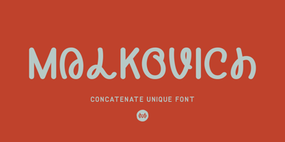 Malkovich designed to become a concatenate unique font, this font has the potential to bring each of your creative ideas. Combine with standard and special alternative glyphs so you can create a lot with layouts and compositions. Malkovich brings a touch of custom typography to logos, websites, social media quotes, wedding branding, and more. Whats Included ? Uppercase & Lowercase Number & Symbol International Glyphs Multilingual support Feature UPPERCASE Lowercase Number & Symbol International Glyphs Alternative Thank you so much for checking out my shop, and please get in touch if you have any questions!
 - Pursue Your Passion by Seemly Fonts,
$12.00 Pursue Your Passion presents a sophisticated handwritten font meticulously crafted to infuse your designs with a touch of artistic elegance. Its natural flow and unique style make it a versatile choice for a diverse range of projects, from branding to editorial design. This font transcends conventional boundaries, inviting creativity to soar without limitations. Its innate charm adds a layer of refinement to your visual narratives, while the impeccable attention to detail ensures seamless integration into your design arsenal. Unleash your creative potential with Pursue Your Passion, where imagination knows no bounds.
 - Mallkis by madeDeduk,
$14.00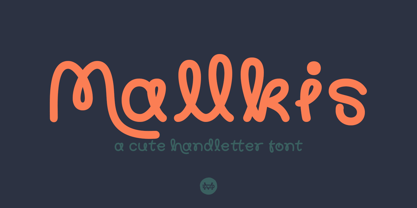 Mallkis is a cute handlettering font, playful with this font has the potential to bring each of your creative ideas. Combine with standard and special glyphs so you can create a lot with layouts and compositions. Mallkis brings a touch of custom typography to logos, websites, social media quotes, wedding branding, and more. Whats Included ? Uppercase & Lowercase Number & Symbol International Glyphs Multilingual support Feature Uppercase Lowercase Number & Symbol International Glyphs Alternative Ligature Thank you so much for checking out my shop, and please get in touch if you have any questions! at: dedukvic@gmail.com
 - Tropen by Ahmet Altun,
$12.00 Tropen Font Family comes in one weight with six different types of styles but compatible at the same time with each other. All fonts are hand-made. It can be accessed to the extras with the standard keyboard codes which makes the use of font files very practical and easy. Tropen Font Family was designed carefully to create elegant works. It would be a perfect choice to design posters, affiches, logos, t-shirt and magazine prints, eye-pleasing typographic designs and more.
 - Charlbury by Calum Adams,
$4.00 Introducing Charlbury, a refined sans-serif inspired by the idyllic charm of the countryside. Seamlessly blending contemporary features with timeless elegance. Crafted with clean lines and well-balanced proportions, exuding clarity and readability. The not-so-subtle curves, and sharp edges, reflect the picturesque landscapes of its namesake; A harmonious fusion of modernity and heritage. Whether used in print or digital media, Charlbury adds a touch of sophistication, making it an excellent choice for those seeking a capable typographic aesthetic.
 - Catterpillar by Zeenesia Studio,
$14.00 Catterpilar is a stylist handdraw font. The Catterpilar font works great for any design project, be it web, printing, logotype, posters, badges, signage, product, brand, t-shirt design, etc. Catterpilar font contains almost 215 glyphs with several OpenType Features; Stylistic Alternate, Standard Ligature & Multylangual support. The OpenType Feature can be used to create your own custom typography of your design. The Catterpilar font is a beautiful example of stylist fonts. Please contact me for more information about the font terms and condition.
 - Linotype Abstract by Linotype,
$29.99American designer Frank Marciuliano created the Linotype Abstract display font in 1997. Abstract's letters are made up of collaged elements: a single letter can contain several different textures. Instead of an upper and lowercase, Linotype Abstract offers two different uppercase alphabets, each with different patterns. Text set in Linotype Abstract takes on the appearance of a cubist painting, making it the perfect font for all of your funky type needs. Linotype Abstract is included in the Take Type 4 collection from Linotype GmbH." - Vtg Stencil US No. 4 by astype,
$18.00 The Vtg Stencil fonts from astype are based on real world stencils from several countries. The US No. 4 design was derived from a typical antique US-American stencil-plate. This revolving stencil-plate was invented by Eugene L. Tarbox and patented in 1868. It was a mass factored product and a very common tool in the United States until the success of the interlocking stencils. In case of US No. 4 an original early stencil plate from New York Stencil Works was used. The Regular font style is a clean font design featuring an extended Latin glyph set including some typical stencil ornaments and tabular figures. The Paint font style is made from true stenciled letters and features all the letters of the stencil-plate only. If you like the later interlocking design have a look to my Vtg Stencil US No.2 font. More info: pdf specimen
 - Garuda by Campotype,
$49.00 Garuda typeface, featuring the shape and style based on "Garuda Pancasila", the state symbol of the Republic of Indonesia. Garuda is a mythical bird in the Javanese puppet stories, is very similar to the eagle. At the typeface we can find more ligatures beside than the standard. Within Garuda at least encoded 792 glyphs per weight onto major codepage: win 1252, 1250, 1254, 1257 including Mac OS Roman. It is containing more OpenType features such as swash, contextual alternate, stylistic, figures/number, and a few bit ornaments. The typeface has a pretty good readability and legibility even in small sizes. So it is useful for short texts (text length? Whom fear) for print and screen material. Usage on headlines, posters, titles, or something like that, can utilize ornament lines as a sweetener. Please find more information about the OpenType Manual of this typeface on the gallery page (pdf).
 - Brush Drops by Ditatype,
$29.00 Brush Drops is a modern, impressive font that mixes the brush script characteristics and lovely, smooth ink drop details. This capital letter font shows stronger, more elegant displays. The letter shapes are in soft and smooth brush wipes with even edge lines to show firmer, clearer impressions. Furthermore, the ink drop details show personal, interesting touch on some of the letter parts. Bright, contrast colors will make this font outstanding and eye-catching. In addition, you may apply it for big text sizes to be greatly legible, and enjoy the available features here as well. Features: Multilingual Supports PUA Encoded Numerals and Punctuations Brush Drops fits best for various design projects, such as brandings, quotes, printed products, merchandise, social media, etc. Find out more ways to use this font by taking a look at the font preview. Thanks for purchasing our fonts. Hopefully, you have a great time using our font. Feel free to contact us anytime for further information or when you have trouble with the font. Thanks a lot and happy designing.
 - Oceanwide Pro by California Type Foundry,
$47.00 A font perfect for not just one, but many projects! Introducing Oceanwide Pro, a sans that loves to be used in just about any situation! Designed with ultra clean lines and versatility in mind, Oceanwide wants to be your new favorite sans! Oceanwide’s ultra clean letters work anywhere you want to communicate orderliness and competence, and designed to build trust and rapport with your audience. Its wide proportions make it ideal for display and logo use. Oceanwide especially shines for white/bright letters on black/dark backgrounds! That’s because the inside shapes are nearly perfect circles in many weights. Here's a quick video tour of Oceanwide Pro by Dave Lawrence, including all the great things Oceanwide can be used for! We've tested Oceanwide for these industries, with stunning results!: Tech Arts Fashion & Style Business & Branding Corporations Logistics Architecture Food and many more... Oceanwide can be used for: Headers Subheadlines Logos Even body text, if tracked. Print & Screen The styles it can take are also many. It's great for: Modern/minimalist design Flat design Cut out design User Interface (UI) Technical designs In combination with text effects, even for grunge and other situations. And many others... DESIGN FEATURES Simplicity Tall x-height Hand-sloped obliques (italics) Narrow spacing Semi-wide proportions Expert kerning Well proportioned, usable lights & extra lights Large caps Great ALL CAPS MODE Uppercase punctuation Uppercase spacing with California Type Foundry’s Smart Tracking™ Advanced fraction support Proportional lining figures Thick joins Smooth curves Sturdy—great for textures and effects Variable font available Latin Pro character set for Central European languages. That's the writing for over 782 languages and transliterations worldwide! DESIGN STORY—THE FORGOTTEN SANS by Dave Lawrence, Lead Designer, California Type Foundry Adrian Frutiger was the 20th century master of sans, but I didn't realize he had made—not one—but TWO geometric sans! It wasn't until I had purchased the book “Adrian Frutiger: Typefaces”. I had hoped to someday meet Adrian Frutiger, but he passed away that very same year. Here is the story of Frutiger's forgotten sans. Back in 1968, Frutiger was approached by Pentagram to make a design for British Petroleum. They wanted a "new version of Futura". However, they wanted him to make a couple adjustments. First, they felt that Futura was "too fiddly." By this, they meant that it narrowed too much at the joins. (Joins are for example where the round and straight parts of the 'd' meet.) This is something that is necessary for small print text (to prevent ink clogging), but is not necessary at large sizes. Second, they wanted it to be entirely geometric, using the circular shape with minimal optical corrections. Unfortunately this font was not even used very consistently in the BP brand. A haphazard mix of Futura and Frutiger's BP font ensued. It was then replaced by another font design very soon after. My design is different in several ways. First, the commas and quotes are a more modern style. I tried his original commas, but these just didn’t work to 21st century eyes. Second, in his drawings, Frutiger went for a more standard u with a downstroke on the right. However, Oceanwide has a simpler u. Third, I made more optical adjustments. At the direction of his employer, Frutiger reluctantly put no font optical corrections into the letters. So I think my optical adjustments are similar to what Frutiger would have wanted. Fourth, I extended the weight into the light and extra light ranges. Fifth, the rest of the font I created according to the principles of Adrian Frutiger, but with no sources for inspiration. Here is Frutiger’s design philosophy, in his own words: “If you remember the shape of your spoon at lunch, it has to be the wrong shape. The spoon and the letter are tools; one to take food from the bowl, the other to take information off the page... When it is a good design, the reader has to feel comfortable because the letter is both banal and beautiful.” The words about the spoon were the ones I kept in my mind as I tried to make the curves ultra smooth, and the shapes ultra simple. Hopefully this font is a worthy successor to the font that inspired it. Released on the 93rd birthday of Adrian Frutiger, to celebrate the life and achievements of this amazing designer. ——————— Simplicity. Versatility. Oceanwide.
 - Dream Within A Dream by Storm Type Foundry,
$55.00 Dream Within a Dream was the title of exhibition of Czech art inspired by the work of Edgar Allan Poe curated by Otto M Urban and Veronika Hulíková. Three dozens of artists exhibited their works in the Czech National Gallery in 2020. The cataloguje was printed with the use of the present typeface. Artists took significant interest in Poe's literary oeuvre only after the writer's untimely death. This was mainly thanks to the poet Charles Baudelaire who translated Poe's works to French. As early as in the second half of the 19th century, prominent artists such as Edouard Manet, Odilon Redon, James Ensor and Gustave Doré created remarkable artworks inspired by Poe. Although the first Czech translations of Poe's woks date to the 1850s, artworks inspired by them only appeared several decades later, at the turn on the 20th century. Poe's poems and short stories inspired František Kupka and soon after him, Josef Váchal, Jan Konůpek and František Kobliha. Alfred Kubin, a German artist born in Bohemia, made illustrations for the German translation of Poe's collected stories. Later on, Alén Diviš and František Tichý created further Poe-inspired artworks. Poe was a source of inspiration for Jan Švankmajer and more recently, František Štorm and Jaroslav Róna.
 - Brother Dreams by Ditatype,
$29.00 Brother Dreams is a captivating brush font that exudes a raw and artistic vibe. With its bold capitalized letterforms and ragged edges, this typeface brings a unique and rebellious touch to your designs. The defining feature of Brother Dreams lies in its rugged and ragged edges, giving the font a handcrafted and slightly distressed appearance. This font is designed with expressive brush strokes, capturing the essence of brush calligraphy. The bold capitalized letterforms command attention, making a powerful statement with their unconventional and untamed style. Inspired by the untamed spirit of artistic expression, Brother Dreams embodies a sense of creativity and authenticity. The rough and ragged edges add a touch of uniqueness and individuality to each letter, as if they were painted with passion and emotion. This font embraces imperfection and celebrates the beauty of artistic spontaneity. Each letter of Brother Dreams is meticulously crafted to maintain its boldness and legibility while embracing the rugged and ragged edges. The resulting composition is a balance of artistic expression and readability. This font allows your message to stand out with its raw energy and rebellious charm. Enjoy the various features available in this font. Features: Multilingual Supports PUA Encoded Numerals and Punctuations Brother Dreams is ideal for headlines, titles, logos, and any design that requires a lively and energetic display. Whether you're working on posters, packaging, branding materials, or any project that needs a touch of liveliness, this font will bring a contagious sense of cheer. Find out more ways to use this font by taking a look at the font preview. Thanks for purchasing our fonts. Hopefully, you have a great time using our font. Feel free to contact us anytime for further information or when you have trouble with the font. Thanks a lot and happy designing.
 - Speedy Space Goat Oddity by LomoHiber,
$12.00 Speedy Space Goat Oddity is the font with really interesting mood. My purpose was to transfer freedom, immediacy, and a bit of insanity with it. I've painted it with self-made paint and brush in a trippy environment. You can use Speedy Space Goat Oddity almost everywhere (not for body text). It's great for posters, clothes design, package design, music album covers. Also, with the right approach, you can use it as horror font. Speedy Space Goat Oddity Features: Pant texture 2 ligatures for tt and ff 14 contextual alternates for most common double letters Carefully tuned kerning (preview above doesn't show it for some reason) If you have some issues or questions, please let me know: lhfonts@gmail.com Hope you'll enjoy using Speedy Space Goat Oddity!
 - Semikolon by URW Type Foundry,
$35.00 SemikolonPlus: Optimal readability by reduced, distinct letter forms. Appropriate for early readers of any age in schools and other educational institutions. SemikolonPlus minimizes the risk of confusing similar characters and therefore is predestinated for the use in text blocks, work sheets, educational games et cetera. Furthermore, with its accented characters, currency signs, true fractions and other special characters, SemikolonPlus is suited for numerous typographic tasks and – thanks to its distinct letter forms - offers great readability, even in lower point sizes. SemikolonPlus is recommended by the German association of alphabetization and basic education, which uses it for adult education, reading magazines, teaching material and the own YouTube-channel. SemikolonClassic: Is the familiar font with alternative character forms. E.g. it contains the lower case double level a and g, as well as glyphs harmonically formed to the typeface. The SemikolonClassic is suitable for diverse uses in various sectors. Together or in combination SemikolonPlus and SemikolonClassic offer extensive possibilities for the layout of text material with their heavy font weights.
 - Full Neue by Bülent Yüksel,
$19.00Full Neue is the younger brother of original Full Sans, Full Slab and Full Tools. Ideally suited for advertising and packaging, editorial and publishing, logo, branding and creative industries, poster and billboards, small text, way-finding and signage as well as web and screen design. Full Neue provides advanced typographical support for Latin-based languages. An extended character set, supporting Central, Western and Eastern European languages, rounds up the family. The designation “Full Neue LC 50 Book” forms the central point. The first figure of the number describes the stroke thickness: 10 Thin to 90 Bold. Full Neue LC comes 5 weights and italics also Full Neue SC comes 5 weights and italics total 20 types. The family contains a set of 485 characters. Case-Sensitive Forms, Classes and Features, Small Caps from Letter Cases, Fractions, Superior, Inferior, Denominator, Numerator, Old Style Figures just one touch easy In all graphic programs. Full Neue is the perfect font for web use. You can enjoy using it. - Twine by Wilton Foundry,
$29.00 By twisting and weaving separate strands of rope together, a stronger TWINE is created. The distinctive “valleys” that give the twine its twisted and wavy appearance is the result of the twining process. Similarly, TWINE the font, is an exaggerated representation of the calligrapher’s individual pen strokes that create a cohesive character which is enhanced with the stencil. Unlike other stencils, TWINE emphasizes calligraphic strokes, so you will find it very legible even in small point sizes. Check it out! Furthermore, twine is inspired by Plantin, an old-style serif typeface named after the printer Christophe Plantin, which is based on the 16th century Gros Cicero face cut by Robert Granjon. Twine is a great choice when you need a font that is timeless, contemporary and distinctive. Perfect for Advertising, Corporate identities and Packaging design, Museum display, Technology, Hospitality, Travel, and Retail applications. Twine is available in TWINE Regular, TWINE Italic, TWINE Bold, TWINE Bold Italic. It is a Stencil that is Distinctive, Contemporary, and Timeless.
 - Full Slab by Bülent Yüksel,
$19.00Full Slab is the younger brother of original Full Sans, FullNeue and Full Tools. Ideally suited for advertising and packaging, editorial and publishing, logo, branding and creative industries, poster and billboards, small text, wayfinding and signage as well as web and screen design. Full Slab provides advanced typographical support for Latin-based languages. An extended character set, supporting Central, Western and Eastern European languages, rounds up the family. The designation “Full Slab LC 50 Book” forms the central point. The first figure of the number describes the stroke thickness: 10 Thin to 90 Bold. Full Slab LC comes 5 weights and italics also Full Slab SC comes 5 weights and italics total 20 types. The family contains a set of 485 characters. Case-Sensitive Forms, Classes and Features, Small Caps from Letter Cases, Fractions, Superior, Inferior, Denominator, Numerator, Old Style Figures just one touch easy In all graphic programs. Full Slab is the perfect font for web use. You can enjoy using it. - Spry Roman by Stephen Rapp,
$49.00 Handmade, expressive, lively, organic— …words typically used to describe a script font or a casual sans. Spry Roman opens up new possibilities. It’s origin is handwritten letters created using a pointed nib on slightly toothy paper. While based on a Roman form, the letters are designed to break out of the mold and dance along the baseline. Spry Roman Pro is a fully featured opentype font. Among the 964 glyphs are loads of alternate characters and swash letters; a full set of small caps; simple fractions; case sensitive punctuation; and a variety of ornaments, border elements, and flourishes. It also includes a full dose of language support for not only main characters, but also for alternates and small caps. Ligatures have been kept to a minimum to allow users the option of tracking text. **Please note that the Pro version has all the glyphs of the others combined. The smaller versions are for those who don't have opentype savvy apps like Adobe Illustrator.
 - KK3045 Pro by HS Fonts,
$39.00 The font family KK30/45 is available in 3 weights: Light, Regular, and Bold. Type Designer: Kuncho Kunev The name of family - KK30/45 is from the first letters of the designer's name (K)uncho (K)unev and from the main angles of the slanted stems - 30° and 45°. Release date: December, 2001 HermesSOFT Ltd. The design of КК30/45 incorporates a geometric variety of shapes, and have been originally designed in such a way that all slanted stems are 30° and 45°, The very high x-height and low bottom parts allow typesetting with almost 100% leading. КК30/45 is a display face suited best to sizes 16-18 point and above. There are included also all Cyrillic vowels with accents that are really necessary for the professional typesetting in Cyrillic languages. Supported Languages: Western Europe (Greek not included), Central/Eastern Europe, Baltic, Turkish, Romanian, Cyrillic. Supported Code Pages: Macintosh and Windows, any for above languages. Opentype features includes kern, fractions, ordinals, superscripts.
 - Abril by TypeTogether,
$39.00 Conceived specifically for intensive editorial use, whether it is in newspapers, magazines or digital media, Abril is a font family of two worlds. The titling weights, based on a contemporary revamp of classic Didone styles, display both neutrality and strong presence on the page, attracting the reader’s attention with measured tension in its curves, good color and high contrast. It also features typographic niceties such as ornaments, borders, special dingbats and alternate letters and numbers that propose a broad palette of tools to the designer. The text weights are more closely inspired by both, 19th century slab serifs and scotch roman types. They maintain consistency with the headline styles, and at first glance may appear to have the same shapes only with lower contrast. However, in reality the letter forms of Abril Text were engineered from scratch to achieve a color, texture and overall width that allow using the font comfortably in the most challenging environments for continuous reading, such as newspapers. This also makes it a great font family for pocketbooks and magazines. Abril competes, in terms of economy of space, head to head with some newspaper classics such as Utopia or Nimrod, but featuring a more contemporary look and feel; and unlike them, includes a full set of small caps with numbers and punctuation. The four main text weights of Abril Text were also manually hinted which grants the possibility of a smooth transition from printed media to web platform. Abril consists of 8 text styles and 12 display styles, all of them containing the standard TypeTogether character set that supports over 50 languages including those from Central and Northern Europe.
 - Phiz by Shinntype,
$29.00 Phiz is a diverse suite of 28 decorative fonts based on Figgins Sans Extra Bold. Classic (10 fonts), Rounded (7 fonts), Rough (4 fonts) and Particles (7 fonts). The Rough and Particles styles emerge as a unique niche—neither imitating distressed printing (e.g. the “rusty” look), nor casual, hand-drawn styles. These type designs are conceived and executed as complex algorithmically-generated graphic procedures, in which repetitive elements have been artfully applied to the Sans capitals, and manually nuanced. As such they also differ substantially from textured glyph shapes that have been cut out from larger pattern fields, for the constituent particles are disposed in relation to the specific shape of each character they define. The caps-with-small-caps format was chosen for two reasons. Firstly, titling display usage is predominantly capitals, and secondly, rather like optical scaling, having the same resolution of texture available in two different “sizes” (upper and lower case) should prove useful in the hierarchy of page layout—not primarily for setting upper and lower case text as caps-with-small-capitals, although this is of course an option. All figures and major symbols (punctuation and currency) are provided in both cap and small cap height.
 - Capraia by CAST,
$45.00 Capraia is a book typeface, with a heavily quirky look when shown at big sizes, and with an irregular but attractive rhythm at text sizes. Capraia Book and Regular are designed specifically for continuous texts: Book meets a current preference of Italian publishers for lighter faces, while the slightly heavier Regular is intended for the wider international market. True to its vocation for publishing, Capraia has a big x-height, medium contrast and wide bracketed serifs. Furthermore, its slightly flattened curves, some unconventional roman letterforms (a, G, Q) and the 'slanted roman' italics, along with design details such as ball terminals, give to the whole family a very contemporary appeal. Originally the design was intended as a tribute to Caslon's Great Primer but at a certain point the designer was enthralled by Baskerville. Capraia is the unpredicted and original result of that intense experience.
 - Ceebo by Oliver Matelowski,
$55.00 Ceebo is a friendly sans-serif, which show some aspects of a humanist and grotesque typeface. It retained more details of writing and got some forms and characteristics of an italic. The font contains some alternative glyphs. It also contains some ligatures and discretionary ligatures. In addition, there are adjusted figures and additional character for uppercase letters, lowercase letters and small caps, which react by OpenType-Feature. The font was designed to stay legible also in small sizes: beside as possible open counters, a tall x-high, distinct vents and cuts, it especially are the details of the glyphs which make it discernable. The regular weight is slightly thinner than other sans-serif fonts, moreover the diacritics and small glyphs were designed for small sizes by taller and more open forms. The resulting “ruggedness” is mellowed by half-rounded stems and pointed stem ends.
 - Stern Pro by Canada Type,
$49.95 Originally released in 2008, Stern is the only typeface to be produced and marketed simultaneously in digital and metal. In the twenty-first century, no less. It is also the last typeface Jim Rimmer ever completed. The process he used for its design and manufacture is the stuff of legend, and can be seen in the Richard Kegler documentary, Making Faces: Metal Type in the 21st Century. The design is a delicate upright italic named in memory of Chris Stern, the late artist and printer from Washington State. In 2013, Canada Type remastered and expanded the design's offerings to a glyphset of over 1200 characters, updated programming. Now Stern Pro includes the following features: - Small caps. - Caps-to-small-caps functionality, useful for setting mid-height caps alongside lowercase. - Tall caps. - Historical forms. - A wide variety of alternates for both uppercase and lowercase letters. - Plenty of ligatures. - Seven types of numerals, enclosers, cojoiners and currency symbols. - Automatic fractions. - A complete set of lowercase ordinals, from a to z. - Case-sensitive forms. - Language support for Greek and over 50 Latin languages. 20% of this font's revenues will be donated to the Canada Type Scholarship Fund, supporting higher typography education in Canada.
 - Slate by Monotype,
$34.99 A typeface of grace, power and exceptional versatility, the Slate collection is a truly beautiful design that achieves stellar levels of readability, both in print and on screen. Created by the award winning type designer Rod McDonald, this six-weight sans serif family is a rare example of sublime aesthetics meeting world-class functionality. The typeface’s legible letterforms embody an amalgam of the best traits of both humanistic and grotesque letterforms. “I didn’t want a face with an ‘engineered’ look, or with any noticeable design gimmicks or devices,” admits designer McDonald. “I wanted a pure design. I confess that I was ruthless with any character that wanted to stand out from the rest.” The Slate collection is available in six weights with complementary italics, with slight changes in structure from the light to the black weights. Its light weight is reminiscent of early American sans. Whether for use in display work or in longer-form settings, few typefaces possess the beauty and power of this design, leaving the Slate family an excellent addition to any designer’s typographic quiver.
 - Black History by Ditatype,
$29.00 Black History is a handwriting script font to express personal, artistic nuances and is made in brush designs to produce casual and natural displays. The thick letter weight will show bolder impressions and emphasize the desired elements in the design. Combination of low contrasts, when the bright and the dark parts of the letters are not very significant, will create smooth effects. Unlike the other handwriting fonts, Black History’s letters are not always interconnected to each other. Furthermore, you can apply this font for big text sizes to be greatly legible and also enjoy the available features here. Features: Multilingual Supports PUA Encoded Numerals and Punctuations Black History fits best for various design projects, such as brandings, headings, magazine covers, quotes, printed products, merchandise, social media, etc. Find out more ways to use this font by taking a look at the font preview. Thanks for purchasing our fonts. Hopefully, you have a great time using our font. Feel free to contact us anytime for further information or when you have trouble with the font. Thanks a lot and happy designing.
 - Cloudbuster by K-Type,
$20.00 Cloudbuster is K-Type’s take on the mid twentieth century style of extra condensed slabs/moderns inspired by Imre Reiner’s Corvinus Skyline of 1934. Unusually, Cloudbuster has a printed-look softness, courtesy of very slightly rounded corners throughout, so it looks a little less harsh than similar typefaces. The font is an imposing display face with elegant, unfussy letterforms and a generous x-height.
 - HT Osteria by Dharma Type,
$19.99 HT Osteria is a monoline script, but you don’t feel it monotonous because of distinctive shapes of the characters. HT Osteria is suitable for signage, package, and posters or any other kind of display use. Holiday Type Project offers retro hand drawing scripts. Inspired by retro script on shopfront lettering, wall paint advertisements in Italy around 1950s. Check out the script fonts from Holiday Type!
 - Hambare by Differentialtype,
$10.00 Hambare is a sans serif font family that is bold, elegant, and futuristic. Its clean lines and balanced proportions make it an ideal choice for digital and print designs, ensuring readability and visual impact. Hamabare comes with six styles that you can mix and match. Add it to any design to provide the flexibility and visual impact you need to take your designs to the next level!
 - Crunold by Trustha,
$17.00 Crunold is a bold hand-drawn with dingbats as his mate. Inspired by today's popular designs, abstract shapes as an important element in both digital and print designs. Crunold is perfect for your creative projects. Because, a combination of typography, and the abstract shape of art. Makes your design perfect, also easier in the process. Crunold is perfect for branding, headlines, packaging, and many more.