10,000 search results
(0.041 seconds)
- Veronika by Linotype,
$29.99Veronika is a semi-serif text face, available in three styles: Regular, Italic, and Bold. All three faces are available in OpenType format, with both lining and old-style figures. Grüger, a German artist and designer, first began the design of her typeface by writing out its letterforms with a wooden stylus. She wanted to create a new semi serif face that had uniform stroke widths, but still maintained some aspects of calligraphy. Veronika achieves this; the terminals that begin the first strokes of most letters are round and bulbous, as if the writing instrument added extra emphasis on that spot. This adds a dynamic, movement-like quality to texts designed with Veronika. Aside from some sans serif-ness, Veronika appears similar to old style typefaces from the renaissance: classical inscriptions inspired the proportions of the capital letters, and the lower case letters stem from Carolinian minuscule. These proportions allow Veronika to function very well in text and at small sizes. However, only when you design larger headlines, logos, or other elements with Veronika, will you notice all of its special qualities, like its weight distribution and stroke characteristics. - Happy Maggie by SIAS,
$29.90 The design of this font was created by a 13-year-old girl. The digitisation is faithful to the original drawings and keeps all of the wonderful special details which make this font absolutely unique.
 - Chakie by Garisman Studio,
$20.00 Just call me CHAKIE. I'm born from the old natural brush chalk look from the 60's and 70's. Use meto create very bold and strong design! Great for posters, t-shirt designs, branding, packaging, labels, and more. Bring back me to the 60's brother! :D And why you must grab me? - Simple installation - Support for 23 languages (WOW!) - Compatible with MAC or PC - PUA encoded - Lots of fun!
 - Koweti by Twinletter,
$15.00 Introducing Koweti, a premium Arabic style font. Specially designed to bring luxury and prestige to your designs. This unique letterform gives you the flexibility to create the look and feel you need for any occasion. Using this font is the best choice to bring harmony to your designs.
 - Creolia by Milan Pleva,
$18.00 Creolia is a bold rounded serif typeface in modern and classy style. OpenType features include old style figures and ligatures. Creolia is ideal for headlines, headers, logos, labels, packaging, postcards, presentations, magazines, invitations, etc. Features: Basic latin alphabet A-Z 56 Ligatures & Alternates 112 Accented characters Numbers, Punctuation, Currency, Symbols, Math symbols & Diacritics Old style figures Enjoy Creolia!
 - Cholens by Mevstory Studio,
$20.00 Cholens is a bold, rounded script typeface in a modern and classy style. OpenType features include old style figures and ligatures. Cholens is ideal for headlines, headers, logos, labels, packaging, postcards, presentations, magazines, invitations, and more. Features: Basic latin alphabet A-Z Ligatures & Alternates Accented characters Numbers, Punctuation, Currency, Symbols, Math symbols & Diacritics Old style figures
 - AZ Hello by Artist of Design,
$25.00 AZ Hello font was inspired from old auto repair signs. This font utilizes an "old look" to the line work which is designed to have a "worn feel" to it. Ideal for use as headline or sub-head text in you design.
 - ITC Souvenir by ITC,
$45.99 A classic, timeless design by the phenomenal Ed Benguiat! Featured in: Best Fonts for Logos
 - Admiral by Greater Albion Typefounders,
$12.00 Admiral was inspired by and extrapolated from the Art Nouveau lettering incised into the facade of a local hostelry. This gave us some inspiration for the capitals 'A', 'B', 'C', 'E', 'H', 'I', 'L', 'O', 'S', 'T' and 'U'; we then had great fun extrapolating the rest! The source of the name Admiral can be spotted if you look at characters such as 'A', 'H' and 'N'. Admiral's distinctive charm and humour lends it to projects with a 1900s Art Nouveau theme, be they book covers, posters, signage, invitations, cards, or anything else you enjoy!
 - Mentalis by RGB Studio,
$17.00 Mentalis is modern bold script font. Made carefully to get the best curves and unique form that never exist before.This font is comes in uppercase, lowercase, punctuations, symbols & numerals, stylistic set alternate, ligatures, and washes. Mentalis is Suitable for any graphic designs such as branding materials, t-shirt, print, business cards, logo, poster, t-shirt, photography, quotes .etc. This font is suitable to use as a logotype / wordmark / label, etc with its unique and bold characters makes it stand out from the crowd. Files Include : Basic Latin A-Z and a-z Numbers Symbols PUA Encode Multi-language Support Thanks and have a wonderful day, If you have any questions, please get in touch with us Don't forget to check out our other products.
 - Bodoni Ornamental by FontMesa,
$30.00 New for 2020 Bodoni Ornamental now has two italics to choose from, one basic italic and a second which is more of a true italic with a few uppercase letters that have been stylized. Only one italic can be style linked to the regular upright version so in the second italic we've added Avanti to the name which means forward in Italian. When purchasing the regular upright and Avanti italic together they will install as two separate families. Bodoni Ornamental is a revival of a very old typeface based on the Poster Bodoni letter shape. Giambattista Bodoni passed away in 1813, this decorative version was created in the 1820’s or 1830’s which was the time period when many of these ultra bold decorated type faces began to appear, the original artist is currently unknown. The original version of this ornate classic was only available as a set of uppercase letters, today over one hundred eighty years later this font is now complete with a new lowercase, numbers and accented characters for Eastern, Central and Western European countries. Due to the ornate detail in Bodoni Ornamental when printing itís recommended to use a laser printer 600dpi or greater, a 1200dpi printer will give you the best results rendering the most detail at the smallest possible point size for this font. Small home user Ink Jet printers are not recommended for Bodoni Ornamental unless you set the font to a very large point size. With Ink Jet printers much of the detail in the letters will bleed together as the ink hits the page, commercial Ink Jet printers such as GiclÈe printers may give good results. When using Bodoni Ornamental for digital images including web site graphics it may help to add a one pixel stroke fill around the letters setting color to white or grey, this may help the web site images display better on some computer's. You will need a photo editing application such as Adobe Photoshop to create your image adding the stroke fill and save as a jpg , png or gif file. I hope you enjoy this old font as much as I did making it. Note: When previewing the Bodoni Ornamental font in the Windows font preview you may notice some letters appearing lighter and some darker, this is a problem with the preview window and some ornate fonts, Bodoni Ornamental will print normal and not with mixed light and dark letters.
 - Hejira by Sudtipos,
$49.00 Hejira means “rupture” and this concept was the primary principle that guided the creation of this typeface: to escape conventions and take up the challenge of designing letters with an unusual and fresh approach. Unlike traditional typefaces, each member of this somewhat atypical family has its own distinct personality and formal features. A thin, spiky font that looks like its sharp serifs could pierce through. A more experimental sibling, based on the same skeleton but taken to the extreme, that is best suited to setting big titles. An odd-one-out, sans-serif style whose shapes mimic those generated by the movement of a calligraphic pen. And a quirky fat-face with a flair for combining round curves with pointy elements. Regardless of how different they may be, all four styles feel part of the same system and can be used alongside each other seamlessly. The Hejira set includes multiple ligatures and supports a wide variety of Latin alphabet-based languages.
 - LTC Goudy Initials by Lanston Type Co.,
$24.95LTC Goudy Initials has been a best-seller since it was reformatted to font format by P22 in 2005. We decided that while it works very well at medium sizes, when it was used extra large, the outlines were not as true to Frederic Goudy’s 1917 drawings as they could be. We decided to redraw from the ground up—and here we have the NEW LTC Goudy Initials! Meticulously redrawn by Miranda Roth, these ornaments referenced original proofs of large sizes of Cloister Initials. In our quest for artwork for this project, we even arranged a quickly sold out recasting of the 120 point size and have produced a limited edition letterpress print from this casting This new digital version features two additional layers to allow for quick colorizing of the central letter and/or the floriated background. Registered users of the previous version of LTC Goudy Initials may upgrade to the set at a discount. - RM Squarial by Ray Meadows,
$19.00 Based loosely on a square, this hair line design works best at 24pt and above. Due to the modular nature of this design there may be a slight lack of smoothness to the curves at very large point sizes (around 100 pt and above).
 - OldHaroldRee by Ingrimayne Type,
$12.95 OldHaroldRee is a modification of PhederFrack, a calligraphic fraktur face. It keeps the lower case letters and inserts a completely different set of upper-case letters, which is in the “Old English” rather than the “Old German” or fraktur style. It comes in two weights, a bit unusual for an Old-English style typeface.
 - Bayern Handschrift NF by Nick's Fonts,
$10.00A hundred-year-old offering from Bauer & Company, named simply "Manuscript," provided the inspiration for this elegant script face. The name translates as Bavaria Handwriting. - Mobil Pro by RMU,
$35.00 In 1960 Ludwig & Mayer released this Matheis design which was completely redrawn, digitized and extended for most main European languages, West and East. To take advantage of all ligatures in this font, I recommend to activate both OT features, standard and discretionary ligatures.
 - Nobody Home JNL by Jeff Levine,
$29.00 Nobody Home JNL is unusual in nature as it combines two vintage typestyles into one font. Both have been used for home and property identification for decades and still remain popular. Over the years the letters and numbers have been made of cast steel, aluminum, brass and plastic. The alphabet is in a distinctly bold, asymmetrical style, while the numbers almost take on a calligraphic feel. There is just a basic character set - alphabet, numerals and simple punctuation. While the font has been reasonably spaced and kerned, it's best to remember that neither type design was made with digital technology in mind, so it's suggested to adjust your layout manually for optimum results. Nobody Home JNL is best-suited for replicating street addresses, apartment numbers on doors, and homeowner (or apartment house) names on buildings - whether in print design or as plotter-cut vinyl graphics.
 - Cursed Stone by Ditatype,
$29.00 Cursed Stone is a spine-chilling display font that will transport your designs to a realm of dark enchantment. Designed in large letters and with a bold weight, this typeface demands attention and exudes an aura of haunting mystery. Each letter is meticulously crafted with eerie stone texture details, adding an ominous and cursed touch to the font. The large size of the letters enhances the font's imposing presence, making it impossible to ignore. The stone texture details in each letter of this font bring an authentic and sinister feel, as if the font was chiseled from the depths of an ancient cursed monument. These haunting details add an element of mystique and darkness, immersing the viewer into a world of malevolent enchantment. The combination of bold weight and stone texture gives Cursed Stone a rugged and formidable look, evoking images of cursed relics and forbidden ruins. The letters appear to hold secrets from the past, carrying a haunting energy that captures the imagination. For the best legibility you can use this font in the bigger text sizes. Enjoy the available features here. Features: Alternates Multilingual Supports PUA Encoded Numerals and Punctuations Cursed Stone fits in headlines, logos, movie posters, flyers, invitations, branding materials, print media, editorial layouts, headers, and any horror-themed project. Find out more ways to use this font by taking a look at the font preview. Thanks for purchasing our fonts. Hopefully, you have a great time using our font. Feel free to contact us anytime for further information or when you have trouble with the font. Thanks a lot and happy designing.
 - Romanson by Larin Type Co,
$15.00 Romanson - a modern display serif font with a lot of alternates and ligatures. This font can look more classic (conservative) serif, which is perfect for texts. So same he can be more expressive, playing and more modern with alternative substitutes and ligatures, try to play with them and you will get the uniqueness in your project. Just try to create a logo from uppercase, change them to create the best and harmonious and inimitable design. This font includes 205 Uppercase, 27 Lowercase alternates and 51 Ligatures.
 - Nurnberg Schwabacher by Intellecta Design,
$29.95"I digitized and to revitalize NurnbergSchwabacher by the extinct Haas'sche Schriftgiesserei, a German/Swiss foundry established in 1790 and based in Basel/Münchenstein. Many of its shares were acquired by D. Stempel in 1927. On the Luc Devroye site this foundry is listed on the Extinct Foundries of the 18th century page. This design is very similar to another Intellecta best seller: Hostetler Fette Ultfraktur Ornamental, both drawn from the classical type specimen book from Hostetler. The ornamental frame that completes the font is a fantastic baroque ornament that I found in another old book, unfortunately lost now. Luc Devroye, whose book is the source for all of my fonts, writes this about Rudolf Hostettler: He was a Swiss type designer, author of “The Printer’s Terms” designed by Jan Tschichold, of "Technical Terms of the Printing Industry" (5th edition was printed in 1995), and of "Type: eine Auswahl guter Drucktypen; 80 Alphabete klassischer und moderner Schriften" (Teufen, Ausser-Rhoden: Niggli, 1958). He also wrote "Type: A Selection of Types" (1949, fgm books, R. Hostettler, E. Kopley, H. Strehler Publ., St. Gallen and London) in which he highlights type made by European houses such as Haas, Enschedé, Deberny and Nebiolo. Jost Hochuli wrote his biography. - Henriette by Typejockeys,
$- The redefinition of a classic In the 1920s the Viennese government decided to standardize the street signs across the city. A typeface was especially constructed for the purpose. It was available in a Heavy and a Bold Condensed version, to support short street names as well as longer ones. As the years went by, the typeface was adopted and redrawn by several enamel factories. These adaptations lead to variations on the design, and to the fact that there isn’t a Viennese street sign font but 16 – in part severely – different versions. Henriette is not a digitization of any of those versions; rather, it is influenced by all of them. The italic versions are completely original and designed to accompany the Roman.
 - Echelon by Barnbrook Fonts,
$50.00 Echelon is based upon 1970s Eastern European ‘pipe-style’ typefaces. This style of Communist consumer typography came from what, at the time, seemed like a bizarre mirror universe: Existing alongside the West, similar-but-different, essentially unknowable. Even though the letterforms had the same historical origins as their Western equivalents, they also had their own bizarre fashionable/unfashionable aesthetic. The parallels between the surveillance practices of the Soviet Union and those of today’s Western governments informed the naming of this typeface. Echelon is the codename for a massive international surveillance system that collects and processes data from communications satellites. It can eavesdrop on telecoms and computer systems, it can track bank accounts. It can record and store information on millions of individuals.
 - Typer Pro by (v) design,
$25.00 Typer Pro (formerly Consul Typewriter Pro) is a modern OpenType font family reviving the look of old typewriters. Its carefully converted forms are detailed enough even for high pointsizes while keeping a reasonable number of outline points. Typer Pro comes in two variants: Typer Pro Mono is strictly monospaced (all characters occupy the same amount of horizontal space – this way old typewriters usually operated). However, sometimes a more even appearance may be desirable. Therefore, Typer Pro Text has been proportionally altered for a more pleasant and balanced look. Moreover, it is possible to achieve both proportional and monospaced look in both families via Stylistic Sets. You can choose from four different weights in each family and pick characters from its extensive glyph set. Typer also contains a number of Stylistic alternates, randomly replaced alternative letters to avoid the repetition of letters in a word. Typer Pro is a versatile typeface and is perfectly legible even at small sizes and on-screen. When printed, it looks best at its original size around 11–12 pt. Typer supports many OpenType features and offers great multilingual support for most of Latin-based languages. Feel free to download the detailed PDF Specimen.
 - Movie Script by Wiescher Design,
$39.50 Movie Script is the script that was used in German movie-brochures. Those were small four page leaflets with a lot of sepia-colored pictures about the movie one was about to see. Today those things are collectors items. The script was also used on those hand-painted posters above the cinema entrance. I cleaned up the old script and made it just a little bit more readable, but overall I left it as it was. Of course I added the necessary glyphs for today's world, like Euro and so on. When I was a kid, my grandfather gave me 1 German Mark and I could go to the movies matinee, that was around 10:30 in the morning, the entrance cost something like 60 Pfennig and the rest was for peanuts and a drink. Still today I love my grandfather for that, movies introduced the world to me (no TV then). Your grandfather-loving designer Gert Wiescher
 - Dub Tone by Seb Dub,
$10.00 DubTone is simple sans serif font with a halftone texture from an old newspaper scan on an old flatbed scanner. This font was created for a movie poster in 2003 and then finally converted to a font in 2012. Each of the characters were individually designed with care to make sure that in small or large sizes it remained readable with a unique texture.
 - FP Dancer Pro by Fontpartners,
$29.00 FP Dancer attempts to combine a constructed face with an upright script face. The goal was a type family that combines softness and friendliness with more strength. Typographica.org selected this font as one of the best typefaces for 2007.
 - Andilay by Rezastudio,
$9.00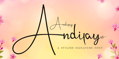 Andilay is a lovely and timeless handwritten font. It is the best choice for creating eye catching logos, branding and quotes. This font is PUA encoded which means you can access all of the glyphs and swashes with ease!
 - RM New Albion by Ray Meadows,
$19.00 A classic blackletter Which looks best at 16pt and above. Due to the modular nature of this design there may be a slight lack of smoothness to the curves at very large point sizes (around 100 pt and above).
 - Semrawut by Andrey Font Design,
$9.00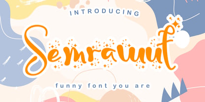 Semrawut is a lovely and timeless handwritten font. It is the best choice for creating eye catching logos, branding and quotes. This font is PUA encoded which means you can access all of the glyphs and swashes with ease!
 - Dainty Lady by Solotype,
$19.95You will see this in the old type catalogs as Dainty. Late in the nineteenth century, type founders developed a number of fonts with a "pen-drawn" look. They wanted to complete with the work of the hand lettering artists who were coming into their own, thanks to the new art of photoengraving - Ziggy Zoe - Unknown license

- Cocoro by Okaycat,
$29.50 Cocoro is a rounded textured font. Cocoro is extended, containing West European diacritics & ligatures, making it suitable for multilingual environments & publications.
 - Goodwine by Gleb Guralnyk,
$15.00 Hi. Presenting a simple and elegant font named "Goodwine" includes lots of characters with many languages support (West European, Cyrillic, etc...).
 - Cowboy Rhumbahut by Chank,
$59.00Cowboy Rhumbahut is an old-timey script the drips with a twang and tradition that you can practically hear. If you've been wandering the range, searching for the perfect cowboy alphabet for you, you might wanna wrangle up this old-time original. My goodness that's one kooky cowboy font. Now get to work and start makin' something with it, ya lily-livered varmint! - Ballard Avenue by Turtle Arts,
$20.00Ballard Ave is inspired by old vintage signage found in Ballard, Washington, an old neighborhood of Seattle. Ballard Avenue is a protected historical district filled with turn of the century brick buildings that have been converted into quaint shops and independent businesses. This alphabet is based on the antique signage that still exists on the sides of many of these buildings. - Bibliophile Script by Sudtipos,
$79.00 A friend once jokingly told me that what I really do is mine extinct arts for parts to use in modern things, like going to the scrapyard to pick up bumpers, quarter-panels and dashboards off of Datsuns and Ponies to build a shiny new Ferrari. I still kind of grin at that, but I certainly do spend a lot of time looking at old things and imagining ways they would work today. This shiny new Ferrari here is called Bibliophile, and it contains scrap heap parts from various pages by Louis Prang, the Prussian-American printer and publisher who inspired my Prangs fonts. This is my second engagement with the late 19th century man, and it’s quite a bit more intricate than just an italic Didone with a connected lowercase. Bibliophile marries Round Hand calligraphy with Italian capitals, two styles not often relayed in the same alphabet, but work together beautifully when combined well. When you combine them well with a few long-practised tricks of the trade, then mix in a few trusted features from my previous work over the years, you get my usual crazy exuberance, like 17 different shapes for the d, 21 different forms for the y, endings, beginnings, swashes, ornaments, and so on. It’s no secret that I can get carried away when I’m so consumed by an idea. — Bibliophile comes in 2 weights, each of them with over 900 glyphs covering all the latin languages. Bibliophile also comes with a bold weight, something I’m always reluctant to do with something as adventurous and complex as the structure of this historical mashup. But I couldn’t chase away the idea of increasing the contrast while maintaining the hairlines in a lowercase this narrow. Part of it was the curiosity about the outcome, and part was the sheer challenge of it. I think it turned out OK. Words set in either weight will show delicateness and elegance, and the more time you spend inside the font and micro-manage the setting, the more ways you will find to magnify either. Bibliophile can be as muted or luxurious as you want it to be. This is the kind of alphabet that fits well in fashion marketing and high-end packaging, from the very subdued to the super-exquisite. Enjoy the gleaming new vehicle made with freshly polished old parts.
 - ITC Stepp by ITC,
$29.99When Hal Taylor saw the 1930 logo for the Stetson Shoe Company of Weymouth, Massachusetts, he didn't run out and buy a pair of loafers. Instead, he seized on this striking example of an Art Deco logotype as the basis for a new typeface design. “I was impressed with the delicate and sophisticated letter forms,” Taylor recalls, “particularly the enlarged cap S -- in any other case it would have seemed unbalanced, but in the context of this logo, it worked perfectly.” All the letters in the original all-caps Stetson Shoe logo were rendered with condensed proportions except the O, which was a perfect circle. While the prominent O added visual interest to the logo, Taylor knew that such a character would limit his typeface to display applications. For versatility's sake, he drew his O for ITC Stepp with the same proportions as the rest of the alphabet. Taylor also gave the logotype's inverted S a more traditional design, but kept the original as an alternate character in the OpenType font. Taylor's toughest challenge during the design process was creating a lowercase. “A good type design tells you what it wants to be,” he says, “and after a little while the Stepp caps began to tell me what the lowercase should look like.” Taylor's lowercase is slightly more conventional than the caps. The jaunty g" and almost upside-down "s" add subtle charm, while the capital letters provide the broader gestures of Stepp's personality. Together, they create a versatile and distinctive typeface design. One of Hal Taylor's first jobs was as a photo-lettering typographer in Philadelphia, setting headlines and creating custom lettering. This was followed by a stint doing finished lettering for John Langdon, whose ambigrams appear in Dan Brown's best-selling novel, Angels & Demons. Today, Taylor works as a graphic designer in the publishing industry, but he still finds time to create an occasional hand-lettered book jacket, and draw handsome typeface designs. ITC Stepp is available in four weights, ranging from Light to Ultra Bold. All four weights have companion italics, and the lightest three weights also offer a suite of small caps." - Caslon Antique - Unknown license

- _a e i o u - Personal use only


