10,000 search results
(0.229 seconds)
- Mano Danielli by Kate Brankin,
$32.00 Mama, are you doing letters? I want to do letters too! Mano Danielli is based on the writing of a 6 year old child. Great for anything that has to do with children - even the inner ones.
 - Gizmo by G-Type,
$46.00 Gizmo was created by writing with a brush pen on fairly porous paper, selecting the best characters, then scanning and tracing with precision to maintain maximum character integrity. Clever programming ensures an even flow when set as text, enabling Gizmo to appear as quickly-written handwriting. The inclusion of multiple ligatures, which automatically kick in as you type, give Gizmo a truly authentic brush script appearance and hand-drawn dynamic. Gizmo works especially well at large sizes when the characteristically blobby and uneven edges become more evident.
 - Things by PizzaDude.dk,
$20.00 OMG! I never thought I'd finish this font! Actually, the idea came to me in the late 1990-ies, but the sketches lied at the bottom of the "fonts I will complete one day In the future" pile ... also called "fonts I most likely won't complete...EVER" pile! :) Anyway, I started up with letters for both upper and lowercase, no numbers or punctuation. I figured if people ever purchased this font, all they would need were upper- or lowercase letters. But the rest of the glyphs seemed to miss out, so I made the numbers and some punctuation. But I still found the font incomplete...therefore I redid all the punctuation (from "standard" punctuation to "picturish" punctuation) and added two additional sets of letters. Meaning that there is 4 different versions of letters to choose from: 2 different lowercase, and 2 different lowercase. I had a lot of fun drawing this font, and some fun doing the detective work finding out how the MANY lettershapes should look! I hop you too have fun using this font! :)
 - Fer by ParaType,
$30.00 Fer is a sans-serif font for body text, not lacking in its own distinctive voice. The aftertaste of reading the text set in Fer is like reading the letters on old rusty plates somewhere in Southern Europe, hence the name (Fer means iron in French). Being a modern system that includes a variable font with weight and optical size axes, Fer combines the features of geometriс sans serifs and old sans serifs with closed apertures. The typeface contains three sets of styles: for captions, text and headings, — with the weight ranging from regular to black. Fer was created with the idea to unite nations. The Latin character set supports all European languages, most African languages and Vietnamese. Cyrillic has support for all living Cyrillic languages and some obsolete characters too. The font also supports the Greek language. Additionally, the character set includes currency signs of all supported languages’ countries, old style, lining, tabular and proportional figures as well as numbers in squares and circles. Lastly, the font has lots of localized letterforms and stylistic sets. Fer was designed by Dmitry Goloub for Paratype in 2020–2023.
 - AZ Varsity by Artist of Design,
$20.00 AZ Varsity font was inspired from a combination of typical collegiate t-shirts designs and also the current wave of Hollister t-shirt designs (rough look). This font utilizes an "old look" to the line work which is designed to have a "worn feel" to it. It is designed to compliment it's sister font, AZ Vintage Brushed. This font is designed for use as a worn and antiqued headline or subheadline.
 - Eloisse by Yumna Type,
$16.00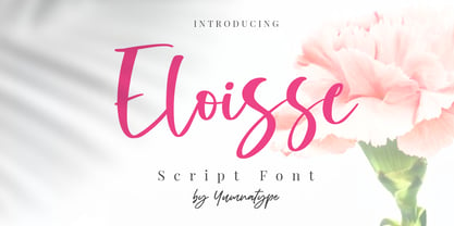 Eloisse is a beautiful handwritten font. Made for any professional project branding. It is the best for logos, branding and quotes. Every letter has a unique and beautiful touch. Includes: Eloisse (OTF) Features: Standard Ligatures PUA Encoded Multilingual Support Numerals and Punctuation by Yumnatype
 - Sweety Palm by Yumna Type,
$16.00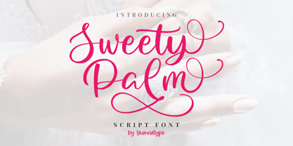 Sweet Palm is a elegant handwritten font. Made for any professional project branding. It is the best for logos, branding and quotes. Every letter has a unique and beautiful touch. Features: Standard Ligatures Stylistic Set Swashes PUA Encoded Multilingual Support Numerals and Punctuation by Yumnatype
 - Kentledge by Namogo,
$35.00 Kentledge is a grotesque sans type family based on geometric forms that have been optically corrected for better legibility. The family includes extended language support (over 200 languages), alternates, ligatures and more. It is best suited for graphic design and any display / text use.
 - Fluffy Puddle by Yumna Type,
$16.00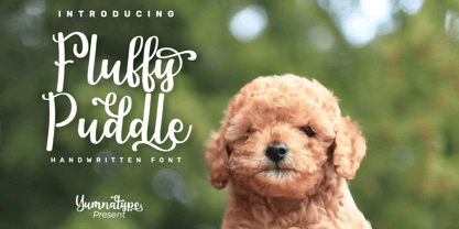 Fluffy Puddle is a beautiful handwritten font. Made for any professional project branding. It is the best for logos, branding and quotes. Every letter has a unique and beautiful touch. Features: Standard Ligatures Stylistic Set PUA Encoded Multilingual Support Numerals and Punctuation by Yumnatype
 - Milky Matcha by Yumna Type,
$16.00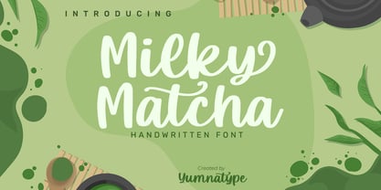 Milky Matcha is a beautiful handwritten font. Made for any professional project branding. It is the best for logos, branding and quotes. Every letter has a unique and beautiful touch. Features: Standard Ligatures Stylistic Sets PUA Encoded Multilingual Support Numerals and Punctuation by Yumnatype
 - Cocobella by Cultivated Mind,
$29.00 Cocobella is a beautiful chic and elegant hand painted font. The characters are uneven which gives Cocobella an edgy unique look. Cocobella will work best for clothing brands, fashion magazines, advertising, books, greeting cards, invitations, weddings and any time you feel sophisticated and chic.
 - Masculine by Yumna Type,
$16.00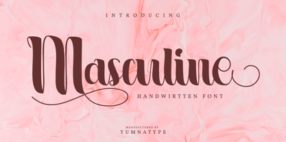 Masculine is a beautiful handwritten font. Made for any professional project branding. It is the best for logos, branding and quotes. Every letter has a unique and beautiful touch. Features: Standard Ligatures Swashes Stylistic Sets PUA Encoded Multilingual Support Numerals and Punctuation by Yumnatype
 - ITC Manhattan by ITC,
$29.99Manhattan was designed in 1970 for ITC by Tom Carnase, who also created Avant Garde Gothic. The distinguishing characteristic of this designer's work is found in the emphasis on the thick-thin constrast. In this case, Carnase approached the border of the impossible. The heavy vertical strokes stand opposite the finest of lines and the thick columns dominate the overall look. The basic forms are strictly constructed, as are those of Morris F. Benton's Broadway of 1925, to which many parallels can be found. Manhattan is best used for applications which will not be placed too far from the viewer, as at too great a distance the fine lines can no longer be seen. It should be used exclusively for headlines in medium point sizes. - Nockwell by Ronny Studio,
$19.00 Nockwell font - Psychedelic liquid decorative font, which works perfectly for bold titles, Festival posters, as a graphic element for bright T-shirt or hoodies, or even backgrounds! This weird and ugly font likes an experiment with spacing and different deformation. Please, don't hold back on your bold modern ideas! Features : - Lowercase & Uppercase ( All Caps ) - numbers and punctuation - Ligature - multilingual - PUA encoded Please contact us if you have any questions. Enjoy Crafting and thanks for supporting us! :) Thank you
 - Tinderbox by Device,
$29.00 16th and 17th century formal handwriting forms the basis for Tinderbox, an antique script. Preserving the rough impression of a quill pen on parchment, Tinderbox evokes old manuscripts, ecclesiastical texts, gothic inscriptions, faded tattoos and horror literature; spooky calligraphy for the digital age.
 - Albion's White Christmas by Greater Albion Typefounders,
$14.00 “Albion’s White Christmas” can only be described as a snowy blackletter. In the tradition of old childrens' comics, yuletide magazine mastheads and vintage Christmas cards, it is a snow draped blackletter ideal for the winter holidays and letting in the spirit of Christmas.
 - Designal by Type-Ø-Tones,
$40.00 Designal is a Félix Rufín design based on the DIN theme. The goal was to create a suitable unicase, an old dream of typographers. The icons collection —more than 400— is a result of Rufín’s obsession with label design. OpenType, 8 styles.
 - ATF Garamond by ATF Collection,
$59.00 The Garamond family tree has many branches. There are probably more different typefaces bearing the name Garamond than the name of any other type designer. Not only did the punchcutter Claude Garamond set a standard for elegance and excellence in type founding in 16th-century Paris, but a successor, Jean Jannon, some eighty years later, cut typefaces inspired by Garamond that later came to bear Garamond’s name. Revivals of both designs have been popular and various over the course of the last 100 years. When ATF Garamond was designed in 1917, it was one of the first revivals of a truly classic typeface. Based on Jannon’s types, which had been preserved in the French Imprimerie Nationale as the “caractères de l’Université,” ATF Garamond brought distinctive elegance and liveliness to text type for books and display type for advertising. It was both the inspiration and the model for many of the later “Garamond” revivals, notably Linotype’s very popular Garamond No. 3. ATF Garamond was released ca. 1918, first in Roman and Italic, drawn by Morris Fuller Benton, the head of the American Type Founders design department. In 1922, Thomas M. Cleland designed a set of swash italics and ornaments for the typeface. The Bold and Bold Italic were released in 1920 and 1923, respectively. The new digital ATF Garamond expands upon this legacy, while bringing back some of the robustness of metal type and letterpress printing that is sometimes lost in digital adaptations. The graceful, almost lacy form of some of the letters is complemented by a solid, sturdy outline that holds up in text even at small sizes. The 18 fonts comprise three optical sizes (Subhead, Text, Micro) and three weights, including a new Medium weight that did not exist in metal. ATF Garamond also includes unusual alternates and swash characters from the original metal typeface. The character of ATF Garamond is lively, reflecting the spirit of the French Renaissance as interpreted in the 1920s. Its Roman has more verve than later old-style faces like Caslon, and its Italic is outright sprightly, yet remarkably readable.
 - Gutknecht by Proportional Lime,
$9.99 Jobst Gutknecht was a highly successful printer in the city of Nuremburg from 1514 to 1542. He published the "Achtliederbuch" (the first Lutheran hymnal, with a whole 4 tunes) and many works by Martin Luther. This font is an accurate "recutting" of the font face Gutknecht used for the body text in his printed works. It has been extended to over 900 glyphs adding hundreds for modern use. It also presents many ancient things like old ligatures such as "tz", a hedera, and alternate style pilcrow for visual interest. And for those conservative types the modern lower case "k" is also available.
 - Scriptek by ITC,
$29.99 Scriptek was created by British designer David Quai in 1992, based on the constructivist forms which became popular after the First World War with the progressing industrialization in Moskow. Typefaces such as Scriptek were often used in the propaganda of totalitarian political systems and can still be seen on monuments like the central train station in Milan or political posters of the 1930s and 40s. The robust Scriptek has strong serifs in the upper left and lower right of characters and this, together with the diagonal strokes of many lower case letters, gives the font a dynamic feel. Scriptek is best used for headlines and display.
 - Yenda by Deniart Systems,
$20.00 Yenda is a bold angular font with just a bit of swoosh. Great for short text and headlines! Don't leave this one out of your next sci-fi or bold designs! This typeface includes all the special diacritics required for European languages.
 - American Sensation by Megami Studios,
$12.50 This font is styled after artwork from the cola signs of old. Signs that talked about "America's Sensation", with "Cool, Refreshing Taste" and other words of a bygone era, one with cane sugar and not corn syrup. Filled with a retro feeling of sophistication and playfulness, this font can be used in a variety of fashions.
 - Geometry Soft Pro by CheapProFonts,
$10.00 The Geometry Pro family has been designed to be the final word in purely geometric fonts, and this rounded “Soft” sub-family is the ultimate web 2.0 style font collection. Even though it is strictly geometric (as drawn with a compass and a ruler fixed to 90 and 45 degree angles) it is not slavishly modular: letters have differing widths, and the sidebearings, spacing and kerning has been finely adjusted to create smooth text. The Soft family contains three weights each with 6 variants: A is the basic form and the starting point B has more dynamic and modern shapes C has open and swirly shapes X is the serious text version Y has a very horizontal look Z is a collection of all the remaining more funky shapes Mix and match to your heart’s desire! Please enjoy the free “Bold N” version - this “notched” variant lets you test out the quality of the outlines and the language support. ALL fonts from CheapProFonts have very extensive language support: They contain some unusual diacritic letters (some of which are contained in the Latin Extended-B Unicode block) supporting: Cornish, Filipino (Tagalog), Guarani, Luxembourgian, Malagasy, Romanian, Ulithian and Welsh. They also contain all glyphs in the Latin Extended-A Unicode block (which among others cover the Central European and Baltic areas) supporting: Afrikaans, Belarusian (Lacinka), Bosnian, Catalan, Chichewa, Croatian, Czech, Dutch, Esperanto, Greenlandic, Hungarian, Kashubian, Kurdish (Kurmanji), Latvian, Lithuanian, Maltese, Maori, Polish, Saami (Inari), Saami (North), Serbian (latin), Slovak(ian), Slovene, Sorbian (Lower), Sorbian (Upper), Turkish and Turkmen. And they of course contain all the usual “western” glyphs supporting: Albanian, Basque, Breton, Chamorro, Danish, Estonian, Faroese, Finnish, French, Frisian, Galican, German, Icelandic, Indonesian, Irish (Gaelic), Italian, Northern Sotho, Norwegian, Occitan, Portuguese, Rhaeto-Romance, Sami (Lule), Sami (South), Scots (Gaelic), Spanish, Swedish, Tswana, Walloon and Yapese.
 - Tropical Jungle by Colllab Studio,
$19.00 "Hi there, thank you for passing by. Colllab Studio is here. We crafted best collection of typefaces in a variety of styles to keep you covered for any project that comes your way! Tropical Jungle is a fun wild font, inspired by the wild life of the jungle. Inspired by the tropical rainforests of South America, Africa, and Asia, this font will inspire you to get out there and explore! Tropical Jungle is a bold, quirky typeface that captures the joyous spirit of life on earth or at least, of the parts we’re most familiar with: monkeys swinging through trees, tigers stalking their prey through the jungle, butterflies flitting from flower to flower. You can tell just from looking at it that this is going to be a fun-loving font that will bring a smile to your face and a bounce to your step. With over 500 glyphs, this stack of jungle animals will be a joy to use! We made sure our font was easy to read in any application so you don’t have to worry about your documents cluttering up. We know you can’t wait to get started using it in your next project. So go ahead! Grab Tropical Jungle now! A Million Thanks Colllab Studio www.colllabstudio.com
 - Vernyhora by Bohdan Hdal,
$21.00 The vintage display font family Vernyhora. The typeface is intended to be used in those places where the letters when it is necessary to transmit the strong character, stability and historicity. The font has got 6 weights. It contains extended Cyrillic and Latin alphabets. It also consists of the alternative set of characters from the old Ukrainian alphabet. It can be used for the state institutions names. It was planned to be a font of old cities and towns. From the very beginning the font was created in order to execute signboards at the entrance of towns. For the font creation the author was inspired by the graphic designers of the early 20th century, such as Georgiy Narbut and Fedir Krychevs'kyi. From the Ukrainian language the font name is translated into English as mountains mover.
 - Ainslie Sans by insigne,
$- Say g'day to Ainslie Sans, insigne Design’s new typeface. Like its big brother, the new face incorporates a mix of influences from Oz, although Sans is pared down from the original semi-serif. The original Ainslie was inspired by Mt. Ainslie and the city of Canberra’s inner suburb of the same name. Canberra is Australia’s capital--a planned city designed by American architect Walter Burley Griffin. Griffin’s style and geometric design for the city, which include Mt. Ainslie, are now also the same structure that make up the foundation of Ainslie Sans. Unlike the original Ainslie family member, though, Ainslie Sans does away with much of the aboriginal-inspired touches by eliminating the semi-serifs, forcing the font to borrow more heavily than its predecessor from Canberra’s distinct, geometric design and style. The result’s a spiffy Australian font that’s usable within a wide array of applications. The trendy typeface incorporates a multitude of alternates. You can access these in any OpenType-enabled application. Alternates, swashes and alternate titling caps allow you to customize the look and feel. Also incorporated are capital swash alternates, old style figures, and compact caps. Check out the PDF brochure to view these options in action. OpenType enabled applications can take complete benefit of your automatic replacing ligatures and alternates. This font also presents the glyphs to help a wide array of languages. Try it for copy. Try it for a headline. Try it alongside the original Ainslie. Whichever way suits you best, give it a burl. You won't be sad you did.
 - Night Circus by Yumna Type,
$25.00 Night Circus is a capitalized display font in a circus theme having unique, interesting designs with big, prominent letter sizes to catch attention. All of its letters are peculiarly designed in bright colors and many decorative circus elements. The power-expressing big, thick letters are perfect to use in power, boldness message-delivering designs. The advantages of Night Circus font, which provides a clipart in line with the theme, are the abilities to produce unique, charming nuances to your designs and to make your products more interesting which increases the products’ attractiveness. You can use it in big text sizes to be greatly legible and enjoy the available features here. Features: Multilingual Supports PUA Encoded Numerals and Punctuations Night Circus fits best for various design projects, such as brandings, headings, magazine covers, quotes, printed products, merchandise, social media, etc. Find out more ways to use this font by taking a look at the font preview. Thanks for purchasing our fonts. Hopefully, you have a great time using our font. Feel free to contact us anytime for further information or when you have trouble with the font. Thanks a lot and happy designing.
 - Disco Jaw by PizzaDude.dk,
$20.00 The beat is on, the piano plays the funky tunes and the rhythm guitars do their best to get the party started! The party starts with your design - use the Disco Jaw font if you are working with a theme that involves comic, kids, commercial, arts and crafts, posters ... anything that needs a fresh kick! Included are jumpy alternative letters, which makes your text look alive and kicking - and or course, there is multilingual support!
 - Le Havre Rough by insigne,
$19.00 Le Havre Rough. It’s high-resolution, hand-crafted letterpress to the core. Based on insigne’s popular Le Havre typeface, this new heat-treated, weathered face of all caps joins the realism and appeal of the top-quality Le Havre family. Rough’s eroded, printed look is extremely customizable, offering eleven distressed choices that appear fantastic even at large output sizes. Go ahead. Try it on, say, a billboard. Maybe even Times Square. The font includes hand-printed texture and distinctive shadow choices, too. Options include three inline versions, two shadow layers, and a clean primary version. Combine and match the options easily as you need, layering normal and shadow variations to alter appearance and texture. You can activate Art Deco alternates by using OpenType contextual alternates. Rough has an extra-large character set for many languages. Additionally, the typeface offers 62 extra ornaments like arrows, emblems, numbers & lines. Use its full texture and grit to capture the classic, genuine print feel that you need in your project. A few suggestions for use: - In Photoshop, jigger with various 'anti-aliasing' options for best outcomes. Smooth or strong is generally best. - In Illustrator, the shadow layer occasionally doesn't align when using the regular layer. To fix the alignment, open the type drop-down menu and choose Area Type Options > Em Box Height. Learn more about the using layered type styles on this informative video.
 - Tequendama by JVB Fonts,
$30.00 A display fontface for titles inspired on Latin America, Ethnic, Native, Tribal, Mysthical, Handmade, Aboriginal, Pre-Hispanic, Pre-Columbian, Textured. By mid-1997 I was developed the early type edition was called «Muisca Sans» as my work for the degree in Graphic Design (Universidad Nacional de Colombia), based on the concept of pre-Columbian figures characteristics within some of the very few visual elements recovered from the Muisca culture, ancient pre-Columbian tribe disappeared before the arrival of the Spaniards in what is now central Colombia. In fact, the name of the capital Bogotá (the capital of Colombia) goes back to Bacatá as primary or village downtown of what was once the imperial capital of tribe Muisca. Although this unfinished early typographic project has not yet been published, Tequendama is the evolution of the first one. Tequendama reminds the myth of Muisca culture and religion of this tribe. The god Bochica, a wise old man with a white beard heard the cries of his tribe suffered against flooding of their land losing harvests before the divine punishment resulted by the offended god Chibchacun. However Bochica appeared wearing a white robe sitting on a huge rainbow and he broken the mountain towards the southwest wise old man with a golden staff broke the mountain to drain the flooded savanna. This emblematic and iconic place would later be called as «Salto de Tequendama». Tequendama name also been adopted to a nearby province to Bogotá.
 - Modesto Initials by Parkinson,
$20.00 Modesto Initials had existed as a single font for several years. I recently added a fill font to put color in the Inlines. The Inline font still works by itself. The Fill font works alone too, as an ultra Modesto on steroids. They work best together. Modesto is a loose-knit family based on a signpainters lettering style popular in the late-19th and early-20th centuries. It evolved from the lettering I used for the Ringling Bros. and Barnum & Bailey Circus Logo. The Modesto family was not planned. It just happened, a few fonts at a time over about fifteen years. In 2014 seven new Italic fonts and two Chromatic families were added. There is a downloadable MODESTO USER MANUAL PDF in the Gallery section for this family.
 - Amelia by Linotype,
$29.99American designer Stanley Davis created the font Amelia™ in 1965. What sets Linotype Amelia apart from all the rest are its unusual inner spaces. Their teardrop forms lead the readers eye through the line of text. These teardrop shapes can also be seen in the contours of the characters themselves, making the letters look rounded and flexible. Amelia speaks the language of the digital age. The flowing strokes and round forms give it an uncomplicated and lively look. - ITC Stone Sans II by ITC,
$45.99 The ITC Stone Sans II typeface family is new from the drawing board up. Sumner Stone, who designed the original faces in 1988, recently collaborated with Delve Withrington and Jim Wasco of Monotype Imaging to update the family of faces that bears his name. Sumner was the lead designer and project director for the full-blown reworking – and his own greatest critic. The collaborative design effort began as a relatively simple upgrade to the ITC Stone Sans family. As so often happens, however, the upgrade proved to be not so simple, and grew into a major design undertaking. “My initial intent,” recalls Sumner, “was to provide ITC Stone Sans with even greater versatility. I planned to add an additional weight, maybe two, and to give the family some condensed designs.” As Sumner began to look more closely at his twenty-year-old typeface, he decided that it would benefit from more extensive design improvements. “I found myself making numerous refinements to character shapes and proportions,” says Sumner. “The project scope expanded dramatically, and I’m pleased with the final result. The redesign has improved both the legibility and the overall appearance of the face.” The original ITC Stone Sans is part of the ITC Stone super family, along with ITC Stone Serif and ITC Stone Informal. In 2005 ITC Stone Humanist joined the family. All of these designs have always offered the same three weights: Medium, Semibold, and Bold – each with an italic counterpart. Over time, Stone Sans has emerged as the godfather of the family, a powerful design used for everything from fine books, annual reports and corporate identity programs, to restaurant menus, movie credits and advertising campaigns. ITC Stone Sans, however, lacked one attribute of many sans serif families: a large range of widths and weights. “These fonts had enjoyed great popularity for many years – during which graphic designers repeatedly asked for more weights and condensed designs in the family,” says Sumner. “Their comments were the impetus.” ITC Stone Sans II includes six weights ranging from an elegant Light to a commanding Extra Bold. An italic counterpart and suite of condensed designs complements every weight. In all, the new family encompasses 24 typefaces. The ITC Stone Sans II family is also available as a suite of OpenType Pro fonts, allowing graphic communicators to pair its versatile design with the capabilities of OpenType. These fonts offer automatic insertion of ligatures, small caps and use-sensitive figure designs; their extended character set also supports most Central European and many Eastern European languages. ITC Stone® Sans II font field guide including best practices, font pairings and alternatives.
 - Saloon Girl by FontMesa,
$25.00 Saloon Girl is a revival of an old classic font used by sign painters and includes the rarely seen lowercase. Saloon Girl comes with extra fill fonts, you will need an application that works in layers in order to use the fill fonts that come with FontMesa fonts. In this all new 2020 version we've added case sensitive form, small caps and italics.
 - Iraan NF by Nick's Fonts,
$10.00A refreshing stars-and-stripes treatment, suggested by lettering artist Francisco Gonzales, combined with the letterforms of an old ATF typeface named "Rodeo", produced this delightfully novel font, suitable for patriotic occasions. Named for a small Texas town, which pronounces its name "Eerie-Ann." Both versions of the font include 1252 Latin, 1250 CE (with localization for Romanian and Moldovan). - Hennepin by Josh Grzybowski,
$24.99 Hennepin derives from a bridge, a street and a county that share the same name in Minneapolis, MN. It is a serif font comprised of three agile weights: regular, light, and extra light. The character set contains typical OpenType features in addition to small caps, and old style numbers, but most importantly, it embraces stylistic alternatives that unite and complete this font.
 - Tickety Boo NF by Nick's Fonts,
$10.00Here's a new take on an old favorite from Frederic Goudy, named Goudy Fancy. Taking its name from a British expression meaning "A-OK," this font is a perfect choice for engaging and enchanting headlines. The font also contains numerous alternate characters to spice up your layouts. Both versions of the font contain characters to support all major European languages. - RM Celtic by Ray Meadows,
$19.00 RM Celtic is derived from a mix of Uncial, Carolingian, Insular and Half-Uncial characters that, together, provide a legible and useable font with a touch of that old Celtic magic. Due to the modular nature of this design there may be a slight lack of smoothness to the curves at very large point sizes (around 100 pt and above).
 - DEADman by Volcano Type,
$29.00The font family "DEADman" is mostly inspired by the weird style of the British illustrator Ralph Steadman. He had a long partnership with the American journalist Hunter S. Thompson, drawing pictures for several of his articles and books e.g. "Fear and Loathing in Las Vegas." Like Steadman's artwork all the letters are painted with ink. The best ones were selected out of hundreds of variations to get the whole character set complete and look uniform. By combining the regular weight with one (or both) of the additional weights "Blotting" and "Squirting" you can achieve a more freaky and psychadelic look. - Egg Farm JNL by Jeff Levine,
$29.00 The opening titles and credits of the 1947 film comedy “The Egg and I” were done in a hand lettered casual sans serif typeface which inspired the digital font Egg Farm JNL; available in both regular and oblique versions. “The Egg and I” introduced audiences to Ma and Pa Kettle as portrayed by Marjorie Main and Percy Kilbride, who went on to do a number of additional films as those characters.