10,000 search results
(0.059 seconds)
- Analogue Pro by Ingo,
$42.00 very traditional forms strongly slanted italic consistant proportions extraordinary ligatures swashes alternate letters alternate figures lower case l with a hooked “foot” Believe it or not, there are hardly any sans serif fonts in which the lower case letter l also has the hooked form of an l. Instead, we readers have to constantly distinguish whether we are seeing an uppercase I or a lower case l — just take a look at the word “Illinois”... The ingoFont Analogue was developed for exactly this reason. The intent: To create a pretty much »ordinary«, even classical font with its most striking characteristic being the inclusion of the “crooked l.” As a model, I used the »mother of all sans serifs«, Akzidenz Grotesk from Berthold, with its beginnings going back to the 19th century. Analogue is so to say a new interpretation of Akzidenz Grotesk from ingoFonts. All characters — following the model — have been newly designed. And if you want to emphasize the shape of the hooked foot even more, you can also activate the alternate styles for d, h, m, n (Style Set 1). Conversely, the alternate a somewhat softens the “hooked” impression (Style Set 2). The slanted versions — it isn’t truly a real cursive font — are noticeably stronger with 13° than the italics in comparable fonts, and were given a round e with a mind of its own which distinguishes itself considerably compared to the upright characters in the overall appearance of the font. More modern and formal solutions in detail were chosen for some of the characters, for example the M was given lightly slanted sides; the a reflects the curves of the s; the “feet” of a, l and t match; the flared legs of K and R became a “foot”, too. General proportions were carried over almost completely with no changes from Akzidenz Grotesk as well as the slanted trimming on the open forms of a, c, e, s; in comparison, C, G and S were given straight endings. Analogue contains many ligatures, even discretional ligatures, plus proportional, old style as well as tabular figures. All in all, at first sight Analogue brings back memories of the charm of its well-known predecessor; and yet, many small differences give Analogue an unmistakable certain something...
 - Banco by ITC,
$29.00Banco was the first typeface work of French designer Roger Excoffon and was released in 1952. The strong forms look as though they were rolled out of sheet metal and feature upright, tapering strokes. The slight slant, the varying heights of stroke ends, and the relationships between line and curve give Banco font its sense of liveliness and dynamism. Excoffon did not design a matching lower case alphabet for his capitals, but this was accomplished later by Phill Grimshaw, who also designed the light weight. He deliberately 'underdesigned' the lower case forms, producing a more reserved alphabet based on the design ideas of the original. - Ombres by Typephases,
$25.00 Very close thematically and in style to the rest of our “whimbats” (the Absurdies, Bizarries, Illustries, Genteta and Whimsies series), the Ombres contain a number of peculiar silhouettes and illustrations of people that range from cute to scary, with everything in between. Ombres offers152 pictures in 3 files. These imaginary characters were produced with different techniques: quick pencil sketches, ink, watercolour, though once digitized and simplified to bring them into the font files there is little apparent difference. The silhouettes, rather than flat shadows are more dimensional in their look, because they have been digitized retaining the original brushwork or pencil strokes of their source drawings. Some of them remind of the venerable tradition of metal stock cuts from vintage type foundries. The digitized results are quite different, but the energetic nature of the subjects has been mantained. Their vectorial file format means you can use them at any size with no loss of quality. Every Ombres dingbat offers ready-made images for a variety of creative projects. They can be used as they come or easily customized in any graphics program. At small sizes they are ideal spot illustrations with a whimsical touch; at large sizes they can bring a whole page, a spread or even a big poster to live.
 - Kooky BT by Bitstream,
$57.99Allen Zuk has designed this wacky typeface that he calls KOOKY. Each character has three variants that bounce about the baseline. The effect is a randomly casual appearance that is great for headlines. The OpenType version does this automatically by using contextual alternates in applications that recognize this option. - Let's Jazz by Unio Creative Solutions,
$9.00 Introducing “Let’s Jazz” - a playful typeface which is inspired by iconic mid-century American advertising and lettering. With this project we wanted to homage the dazzling graphics of those booming years and the result is a jazzy typeface that provides a condensed aspect with a bouncy rhythm. As previously said, Let’s Jazz gives the spontaneous vibe of this sensational music genre but it has been also designed with a strong focus to the very distinct look of Saul Bass graphics, which are honestly still fresh and convincing, even nowadays. Let’s Jazz offers two versions, Regular and Stamp. Each version contains more than 450 glyphs and covers several languages based on the Latin alphabet; the jazzy experience is enhanced with OpenType (OTF) support for small caps and includes some neat ligatures and alternates plus the oldstyle bouncy numerals*. This package is a powerful tool in a wide variety of design purposes: headlines, packaging, logotypes, badges, posters and much more. *Let’s Jazz has built-in OpenType features enabled for Adobe® Creative Suite® and any other opentype capable software. All the extra characters has been additionally coded with “PUA Unicode”, which basically means that this font duo is totally accessible without any additional design software. All the extra characters can now be copied straight out the FontBook (Mac) or CharacterMap (Win) and pasted into your favorite text editor. Official mini-tutorials available here: - How to access alternates, ligatures and swashes in Font Book®: https://youtu.be/mGKlvKr0ReI - How to use alternates, ligatures and swashes in Photoshop®: https://youtu.be/46ZtDbHwUAc Specifications: - Multi-language Support (Central, Eastern, Western European languages) - OpenType features (Standard and Discretionary Ligatures, Alternates, Small Caps, OldStyle Numerals) - PUA Coded Extra Characters Thanks for viewing, Unio.
 - Vienna Woodtype by XTOPH,
$25.00 This font is based on real prints made out of a linocut. The glyphs were handprinted, then scanned and then turned into a computer font.
 - Square Dance by Solotype,
$19.95Animated types like this one have been around for fifty or more years. They certainly add a sense of liveliness to a headline. This one trades upon the "wrong way weights" of the old French Clarendon. Think of it as Barnum with Bounce. - Cooper Screamers by Wordshape,
$- In 1925, at the request of Barnhart Brothers & Spindler, the foundry he worked for, Oswald Bruce Cooper designed a wide selection of "screamers", oversized exclamation points used to grab attention in display advertising. The foundry rushed the screamers into production, much to Cooper's dismay. Cooper was disappointed with the final form of the screamers– they were designed in assorted weights to match the assorted Cooper series of typefaces, as well as in a variety of other formal solutions- squaredoff, incised, wavy, Tuscan, and rounded. Cooper's working design methodology was to re-draw his projects a number of times in order to refine the formal results. However the screamer project was hastily cut by the head of BB&S's matrix engraving room in fourteen sizes from the initial sketches, causing Cooper to fire off a fiery missive stating, "Everything I draw is bum the first half-dozen times I draw it; the trouble with these is that I drew them only once!" This typeface is the result of researching Cooper's original drawings and series of engraved proofs for the screamers, as well as the original Screamer type specimen. Cooper Screamers have never been available before in digital format.
 - Arkeo BT by Bitstream,
$50.99Arkeo BT is designer Brian Sooy's first typeface family published by Bitstream. Given very few design elements to work with, Brian has designed a bitmap font that is unique and very readable. There are three widths, Condensed, Regular and Extended. In our opinion, pixels never looked so good. Arkeo performs equally well on screen and as on paper. The OpenType versions include an extended character set featuring oldstyle figures, fractions and additional f-ligatures. Design was begun in late 2001 and completed in 2002. Sooy asked Bitstream to critique, which we did gladly. We also added additional characters for OpenType. This included alternate figure set, an extended set of fractions and additional f-ligatures. Sooy used preliminary versions for setting parts of the TypeCon 2002 material and website. - Ongunkan Old Turkic by Runic World Tamgacı,
$50.00 Orkhon inscriptions (Orkhon inscriptions, Orkhon inscriptions, Khöshöö Tsaidam monuments (also known as Khoshoo Tsaidam, Koshu-Tsaidam or Höshöö Caidam) or Kul Tigin steles (simplified Chinese: 阙特勤碑; traditional Chinese: 闕特勤碑; pinyin: Què tèqín bēi )) They are two monumental installations written by the Göktürks in the Old Turkic alphabet in the Orkhon Valley in Mongolia at the beginning of the 8th century. They were erected in honor of two Turkish princes Kül Tigin and his brother Bilge Kagan. Both Chinese and Old Turkish inscriptions describe the legendary origins of the Turks, the golden age of their history, their subjugation by the Chinese and their liberation by İlteriş Kağan. According to one source, the inscriptions contain "rhythmic and parallel passages" similar to those of epics. In the Old Turkish Alphabet, 38 letters are accepted academically and this pattern is generally used in the books. But there are more than 38 letters in this alphabet, these special letters are included in this font.
 - Doriss Girls by Open Window,
$- Dorriss girls were the dancing troop at the Moulin Rouge. I had the idea for this font while trying to come up with an alternative to beveling. I thought it would be interesting to create this sort of stepped effect as I've never really seen this treatment on a font before. Then my need to create chaos shows up again with Doriss Girls informal. A hand drawn take on the forms. This seemed like it would appear on an old art nouveau poster by the great Toulouse Lautrec, so there you have the genesis of this font. I've been somewhat compelled by the letterforms so I may expand and create a more normal version of this font someday with a range of weights. That would be the bees knees.
 - TT Autonomous by TypeType,
$39.00 TT Autonomous useful links: Specimen PDF | History of creation | Graphic presentation | Customization options Please note! If you need OTF versions of the fonts, just email us at commercial@typetype.org About TT Autonomous: The idea was born in Amsterdam when one of our colleagues took the official electric taxi at the Schiphol airport. At the moment we were thinking about creating a new wide sans-serif, and an interesting question emerged during the trip: what font would be associated with autonomous electric transport. Then we thought it would also be nice to expand this theme visually. This is how the font family TT Autonomous came about. It is a modern brutal technological sans-serif. The basic visual characteristic of the typeface is the noticeable squareness of the characters and angular internal space. In addition, the typeface proportions tend to appear monospaced, but they are not really monospaced. The width of the characters is inspired by automobile logotype proportions, which are mostly rather wide. We could not disregard the fact that code lines in software for autonomous cars are traditionally typed using monospaced fonts and added a special monospaced subfamily to the TT Autonomous typeface. Thanks to the squareness of the characters inherited from the main family and the real monospace properties, the character forms in the subfamily turned out very specific and interesting. This is especially true for oblique monospaced fonts, which are true italics. In addition, we created a couple of outline styles which are great for use in titles and large inscriptions and perfectly match the basic family and the monospaced family. As opposed to outlines that can be created in graphic editors, in TT Autonomous Outline we worked through the narrow and questionable spots, thanks to which the font looks professionally complete and harmonious. As from the very beginning, the font was developed with tomorrow's technologies in mind, we could not miss addressing variability and creating a variable font. TT Autonomous has variable versions for both the basic and the monospaced subfamilies. TT Autonomous is a complex font family that consists of 32 fonts intended to solve a broad range of design tasks. Overall, the font family features 14 regular styles, 6 monospaced styles, 7 reversed styles, 2 outline styles and 3 variable fonts. The number of glyphs varies from 630+ in the monospaced font to 790+ in the basic styles. The basic subfamily has alternates, ligatures, old-style figures, slashed zeroes, and many other useful features. FOLLOW US: Instagram | Facebook | Website TT Autonomous language support: Acehnese, Afar, Albanian, Aleut (lat), Alsatian, Aragonese, Arumanian, Asu, Aymara, Azerbaijani, Banjar, Basque, Belarusian (cyr), Belarusian (lat), Bemba, Bena, Betawi, Bislama, Boholano, Bosnian (cyr), Bosnian (lat), Breton, Bulgarian (cyr), Catalan, Cebuano, Chamorro, Chichewa, Chiga, Colognian, Cornish, Corsican, Cree, Croatian, Czech, Danish, Dutch, Embu, English, Erzya, Esperanto, Estonian, Faroese, Fijian, Filipino, Finnish, French, Frisian, Friulian, Gaelic, Gagauz (lat), Galician, Ganda, German, Gusii, Haitian Creole, Hawaiian, Hiri Motu, Hungarian, Icelandic, Ilocano, Indonesian, Innu-aimun, Interlingua, Irish, Italian, Javanese, Jola-Fonyi, Judaeo-Spanish, Kabuverdianu, Kalenjin, Karachay-Balkar (cyr), Karachay-Balkar (lat), Karaim (lat), Karakalpak (lat), Karelian, Kashubian, Kazakh (lat), Khasi, Khvarshi, Kinyarwanda, Kirundi, Kongo, Kumyk, Kurdish (lat), Ladin, Latvian, Leonese, Lithuanian, Livvi-Karelian, Luba-Kasai, Ludic, Luganda, Luo, Luxembourgish, Luyia, Macedonian, Machame, Makhuwa-Meetto, Makonde, Malagasy, Malay, Maltese, Manx, Maori, Marshallese, Mauritian Creole, Minangkabau, Moldavian (lat), Montenegrin (cyr), Montenegrin (lat), Mordvin-moksha, Morisyen, Nahuatl, Nauruan, Ndebele, Nias, Nogai, Norwegian, Number, Nyankole, Occitan, Oromo, Palauan, Polish, Portuguese, Quechua, Rheto-Romance, Rohingya, Romanian, Romansh, Rombo, Rundi, Russian, Rusyn, Rwa, Salar, Samburu, Samoan, Sango, Sangu, Sasak, Scots, Sena, Serbian (cyr), Serbian (lat), Seychellois Creole, Shambala, Shona, Silesian, Slovak, Slovenian, Soga, Somali, Sorbian, Sotho, Spanish, Sundanese, Superscripts and Subscripts, Swahili, Swazi, Swedish, Swiss German, Tagalog, Tahitian, Taita, Talysh (lat), Tatar, Teso, Tetum, Tok Pisin, Tongan, Tsakhur (Azerbaijan), Tsonga, Tswana, Turkish, Turkmen (lat), Ukrainian, Uyghur, Valencian, Vastese, Vepsian, Volapük, Võro, Vunjo, Walloon, Welsh, Wolof, Xhosa, Zaza, Zulu.
 - ITC Outpost by ITC,
$29.99Hal Taylor's ITC Outpost was not the result of a detailed design brief, nor was there a methodical development of key concepts or characters. Outpost just seemed to emerge all at once during a brief sketching session," says Taylor. "I guess what I was thinking of was an antiquated Western perception of some sort of Middle Eastern hand lettering - a 'mysterious East' sort of thing." ITC Outpost's sense of the exotic has an almost Art Nouveau quality, with its sensuous curves and sweeping strokes. The open bowls and opposing weight bias in many of the characters add to the design's striking personality. A suite of alternate and swash letters enables the setting of distinctive display copy. ITC Outpost's family of roman, italic, and swash characters is compact but versatile. The caps have the grace and authority of a titling face. Add in the lowercase and swash letters and copy is transformed into something lighthearted and full of verve. ITC Outpost creates dramatic headlines and adds a flourish to invitations, menus, logos and packaging An accomplished designer, Taylor has spent most of his career in the lettering and typographic arts. He began as a photo-lettering typographer, setting headlines and creating custom lettering, and now works in the publishing industry. " - Throrian Formal - 100% free

- Throrian Commonface - 100% free

- Loopy BRK - Unknown license

- Loopy (BRK) - Unknown license

- Hadley - Unknown license

- Lyra by Canada Type,
$39.95 Lyra is an Italian Renaissance script that might have developed if metal type had not broken the evolution of broad pen calligraphy. It lies in the area between the humanist bookhand and the chancery cursive, combining the fullness and articulation of the Roman letters with a moderate italic slant and condensation. A steep pen-angle allows use of a broader pen relative to the x-height, giving the letters more contrast with light verticals and heavy curves. Lyra embodies the Renaissance spirit of refining technical advances of the late middle ages with reintroduction of ancient classical principles. Based on the moving penstroke with constantly changing pen-angle, it brings the vitality of handwriting to the ordered legibility of type. Lyra is a formal italic, too slow for copying books. By eliminating the element of speed, digital technology opens up a new level of calligraphy, bringing it into the sphere of typography as would naturally have happened if metalworkers had not controlled the process. If classical Western traditions are respected, digital calligraphy has the potential to recapture the work of the past and restart its stalled evolution. There is of course no substitute for the charm of actual writing, with each letter made for its space; but the tradeoff is for the formal harmony of classical calligraphy as every curve resonates in tune with every other. This three-weight font family marks Philip Bouwsma's much-requested return from a three year hiatus. It also reminds us of his solid vision in regards to how calligraphy, typography and technology can interact to produce digital beauty and vesatility. Each of the three Lyra fonts contains almost three character sets in a single file. Aside from the usual wealth of alternates normally built into Bouwsma's work, Lyra offers two unique features for the user who appreciates the availability of handy solutions to subtle design space issues: At least three (and as many as six) length variations on ascending and descending forms, and 65 snap-on swashes which can be attached to either end of the majuscules or minuscules. The series also offers 24 dividers and ornaments built into each weight, and a stand-alone font containing 90 stars/snowflakes/flowers, symmetric contstructs for building frames or separators, masking, watermarking, or just good old psychedelia.
 - FS Conrad by Fontsmith,
$50.00 Art into type In 2008, Fontsmith were approached by their friend, Jon Scott, to investigate whether a typeface could assume the aesthetic of one artist’s body of work. Jon’s not-for-profit charity, Measure, was organising an event for the artist, Conrad Shawcross, whose giant mechanical installation, entitled Chord, was going on public display in the long-disused Kingsway tram tunnel in Holborn. Chord explores the way we perceive time, as either a line or a cycle. Two enormous machines with dozens of rotating arms and moving in opposite directions, weave rope with almost infinite slowness. An unusual brief Phil Garnham visited Conrad in his Hackney studio to get a feel for his work and ideas. “Conrad is a very clever and philosophical guy. He struggled to see how typeface design had any relevance to him and his art. This was going to be a challenge.” The artist presented the type designer with a pile of rope and a huge diagram of sketches and mathematical workings. “This was, in essence, my brief.” Phil developed three concepts, the simplest of which ticked all the boxes. “The idea of the strokes in the letterforms appearing and ending at peaks or points of origin fitted perfectly with Conrad’s idea of time occurring and ending at two ends of the sculpture.” Two versions Phil planned modules for two versions of the typeface: one with five lines in the letterforms and one with seven. He then drew the modules on-screen and twisted and turned them to build the machine that is FS Conrad. “This is not a simple headline typeface,” says Phil. “It’s not a rigid structure. It has varying character widths, and it’s informed by real typographic insight and proportions so that it actually works as piece of functioning, harmonious type.”
 - EDB Indians - Unknown license

- CA Saygon Text by Cape Arcona Type Foundry,
$40.00 CA Saygon Text is the logic consequence of CA Saygon. It is much calmer and therefore also suitable for reading texts and everyday’s editorial tasks. Basic shapes and proportions were adopted from Saygon and continued in such a way that a font family from Thin to Extrabold resulted. A fundamental inspiration were early static grotesque typefaces such as Akzidenz Grotesk. Nevertheless, the typeface was by no means intended to have a historical look. Thus, a relatively high x-height was chosen, which makes the typeface quite economical in type-setting, since the letters appear visually larger. A relatively small line spacing with good legibility can be achieved due to the small ascenders and the low cap height. Letters like f and t, which otherwise tend to end in curves, were given right angles, which on the one hand meets certain design elements of the original Saygon, but on the other hand also refers to contemporary trends in typeface design. A special feature are the five styles in which CA Saygon Text can be used. The default setting is the Helvetica style, with two-storey a and g. The Futura style has a single-storey a and a two-storey g accordingly. The third style with two-storey a and three-storey g is called the Franklin style. But the real highlight is the Cape style with single-storey a and three-storey g – a real rarity up to now. Let yourself be inspired by this unusual typeface. If you like it even more progressive, you should try the flat style, which continues the right angles in a, g, and y as well. Thanks to the Cyrillic and Latin Extended character sets, a huge linguistic area is covered that even extends to Vietnam! Even the exotic German capital-double-s is available and appears automatically when typed between other capital letters. Numerous OpenType features make life easier for the professional typographer: there are fractions, superscript and subscript numbers, as well as proportional and tabular capitals.
 - Dominant Youth by Fikryal,
$25.00 Introducing Dominant Youth, a bold and impactful display serif font that exudes confidence and strength. With its commanding presence, Dominant Youth is designed to make a lasting impression on any creative project. The font’s robust and assertive letterforms showcase a unique blend of classic elegance and contemporary style. Its tall and slender structure adds a touch of sophistication, while the sharp serifs give it a distinctive edge. Dominant Youth is carefully crafted to capture attention and evoke a sense of boldness and youthfulness. Whether you’re working on branding, editorial design, headlines, posters, or any other project that demands attention, Dominant Youth is the perfect choice. Its versatile nature allows it to excel in both digital and print mediums, ensuring your message stands out in a captivating manner. The well-defined characters of Dominant Youth provide excellent legibility, even at smaller sizes. The font’s wide range of weights and styles offers flexibility, allowing you to experiment and find the perfect balance for your design needs. From light and elegant variations to bold and impactful options, Dominant Youth empowers you to create visually striking compositions that leave a lasting impression. Don’t settle for ordinary typography when you can make a statement with Dominant Youth. Embrace its commanding presence, embrace its youthful energy, and elevate your designs to a new level of distinction. Features: Dominant Youth Multilingual Support Thank you
 - RePublic by Suitcase Type Foundry,
$75.00In 1955 the Czech State Department of Culture, which was then in charge of all the publishing houses, organised a competition amongst printing houses and generally all book businesses for the design of a newspaper typeface. The motivation for this contest was obvious: the situation in the printing presses was appalling, with very little quality fonts existing and financial resources being too scarce to permit the purchase of type abroad. The conditions to be met by the typeface were strictly defined, and far more constrained than the ones applied to regular typefaces designed for books. A number of parameters needed to be considered, including the pressure of the printing presses and the quality of the thin newspaper ink that would have smothered any delicate strokes. Rough drafts of type designs for the competition were submitted by Vratislav Hejzl, Stanislav Marso, Frantisek Novak, Frantisek Panek, Jiri Petr, Jindrich Posekany, and the team of Stanislav Duda, Karel Misek and Josef Tyfa. The committee published its comments and corrections of the designs, and asked the designers to draw the final drafts. The winner was unambiguous — the members of the committee unanimously agreed to award Stanislav Marso’s design the first prize. His typeface was cast by Grafotechna (a state-owned enterprise) for setting with line-composing machines and also in larger sizes for hand-setting. Regular, bold, and bold condensed cuts were produced, and the face was named Public. In 2003 we decided to digitise the typeface. Drawings of the regular and italic cuts at the size of approximatively 3,5 cicero (43 pt) were used as templates for scanning. Those originals covered the complete set of caps except for the U, the lowercase, numerals, and sloped ampersand. The bold and condensed bold cuts were found in an original specimen book of the Rude Pravo newspaper printing press. These specimens included a dot, acute, colon, semicolon, hyphens, exclamation and question marks, asterisk, parentheses, square brackets, cross, section sign, and ampersand. After the regular cut was drafted, we began to modify it. All the uppercase letters were fine-tuned, the crossbar of the A was raised, E, F, and H were narrowed, L and R were significantly broadened, and the angle of the leg and arm of the K were adjusted. The vertex of the M now rests on the baseline, making the glyph broader. The apex of the N is narrower, resulting in a more regular glyph. The tail of Q was made more decorative; the uppercase S lost its implied serifs. The lowercase ascenders and descenders were slightly extended. Corrections on the lower case a were more significant, its waist being lowered in order to improve its colour and light. The top of the f was redrawn, the loop of lowercase g now has a squarer character. The diagonals of the lowercase k were harmonised with the uppercase K. The t has a more open and longer terminal, and the tail of the y matches its overall construction. Numerals are generally better proportioned. Italics have been thoroughly redrawn, and in general their slope is lessened by approximatively 2–3 degrees. The italic upper case is more consistent with the regular cut. Unlike the original, the tail of the K is not curved, and the Z is not calligraphic. The italic lower case is even further removed from the original. This concerns specifically the bottom finials of the c and e, the top of the f, the descender of the j, the serif of the k, a heavier ear on the r, a more open t, a broader v and w, a different x, and, again, a non-calligraphic z. Originally the bold cut conformed even more to the superellipse shape than the regular one, since all the glyphs had to be fitted to the same width. We have redrawn the bold cut to provide a better match with the regular. This means its shapes have become generally broader, also noticeably darker. Medium and Semibold weights were also interpolated, with a colour similar to the original bold cut. The condensed variants’ width is 85 percent of the original. The design of the Bold Condensed weights was optimised for the setting of headlines, while the lighter ones are suited for normal condensed settings. All the OpenType fonts include small caps, numerals, fractions, ligatures, and expert glyphs, conforming to the Suitcase Standard set. Over half a century of consistent quality ensures perfect legibility even in adverse printing conditions and on poor quality paper. RePublic is an exquisite newspaper and magazine type, which is equally well suited as a contemporary book face. - Naive Inline by S&C Type,
$8.00 Naïve Inline is a layered serif handwritten font designed by Fanny Coulez and Julien Saurin in Paris. Our goal was to draw a font with finely irregular lines that give a human and whimsical feeling. We designed three weights to assure a good readability whatever the size. They can be enhanced with five different interior patterns and three shadows to improve your designs and bring a charming and unusual feeling. To do so, you can simply superimpose the layers with a compatible software like Photoshop, the weight above and the pattern(s) below, then choose a color for each. This font is part of our Naïve superfamily that contains lot of variations: Line, Inline, Serif, Sans Serif, and a special Art Deco one. Just click on our foundry name to see them all! We hope you will enjoy our work. Merci beaucoup!
 - Brume by Creativemedialab,
$16.00 Brume font is a bold, attractive and beautiful font. "Easy to read, modern and elegant look but stylist", this will be the first words that your client says to your design using this font. Comes with uppercase and lowercase. It has many alternates character with nice curve that you can arrange to create a nice logo lettering, or use it as a display face on a poster and add a few alterations to it to make a beautiful eye catching words. Brume font is best for logo lettering, headlines, product packaging, t-shirt design, wedding theme, poster, book cover, wedding invitation, Christmas and more To access alternate: In Adobe Photoshop go to Window - glyphs In Adobe Illustrator go to Type - glyphs
 - Hunterland by Aminmario Studio,
$20.00 Hunterland is a modern signature font. This font was created to look as close to a natural handwritten as possible by including some alternates lowercase, ligature and underlines. Perfect for any awesome projects that need hand writing taste. Comes with regular and italic. Built in Opentype features, this script comes to life as if you were writing it yourself. Also support multilingual. It's highly recommended to use it in opentype capable software - there are plenty out there nowadays as technology catches up with design ... Other than Photoshop, Illustrator and Indesign, many standard simple programs now come with Opentype capabilities - even the most basic ones such as Apple's Text Edit, Pages, Keynote, iBooks Author, etc. Even Word has found ways to incorporate it. AminMario
 - Dry Brush Serif by Kaer,
$28.00 I'm happy to present you my new classic style font. It's a vintage serif font with my brush touches. I used dry strokes with rough edges decoration elements. Perfect if you want to add slight retro style to your project. I designed it for fashion labels, classic headlines, glamour posters, luxury identity, wedding invitations. You will get: * Uppercase glyphs * Numbers and symbols * Multilingual support * Free future updates Please feel free to request to add characters you need: kaer.pro@gmail.com Thank you!
 - One Day by Typehill Studio,
$10.00 One Day is a new modern script font with an irregular baseline. A contemporary approach to design, handmade natural, suitable for use in title design such as clothing, invitations, book titles, stationery designs, quotes, branding, logos, greeting cards, T-shirts, packaging designs, posters, and more. Complete with uppercase and lowercase letters, as well as multi-language support, numbers, punctuation. Also provide some ligatures and swash. Thanks so much for looking and please let me know if you have any questions.
 - East Botany by Reyrey Blue Std,
$16.00 Say Hi to East Botany. A new bold and stylish font with modern, groovy and retro look. It comes with large selection of alternate glyphs to give your any project to a unique design. East Botany is perfect for luxury logo and branding, classy editorial design, woman magazine, cosmetic brand, fashion promotional, blog design, modern advertising design, card invitation, art quote, book/cover title, and modern and more. Features : · All Uppercase and Lowercase · Number & Symbol · Supported Languages · Alternates and Ligatures · PUA Encoded
 - Braderia by Aldedesign,
$25.00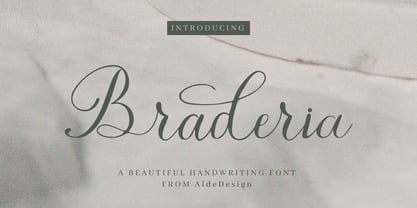 Braderia // Modern Calligraphy is a stylish script font that features a varying baseline, smooth line, modern, and depth of love. For those of you who need a touch of love and modernity for your designs or branding, it can be used for various purposes such as headings, weddings, invitations, signatures, logos, branding, t-shirt, letterhead, signage, labels, news, posters, badges, etc. Each Font Has: Stylish modern handwritten script Beautiful Swash (Ending tail) Beautiful Titling (Beginning tail) Special Ligatures Multilingual Support
 - Belgiany by Sealoung,
$25.00 Belgian is a beautifully stylish modern serif font. A new beautiful serif that we created specifically for your logo and branding needs, with an extra unique shape that will add value to your brand. It's great to take advantage of designers or product owners who need a solution to make their designs look more beautiful and modern. And especially for Belgian fonts, We prepare any alternative characters to help you create unlimited variations for your creative needs especially for logo types or wordmarks.
 - Premiere Christmas by Aldedesign,
$25.00 Premiere Christmas // Modern Calligraphy is a stylish script font that features a varying baseline, smooth line, modern, and depth of love. For those of you who need a touch of love and modernity for your designs or branding, it can be used for various purposes such as headings, weddings, invitations, signatures, logos, branding, t-shirt, letterhead, signage, labels, news, posters, badges, etc. Each Font Has: Stylish modern handwritten script Beautiful Swash (Ending tail) Beautiful Titling (Beginning tail) Special Ligatures Multilingual Support
 - Bogem Style by Sensatype Studio,
$15.00 Bogem is a Historical Vintage Serif. A New Vintage font that we created special for Unique branding needs, with extra ligature in unique style that ready to add value of your brand. It's so nice to leverage designer or product owner that need solutions to make their design look more unique and vintage. Lowercase and Uppercase characters Numbers and Punctuations Preview as a inspirations that you can do with Bogem font Available for PC and Mac Wish you enjoy our font.
 - Segule by Sensatype Studio,
$15.00 A new San Serif Font that we created special for Headline, Title and more stand out typography needs. It's so perfect to add your style and headline overview. And specially for Headline font, we crafted for unique style and modern feels so enjoy to create any project that will show your main idea out. Segule Modern Humanist Sans Serif Font ready with: Preview as a inspirations that you can do with Segule font Ready with All characters Wish you enjoy our font. :)
 - Magdalena by BBA Key,
$12.00 Magdalena Script Magdalena Script New fresh & modern style with handmade calligraphy, decorative characters and dancing lineage! So wonderful are invitations like greeting cards, branding material, business cards, quotes, posters, and more !! If you do not have programs that support OpenType features like Adobe Illustrator and CorelDraw X Versions, you can access all alternative flying machines using Font Book (Mac) or Character Map (Windows). If you have any questions, please feel free to contact me via email. Thanks and good luck :-)
 - Holiday And Party Words by Outside the Line,
$19.00 Handwritten or printed holiday and party words for all your flyers and party invitations. Font includes Happy Birthday, Merry Christmas, Happy Holiday, New Year, Holidaze, Joy, Greetings, Ho, Ho, Ho, Fa, La, La, Glad Tidings, Jingle, Yule tide, Happy Kwanzaa, Happy Hanukkah, Easter, Valentine’s Day, 4th of July, Labor Day, Engagement, Wedding, Baby, Open House, Party, Shower and Event. Just add an icon from Party Doodles or Holiday Doodles or Holiday Doodles Too and you have a years worth of flyers!
 - Kidplay by ZetDesign,
$6.00 Hey Guys! My new Font Kidplay is a funny and playful sans serif, perfect for child magazine cover, comic creations, branding projects, headlines, posters and packaging! Kidplay font has three styles allow unique and versatile design options! Furthermore it is a unicase font, so you can also play with uppercase and lowercase initials. But that's not all! it is equipped with multilingual accents, so it can be used in several Latin languages. I hope you enjoy my creation. Thank you!
 - Buttergone Brush by Lucky Type,
$14.00 Buttergone is a new modern brush font with an irregular baseline. a contemporary approach to design, handmade natural, suitable for use in title design such as clothing, invitations, book titles, stationery designs, quotes, branding, logos, greeting cards, T-shirts, packaging designs, posters, and more. Complete with uppercase and lowercase letters, as well as multi-language support, numbers, punctuation, as well as some ligatures and swash glyphs. Thanks so much for looking and please let me know if you have any questions.
 - Cygnus by JVB Fonts,
$24.95 A font face with cyber, spacial, and aerial connotations that offers a decisive futuristic and techno spirit. Available in two stylish versions, clear and rusty. With one alternate for lowercase /a/ and more diacritics and ligatures and extended range glyphs and more new stylish alternates, Cygnus can be used in titles and display text that require a futuristic and dynamic style. Recommended for games, presentations, or any graphic design pieces that reveal and need futuristic, techno, spacial, aerial and/or Sci-fi style.


