10,000 search results
(0.062 seconds)
- Evalfey Variable by insigne,
$99.99 Introducing Evalfey— a script that captivates at first glance. With its refined and polished demeanor, Evalfey invites you into a world of elegance, yet its simplicity makes it incredibly accessible. The elevated x-height, distinctive flag-like terminals, and the fluidity of its sweeping strokes imbue the font with a harmonious and flowing quality, elevating your designs to new heights. Ideal for wedding invitations and more, Evalfey Script exudes a romantic allure with its brushed look and pronounced 'nuptial' ambiance. Whether it's for save-the-date cards, thank-you notes, or any cherished wedding memorabilia, Evalfey is the epitome of sophistication and grace. Stand out from the ordinary with Evalfey— a font that marries simplicity with regality, making it the quintessential choice for weddings that aspire to be remembered. The lofty x-height, elegant terminals, and rhythmic strokes render Evalfey a crown jewel in typographic design. Elevate your special moments with Evalfey, a harmonious blend of elegance and simplicity, making it your go-to font for wedding invitations, announcement cards, and any keepsake that calls for a touch of the extraordinary. Production assistance from Lucas Azevedo.
 - 1812 by Apostrof,
$40.00 '1812' type family is a revival and further development of the typeface '1812' by Lehmann Type Foundry (St. Petersburg). It was created for the centenary of the French invasion of Russia, known in Russia as the Patriotic War of 1812 along the lines of decorative engraved inscriptions and ornamented typefaces of that time, presumably by the artist Alexandre Benois. It was used mainly for the decoration of luxurious elegant publications. Later, in 1917, this typeface was used on the Russian Provisional Government banknotes. In the Soviet period of time '1812' appeared to be one of the few typefaces included in the first Soviet type standard OST 1337. It was produced for manual typesetting until the early 1990s. This typeface could be seen on Soviet letterheads, forms, posters and even air tickets. The digital version development was launched in 2010. The original version was supplemented with lowercase letters and alternative symbols, the extended Latin and Cyrillic alphabets were fully supported. The font was evolved into a family of 14 decorative styles which can refine any design giving it a festive and elegant but at the same time strict and nostalgic look. Despite its decorative nature, '1812' is perfectly readable in small emphasized text blocks due to its classic shape and careful spacing.
 - Lathier by Twinletter,
$17.00 Welcome to a world of design full of character and creativity! Lathier is a unique display font, combining bold and fat elements into an unforgettable letterform. If you're looking for a truly powerful look for your various visual design projects, Lathier is the perfect choice. What sets Lathier apart? The unique shape of the letters is strong and full of character. With regular, shadow, and slant families, as well as complete ligature and alternate features, Lathier gives you the flexibility to create typographic designs that are striking and different from the rest. Lathier supports multiple languages. With Lathier fonts, your message will penetrate the world, without language barriers. It's time to create a truly extraordinary design. Get Lathier now and watch how this font will transform any of your projects into powerful and unique works of typographic art.
 - Mecanica by Type Innovations,
$39.00 Mecanica is an original design by Alex Kaczun. It is a display font not intended for text use. It was designed specifically for display headlines, logotype, branding and similar applications. The entire font has an original look which is strong, dynamic, machine generated and can be widely used in publications and advertising. Mecanica is a futuristic, techno-looking and expressive typeface with an appearance of metal-like parts with some very sharp edges. This attractive display comes in roman with lower case and lining figures. The font also is available with true-drawn slant italics. Other design style variations include Swash as well as Ornamental Italic Capitals along with a few Ornamental Symbols to embellish and enhance the possibilities.
 - Galactic Core by Thomas Käding,
$9.00 A clean and easy-to-read Aurebesh font, inspired by writing in the Star Wars (TM) movies and at Disney's Hollywood Studios (TM). Includes special characters for CH, AE, EO, KH, NG, OO, SH, and TH. If your software supports this feature, then these replacements are automatically made while you type. If you do not want to use them, and you are unable to disable the feature in your software, then please use the GalacticCore_NoSubs file. That file has automatic replacements disabled. It has a different font name, so both files can be installed at the same time. Also includes both styles of numerals, Sabacc dice faces, and card suits. We created this font to be used for typesetting books and stories. But feel free to use it for t-shirts, artwork, or whatever.
 - Bank Sans EF by Elsner+Flake,
$35.00 With its extended complement, this comprehensive redesign of Bank Gothic by Elsner+Flake offers a wide spectrum for usage. After 80 years, the typeface Bank Gothic, designed by Morris Fuller Benton in 1930, is still as desirable for all areas of graphic design as it has ever been. Its usage spans the design of headlines to exterior design. Game manufacturers adopt this spry typeface, so reminiscent of the Bauhaus and its geometric forms, as often as do architects and web designers. The creative path of the Bank Gothic from hot metal type via phototypesetting to digital variations created by desktop designers has by now taken on great breadth. The number of cuts has increased. The original Roman weight has been augmented by Oblique and Italic variants. The original versions came with just a complement of Small Caps. Now, they are, however, enlarged by often quite individualized lower case letters. In order to do justice to the form changes and in order to differentiate between the various versions, the Bank Gothic, since 2007 a US trademark of the Grosse Pointe Group (Trademark FontHaus, USA), is nowadays available under a variety of different names. Some of these variations remain close to the original concept, others strive for greater individualism in their designs. The typeface family which was cut by the American typefoundry ATF (American Type Founders) in the early 1930’s consisted of a normal and a narrow type family, each one in the weights Light, Medium and Bold. In addition to its basic ornamental structure which has its origin in square or rectangular geometric forms, there is another unique feature of the Bank Gothic: the normally round upper case letters such as B, C, G, O, P, Q, R and U are also rectangular. The one exception is the upper case letter D, which remains round, most likely for legibility reasons (there is the danger of mistaking it for the letter O.) Because of the huge success of this type design, which follows the design principles of the more square and the more contemporary adaption of the already existing Copperplate, it was soon adopted by all of the major type and typesetting manufacturers. Thus, the Bank Gothic appeared at Linotype; as Commerce Gothic it was brought out by Ludlow; and as Deluxe Gothic on Intertype typesetters. Among others, it was also available from Monotype and sold under the name Stationer’s Gothic. In 1936, Linotype introduced 6pt and 12pt weights of the condensed version as Card Gothic. Lateron, Linotype came out with Bank Gothic Medium Condensed in larger sizes and a more narrow set width and named it Poster Gothic. With the advent of photoypesetters and CRT technologies, the Bank Gothic experienced an even wider acceptance. The first digital versions, designed according to present computing technologies, was created by Bitstream whose PostScript fonts in Regular and Medium weights have been available through FontShop since 1991. These were followed by digital redesigns by FontHaus, USA, and, in 1996, by Elsner+Flake who were also the first company to add cursive cuts. In 2009, they extended the family to 16 weights in both Roman and Oblique designs. In addition, they created the long-awaited Cyrillic complement. In 2010, Elsner+Flake completed the set with lowercase letters and small caps. Since its redesign the type family has been available from Elsner+Flake under the name Bank Sans®. The character set of the Bank Sans® Caps and the Bank Sans® covers almost all latin-based languages (Europe Plus) as well as the Cyrillic character set MAC OS Cyrillic and MS Windows 1251. Both families are available in Normal, Condensed and Compressed weights in 4 stroke widths each (Light, Regular, Medium and Bold). The basic stroke widths of the different weights have been kept even which allows the mixing of, for instance, normal upper case letters and the more narrow small caps. This gives the family an even wider and more interactive range of use. There are, furthermore, extensive sets of numerals which can be accessed via OpenType-Features. The Bank Sans® type family, as opposed to the Bank Sans® Caps family, contains, instead of the optically reduced upper case letters, newly designed lower case letters and the matching small caps. Bank Sans® fonts are available in the formats OpenType and TrueType.
 - BF Garant Pro by BrassFonts,
$39.99 BF Garant™ Pro elegantly balances geometric design with dynamic character! (This Pro-Edition is the fully packed upgrade of the well-known Hot New Fonts #1 BF Garant.) The strict architecture is combined with open counters, tapered spurs and diagonal cut ascenders and descenders that create an open, lively character without denying the straightness of geometry. 10 weights from Thin to Black and matching (oblique) Italics ensure versatile use of the type family. BF Garant Pro’s characters include the extended Latin Unicode range (incl. Vietnamese), Cyrillic and Greek. So it is very suitable for branding and packaging. “The last modern geometric typeface you really need!” The large x-height, dynamic details and some more conventional, humanist-inspired letter alternatives (a, g, k, u, y, G, Q - some of which are grouped together in the style set “Text”), make it not only a contemporary graphic element, but a highly legible timeless design tool, is not only ideal for logotypes or contemporary branding use, but also for modern editorial design. The 1,760 characters per font include ligatures, alternates, line figures and old style figures, small caps, numerals for small caps, fractions, symbols (incl. Peace sign), currencies, different arrows etc. In addition, 23 useful OpenType features make BF Garant™ Pro a workhorse for many typographic applications. With the 11 style sets, BF Garant™ can be fully adapted to the user’s requirements without losing its unique character. And for those who ever wanted to open a bar on Tatooine, BF Garant™ Pro also includes the currency sign of Galactic Credits! Feel the Font!
 - FranciscoLucas Briosa - Unknown license

- FranciscoLucas Llana - Unknown license

- Geeeki Soft by Drawwwn,
$15.00 Geeeki Soft is a playful semi serif font, it's cute yet nerdy, stylish but dorky. Bold and chunky, it's a unique headline grabber, so it's the perfect match for style magazines, fashion brands and whimsical websites. Find your inner super-geek! Now softer, rounded and bouncier geeeki is available too!
 - Circus Stars by Vladislav Ivanov,
$20.00 Circus stars is Vladislav Ivanov font with a retro touch, inspired by the look of old circus and movie posters. It works well with normal size text, but it works even better for large displays, short words, or even just to incorporate a few or single characters in a design.
 - Marking Device JNL by Jeff Levine,
$29.00 Similar to date and numbering stamps, there once was manufactured rotary band stamps with different letter and number configurations that were used for various identification purposes. From a set of vintage bands acquired from a now-closed rubber stamp shop, Marking Device JNL replicates the serif typeface used on these devices.
 - Selcouth by Gassstype,
$25.00 Here comes a New font, Introducing SELCOUTH It's Weird Display Font is a Natural Brush Style and Authentic classy style, this font is great for your creative projects such as watermark on photography, and perfect for logos & branding, invitation,advertisements,product designs, stationery, wedding designs,label ,product packaging, special events or anything that need handwritting taste. SELCOUTH is a natural Hand Drawn feel. It is perfect for any design project as Invitation,logo, book cover, craft or any design purposes,photos, photography overlays, signs, window art, scrapbooking, tags and so much more!
 - Playing Fake by Gassstype,
$23.00 Hello Everyone, Introduce our new collection,Playing Fake is Bad Display Font.this is a Strong Style and classy style, inspired by famous logos of Technology and brands that have very strong characteristics, this font is great for your creative projects such as watermark on photography, and perfect for logos & branding, invitation,advertisements,product designs, stationery, wedding designs,label ,product packaging, special events or anything that need handwritting taste. Playing Fake has charming, authentic and relaxed characteristic more natural look to your text with a more natural look to your text.
 - Stoner PS by pentagonistudio,
$19.00 Stoner PS Is New Geometric Family Sans Inspired By Modern and Elegant Font. SOFTWARE REQUIREMENTS : Fonts and alternate : No special software required they may be used in any basic program /website apps that allows standard fonts That's it folks! You can go ahead and get cracking :) Follow My Shop For Upcoming Updates Including Additional Glyphs And Language Support. And Please Message Me If You Want Your Language Included or If There Are Any Features or Glyph Requests, Feel Free to Send me A Message. Have a Good Day !
 - Faringa by Sensatype Studio,
$15.00 Faringa is a New Bold Vintage Font with Retro style inside. An extraordinary style with vintage and retro in serif font, to make your design more standout. As our focus that analyze any typeface that helps to leverage any logo design to look more modern and unique. We prepared this font with any vintage characters to help you create creative style. Faringa Bold Retro Vintage Font ready with: Better style of characters with creative style Preview as a inspirations that you can do with Faringa font All Uppercase characters Wish you enjoy our font. :)
 - Aughlesia by Aldedesign,
$18.00 Aughlesia is a stylish script font that features a varying baseline, smooth line, modern, and with a depth love. For those of you who need a touch of love and modernity for your designs or branding, it can be used for various purposes such as headings, wedding, invitation, signature, logos, branding, t-shirt, letterhead, signage, labels, news, posters, badges, and more. We designed this font with OpenType features to give an artistic touch on it. Aughlesia includes: -Stylish modern handwritten calligraphy script -Beautiful Swash (Ending tail) -Beautiful Titling (Beginning tail) -Special Ligatures -Multilingual Support
 - Pacho by madeDeduk,
$15.00 Introducing Pacho is a brand new serif family with much special alternative glyphs and ligatures comes with 9 variable weight to get more stunning. Use this font family for any branding, product packaging, invitation, quotes, t-shirt, label, poster, logo etc. Feature 9 Weight UPPERCASE & Lowercase Number & Symbol International Glyphs Alternative & Ligatures Multilingual support Feel free to drop us a message any time and follow my shop for upcoming updates Shoot me on email at: dedukvic@gmail.com and find more previews on my Instagram here : https://www.instagram.com/acekelgondolayu/?hl=en Hope you enjoy it.
 - Emperator by Latinotype,
$35.00 Marcelo's new typeface Emperator —based on his knowledge gained from instruction by master calligraphers— provides a fresh perspective on classic typefaces. Emperator comes in 3 variants that make your designs look elegant, legible and expressive. This font is perfectly suitable for a wide range of applications such as titles, wedding invitations, short text, logos, labels, book covers, posters, packaging, etc. Emperator's character set includes small caps (letters, figures and symbols), fractions, stylistic alternates, ligatures, mathematical symbols, etc.— more than 750 glyphs in all, supporting over 200 Latin-based languages.
 - Gerbera by Brownfox,
$44.99 Gerbera is a new sans-serif with a distinct personality that fuses geometric and organic elements. It is at once hip and quaint, clear yet idiosyncratic, restrained but sensual. Its deliberately varied classical capital proportions and geometric structure are balanced by slightly reversed stress and pinched terminals on curved strokes. This versatile font comes in five weights with their italics and offers a variety of Open Type features, including small caps, alternate characters and punctuation, five sets of figures, and CE, Baltic, and Cyrillic support. Designed by Gayaneh Bagdasaryan & Vyacheslav Kirilenko, 2014-2022.
 - Little Boy by Gassstype,
$23.00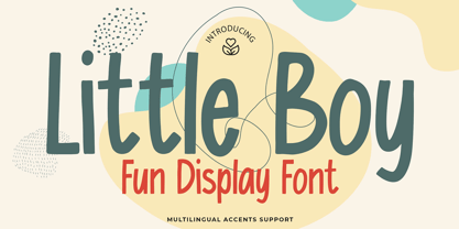 Here comes a New font, Introducing Little Boy It's Fun Display Font is a Cute Craft style and Textured Natural Style , this font is great for your creative projects such as watermark on photography, and perfect for logos & branding, invitation,advertisements,product designs, stationery, wedding designs,label ,product packaging, special events or anything that need handwritting taste. Little Boy a natural display Hand Drawn feel. It is perfect for any design project as Invitation,logo, book cover, craft or any design purposes,photos, photography overlays, signs, window art, scrapbooking, tags and so much more!
 - Modeling SS by Sensatype Studio,
$15.00 Modeling is a Modern Fashion Sans Serif In a new generations, we analyze that any designer or brand owner need to make their brand standout. As our focus that analyze any typeface that helps to leverage any logo design to look more modern, fashionable and unique. We prepared this font with expanded style characters to help you create a classy branding in any projects. Modeling Modern Fashion font ready with: Creative Expanded Characters Preview as a inspirations that you can do with Modeling font Ready with Lowercase and Uppercase characters Wish you enjoy our font. :)
 - Gentle Whisper by Anmark,
$15.00 I’m pleased to introduce my new handwritten floral font Gentle Whisper. Gentle Whisper comes in two styles: Floral and Regular. Gentle Whisper Floral is an elegant, decorative, feminine font. Floral uppercase letters are ideal for your wedding monograms and logos. Use this font for wedding invitations, branding, packaging, magazines, florist shops, social media, restaurant menus, greeting cards, headers and many more. Gentle Whisper Regular is a modern calligraphy font. It's perfect for wedding design projects, instagram, invitations, signatures, watermarks, logos, letterpress address, titles, birthday invitations, handwriting and more.
 - Something Real by Gassstype,
$25.00 Hello Everyone, introduce our new product Something Real – Pure Handmade Typeface font with a Signature Style and classy style, this font is great for your creative projects such as watermark on photography, and perfect for logos & branding, photography, invitation, watermark,advertisements,product designs, stationery, wedding designs,label ,product packaging, special events or anything that need handwritting taste. That is why Something Real has charming, authentic and relaxed characteristic more natural look to your text with a more natural look to your text. You can activate Ligature OpenType panel.
 - Insomnyacs by Gassstype,
$23.00 Here comes a New font, Introducing INSOMNYACS It's Weird Display Font is a Natural Style and Authentic classy style, this font is great for your creative projects such as watermark on photography, and perfect for logos & branding, invitation,advertisements,product designs, stationery, wedding designs,label ,product packaging, special events or anything that need handwritting taste. INSOMNYACS is a natural Hand Drawn feel. It is perfect for any design project as Invitation,logo, book cover, craft or any design purposes,photos, photography overlays, signs, window art, scrapbooking, tags and so much more!
 - Yelenia Sareta by Keristyper Studio,
$14.00 Introducing a new Stylish Signature font, Yelenia Sareta! This Font is perfect for elegant logos, upscale packaging, wedding stationery, websites, and any other projects requiring a handwritten and luxurious touch. Yelenia Sareta Font multilingual support: Afrikaans, Albanian, Catalan, Danish, Dutch, English, Estonian, French, Finnish, German, Icelandic, Indonesian, Italian, Malay, Norwegian, Portuguese, Spanish, Swedish, Zulu, and many more. What’s Included : Standard & Multilingual glyphs Ligature Works on PC & Mac Simple installations Accessible in Adobe Illustrator, Adobe Photoshop, Adobe InDesign, and even work on Microsoft Word. Hope you enjoy our font!
 - Gliny by Typesketchbook,
$45.00 Gliny was created by mixing different styles of handwriting fonts that derived from various tools such as pen, markers, drafting pens, painting brushes, writing brush and etc. In order to develop a new and diverse font styles. We also keep incomplete details and uneven textures that resulted from a writing process. We provide various font styles to help you mix and match them to suit your creative work harmoniously. Gliny comes with different font families such as brush, slab serif, heavy, handmade script for making your amazing work !!
 - Getih West by Twinletter,
$15.00 Getih West It’s a Halloween font, but there’s no need to fear. It’s not just for Halloween fans; You can use it to create cool designs and logos for everything from snowboarding gear to new products at work. Or, if you’re in a hurry, use it to make a fun invitation for your next party — because everyone loves an invitation that screams “Boo!” Of course with this font your various design projects will be perfect and amazing, get a beautiful title and start using our font for your special project.
 - Novin by Naghi Naghachian,
$85.00 Novin Font family is designed by Naghi Naghashian. This Font is developed on the basis of specific research and analysis on Arabic characters and definition of their structure. This innovation is a contribution to modernisation of Arabic typography, gives the font design of Arabic letters real typographic arrangement and provides more typographic flexibility. This step was necessary after more than two hundred years of relative stagnation in Arabic font design. Novin supports Arabic, Persian, and Urdu. It also includes proportional and tabular numerals for the supported languages. Novin Font is available in Light, Regular and Bold. Novin design fulfills the following needs: A Explicitly crafted for use in electronic media fulfills the demands of electronic communication. Novin is based on Aldo Novareses Eurostile Extended. B Suitability for multiple applications. Gives the widest potential acceptability. C Extreme legibility not only in small sizes, but also when the type is filtered or skewed, e.g., in Photoshop or Illustrator. Novin’s simplified forms may be artificial obliqued in InDesign or Illustrator, without any loss in quality for the effected text. D An attractive typographic image. Novin was developed for multiple languages and writing conventions. E The highest degree of geometric clarity and the necessary amount of calligraphic references. This typeface offers a fine balance between calligraphic tradition and the contemporary sans serif aesthetic now common in Latin typography.
 - Flink Neue by Identity Letters,
$45.00 Geometric typefaces are a staple in every typographer’s toolbox since the 1920s. It was a time when iconic faces such as Futura, Erbar, and Kabel appeared on the scene and turned the world of type upside-down. Inspired by those early giants as well as later epigones with a legacy of their own (such as 1970’s Avant Garde Gothic), Flink Neue is the Identity Letters take on this genre, characterized by a clean and focused appearance. With neat shapes and the look of pure geometry, Flink Neue adapts to a vast range of applications and topics, from the fine print in contract to website body copy to logo design to billboard-size slogans. Its x-height is considerably larger than in classic geometric sans-serif fonts; its proportions are harmonized as opposed to strictly constructed. This makes for a more contemporary look, setting it apart from the classics. With three different widths, Flink is a true all-rounder. Geometric fonts are usually quite wide, which often leads to text-settings problems with headlines or small print. The Condensed and Compressed variants of Flink Neue solve this problem easily. This font family comes along in 18 weights from Thin to Black with matching Italics. There are almost 1400 characters per style, including nine stylistic sets that offer variations to the look and feel of Flink Neue, making it even more versatile. Besides the default mood of Flink Neue, there is also a Text and Bauhaus variant, where different letters have been changed to create a new mood. In theory, you just need one single font file to change between all three moods, but to make it easier for you, we also exported each mood within a separate file. Plenty of additional Open Type Features like ligatures, small caps, case sensitive forms, old-style figures, tabular figures and symbols make Flink Neue a valuable tool for the discerning typographer. Flink Neue is the reimagination of a classic genre, designed to suit the needs of our time.
 - Sign Helpers JNL by Jeff Levine,
$29.00Sign Helpers JNL is a collection of silhouette images carefully redrawn from two distinct sources. Prior to their bankruptcy in 1984, the Holes-Webway Company of St. Cloud, MN produced thousands of their "Webway" sign kits that were utilized by merchants, libraries and schools throughout the country. At one point they included in their sales catalog a selection of die-cut images for embellishing sign work. In the late 50s and throughout the 60s, the Joseph Struhl Company (now known as Magic Master Industries) produced cling vinyl sign kits for business, and a home movie titling set for do-it-yourself film makers. This set also featured die-cut embellishments. A generous selection of designs from both kits have been faithfully re-drawn in digital form to pay tribute to two innovative companies. Other fonts based on products from these companies are Sign Kit JNL (Webway® Sign Kit), Cling Vinyl JNL, and Sign Maker JNL (Magic Master® Sign Kits). Trademarked names are used purely for reference purposes. - FTY Varoge Saro Noest by The Fontry,
$25.00 VAROGE SARO NOEST arrives on your computer with OpenType replacement features standard, along with extended language support for Central European, Greek, Cyrillic and Extended Cyrillic. We've even included some nice character options for our German-speaking customers with the uppercase Eszett and a number of alternatives to the standard lowercase eszett. Also included is the new Turkish Lira. VAROGE SARO NOEST is a font with a very funny name. Sometimes it can be a funny font. Or a font that is fun. It looks kinda casual, but also a little bit handwritten--freeform and freehand. Or a form of block lettering with a rough edge. Not too rough. Just enough to break up the visual rigidity. But this is not a face in distress. It's mostly at ease in its surroundings. If it's in text mode, it handles the job comfortably. In headline mode it does well too. It's quite flexible and looking for a home. Give this font a home. See if you can figure out what to use it for. See if you see what we saw when we made it. We saw a font that's cool and elegant with a bit of a tantrum driving the node count. We also found it's impossible to look away from it. Anyone can see that. That's why you're here. That's why you're reading this. And VAROGE will do you a favor if you let it. Revisit your typographic beliefs and head over to the one persistent constant in life: your font list. Is VAROGE SARO NOEST on it? If it were to set up headquarters there, you might discover something ideal. That's the favor I was promising.
 - Guillotine by Canada Type,
$24.95 Guillotine is inspired by an uncredited early 1970s film face called Rhythm Bold. While the original film type had plenty of round forms that were uneven and somewhat badly drawn to fit within the overwhelming pop wave of the time, this digital incarnation disposes of all curves, relies on a much sharper grid, and adheres to specific parameters of stroke widths and angles. Guillotine is a thick poster classic, mechanically constructed yet clearly exhibiting the idiosyncratic traits of hand drawing. Its forms embody the amalgamation of a multitude of influences, such as woodcut letters, punch card forms, and the unique art nouveau concepts that were popular in the 1960s and 1970s. The totality of the font is a strong display aesthetic that plays very well anywhere the eye is meant to see a strong but casual, sharp but hand crafted message. This font comes in all popular formats for all common platforms, and includes expanded language support to cover Western, Eastern and Central European Latin languages, as well as Baltic, Celtic/Welsh, Esperanto, Maltese, and Turkish. A few alternate characters are sprinkled throughout the character map.
 - Corporative by Latinotype,
$26.00 The first typeface developed by Latinotype Team. Corporative is a semi serif font that has a marked personality and distinctive traits, what makes it suitable to be used at large text sizes.Since it is a condensed font, it can also be used in smaller sizes. Corporative and Corporative Sans come with the Latinotype’s standard set of 350 characters, making it possible to use the font in 128 different languages. Corporative provides users with a wide range of characters, weights and widths for every project. By combining different variants,designers can achieve the best results. The family consists of 64 fonts: a basic family that includes 8 weights plus italics, an alternative family of 8 weights with matching italics and 2 condensed families, one regular and one alternative, both with italics. Latinotype has added new faces to its team. Latinotype Team nowcomprises: Javier Quintana, César Araya, Bruno Jara, Luciano Vergara and DanielHernández. Corporative was created by Latinotype Team and developed by Javier Quintana and César Araya, under the supervision of Luciano Vergara, Miguel Hernández and Daniel Hernández.
 - Liza Pro by Underware,
$50.00 Lettres d’amour! Flirting, fashionable, provocative, emotional, casual, moderate, extremely sensible & beautiful - Liza Pro covers it all. Liza Pro, Underware’s dear creation, is a live-script typeface. Thanks to its extremely intelligent OpenType architecture, she approaches human hand lettering as closely as technically possible. Liza Pro deeply analyzes the text. Out of a stock of 4000 hand crafted characters, Liza creates the most optimal combination. All of this works automatically. All you need to do is start typing your lettres d’amour, and Liza makes the text always look different. She gives your creative piece the impression par excellence. Erotique mais intelligent. She is as clever as we could imagine. She kept all folks at Underware busy for a couple of years. It all started one rainy night back in May 2004 but quickly changed into a fatal affair exceptionnelle. But now, 5 years later we are quite sure: this is something serious. Yes, we are talking about real love. L’amour pour la vie. Liza Pro has Underware’s world-dominating Latin Plus character set, supporting a total of 219 languages (Latin 1 + 2 and beyond). Liza Pro is a package of 4 fonts which work together. Liza Display Pro rocks the script lettering to the max. The build-in Out-of-ink feature, LetterSwapper and Protoshaper makes this font a realtime-digital-calligrapher. She’ll swash up your text drastically, giving long strokes, loops and swashes to letters if their context allows. Liza Text Pro has a more silent, moderate character - she’s well behaving sister of Liza Display Pro, designed to walk long pieces of text in a lively script style. Liza Caps Pro adds more possibilities and functionality to these two script fonts. It bridges the gap in case running script lettering doesn’t do the job, but it also works perfectly on its own. Every capital letter appears in various shapes to obtain the manual lettering feeling. Liza Ornaments Pro is for extra delicatesse et est plus charme. Four heart winning fonts, pour la langue l’amour!
 - Mackay by René Bieder,
$39.00 Mackay is a powerful transitional serif in 6 weights plus matching italics, designed for screen and print. The eccentric serifs on uppercase letters like E, F, L and T are inspired by Alexander Kay’s “Ronaldson” from 1884, working as the starting point for the family. The lowercase letters follow the traditional Antiqua model with attributes tracing back to drawings from the early 20th century. The “grotesk” lowercase a, as well as the sharp lowercase s, derived from the closed shapes of uppercase letters like C, G or S, create a compact and bold appearance while a large x-height and small descenders add a modern look. In favor of a dynamic and elegant impression, the design of the italic cuts come with a strong calligraphic influence. This results in completely new shapes for letters like lowercase a or g, ensuring a smooth integration into their surrounding letters while maintaining a distinctive appearance when combining with romans. The family comes with a variety of opentype features like case sensitive shapes, old style figures, fractions, ordinals and many more. Additional attention was given to the standard and discretionary ligatures, extending the structure of the basic glyphs with elegantly designed letter combinations for g/i, i/t or s/t. According to their dynamic architecture, the italic weights are equipped with additional initial swash characters to subtle accentuate the calligraphic roots. As a result of a high stroke contrast the family works great in paragraphs with medium to large font sizes like headlines, short paragraphs or logos. With its 12 cuts, the family meets all requirements on high quality typography.
 - Clumsy by Gaslight,
$15.00 Clumsy is a two weight all caps handcrafted awkward font with alternates for all characters and digits. The font was inspired by a few lines of text from an old soviet book about vine. Clumsy is a good choice for small amounts of text. When Clumsy is used in OpenType applications, its Contextual Alternates feature produce a striking random-like effect on glyphs distribution, achieved by cycling through alternates. When not using the Contextual Alternates feature, you can still pick the alternates in the Glyphs palette or use the alternates available from the keyboard upper and lower case.
 - Serious Damage by PizzaDude.dk,
$15.00 It came from a distant solar system, beyond any space we know. With superior knowledge and the ability to totally destroy the world as we know it...unless we act now...and find the strength to...arghhh... Naaah, I am just pulling your leg. The Serious Damage font could be used for something dramatic as the font for a movie poster, featuring the next "earth will be destroyed by aliens" movie. But it is suitable for more than that! With its straight lines and chunky letters, dramatic or not, Serious Damage could be a good choice!
 - P22 Pooper Black Pro by IHOF,
$39.95 Pooper Black Pro is based on a brush ethic and has an extreme axis that lends a certain amount of speed to the font while the lack of connectors slows it down. The pro version expands on the original and popular Pooper Black with the addition of full Central and Eastern European character sets and plenty of alternate characters for those who have applications that support Opentype features. Almost all of the lower case characters now include an in stroke and out stroke version for greater design flexibility. A wonderful face for packaging, titling, and short bursts of text.
 - Ariom Sans by S6 Foundry,
$25.00 Ariom is a fresh, geometric, sans-serif font family inspired by iconic typefaces. Ariom has a big x-height value, geometrical letterforms, sharp edges, and strong stroke contrast as the neo-grotesque fonts from the 20th Century. The typeface is versatile and can be successfully used in magazines, posters, branding, websites, headlines, large-format prints, brand identities, social media, advertising, editorial design, posters. The family contains over 40 alternative glyphs and over 50 ligatures in each style. The family comes in 3 weights with their corespondent italics. The family Latin supports Western, Central, South Eastern, South American, Oceanian, Pan African, Vietnamese, and Sámi.

