10,000 search results
(0.038 seconds)
- Sugarbang by astroluxtype,
$20.00 The 1960’s and 1970’s are the inspiration for Sugarbang! Everything from music packages, beach party movies of the 60’s to cereal box art of the 1970’s are reflected in the kooky style that this font evokes. Sugarbang! is built on a random baseline so letterforms bounce up and down adding to the “zany” look of the design. Look to the second font, Koo Koo Puff, to be the next release in the Cerealboxx collection. Available now. It is a minimal font set which includes uppercase and lowercase letterforms. Suggested uses for the font would be above 42 points in size. Please note its normal tight spacing and that cap “T” and cap “L” have been specially kerned to account for the overhang of certain other letterforms. Sugarbang! - just add milk and it’s sugar frosted font goodness.
 - Apnea by The Type Fetish,
$25.00 Apnea is a layerable type family consisting of fifty weights. It is an all caps font with a few lowercase alternatives (a, e, i, m, n, t, w, and y) thrown in for a more casual feel. The base letterforms are inspired by a painted sign I found in the garage of an old house I moved into years ago. All the hand-drawn elements were done directly in FontLab to keep them loose and playful without getting distorted or grungy. At its core Apnea consists of eight base weights (Base, Drop Shadow, Halftone, Inline Fill, Outline, Outline 3D, Shading and Shadow) that when combined, can make up the rest of the family. Have fun, experiment and play!
 - Enemy Lines by Comicraft,
$19.00 You've been shot down over enemy territory and you've managed to survive for weeks thanks to your training and instincts*... but now you're being ruthlessly pursued by MAPPO's footsoldiers... The ELEPHANTMEN! Will your commanding officer go against orders in an attempt to rescue you or will his mission be abruptly aborted, stranding you behind ENEMY LINES? In order to survive, you may have to betray your own rebel forces, your allies and the entire free world! The future of mankind hangs in the balance! Failure is not an option! Bummer. *This font's modus operandi bears no relation to the story of any other font that may have been shot down behind enemy lines, real or imagined.
 - Argyle Rough by Type Associates,
$24.95 Argyle Rough was originally developed for a packaging campaign in the late 80s in my studio and sat around in various stages of completion until I decided to autotrace my original drawings. I liked the quirky roughness and decided that it did not detract from the charm of the original, in fact it improved it and saved me a whole lot of work. The original campaign called for a few additional alternate characters for use at either end and double in the middle of words, ee, ff, ll, ss etc and a stylized Th, always useful. I hope you enjoy Argyle Rough, named after the world’s largest diamond mine – a rough diamond, get it?
 - Gridder - Unknown license

- Nexus Typewriter Pro by Martin Majoor,
$49.00 Nexus (2004) consists of three matching variants – a serif, a sans and a slab – which makes it a highly versatile typeface. Nexus started as an alternative to Seria, a typeface Majoor had designed some 5 years earlier. But soon the design developed into a new typeface, with numerous changes in proportions and in details and with a redrawn italic. Besides the three connected versions (Nexus Serif, Nexus Sans, Nexus Mix) Majoor designed a monospaced version called Nexus Typewriter. The Nexus family is a workhorse typeface system like Scala, with features such as small caps in all weights, four different sorts of numbers and an extensive set of ligatures. All fonts in the Nexus family come in regular, italic, bold and bold italic. Free bonus: there are more than 100 elegant Swash italics and dozens of arrows and other icons. The Nexus family was awarded the First Prize at the Creative Review Type Design Awards 2006.
 - Ebisu by Thinkdust,
$10.00 Ebisu is a sans serif family consisting of 10 different weights. Designed by Alex Haigh in 2010, and influenced by one of his original designs from 2008 Hiruko - Ebisu loses the soft sans serif curves, for a more robust geometric styling. But it’s much more than a geo-replica. The lowercase characters also have a more exaggerated sharpness that gives the whole family a unique look and feel. The kerning has been individually crafted for each letter, with vigorous attention - to ensure that each letter from is produced in a way that works with every member of the set, for a tightly knit sans serif family. It speaks many languages too. The open type features have an extended character set to support Eastern and Western European languages. With each weight conveying a different personality, Ebisu is set to become the modern new sans serif family to sit alongside you classics for versatility, cleanliness and a crafted edge.
 - Nexus Mix Pro by Martin Majoor,
$49.00 Nexus (2004) consists of three matching variants – a serif, a sans and a slab – which makes it a highly versatile typeface. Nexus started as an alternative to Seria, a typeface Majoor had designed some 5 years earlier. But soon the design developed into a new typeface, with numerous changes in proportions and in details and with a redrawn italic. Besides the three connected versions (Nexus Serif, Nexus Sans, Nexus Mix) Majoor designed a monospaced version called Nexus Typewriter. The Nexus family is a workhorse typeface system like Scala, with features such as small caps in all weights, four different sorts of numbers and an extensive set of ligatures. All fonts in the Nexus family come in regular, italic, bold and bold italic. Free bonus: there are more than 100 elegant Swash italics and dozens of arrows and other icons. The Nexus family was awarded the First Prize at the Creative Review Type Design Awards 2006.
 - Aviano Flare by insigne,
$24.99 The Aviano series returns with a flared semi-serif. Aviano Flare's subtly curved forms lend refinement and luxurious elegance to your designs. Aviano's foundational extended classical forms give the face strength and power. Aviano Flare is a versatile new addition to the Aviano titling series. Aviano Flare comes in six different weights and is packed with OpenType features. Want to get rid of the serifs for that logotype or headline? Need swash forms? Art Deco alternates? Aviano Flare includes 74 alternate characters. Two style sets are available, two sets of art deco inspired alternates, small forms, swash, titling and stylistic alternates. Aviano Flare also includes 40 discretionary ligatures for artistic typographic compositions. Please see the informative .pdf brochure to see these features in action. Be sure to check out the rest of the Aviano series which can be used as complementary faces, including Aviano, Aviano Serif, Aviano Sans, Aviano Didone and Aviano Slab.
 - Scrittura by Scholtz Fonts,
$12.50 Scrittura was inspired by Anton Scholtz’s font, Honeybird, and developed into a contemporary variation with three styles. Scrittura Moderna: sleek and calligraphic. A dramatic, vigorous yet elegant font, whose upright letter shapes flow into each other like molten gold. Use Moderna for marketing cosmetics and clothing, for book covers, greeting cards, wedding stationery. Scrittura Antiqua: weathered, almost grungy. A new font with an “antique” look , reminiscent of ancient parchment manuscripts. Use Antiqua for certificates, medieval banquet or wedding stationery, theatre posters and programs, and book covers. Scrittura Fantasia: magical and ghostly. A slightly distorted, evoking Halloween, the Day of the Dead, and your favorite horror movie. Use Fantasia for horror comic covers & posters, horror movie posters, CD covers, Halloween material. The font contains over 272 characters - (upper and lower case characters, punctuation, numerals, symbols and accented characters are present). It also includes "open-type"characters to enhance the flow of the text. It has all the accented characters used in the major European languages.
 - Nexus Sans Pro by Martin Majoor,
$49.00 Nexus (2004) consists of three matching variants – a serif, a sans and a slab – which makes it a highly versatile typeface. Nexus started as an alternative to Seria, a typeface Majoor had designed some 5 years earlier. But soon the design developed into a new typeface, with numerous changes in proportions and in details and with a redrawn italic. Besides the three connected versions (Nexus Serif, Nexus Sans, Nexus Mix) Majoor designed a monospaced version called Nexus Typewriter. The Nexus family is a workhorse typeface system like Scala, with features such as small caps in all weights, four different sorts of numbers and an extensive set of ligatures. All fonts in the Nexus family come in regular, italic, bold and bold italic. Free bonus: there are more than 100 elegant Swash italics and dozens of arrows and other icons. The Nexus family was awarded the First Prize at the Creative Review Type Design Awards 2006.
 - Mikha by Eurotypo,
$19.00 Mikha, designed by Carine de Wandeleer, is a delightfully handwritten family font which keeps the casual drawing of a marker with clean strokes. Its slight bounce and intentional irregularity, gives your words a wonderful flow. This new font family with 736 glyphs, includes Regular, Condensed and Sans. It has OpenType features such as Stylistics alternates, Swashes, Ligatures, up to five Stylistic sets by letter, initial and terminal forms in upper and lower, ornaments that allow you to mix and match pairs of letters and a Central European language support to fit your design. This OpenType features may only be accessible via OpenType-aware applications, or the Character Map to view and copy any of the extra characters to paste into your favorite text editor/app. This will help your creativity and make it easier to make expressive and elegant your typographic work. Also with Mikha Sans it is possible to write all in capitals. Mikha looks lovely on wedding invitations, greeting cards, logos, posters, labels, t-shirt design, logos, business-cards and is perfect for using in ink or watercolor based designs, fashion, magazines, food packaging and menus, book covers and whatever your imagination holds! Enjoy it!
 - Captain Tall Ship by Alphabet Agency,
$20.00 Captain Tall Ship is the clean version of Captain Tall Shipwreck. The font can be used in many project themes, from birthday party invitations to beer labels. The font could be potentially used is a number of design themes including bars, pubs, pirate, navy, seafarer, alcohol products, western/cowboy, card game/gambling, biker gang, tattoos, emblems and crests, old military & hunting to name a few.
 - Planny by Kaer,
$19.00Planny is a blueprint font created for the reproduction of a technical drawing or engineering drawing. All characters were designed with construction lines. The blueprint process was characterized by white lines on a blue background, a negative of the original. What you will get: Regular style Uppercase and lowercase glyphs Multilingual support Numbers and symbols Please feel free to request to add characters you need: kaer.pro@gmail.com - Kernig Braille by Echopraxium,
$5.00 This font is the younger sister of HexBraille with which it may be combined to create new patterns. This also explains why their introductory text are similar. Introduction The purpose of this monospace font is to display braille in an original and "steganographic" way. The Kernig prefix means "Robust" in German, this is because of the crank shapes . The core of the glyph design is a flat hexagon which can be read as 3 rows of 2 dots (i.e. regular braille glyph grid). Even if within a glyph, braille dots ("square dots" indeed) are placed on the vertices of a flat hexagon, the difference with HexBraille is that edges connecting vertices are not straight lines but "crank shapes" instead. This can be summarized by saying that the whole glyph is a Hexcrank (a flat hexagon where vertice pairs are connected by a crank shape) NB: The initial design is illustrated by glyphs 'ç' (no dot) and 'û' (6 dots) as shown by poster 6. A. "Kernig Lattice" In KernigBraille, glyphs are connected to each other, thus for each Hexcrank glyph there are 6 connections: 2 on left/right and 4 on top/bottom. In the final design some cranks were removed for esthetical reason (i.e. leave empty space for allowing patterns diversity). In summary, a text using this font won't display a honeycomb but a lattice instead. NB: Please notice that in order to obtain the lattice without vertical gaps, you must set the interline to 0. The lattice is made from 3 kind of shapes: a.1. Hexcrank a.2. Square a.3. Irregular cross (mostly unclosed) The design favored squares over crosses. The whole slightly resembling a PCB. B. Text Frames It's possible to frame the text with 4 sets of frame glyphs (as illustrated by poster 2) b.1. Kernig { € ° £ µ § ¥ ~ ¢ } b.2. Rectangular-High { è é ê ï î à â ä } b.3. Rectangular-Low { Â ù Ä Ê Ë Ô õ ö } b.4. Mixed Kernig+High: a mix of Kernig and Rectangular-High frame glyphs When using frame glyphs, it is advised to show Pilcrow (¶) and Non Breaking Space, which are replaced by empty shapes in this font (e.g. in Microsoft Word, use CTRL+8 or use [¶] button in the ribbon).
 - ITC Stone Sans II by ITC,
$45.99 The ITC Stone Sans II typeface family is new from the drawing board up. Sumner Stone, who designed the original faces in 1988, recently collaborated with Delve Withrington and Jim Wasco of Monotype Imaging to update the family of faces that bears his name. Sumner was the lead designer and project director for the full-blown reworking – and his own greatest critic. The collaborative design effort began as a relatively simple upgrade to the ITC Stone Sans family. As so often happens, however, the upgrade proved to be not so simple, and grew into a major design undertaking. “My initial intent,” recalls Sumner, “was to provide ITC Stone Sans with even greater versatility. I planned to add an additional weight, maybe two, and to give the family some condensed designs.” As Sumner began to look more closely at his twenty-year-old typeface, he decided that it would benefit from more extensive design improvements. “I found myself making numerous refinements to character shapes and proportions,” says Sumner. “The project scope expanded dramatically, and I’m pleased with the final result. The redesign has improved both the legibility and the overall appearance of the face.” The original ITC Stone Sans is part of the ITC Stone super family, along with ITC Stone Serif and ITC Stone Informal. In 2005 ITC Stone Humanist joined the family. All of these designs have always offered the same three weights: Medium, Semibold, and Bold – each with an italic counterpart. Over time, Stone Sans has emerged as the godfather of the family, a powerful design used for everything from fine books, annual reports and corporate identity programs, to restaurant menus, movie credits and advertising campaigns. ITC Stone Sans, however, lacked one attribute of many sans serif families: a large range of widths and weights. “These fonts had enjoyed great popularity for many years – during which graphic designers repeatedly asked for more weights and condensed designs in the family,” says Sumner. “Their comments were the impetus.” ITC Stone Sans II includes six weights ranging from an elegant Light to a commanding Extra Bold. An italic counterpart and suite of condensed designs complements every weight. In all, the new family encompasses 24 typefaces. The ITC Stone Sans II family is also available as a suite of OpenType Pro fonts, allowing graphic communicators to pair its versatile design with the capabilities of OpenType. These fonts offer automatic insertion of ligatures, small caps and use-sensitive figure designs; their extended character set also supports most Central European and many Eastern European languages. ITC Stone® Sans II font field guide including best practices, font pairings and alternatives.
 - Planet Express by Estudio Calderon,
$29.99 Family type designed by Felipe Calderón. This type is a display with a modern style and a different and innovative concept. The development of this type was a challenge because it was set out from the begining as a script font with ornaments and complements, where the round shapes do not have prominence in the result. Planet Express is an interesting job from the aesthetic point of view, it works for big scale texts and contains little shadow-cuts in each character to give it more personality and stand out among other fonts from this gender. I hope this new project works to solve issues in design. Planet Express is composed of Regular & Italics, it has 250 intelligent ligatures to produce the best signs in big scale, it is perfect for branding and works very well with the geometric complements. It is designed with programming in opentype: Ligatures, Discretionary ligatures, Stylistic Alternates, Stylistic set 01, Stylistic set 02, Stylistic set 03, Stylistic set 04, Stylistic set 05, Stylistic set 06, Stylistic set 07, Stylistic set 08 & Stylistic set 09, multiple language support and a complete set of extras like arrows, catchwords, flags, emblems, hands, fleurons & crossed elements. Planet Express can be used in different ways, each character pretends to cover the needs in any circumstance where it is used. It is funny to write words and play with the complements. It also works with current concepts in graphic design like sports, cars, hip hop, music, social network, skateboarding and more. Everybody can use this font, it works with different languages like italian, french, portuguese, danish, german and so forth. See specimen and samples here. Enjoy it!
 - Bovary by Eurotypo,
$24.00 Bovary is an elegant, stylized and expressive script font inspired by those beautiful calligraphies of yesteryear, but in a modern point of view. Bovary is full of personality! When I designed it, I started from the Clauques Script. Therefore, Bovary can be perfectly combined with Clauques Sans. Bovary includes almost 900 glyphs with many stylistic variations, swashes, ending and initial forms, catchwords and ligatures for both uppercase and lowercase, assuring almost infinite combination possibilities. In addition, the font includes a set of very useful ornaments to combine and give an ornamental aspect to the calligraphic text. All our fonts are carefully controlled and tested in both aspects: readability and technical aspects. We deal with the kerning pairs, optimization of hinting information to avoid pixel grid, and the precise programming of the OpenType features; as well as drawing smooth curves points and the final touch of each glyph. Remember that to access to all additional characters, you must use software that is truly compatible with OpenType, such as Adobe CS applications, or we recommend using the Glyphs palette. This family font is perfect for logos, magazines and book covers, fashion, headlines and short phrases, cards, posters, websites, and packaging. Bovary is the brand new modern script, designed by Carine de Wandeleer and published by Eurotypo.
 - Omed Brush by Alit Design,
$22.00 Presenting the Omed Brush Signature Script font by alitdesign. The Omed Brush Signature Script font is inspired by spontaneous and dynamic signature strokes with an ink texture that makes the Omed Brush Signature Script look real. The Omed Brush Signature Script font looks unique and charming which makes designs using the Omed Brush Signature Script look more prominent and cool. The Omed Brush Signature Script font is perfect for a collection of new fonts on your computer, tablet and smartphone for making unique designs or lettering. The Omed Brush Signature Script font is perfect for magazine cover designs, brochures, flyers. Instagram ads, Canva Design and so on with unique and modern concepts. besides that this font is very easy to use both in design and non-design programs because everything changes and glyphs are supported by Unicode (PUA). The Omed Brush Signature Script contains 804 glyphs with many unique and interesting alternative options. Language Support : Latin, Basic, Western European, Central European, South European,Vietnamese. In order to use the beautiful swashes, you need a program that supports OpenType features such as Adobe Illustrator CS, Adobe Photoshop CC, Adobe Indesign and Corel Draw. but if your software doesn't have Glyphs panel, you can install additional swashes font files. Thank You Alit
 - Aviano Future by insigne,
$24.99 The Aviano series returns with a vigorous and futuristic sans serif. Aviano Future’s powerful squared forms lend intensity and authority to your designs. Aviano Future’s extended forms give the face strength and muscle. Aviano Future is a versatile new addition to the Aviano titling series. Aviano Future comes in six different weights with “fast” Fasts and is packed with OpenType features. Want to use more traditional rounded forms? Need swash forms? Art Deco alternates? Aviano Future includes 390 alternate characters. Eleven style sets are available, two sets of art deco inspired alternates, small forms, tough swash, constructivist titling and traditional stylistic alternates. Aviano Future also includes 40 discretionary ligatures for artistic typographic compositions. Please see the informative .pdf brochure to see these features in action. OpenType capable applications such as Quark or the Adobe suite can take full advantage of the automatically replacing ligatures and alternates. This family also includes the glyphs to support a wide range of languages. Aviano Future is a great choice for a professional designer that wants to achieve a technological, futuristic or epic look. Be sure to check out the rest of the Aviano series which can be used as complementary faces, including Aviano, Aviano Serif, Aviano Sans, Aviano Didone, Aviano Flare and Aviano Slab.
 - Hollow Roachian Futhark - 100% free

- Trasandina by TipoType,
$24.00 Trasandina is a very unique font-family: a modern, versatile, workhorse typeface with a special personality, given by the mix of humanist and geometric models, remaining far from both extremes. This typeface has 9 styles plus their matching italics, it has an incredible wide range of weights, from very thin to an ultra thick stem. This was made following the Luc(as) de Groot’s Interpolation Theory. Trasandina’s versatility also resides in the +800 characters that each weight includes, having several open type features and language support for more than 200 languages. This font has been specially designed for web (using hinting instructions), making it work in small and large sizes on different types of screen resolutions. Trasandina’s most interesting feature is its flexibility: On one hand, is easy to read thanks to its humanistic letterforms which allow this typeface to be legible in small sizes while remaining neutral (specially around its middle weights). And, at the same time, it’s perfect for logos and posters that need a lot more personality, this is mainly due to its more geometric nature in light and bold weights. Thank you for your support! It’s people like you that allow our team to keep enjoying creating new fonts. That’s why we’d like to hear from you! Send us your work using our fonts: info@tipotype.com, and you'll have a special 50% OFF on Tipotype at Myfonts
 - Daily Routines by Fikryal,
$23.00 The “Daily Routines” Handwritten Display Font is a delightful and charismatic typeface that effortlessly captures the essence of casual elegance. With its carefully crafted strokes and artful imperfections, this font exudes a sense of handmade authenticity that is both inviting and versatile. Designed with meticulous attention to detail, “Daily Routines” showcases a harmonious blend of playful curves and well-balanced letterforms, making it a perfect choice for projects that seek to strike a harmonious balance between approachability and sophistication. Its smooth and flowing lines lend a sense of fluidity and ease, evoking a feeling of effortlessness and natural rhythm. The irregularities in each letter lend a unique charm, reminiscent of handwritten notes penned with care. The “Daily Routines” Handwritten Display Font is specifically tailored for projects that demand a warm and friendly touch, such as invitations, greeting cards, product packaging, and branding materials. It easily conveys a sense of personal connection, making it ideal for conveying heartfelt messages or highlighting the human element in design. Whether utilized for digital or print media, this font ensures legibility and readability, even in smaller sizes. Its captivating appearance adds a touch of personality to any text, making it stand out while retaining a sense of tasteful subtlety. Embrace the captivating allure of the “Daily Routines” Handwritten Display Font to infuse your designs with a genuine and endearing character, elevating them to new levels of aesthetic appeal and resonating with your audience on a profound level. If you have any questions please don’t hesitate to contact me follow my Instagram: fkryall Thank you
 - Rockseed by Gassstype,
$25.00 Hello Everyone, introduce our new product Font Rockseed it is Brush Display Typeface .This is a Textured Natural Style and classy style with a clear style and dramatic movement. This font Rockseed is great for your next creative project such as logos, printed quotes, invitations, cards, product packaging, headers, Logotype, Letterhead, Poster, Design this font is great for your creative projects such as watermark on photography, and perfect for logos & branding, invitation,advertisements,product designs, stationery, wedding designs,label ,product packaging, special events or anything that need handwritting taste. You can activate 6 Ligatures and 12 Alternate glyphs OpenType panel.
 - Bloopers by Gassstype,
$23.00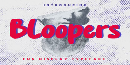 Hello Everyone, introduce our new product Font Bloopers is a Fun Display Typeface .This is a Textured Natural Style and classy style with a clear style and dramatic movement. This font Bloopers is great for your next creative project such as logos, printed quotes, invitations, cards, product packaging, headers, Logotype, Letterhead, Poster, Design this font is great for your creative projects such as watermark on photography, and perfect for logos & branding, invitation,advertisements,product designs, stationery, wedding designs,label ,product packaging, special events or anything that need handwritting taste. You can activate 7 Alternate OpenType panel.
 - Pathway by Gassstype,
$25.00 Hello Everyone, introduce our new product font PATHWAY is a Brush Font.This is a Textured Natural Style and classy style with a clear style and dramatic movement. This font PATHWAY is great for your next creative project such as logos, printed quotes, invitations, cards, product packaging, headers, Logotype, Letterhead, Poster, Design this font is great for your creative projects such as watermark on photography, and perfect for logos & branding, invitation,advertisements,product designs, stationery, wedding designs,label ,product packaging, special events or anything that need handwritting taste. This font is PUA encoded which means you can access all of 11 Ligatures glyphs.
 - Sweet Darkness by Gassstype,
$23.00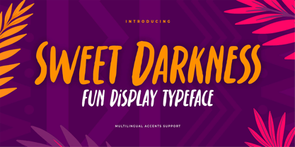 Hello Everyone, introduce our new product Font Sweet Darkness is a Fun Display Typeface .This is a Textured Natural Style and classy style with a clear style and dramatic movement. This font Sweet Darkness is great for your next creative project such as logos, printed quotes, invitations, cards, product packaging, headers, Logotype, Letterhead, Poster, Design this font is great for your creative projects such as watermark on photography, and perfect for logos & branding, invitation,advertisements,product designs, stationery, wedding designs,label ,product packaging, special events or anything that need handwritting taste. You can activate Ligatures glyphs and Alternates glyphs OpenType panel.
 - Nice Postman by Gassstype,
$23.00 Hello Everyone, introduce our new product Font Nice Postman is a Fun Brush Font .This is a Textured Natural Style and classy style with a clear style and dramatic movement. This font Nice Postman is great for your next creative project such as logos, printed quotes, invitations, cards, product packaging, headers, Logotype, Letterhead, Poster, Design this font is great for your creative projects such as watermark on photography, and perfect for logos & branding, invitation,advertisements,product designs, stationery, wedding designs,label ,product packaging, special events or anything that need handwritting taste. You can activate 19 Ligatures glyphs and Alternates glyphs OpenType panel.
 - TELETYPE 1945-1985 - Unknown license

- Berling Nova by Linotype,
$29.99Swedish designer Karl-Erik Forsberg created the original Berling typeface in 1951. Owned by Verbum in Sweden, Berling was completely redesigned and released in 2004, under the name Berling Nova. Forsberg (1914–1995) is considered one of Sweden’s most masterful graphic designers, and his original Berling has come to be seen as possibly the most definitive Swedish typeface. But a redesign was necessary in order to secure that the spirit of Berling would survive in the digital age. Linotype, the distributor of the original Berling™ , provided its collection of source materials to the designers working on Berling Nova. Additionally, Akira Kobayashi — Linotype’s Type Director — lent them his advice as their project advanced. Berling Nova is available in two optical sizes: Text and Display. The original Berling was a classic Renaissance roman face, with fine terminals and sharp, beak-like serifs. If one looks at Berling’s old lead type proofs in the smaller type sizes, it is clear that these had a fuller and more readable form than in later digital versions. So, in order to help return the new Berling Nova to its original splendor, both the base forms and the serifs were softened and inflated. In the text version, the x-height has been increased a bit (by 4%), the diagonal axis is less apparent, and special glyph ranges, such as those for small caps and old style figures, have been included in the font’s character sets. The display version still has the unmistakable “Berling” character that displays Forsberg’s mastery. Berling Nova is well suited for longer text passages in books, publications, and magazines. This typeface fulfils all the demands that one can make on a legible newspaper typeface. Access to both text and display versions are important to the demanding typographer. This is the first time since the typeface was digitalized that it is possible to use it in order to create truly beautiful and functional typography in all type sizes. - Grenale #2 by insigne,
$24.00 Grenale #2 shapes the new standard of elegance within the Grenale family. Not your typical sans, this pure, geometric structure with its glamorous sensitivity draws much inspiration still from Grenale's didone sans and the haute couture influence. Independently attractive, though, the form abandons the original's high contrast for its own minimal stroke variation, achieving proper balance through its graceful strokes. Grenale's thin weights are simple but vibrant--elegant forms that naturally lend themselves to designer journals and high-end branding along with upscale applications. With added energy and power, the thicker weights give your work a firmer, statlier look. Grenale #2's upright versions are also matched by optically adjusted italics. While unique in appearance, any of #2's weight also provide a well-matched companion to its original counterpart. The fashionable typeface includes a multitude of alternates that may be accessed in any OpenType-enabled application. The stylish features include a large group of alternates, swashes, and meticulously refined details with ball terminals and alternate titling caps to accessorize the font. Also included are capital swash alternates, old style figures, and small caps. Peruse the PDF brochure to see these features in action. OpenType enabled applications such as the Adobe suite or Quark can take full advantage of the automatic replacing ligatures and alternates. This family also offers the glyphs to support a wide range of languages. It's time to think high-class. Graceful and assured, the carefully crafted forms of Grenale #2 step pleasantly onto each page with elegant charm. Include its range of alternate glyphs, and this chic font is a superb choice for bringing a far more refined look to your projects.
 - Quotes by Sudtipos,
$49.00 «Quotes» is the second typeface calligraphed by Yani Arabena, designed along with Guille Vizzari and Ale Paul, for Sudtipos. Being thrilled by the use of the pointed brush, spontaneous messages, gesture and freshness to represent inspirational phrases and quotes written by hand, «Quotes» comes in two handwriting styles: Script and Caps. «Quotes Script» and «Quotes Caps» are thought together and complement each other filling with rhythm and infinite sensations to the spoken words. A more free and spontaneous version –Script–, joined by an uppercase system –Caps–, that offers a huge amount of alternate glyphs, ligatures and connectors, to enrich different messages brought to life with this type family. «Quotes Script» counts on a great variety of alternate signs in its lowercase as well as its uppercase letters. It hands a combination of ligatures and capital alternates that allows to shape the beginnings and endings of words and phrases intended to be inspiring and to inspire others that read them. «Quotes» also stands for the fashion universe, Gourmet, Natural, the D.I.Y. passionates, and for all those who seek for the Handcrafted spirit and agrees that it adds an added value to its products and in their communication possibilities. Nowadays, new trends in the calligraphic and drawn letters fields, have lead to the use of the brush pen as a daily practice, bringing to life phrases that motivates people to share their thoughts. «Quotes» is a typeface that invites to write, share and influence others to make their own. Sometimes a feeling can’t be explained, but «Quotes» is a font that can.
 - Alepholon by Typodermic,
$11.95 Are you ready to take your designs to new heights? Look no further than Alepholon, the revolutionary industrial typeface with its own unique flair. With its unconventional curves and resilient, mechanized structure, Alepholon is the perfect choice for futuristic lunar road signs, as well as any design that needs to make a bold and impactful statement. By incorporating Alepholon into your work, you’ll be adding a sense of excitement and wonder that’s sure to captivate your audience. This typeface is more than just a font – it’s a symbol of progress and innovation that’s sure to elevate any message to new heights. So why settle for ordinary fonts when you can make a bold statement with Alepholon? Try it out today and experience the future of typography for yourself! Most Latin-based European, Greek, and some Cyrillic-based writing systems are supported, including the following languages. Afaan Oromo, Afar, Afrikaans, Albanian, Alsatian, Aromanian, Aymara, Bashkir (Latin), Basque, Belarusian (Latin), Bemba, Bikol, Bosnian, Breton, Bulgarian, Cape Verdean, Creole, Catalan, Cebuano, Chamorro, Chavacano, Chichewa, Crimean Tatar (Latin), Croatian, Czech, Danish, Dawan, Dholuo, Dutch, English, Estonian, Faroese, Fijian, Filipino, Finnish, French, Frisian, Friulian, Gagauz (Latin), Galician, Ganda, Genoese, German, Greek, Greenlandic, Guadeloupean Creole, Haitian Creole, Hawaiian, Hiligaynon, Hungarian, Icelandic, Ilocano, Indonesian, Irish, Italian, Jamaican, Kaqchikel, Karakalpak (Latin), Kashubian, Kikongo, Kinyarwanda, Kirundi, Komi-Permyak, Kurdish (Latin), Latvian, Lithuanian, Lombard, Low Saxon, Luxembourgish, Maasai, Macedonian, Makhuwa, Malay, Maltese, Māori, Moldovan, Montenegrin, Ndebele, Neapolitan, Norwegian, Novial, Occitan, Ossetian, Ossetian (Latin), Papiamento, Piedmontese, Polish, Portuguese, Quechua, Rarotongan, Romanian, Romansh, Russian, Sami, Sango, Saramaccan, Sardinian, Scottish Gaelic, Serbian, Serbian (Latin), Shona, Sicilian, Silesian, Slovak, Slovenian, Somali, Sorbian, Sotho, Spanish, Swahili, Swazi, Swedish, Tagalog, Tahitian, Tetum, Tongan, Tshiluba, Tsonga, Tswana, Tumbuka, Turkish, Turkmen (Latin), Tuvaluan, Uzbek (Latin), Ukrainian, Venetian, Vepsian, Võro, Walloon, Waray-Waray, Wayuu, Welsh, Wolof, Xhosa, Yapese, Zapotec Zulu and Zuni.
 - Tipo Metro CDMX by Ixipcalli,
$- La tipografía “Tipo Metro CDMX” fue desarrollada por Lance Wyman como parte del proyecto “Metro” desde los años setenta, y es uno de los elementos clave de la cultura visual del transporte del Sistema de Transporte Colectivo Metro (STC Metro). Este estilo se ha convertido en el icónico fundamental del trasporte público para los residentes de la Ciudad de México. En esta edición, los tipos minúsculas son una adaptación “no oficial” para el Tipo Metro CDMX, enriqueciendo la tipografía a un estilo visual de altas y bajas, por lo que se prescinde del diseño base como trabajo propio para enfatizar los tipos minúsculas exclusivamente, además de que se han añadido algunos caracteres de acentuación extendiendo su uso a otros lenguajes. Los tipos son una nueva propuesta por Ixipcalli en el presente año 2023. The “Tipo Metro CDMX” typeface was developed by Lance Wyman as part of the “Metro” project since the 1970s, and is one of the key elements of the visual culture of transportation of the Metro Collective Transportation System (STC Metro). This style has become the iconic fundamental of public transportation for the residents of Mexico City. In this edition, the lowercase types are an “unofficial” adaptation for the Tipo Metro CDMX, enriching the typography with a visual style of highs and lows, so the base design is dispensed with as my own work to emphasize the lowercase types exclusively, In addition, some accentuation characters have been added, extending their use to other languages. The types are a new proposal by Ixipcalli in the current year 2023.
 - Dynamic Duo by Comicraft,
$19.00 Batman & Robin! Thelma & Louise! Butch Cassidy & The Sundance Kid! Hip Flask & Farrell! Frodo & Sam! Sonny & Cher! Calvin & Hobbes! Bert & Ernie! Dynamic Duos exist in all forms of literature & entertainment, and now Comicraft is proud to introduce its latest alliterative offering, DYNAMIC DUO! A buddy movie in font form, Dynamic Duo is a team-up of Solid and Open weights who can’t decide who is the lead and who is the sidekick! In the fine tradition of all two-in-ones and company-wide comic crossovers, first they fight and then they team up — to take your design on the biggest, loudest, most intense adventure of All Time. Dynamic Duo features comic-book style hook caps and alternate uppercase letters which automatically cycle for a more natural, hand-drawn appearance. Solid and Open weights can be layered to create chromatic effects, and matching variable fonts allow near-infinite control of weight and slant. Each weight contains 478 glyphs and supports 220 languages. Comicraft fonts are created BY comic book letterers FOR lettering comic books. Accept no substitutes! Artwork by Axel Medellin from Elephantmen #73
 - Haboro by insigne,
$- Haboro is a powerful workhorse. It’s a neoclassical font developed for numerous uses, ranging from editorial and corporate to web pages and apps. This new face from insigne Design takes a modern twist on the high-contrast typeface genre known as the Didone. Recognized for their ability to convey clarity, the geometric simplification of the Didone genre adds a level-headed rationality to whichever work it’s applied. Didones are used to lend style and sophistication to a wide number of applications—everything from style or cosmetic labels to annual reports. With its unique take on this classic genre, Haboro—with its slight wedge-shaped serifs and unique terminals—is still defined by elegance, tradition and timelessness. Even more to its versatility, this multi-purpose text face features whimsical terminals, which liven up even the most serious texts. If you desire, you can also opt for the more usual ball terminals by activating OpenType alternates. The Haboro family consists of seven weights from a Thin to a Black along with matching italics. The contrast from the letters’ thick strokes and thin strokes draws the eye to your design, making Haboro a powerful visual tool for communicating your message. The typeface also contains numerous ligatures and alternates. Choose between serif variants such as ball terminals or standard serifs by utilizing OpenType alternates. We recommend using the default contextual alternates and discretionary ligatures in order to benefit from all members of this fantastic font family. In addition, Haboro has a sizable set of option glyphs and numerous other OpenType variables to give your text the unique touches it needs. Haboro has all of the attributes you need to undertake your next project. Use its modified elegance to shape and mold your next design, whether a web site, app, branding package, or magazine. You’ll find there’s no job Haboro can’t take on.
 - Mintely by Din Studio,
$29.00 Mintely is a sophisticated and versatile serif font family designed to elevate your typography to new heights of elegance and legibility. With its 6 style variations and 8 weight options, this font offers an extensive array of choices to suit a wide range of design projects. This family combines classic and modern elements, resulting in a timeless design that can adapt to various design contexts. The 6 style variations in this serif provide you with a variety of typographic options, allowing you to experiment with different looks and moods. Whether you need a sleek and minimalistic appearance or a more decorative and ornate style, Mintely has you covered. Additionally, the 8 weight options in Mintely offer a wide range of possibilities in terms of contrast and emphasis. From thin and elegant weights to bold and impactful variations, this font family ensures that you can effortlessly find the perfect weight for your specific design needs. Because of its legibility you can use this font in a variation of text sizes. Enjoy the available features here. Features: Multilingual Supports PUA Encoded Numerals and Punctuations Mintely fits in headlines, logos, posters, flyers, invitations, branding materials, print media, editorial layouts, headers, and any many more. Find out more ways to use this font by taking a look at the font preview. Thanks for purchasing our fonts. Hopefully, you have a great time using our font. Feel free to contact us anytime for further information or when you have trouble with the font. Thanks a lot and happy designing.
 - Art Deco Arabic by Naghi Naghachian,
$102.00 Art Deco Arabic is a sans-serif Headline font. Designed by Naghi Naghashian as a sigle weight. Art Deco Arabic is reminiscence of Art Deco style, at the beginning of 20th century. The Latin part is a new design inspired from Art Deco style. It is extremely legible even in very small size. This font is a contribution to modernisation the Arabic typography, gives the font design of Arabic letters real typographic arrangement und provides more typographic flexibility. Art Deco Arabic supports Arabic, Persian ( Farsi ), Urdu and Latin.It also includes proportional and tabular numerals for the supported languages. Art Deco Arabic design fulfills the following needs: A Explicitly crafted for use in electronic media fulfils the demands of electronic communication. B Suitability for multiple applications. Gives the widest potential acceptability. C Extreme legibility not only in small sizes, but also when the type is filtered or skewed, e.g., in Photoshop, InDesgine or Illustrator. ArtDecoArabic’s simplified forms may be artificial obliqued in InDesign or Illustrator, without any loss in quality for the effected text. D An attractive typographic image. Art Deco Arabic was developed for multiple languages and writing conventions. Art Deco Arabic supports Arabic, Persian,Urdu and Latin. It also includes proportional and tabular numerals for the supported languages. E The highest degree of calligraphic grace and the clarity of geometric typography.
 - Woodford Bourne PRO by Monotype,
$25.99 Woodford Bourne PRO is the evolution of my original Woodford Bourne typeface that was inspired by the iconic stone cast letters on the façades of the 19th century Woodford, Bourne & Co. buildings in Cork City, Ireland. Woodford Bourne PRO has matured with numerous improvements to make it an even more versatile font family. The fonts have been completely redrawn and spaced, there are now an additional 500 glyphs for you to use across 9 stylistic sets. The additions include underlined caps, small caps, petite caps, catchwords, discretionary ligatures and more. Please view the specification sheet before you purchase to see all the glyphs and features. Key features: • Woodford Bourne PRO is a vintage geometric sans, optically adjusted for improved aesthetics and legibility 2 FONTS IN 1 – Use the default contemporary character set, or switch to vintage style with stylistic sets 9 Weights in Roman and Italic Thin | ExtraLight | Light | Regular | Medium | SemiBold | Bold | Black | Ultra Underlined Caps, Small Caps, Petite Caps, Catchwords, Discretionary Ligatures Full European character set 1000+ glyphs per font UPDATED JULY 2021 (v.3) Woodford Bourne PRO v.3 update includes numerous improvements including rebalanced /S/s/ glyphs to make them less ‘top heavy’. Italics have been redrawn to smoothe out irregularities. Improvements have been made to diacritics and glyph coverage now supports all Latin European languages.
 - Irrlicht by Aarhaus,
$30.00 Irrlicht is based on C. H. Kleukens’ 1923 typeface Judith Type . Whilst Dunkle Irrlicht is a fairly faithful rendition and extension of Kleukens’ typeface, the Licht style was initially added as a stand-alone stencil version; yet, the two styles work perfectly together – for different nuances, for emphasis or simply stacked/layered. Irrlicht is equipped with upper- and lowercase ligatures, contextual and stylistic alternates, fractions, superior and inferior figures, extended language support and a few extra goodies. Additional information – How Irrlicht came to life Christian Heinrich Kleukens cut his Judith Type in 1923, at the peak of German expressionism, exclusively for publications with the Ernst-Ludwig-Press, such as a limited series of biblical prints – the first being the Book of Judith , hence the original’s name. I stumbled upon this typeface a couple of years ago in a nice little 1930 booklet of the Gutenberg-Gesellschaft and was struck by its forceful darkness on paper and its seemingly simple, crude letterforms. The lack of a long-ſ in the final version of Judith Type – quite unusual for a German typeface of that time – adds to this feel of crudeness and spontaneity*. Judith Type seemed to me like a semi-blackletter cousin of Rudolf Koch’s typeface Neuland (cast in the same year). Besides its apparent affinity with expressionism, it reflects a lot of that deeply spiritual craftsmanship of the era – much like Neuland. A few months later, when I was working on a stencil project and looking for a typeface that could be cut into thin wooden plates easily, I remembered those dark, sharp letters that seemed to be lacking any curves at all. After enlarging a few letters and tracing them by hand, the whole set was redrawn digitally, using only straight lines. As for spacing, the goal was to keep the letters tight but to avoid touching characters – without ironing out all the original’s tension and rhythm. Deliberate kerning, subtle contextual alternates and ligatures help to deal with critical glyph combinations. Two additional versions were developed: a stencil version with open counters and, in reference to a popular style of the 1920s and inspired by dry, cracked wood, an inline version. These two additional styles were later merged into one font – Lichte** Irrlicht was born. — AARHAUS * Consequently, the original typeface’s German eszett is simply a ligature of the “round s” and standard z . In some of his publications, Kleukens dispenses with using eszett altogether and sets double s instead. Irrlicht , however, does feature a more common eszett (ß); the original, among other more faithful letter forms, can be accessed via the stylistic sets feature ** licht – literally bright – being the German term for inline typefaces – not to be confused with leicht ( light )


