10,000 search results
(0.036 seconds)
- Mortella Display by FoxType,
$12.00 Mortella Display is a Brand New Elegant Typeface with a powerful font family. It has a dependable and uncompromising style, with controlled letterforms and modern touches. It looks amazing in logos, magazines, and movies. Mortella Font would be perfect for branding, headlines, Captions, paragraphs, and posters. The various weights allow you to experiment with a wide range of applications. It's created to make an impression without sacrificing its beauty and readability. It's shown a clean, minimalist, warmth, quirky, yet still purposed to be versatile The Typeface includes Three Weights - Bold, ExtraBold and Black. Numerals and extended punctuation (200+ Glyphs). Expert kerning and quality crafting. Thank you for taking the time to look into the font.
 - Ottenburg Display by FoxType,
$14.00 Ottenburg Display is a Brand New Elegant Typeface with a powerful font family. It has a dependable and uncompromising style, with controlled letterforms and modern touches. It looks amazing in logos, magazines, and movies . Ottenburg Font would be perfect for branding, headlines, Captions, paragraph, and posters. The various weights allow you to experiment with a wide range of applications. It's created to make an impression without sacrificing its beauty and readability. It's shown a clean, minimalist, warmth, quirky, yet still purposed to be versatile The Typeface includes Nine Weights - Regular, Medium, SemiBold, Bold. All offer wide language support numerals and extended punctuation. Thank you for taking the time to look into the font.
 - Grosse Pointe Metro by GroupType,
$19.00GP Metro® is a faithful version of the Dwiggins 1930 urban classic: Metrolight, Metromedium, and Metroblack. In 1929, English type designer, William Addison Dwiggins, (WAD) was commissioned by the Merganthaler Type Foundry to design a warmer, more humanistic, and less mechanical sans to effectively compete with Futura, a highly-popular geometric sans designed by Paul Renner in 1927 and first released by Meganthaler's arch-rival, the Bauer Type Foundry in Germany. FontHaus has licensed from GroupType updated files with additional styles including 2 rough versions and a soft together with the classic Regular styles and weights. These new styles will offer designers a wider range of options to design with these amazing classics. - Victory Speech by Comicraft,
$49.00 It's that time of year again, isn't it? And yes, we're speaking rhetorically, because our true intent is to rouse voters into action, claim a significant gain in support over our nearest rivals and lead the nation, perhaps The World, into a new era of prosperity, one in which our once proud nation can become great yet again! An era of Hope, a time of peace and an end to war! Because never, in the field of human conflict, have so many, given so much and gained so little so that the have nots can reward themselves and those that have and-and... Victory, and Hope, and Greatnessness! Related font: Victory Speech Lower
 - Haarlemmer by Monotype,
$29.00 Haarlemmer is a recreation of a never-produced Jan Van Krimpen typeface that goes one step beyond authentic: it shows how he wanted it to be designed in the first place. The original, drawn in the late 1930s, was created for the Dutch Society for the Art of Printing and Books and was to be used to set a new edition of the Bible, using Monotype typesetting. Hence the problem: fonts for metal typesetting machines like the Linotype and Monotype had to be created within a crude system of predetermined character width values. Every letter had to fit within and have its spacing determined by a grid of only 18 units. Often, the italic characters had to share the same widths as those in the roman design. Van Krimpen believed this severely impaired the design process. The invasion of Holland in World War II halted all work on the Bible project, and the original Haarlemmer never went into production. Flash forward about sixty years. Frank E. Blokland, of The Dutch Type Library, wanted to revive the original Haarlemmer, but this time as Van Krimpen would have intended. Blokland reinterpreted the original drawings and created a typeface that matched, as much as possible, Van Krimpen's initial concept. While Van Krimpen's hand could no longer be on the tiller, a thorough study of his work made up for his absence. The result is an exceptional text family of three weights, with complementary italic designs and a full suite of small caps and old style figures. Van Krimpen would be proud.
 - TessieMiscellaneous by Ingrimayne Type,
$13.95 A tessellation is a shape that can be used to completely fill the plane—simple examples are isosceles triangles, squares, and hexagons. Tessellation patterns are eye-catching and visually appealing, which is the reason that they have long been popular in a variety of decorative situations. These Tessie fonts have two family members, a solid style that must have different colors when used and an outline style. They can be used separately or they can be used in layers with the outline style on top of the solid style. For rows to align properly, leading must be the same as point size. To see how patterns can be constructed, see the “Samples” file here. Shapes that tessellate and also resemble real-world objects are often called Escher-like tessellations. Most of the shapes contained in TessieMiscellaneous are Escher-like tessellations. Most or all of these shapes were discovered/created by the font designer during the past twenty years in the process of designing maze books, colorings books, and a book about tessellations. (Earlier tessellation fonts from IngrimayneType, the TessieDingies fonts, lack a black or filled version so cannot do colored patterns. The addition of a solid style that must be colored makes these new fonts a bit more difficult to use but offers far greater possibilities in getting visually interesting results.)
 - State of Love and Toast LL by Leftover Lasagne,
$25.00 State Of Love and Toast is a retro typeface reminiscent of the early 90’s. It’s certainly the Seattle of fonts. The font features auto ligatures for duplicate letters, quite a few graphical elements & shapes which can be accessed by shortcuts (lowercase letter + number form 0-9) and smallcaps (alternate versions of the lowercase letters).
 - Gikit by bb-bureau,
$65.00 Gikit is a very raw and quirky typeface structured according to a strict grid. The design is massive, with very little curve (just the dots and a few punctuation marks). A really stand out characteristic is Gikit’s accents that crush the forms. The type is drawn with 2 styles, for 2 uses: Tittle or Text.
 - Drumbeat by EdyType,
$60.00 DRUMBEAT, a brand new face from Edy Type, coming to help resolve the necessities of loose scripts in Packaging and Editorial Design. Its' very particular thicks and thins and ups and down, makes it very suitable whenever informalities is required. Used with tiny little characters, enlarged to mammoth sizes or filling a large page with it, would show it’s perfect balance and color, almost as if where hand writen. In fact, a truly different script, a graphologist would declare that is written by a person very sure of what he wants, and besides and best of all, it’s pretty.
 - FF Meta Hebrew by FontFont,
$79.99German type designer Erik Spiekermann, created this sans FontFont between 1991 and 2010. The family has 28 weights, ranging from Hairline to Black in Condensed and Normal (including italics) and is ideally suited for advertising and packaging, book text, editorial and publishing, logo, branding and creative industries, small text as well as web and screen design. FF Meta provides advanced typographical support with features such as ligatures, small capitals, alternate characters, case-sensitive forms, fractions, and super- and subscript characters. It comes with a complete range of figure set options—oldstyle and lining figures, each in tabular and proportional widths. As well as Latin-based languages, the typeface family also supports the Cyrillic, Greek, and Hebrew writing systems. FF Meta Variable are font files which are featuring two axis and have a preset instance from Hairline to Black and Condensed to Roman In 2011, FF Meta was added to the MoMA Architecture and Design Collection in New York. This FontFont is a member of the FF Meta super family, which also includes FF Meta Correspondence , FF Meta Headline , and FF Meta Serif . - Cíclope by Andinistas,
$19.95 Cíclope is a typeface family designed by Carlos Fabián Camargo in 2012 and used to write the headlines. Its idea is based on an army of stone soldiers that with their size and strength cause earthquakes. Under this concept he obtained stencil and sans serif letters with monstrous shapes and torn counterforms. Its usefulness as well as readability consists in imitate rocks with scars and cracks. For that reason, Cíclope family has three sizes, each with their respective italics distributed at different levels of corrosion. In addition, each file contains 260 glyphs useful for designing words and phrases with systematically eroded treatments for advertisement material. Thus Cíclope works as a raw material in the exploration of new graphic design. Finally, Cíclope concept has grotesque, geometric and humanistics letters roots that seem disastrous but each and every detail has been planned with high definition drawing. Most importantly, it expresses a big amount of grunge style with cracked edges and medium contrast between thin and thick strokes. In that sense, the writing seems impaired and special for design of logos, posters, flyers, brochures and worn, crusty or demolished graphic design.
 - Bango Pro by JCFonts,
$30.00 Bango Pro is a lively, heavyweight font with a strong cartoon feel, perfect for poster design, packaging, and anything that needs to draw attention - in an informal way. Originally released with uppercase and unicase characters only, this new version (commissioned in 2013 by a London-based design agency) includes lowercase characters and some additional OpenType features, like stylistic alternates, fractions, localized forms, among others.
 - Speechless by Gassstype,
$23.00 Hello Everyone, introduce our new product Speechless is a Playful Handwritten Font with a natural handwritten feel. This handmade font will make your design has a beautiful natural touch for each details. It is perfect for any design project as Invitation,logo, book cover, craft or any design purposes. That is why Speechless has authentic and strong characteristic more natural look. You can activate Ligatures OpenType panel.
 - Dasheta by Brand Type,
$24.00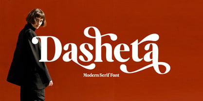 Introducing our new product called Dasheta Modern Serif Font. A beautiful classy, elegant, and modern Modern Serif font. This font is perfect for a wide variety of projects, such as signatures, stationery, logos, weddings, typographic quotes, magazine or book covers, website headers, clothing, branding, packaging design, and more. Also for branding related to fashion or editorial design and displays both masculine and feminine qualities.
 - Grinko by Grontype,
$14.00 Grinko is a new unique decorative san serif font, created with bold and equal stroke all around with sharp edges that provide strong and straight feeling. This font extend some ligature and alternative glyphs to give you optional choices in creating typography projects. Grinko font is perfect for branding design, logotype, logo tagline, flyer header, magazine title, or even short quote for layouting ideas. Grinko features:
 - Best Mommy by Dhan Studio,
$23.00 Best Mommy is a beautiful hand-painted font that looks more natural and fun, combines a mixture of lowercase ligatures, uppercase alternatives and several lowercase alternatives and makes it look attractive and unique, also includes some cute extras that you can use your designs for. This fonts can be used for various purposes such as headings, logos, invitations, t-shirts, letterhead, signage, labels, news, posters, badges etc.
 - Lonesome Zombies by Gassstype,
$25.00 Hello Everyone, introduce our new product Lonesome Zombies Terrible Bloody Typeface Brush font Best for poster, horror poster, childrenbook, cartoon rough, comic and project that need horror vibes. Letters are made with brushes on Procreate. Then crafted carefully drawn into vector format. That is why Lonesome Zombies has Stylish and strong characteristic more natural look to your text with a more modern look to your text.
 - Blunt by Miller Type Foundry,
$16.99 Blunt is a refreshing new bold headline typeface, designed to be an alternative to overused headline typefaces such as Impact. Blunt is more than just a one-trick-pony though, but includes 4 weights (Condensed - Wide) each with matching italics. This gives Blunt a lot more versatility when it comes to headline use. Try Blunt today and shout your most important messages with boldness!
 - Coolesta by Dilbadil,
$14.00 Hello, let me introduce my new signature font Coolesta. Made with great effort to produce an elegant and modern style. This font is made like handwriting so it is suitable for branding, logos, business cards, photographs, wedding invitations, quotes, clothes, coffee and others. What did you get? By providing OpenType facilities you will get: – Alternates Ss01, Ss02, Ss03, Ss04, Ss05 – Ligatures – Multilingual Support – Swashes – Multilingual’s alternate
 - Phonema by Fontop,
$10.00 Warm welcome to my new sans serif typeface PHONEMA. Six stylish and modern fonts are included into this type family. Looks great as headlines on posters, text in magazines, presentations. Also can be used in logos and blog posts. Will reinforce your creative work with eye catching and bold message. Each font has Latin multilingual support as well as uppercase letters, lowercase letters, numbers and basic punctuations.
 - Highest by Jos Gandos,
$15.00 Highest Script Style - a new modern & fresh script with a handwritten and natural script style. This font will make your design look elegant, natural and stylish. Highest Font is perfect for any awesome projects such as photography, watermark, quote design, social media posts, poster, advertisements, logos & branding, invitation, product designs, label, stationery, wedding designs, product packaging, special events or any project that need handwriting taste.
 - LP Hand Eins by URW Type Foundry,
$19.99 LP Hand Eins is a typeface designed by German type designer Peter Langpeter. LP has been running his own design studio since 1995, working as a typeface and logo designer, as a calligrapher, cartographer and illustrator. During this time LP created a large number of excellent new typeface designs. LP Hand Eins is well-suited for plenty of applications, e.g. personal correspondence, invitations, greeting cards etc.
 - Neonix by Niznaztype,
$9.00 Neonix is a modern and futuristic typeface. Neonix is a font that suitable for postmodern, futuristic, contemporary styles of graphic design. Neonix have unique glyph characteristic. Neonix is perfect for futuristic graphic art, postmodern arts, editorial design, posters, t-shirt, book cover, headlines, advertising, branding, movies tittling and others. Neonix will make your design have a new style when you make a design with this font.
 - Joleigh by Supfonts,
$12.00 This font is a new Signature Script with a floating baseline, ligatures, swashes and multilingual support :) Joleigh Script will look beautiful on holiday invitations, wedding invites and stationery, logos, and more. Test it out below to see how it could look for your next project! Includes: Uppercase and lowercase Numbers and punctuation Foreign language support 159 ligatures Check out my blog: www.instagram.com/dmitriychirkov pinterest.com/dmitriychirkov7 Enjoy!
 - Salmond by Arterfak Project,
$19.00 Meet Salmond, a geometric and modern sans serif font designed with a tight letterspace, exuding a unique, minimalist charm. Consists with six weights, ranging from Light, Regular, News, Medium, Semibold, and Bold, matching with Oblique styles and multilingual support. This font family offers versatility for various design needs, designed especially for display such as titles, branding, logos, books, UI/UX, and impactful editorial work.
 - Etzada MF by Masterfont,
$59.00 Unique elegant font with condensed biblical scent. OpenType Pro Excellent support for Niqqud (Vowels). All marks are programmed to fit each glyph's shape and width. OpenType Pro includes new advanced features like Dagesh Hazak, ShevaNa, Qamatz Katan, Holam Haser and wide letters. Best used with Adobe InDesign CC that support complex Hebrew text. Please check these advanced features in this link: https://tinyurl.com/ybgdsxme
 - Skeleton Slab by Studio K,
$45.00 Skeleton Slab brings a new elegance to a classic form. I was thinking of calling it Ozymanidias, after Shelley’s poem, because it evokes memories of ancient runic inscriptions, but then I thought that was maybe a bit pretentious, and I decided I'd keep it simple and descriptive. Besides, I wasn't sure how to spell Ozymandias! Skeleton Slab has small caps in place of lower case.
 - Something Rounded by wearecolt,
$16.00 Something Rounded is a soft version of Something New and has been designed with logo designers and typographers firmly in mind. This feature-packed display font is a perfect addition to your design arsenal, ready for your next logo wordmark, heavy headings, or coffee labels. "A stylish mix of serif and blackletter" Great for; logos, branding materials, business cards, gift cards, t-shirts, prints, posters, quotes, etc.
 - Maelie by Supfonts,
$15.00 Hello dears! This font is a new Calligraphic Script. Here is that: floating baseline, ligatures and multilingual support :) Maelie Script will look beautiful on holiday invitations, wedding invites and stationery, logos, and more. Test it out below to see how it could look for your next project! Includes: Uppercase and lowercase Numbers and punctuation Foreign language support Ligatures Check out my blog: https://www.instagram.com/zloillev pinterest.com/dmitriychirkov7
 - Astrella by Handpik,
$13.00 Hello, this time we want to introduce a new product. namely "Astrella Typeface", a Serif display font that has a classic, feminine and elegant style. Mechta font is perfect for many different projects such as logos & branding, invitation, stationery, wedding designs, social media posts, advertisements, printed quotes, product packaging, product designs, label, photography, watermark, special events or anything. Feature Uppercase Lowercase Numeral Functional Ligature Stylistic Multilingual
 - Excelsius by Comicraft,
$19.00 Once upon a midnight dreary, this Comicraftsman pondered, weak and weary, For a name synonymous with Mighty and Marvelous comics lore. Solid, Outline, Inline was the nameless font I'd crafted, I nodded, nearly napping o'er the work I'd grafted When suddenly came a tapping, As of someone gently rapping, rapping at my cubicle door. "'Tis some visitor," I muttered, "tapping at my cubicle door-- Calling out "EXCELSIOR!" Then an Amazing Vision beguiled my sad fancy into smilin', By the Spectacular decorum of the countenance it wore, "Though thy crest be shorn and shaven," he said, "thou art sure no craven, And thy font should not remain nameless here forevermore!" Eagerly I wished the morrow; vainly I had sought to borrow From comic books surcease of sorrow, letters that called out "EXCELSIOR!" Then, upon the velvet sinking, I betook myself to linking Fancy unto fancy, thinking of the nominative neuter singular thing Like Some Silvered Surfer wandering from the Nightly shore-- The Vision shrieked, upstarting--"Tell me what thy lordly name is thus!" Quoth the Craftsman: "EXCELSIUS!"
 - Morthena by Blankids,
$24.00 Hello i came back with a new product, this is Morthena Script, this is a copperplate style font that looks classic, vintage and retro but still looks elegant, luxurious and georgeous. Morthena is a little different from some existing fonts, I made a slightly different shape and added an alternative character with a more decorative shape as well I added 35 different swashes that you can use easily, please see this video how to using this font: https://www.youtube.com/watch?v=mwp1yyOko4s&feature=youtu.be
 - Coffee Please by Gassstype,
$23.00 Hello Everyone, Introduce our new collection Coffee Please - Natural Handwritten Script Font with a natural style and dramatic movement. Crafted manually with love and passion, This font is great for your next creative project such as logos, printed quotes, invitations, cards, product packaging, headers, Logotype, Letterhead, Poster, Label, and etc. This handmade font will make your design has a beautiful natural touch for each details. This font is PUA encoded which means you can access all of 8 Ligatures glyphs.
 - Sovett by Twinletter,
$12.00 Introduces our new "Sovett" handwriting script font which is flexible in every typeface. This beautiful font you should use to create your perfect design work This font is designed with a natural touch of handwriting which is refined to create a portion and composition that suits your needs. So this font is suitable for craft, children's writing, adventure posters, food banner titles, wedding invitations, product packaging logos, quotes, social media page covers, furniture banner headlines, book covers, and much more.
 - Guess Who by Gassstype,
$23.00 Hello Everyone, introduce our new product Font Guess Who is a Fun Display Typeface .This is a Textured Natural Style and classy style with a clear style and dramatic movement. This font Guess Who is great for your next creative project such as logos, printed quotes, invitations, cards, product packaging, headers, Logotype, Letterhead, Poster, Design this font is great for your creative projects such as watermark on photography. You can activate 8 Ligatures glyphs and 8 Alternates glyphs OpenType panel.
 - Handy Pen by Gassstype,
$23.00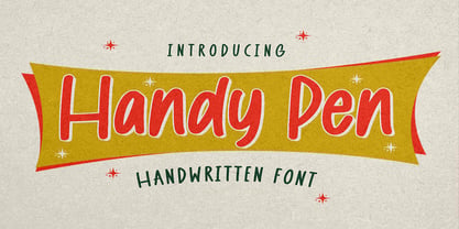 Hello Everyone, introduce our new product Font Handy Pen it is Handwritten Font,This is a Textured Natural Style and classy style with a clear style and dramatic movement. This font Handy Pen is great for your next creative project such as logos, Logotype, Letterhead, Poster, Design this font is great for your creative projects such as watermark on photography, and perfect for logos & branding, invitation,advertisements,product designs, stationery, wedding designs,label ,product packaging, special events or anything that need handwritting taste.
 - Alverata PanEuropean by TypeTogether,
$119.00 Gerard Unger’s new typeface Alverata is a twenty-first-century type-face inspired by the shapes of Romanesque capitals in inscriptions of the eleventh and twelfth centuries, without being a close imitation of them. It is additionally based on the early twentieth-century model, but tweaked so as to prevent blandness and monotony. Alverata performs beautifully in both screen and on paper, delivering excellent legibility. Its letters are open and friendly in small sizes and lively and attractive in large sizes. They are robust, and show refinement in their detail. Unger’s Alverata is an extensive type family, with versions for both formal and informal applications, and with Greek and Cyrillic relatives. Alverata consists of three different fonts: Alverata, Alverata Irregular and Alverata Informal, that vary in form and width, but maintain the same spirit. The Irregular version is particularly inspired by the Insular letterforms, the uncials, and their constantly changing positioning. Alverata strikes a balance among Europe’s diversity of languages, combining contemporary typographical practices with features of medieval letterforms, from the time when Europe came into being. Visually, some written languages, such as Czech and Maltese, differ quite strongly from languages like English and German, notably because of their many accented characters. While other typefaces will show this difference, Alverata removes it. As a result, Alverata enables harmonious convergence of languages. For the development of the Greek letterforms, Unger collaborated with Gerry Leonidas (University of Reading) and Irene Vlachou (Athens), and with Tom Grace on the Cyrillic letterforms.
 - TA Bankslab by Tural Alisoy,
$33.00 The building of the Northern Bank of St. Petersburg's Baku branch was built in 1903-1905. It was the first Art Nouveau-style building in Baku, Azerbaijan. Later the bank was transformed into the Russian-Asian Bank. After the oil boom in Baku in the 19th century, branches of many banks and new banks were opened in the city. The branch of the Northern Bank of St. Petersburg was among the first banks that was opened in Baku. N.Bayev was the architect of the building for the branch of the Northern Bank of St. Petersburg located at Gorchakovskaya 3 in 1903-1905. The building currently houses the Central Branch of the International Bank of Azerbaijan. My purpose in writing this is not to copy and paste the information from Wikipedia. What attracted me to the building was the word "Банкъ" (Bank) written in Cyrillic letters, which was also used in Azerbaijan during the Soviet era. The exact date of the writing is not known. Every time I pass by this building, I always thought of creating a font of this writing someday. I had taken a photo of the building and saved it on my phone. I did a lot of research on the font and asked a lot of people. However, some did not provide information at all and some said they did not have any information. I was interested in the history of this font but I do not know if this font really existed or it was created by the architect out of nowhere. If there was such a history of this font, I wanted to recreate this font and make it available. If not, I had to create it from scratch in the same way, using only existing letters on the building. Finally, I made up my mind and decided to develop the font with all letters I have got. It was difficult to create a font based on the word, Банкъ. Because in the appearance of the letters, the midline of the letters on A, H, K was very distinct, both in the form of inclination and in more precise degrees. The serif part of the letters, the height of the upper and lower sides, differed from each other. I don't know whether it was done this way when the building was constructed or it happened over time. I prepared and kept the initial version of the font. I took a break for a while. I started digging on the story of the font again. Meanwhile, I was researching and got inspired by similar fonts. Unfortunately, my research on the font's history did not yield any results. I decided to continue finishing up the font. After developing the demo, I created the font by keeping certain parts of these differences in the letters. In addition, I had to consider the development of letters in the Cyrillic, as well as the Latin alphabet, over the past period. Thus, I began to look at the appearance of slab-serif or serif fonts of that time. In general, as I gain more experience in developing fonts, I try to focus on the precision of the design for each font. In recent years, I specifically paid attention to this matter. YouTube channel and articles by Alexandra K.'s of ParaType, as well as, information and samples from TypeType and Fontfabric studios on the Cyrillic alphabet were quite useful. I gathered data regarding the Latin alphabet from various credible sources. I do not know if I could accomplish what I aimed at but I know one thing that I could develop the font. Maybe someday I'll have to revise this font. For now, I share it with you. I created the font in 10 styles. 7 weight from Thin to Extra Black, an Outline, Shadow, and Art Nouveau. The Art Nouveau style was inspired by the texture in the background used for the text on the building. The texture I applied to capital letters adds beauty to the font. If you like the font feel free to use it or simply let me know if your current alphabet doesn't support this font.
 - TA Bankslab Art Nouveau by Tural Alisoy,
$40.00 TA Bankslab graphic presentation at Behance The building of the Northern Bank of St. Petersburg's Baku branch was built in 1903-1905. It was the first Art Nouveau-style building in Baku, Azerbaijan. Later the bank was transformed into the Russian-Asian Bank. After the oil boom in Baku in the 19th century, branches of many banks and new banks were opened in the city. The branch of the Northern Bank of St. Petersburg was among the first banks that was opened in Baku. N.Bayev was the architect of the building for the branch of the Northern Bank of St. Petersburg located at Gorchakovskaya 3 in 1903-1905. The building currently houses the Central Branch of the International Bank of Azerbaijan. My purpose in writing this is not to copy and paste the information from Wikipedia. What attracted me to the building was the word "Банкъ" (Bank) written in Cyrillic letters, which was also used in Azerbaijan during the Soviet era. The exact date of the writing is not known. Every time I pass by this building, I always thought of creating a font of this writing someday. I had taken a photo of the building and saved it on my phone. I did a lot of research on the font and asked a lot of people. However, some did not provide information at all and some said they did not have any information. I was interested in the history of this font but I do not know if this font really existed or it was created by the architect out of nowhere. If there was such a history of this font, I wanted to recreate this font and make it available. If not, I had to create it from scratch in the same way, using only existing letters on the building. Finally, I made up my mind and decided to develop the font with all letters I have got. It was difficult to create a font based on the word, Банкъ. Because in the appearance of the letters, the midline of the letters on A, H, K was very distinct, both in the form of inclination and in more precise degrees. The serif part of the letters, the height of the upper and lower sides, differed from each other. I don't know whether it was done this way when the building was constructed or it happened over time. I prepared and kept the initial version of the font. I took a break for a while. I started digging on the story of the font again. Meanwhile, I was researching and got inspired by similar fonts. Unfortunately, my research on the font's history did not yield any results. I decided to continue finishing up the font. After developing the demo, I created the font by keeping certain parts of these differences in the letters. In addition, I had to consider the development of letters in the Cyrillic, as well as the Latin alphabet, over the past period. Thus, I began to look at the appearance of slab-serif or serif fonts of that time. In general, as I gain more experience in developing fonts, I try to focus on the precision of the design for each font. In recent years, I specifically paid attention to this matter. YouTube channel and articles by Alexandra K.'s of ParaType, as well as, information and samples from TypeType and Fontfabric studios on the Cyrillic alphabet were quite useful. I gathered data regarding the Latin alphabet from various credible sources. I do not know if I could accomplish what I aimed at but I know one thing that I could develop the font. Maybe someday I'll have to revise this font. For now, I share it with you. I created the font in 10 styles. 7 weight from Thin to Extra Black, an Outline, Shadow, and Art Nouveau. The Art Nouveau style was inspired by the texture in the background used for the text on the building. The texture I applied to capital letters adds beauty to the font. If you like the font feel free to use it or simply let me know if your current alphabet doesn't support this font.
 - One Code by Letterhead Studio-VG,
$15.00 One Code was made in the end of 1998. Original naive character was specially created for an unique design project, but now it is ready for use as an ordinary typeface.