10,000 search results
(0.046 seconds)
- Gobsmacked by Hanoded,
$15.00 Gobsmacked is a rather new English word. It has been around since 1959 and was used mostly around Liverpool at that time. The word means: ’astounded’, ‘flabbergasted’ (another nice word!) or ‘speechless’. Gob could be of French or Scottish Gaelic origin and means ‘mouth’. Gobsmacked font was created using a brush and black gouache. The result is a very eroded, very legible and quite unique brush font. I have created alternates for the lower case letters, plus two double letter ligatures (oo and ss). Use it for any design that needs a little brushwork; I am sure the result will leave you gobsmacked!
 - Xtra Sans by Typolar,
$58.00 In its characteristics Xtra Sans is a combination of modern grotesks/grotesques and traditional calligraphy. Its upright and compact letterforms generate a sturdy effect as in the early 20th century grotesks Nobel, Kabel or Erbar. On the contrary, dynamic inside forms (counters) give the characters a fluent appearance. As a result, Xtra Sans stands out in large size, while remaining highly legible in small and long text. In 2007 Xtra Sans received a Certificate of Excellence in Type Design from Type Directors Club, New York. In 2002, still unpublished, it was awarded a bronze prize at the Morisawa Awards, Tokyo.
 - Rockeby Brush by My Creative Land,
$25.00 Rockeby Brush is a new font family that joins a well known collection - Rockeby Typography Toolbox. It contains 3 brush fonts - Dry, Rough and Clean - and a Brush Extras font that contains different design elements and graphic to complement your design whether it is a logo, website or a more complex design project. The Rough Brush font has a unique feature - the grunge texture that is applied not only to the letters but to the surrounding space as well. You can successfully mix and match all 50 fonts within Rockeby Typography Toolbox to get your design a stylish look. Rockeby SemiSerif Family ; Rockeby .
 - Le Havre Rounded by insigne,
$24.99 The Le Havre series is a series of geometric sans serifs inspired by the dignified era of the passenger ship, when getting to your destination was a delight in and of itself. Le Havre Rounded is a fun and new interpretation of geometric sans serifs. Le Havre Rounded features its sister family's compressed capitals, low x-height and geometric construction, and its rounded forms lend it to be used in contemporary and technology settings. Le Havre OpenType features include twenty five alternate characters, ligatures and old style figures. The Le Havre family includes a spectrum of weights for many design options.
 - Diamonds by HVD Fonts,
$30.00 The Diamonds type family was designed by Hannes von Döhren in 2012. It is an experimental search for geometric new letterforms, which are still easy to read and generate some unexpected attention. Hannes wanted to create a straight and clear typeface but pull away from the path of classic and well learned letter shapes. The Diamonds type family is equipped for complex, professional typography. The OpenType fonts have an extended character set to support Central and Eastern European as well as Western European languages. Each font includes alternate letters, fractions, scientific superior/inferior figures and a set of arrows and geometric forms.
 - Technojunk by Hanoded,
$15.00 I came across an article in which the author warned about the growing pile of technojunk. It appears we throw away 50 million tonnes of unwanted gadgets EVERY YEAR - and, yes, that number is growing as these are the figures for 2012. 50 million tonnes - just think of that! The new font I was working on had a squarish look - almost computer like, so I decided to call it technojunk. Hopefully you won't throw it away… Technojunk is a 3D font, every glyph was drawn by hand. It is fat, fun and very useful. Try it out!
 - UT Triumph by Uniontype,
$29.00 UT Triumph Script by Uniontype is a modern type family inspired by classic Americana scripts. The family consists of regular, vintage, and press styles. Also it contains shadow layers with which you can quickly & easily add depth of UT Triumph Script by duplicating the text layer and switching it to Shadow. Choose сolor and offset according to your taste. UT Triumph Script provides advanced typographical support with contextual alternates, ligatures and swashes. UT Triumph Script is good for menu, signs, packaging, posters, letterings and logos. Use the vintage and press styles to feel the true spirit of new retro!
 - Tough Talk by Comicraft,
$29.00 What's that, bub? Looking for a whole train full of whupass? A six pack of adamantium shred? Listen, are you talking to me or chewing a brick? Either way you're gonna get all your teeth broken. And if you think that's all just Tough Talk, make your move, bub. (Our new font, ToughTalk, put the words in Wolverine's mouth in the pages of Steve Skroce's WOLVERINE: BLOOD DEBT, but don't tell the short Canadian over there, he's likely to get upset at the mere suggestion that people put words in his --) What? No, I didn't, uh, say you were -- ulp -- short...
 - ITC Peter's Miro by ITC,
$29.99ITC Peter's Miro is the work of New York designer John Peter. It was inspired by the letters used by Joan Miro in his paintings. No one used letterforms more frequently in his work than Joan Miro," says Peter. For his typeface, however, "considerable liberty has been taken with his [Miro's] original letters and missing characters have been added." The letters are a simple script, irregularly and almost crudely written, but bursting with energy. To give designers free rein with their creativity, Peter designed two complete versions of the alphabet in both upper- and lowercase, Peter's Miro and Peter's Miro Too." - Yekuana Pro by Neo Type Foundry,
$28.50 Yekuana Pro is a typeface whose design is based primarily on the study of certain geometric ethnic ancestral Venezuelan signs, visually rich and originally used in the enrichment of various utilitarian objects with high symbolic and cultural content. It’s a family that is composed of 330 glyphs y of two weights, including Inline and Outline versions, Stylistic Alternates, Fractions, Ordinals and Ligatures. The combination of their styles through the use of layers by contrasting colors application of allows to obtain new interesting results. Its use is recommended for titles or short phrases and elements of oversized visual communication.
 - Raina by Nathatype,
$29.00 Want to have a more unique design? Raina is a new way to show uniqueness and freedom in your design. Raina is one of the sans serif font combinations with the display font. Unlike the other solid, firm displays of sans serif font, Raina expresses more artistic, unique displays as a result of the display font’s character combinations. Its differing letter shapes from ordinary alphabets create uniqueness for this font because each letter has no straight lines, but indentations or cavities instead, and no tiny lines or hooks as a sans serif font character. With the unique shape of this font, use this font on bigger screens for a legibility reason. This font has included outstanding features to take your creativity and ideas to the next level. Features: Ligatures Multilingual Supports PUA Encoded Numerals and Punctuations Raina fits for various design projects, such as posters, banners, logos, book covers, quotes. , headings, printed products, merchandise, social media, etc. Find out more ways to use this font by taking a look at the font preview. Feel free to contact us if you require more information when you are experiencing a problem. Thank you. Happy designing.
 - Chypre by insigne,
$- 21st century innovation demands a 21st century style. It’s the age of virtual assistants. It’s machine learning and AI. It’s blockchain and cryptocurrencies. Shape the feel of these modern concepts with the mechanically-inspired forms of Chypre. Chypre’s subtle technological feel is perfect for our culture’s evolving electronic media applications. At its source, the carefully adjusted character designs and the balanced weight contrast convey to the modern reader an understanding of cutting edge concepts through a pleasing human feel. Unlike many other tech-driven fonts out there, this next-gen cyborg is a great option for text settings as well as headlines. The new face is composed of six styles, including numerous alternates which dramatically alter the appearance. There are also extra letter shapes, numerous figure options, and extensive language support. Designed to fit where you need a high-tech feel, Chypre is a modern font for a modern age.
 - Belly Laugh by Comicraft,
$19.00 When we asked Dave Gibbons to name the typestyle he created for the sound effects in GIVE ME LIBERTY, he must've thought we were kidding. So we humored him, and now you can get in on the joke when you order BELLY LAUGH and Dave's signature font for just $99. It's a rib-tickler alright, and it's also available separately for those of you who like to laugh alone.
 - Arial Nova by Monotype,
$45.99The Arial® Nova family takes Arial back to its roots. Character spacing has been adjusted and a number of subtle modifications were made to the design to return the shapes and proportions to those of the original 1982 design created for IBM's then new high-speed laser printers. Although these first Arial fonts, called "Sonora Sans" by IBM, were low-resolution bitmaps, it was apparent that the design could also be an important high-resolution digital typeface, and Arial was redrawn for Monotype's imagesetters in the late 1980s. In the process Arial evolved from its original design loosing some of its earlier personality. The restored Arial Nova family is made up of three weights of roman design of standard proportions and three weights of condensed - all with complementary italic designs. The Arial Nova family is also compatible with the fonts that Microsoft® provides in the Windows® 10 operating system. - Dolce by Anatoletype,
$33.00Dolce is the next step in Elena Albertoni’s ongoing exploration of handwritten letterforms that started with her typefaces Dyna and Scritta. It is an attempt to arrive at a more naturally flowing type of handwriting, striking a balance between the orderly and the informal, while taking a critical look at the possibilities and limits of OpenType. Dolce uses OpenType functionality to achieve a strong sense of spontaneity. . Because the uppercase letters of Dolce are lively calligraphic initials, they should be used only in combination with lowercase, and not in all-caps setting; to make it easier for the user, Dolce includes a special OpenType feature that automatically substitutes initials with small caps when words are completely set in capitals. The small caps set is calmer, fitting nicely with the rest of the typeface. Dolce offers full support for Central European languages. In 2005 Dolce received the “Certificate of Excellence in Type Design” award from the Type Directors Club (TDC) of New York. - Davison Spencerian by House Industries,
$33.00 As one of the most distinguished lettering artists of the 20th century, Meyer “Dave” Davison’s greatest contribution to the American visual landscape is arguably Davison Spencerian. The alphabet made its first appearance in Photo-Lettering’s 1946 catalog and remains a benchmark of the ornamental script genre. Thanks to the skillful hands of Mitja Miklavčič and the tireless eyes of House Industries designers Ben Barber and Ken Kiel, we have preserved the poise and precision of Davison’s masterwork in this faithfully-rendered digital incarnation. From automotive exhaust accessories and pirate-themed wedding invites to New Orleans sissy bounce hip-hop CD covers and upmarket bivalve ambrosia packaging, Davison Spencerian offers sober sophistication and unparalleled flexibility. DAVISON SPENCERIAN CREDITS: Typeface Design: Meyer “Dave” Davison Typeface Digitization: Mitja Miklavčič Typeface Direction: Ben Kiel and Ken Barber Like all good subversives, House Industries hides in plain sight while amplifying the look, feel and style of the world’s most interesting brands, products and people. Based in Delaware, visually influencing the world.
 - Basic Commercial Soft Rounded by Linotype,
$29.99 Basic Commercial is a font based on historical designs from the hot metal typeface era. It first appeared around 1900, and was created by type designers whose names have not been recorded but whose skills cannot be overlooked. This typeface's design has been popular among groups and movements as diverse as the Bauhaus, Dadaism, and the masters of Swiss/International-Style typography. It influenced for a variety of later grotesque fonts, such as Helvetica and Univers. Basic Commercial was distributed for many years in the United States under the name Standard Series. The typeface worked its way into many aspects of daily life and culture; for instance, it became the face chosen for use in the New York City subway system's signage. The Basic Commercial's font family members have a clear and objective design. Their forms exhibit almost nothing unusual, but remain both lively and legible nonetheless. Perhaps for this reason, Basic Commercial's design has been popular with graphic designers for decades. To read more about the history of typefaces like Basic Commercial, visit our font feature, The Sans Serif Typefaces. In addition several weights of this typefamily are available as soft rounded versions."
 - Museum Initials by Wundes,
$12.00Museum is the Wundes foundry's first font revival. These letter forms are scanned from the engravings of Freeman Delamotte who in 1879 published a spectacular set of ancient and mediaeval ornamental alphabets. The original forms for this font were created in 1490, a few years before Columbus discovered America. There was not much information on the origin of this font, save that it came from a British museum, hence the name. The original character set was missing the letters J,P,V and W so I've constructed these letters in the same style to complete the alphabet. Other than those 4 additions, the engravings are true to their original forms. - PF Bodoni Script Pro by Parachute,
$79.00 Always intrigued by Bodoni's original work, I was set out—back in 2000—to examine his work and study Manuale Tipografico, one of the greatest specimen books ever printed. Issued in 1818 at Parma, Italy by Bodoni's widow, the two-volume work shows an impressive array of 142 roman alphabets and some foreign ones such as Greek and Cyrillic. After a careful examination of all characters, I decided to create a typeface based on the distinct script capitals presented in the book. Matching lowercase italics were later selected and designed to complete the series. Since my intention was not to create simply a digital version of Bodoni's work, this typeface was designed with connected characters and capitals with extra calligraphic elements. The result was released in 2002 and published in our award-winning catalog/book IDEA/Trendsetting Typography vol.1. Later in 2005 we revived a large number of ornaments and borders (credit goes to designer George Lygas). All this work was left behind till recently when it was revisited to create a complete 'Pro' family. Several new uppercase and lowercase glyphs were designed in order to create a distinct typeface, which is based on Bodoni but yet it stands out on its own. The new version also takes care of conflicts between neigbouring letters, something that was not included in the first version. Bodoni Script Pro is a 3-weight superfamily. It supports 10 special opentype features including 'contextual alternates' as well as support for both Latin and Greek. Each font comes with 725 glyphs including a large number of alternates as well as 144 ornaments. Furthermore, when you purchase the whole package you get a bonus font which contains 120 frame parts. These parts, when put together, create some truly amazing borders. -Panos Vassiliou
 - Tube Script by Ingo,
$42.00 A font from the tube: an individual handwriting with a slightly wet character. In this case, the “pen” was a tube of black paint. It’s easy to see that you can’t really write “beautifully” with it. Nevertheless, the “Tube Script” is a beautiful, personal handwriting whose clumsy origins are not at all obvious in small font sizes. But if it’s big enough, then all the peculiarities of the paint container misused as a writing implement become apparent. Sometimes the line is very thin and delicate, sometimes it’s just a thick blob meant to represent a letter, depending on how hard the tube was squeezed. A few spills are inevitable. These coincidences of painterly writing are what make this font so appealing. This creates organic forms, random effects, breaks, streaks, where the writer normally determines the form. As such, this font is a great match for anything organic, picturesque, handmade, personal, or even random, unpredictable, or just plain natural. Hundreds of ligatures make the letters appear in a different form each time depending on it’s combination. And more than a hundred alternate characters can be selected using the corresponding OpenType features, thus enabling even more variety in the typeface. This creates the typically restless, extremely varied impression of a really individual script – almost as if it were really handwritten.
 - Anthony Writters by Gassstype,
$25.00 Hello Everyone, Introduce our new collection Anthony Writters is A Handwritten Script,This font Stylish Script is great for your creative projects such as watermark on photography, and perfect for logos & branding, photography, invitation, watermark, advertisements, product designs, stationery, wedding designs,label, product packaging, special events or anything that need taste. Anthony Writters is Font Authentic that is written casually and quickly. Then scanned and carefully drawn into vector format. This handmade font will make your design has a beautiful natural touch for each details. You can activate Ligature OpenType panel design more interesting.
 - Endless Revisions by Gassstype,
$25.00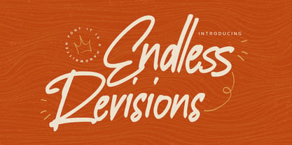 Hello Everyone, Introduce our new collection Endless Revisions It's A Handwritten Font,This font Stylish Script is great for your creative projects such as watermark on photography, and perfect for logos & branding, photography, invitation, watermark, advertisements, product designs, stationery, wedding designs,label, product packaging, special events or anything that need Signature taste. Endless Revisions is Font Authentic that is written casually and quickly. Then scanned and carefully drawn into vector format. This handmade font will make your design has a beautiful natural touch for each details. You can activate Ligature glyphs OpenType panel.
 - Havana Choice by Gassstype,
$22.00 Hello Everyone, Introduce our new collection Havana Choice is A Natural Handwritten Font,This font Stylish Authentic Script is great for your creative projects such as watermark on photography, and perfect for logos & branding, photography, invitation, watermark, advertisements, product designs, stationery, wedding designs,label, product packaging, special events or anything that need Signature taste. Havana Choice is Font Authentic that is written casually and quickly. Then scanned and carefully drawn into vector format. This handmade font will make your design has a beautiful natural touch for each details.
 - Geek Speak by Comicraft,
$29.00 Scissors cuts paper, paper covers rock, rock crushes lizard, lizard poisons Spock, Spock smashes scissors, scissors decapitates lizard, lizard eats paper, paper disproves Spock, Spock vaporizes rock, and as it always has, rock crushes scissors. If you're familiar with this theory, you already Speak Geek, and now you can download a font that has 250 friends in the Comicraft Font Library but has never met one of them. Take it to Comic-con this weekend and take photos of Wonder Woman cosplayers together then post them to your tumblr account... Or head down to the basement for D&D and debate the merits of George Lucas fiddling with his trilogies. Yep, GEEKSPEAK shoots first -- put that on a t-shirt! And gimme some Spock. GeekSpeak features Western & Central European, Vietnamese & Cyrillic support, worldwide currency symbols and Crossbar I Technology™ * Comicraft fonts are created by actual comic book letterers for actual comic book lettering
 - Adhesive Serif Letters JNL by Jeff Levine,
$29.00 A few scant examples of die cut gummed letters (R, C, Y and &) provided the design inspiration for Adhesive Serif Letters JNL. Influenced by the Caslon style, this typeface offers clean, legible titling. The sample letters were once manufactured by the Tablet and Ticket Company of Chicago and sold under their brand name of Willson's [named for the founder of the company]. Gummed letter sets were available in a variety of styles and sizes for various sign, merchandising and marking needs.
 - Eurobrush by profonts,
$41.99 Eurobrush Pro is a new handwriting script designed by German type designer Ralph M. Unger. He produced not only the standard Western character complement, but added all of the Eastern European Latin glyphs and, on top of that, even the complete Cyrillic characters. Born and grown up in Th�ringen, former East Germany, Unger has a fair knowledge of Polish and also Russian (Cyrillic). Eurobrush Pro is a very beautiful, casual, informal and modern handwriting in `brush-style of a contemporary type designer. Even though a digitized handwriting, it keeps a very natural and pleasant look, at the same time being generous and well-readable. The individual characters combine quite easily and perfectly with no need for extra variants (although Unger included a number of ligatures). Eurobrush Pro is well-suited for plenty of applications, e.g. personal correspondence, invitations, greeting cards, headlines etc. Eurobrush Pro is supplied in the complete Latin character set (West + East) including ligatures, plus Cyrillic.
 - Clear Sans by Positype,
$29.00 Clear Sans™ is a… wait for it… rational geometric sans serif. It is intended to fill a niche… to provide an alternative to the somewhat based-on-vernacular signage, somewhat geometric sans. I hear the word vernacular thrown around too much and too loosely. If a typeface is based in the vernacular, based on hand-painted or hand-crafted signage, then it should be based on the movements of the hand, retain that warmth and not on a pretty geometric model. For me, clean, geometric and precise doesn't have to be cold and expressionless. The original skeleton was hand-painted in 2008 to help determine and inform my decisions going forward. The typeface was completed shortly afterwards at the behest of an old friend for their identity. As usual, I expanded it, but considered retiring it since there were so many things similar out there. Years later, I had a chance to rediscover it and came to the conclusion that it could be improved, expanded in a logical and useful way, and introduced. I would be lying if I didn't admit that the rise of webfonts and embedded type in applications influenced many of the decisions I made about reworking Clear Sans™. Completely new Text and Screen fonts were developed that utitlize larger x-heights, space-saving widths, logical (and simplified) weight offerings… to name a few alterations. Even the pricing of each variant was considered to produce a more reasonable and simple solution for the developer, designer, professional and novice. Clear Sans™ is a departure from my previous sans serifs, but the influences of Aaux Next, Akagi Pro and Halogen are evident. Enjoy a light-hearted mini-site devoted to Clear Sans™
 - Clear Sans Text by Positype,
$25.00 Clear Sans™ is a… wait for it… rational geometric sans serif. It is intended to fill a niche… to provide an alternative to the somewhat based-on-vernacular signage, somewhat geometric sans. I hear the word vernacular thrown around too much and too loosely. If a typeface is based in the vernacular, based on hand-painted or hand-crafted signage, then it should be based on the movements of the hand, retain that warmth and not on a pretty geometric model. For me, clean, geometric and precise doesn't have to be cold and expressionless. The original skeleton was hand-painted in 2008 to help determine and inform my decisions going forward. The typeface was completed shortly afterwards at the behest of an old friend for their identity. As usual, I expanded it, but considered retiring it since there were so many things similar out there. Years later, I had a chance to rediscover it and came to the conclusion that it could be improved, expanded in a logical and useful way, and introduced. I would be lying if I didn't admit that the rise of webfonts and embedded type in applications influenced many of the decisions I made about reworking Clear Sans™. Completely new Text and Screen fonts were developed that utitlize larger x-heights, space-saving widths, logical (and simplified) weight offerings… to name a few alterations. Even the pricing of each variant was considered to produce a more reasonable and simple solution for the developer, designer, professional and novice. Clear Sans™ is a departure from my previous sans serifs, but the influences of Aaux Next, Akagi Pro and Halogen are evident. Enjoy a light-hearted mini-site devoted to Clear Sans™
 - Clear Sans Screen by Positype,
$21.00 Clear Sans™ is a… wait for it… rational geometric sans serif. It is intended to fill a niche… to provide an alternative to the somewhat based-on-vernacular signage, somewhat geometric sans. I hear the word vernacular thrown around too much and too loosely. If a typeface is based in the vernacular, based on hand-painted or hand-crafted signage, then it should be based on the movements of the hand, retain that warmth and not on a pretty geometric model. For me, clean, geometric and precise doesn't have to be cold and expressionless. The original skeleton was hand-painted in 2008 to help determine and inform my decisions going forward. The typeface was completed shortly afterwards at the behest of an old friend for their identity. As usual, I expanded it, but considered retiring it since there were so many things similar out there. Years later, I had a chance to rediscover it and came to the conclusion that it could be improved, expanded in a logical and useful way, and introduced. I would be lying if I didn't admit that the rise of webfonts and embedded type in applications influenced many of the decisions I made about reworking Clear Sans™. Completely new Text and Screen fonts were developed that utitlize larger x-heights, space-saving widths, logical (and simplified) weight offerings… to name a few alterations. Even the pricing of each variant was considered to produce a more reasonable and simple solution for the developer, designer, professional and novice. Clear Sans™ is a departure from my previous sans serifs, but the influences of Aaux Next, Akagi Pro and Halogen are evident. Enjoy a light-hearted mini-site devoted to Clear Sans™
 - Courage by Positype,
$35.00 High-contrast? High impact? Have Courage? Eye-catching and (extra, extra) bold, Courage balances ultra-high stroke weight, delicate details, and unique letterforms with a self-indulgent passion that will make you feel a little guilty using it. Honestly, use it large and don’t try to force it into a small space, because these fearless letterforms need room to move. Flavored with both upright and italic styles, each font includes an indulgent level of alternates, swashes and titling options, visual elements and more. A backstory with a different name Years ago, I was commissioned to take my Lust typeface and produce something unique to use for large format graphics for an event…cool. It needed to be hyper-contrast with a lot of over-the-top details. With a tight turnaround, I looked for primers within my development catalogue to help me, and settled on some early work on a typeface I had drawn called Hedonist. I used those sketches and its conventions to retrofit and build out Lust Hedonist (only to see the project go bust on the client’s end). I intended to go back shortly after the Lust Hedonist release to finalize a retail version of the OG Hedonist, but I never could settle on the look of the 'g' or the numerals, got distracted with other projects, and never picked it back up… until last year. After randomly doodling a fat, flat ‘g’ with an extremely tilted counter axis, I knew immediately how it could be used and that (re)set things in motion. Only problem was, in the process of refining the letterforms I began truly dissecting the pieces, rediscovering all of the recklessness within Hedonist, and decided on fundamentally rewriting the approach to the typeface… literally flaying it to the bone. I’m much, much happier with this finished typeface now, but the name no longer fit the moniker given to the first, adolescent approach—there’s far more audacity and cleverness in these letterforms, tenacious in their resolution now. As a result, the name Courage fit the mettle of this typeface so much more, so I kept it.
 - Rounded, two. - Personal use only

- Rebelion by Gassstype,
$23.00 Here comes a New font,Introducing REBELION It's Unique Rough Brush Font is a Strong Style and classy style, this font is great for your creative projects such as watermark on photography, and perfect for logos & branding, invitation,advertisements,product designs, stationery, wedding designs,label ,product packaging, special events or anything that need handwritting taste.
 - Boredom by Invasi Studio,
$17.00 You want to add more raw for your design. Introduction our new Handwritten Font. A Boredom Font with realistic scribbles pen styles. This set can make your design more realistic. Includes 2 set alternate variations for each A-Z letter (both uppercase and lowercase). So you can create a combination of whatever you want!
 - Big Deal by Daily Studio,
$13.00 Big Deal is a display San serif font with a strong character. A beautifully handcrafted modern typeface that helps you to create remarkable logos, headings, advertisements, and more. With 235 glyphs and files in OTF format. If you want to make your project to a whole new level, you are going to love this font.
 - Aesthetic Romance by Sign Studio,
$15.00 Sign Studio presents a new font which is beautiful and romantic style. Aesthetic Romance is medium thick which means it can be versatile for captioning as well as Title Display. Equipped with beautiful Ligature characters and alternative characters. This font would be perfect for any design of titles, headers, branding, labels, magazines, posters and more.
 - Granny Tales by OKSHUtypeCO,
$12.00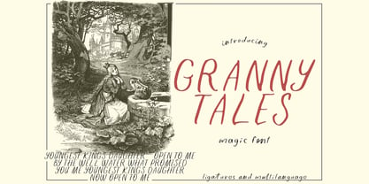 Granny Tales - a new fresh handmade calligraphy font. Very suitable for greeting cards, branding materials, business cards, quotes, posters, and more!This font are perfect for wedding postcard. Or you can create perfect and unique design of your logo, blog, stationery, marketing, magazines and more :) Features : Ligatures UpperCase & Lowercase Numerals & Punctuations Multilingualcharacters(AÀÁÂÃÄÅCÇDÐEÈÉÊËIÌÍÎÏNÑOØÒÓÔÕÖUÙÜÚÛWYÝŸŸ ÆŒßÞàáâãäåæçèéêëìíîïðñòóôõöøùúûüýÿ)
 - Lonesome by Gassstype,
$23.00 Here comes a New font, Lonesome is a All Caps Brush Font that is written casually and quickly. Letters are made with brushes on Procreate. Then crafted carefully drawn into vector format. That is why Lonesome has Stylish and strong characteristic more natural look to your text with a more modern look to your text.
 - Berlindah Monoline by Juncreative,
$15.00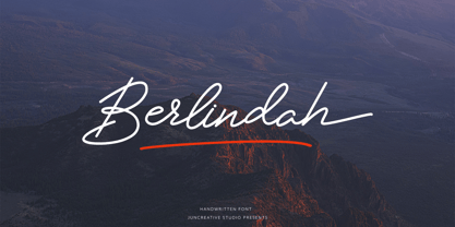 Berlindah Monoline is a new modern and fresh script with a handwritten style that makes this font looks elegant, natural, stylish and ideal for any awesome project that needs handwriting feel. Berlindah is perfect for branding projects, logos, wedding designs, social media posts, advertisements, product packaging, product designs, labels, photography, watermarks, invitations, stationery and more.
 - Jamarius Script Font Trio by Zane Studio,
$15.00 Jamarius Script - This handwritten font is a new modern script with an irregular base line. Trendy and feminine. Jamarius Script looks beautiful in wedding invitations, thank you cards, quotes, greeting cards, logos, business cards, and more. Perfect for use in ink or watercolors. Including beginning and end letters, alternatives and support for many languages.
 - Revolter by Gassstype,
$25.00 Here comes a New font,Introducing Revolter It's Unique Rough Brush Font is a Authentic Style and classy style, this font is great for your creative projects such as watermark on photography, and perfect for logos & branding, invitation,advertisements,product designs, stationery, wedding designs,label ,product packaging, special events or anything that need handwritting taste.
