10,000 search results
(0.038 seconds)
- Baldufa Cyrillic by Letterjuice,
$66.00 Baldufa is a charming typeface with strong personality, which looks very comfortable in text. There is a search to obtain complicated curves and detailed features, which gives the typeface a touch of beauty and elegance. However, this is also a self-conscious design that claims through the rounded serifs and irregular vertical stems appreciation for quirkiness and human imperfection. The letterforms are inspired by the slight distortions and idiosyncrasies that came with old printing methods. It has distinct, features such as rounded serifs, irregular vertical streams, ink traps and extremely thin junctions. In the Italic, serifs have been removed to enhance movement and expressivity. These experiments in form have not come at the cost of legibility: The typeface remains suitable for both small and display text.
 - Le Monde Livre Std by Typofonderie,
$59.00 A text face in 4 styles Before the arrival of Phototypesetting, each font size had a specific design. Le Monde Livre, designed by Jean François Porchez, along with Le Monde Journal re-establishes this practice. When Le Monde Journal was developed specifically for use at small point sizes (below 10 points.) Le Monde Livre works beautifully for book typography, magazine settings. In comparison to the italics in Le Monde Journal, Le Monde Livre’s italics are of a totally different design, closer to the models of the Renaissance. The families match well together on the same page, Le Monde Journal for small sizes settings, Le Monde Livre for large settings. The verticals metrics and proportions of Le Monde Livre are calibrated to match perfectly others Typofonderie families.
 - Baldufa Greek by Letterjuice,
$47.00 Baldufa is a charming typeface with strong personality, which looks very comfortable in text. There is a search to obtain complicated curves and detailed features, which gives the typeface a touch of beauty and elegance. However, this is also a self-conscious design that claims through the rounded serifs and irregular vertical stems appreciation for quirkiness and human imperfection. The letterforms are inspired by the slight distortions and idiosyncrasies that came with old printing methods. It has distinct, features such as rounded serifs, irregular vertical streams, ink traps and extremely thin junctions. In the Italic, serifs have been removed to enhance movement and expressivity. These experiments in form have not come at the cost of legibility: The typeface remains suitable for both small and display text.
 - ZT Mota by Khaiuns,
$14.00 ZT Mota is a bold and elegant typeface. It has a temperamental character but is more flexible towards various stylistic designs, reflecting more in its graphics the transitional stage between classical serifs of varying proportions, leaning towards the stylized types of Roman culture. All the ZT Mota styles are based on the same core but with a completely different expression which is to have an extra large x-height and bold so that the font looks bold as if the writing on the font was actually carved out of stone, perfect for an efficient choice for use of distinguishable displays such as headlines, packaging, magazines, posters, and advertisements, among others. I hope you have fun using ZT Mota Thanks for using this font ~ Khaiuns X zelowtype
 - Schnebel Slab Pro by URW Type Foundry,
$35.99 The refreshingly clear Antiqua Schnebel Slab is a refreshingly clear and strong interpretation of a contemporary Antiqua with subtle contrast and firm serifs, which offer excellent readability at very small size, and, at the same time, provide a lot of expression for use in headlines. The italics, drawn specifically for this purpose, contribute to a harmonious picture, which never loses creative tension, thanks to its aesthetics. The careful addition of ligatures, small caps, and proportional and old-style figures allows for well-proportioned typesetting. The condensed and expanded variants, which also come in 6 weights each, offer plenty of freedom to design with numerous combinations. Schnebel Slab Pro combines especially well with Schnebel Sans Pro.
 - Aquus by phospho,
$39.00 Aquus is a contemporary all-caps display font that refines the elegance of a classic Didone with experimental interventions. Geometric elements and subtle details are found in its letters, many of which connect to ligatures. Most alternate glyphs can be switched automatically by use of the Stylistic Set function in OpenType-supporting applications, others you can access manually via the glyphs palette. You may try Aquus Linearis as a fashionable outline variant, which reveals its beauty especially when combined with imagery. Use them best for concise strings of characters, such as logotypes, packaging or magazine titles. Aquus Simplex is their sober companion, based on the same letterforms, minus the geometric ornaments and conjunctions.
 - SD Quainton by Sawdust,
$35.00 SD Quainton was created in 2016 by Jonathan Quainton the co-founder of graphic design studio Sawdust. With a harmonious blend of Didone and Bauhaus elements Quainton embarks on a fresh and innovative direction. Drawing inspiration from revered typefaces like Bodoni and Didot, SD Quainton evokes the same sense of awe that captivated its creator. Designed with specific contexts in mind, SD Quainton finds its perfect home in the realms of fashion, retail, and premium products, where its captivating charm can truly shine. Although ideally suited for eye-catching headlines and titles due to its delicate strokes, the possibilities of where this remarkable typeface may find its place are as limitless as the designer's imagination.
 - P22 Tai Chi by IHOF,
$24.95 Experimental lettering Stephen Rapp created in 1999 became the spark that Stephen's imagination transformed into the Tai Chi design. Tai Chi is a display face but it could also be used as a textured calligraphic script. Its delightful sense of movement distinguishes it from other scripts. Individual characters stand poised in a vertical Zen-like balance while at the same time displaying an inner rhythm that makes them appear to dance along the line. Rich in texture and variation, Tai Chi works very well at medium and large point sizes. The font contains several alternate letters that help maintain a hand-lettered look. Tai Chi includes both upper and lowercase letters but works well in all uppercase settings.
 - Proper by Scholtz Fonts,
$17.00Proper was based on handwritten characters (of my own) that I scanned and then digitally touched up. I kept the digital editing to a minimum so as to preserve the freshness of the original. I did, however, want to convey a sense of propriety and regularity and so my original handwriting was done with quite a lot of control. I kept the size of the lower case characters quite large and this makes the font very readable, even at quite small point sizes. Proper may be used when you need clean, legible text, with a natural look, e.g.: -- magazines aimed at the natural health market -- "natural look" fashion pages -- "natural look" decor pages -- natural food products -- natural beauty products -- children's books -- packaging for children's toys, games etc. -- educational material -- comics Proper contains a full character set with all upper and lower case characters, numerals, symbols, accented characters and it has been carefully spaced and kerned. - Insider by Characters Font Foundry,
$25.00 Insider is a warm & legible grotesque. It’s custom made for Insider Consulting in Düsseldorf, Germany. It’s highly legible in small sizes because of the basic proportions and the balanced inner forms. It’s optimized for setting longer texts, but also works very well in headlines and leads. The fonts contain loads of OpenType features to spice up your design. The matching Stencil font is very suited for creative designs. The Stencil Regular has the same dimensions as the Insider Regular, so you can mix them without hassle. The font family has real italics and not just mathematically slanted romans. The dynamic cursive shapes root in handwriting. With 9 styles (5 weights + 4 italics), the family is very versatile and can be used for designs with a complex typographical hierarchy.
 - Hunkster by Heypentype,
$20.00 HUNKSTER is heypentype journey to simplified a stencil fonts. Simplified means it must easy and fast to cut when creating stencil art. Hence, this typeface inspired a lot from stencil arts and fonts right from the beginning of its creations. When a lot of stencil fonts out there used to create political message and self-expression, Hunkster take it beyond that. This typefaces can be applied to anything, from motorsports, branding, logo or logotype, industrial design, products packaging, software, games, website headlines,etc. Whatever it will be used, the spirit of the stencil and street art remains. Include in this typeface family is plenty of ligatures because the nature of stencil and our design aims, easy-to-cut but still beautiful. Most importantly its thrown away an image of stencil fonts bound on military themes. This ligatures will be developed in the future release along with updates on Hunkster variable fonts.
 - Sigmund Freud Typeface by Harald Geisler,
$29.00 “For those who regret what keyboards and touch screens have done to their penmanship, typographer Harald Geisler has an answer: Sigmund Freud.” — The Wall Street Journal Sigmund Freud was a neurologist who lived from 1856 to 1939. His research and studies led to the foundation of ‘Psychoanalysis’. When I first saw Freud’s century old letters, I was fascinated by the beauty of these historic manuscripts. It made me smile to imagine a person writing his or her shrink a letter set in Freud’s handwriting. I started to plan creating a font based on his manuscripts. I contacted the Sigmund Freud Museum Vienna and Freud Museum London. To start the creation I selected eight handwritten documents from the archive in Vienna – This selection of specimen was my orientation during the design process. The Samples were created between 1883 to 1938 and are of various character such as handwritten scientific papers, personal letters, notes and a telegram. A successful Kickstarter Campaign "The Sigmund Freud Typeface - A Letter to your Shrink" with over 1400 Backers enabled me to visit the archive in Vienna and study the original manuscripts of Sigmund Freud. After a year of preparation and design work, I finished four alphabets based on Freud’s handwriting. What are the different Versions PRO, Kurrent, #1, #2, #3 and #4 about? “This project gives people the convenience afforded by the computer while maintaining the romantic nostalgia, beauty, and character of letter writing with real handwriting.” — Daniel Vahab, The Huffington Post When you write with your hand, every letter looks a little different. When you write a text on your computer every letter looks exactly the same. In order to make type look like handwriting, I chose four different variations of each letter from Freud’s manuscripts, drew and stored them in the font. The font is then programmed to exchange letters while you are typing. This makes the rendered result on your screen or print look like unique handwriting. PRO While you are typing… the PRO Version actively combines all four alphabets and exchanges them automatically. Through this mechanism never the same two o’s will stand next to each other. With every touch a unique look is generated. This works in certain applications i.e. Word 2010(or newer), Pages, TextEdit, Editor(Pre-installed on Windows 7 or newer), InDesign, Illustrator… →Here you can see an animation of what this effect looks like in action. (Please Note: some applications like LibreOffice, OpenOffice do currently not support this feature. Date: December 2013) #1 #2 #3 and #4 The Sigmund Freud Typeface #1, #2, #3 and #4 each hold one individual lowercase alphabet based on Freud’s handwriting. Kurrent Most of Freud’s correspondence was written in German. Until the 1950′s a different handwriting was taught throughout German speaking countries (Switzerland, Austria, Germany). This style is called Kurrent. The name Kurrent and Cursive derive from the Latin word currere - to run, hurry - both styles were designed to write fast. As you can see in the samples above, Freud practiced both Kurrent and when writing english Cursive (Latin script or Joined-up). Kurrent has three significantly different letters (s,h,e). Use Kurrent to render the authentic look of an historic Sigmund Freud letter in German. Bundle On the Top of this page you can get all six fonts of the Sigmund Freud Typeface Family in a bundle. International Typeface All styles of the Sigmund Freud Typeface feature a wide range of accented letters so you can write to all your friends in Sweden (Bjørn) France (Chloé & Zoë), Ireland (Dáirine), Poland (Łucja), Germany (Jörg) and almost everywhere around the globe (Find a complete list in the tech specs). Usage recommendations I hope that this design will be valuable to you and most of all that you have fun with this typeface! 1. Point Size — To reproduce the size of Sigmund Freud’s handwriting adjust the type size between 18-24 point in your word processor. If you are using an imaging software like Photoshop set the resolution to 300dpi and adjust the point size between 18-24. 2. Line Spacing — Narrow the line hight until swashes of capital letters touch the baseline above. This also happens when you write a letter and gives the document a unique handwritten look. 3. Right Aligned — Freud had the habit to write towards the right edge of the page and start loosely on the left. Set your text alignment to ‘right’ to incorporate this dramatic expression also to your documents. What do other People say about the Sigmund Freud Typeface? “Wouldn’t you love to write a letter to your shrink using the Sigmund Freud typeface?” — Dorothy Tan, Design TAXI ''“JUST DON’T WRITE A LETTER TO YOUR MOTHER WITH IT… …until the reader looks a bit closer, and they see 70+ years of modern science weighing in on turn-of-the-century pop psychology."'' — Mark Willson, Fast Company “Doctor, what does it mean if you dream of creating a font of Freud’s handwriting?” — Ayun Halliday, Open Culture “…geekily romantic, at once artistic and scientific” — Edie Jarolim, Freud’s Butcher “…sympathisch” — Jürgen Siebert, Fontblog !WOW! Thank you for reading the complete font description! You are awesome! If you still have a question please contact me through MyFonts or my website haraldgeisler.com. Credits This project was made possible by the help of 1481 Backers on Kickstarter and the kind support of the Sigmund Freud Museum Vienna and the Freud Museum London. Thank you. All of Freud’s Manuscripts shown are © Sigmund Freud Museum Vienna. Poster Image: IN17 - Sigmund Freud, Germany 1932. © Freud Museum London. Flag Image: IN19 - Sigmund Freud 1930’s. © Freud Museum London.
 - Kostic Serif by Kostic,
$50.00 Kostic Serif is a classic transitional typeface (like Baskerville, Bookman, Caslon, Times) with tall, clean characters and a large glyph set to support all European languages - Greek and Cyrillic script included. Excellent for setting multiple pages of text and packed with OpenType features (proportional lining and oldstyle numbers, tabular figures, superscript and subscript, numerator and denominator figures, fractions and 31 ligature in 659 characters), it should meet the demands of even the most demanding typographic works. Kostic Serif is made with fairly large x-height, so the text is legible in very small sizes. Zoran began the work on Kostic Serif around 2002 and after completing Regular, Bold and matching italics, he wasn’t too pleased with the design, so he dropped further work on it to make other fonts. In 2010 Nikola came upon unfinished files for Kostic Serif, and decided to redesign the letters, while retaining basic proportions and widths that Zoran established earlier. When they were both pleased with the new look of the font, they made Medium and decided to add CE and Greek script to the glyph set, to make it pan-european.
 - Hearts by kapitza,
$29.00 Hearts contains 70 groovy heart illustrations and repeat patterns. It’s great for designing unique and personal t-shirts, greeting cards, gifts and even wrapping paper. You can use individual characters as illustrations and create repeat patterns and borders by selecting a character and pressing the same key over again. Easy!
 - First Responder JNL by Jeff Levine,
$29.00 First Responder JNL is a back slanted version of Catalog JNL, and is intended to be used for graphics on police and fire vehicles to emulate "forward" movement, which is a popular theme on such vehicles. It is also useful in conveying the same image in print applications and web design.
 - Gontela by Attype Studio,
$15.00 Gontela - Inspired by typeface on 70s era, Gontela the handwritten vintage font. combine it with ending swash for better letterform. Gontela is perfect for children product, branding, logo, invitation, stationery, product packaging, merchandise, monogram, blog design, game titles, cute style design, Book/Cover Title and more. Features : - Ending swash - Multilingual Support
 - Albion's Old Masthead by Greater Albion Typefounders,
$15.00 Albion’s old Masthead is inspired by traditional newspaper mastheads. A heavy Black Letter which brooks no argument, and can be emphatic and refined (emphatically refined?) at the same time. Ideal for signage with a ‘period’ feel, book covers, posters and banners. Why not add something solid to your latest project…
 - Smash by Cool Fonts,
$24.00 Smash is nicely distressed and has cracks, chunks and blobs. Some people think it looks like a crappy FAX or broken typewriter. It is compatible with Overexposed, so you can mix and match letters so you don't have two of the same messed up letters in a row.(Pretty cool huh?)
 - Farmstand by Atlantic Fonts,
$26.00 Farmstand is a fresh and joyful font with the same kind-hearted feeling and naiveté of your local farmstand. Paired with Farmstand Goodies, 52 hand-drawn images of funky farmers' fare, you can celebrate and have some pickles, savor sweet strawberries, or get creative with Cosmos. Sometimes life can be simple.
 - Resting by Nathatype,
$29.00 Font is the most important design element to increase your branding. However, it may be tricky and take quite a while to figure out the perfect font for your design. Resting is a perfect display serif font for any of your design projects. Serif font is a font type with sticky small lines on the letters’ edges expressing formal, classic nuances and more aesthetic, creative touches due to the display font combinations. This display font has thick, high contrast lines perfect for catching attention and creating firm impressions. In addition, use this font for big text sizes for a legibility reason and make use of the other interesting features to beautify your designs. Features: Stylistic Sets Ligatures Multilingual Supports PUA Encoded Numerals and Punctuations Resting fits best for various design projects, such as brandings, posters, banners, logos, magazine covers, quotes, headings, printed products, invitations, name cards, merchandise, social media, etc. Find out more ways to use this font by taking a look at the font preview. Thanks for purchasing our fonts. Hopefully, you have a great time using our font. Feel free to contact us anytime for further information or when you have trouble with the font. Thanks a lot and happy designing.
 - Mandrel Didone by insigne,
$24.00 A new family has sprung from the world of insigne. Mandrel Didone is his name. The face is well-liked by those with whom it seeks an audience because of its courtly demeanor and exquisite look. Mandrel Didone conducts itself beautifully in front of each set of eyes with a confident attitude, never wavering or tripping in its polished step. But, despite it’s gentility, this exquisite family is not weak in the face of adversity. Mandrel Didone is a powerful and conspicuous typeface that has towering x-heights, great contrast, confident bends, and sharp serifs. It is well-crafted for high-impact resistance. It uses its sharp serif ends deftly, cutting through opponents' clumsy clutter in the battle for the reader's attention. This noble family consists of nine weights and their matching italics, ranging from Thin to Black. Mandrel Didone also comes with a plethora of OpenType options to let you embellish your text. The family's 500 glyphs and support for more than 70 languages are accompanied with ligatures, old-style figures, and stylistic sets. Raise your glass in honor of the new Mandrel Didone! This champion, with its powerful serifs and great contrast, is ready to take on your challenge in many tests to come.
 - Lab Slab Pro by Vanarchiv,
$50.00 Lab Slab Pro is a geometric slab typeface with a technological and minimalist look and is suitable for use in large sizes. It has eight versatile weights, (from Thin to Black) including true italics for each one, and a wide range of stylish alternate characters to improve its use in different graphic contexts. The name of this typeface was inspired by an experiment, mixing a structure with calligraphic influences and completely geometrical and structured drawings. Lab Slab Pro has a wide range of OpenType® features such as: small caps, old style/titling and small caps figures, fractions, superior and inferior scripts, scientific components and ligatures. Lab Slab Pro is Lab's best and most powerful mutation designed by Tiponautas.
 - Grandheron Sans by André Simard,
$11.99 If you are looking for a font with very good readability, even with its square appearance and condensed design, Grandheron is for you. You should find attractive the design of some glyphs like those one: a,f,k,l,v,y and also AJKMNVXY to name a few. Grandheron could be use as well in small size as in huge size. You will certainly like its Thin or Light font which give an awsome effect for titles, subtitles, caption for magazines related to fashion, architecture or even cultural in general. You could easily mix Grandheron with serif typeface as Harfang Pro. There is no limit to create great designs with this large typeface family, so enjoy!
 - Sethasso by Twinletter,
$15.00 Introducing our newest font called Sethasso, clean simple, and elegant themed signature font, which is written in natural hand strokes making this font more charismatic natural, This font in addition to having a charming and unique shape is also equipped with various alternative options that make it easier for you to create beautiful and extraordinary designs This font is perfect for business cards, photography studios, autographs, interior designs, model names, coffee late, travel, weddings, cosmetics, jewelry, social media posts, product packaging, watermarks, special events, or anything else. Start using this font to add an authentic and heartfelt vibe to any design project.
 - Cyberend by Alit Design,
$19.00 Introducing "Cyberend" – a font that seamlessly marries the raw, edgy aesthetic of cyberpunk with the precision of square pixels and the sleek modernity of italic serifs. As the digital world converges with futuristic design, Cyberend emerges as the quintessential typeface for those seeking a cyberpunk-inspired typographic experience. Dystopian Elegance: Cyberend encapsulates the essence of cyberpunk, embodying a dystopian elegance that effortlessly blends chaos and sophistication. The font's italic serifs add a touch of rebellion and forward momentum to every character. Pixelated Precision: Immerse yourself in the pixelated precision of Cyberend, where each character is meticulously designed with square pixels. The result is a sharp, high-tech appearance that resonates with the digital landscapes of cyberpunk aesthetics. Versatile Impact: From gaming interfaces to film titles, Cyberend makes a bold statement in any digital or print medium. Its versatility allows you to infuse cyberpunk vibes into logos, posters, websites, and more, giving your projects a distinctive and immersive feel. Futuristic Legibility: Despite its cyberpunk flair, Cyberend prioritizes legibility. Each character is crafted to ensure readability, maintaining a perfect balance between avant-garde design and practical functionality. Unleash the power of Cyberend to transport your audience into a cyberpunk-inspired future. Whether you're designing for tech enthusiasts, gamers, or cyberpunk aficionados, this font is your gateway to a digital realm where style meets rebellion. Upgrade your typographic game with Cyberend and let your creations transcend the boundaries of conventional design.
 - Continuo by Delve Fonts,
$39.00 Continuo is a fascinating, all-uppercase display typeface wherein the contour of each letterform is described with a single, continuous line. The challenges presented by that simple idea are similar to constructing letterforms with neon tubing. For example, when the strokes of a letterform need to be heavier than the width of the neon tube, two tubes are employed to create the outer contours, effectively leaving an unfilled void inside the stroke. Also, since neon tubes cannot be broken apart as they trace the contours, they must follow a path that, for reasons of economy and to avoid optical massing (or bright spots in neon), the tubes are not crossed. So too, the construction of Continuo follows. The newly updated Continuo now has alternate forms of letters A-Z available in the lowercase a-z and by extension those alternates are also present in the lowercase diacritics. The new Latin Plus glyph repertoire of Continuo contains almost 900 glyphs, supporting 224 languages, including Vietnamese and multiple African languages. A handy set of arrows and additional international currency symbols were added as well. The name is derived from the musical term “Basso Continuo” meaning an almost constant bass line, an integral part of most musical melodies. As an in-line display type, Continuo is ideal for headlines and most oversized applications and its unique appearance commands attention from viewers.
 - ZF Captiva by ZooFont,
$22.00 The name Captiva is derived from the word captivate, meaning 'enchanting' or 'capturing the heart'. Captiva is a geometric sans serif font with a harmonious blend of clean shapes and straight lines, diagonal lines, and curves. The simple yet sophisticated design shows a soft yet hard, hard yet beautiful appearance. It has a total of 9 thickness levels, and the edges and strokes are rounded to give the user a peaceful impression. The non-decorated form gives the user a comfortable reading of the text, and the high height value and wide inner space make it stand out from other fonts. In addition, it provides comfortable readability in various digital media as well as in general printing environments. Captiva has the following features: 9 thickness levels (from thin to heavy) extended latin 450+ glyphs fixed width numbers The Latin extension offers more than 130 languages with extensive multilingual Latin support for Western, Central, and Southeastern Europe.
 - VIP by Canada Type,
$29.95 VIP is a humanist sans serif uppercase and figures combined with a freshly redrawn revival of the classic Constanze initials originally designed by Joachim Romann for Stempel in 1956. As well as a vehicle to revive the Constanze initials, VIP was inspired by modern typography found in many artful books, on many product packages, and on the windows and literature of high-end restaurants, jewelry stores, haute couture fashion sellers, architecture firms and trendy brand name establishments. If you've walked through the soho or downtown of any major metropolitan, you've seen them: Widely tracked words or lines starting with a script majuscule and going on with clean and comfortable sans serif caps. If classy modern combination typography is your thing, you will find much pleasure in using VIP. VIP was updated with expanded language support in 2012. It now supports a very wide range of codepages, including Cyrillic, Greek, Central and Eastern European, Turkish, Baltic, Vietnamese, and of course Celtic/Welsh.
 - Cienfuegos - Personal use only

- Banquet SCF by Scholtz Fonts,
$21.00Banquet SCF is a rough-and-ready brush font with a "warts and all" appearance. Is has a simple, unsophisticated "believable" look. Use it when you want to make your message more honest, more homespun and more real. Use it in menus, invitations and advertisements. When I created it, I was designing a simple brush-written invitation to a medieval banquet. Hence the name: "Banquet". It has a full character set with all upper and lower case, special and accented characters. All characters have been letterspaced and kerned. - Cattus by Craft Supply Co,
$15.00 Cattus is a handwritten script font based on the expression of real handwriting. Cattus will work perfectly for fashion, e-commerce brands, trend blogs, wedding boutiques or any business that wants to appear upscale and chic. Cattus is also suitable for logos, greeting cards, quotes, posters, branding, name cards, stationary, design titles, blog headers, art quotes, typography, art, modern envelope lettering or book design, happening style like hand-drawn design or watercolor design themes, craft design, any DIY project, book titles, or any purpose to make your art/design project look pretty and trendy.
 - Xanthine by Hanoded,
$15.00 Xanthine… is a purine base found in most human body tissues. Yes, you can forget that. I don’t even know what it means, but I suddenly realised that I was running low on fonts with an ‘x’ in the name. Xanthine font is a messy brush: it is all caps, but upper and lower case mingle freely. It comes with a whole bunch of diacritics and some interesting ligatures as well. I have included a very handy shapez pack and a truckload of arrows - anything to make you happy…
 - Bluehonest by Allouse Studio,
$16.00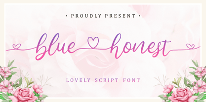 Lovely Script Font. Bluehonest come with many stylistic-alternates to fulfill your need. Lovely Alternates Uppercase, Regular and Lovely Beginning and Ending Swash, Big Love ending swash to pairing initials/name/anything, Multi-Lingual Support. We highly recommend using a program that supports OpenType features and Glyphs panels like many of Adobe apps and Corel Draw, so you can see and access all Glyph variations. Bluehonest is perfect for any tittles, logo, product packaging, branding project, megazine, social media, wedding, or just used to express words above the background.
 - Barqon by Graphicfresh,
$14.00 Barqon is a vintage display family including Regular and Stamp versions. it's perfect for logos, name card, magazine layouts, invitations, headers, or even large-scale artwork. Barqon includes 2 OTF files within the Zip folder. Features Uppercase Punctuation and Number Multilingual Language Alternate That's it! Get cracking!! I hope you have as much fun using it as I did making it :) If you are still unsure, feel free to drop me a line, I'll try to get to you as soon as possible :) Now go ahead and Get designing already! Thanks
 - Bell Martellus by Chank,
$99.00 Full of texture and regal personality, Bell Martellus was derived from a book published in 1475 by Henricus Martellus entitled “Liber Insularum.” The writing style is based on the Carolingian Script created by the Emperor Charlemagne and his scribe, Alquin of York, in the 9th century A.D. This old world lettering comes with new world OpenType capabilities, including swash caps and small caps. The James Ford Bell Library at the University of Minnesota commissioned Bill Moran to develop this font as a means of introducing their amazing collection of rare books, maps and manuscripts to a wider audience. Once the historic script was fontified by Bill, it was forwarded to Chank Co, where we added some snazzy baubles for the discriminating typographer. Everybody can enjoy the antique genuine nature of Bell Martellus, but advanced OpenType users also get extra features in Adobe CS applications.
 - Galix by Eclectotype,
$40.00 Galix is a technical sans designed to look futuristic without any of the retro appearance often found in this genre. It has a squarish, slightly condensed anatomy, and is characterized by thin joints and deep ink traps that add a sparkle to the otherwise monoline typeface. In the italic styles, these cuts are accentuated even more which creates a feeling of speed in the letterforms. Galix is optimized for display typography (the ascender height is the same as the cap height, and the spacing is somewhat tight) but the middle weights are very readable at smaller sizes, where I'd recommend adding a little tracking. OpenType features include ft and tt ligatures, stylistic sets/alternates, automatic fractions, tabular, superscript and subscript figures, case sensitive forms. Perfect for websites, apps, infographics, magazines and logotypes, Galix is technical but with a warmth and personality that is often missing from this genre.
 - Arsapia by URW Type Foundry,
$49.99 Michael Hoffmann manufactures digital fonts for 30 years. At URW++ he contributed to the technological progress. Over the years, he also specialized in the ideal representation of fonts on screen and the complex assembly of international fonts with scripts of all countries. In his latest project he put the emphasis on developing a highly readable typeface. Less interested in the design as in the functionality of this typeface, he designed Arsapia which he has now installed as a system font on all his computers. Michael Hoffmann studied Japanology at the University of Hamburg and traveled in the early years of his professional activity frequently to Japan, there to train the IKARUS font production tools to Japanese customers. In his spare time he plays guitar or golf depending on the weather. The typeface Arsapia has been designed in such a way that all three font styles Light, Regular and Bold have the same width. When a user therefore opts for the use of Arsapia Light, even though he has already written his text in Regular, nothing changes with respect to the letter tracking. When choosing the Bold for emphasis: Nothing changes except the blackness of the letters. A font change does not engender unwanted line and page breaks of itself. All letters can be clearly distinguished from each other. 1 l I O 0 are all different. For programmers and lovers of monospaced fonts Michael Hoffmann has developed a fourth typeface: Arsapia Mono. This is the perfect terminal font.
 - Getaway Car by Hanoded,
$15.00 When I am working on a new font, I usually play some music, or have a song in my head. When I was working on this font, an Audioslave song called Getaway Car was playing in my head. Again: naming a font is not that difficult! Getaway Car was made with a cheap brush and expensive Chinese ink. It is an all caps font, ideally suited for posters, book covers and designs that need a bold, rough & ready look.
 - Makio by HIRO.std,
$25.00 Makio is San Serif Typeface Makio inspired by modern life, clean, simple life, Japan culture, and minimalist symbols. This font works great in any branding, name card, logos, title, websites, product packaging, flyers, magazines, label, films, stationary, posters, etc. and any design project that requires clean, modern and simple touch. FEATURES - Six Weight - Uppercase and Lowercase letters - Support Opentype Features - Numbering and Punctuations - PUA Encoded Characters - Ligatures - Multilingual Support - Works on PC or Mac Enjoy using! Thanks. HIRO.std
 - Riads Script by Arsa Visual,
$9.00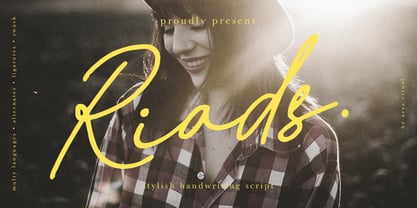 Introducing "Riads - Stylish Handwriting Font" with a signature style look. "Riads Script" very recommended for you who want to make some designs with natural handwriting style. This font easy to use and perfect for elegant branding, greeting cards, wedding design, name card design, invitation design, poster, packaging, romantic book cover designs, handwritten quotes, unique social media post, and so much more. Feature and what inside: • Uppercase and Lowercase • Uppercase and Lowercase Alternates • Number and Punctuation • Ligature • Swashes • Multi Languages
