10,000 search results
(0.037 seconds)
- Zibryain by Ably Creative,
$12.00 Zibryain is a unique display font. Modern style created as a result of my experiments on letterforms, on the one hand I like the appearance of the individual curved lines, on the other hand they seem very strange, foreign and illogical. It was like looking into a microscope and seeing something strange. I wanted to develop and study these forms as something new, because I had never seen anything similar before. The result is a contrasting font that has sharp, smooth curves and lines. The Zibryain font is perfect for designing company logos, online game logos, magazine covers, biographies, business cards and all your design work of course. become more attractive in appearance.
 - MonsterPie by Marc Lohner,
$28.00 Say hello to MonsterPie. This font brings the funny appearance of irregular designed characters together with the classic look of the Didone typefaces from the 18th century – that makes it a good choice for theme parks, movie posters, games, greeting cards and kid’s products. A large database and plenty of alternate characters work in the contextual alternates feature to keep your headlines bouncing all the time. Other implemented Opentype features are case sensitive forms, ligatures, arbitrary fractions and many more. On top, MonsterPie has a set of nice arrows, two different ampersands and extensive support for south-eastern, central and western european languages, as well as for Pīnyīn to offer. Designed by Marc Lohner in 2016.
 - Rough Stamp Times by TypoGraphicDesign,
$9.00 The typeface Rough Stamp Times is designed from 2016–2022 for the font foundry Typo Graphic Design by Manuel Viergutz. The display font based on the original rubber stamps from flea market. The font started from 50+ stamps (analog) and was finally digitalize and extended to 600+ glyphs (digital). 4 font-styles (Rough, Clean, Misprint, Impact) with 601 glyphs incl. decorative extras like icons, arrows, dingbats, emojis, symbols, geometric shapes (type the word #LOVE for ♥︎ or #SMILE for ☺ as OpenType-Feature dlig) and stylistic alternates (9 stylistic sets). For use in logos, magazines, posters, advertisement plus as webfont for decorative headlines. The font works best for display size. Have fun with this font & use the DEMO-FONT (with reduced glyph-set) FOR FREE! Font Specifications ■ Font Name: Rough Stamp Times ■ Font Styles: 4 (Rough, Clean, Misprint, Impact) + DEMO (with reduced glyph-set) ■ Font Category: Display for headline size ■ Font Format:.otf (Mac + Win, for Print) + .woff (for Web) ■ Glyph Set: 601 glyphs incl. extras like icons (decorative extras like arrows, dingbats, emojis, symbols) ■ Design Date: 2016–2022 ■ Type Designer: Manuel Viergutz
 - Anti Atom Font by TypoGraphicDesign,
$19.00 The typeface Anti Atom is designed from 2021 for the font foundry Typo Graphic Design by Manuel Viergutz as a political statement #antiatom #atomkraftneindanke The display font based on the original Anti Atom Sonne from Anne Lund. Thanks to Stefan Bergmeier for the Input. 4 font-styles (Sun, Cap, Mirror, Outline) with 375 glyphs (Adobe Latin 2) incl. 100+ decorative extras like icons, arrows, dingbats, emojis, symbols, geometric shapes (type the word #LOVE for or #SMILE for as OpenType-Feature dlig) and stylistic alternates (3 stylistic sets). For use in logos, magazines, posters, advertisement plus as webfont for decorative headlines. The font works best for display size. Have fun with this font & use the DEMO-FONT (with reduced glyph-set) FOR FREE! Font Specifications ■ Font Name: Anti Atom ■ Font Styles: 4 (Sun, Cap, Mirror, Outline) + Icons + DEMO (with reduced glyph-set) ■ Font Category: Display for headline size ■ Glyph Set: 374 glyphs (Adobe Latin 2) incl. 100+ icons (decorative extras like arrows, dingbats, emojis, symbols) ■ Design Date: 2021 ■ Type Designer: Manuel Viergutz
 - Icons Dingbats Symbols Set by TypoGraphicDesign,
$9.00 The typeface “Icons Dingbats Smybols Set” is designed at 2019 for the font foundry Typo Graphic Design by Manuel Viergutz. The Basic Icons Set is a display typeface that inspired by the here and now. 426 glyphs / icons / decorative extras like icons, arrows, dingbats, emojis, symbols, ornaments, social media icons, sign of the zodiac, geometric shapes, catchwords, decorative ligatures (type the word #LOVE for or #SMILE for as OpenType-Feature dlig) and stylistic alternates (8 stylistic sets). For use in logos, magazines, posters, advertisement plus as webfont for decorative headlines. The font works best for display size. Have fun with this font & use the DEMO-FONT (with reduced glyph-set) FOR FREE! ■ Font Name: Icons Dingbats Smybols Set ■ Font Weights: Reg + DEMO (with reduced glyph-set) ■ Font Category: Display for headline size ■ Font Format: .otf (OpenType Font for Mac + Win) ■ Glyph Set: 436 glyphs / decorative extras like icons ■ Specials: Alternative letters, stylistic sets, automatic contextual alternates via OpenType Feature. Dingbats & Symbols, arrows, hearts, emojis/smileys, stars, further numbers, lines & geometric shapes ■ Design Date: 2019 ■ Type Designer: Manuel Viergutz
 - ITC Orbon by ITC,
$29.99ITC Orbon font is the work of New York designer James Montalbano, inspired in part by a demo of black letter calligraphy in which letters were created out of only four or five basic strokes. I combined that idea with the notion of taking historical forms like German gothic blackletter and progressively paring them down to achieve a futuristic version, as if this old form naturally evolved over several hundred years to arrive at its post-modern incarnation." Text should be set in point sizes of 20 and higher for optimal legibility. ITC Orbon is a highly condensed font with unique, oblong shapes which are ideal for a number of display applications." - URLOP by Mikołaj Grabowski,
$9.00 Colour is more fun than black, but multicolour is even better. Let me introduce URLOP, a wide type family suitable for your fancy posters, headlines, covers, illustrations, websites, initials, blackmails, chronicles, signboards, poems and many others. Twelve basic styles, which make the overall construction, give a wide range of opportunities. All of them, being able to mix with each other, vary from a thin INSIDE, through a medium FILL, to a double-stem PLUS styles. And then comes a range of colour fonts, so you don’t have to waste any of your precious time for experiments, because I’ve already done it for you! URLOP is an all-caps display collection consisting of three sub-families of fonts, divided by the usage they are designed for. First of all, there is a wide range of alphabets made in the new OpenType-SVG colour fonts format. This is quite a novelty and a very promising technology at the same time. It allows designers to store colour information inside the font. Due to my experience with layered colour thinking that I explored in my first family - Epilepsja , I decided to make several preset layer combinations in this auspicious format. This sub-group is tagged RGB. Make sure that your field of usage and software support OT-SVG format. However, if you feel a need to experiment in the old-fashioned way, you may buy separate layers under the DIY tag. The last group is very similar to the DIY, but it was optimized to look better when standing without other layers. It’s called PRO*. All styles cover Latin alphabets of Europe, basic Cyrillic and Greek sets. Have fun! Before using the font, read the instructions and specimen attached to font files in the purchased package or download them from the Gallery tab on this site. This will help you avoid making unexpected mistakes when combining layers. *PRO subfamily release planned in 2019.
 - Neuzeit Grotesk by URW Type Foundry,
$39.99 Neuzeit Grotesk was originally designed by Wilhelm Pischner (1904-1989) and was released by the font foundry D. Stempel in 1928-1939. In 1970, the German Standards Committee advised the standard use of Neuzeit-Grotesk for official signage and traffic directional systems, and the abbreviation DIN was added to the name of the font. DIN" stands for Deutsches Institut für Normung (The German Institute for Industrial Standards). Neuzeit Grotesk was also once the standard in the German printing industry. It has been seen as a straightforward and utilitarian typeface, with no unusual or distracting features. Like other typefaces from the 1920s, it reflects the philosophy of those times, "Form is Function." Today, however, because of its familiarity and practicality, Neuzeit™ Grotesk has acquired an almost cheerful and reassuring aura. Try it out for signage, magazine headlines, or flyers. See also Neuzeit S for text weights of Neuzeit Grotesk.
 - Calcis by Eurotypo,
$24.00 “Chalkís” or “Chalkida” was the capital of the Euboea island in old Greece. The name derived from the Greek and it means copper - bronze. Colonist from this area founded several important cities in the Magna Graecia, such as Cumae (coastal area of Southern Italy), where our alphabet come from. At the beginning, first scribes draw the signs in mono-line, but later on, the influence of materials, tools and the skill of calligraphers, developed the refinement of the lettering. “Calcis” is a family of sans serif fonts, characterized by its austere, functional and clear style, emerged from straight lines and primary shapes; but enriched by the contribution of countless anonymous calligraphers who have polished and embellished their forms over the years. “Calcis” is presented in five weights and italic style. It has good legibility in small sizes, elegance and strong visual impact in headlines as well. Each font of the family contain 377 glyphs with accurate kerning pairs careful controlled, and advanced typographical support with OpenType features such as: old style numerals, ligatures, discretional ligatures and case-sensitive forms. It also contain diacritics for Central European languages.
 - Tapas by Fenotype,
$20.00 Tapas is a delicious multi type family with a little something for everyone's tastes and needs. The family consists of four distinct members that share same traits but communicate different aspects. Together they’ll create a bold and effortless mix of various flavors and accents. Naturally, the fonts can be used individually too. Use the Tapas type family in packaging, branding or editorial – wherever some delicious flavors are needed.
 - Zeebonk by Hanoded,
$15.00 Zeebonk (literally 'Sea Chunk') is Dutch for a sailor - in particular, a large, pickled and brined, seven-seas-been-there-done-that specimen. The font itself brings back memories of the outrageous tattoos those same 'zeebonken' used to have. Zeebonk comes with extensive language support, alternates for the upper case (and some lower case letters as well) and a healthy dose of good old fashioned sea dog humor!
 - Rocinante Titling by XO Type Co,
$40.00 Rocinante Titling is a study in interior and exterior tension, with tightly-packed interiors and unexpected lightwells contrasting generous letterspacing. 5 weights and obliques on the same weight range as Havelock Titling, the family is a contrasting partner meant for combination. It’s made for creating contrast and tension in your work. Here’s a downloadable PDF specimen, and here's more about the process of getting from Havelock to Rocinante.
 - Engravia by K-Type,
$20.00 Engravia is a Didone display face supplied in three varieties of engraving – Inline, Shaded and Sawtooth – plus a plain basic font. All four fonts share the same spacing and kerning, so engraved characters can be overlaid onto plain ones to produce bicolor effects. All four Engravia fonts are included in the download. The typeface was developed from K-Type’s rustic Building & Loan font, redesigned and drawn with precision outlines.
 - Scott McCloud by Comicraft,
$39.00 Whether you're Making, Understanding or Reinventing comics, you'll need a comic book font that makes your comic book—or comic book about making, understanding or reinventing comic books—look like a, um, comic book. Yes, it's all very well writing about the Invisible Art of Making Comics, but if you can't read about the Storytelling Secrets of Comics, Manga and Graphic Novels, they'll still be secrets, won't they? That's why Scott McCloud came to us to create the official "Making Comics: Storytelling Secrets of Comics, Manga and Graphic Novels" comic book font, or as we like to call it: McComicBookFont.
 - Sprightful Font by Get Studio,
$15.00 Sprightful Font is a casual dry brush font with a bunch of letter variations to make that perfect and unique design. Ideal for the header, logos, handwritten quotes, product packaging, poster, merchandise, social media & greeting cards. Sprightful Font comes with upper and lowercase characters, a large set of punctuation glyphs, numerals, and the second version of Sprightful, with a completely new set of both lower and uppercase characters. If you wanted to avoid letters looking the same each time to recreate a custom-made style, or try a different word shape, simply switch to this font for an additional layout option.
 - Kono by Thinkdust,
$10.00 Kono is a font straight from the modern, gritty, warfare computer game genre. Rough and ready, with letters that double as numbers and look fit to be sprayed on a bunker wall, Kono brings you a bleak example of the near-future, where pragmatism rules out over artistry. Kono itself, ironically, is stylistically crafted to capture this feeling, carefully selecting the perfect mix between flat, straight lines and rounded corners, using wide, squat characters to mimic practical architectural styles. Kono is great for capturing a bleak but somewhat heroic attitude, whether you want to use that to encourage optimism or advertise pessimism.
 - Geom Graphic by Dharma Type,
$19.99 Inspired by Japanese robot animations in 80s such like Gundam and Ideon, Geom Graphic is a square geometric sans serif for wide range of usage. The family give an impression similar to Eurostile but is more squared and geometric. The letterforms of Geom Graphic are designed slightly rounded to appear natural, warm and retro. This family consisting of 4 weights with matching Italics. The wide range of languages is designed targeting use for futuristic product of game, movie, logo and so on. We released 4 big Sci-Fi families in 2013. Check it out! Clonoid Controller Geom Graphic Space Colony
 - Gridlock by I Can Be Your Type,
$10.00A condensed font using constructivism history to convey the cold hearted steel of machinery and progress. Gridlock tries it's best to fit as much info as possible in a small space neatly in line and with the subtle curves and smoothness of bent steel. The inspiration for Gridlock actually came accidentally after designing some lettering for a self-promo project and it needed something that just was condensed with visual appear. So imagining about how condensed fonts feel, I imagined them being squished together just like cars in traffic are forced to work together to make it to their end destination. - PF Synch Pro by Parachute,
$79.00 An industrial strength slab-serif typeface which performs equally well with headlines as well as longer text. It differs from the stiff almost mechanical structure of other slabs, by introducing distinct letterforms in characters like ‘f’, ‘r’ and managing at the same time to combine effectively the typeface’s round parts with deep cuts and sharp inner corners, which add an interesting character to this otherwise contemporary series. PF Synch Pro consists of 4 fonts from black to regular. It is loaded with 3 special OpenType features and offers multilingual support for all European languages including Greek and Cyrillic.
 - Metalsmith by Burntilldead,
$13.00 Say hi to “Metalsmith” font family, a stylish custom culture typeface. Started from the enthusiasm of custom motorcycles, artsy looks of hand made typefaces & illustrations, along with the freedom vibes that came with it, become the first motivation in making this Metalsmith typeface. Packed up with three styles font; regular Clean, Ink Paint & Vintage textured. Italic version on each styles are included. There are 655 glyphs on each styles font including Stylistic sets, Discretionary Ligatures, Standard Ligatures, Contextual Alternates etc. Powered with OpenType features that allows you to mix and match pairs of letters to fit into your design.
 - FF OCR-F by FontFont,
$68.99 German type designer Albert-Jan Pool created this sans FontFont in 1995. The family contains 3 weights: Light, Regular, and Bold and is ideally suited for film and tv, small text as well as software and gaming. FF OCR-F provides advanced typographical support with features such as ligatures, alternate characters, case-sensitive forms, fractions, super- and subscript characters, and stylistic alternates. It comes with a complete range of figure set options – oldstyle and lining figures, each in tabular and proportional widths. As well as Latin-based languages, the typeface family also supports the Cyrillic writing system.
 - Reardon AOE by Astigmatic,
$19.95 Disco lives on in the alphabet stylings of Reardon AOE. From its uber-fat letterforms to its hole punched counters, Reardon AOE started as a digitization of a film typeface called Joyce Black by LetterGraphics. This flashback typestyle was taken from its limited A-Z and numerals set and fleshed out to include an expanded language glyph set. Reardon AOE finds itself thrown into a late 70’s-early 80’s flashback frame of mind, appealing to all of the disco and video game typography of that time, ready to throw down the vibe for your designs.
 - FS Sinclair by Fontsmith,
$80.00 ZX Spectrum In 1982, a home computer came on the market that would launch the UK IT industry. The ZX Spectrum sold five million units and spawned thousands of software titles. It was the must-have gadget for every teen. FS Sinclair is inspired by the memory of Sir Clive Sinclair’s greatest creation: the experience of entering its clunky command codes and reading its simple, grid-placed type. Smart, switched-on, great in text and display, FS Sinclair is a modern grid-based font, drawn with the Spectrum in mind and brought to life by well thought-out design. Formula Having completed the font for Channel 4’s brand update, the Fontsmith team defined the formula for its next font: the creative essence of the C4 work but with more structural discipline, more rigid form and a little more seriousness. The new font wouldn’t look self-consciously retro but it would reference the past and, it was hoped, influence the future. Readability Like the ZX Spectrum, it took a while for the new font to do exactly what it was meant to do. Many of the early concepts by Phil Garnham and Jason Smith were too jagged – the result of an awareness of getting too close to existing fonts of the same ilk, such as Wim Crouwel’s Gridnik. Eventually, FS Sinclair evolved into a more readable, functional grid-based type design that answered Phil and Jason’s original, self-set brief. Idiosyncratic There’s a technological, systems feel to FS Sinclair but ultimately, humans are in charge. The lowercase “a”, “n”, “m” and “r” have clean-cut “ears”, and the square-ish design is softened by round joins on the inside of the letterforms. The idiosyncratic design of letters such as “g”, “j”, “k”, “v”, “w” and “y” bring the design up to date. This is a modular font with character, and a range of weights that allow varied application.
 - Josef K Paneuropean by Juliasys,
$38.95 With the Josef K *, Julia Sysmäläinen continues her artistic debate on Franz Kafka’s writing style. This time the designer of FF Mister K is not drawn to Kafka’s literary works created at night but to those the writer produced at daytime as a high-ranking, confident bureaucrat – Dr Franz Kafka. The typefaces Josef K “Paneuropean” and “Strong European” echoe Kafka’s prestigious status at the Workmen’s Accident Insurance Institute of the Austro-Hungarian Empire. Their ductus, originating from a broad-nibbed ink pen combines a clear, self-confident stroke with the calligraphic features so typical for Franz Kafka’s handwriting. While both typefaces are more straightforward and bolder than the wonderfully erratic fonts of the FF Mister K family Josef K Paneuropean is best characterized as a semibold handwriting textface. Josef K Strong European, Sysmäläinen’s latest “K”-accomplishment, provides an ideal complement to it as a distinctly bold display face – great for headlines, product names and branding. It combines perfectly not only with Josef K Paneuropean but also with all the FF Mister K textfaces. Both Josef K Paneuropean and Josef K Strong European have Western, Central European and Extended Cyrillic character sets. With more than 2500 glyphs they support over 100 languages. *Kafka’s persona Josef K is a leading bank officer – reminiscent of the author himself – in the novel The Trial.
 - He's Dead Jim - Unknown license

- DigitalStrip - Personal use only

- WizardSpeak - Personal use only

- suede - Unknown license

- Papillon Script by Fenotype,
$30.00 Papillon Script is an eloquent pen script with large display capitals and small but legible lowercase letters. It’s ideal for logo, headline, brochure, model for a neon sign or any display use like that. Papillon Script is completely monolinear and it gives a clear but vivid impression of a hand writing style. Papillon Script is equipped with following OpenType features: • Standard Ligatures is automatically on and it adds variation and smoothness to typing. If a same letter repeats in the same word the latter will automatically change to an alternative version. • Contextual Alternates is an optional feature that cuts the connection between letters every once in awhile. • Titling Alternates changes the last character in every word into an ending Swash alternative. • From Stylistic Set 1 you’ll find a set of 34 ornaments, strokes and arrows. • Small Caps turns lowercase into a set of legible capital letters.
 - Bethlehem Ephrath by HiH,
$10.00 One menorah that I have long found particularly appealing was named The Tree of Life Menorah, a replica of which I gave as a gift one holiday to a kindly old couple who were neighbors and became friends. It had a simple, organic elegance that I see in the best of Art Nouveau sculpture. To me personally, Judeism is a celebration of life, like the triumph of the flower that blossoms in the crack of the city sidewalk. Just as Hanukkah celebrates the rededication of the temple and the miracle of the oil, it celebrates the victorious quest for freedom of the Hebrew people led by Judah Maccabee. Hanukkah represents determination and courage and faith — and it represents the presence of God in the lives of His people. It is interesting to note that the founding of the Albanian nation in the early twentieth century grew out of the resistance of the Albanian people to the imposition of Greek language and culture in the aftermath of the dissolution of the Ottoman Empire. The typeface, HADASSAH, designed by Henri Friedlander (1904-1996), is my favorite Hebrew typeface. Thirty years in the crafting, I believe it is unsurpassed for its shear beauty, combining a subtle modulation of stroke with a simplicity and clarity of form. No doubt, that is why it has become so popular. For me, the Sîyn/Shîyn characters are especially satisfying. For a Hanukkah message in Hebrew, I would choose HADASSAH LIGHT for a headline and print it as large as I could. If, however, you are looking for a friendly, warm face for a seasonal message in a roman-letter based language, may I suggest BETHLEHEM EPHRATH. It will be as comfortable as a bulky, hand-knit sweater on a frosty afternoon and reflects the solid, encompassing, family orientation of this holiday. It was on the way to Ephrath that Jacob’s beloved wife Rachel gave birth to Benjamin and then died from her labor. It was to Ephrath that Naomi and Ruth returned and in Ephrath that we have the wonderful, heart-warming story of the marriage between Ruth and her Redeemer-Kinsman, Boaz. And it was to Ephrath that prophet, Samuel, went to find a new king and there in Ephrath that the prophet annointed a small shepherd boy named David. The Proverbs tell us to seek wisdom. Never underestimate the impact you have on others. Words of kindness can change people’s lives. The Talmud says that the highest form of wisdom is kindness. Be wise this holiday season. The font BETHLEHEM EPHRATH is based on the typeface Accent with the permission of URW++ of Hamburg, Germany. Like most display fonts, it is most effective at 18 points and larger. Like most script fonts, it is most effective when set with both upper and lower case. Although this font is readable in all caps (many scripts are not), that does not make it a good idea. Do so only with caution.
 - Bubble Guts by RVM Creative,
$9.00 Bubble Guts is a whimsical typeface with four fonts. It is one of the few of its kind that has both uppercase and lowercase options, allowing the user versatility and legibility at the same time. Its four styles, Normal, Italic, Shadow, and Extrude, allow for the user to create a bevy of visual effects. It has a retro feel that makes it great for animations, invites, branding, and social media! What you get Bubble Guts Regular Bubble Guts Italic Bubble Guts Shadow Bubble Guts Extrude This typeface supports 438 characters, and it supports most western languages! Layer these fonts to get all types of cool effects! Extrude is perfect for this; it allows for the user to fit the "Bubble Guts Regular" characters on top and create layers.
 - Neubau Pro by TipografiaRamis,
$49.00 Neubau is a condensed geometric display typeface, designed in 2009. The inspiration for this face came from Joost Schmidt lowercase letters developed during 1925-28 in Bauhaus Dessau. Schmidt was one of the proponents of New Typography – a movement advocating the use of only lowercase letters which were constructed strictly geometrically using only ruler and compass. Neubau Pro is the new edition of Neubau fonts. The new typeface is an upgraded version of an old fonts (2009), with careful refinements to glyph shapes, and the extension of glyph amounts which enabled support of more Latin languages as well as Greek and Cyrillic languages. Neubau Pro is released in six styles with small caps, and true italics, and contains OpenType features. This typeface can be used for editorials and print designs.
 - Drafty Windows by Ali Hamidi,
$10.00 Drafty Windows is a cute, quirky and whimsical script font. Whether you use it for cartoon related designs, children games or just any creation that requires a lovely touch, this font will be an amazing choice.
 - Bandes by Sealoung,
$20.00 Bandes is a bold, thick lettered, retro styled display font. Whether you use it for cartoon related designs, children games or just any creation that requires a lovely touch, this font will be an amazing choice.
 - Factory Heroes by Ali Hamidi,
$10.00 Factory Heroes is a cool, playful and friendly display font. Whether you use it for cartoon related designs, children games or just any creation that requires a lovely touch, this font will be an amazing choice.
 - Amazingly Beautiful by Ali Hamidi,
$10.00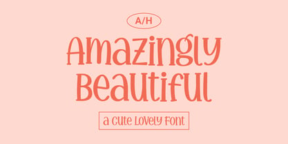 Amazingly Beautiful is a cute, quirky and whimsical display font. Whether you use it for cartoon related designs, children games or just any creation that requires a lovely touch, this font will be an amazing choice.
 - Shifty Notes by Ali Hamidi,
$10.00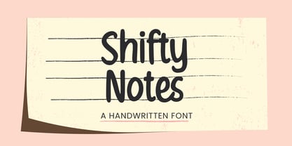 Shifty Notes is a cute and simple lettered handwritten font. Whether you use it for cartoon related designs, children games or just any creation that requires a lovely touch, this font will be an amazing choice.
 - Encrypto by Ronin Design,
$15.00 Encrypto is a modern typeface featuring begining and ending alternates. Designed for modern project themes, this font is perfect for game/app designs, logo designs, posters or pretty much anything else that requires a unique touch.
 - Snowy Owl by Ali Hamidi,
$10.00 Snowy Owl is a cute, joyful and fun display font. Whether you use it for cartoon related designs, children games or just any creation that requires a lovely touch, this font will be an amazing choice.
 - Fresh Lemons by Yumna Type,
$15.00 Your font choice is important because without the right font, you have a higher risk of failure to attract the audience's attention resulting in having a big trouble competing with competitors. A good font shows characters of your projects and makes them more prominent than the others. Therefore, Fresh Lemons is here to be the perfect, eye-catching font option. Fresh Lemons is a visually amazing display font with thin lines suitably applied for a more elegant, modern looking display. In addition, such a font shows professional, high quality nuances on your designs due to the simple forms and consistent proportions to be legible enough. You will receive a clipart as a bonus and you can also enjoy the available features here. Features: Ligatures Multilingual Supports PUA Encoded Numerals and Punctuations Fresh Lemons fits best for various design projects, such as brandings, posters, banners, headings, magazine covers, quotes, invitations, name cards, printed products, merchandise, social media, etc. Find out more ways to use this font by taking a look at the font preview. Thanks for purchasing our fonts. Hopefully, you have a great time using our font. Feel free to contact us anytime for further information or when you have trouble with the font. Thanks a lot and happy designing.


