10,000 search results
(0.043 seconds)
- Andulka by Storm Type Foundry,
$44.00A universal typeface for books, magazines and newspapers must be economizing, quiet, strong in drawing, but original and peaceful at the same time. Type "for all weather" must resist also many difficulties of printing on different surfaces. Therefore, the basic design "Text" is slightly darker and legible from 6 point size even in a dim light, whereas "Book" reduces the effect of running ink and saves toner cartridge. In offices of smaller companies these lighter fonts are welcomed as toner-savers. Andulka also need less space on the page than other text typefaces and saves paper too. Medium and Bold designs keep the original grace, changing its weight only in shadows. Italics may remind humanistic inspiration and forcing the horizontal of x-height with robust horizontal serifs, whereas Roman lower case maintains the baseline. Basic numerals are non-aligning proportional, but there are available upper case figures as well as special numerals drawn for the same height as small caps, which is just about a hairline above the x-height. The characteristic feature of Andulka is a squinted eye in letters 'a', 'c', 'f', 'r', 's', 'k', and softened diagonals through all characters in family. Diagonals were always disturbing and gripping attention extensively. Serifs are stressed trapezoids reminding small beaks at curved endings, descenders 'j' and 'y' may evoke tail feathers of budgerigar. Andulka [budgerigar] sings lovely and is everyday quiet companion. The whole family consists of 24 separate fonts for graphic studio, office or home. - Eventyr by PizzaDude.dk,
$17.00 Eventyr is danish and means fairytale. You may know the name of the famous danish author, HC Andersen, who was well known for his fairytales. Actually I finished this font while listening to one of his fairytales, and that inspired me to call this font Eventyr. Most fairytales include the number 3 (3 choices, 3 wishes ... etc) but this font has the number 4 - because you have 4 slightly different versions of each letter to choose from. Enough to make your project look magical! Of course, the font has multilingual support, because fairytales are well known all around the world! :) Caps only Fonts.
 - Tomatoes Cake by Balpirick,
$15.00 Tomatoes Cake is a Cute Handbrushed Font. Whether you’re using it for crafts, digital design, presentations, or making greeting cards, this font has the potential to become your favorite go-to font, no matter the occasion! This font only has allcaps letters. - also multilingual support Enjoy the font! Feel free to comment or feedback! Thank you!
 - Cupid Gummies by Balpirick,
$15.00 Cupid Gummies is a Sweet and Cute Handbrushed Font. Whether you’re using it for crafts, digital design, presentations, or making greeting cards, this font has the potential to become your favorite go-to font, no matter the occasion! This font only has allcaps letters. - also multilingual support Enjoy the font! Feel free to comment or feedback! Thank you!
 - Purple Bread by Balpirick,
$15.00 Purple Bread is a Tall Handwritten Font. Whether you’re using it for crafts, digital design, presentations, or making greeting cards, this font has the potential to become your favorite go-to font, no matter the occasion! This font only has allcaps letters. - also multilingual support Enjoy the font! Feel free to comment or feedback! Thank you!
 - Queens Burger by Balpirick,
$15.00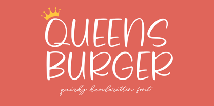 Queens Burger is a Quirky Handwritten Font. Whether you’re using it for crafts, digital design, presentations, or making greeting cards, this font has the potential to become your favorite go-to font, no matter the occasion! This font only has allcaps letters. - also multilingual support Enjoy the font! Feel free to comment or feedback! Thank you!
 - Almond Cookie by Balpirick,
$15.00 Almond Cookie is a Monoline Handwritten Font. Whether you’re using it for crafts, digital design, presentations, or making greeting cards, this font has the potential to become your favorite go-to font, no matter the occasion! This font only has allcaps letters. - also multilingual support Enjoy the font! Feel free to comment or feedback! Thank you!
 - Write Marker by Balpirick,
$15.00 Write Marker is a Bold Marker Font. Whether you’re using it for crafts, digital design, presentations, or making greeting cards, this font has the potential to become your favorite go-to font, no matter the occasion! This font only has allcaps letters. - also multilingual support Enjoy the font! Feel free to comment or feedback! Thank you!
 - Butterfly Wingz by Ingrimayne Type,
$5.00 IngrimayneType has put letters inside a variety of objects, including bowling pins, book covers, coffee mugs, teapots, pumpkins, Christmas ornaments, train cars, tombstones, old bottles, circles, and rectangles. In each case the letters were placed on a single shape. The use of the Opentype feature of contextual alternatives makes it easy to use two different but alternating shapes. ButterflyWingz puts its letters on the right and left wings of a butterfly. The wings provide a large surface for drawing letters, but they have a odd shape so letters must be distorted to fit. The wings are symmetrical but some letters are not, so the right and left wing versions of the same letter are sometimes quite different. Without the contextual alternative feature one could design a typeface like ButterflyWingz but the user would have to alternate upper and lower case keys. With contextual alternatives turned on, the computer automatically alternates the letters creating a line of complete butterflies. Turning on the Opentype feature stylistic styles one (ss01) replaces the empty spaces with empty wings. However, sometimes an empty wing at the end of a line is unwanted and it can be removed by changing the typeface or by turning off the stylistic style for that character. The family contains two styles, a filled style and an outline style. They can be used separately or together in layers to add color. (Empty wings are on the logicalnot and registered characters.) ButterflyWingz is hard to read and should be used in small doses for decorative effects.
 - Sigmatone by Keristyper Studio,
$12.00 Introduce Sigmatone Inspired by old skool graffiti tagging, and street art, we created this Typeface, drawn in Procreate app, then vectorized and crafted carefully. This font is good for logo design, Social media, Movie Titles, Books Titles, short text even long text letters, and good for your secondary text font with sans or serif. Featured: Standard Uppercase & Lowercase Numeral & Punctuation Multilingual : ä ö ü Ä Ö Ü ß ¿ ¡ Alternate & Ligature PUA encoded We recommend programs that support the OpenType feature and the Glyphs panel such as Adobe applications or Corel Draw. so you can use all the variations of the glyphs. Hope you enjoy our fonts!
 - Sausage by Eclectotype,
$40.00 Sausage is unapologetically bold and bulbous. Influenced by magnetic fridge letters, hot dogs and 70s phototype fonts, it is retro, but not cloyingly so. It was a deliberate plan to make Sausage only a single style typeface. The freedom that not having to think about how the font should relate to other weights allowed me to push the glyphs to places they might not otherwise have been able to go. There isn't a single corner in the entire font, and you'd be hard pushed to find a straight line. This is as soft and friendly as they come, and still equipped with numerous ligatures, alternates and arrows for sophisticated typography.
 - Notes from Paris by PeachCreme,
$18.00 "Notes from Paris" will make your letters look très chic while still maintaining its functionality with easy-to-read letterforms. Furthermore, the comforting vibe of this font brings a touch of relaxation to your typography. The words flow with ease and grace, like a gentle breeze on a summer day in the city of love. So, whether you're crafting a logo design or wedding invite, "Notes from Paris" is a font that you must have for a chic and legible typographic journey. With 59 Opentype ligatures, this font blurs the line between script and handwriting, allowing for a seamless transition between letters and creating a truly genuine sensation.
 - Honess by Zamjump,
$17.00 Honess is a luxurious handwritten script font with a thick classic feel this font is perfect for craft artists to elevate their work into beautiful masterpieces. Honess is also great for graphic designers looking for a cute font for their work. includes : - uppercase, - lowercase, - standard punctuation, - standard ligature, - bigining swash. - ending swash - numbers. - multi lingual to use a character with a line prefix is quite easy, that is, simply by typing an unterscore is added to the desired character, for example (_a) then the character a will have a line at the beginning, as well as a ending swash, type the character then followed by an underscore (a_).
 - Brush Type Standard by Brush Art Design Office,
$39.50I created the brush font named "BrushType Standard" in my unique brush style. I made it for ad designers. I believe this is the only one brush font in the world, so using it will enable them to get easily satisfied on their work. Brush handwriting in Japan has a long and proud Tradition and History. I tried to interject this feeling of Tradition into my font designs for you to comprehend its true meaning. I trust I have succeeded to convey my feelings to you. In addition, I can say each letter of the "BrushType Standard" is truly art. I am a pioneer of Brush Art. - Wasty Pudding by PizzaDude.dk,
$15.00 Wasty Pudding was made by drawing a lot of letters, over and over again - and not caring so much about the looks, but focusing more on the speed of drawing, because I wanted a font that represented the way I write, when I am taking notes for myself. It’s not pretty, but it’s legible and scribbeliciously beautiful! :) Anyway, I think the purpose of this font is massive amounts of text. Song lyrics, novels, stories, diaries, manuscripts, books, etc. I bet you can fool someone with them thinking that this is not a font, because I have added 6 different versions of each lowercase letter!!!
 - Boosters by Nathatype,
$29.00 Looking for a vintage and bold font to captivate your audience or clients,? If you need to create have a t-shirt branding company, or need to create a new menu - then this is the perfect font for you. Boosters-A Vintage Font Boldy Vintage is a bold, fun, and vintage typeface that is made in uppercase and lowercase. This font is the best to maximize the amount of street vibe and vintage vibes. Ideal to create amazing headings, logos, menus, and social media graphics. Our font always includes Multilingual Support to make your branding reach a global audience. Features: Ligatures Alternates Bonus Oranament PUA Encoded Numerals and Punctuation Thank you for downloading premium fonts from Nathatype
 - Quiet Time by ParaType,
$25.00The font was developed as a part of a corporate identity project for a pillow shop on the base of existing logo. It’s an attempt to reflect the space of a dream -- virtual reality where objects don’t have solid shapes, but present just hardly noticed disappearing contours. This idea determines the design of letters that resemble illustrations rather then alphabetical symbols and are based on ultra thin stems. The font was designed by Elena Kolesnikova and released by ParaType in 2009. - Sponge Bear by Attractype,
$12.00 Sponge Bear is a playful heavy display font, this unique font is suitable for various designs that require thick text and designs with funny, cheerful, happy, spirit, adventure themes. The stylistics of the Sponge Bear font will change the vertical position of the letters randomly, this will make the series of words more unique and interesting. Have fun creating with Sponge Bear.
 - Cumhuriyet Pro by Fontuma,
$28.00 Cumhuriyet is an Arabic concept that means "the form of government in which the nation holds the sovereignty and uses it through the deputies elected for certain periods". The reason why I gave this name to the font is that 2023 is the centennial anniversary of the Republic of Turkey, which was founded by Atatürk. This typeface, which is sans serif, consists of three families: ▪ Cumhuriyet: Font family with Latin letters ▪ Cumhuriyet Pro: Font family including Latin, Arabic and Hebrew alphabets ▪ Cumhuriyet World: Font family including Latin, Cyrillic, Greek, Arabic and Hebrew alphabets Cumhuriyet Pro is a family of multi-purpose typefaces designed in a geometric style. This font is an extremely useful font for media and digital media as well as for printed products. In this respect, the Cumhuriyet font can be used as a text and title font in publishing and printing areas, magazines, newspapers, books, banner and poster designs, and websites.
 - Teimer Std by Suitcase Type Foundry,
$75.00Typographer and graphic designer Pavel Teimer (1935-1970) designed a modern serif roman with italics in 1967. For the drawing of Teimer he found inspiration in the types of Walbaum and Didot, rather than Bodoni. He re-evaluated these archetypes in an individual way, adjusting both height and width proportions and modifying details in the strokes, thus effectively breaking away from the historical models he used as a starting point. Teimer's antiqua has less contrast; the overall construction of the characters is softer and more lively. The proportions of the italics are rather wide, making them stand out by their calm and measured rhythm. This was defined by the purpose of the typeface, as it was to be utilised for two-character matrices. The long serifs are a typical feature noticeable throughout the complete family of fonts. In 1967, a full set of basic glyphs, numerals and diacritics of Teimer's antiqua was submitted to the Czechoslovak Grafotechna type foundry. However, the face was never cast. At the beginning of 2005 we decided to rehabilitate this hidden gem of Czech typography. We used the booklet "Teimer's antiqua - a design of modern type roman and italics", written by Jan Solpera and Kl‡ra Kv’zov‡ in 1992, as a template for digitisation. The specimen contains an elementary set of roman and italics, including numerals and ampersands. After studying the specimen, we decided to make certain adjustments to the construction of the character shapes. We slightly corrected the proportions of the typeface, cut and broadened the serifs, and slightly strengthened the hair strokes. In the upper case we made some significant changes in the end serifs of round strokes in C, G and S, and the J was redrawn from the scratch. The top diagonal arm of the K was made to connect with the vertical stem, while the tail of Q has received a more expressive tail. The stronger hairlines are yet more apparent in the lower case, which is why we needed to further intervene in the construction of the actual character shapes. The drawing of the f is new, with more tension at the top of the character, and the overall shape of the g is better balanced. We also added an ear to the j, and curves in the r have become more fluent. To emphasise the compact character of the family, the lining numerals were thoroughly redrawn, with the finials being replaced by vertical serifs. The original character of the numerals was preserved in the new set of old-style figures. To make the uppercase italics as compact as possible, they were based on the roman cut rather than on the original design. The slope of lowercase italics needed to be harmonised. The actual letter forms are still broader than the characters in the original design, and the changes in construction are more noticeable. The lower case b gained a bottom serif, the f has a more traditional shape as it is no longer constricted by the demands of two-matrice casting, the g was redrawn and is a single storey design now. The serifs on one side of the descenders of the p and q were removed, the r is broader and more open. The construction of s, v, w, x, y, and z is now more compact and better balanced. Because Teimer was designed to make optimal use of the OpenType format, it was deemed necessary to add a significant amount of new glyphs. The present character set of one font comprisess over 780 glyphs, including accented characters for typesetting of common Latin script languages, small caps and a set of ligatures, tabular, proportional, old style and lining, superscript and fraction numerals. It also contains a number of special characters, such as arrows, circles, squares, boxed numerals, and ornaments. Because of its fine and light construction, the original digitised design remained the lightest of the family. Several heavier weights were added, with the family now comprising Light, Light Italic, Medium, Medium Italic, Semibold, Semibold Italic, Bold, and Bold Italic. - Bikini Season by Los Andes,
$37.00 Summer has come! Boho girl is going on her beach vacation. Relaxed, spontaneous, feminine, irreverent, though. Like a girl with a Gipsy soul, she just grabs her Bikini and turns away! This is the new font duo by the couple Coto and Luciano. Bikini includes a sans version, based on the proportion and structure of Roman capitals, but with a contemporary flavor and a clean style that give the typeface a chic touch. The other version of this font duo is a modern calligraphy script of handmade style. The mix is just perfect: opposites attract creating a very interesting counterpoint. Can you guess who is the designer behind each style? This font duo is intended to be used for posters, labelling or branding. The sans and script styles add visual hierarchy when composing text. Feel the fresh free spirit of its OpenType features and ornaments! Please see User Guide Every season is Bikini season!
 - Entestats by Typephases,
$25.00 Nearly a hundred human heads, in three dingbat files. The whole series comes from the sketchbook: the original ink drawings were then digitized and refined to create vector outlines. Rather than perfectly smooth, geometrical shapes, the Entestats, like their close relatives in the Capsbats series, the Entestats retain a handmade look and feel. The Entestats are ready-made illustrations, though of course they will appreciate being enriched with colours, textures, an imaginative layout... and use them for a variety of projects. Use them small, as spot illustrations or as big as a whole page or page spread. The Entestats and their kin, the Capsbats, are a terrific resource for presentations, packaging, logos, brochures and advertisements, to name a few applications. The book 1000 Heads is a compendium of the drawings featured in the Capsbats and Entestats and it gives a glimpse of the limitless applications of this collection.
 - Pigment by PizzaDude.dk,
$15.00 Crayon font gone crazy! 8 different versions of each letter, and they cycle as you type! Great variation, and enough to confuse people about this being a font or real crayon writing! And of course, the font has got a large amount of accented characters as well!
 - Shocked Up by Typefactory,
$14.00 Shocked Up is a cute and fancy display font. It embodies playfulness and authenticity and is the perfect choice for any children activity, game font, party invitation, or school project. Add this chunky lettered font to your designs and notice how it makes them come alive!
 - Pravoslavnie by Simeon out West,
$25.00 This is the first of several Eastern fonts I have created and is the prize of the collection. The Pravoslavnie font is highly decorative, with a more complicated letter ‘a’ and a series of flourishes substituting for punctuation. Like its sister font, Pravoslavnie 3 is highly decorative. It differs from the first version of this font, as it has a less decorative ‘a,’ full punctuation marks, and less ornate number forms.
 - Flexi Gloo by Dryy Type,
$14.00 Flexi Gloo Font A display typeface that has a bubble character and graffiti theme font to work with. The Flexi Gloo font is, as the name suggests, a hypebeast and unique display font. This font I've created has been in heavy use this year & is very versatile, goes well with a variety of designs, elevating it to the highest level. Add this font to your favorite creative ideas and see the results! Features: Single Case, alternate, ligature & multilingual There it is! I really hope you enjoy it
 - Ongunkan Wardruna Arabic Runes by Runic World Tamgacı,
$50.00 Wardruna Arabic is a method of writing Arabic with a Runic-like alphabet devised by Devin Lester. He imagined that if some vikings had settled in the Middle East, they might have started speaking Arabic and writing it with a version of the Runic alphabet. This particular alphabet is based on Tolkien's Cirth Runes. A band of vikings went to Baghdad after raiding in Europe. The markets in Constantinople were closed as the Turks had just sacked the city. These men had heard of the great market in Baghdad and went there to sell their wares, seeing that this land was warm and fertile they decided to stay. They ended up settling the land and taking Arab wives and having children, because of thier Northern European accent their Arabic evolved into a part-Arabic dialect of Iraqi arabic. This is why today you see a few Arabs with green eyes and dark blonde or red hair. The Arabic alphabet was too fluid for them and vikings disdained the use of paper as a persons writings could be burned, so the evolved their runes to fit Arabic.
 - Catalina by Kimmy Design,
$10.00 Earlier this year I visited a bakery in Newport Beach, CA and fell in love with the organic design and typography of the place. Hand-drawn menus, table cards, chalkboards, and wall quotes surrounded the charming spot. It inspired me to create a new font family based on the combination of hand drawn fonts. Included in this package are 5 font families, with 2 graphic ornament fonts. Each font family contains at least a light, medium and bold. Here is a breakdown of what's cookin' at Catalina's Bakery: Catalina Anacapa: Tall and skinny, this font comes in 3 weights for both sans and slab serif styles. It includes contextual alternatives (giving 3 versions of each letter), stylistic alternatives for select letters (A, K, P, Q, R, Y) and also includes Small Caps. Catalina Avalon: Based off Anacapa, this sub family has a high contrasting line weight. It comes in light, regular and bold as well as an inline alternative for both sans and slab serif styles. Avalon also includes opentype features such as contextual alternatives (giving 3 versions of each letter), stylistic alternatives for select letters (A, K, P, Q, R, Y) and small caps for each letter. Catalina Clemente: In a more standard width, Clemente is one of the two sub families that can be used for paragraph text as well as headlines. It's organically geometric in style and comes in ALL CAPS and lowercase, includes upright and custom italics, and has the opentype feature giving 3 versions of each letter. Catalina Script: A great compliment with the display sub-families, Catalina Script rounds out the package with a hand-drawn cursive flair. It includes contextual alternatives (giving 2 variations to each letter) as well as stylistic alternatives for many of the capital and lowercase letters. It has special ligatures for some letter combinations, and titling alternatives for all the capital letters. Catalina Typewriter: The second of the paragraph text sub-families, this typewriter inspired hand-drawn font family works great as either a display or paragraph text. It has contextual alternatives with 3 versions of each letter, and comes in both upright and custom italics versions. Catalina Extras! These two fonts go perfectly with the Catalina Family. They includes borders, frames, arrows, banners, flourishes and more. Catalina Flourish has all of it's options in a light and bold style, to use the light version type all lowercase letters, then to make something bold, used it's uppercase (or shift+) characters. For a breakdown of graphic/letter correlation, see the breakdown PDF. All of Catalina was drawn by the same hand, using the same ink and technique. While they contrast in their type styles, they work together perfectly to create one cohesive font family.
 - Yakout by Linotype,
$187.99Yakout is an Arabic text face that was developed by Linotype & Machinery in 1956 for hot-metal typesetting. Similar to the typewriter fonts created during this period, it utilises a limited range of letterforms to represent a full Arabic characer set, thus forming a style of type design known as Simplified Arabic. The skilful reshaping of letterforms demanded by the constraints of the original restrictive technology has given Yakout a very dynamic effect, and has helped to produce a design whose overall pattern works particularly well in newspaper setting. Digital technology has enhanced the original design by permitting the introduction of wide characters and some additional letterforms, and by improving the joining of the strong, slightly curved baseline. Yakout is available in two OpenType weights: Yakout Light and Yakout Bold. Both of the fonts include Latin glyphs (from Times Europa Roman and Times Europa Bold, respectively) inside the font files, allowing a single font to set text in both most Western European and Arabic languages. Yakout incorporate the Basic Latin character set and support all languages that use the Arabic script. They include tabular and proportional Arabic, Persian, and Urdu numerals and a set of tabular European (Latin) numerals. - KG Primary Penmanship by Kimberly Geswein,
$5.00 I come from a family of educators- my mom, husband, stepmom, brother-in-law, and sister are all currently teaching and I have taught in the past. This font was created after speaking to several elementary school teachers who were struggling to find just the right font to use on worksheets and projects in their classroom. They liked many features of other fonts, but needed small things altered in order to make a "perfect fit" for their class. Hand-drawn by me, this font hopefully addresses several of those issues. As penmanship styles vary across the globe, I am sure this font will not work in every classroom. But hopefully this style will work for many teachers to give their early readers a highly legible, neat, accurate font. It is best used with kerning turned on to allow for accurate letter spacing.
 - AM Fame by Alexey Markin,
$40.00 For the creation of this font I was inspired by the old fonts created not one hundred years ago.
 - Easter Sweet by AEN Creative Studio,
$15.00 Easter Sweet is a fun, quirky, and sweet serif font. No matter the topic, this font will be an incredible asset to your fonts’ library, as it has the potential to elevate any creation. This font is PUA encoded, which means you can access all of the glyphs and swashes with ease!
 - Summer Letter by AEN Creative Studio,
$15.00 Summer Letter is a fun, quirky, and sweet outline display font. No matter the topic, this font will be an incredible asset to your fonts’ library, as it has the potential to elevate any creation. This font is PUA encoded, which means you can access all of the glyphs and swashes with ease!
 - Gango by Adam Fathony,
$18.00 Introducing Gango, the ultimate Variable Font that combines sleek modernity with a playful pop style. This versatile typeface is designed to meet all your creative needs with its ten unique weights, ranging from the delicate Thin and Extra Light to the bold and heavy Extra Bold Heavy. Gango offers you complete control over your typography, allowing you to adjust the font's weight and width seamlessly, all in one font file.
 - Komikaze - 100% free

- Renny Hybrid - 100% free

- B de bonita shadow - Personal use only

- B de bonita - Personal use only

- Hacky Sack NF by Nick's Fonts,
$10.00Ross George in his numerous Speedball chapbooks called the pattern for this typeface Stunt Roman. A studious observer may discern that many of the wackier letterforms were tamed to produce the popular font University Roman; however, this version remains unapoligetically true to the original. All versions of this font include the Unicode 1250 Central European character set in addition to the standard Unicode 1252 Latin set. - Stratic Script by Nootype,
$35.00Stratic Script is an elegant family of seven fonts, all based on handwriting. The main idea was to create a script font with almost no contrast, easy to use and quite legible. The design is flawless, every letter is carefuly connected to another, in all fonts. The 6 weights, which are very close to each other, allow the designer to choose precisely the weight he needs. It’s an ideal font for fashion magazines, posters, book covers, etc… This family contains OpenType features, such as Proportional Figure, Tabular Figures, Standard & Discretional ligatures.


