10,000 search results
(0.065 seconds)
- Sassafrassy by Emily Lime,
$68.00 Sassafrassy™ is a fun hand-calligraphy font family that includes 2 font styles (Simple & Swash), Map Things & a Pattern set to help you create beautiful custom designs. Written using a flexible steel nib & ink on paper. The Simple version includes an extensive character set designed for ease of use. The Swash version has all of the swash characters and gives the font a different stylistic feel. The Pro version contains all characters from both of these two fonts, over 1000 glyphs in total. Also included in this family is a fun “Map Things” set so you can create your own hand-drawn maps & a Free Pattern Set (some of which were used to create the above banners). Map Things & Patterns aren't recommended for use in Word. Language support includes your standard characters plus Eastern European & Baltic character sets. Happy creating!
 - Quinter by Picatype,
$15.00 Quinter is inspired by the writing on the vintage beer labels from the good old days, but still has a strong modern appearance. It come with 2 types of styles. Each combination has been carefully crafted to make your design look better. Ideal for product names, packages, labels, old-fashioned coffee shops, bars and everything with special characteristics in the past. This combination allows you to easily build beautiful vintage designs in a short amount of time. To enable the OpenType Stylistic alternates, you need a program that supports OpenType features such as Adobe Illustrator CS, Adobe Indesign & CorelDraw X6-X7, Microsoft Word 2010 or later versions. We hope you enjoy the font, please feel free to comment if you have any thoughts or feedback. Or simply send me a PM or email me at picatypestudio@gmail.com. Thanks for purchasing and have fun!
 - September Rain Script by Letterday Studio,
$19.00 September Rain Script elegant Calligraphy font is a sweet and romantic calligraphy typeface with characters dancing along the baseline. It has a casual yet elegant touch. Can be used for various purposes such as logos, wedding invitations, titles, t-shirts, letterheads, signage, labels, news, posters, badges etc. This font includes OpenType features with alternative styles, ligatures, and multiple language support. To enable alternative OpenType Stylistic, you need a program that supports OpenType features such as Adobe Illustrator CS, Adobe Indesign & CorelDraw X6-X7, Microsoft Word 2010 or a later version. There are additional ways to swap/swap, using Character Map (Windows), Nexus Fonts (Windows), Font Book (Mac) or software programs like PopChar (for Windows and Mac). How to access all alternative characters, using Windows Character Map with Photoshop: https://www.youtube.com/watch?v=Go9vacoYmBw How to access all alternative characters using Adobe Illustrator: http://youtu.be/iptSFA7feQ0 How to use a stylish font set in Microsoft Word 2010 or later versions: https://youtu.be/x1A_ilsBsGs
 - Apocalypso by Barnbrook Fonts,
$30.00 Apocalypso is a pictogram font for the end of the world. The name Apocalypso is a portmanteau of the words apocalypse (end of the world) and calypso (joyful improvised music), with a meaning analogous to the idiom ‘fiddling while Rome burns’. The Apocalypso family is more of an art project than a practical font and contains a series of crosses and pictograms. The crosses add decorative detailing to typographic layouts, whilst the pictograms can be deployed to express the forthcoming apocalypse. Apocalypso was originally published in 1997, a few years before the turn of the millennium. It is both a document of the ideas of the time and a scarily prophetic vision of a possible world that has now largely come to pass.
 - Dever by insigne,
$24.00 Dever’s brute, industrial lines are rounded up in this new typeface from Jeremy Dooley. Dever combines plenty of inspirations. It’s the flair of the Wild West melded with a shout out to the sign painters and package lettering artists of the 1800s. Dever’s big, bold, and handy frame moves through all three of the family’s strapping members. First is the sans. No doubts on what this brother’s like. Dever Sans is as straight-forward as you’ll find in this family with its four separate weights and numerous distressed options. The second of the kin’s a bit of half-breed, you might say. Pointed serifs bring a sharpness to this outfit. Rounding out the family is Dever Wedge, a bit of wild rodeo all its own. This poke’s a quick draw with any of its 107 font, and with it’s auto-replacing alternates, no two repeating characters are alike. You’re guaranteed a great show anytime Dever leaves the chute. The route to Dever was long, with many a switchback. The Wedge variant was designed first, shelved, then developed into Plathorn. But I wanted to return to those brutish forms and decided to round out the family with a sans, serif and plenty of other options. Any of the Dever family have an extended character set including Central and Eastern European languages. The strong faces have specially adapted sub-families, too, so they’re bound and determined to have an outstanding impact at whatever size you use ‘em. It’s a hard ride ahead corralling all those words. Be sure and add these able-bodied boys to your posse today!
 - Mangerica by Ndiscover,
$25.00This design incorporates different styles into a consistent look. A pinch of script, a little of geometric and some humanistic shapes as well create a very distinguishable sans-serif. It has an overall good feeling specially on the heavier weights that have intended contrast irregularities to create a 'cartoonish' look. On the intermediate weights the design will preform well on small font sizes because of its large counters, low contrast and large x-height, but as you go to the extremes you will see shapes full of personality that will pop out in large font sizes. The font is loaded with opentype features such as small caps, ligatures, alternates, old style figures, and much more. The italic version is deeply rooted in the calligraphic heritage of the Italics. This way the brush inspired strokes are emphasized as well as an overall calligraphic look. Far from being a mere slant, Mangerica Italic had every lowercase glyph redesigned as well as some uppercase, besides that, every glyph was optically adjusted to ensure not only aesthetics but functionality too. - Homework by DAAZ,
$9.00 Homework font was specially conceived/designed for teaching cursive writing. This resource allows tutors and parents to create worksheets for individual or class teaching. Associated with the dashed version of the font, students can learn and exercise their handwriting abilities. All capital letters, excluding I, F, T and P, link to any following small letter: the sequence of the previous letter stroke always follows the angle of the initial stroke of the subsequent letter. This, in the real world, means that words built with the font can be handwritten without having to lift the pen from the paper (except to cross t and f and dot i and j) or interrupt the writing flow. All the letters are base aligned and all small letters have the same ‘x’ height in order to fit a ruled worksheet. Homework font letter stroke widths are uniform in order to emulate regular pens. Homework font also mimics genuine handwriting, making it useful for online stores gift cards, thank you cards and all applications where a real world feel is desired. The Homework font also performs well on long texts.
 - No Parking JNL by Jeff Levine,
$29.00 No Parking JNL was inspired by a hand-cut stencil of those words painted in an area of a department store's parking lot.
 - Brick Stone by Alit Design,
$22.00 Introducing the "Brick and Stone Victorian Typeface" – a timeless and elegant font that beautifully captures the essence of the Victorian era. This exquisite typeface is a masterful blend of intricate craftsmanship, vintage charm, and artistic flair, making it the perfect choice for designers, typographers, and creatives seeking to evoke a sense of classic refinement and sophistication in their projects. The Brick and Stone Victorian Typeface boasts a rich repertoire of design elements that truly set it apart. With meticulously crafted ornaments, graceful swashes, captivating ligatures, and versatile alternates, this font provides an extensive toolkit to elevate any typographic endeavor. Whether you're working on invitations, branding, packaging, signage, or any other creative pursuit, this typeface lends an air of prestige and distinction to your work. Each character of this Victorian typeface has been thoughtfully created to reflect the ornate and elegant aesthetics of the 19th century. The font captures the essence of engraved stone and brickwork, giving your text an authentic vintage touch. The ornamental details add an extra layer of opulence, making every word feel like a work of art. Whether you're designing for weddings, formal events, historical projects, or simply seeking to add a touch of classic sophistication to your work, the Brick and Stone Victorian Typeface will exceed your expectations. Embrace the elegance of the past and unlock a world of creative potential with this remarkable font.
 - Cavole Slab by insigne,
$22.00 Cavole Slab is a new slab serif, designed in early 2011, that has a strong influence from Dutch typography. The name is an altered form of the Portuguese word for feather, emphasizing the typefaceís soft and friendly character. Slab serifs give this face plenty of impact and make it an excellent choice for contemporary designers. The font family includes a very dark and powerful black all the way down to a hairline thin weight, giving a tremendous versatility. The family also features dynamic italics that add plenty of emphasis and momentum. Cavole Slab is suitable for both headline and text settings and should easily find its place in a number of different settings, from corporate identity to magazine body copy. There are six weights that come with complementary italics, and each font includes over 450 characters and extended Latin-based language support. The typeface family comes in OpenType format, and OpenType alternates are easily accessible through OpenType enabled applications such as the Adobe suite or Quark. Please see the informative .pdf brochure to see what OpenType features are available and to see them in action.
 - Old Man Eloquent by Three Islands Press,
$29.00 John Quincy Adams, sixth President of the United States, didn't hit his stride until he'd left that lofty office. It was during his many years in Congress that he assured his legacy, not least because of his long, masterful oratory opposing slavery. His speeches, in fact, won him the nickname "Old Man Eloquent." So when I decided to simulate Adams's penmanship in his legendary diary (which he kept for nearly 70 years), it seemed fitting to call the font by that name. I focused on his handwriting from about 1810, when he was Ambassador to Russia, but also consulted pages from later years. Old Man Eloquent has both regular and bold weights. The OpenType version has more than 450 glyphs, including alternate uppercase characters, old-style and lining figures, and numerous ligatures; all formats contain several common (English) words.
 - Imagist by Fenotype,
$35.00 The mystic sadness of the sight Of a far town seen in the night. Like the poetry movement of the early 20th century, from which the font takes its name, Imagist relies on the power of concrete images and brings an organic vibration to the words it forms. Imagist is a lively and decorative serif typeface with prominent features that appear especially in the letters K, R, M, N, W, V, k, w, v and y. Powerful ball terminals also bring recognizable attraction. Imagist contains six weights and corresponding Italics. Italics have a cursive-style letter s for as Stylistic Alternate. Old Style Numerals and Small Caps can be found in all cuts. Poem by T. E. Hulme.
 - Final Six by Type-Ø-Tones,
$64.00 FinalSix is the typographic adaptation of a lettering. Working on the graphic image for a sports event (the European Waterpolo Final in 2014) we had the idea of creating a character set that reflected the idea of the undulating movement of water in a pool. In practice, we draw characters with rounded tops, bottoms and diagonals and using the word WATERPOLO as a visual reference for a wavy feeling, in a process that we could define as “form follows meaning.” To preserve its personality as much as possible, the most idiosyncratic characters are found in the Default set, while we can find more standardized variations for editorial use in a Stylistic set.
 - Bfrika by Holland Fonts,
$30.00Bfrika is an 'Africa inspired' typeface and a contribution for the typographic issue 'National Typographica' of I-Juici Magazine, in South Africa. This geometrical decorative design represents bold simplicity, directness and rythm. The name evolved from text for the spread in the magazine. The B replaces the A. Africa be free. Bfrika. The concept behind Bfrika is to generate an unpredictable visual rhythm in an attractive decorative presentation. Filling up the white space around the letters accentuates form over function, thus creating an interference of visual impressions with its legibility. This visual rhythm is amplified by its redundancy in a text, only pausing at a break or a word space. Based on the concept of separate printing forms in letterpress, Bfrika Two Tone and Bfribat Two Tone separate the letter from the outside form in two fonts. Placing two text frames exactly on top of each other and assigning each part of these font to a frame in a different color, offers a quick way to add color. Originally Bfrika was designed for I-Jusi magazine #17, National Typografika, South Afrika 2001. Bfribat and both two tone fonts were created for Building Letters, a fund raiser for orphanages in Kenya and Uganda (www.buildingletters.org) and are also available for Mac and PC at www.hollandfonts.com and will be distributed in 2004 through associated foundries. - Charpentier Renaissance Pro by Ingo,
$42.00 A very legible Renaissance Antiqua This typeface is based on the desire to create an Antiqua like those which might have existed at the beginning of the »printing age« — the basic form oriented on the classical Roman and early Middle Ages models, the ductus defined completely by writing with a wide pen and much individual expression in detail. In the spring of 2005 I had the opportunity to closely examine a few pages in the famous book »Hypnerotomachia Poliphili« from 1499. The script used here from Aldus Manutius is exemplary. Most of the book, however, is not very carefully printed. The characters do not stay on the line; the print is at times too strong and at times much too weak. And on these imperfect pages the true character of the letters is recognizable; that is, that they are cut with lively detail which is a result of the patterns provided by full-time writers. After all, around 1499 script was written as a rule and the printed type was oriented on this pattern. I prefer the typeface on the lightly printed pages. The characters are not placed neatly on the line, but the distinct and emerging lively ductus of the individual characters automatically presents harmonious word formations in the eye of the beholder, with the non-perfect line stepping into the background. Also in Charpentier Renaissance, the strokes of the wide pen are still noticeable. The font has very defined softly bent serifs. The forms are powerful and stand solidly on the baseline. Charpentier Renaissance is very legible and yields a solid and yet still lively line formation. The accompanying italic, like its historical models, has almost no inclination. The lower case characters of Charpentier Renaissance Oblique have such idiosyncratic figures that they can also form a font of their own. Please visit www.ingofonts.com
 - ITC Typados by ITC,
$29.99ITC Typados is the joint effort of Roselyne and Michel Besnard and is composed of characters in two different senses of the word. First, it is of course made of letters and symbols, clean and legible with generous widths and x-heights. There is a hint of Art Nouveau style in the tapering, brush-like strokes. But the figures of ITC Typados are also made of characters in the theatrical sense: little tear-drop heads on tapering bodies that bend themselves into the shapes of an alphabet while maintaining a life of their own. The typeface is based on a recurring character in Michel's sculpture and painting, Ado. Ado is the first character who sings and repeats itself in all my creations," says Michel. "This adventure brings new forms for my painting and my sculpture: coiffed heads, bodies in the form of a cone, arms in the form of spread wings, etc." "Type" plus a number of "Ados" equals ITC Typados." - DejaVu Sans Mono - Unknown license

- DejaVu Serif - Unknown license

- DejaVu Serif Condensed - Unknown license

- Lovelace by Zetafonts,
$39.00 Designed by Cosimo Lorenzo Pancini and Andrea Tartarelli with Maria Chiara Fantini, Lovelace is Zetafonts homage to the tradition of nineteenth century “Old Style” typography - a revival of Renaissance hand-lettered shapes driven by the desire to create a less formal and more friendly alternative to Bodonian serifs. While taking inspiration from the letter shapes created by Pheimester or Alexander Kay - with their calligraphic curves and heavy angled serifs that influenced Benguiat and Goudy’s typefaces in the 70s - we also tried to add elegance and contrast by following another 19th century revival style: the Elzevir. This digital homage to victorian typography, aptly named after the algorist daughter of lord Byron, is developed in two optical sizes, both in a six weights range from extralight to extrabold. The text variant offers maximum readability thanks to the generous x-height and screen-friendly design, while the display variant excels in the sharp contrast and thin details needed for editorial and large-size titling use. The italics, strongly influenced by calligraphy, have been complemented with a display script family, including luscious swashes and connected lowercase letters, lovingly designed by Zetafont in-house calligrapher. All the thirty weights of Lovelace cover over 200 languages that use latin, cyrillic and greek alphabets, and include advanced Open Type features as Stylistic Alternates, Standard and Discretionary Ligatures, Positional Numerals, Small Caps and Case Sensitive Forms.
 - Ewofi by Twinletter,
$12.00 We call this san serif font Ewofi This font is designed with attention to the uniqueness and harmony in its use, has a distinctive character in every word that is written using this font. not only that, but we also complete this font with ligatures and alternates that enhance visuals. This handwritten font is perfect for children’s magazines, drink banners, games, posters, beverage, outdoor events, thumbnails, food banners, cheerful writing, film titles, quotes, titles, logos, and various kinds of projects you need, of course, your various design projects will be perfect and extraordinary if you use this font because this font is equipped with a complimentary font family, both for titles and subtitles and sentence text. start using our fonts for your amazing projects.
 - FM Valentines PRO by The Fontmaker,
$29.00 FM Valentines Pro consists of 50+ hand-lettered love expressions and sentiments for various romantic purposes: from St.Valentine's greeting cards to email/ letter signatures, to engagement, wedding and anniversary accessories and gifts. Most of the expressions are in English, with some additions in other languages, such as French, Spanish, Italian, German (for example 'Te quiero', 'Amore', 'Je t'aime', 'Ich liebe dich', etc.). All the words and phrases are original and handwritten - a high quality calligraphy for your projects. In addition there are 10 hand-drawn heart icons in the digits' glyphs. (0-9) I Love You | Happy Valentine's Day | Miss You | Be Mine | Kiss Me | Love Me | Will You Be My Valentine | Love | Ich Liebe Dich | Te Quiero | Amor | Je t'aime | Amour | Amore
 - Bosterina by Gatype,
$12.00 Bosterina is a script typeface with a noble, vintage look., this font has a model Trendy, natural and gentle, with this font you can take advantage of the opportunity in every moment of one wonderful way to highlight the celebration of the feast of your best, because this font will be advocates for purposes such as wedding invitations, party, graduation, birthday, gathering, etc. you need a program that supports Adobe Illustrator CS, Adobe Indesign & CorelDraw X6-X7, Microsoft Word 2010 or a later version. How to access all alternative characters using Adobe Illustrator: https://www.youtube.com/watch?v=XzwjMkbB-wQ Bosterina is coded with PUA Unicode, which allows full access to all additional characters without having to design any special software. Mac users can use Font Book, and Windows users can use Character Map to view and copy any additional characters for pasting into your favorite text editor / application. How to access all alternative characters, using the Windows Character Map with Photoshop: https://www.youtube.com/watch?v=Go9vacoYmBw
 - Aqren by Product Type,
$17.00 Welcome to the world of Aqren, where the beauty of handwriting combines with the dynamics of display. This font comes with five graduated styles that include Regular for a classic look, Outline for a touch of clear contours, Blur for a soft effect, and Distort for an experimental feel. Aqren Specialty: Five Tiered Styles: Explore a variety of five Aqren style variants to create a unique and attractive design according to your wishes. A Touch of Handwritten Vulnerability: Every character in Aqren exudes a touch of handwritten vulnerability, creating an air of authenticity and humanity in every line. Aqren is the perfect choice for projects that want a beautiful handwritten touch and a variety of tiered styles. From promotional materials to greeting cards, this font brings an unmatched personal element. Do not miss this opportunity! Get Aqren Handwriting Font for Display now and watch how every word becomes a valuable work of art.
 - Fontoddler by CozyFonts,
$20.00 Fontoddler Font Family, This font was created with the personality, in mind, of my two-and-a-half-year-old granddaughter Chloe Bella. I believe strongly that fonts have personalities that’s why we refer to their members as ‘characters’ or to be more accurate, ‘glyphs’. This font is playful, bold, colorful in form and design, a bit irregular, a bit informal, a bit irreverent, a bit humorous, a bit sassy, and a bit independent just like my little one. When used in color Fontoddler sings. She’ll be writing and creating visual words in just the nick of time. At 2 she started recognizing many colors and identifying people, places, animals, and objects and now she’s recognizing letters. I can’t wait for her to understand that this font was designed and named after her. Fontoddler currently exists in 3 styles, Medium, Heavy, and Heavy Outline. Naturally Heavy and Heavy Outline are congruous, ie. They are fitting together. I hope you enjoy and use this 24th font family from Cozyfonts Foundry. It will fit well with greeting cards, signage, birthday parties, holiday occasions, invites, stationary, headlines, logos, posters, cartoons, animation titles, movie titles and even sports events and sports logos. Have fun with this one. Tom Nikosey
 - Sigmund Freud Typeface by Harald Geisler,
$29.00 “For those who regret what keyboards and touch screens have done to their penmanship, typographer Harald Geisler has an answer: Sigmund Freud.” — The Wall Street Journal Sigmund Freud was a neurologist who lived from 1856 to 1939. His research and studies led to the foundation of ‘Psychoanalysis’. When I first saw Freud’s century old letters, I was fascinated by the beauty of these historic manuscripts. It made me smile to imagine a person writing his or her shrink a letter set in Freud’s handwriting. I started to plan creating a font based on his manuscripts. I contacted the Sigmund Freud Museum Vienna and Freud Museum London. To start the creation I selected eight handwritten documents from the archive in Vienna – This selection of specimen was my orientation during the design process. The Samples were created between 1883 to 1938 and are of various character such as handwritten scientific papers, personal letters, notes and a telegram. A successful Kickstarter Campaign "The Sigmund Freud Typeface - A Letter to your Shrink" with over 1400 Backers enabled me to visit the archive in Vienna and study the original manuscripts of Sigmund Freud. After a year of preparation and design work, I finished four alphabets based on Freud’s handwriting. What are the different Versions PRO, Kurrent, #1, #2, #3 and #4 about? “This project gives people the convenience afforded by the computer while maintaining the romantic nostalgia, beauty, and character of letter writing with real handwriting.” — Daniel Vahab, The Huffington Post When you write with your hand, every letter looks a little different. When you write a text on your computer every letter looks exactly the same. In order to make type look like handwriting, I chose four different variations of each letter from Freud’s manuscripts, drew and stored them in the font. The font is then programmed to exchange letters while you are typing. This makes the rendered result on your screen or print look like unique handwriting. PRO While you are typing… the PRO Version actively combines all four alphabets and exchanges them automatically. Through this mechanism never the same two o’s will stand next to each other. With every touch a unique look is generated. This works in certain applications i.e. Word 2010(or newer), Pages, TextEdit, Editor(Pre-installed on Windows 7 or newer), InDesign, Illustrator… →Here you can see an animation of what this effect looks like in action. (Please Note: some applications like LibreOffice, OpenOffice do currently not support this feature. Date: December 2013) #1 #2 #3 and #4 The Sigmund Freud Typeface #1, #2, #3 and #4 each hold one individual lowercase alphabet based on Freud’s handwriting. Kurrent Most of Freud’s correspondence was written in German. Until the 1950′s a different handwriting was taught throughout German speaking countries (Switzerland, Austria, Germany). This style is called Kurrent. The name Kurrent and Cursive derive from the Latin word currere - to run, hurry - both styles were designed to write fast. As you can see in the samples above, Freud practiced both Kurrent and when writing english Cursive (Latin script or Joined-up). Kurrent has three significantly different letters (s,h,e). Use Kurrent to render the authentic look of an historic Sigmund Freud letter in German. Bundle On the Top of this page you can get all six fonts of the Sigmund Freud Typeface Family in a bundle. International Typeface All styles of the Sigmund Freud Typeface feature a wide range of accented letters so you can write to all your friends in Sweden (Bjørn) France (Chloé & Zoë), Ireland (Dáirine), Poland (Łucja), Germany (Jörg) and almost everywhere around the globe (Find a complete list in the tech specs). Usage recommendations I hope that this design will be valuable to you and most of all that you have fun with this typeface! 1. Point Size — To reproduce the size of Sigmund Freud’s handwriting adjust the type size between 18-24 point in your word processor. If you are using an imaging software like Photoshop set the resolution to 300dpi and adjust the point size between 18-24. 2. Line Spacing — Narrow the line hight until swashes of capital letters touch the baseline above. This also happens when you write a letter and gives the document a unique handwritten look. 3. Right Aligned — Freud had the habit to write towards the right edge of the page and start loosely on the left. Set your text alignment to ‘right’ to incorporate this dramatic expression also to your documents. What do other People say about the Sigmund Freud Typeface? “Wouldn’t you love to write a letter to your shrink using the Sigmund Freud typeface?” — Dorothy Tan, Design TAXI ''“JUST DON’T WRITE A LETTER TO YOUR MOTHER WITH IT… …until the reader looks a bit closer, and they see 70+ years of modern science weighing in on turn-of-the-century pop psychology."'' — Mark Willson, Fast Company “Doctor, what does it mean if you dream of creating a font of Freud’s handwriting?” — Ayun Halliday, Open Culture “…geekily romantic, at once artistic and scientific” — Edie Jarolim, Freud’s Butcher “…sympathisch” — Jürgen Siebert, Fontblog !WOW! Thank you for reading the complete font description! You are awesome! If you still have a question please contact me through MyFonts or my website haraldgeisler.com. Credits This project was made possible by the help of 1481 Backers on Kickstarter and the kind support of the Sigmund Freud Museum Vienna and the Freud Museum London. Thank you. All of Freud’s Manuscripts shown are © Sigmund Freud Museum Vienna. Poster Image: IN17 - Sigmund Freud, Germany 1932. © Freud Museum London. Flag Image: IN19 - Sigmund Freud 1930’s. © Freud Museum London.
 - Alizé by TypeTogether,
$49.00 Alizé is a three-weight typeface inspired by the chancery italic of the 16th century. It is a high-contrast face, created with syncopations in axes and proportions and subtle irregularities that form a lively and delicate weave, suitable for setting a single word, a special expression, or a short block of prose. The family does not contain a roman, and instead promotes the italic as a primary style, a common printing convention in the 16th and 17th centuries. The italic lowercase predates inclined capitals by about twenty years, and as a nod to this typographic evolution, Alizé’s capitals, small capitals, and figures are very slightly inclined to match the energy of the lowercase. The low x-height and long ascenders and descenders, features associated with finesse and luxury, are reminiscent of the Venetian-style italic, but are further emphasised. Unlike the Venetian italic, however, Alizé has a sharp slope, giving a prominent sweep across the page (alizé is the name of trade wind). Each font of Alizé has a character set count of exceeding 700, and contains an abundance of ligatures, dynamic fractions, ornaments, and pan-European language support. They have also been manually hinted for the highest-quality display on both print and screen.
 - Cypher by Typeco,
$29.00Cypher is a techno looking font that attempts to employ the Gestalt principal of closure. It may, at larger sizes look like some sort of code or a bunch of dots and dashes, but when viewed at smaller sizes it falls together into legible words. This font family was first inspired by an experiment to try to make a legible upper and lower alphabet with the smallest grid possible that would still describe the letterforms. The original conclusion was that it could be done in a 3x6 grid. This made a fun design exercise, but it makes a lousy font. The grid was expanded a bit for aesthetic reasons to a 3x8 grid, But not restricted so severely and so occasionally goes wider than 3 for the certain letterforms. From this a whole family of widths and weights was born, and rather than simply obliquing for italics, a true italic of sorts was created. Cypher is a versatile family of 24 fonts – 4 widths, each with 3 weights and their accompanying italics. - Joker by ParaType,
$30.00 The original sketch of Joker was drawn by Viktor Kharyk in 1978 as experiment on creation type by a method of subtraction. In 2000 the font was digitized, modified and Hebrew, Greek, Georgian, Armenian and Arabi? alphabets and outline style were added. As a display face, Joker allows the creation of decorative compositions, easily combining a vertical and horizontal arrangement of words. Its characters are easy for filling with images. In line the face creates ornamental effect very appropriate for logotype design. The font is good to set small expressive advertising texts also. Joker type family received the third prize at TypeArt 2001 Cyrillic type design competition in Moscow.
 - Delikaat by Cubo Fonts,
$19.00 Delikaat is made up of thin & thick strokes - a version of Cubo Font's former Delicate. Most cursive fonts intend to create the look and feel of real handwriting: many letters have a specific drawing, following other letters that come before and after, or its position at the beginning or at the end of the word. “Delicate” resolved that problem thanks to the OpenType technology, and offers many discretionary ligatures (group of pre-drawn letters), adapted to numerous combinations. Therefore, it’s not only a decorative and calligraphic writing, but also a fluent and energetically one. In order to make the most of it, please activate your software’s OpenType features.
 - Gerucht 2.0 by Rumors Foundry,
$11.00 Gerücht Typeface is a family of digital fonts designed in 2019 by Gabriele Bellanca for Rumors Foundry in three different weights and their corresponding slanted versions. All rights reserved. Gerücht (in English rumor) is the name of the font-family: today the name of a font is part of the graphic design itself, unlike in the past, where it usually consisted of a simple retrospective description (such as in the case of Gothic Condensed No.2) of its characteristics. It's a "one-word advertising slogan", writes Tobias Frere-Jones, which serves to build an idea and a charm to associate with that type of character.
 - Kotadaila by Gatype,
$17.00 Kotadaila is a script font that includes a complete set of uppercase and lowercase letters, multilingual symbols, numbers, punctuation, alternatives and ligatures. This font has a Modern Elegant Style, perfect for branding, logos, invitations, masterheads and more. Kotadaila features OpenType style alternatives, International binders and support for most Western Languages included. To enable the OpenType Stylistic alternative, you need a program that supports OpenType features such as Adobe Illustrator CS, Adobe Indesign & CorelDraw X6-X7, Microsoft Word 2010 or later. Thank you very much for viewing and Enjoying it.
 - Braver Grave by Multype Studio,
$99.00 Braver Grave is a death metal font. This font perfect for logotype death metal band, logotype death metal brand, product, merchandise death metal band, death metal band covers, rock events, rock posters, rock magazine covers, branding, product design, labels and other creative project. What’s Included : Standard glyphs Works on PC / Mac Simple installations Accessible in the Adobe Illustrator, Adobe Photoshop, Adobe InDesign, even work on Microsoft Word PUA Encoded Characters, Fully accessible without additional design software. Multilingual support Thank you for your purchase! Hope you enjoy with our font!
 - Shenttpuro by Jadatype,
$14.00 Shenttpuro is a handwritten brush font with its Japanese vibe !. suitable for your branding, product, logotype, events, and others. Shenttpuro contains standard English letters and several letters that support multilingualism. Can be installed in design applications such as the adobe family or affinity, Shenttpuro is ready to support your designs! By purchasing this font, you will get: - Uppercase and Lowercase letters - Alternates Characters - Ligatures - Numbering and Punctuations - Multilingual Support - Works on PC or Mac - Simple Installation - Support Adobe Illustrator, Adobe Photoshop, Adobe InDesign, also works on Microsoft Word. Thank you
 - Atsuka Montreal by Grezline Studio,
$17.00 Atsuka Montreal is a display font family with elegance and luxury aesthetic. It's a perfect use for any fashion design project. This font is accompanied by signature script to make your creation be more appealing and beautiful. Atsuka Montreal font is also usable in a wide range of works such as logos, covers, posters, quotes, product packaging, merchandise, social media and much more! Feature : - A lot of Alternates - Multilingual Language - Works on PC & Mac - Simple installations - Accessible in the Adobe Illustrator, Adobe Photoshop, Adobe InDesign, even works on Microsoft Word.
 - Benacio by Keristyper Studio,
$14.00 Introducing Benacio Display Font is a handmade font style dance and then traces of life to have a Grungy brush and unique calligraphic shape, the writing style is very natural and simple. Benacio Handwriting Font multilingual support: Afrikaans, Albanian, Catalan, Danish, Dutch, English, Estonian, French, Finnish, German, Icelandic, Indonesian, Italian, Malay, Norwegian, Portuguese, Spanish, Swedish, Zulu, and many more. What’s Included : Web Fonts Standard & Multilingual glyphs Ligature Works on PC & Mac Simple installations Accessible in Adobe Illustrator, Adobe Photoshop, Adobe InDesign, even work on Microsoft Word. Hope you enjoy with our font!
 - Last Dream by Ardian Nuvianto,
$15.00 Last Dream is consisting of a stylish layered font, come with regular and extrude. This font was created with contextual alternates opentype features to create slice effect. Last Dream is perfect for branding projects, logo, social media posts, advertisements, product packaging, product designs, label, stationery and anything that you want. Here is that you get: Last Dream regular and extrude Works on PC & Mac Simple installations Supports multilingual Accessible in the Adobe Illustrator, Adobe Photoshop, Adobe InDesign, even work on Microsoft Word. PUA Encoded Characters – Fully accessible without additional design software.
 - Handestonie by Almarkha Type,
$35.00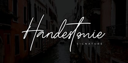 Handestonie – Signature Font and classy style, this font is great for your creative projects such as watermark on photography, and perfect for logos & branding, photography, invitation, watermark, advertisements, product designs, stationery, wedding designs, label, product packaging, special events or anything that need handwriting taste. What’s Included : Standard glyphs Ligatures Alternate glyphs Web Font Works on PC & Mac Simple installations Accessible in the Adobe Illustrator, Adobe Photoshop, Adobe InDesign, even work on Microsoft Word. PUA Encoded Characters – Fully accessible without additional design software. Fonts include multilingual support Cheers! Thank You
 - Haliond by Multype Studio,
$18.00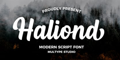 Haliond is a modern script font with bold style and modern looks. This font would perfect for logos, branding, product designs, product packaging, photography, watermark, social media posts, advertisements, invitation, stationery, labels, logos, magazines, books, greeting / wedding cards, fashion, make up, and etc. What's Include : Uppercase & lowercase Numbers and punctuation Multilingual support Ligatures Alternates Swashes Works on PC & Mac Simple installations Accessible in the Adobe Illustrator, Adobe Photoshop, Adobe InDesign, even work on Microsoft Word. PUA Encoded Characters – Fully accessible without additional design software. Thank you for your purchase! Hope you enjoy with our font!
 - Zentral by Wilton Foundry,
$29.00 My goal in designing Zentral was to create a distinctive sculptural font intentionally in Regular and Italic only. I believe Zentral Regular and Italic has the latitude and flexibility needed in most type scenarios without having to resort to multiple weights. Zentral Regular upper/lowercase provides a very pleasant contrast and can be varied by using Zentral Regular capitals. Zentral Italic is ideal for creating emphasis of words, quotes or phrases. This combination provides maximum impact and readability. Zentral is a contemporary font ideal for branding, packaging, advertising, editorial in print and e-print applications.


