10,000 search results
(0.024 seconds)
- Tavern by FontMesa,
$25.00Tavern is a super font family based on our Algerian Mesa design, with Tavern we've greatly expanded the usability by creating light and bold weights plus all new for 2020 with the introduction of extra bold and black weights Tavern is now a five weight family. The addition of the bold weight made it possible to go further with the design by adding open faced shadowed, outline and fill versions. Please note, the fill fonts are aligned to go with the open faced versions, they may work with the outline versions, however you will have to apply them one letter at a time. The Tavern Fill fonts may also be used a stand alone font, however, the spacing is much wider than the regular solid black weights of Tavern. In the old days of printing, fill fonts rarely lined up perfect with the open or outline font, this created a misprinted look that's much in style today. To create that misprinted look using two different colors, try layering the outline fonts offset over the top of the solid black versions. Next we come to the small caps and X versions, for a font that's mostly seen used in all caps we felt a small caps would come in handy. The X in Tavern X stands for higher X-height, we've taken our standard lowercase and raised it for greater visibility in small text and for signage where you want the look of a lowercase but it needs to be readable from the street. In August of 2016 I started the project of expanding this font into more weights after seeing the font in use where someone tried creating a bold version by adding a stroke fill around the letters. The result didn't look very good, the stroke fill also caused the shadow line to merge with the serifs on some letters. This lead me to experiment to see if a new bold weight was possible for this font and I'm pleased to say that it was. After the bold weight was finished I decided to type the regular and bold weights together in a first word thin second word bold combination, however the weight difference between the two wasn't enough contrast. This lead me to wonder if a lighter weight was possible for this font, as you can see yes it was, so now for the first time in the history of this old 1908 type design you can type a first word thin second word bold combination. So why the name change from Algerian to Tavern? Since the original font was designed in England by the Stephenson Blake type foundry I decided to give this font a name that reminded you of the country it came from, however, there were other more technical reasons. During the creation of the bold weight the engraved shadow line was sticking out too far horizontally on the bottom right of the serifs dramatically throwing the whole font off balance. The original font encountered this problem on the uppercase E, L and Z, their solution was a diagonal cut corner which was now needed across any glyph in the new bold weight with a serif on the bottom right side. In order to make the light and regular weights blend well with the bold weight diagonal cut offs were needed and added as well. This changed the look of the font from the original and why I decided to change the name, additional concerns were, if you're designing a period piece where the font needs to be authentic then this font would be too new. Regular vs. Alt version? The alternate version came about after seeing the regular version used as a logo and secondary text on a major product label. I felt that some of the features of the regular version didn't look good as smaller secondary text, this gave me the idea to create an alternate version that would work well for secondary text in an advertising layout. But don't stop there, the alternate version can be used as a logo too and feel free to exchange letters between both regular and alternate versions. Where are the original alternates from Algerian? Original alternates from Algerian are built into the regular versions of Tavern plus new alternates have been created. We're excited to introduce, for the first time, all new swash capitals for this classic font, you're going to love the way they look in your ad layout, sign or logo. The best way to access alternate letters in Tavern is with the glyph map in Adobe Illustrator and Adobe InDesign products, from Adobe Illustrator you can copy and paste into Photoshop as a smart object and take advantage of all the text layer style features Photoshop has to offer. There may be third party character maps available for accessing alternate glyphs but we can't advise you in that area. I know what you're thinking, will there be a Tavern Condensed? It takes a lot of hours to produce a large font family such as this, a future condensed version will depend on how popular this standard version is. If you love Tavern we're happy to introduce the first weathered edge version of this font called Bay Tavern available in February 2020. - Ghostbumps by Rometheme,
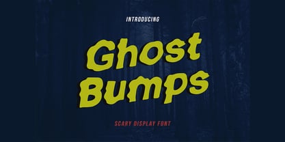
$25.00Introduce our new font “Ghostbumps” is a scary display font, this font looks horror, cool, cartoon, playful, catchy and easy to use. Highlight : - Easy instalation - Work on PC or Mac - PUA Encoded Support - Basic Latin A-Z and a-z - Numbers - Symbols - No special software is required, The fonts can be opened and used in Adobe Illustrator, Adobe Photoshop, Adobe InDesign, even work on Microsoft Word. - Weekend Date JNL by Jeff Levine,
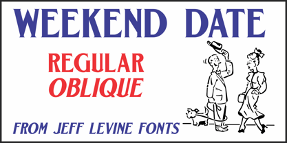
$29.00Sheet music from 1910 with another one of those ridiculous thirteen word titles (“I Love My Steady but I’m Crazy for My “Once-in-a-While’”) had the lengthy verbiage hand lettered in a bold serif typeface with slightly spurred serifs. This has been recreated in a digital typeface with a much shorter name: Weekend Date JNL, which is available in both regular and oblique versions. - Micro Manager NF by Nick's Fonts,
$10.00This font features a complete uppercase alphabet, including accented characters, as well as numbers and standard punctation. Lowercase characters are an assortment of useful dings and things. To create very low-load GIFs, compose your type in Photoshop (or equivalent) at 8 point (or multiples thereof), with anti-aliasing turned off. Both versions of the font include 1252 Latin, 1250 CE (with localization for Romanian and Moldovan). - Authority by Juncreative,
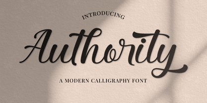
$15.00Authority i a script elegant font, handwrittien perfect for your projects. It has lots of alternate characters that you can find in the glyphs panel. This font is suited for branding projects, as well as packaging. FEATURES Alternate Characters Uppercase and Lowercase letters Numbering and Punctuations Multilingual Support Works on PC or Mac Simple Installation Support Adobe Illustrator, Adobe Photoshop, Adobe InDesign, also works on Microsoft Word - Katzenjammer by Hanoded,
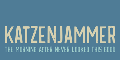
$15.00Katzenjammer is a German word meaning 'Cat's Wail' - it is used to describe a hangover. Katzenjammer font is a slightly eroded, squarish typeface, which would be ideal for headlines, packaging, posters and websites. This all caps font comes with different upper and lower case glyphs and a non-eroded set of alternates for the lower case - for those who like their alphabet nice and neat. - Naturallus by MJB Letters,
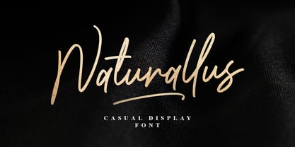
$17.00Naturallus is a Casual display font which is very perfect for branding, signature, wedding designs, social media ads, logos and others Naturallus includes full set of uppercase and lowercase letters, numeral, punctuations and ligatures. Included in this set: Works on PC & Mac Simple installations Accessible in the Adobe Illustrator, Adobe Photoshop, Adobe InDesign, even work on Microsoft Word. PUA Encoded Characters Fully accessible without additional design software - Widdershins by Hanoded,
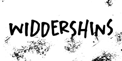
$15.00I like strange words. Widdershins is one of them: it means ‘to go counter clockwise’ and I picked it up from a book I am reading at the moment. Widdershins font was created using a broken bamboo satay skewer and Chinese ink. It is a little messy, uneven and maybe even unnerving, but I am sure you’ll find a way to put it to good use. - Lapendos Stripes by Axara Creative,
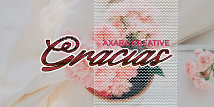
$10.00Introducing a new Lapendos Stripes. It comes with OpenType features such contextual alternates, stylistic alternates, stylistic sets, good for logotype, poster, badge, book cover, tshirt design, packaging and any more. This font is suitable for t-shirts, signage, logos, headlines, branding, packaging, etc. Accessible in the Adobe Illustrator, Adobe Photoshop, Adobe InDesign, even work on Microsoft Word. PUA Encoded Characters – Fully accessible without additional design software. - Moon Pretty by Forberas Club,
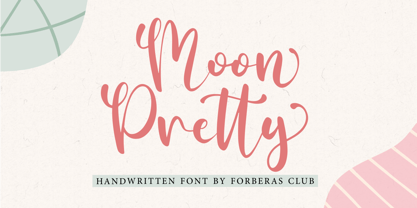
$16.00Moon Pretty, Font by Forberas Modern and beautiful handwritten script font! Great for wedding greeting cards, logos, branding materials, Invitation, business cards, quotes, posters, Cricut artwork and more! • No special software is required. The fonts can be opened and used in any software that can read standard fonts! • This font works with any application Microsoft Word, Adobe Photoshop, Microsoft Paint, Corel, Adobe Illustrator, Cricut, and many others! - Ghoust by Cititype,
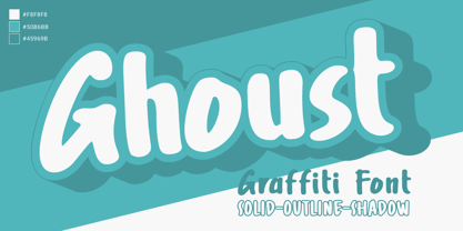
$12.00Ghoust is a graffiti style handwritten font. It includes three variations to give you the ultimate package. You can mix these three styles to create an authentic graffiti look. Please see this tutorial: https://youtu.be/vLS1BDq3rTQ The Solid version has revised kerning to be used as single layer text, working well for crafting designs. If you use the Outline version you have to set glyph tracking. We make tutorial for this setting: Adobe Illustrator: https://youtu.be/-CeXXEEXaaA Word: https://youtu.be/dMcHIaNE-Vw This makes a great addition to your collection of handwriting and display fonts. You can use it for posters, celebration, fun events and cute crafts. - Day And Collins Logotypes by Jeremia Adatte,
$20.00Please Note: as this is a picture-only font, there are no latin alpha/numeric glyphs. Each wood type manufacturer had their own selection of original Logotypes or Catchwords designs. These are taken right from the original source material, an extremely rare 1910 catalog of an English wood type maker called Day & Collins in London. As the name says it, these words are intended to attract attention, to spice up posters, packaging or advertisement designs. I made these available for the digital age, leaving the original texture of printed wood type at the highest detail possible. - Chaman by Cubo Fonts,
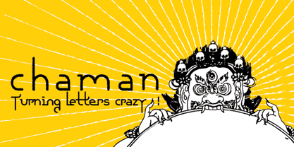
$29.00Chaman is a “hybrid” font. On the one hand serifless, temperate and readable, and on the other hand quick and livily as a manual script, thanks to many unexpected ligatures. Letter design is plain and functional, punctuated by dynamic elements, mostly in ligatures and contextual glyphs, generated at the beginning and end of the word, thanks to your software’s OpenType features. It draws inspiration from the Tibetan alphabet, originally close to our own latin alphabet, as it stems from Bhram handwriting, itself derived from Phoenician alphabet. This alternation of stright vertical lines and regular bows makes Chaman’s design stand out. - Blue Island by Adobe,
$29.00British designer Jeremy Tankard began Blue Island in 1996 with the idea of creating a completely ligature-based roman typeface, an original but complex task that took years to realize. Individually, Blue Island's letters can appear a bit dismembered, but when set together, they are clearly transformed into words which fall in waves down the page. Successfully balancing readability with intriguing decorative forms, Blue Island is especially effective for titling. As for its romantic name, Blue Island is the title of a poem, also by Tankard, which evokes notions of freedom, escape, intrigue, and the undulating beauty of the sea. - Worn Gothic by Baseline Fonts,
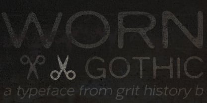
$39.00Worn Gothic, a typeface from the Grit History™ B family, creates rock solid text-- characters that are weathered, defined and strong, like the body of a gargoyle. Worn Gothic is rugged but legible, whose words stay firmly liquid, like dates stamped in concrete. Disjointed K legs create an unnerving look that makes you stare into the structure of the type. Oddities like this complement the integrity of its fluctuating strokes and consistent X-Height. It offers a few stylistic alternates to maintain readability at any size, in many languages. Worn Gothic offers full Greek character support as well as all punctuation. - Film Crew JNL by Jeff Levine,
$29.00It's not a new idea, but it's always a fun one... a typeface comprised of 35mm film frames. Film Crew JNL is Jeff Levine's version, utilizing his Koehler Sans JNL as the lettering inside the frames. The lesser and greater keys have solid black frames for end caps or word spacing, and there's an alternate pair of frames with clear centers on the brace keys. - Retail Merchant JNL by Jeff Levine,
$29.00Retail Merchant JNL is strictly for making prices. The 0-9 keys have large numbers, the shift position of the same keys have smaller, centered numbers, and the alphabet keys have a variety of smaller numbers with underscores in single digits, pairs of numerals and even a few complete prices such as "$1.00". Thrown in for good measure are companion words... "at", "for, "each", "lb." and "dozen"... - Chalk Hand Marker by TypoGraphicDesign,
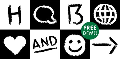
$19.00The typeface Chalk Hand Marker is designed from 2019 for the font foundry Typo Graphic Design by Manuel Viergutz. The rough sans-serif display typeface with 4 font styles (Reg, Bold, Caps, Invert) is inspired by handwriting. 634 glyphs included plus 150+ decorative extras like icons, arrows, dingbats, emojis, symbols, geometric shapes, catchwords, decorative ligatures (type the word #LOVE for ❤️or #SMILE for - Mind Boggle by Hanoded,
$15.00Mind Boggle was made during the renovation of our fixer upper farm house. We had to demolish an old annexe (because it was unsafe) and it caused us some stress, as one wrong movement of the excavator would mean at least a partial collapse of our home… Luckily the driver was a pro and it was mind boggling to see what he could do with a huge machine like that. Mind Boggling? Ah! Check! Mind Boggle is a handmade, all caps, headline font. It is a bit wobbly in places, but it comes with loads of character. The dotty style comes with thousands of hand made dots. They’re not perfect, they’re not even round, but they are unique! - Scene by Monotype,
$29.99Work on Scene began some time after designer Sebastian Lester joined Monotype Imaging in 2000. Clean, calm, and highly legible — thus the design brief Lester set for himself. With Scene, he wanted to provide graphic designers and creative directors with a suite of fonts that would serve as a strong foundation for identity projects, incorporating what he had learned about on-screen and print legibility. Scene was developed during two years of after-hours and weekend work. The family comes in six weights with matching italics, there is a set of “semi-sans” characters to introduce more expressive word rhythms into headlines and blocks of copy. - Prillwitz Pro by preussTYPE,
$49.00Johann Carl Ludwig Prillwitz, the German punch cutter and type founder, cut the first classic Didot letters even earlier than Walbaum. The earliest proof of so-called Prillwitz letters is dated 12 April 1790. Inspired by the big discoveries of archaeology and through the translations of classical authors, the bourgeoisie was enthused about the Greek and Roman ideal of aesthetics. The enthusiasm for the Greek and Roman experienced a revival and was also shared by Goethe and contemporaries. »Seeking the country of Greece with one’s soul«. All Literates who are considered nowadays as German Classics of that time kept coming back to the Greek topics, thinking of Schiller and Wieland. The works of Wieland were published in Leipzig by Göschen. Göschen used typefaces which had been produced by until then unknown punch cutter. This punch cutter from Jena created with these typefaces master works of classicist German typography. They can stand without any exaggeration on the same level as that of Didot and Bodoni. This unknown gentleman was known as Johann Carl Ludwig Prillwitz. Prillwitz published his typefaces on 12th April 1790 for the first time. This date is significant because this happened ten years before Walbaum. Prillwitz was an owner of a very successful foundry. When the last of his 7 children died shortly before reaching adulthood his hope of his works was destroyed, Prillwitz lost his will to live. He died six months later. His wife followed him shortly after. The typeface Prillwitz as a digital font was created in three optical styles (Normal, Book and Display). The typeface Prillwitz Press was created especially for a printing in small sizes for newspapers. »Prillwitz Press« combines aesthetic and functional attributes which make written text highly readable. It was originally designed for a newspaper with medium contrast to withstand harsh printing conditions. Its structure is quite narrow which makes this typeface ideal for body text and headlines where space is at premium. For the Normal – even more for the Book – a soft and reader-friendly outline was created through a so-called »Schmitz« and optimized in numerous test prints. The arris character and the common maximal stroke width contrast of the known classicist typefaces (Didot/Bodoni) were edited by the study of the original prints. This was also done in order to reach a very good readability in small type sizes. This typeface is perfectly suited to scientific and belletristic works. Accordingly it has three styles: Regular, Bold and Italic as Highlighting (1). The typeface Prillwitz is a complete new interpretation and continuing development of the conservated originals from 1790. They have been kept in the German Library in Leipzig. It was always given the priority to keep the strong roughness and at the same time optimizing the readability of this striking font. The type family has all important characters for an efficient and typographic high quality work. ----------- (1) Accentuation of particular words or word orders (e.g. proper names, terms etc.). Typographic means for Highlighting could be Italic, SmallCaps or semi-bold. - Erotica by Lián Types,
$49.00“A picture is worth a thousand words” and here, that’s more than true. Take a look at Erotica’s Booklet; Erotica’s Poster Design and Erotica’s User’s Guide before reading below. THE STYLES The difference between Pro and Std styles is the quantity of glyphs. Therefore, Pro styles include all the decorative alternates and ligatures while Std styles are a reduced version of Pro ones. Big and Small styles were thought for better printing results. While Big is recommended to be printed in big sizes, Small may be printed in tiny sizes and will still show its hairlines well. INTRODUCTION I have always wondered if the circle could ever be considered as an imperfect shape. Thousands of years have passed and we still consider circles as synonyms of infinite beauty. Some believe that there is something intrinsically “divine” that could be found in them. Sensuality is many times related to perfectly shaped strong curves, exuberant forms and a big contrasts. Erotica is a font created with this in mind. THE PROCESS This story begins one fine day of March in 2012. I was looking for something new. Something which would express the deep love I feel regarding calligraphy in a new way. At that time, I was practicing a lot of roundhand, testing and feeling different kinds of nibs; hearing the sometimes sharp, sometimes soft, sound of them sliding on the paper. This kind of calligraphy has some really strict rules: An even pattern of repetition is required, so you have to be absolutely aware of the pressure of the flexible pen; and of the distance between characters. Also, learning copperplate can be really useful to understand about proportion in letters and how a minimum change of it can drastically affect the look of the word and text. Many times I would forget about type-design and I would let myself go(1): Nothing like making the pen dance when adding some accolades above and below the written word. Once something is mastered, you are able to break some rules. At least, that’s my philosophy. (2) After some research, I found that the world was in need of a really sexy yet formal copperplate. (3) I started Erotica with the idea of taking some rules of this style to the extreme. Some characters were drawn with a pencil first because what I had in mind was impossible to be made with a pen. (4) Finding a graceful way to combine really thick thicks with really thin hairlines with satisfactory results demanded months of tough work: The embryo of Erotica was a lot more bolder than now and had a shorter x-height. Changing proportions of Erotica was crucial for its final look. The taller it became the sexier it looked. Like women again? The result is a font filled with tons of alternates which can make the user think he/she is the actual designer of the word/phrase due to the huge amount of possibilities when choosing glyphs. To make Erotica work well in small sizes too, I designed Erotica Small which can be printed in tiny sizes without any problems. For a more elegant purpose, I designed Erotica Inline, with exactly the same features you can find in the other styles. After finishing these styles, I needed a partner for Erotica. Inspired again in some old calligraphic books I found that Bickham used to accompany his wonderful scripts with some ornated roman caps. Erotica Capitals follows the essentials of those capitals and can be used with or without its alternates to accompany Erotica. In 2013, Erotica received a Certificate of Excellence in Type Design in the 59th TDC Type Directors Club Typeface Design Competition. Meet Erotica, beauty and elegance guaranteed. Notes (1) It is supossed that I'm a typographer rather than a calligrapher, but the truth is that I'm in the middle. Being a graphic designer makes me a little stubborn sometimes. But, I found that the more you don't think of type rules, the more graceful and lively pieces of calligraphy can be done. (2) “Know the forms well before you attempt to make them” used to say E. A. Lupfer, a master of this kind of script a century ago. And I would add “And once you know them, it’s time to fly...” (3) Some script fonts by my compatriots Sabrina Lopez, Ramiro Espinoza and Alejandro Paul deserve a mention here because of their undeniable beauty. The fact that many great copperplate fonts come from Argentina makes me feel really proud. Take a look at: Parfumerie, Medusa, Burgues, Poem and Bellisima. (4) Some calligraphers, graphic and type designer experimented in this field in the mid-to-late 20th century and made a really playful style out of it: Letters show a lot of personality and sometimes they seem drawn rather than written. I want to express my sincere admiration to the fantastic Herb Lubalin, and his friends Tony DiSpigna, Tom Carnase, and of course my fellow countryman Ricardo Rousselot. All of them, amazing. - Jherlitha Signature by Yeen Studio,
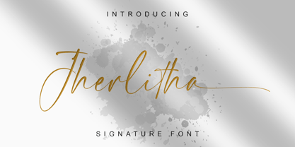
$19.00Introducing Jherlitha - Signature Font This Font can be used for any variety of purposes, such as: Photography, Wedding Invitation, Packaging Product, Logo Type, Brand, and also can be used for personal purpose. This Font Template contains Modern, Elegant, creative, Professional and Unique Concept. FEATURES Uppercase & Lowercase letters Numbering and Punctuations Ligatures Multilingual Support Works on PC or Mac Simple Installation Support Adobe Illustrator, Adobe Photoshop, Adobe InDesign, also works on Microsoft Word. All images on the demo is just for preview purpose only and not actually included on the files Hope you Like it. Thanks. - Thunderion by Sipanji21,
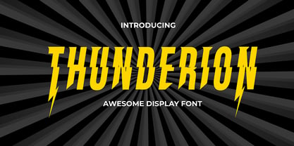
$20.00Thunderion is The ThunderStrike font is a striking display font that captures the electrifying energy of thunderstorms. Each character in this unique typeface is adorned with a dynamic thunder accent, adding a powerful and dramatic effect to your text. With its captivating design, ThunderStrike is perfect for headlines, posters, and any creative project that requires a bold and attention-grabbing aesthetic. Whether you want to emphasize a specific word or phrase, or you're looking to make a lasting impact with your design, this font will deliver a thunderous punch. - Alphonse by RagamKata,
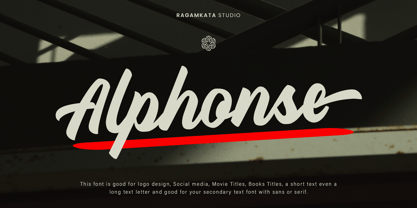
$16.00Alphonse Script Font exudes charm with its distinctive letter details. Crafted with a bold yet modern style, this font presents characters that are not just clear but also invite the eye to explore the beauty of its typography. With available alternate swash accents, each word comes alive, allowing users to express their creativity in an elegant and captivating manner. This font is good for logo design, Social media, Movie Titles, Books Titles, a short text even a long text letter and good for your secondary text font with sans or serif. - Bogani Gottan by Yeen Studio,
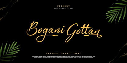
$19.00Introducing Bogani Gottan This Font can be used for any variety of purposes, such as: Photography, Wedding Invitation, Packaging Product, Logo Type, Brand, and also can be used for personal purpose. This Font Template contains Modern, Elegant, creative, Professional and Unique Concept. FEATURES - Uppercase & Lowercase letters - Numbering and Punctuations - Ligatures - Multilingual Support - Works on PC or Mac - Simple Installation - Support Adobe Illustrator, Adobe Photoshop, Adobe InDesign, also works on Microsoft Word. All images on the demo is just for preview purpose only and not actually included on the files Hope you Like it. Thanks. - Amantta by Yeen Studio,
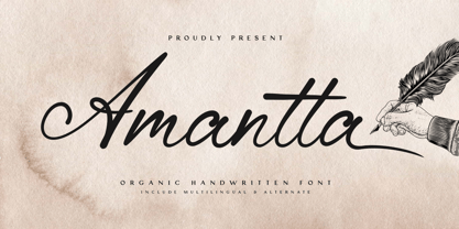
$19.00Introducing Amantta Script Font This Font can be used for any variety of purposes, such as: Photography, Wedding Invitation, Packaging Product, Logo Type, Brand, and also can be used for personal purpose. This Font Template contains Modern, Elegant, creative, Professional and Unique Concept. FEATURES - Uppercase & Lowercase letters - Numbering and Punctuations - Ligatures - Multilingual Support - Works on PC or Mac - Simple Installation - Support Adobe Illustrator, Adobe Photoshop, Adobe InDesign, also works on Microsoft Word. All images on the demo is just for preview purpose only and not actually included on the files Hope you Like it. Thanks. - Shoganai by Hanoded,
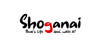
$15.00I really like the Japanese language, as it has words that describe a whole world of meaning. Like Shoganai. It literally means: ‘It cannot be helped’. That’s life, get used to it. Shoganai sums up a lot of the Japanese culture and way of thinking: if things cannot be helped, then accept it and move on. Shoganai is a set of Brush fonts: a thinner, script font and a heavy display font. Use if for book covers, product packaging and more. If you can’t use it, then, well, Shoganai. - Bellasmith by Abbasy Studio,
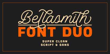
$15.00Bellasmith, is a pair of bold sans and monoline script with a touch of vintage look. This script font comes with multiple alternates that will make your words look like a custom lettering. With additional sans font you will be able to create the beautiful combination. This type of font perfectly suitable for made to be applied especially in logo, and the other various formal forms such as invitations, labels, logos, magazines, books, greeting / wedding cards, packaging, fashion, make up, stationery, novels, labels or any type of advertising purpose. - Bulbia by Typogama,
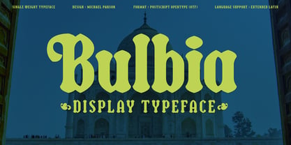
$25.00Bulbia is a single weight, display typeface inspired by the teardrop shape featured in some middle eastern design. With a bold stroke and high contrast, this font conveys a strong, unique voice that can be further enhanced through the use of it’s extensive Opentype features. Through Swash letters, decorative Titling forms or even a range of precomposed word marks, this single weight font expands into a complete design toolkit with multiple applications and possibilities. Bulbia includes an extended Latin character set and is available as an OTF font. - JP MultiColour by jpFonts,
$29.90Multicolored Fonts Many years ago, when Xerox Corporation still had its own font department, I came to Los Angeles in 1985 to train the IKARUS program. One day Bill Kienzel, head of the Xerox font department at the time, said we should go to the Hollywood Hills together; he knew people there who were experimenting with multicolored fonts. After a little wandering through the winding streets of the many hills, we reached a somewhat overgrown, simple family house standing under trees. A group of very inspired designers were waiting for us there. They immediately showed us the works they created using photomechanical tricks. They were fascinating. The American colors and the whole look seemed noble and enchanting. The problem was that this process was very difficult to implement and required a lot of effort on individual letters. They dreamed of a colored font that could be used for normal typesetting. We thought back and forth about how to save the individually colored letters in a common font, but soon gave up because we didn't see a technical option. So this idea and the memory of the time in Hollywood lay dormant in the back of my mind for many years, until at the beginning of this year 2023 I received an order to produce an outline typeface and the story came back to me. Suddenly I knew how to solve the problem from back then: if only the areas that should have the same color in all letters were saved in their own separate fonts, they could be colored independently of each other and later placed on top of each other. I implemented this in the 5 fonts that are now available with the 3 variants “Outside”, “Middle” and “Inside”. Together with the background, 4 colors can be combined with each other. This method works in text programs such as Word or InDesign. In Photoshop or Illustrator, the individual surfaces can also be colored by converting them into paths if the additional “Complete” variants (which contain all 3 contours) are used. There is also a “Basic” variant that can be used to achieve special effects such as overlay, bleed, etc. The first 5 fonts in this series are all based on the principle of contouring. Anyone who claims that you don't need any special fonts because they can be created automatically from any font using common programs is wrong or is only telling only half the truth. Anyone who has ever dealt with this knows that many individual adjustments to the design are necessary after contouring. This has happened in the 5 fonts that are now available and have very different styles. The dream from back then has come true. The user can set any text, long or short, in multiple colors, freely design the color scheme and apply all the usual typographic settings. Volker Schnebel, November 2023 - Falkirk Script by Mysterylab,
$17.00Introducing Falkirk Script, a three-font suite that is excellent for product branding, logos, t-shirts, high-end food and beverage labels, and much more. This collection includes the main letter body font (Falkirk Script Bold), an extruded shadow version, and finally a horizontal line engraving version that highlights the upper half of the letters. Stack the font variations in alignment, assign different colors, outlines, and/or gradients to each layer, and you'll see a wealth of versatile design possibilities opening up. This script has a unique topheavy wedge effect in the lower case, and lyrical old-world script detailing in the capitals. The tapered sweep and simplified ascender design works extremely well in the context of curved arc or arched word designs. - Vernon by Giles Edwards,
$25.00Vernon’s inspiration came while researching and investigating a 'legible' typeface design for tangible purpose. The main characteristics of ‘Vernon’ can be seen in the slightly modulated strokes that reference the natural and friendly humanist proportions of the humanist hand, with open interior letterspace characteristics. The subtle detailing and finishing of strokes and junctions – seen in the curved tail of the lowercase ‘l’ and the head serif of the lowercase ‘i’, create a smooth rhythm along the baseline. Utilizing the ‘contextual alternative’ feature of OpenType, Vernon substitutes select characters in words with word-shapes that may cause visual confusion to some readers. Vernon uses subtle character differentiation in the detailing of the inner-shape / counter space from similar letter shapes (for example: ‘p’, ‘d’, ‘g’ and ‘q’) to assist in creating the contextual alternate designs. Vernon is recommended for use as a text typeface, as it performs well at small text sizes (12 point size and below) intended for continuous reading of printed instructional and presentational information, especially where an inclusive audience demographic is required. - Weg by Huerta Tipográfica,
$18.00WEG* font is an experimental type system where legibility isn’t the focus. This project studies how glyphs are constructed and how their ductus can be modified. I explored how far I can move the limits if I don’t worry about the legibility. In Weg, letters are built by a single line that connects them, along with words and paragraphs. When weight decreases, the legibility of the signs increases. This is the first stage. It’s a project in expansion. The set contains uppercase, lining figures and basic punctuation in three weights: Regular, Light and Thin. The current supported languages are Spanish, Guaraní and English. If you need any other language, please let me know. I would like to expand the character set. Second stage project WEG is an experimental in-expansion font family. Here I present to you the second stage. I’m planning the first upgrade for middle 2021. I’m preparing a pattern set for July 2021. Here you can see the first four patterns. If you buy the font before July 2021, you’ll get this upgrade! • Second stage April - July 2021: pattern set (first four ready). • This upgrade will be available on August 2021. - Harlean by Laura Worthington,
$35.00Harlean is lively and exciting with eccentric letterforms that vary in axis, baseline, and height, a tribute to Harlean’s flexible-nib pen origins. Its curving strokes speak of free-spirited adventure and jazz-inflected, improvisational style. Harlean’s hand-lettered appearance is fashioned from the savvy use of contextual alternates. Easily customize your words with swashes and alternate forms to express your creativity, then complement your layout with ornaments, borders, and corner elements. See what’s included! http://bit.ly/2cjNavf *NOTE* Basic versions DO NOT include swashes, alternates or ornaments This font has been specially coded for access of all the swashes, alternates and ornaments without the need for professional design software! Info and instructions here: http://lauraworthingtontype.com/faqs/ - Scrans by Corradine Fonts,
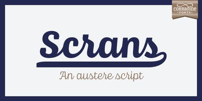
$29.95Scrans (Script + Sans) is a modern script family that gets both, conceptual and formal elements, from classic rational and geometric styles. It's main purpose is to make the difference in an innovative manner. In other words, you can use Scrans in texts where traditionally the classic scripts won’t fit. Scrans is a powerful tool that helps you to obtain clean, minimalists, geometric, contemporary, and mostly, highly legible designs. Each detail in the design of Scrans (like it's compact proportions, it's soft connections, it's cutted endings and it's subtle slant angle), was carefully crafted so you can get a high quality font to use in any project. You can also take advantage of its Open Type features that improve the potential of the typeface, with stylistic alternates and the options to underline smartly the words. Each one of the eight weights supports many languages, including Central and Eastern European as well as Western European languages. - Beorcana Pro by Terrestrial Design,
$40.00Beorcana can be classified as a serifless roman, a stressed sans, a glyphic sans, or calligraphic sans. However it is classified, Beorcana derives not only from other stressed sans designs like Lydian, Amerigo and Optima, but also utilizes classic Renaissance proportions in both Roman and Italic, which facilitate extended reading. Beorcana is available in Display, regular Text and Micro styles. Beorcana’s Text styles offer comfort and liveliness in books, dictionaries, magazines and other reading-intensive settings. Display styles offer a stately and organic flavor for any application. Micro styles perform in tight and dense settings like dictionaries, bibles, maps and fine print. The name Beorcana is a variant of the Icelandic word for the Birch tree, and the related words for the Icelandic rune. Many variant spellings are used for the tree and the rune: Beorc, Berkanan, Birkana, Bercano, Bjork, Bjarka. The Birch was revered as a symbol of renewal, due to its role as a pioneer species in burned, boggy or otherwise unforested areas. - Beorcana Std by Terrestrial Design,
$20.00Beorcana can be classified as a serifless roman, a stressed sans, a glyphic sans, or calligraphic sans. However it is classified, Beorcana derives not only from other stressed sans designs like Lydian, Amerigo and Optima, but also utilizes classic Renaissance proportions in both Roman and Italic, which facilitate extended reading. Beorcana is available in Display, regular Text and Micro styles. Beorcana’s Text styles offer comfort and liveliness in books, dictionaries, magazines and other reading-intensive settings. Display styles offer a stately and organic flavor for any application. Micro styles perform in tight and dense settings like dictionaries, bibles, maps and fine print. The name Beorcana is a variant of the Icelandic word for the Birch tree, and the related words for the Icelandic rune. Many variant spellings are used for the tree and the rune: Beorc, Berkanan, Birkana, Bercano, Bjork, Bjarka. The Birch was revered as a symbol of renewal, due to its role as a pioneer species in burned, boggy or otherwise unforested areas. - Detective Client JNL by Jeff Levine,
$29.00There is no doubt that the 1941 version of “The Maltese Falcon” was superior to the prior two attempts by Warner Brothers at filming Dashiell Hammett’s 1930 novel. Sam Spade was perfectly portrayed by Humphrey Bogart, and the supporting cast of Mary Astor, Peter Lorre, Sidney Greenstreet and Elisha Cook, Jr. rounded out the main players in a great suspense film that is considered to be the first (if not one of the first) of the film noir genre. The title cards for the production and cast credits were hand-lettered in a spurred serif type style strongly reminiscent of the Art Nouveau period, so instead of naming the digital version with some “tough guy detective” moniker, it was decided that Detective Client JNL was more appropriate. After all, this is a reasonably attractive font, and in this kind of film it’s usually the “attractive damsel in distress” [be she the victim or the actual perpetrator] that gets the story rolling… Detective Client JNL is available in both regular and oblique versions. - Scripty by Turtle Arts,
$20.00Scripty is a hand drawn, calligraphy longhand handwritten font. With careful spacing, the letters can be used together to create words that look like theyπve been written with an old≠fashioned fountain pen, or used alone as embellishment to more plebean text.

