10,000 search results
(0.069 seconds)
- Ideal Gothic by Storm Type Foundry,
$44.00At the turn of the 20th century monolinear alphabets were often despised for their dullness. Typographers, therefore, took great pains to breathe some kind of individuality into the monotonous sans-serif scheme. They started with subtle differentiation in the thickness of vertical and horizontal strokes and finished by improving details. By this they arrived at a more decorative appearance of the type face which thus became more regardful of the eye of the bourgeoisie. Ideal Gothic is no exception. It is characterized by a correct stiffness which will improve the morals of every idea printed by this type face. The awkward curves of the italics are a little suggestive of openwork iron products or the bent iron of the decorative little railings in a Prague park. The so-called "hidden" and, furthermore, curved serifs complete the inconspicuous "charm" of this type face. All its above-mentioned features, however, suddenly turn into advantages when we need to design a magazine, a brochure or an annual report, in short whenever illustrations dominate. It is not by accident that the basic design of "Ideal Gothic" has such a light tonal value - it competes neither with fine pencil sketches, nor with sentimental landscapes. It is very suitable for business cards and corporate identity graphics. - Divina Proportione by Intellecta Design,
$29.00 Divina Proportione is based from the original studies from Luca Pacioli. Luca Pacioli was born in 1446 or 1447 in Sansepolcro (Tuscany) where he received an abbaco education. Luca Pacioli was born in 1446 or 1447 in Sansepolcro (Tuscany) where he received an abbaco education. [This was education in the vernacular (i.e. the local tongue) rather than Latin and focused on the knowledge required of merchants.] He moved to Venice around 1464 where he continued his own education while working as a tutor to the three sons of a merchant. It was during this period that he wrote his first book -- a treatise on arithmetic for the three boys he was tutoring. Between 1472 and 1475, he became a Franciscan friar. In 1475, he started teaching in Perugia and wrote a comprehensive abbaco textbook in the vernacular for his students during 1477 and 1478. It is thought that he then started teaching university mathematics (rather than abbaco) and he did so in a number of Italian universities, including Perugia, holding the first chair in mathematics in two of them. He also continued to work as a private abbaco tutor of mathematics and was, in fact, instructed to stop teaching at this level in Sansepolcro in 1491. In 1494, his first book to be printed, Summa de arithmetica, geometria, proportioni et proportionalita, was published in Venice. In 1497, he accepted an invitation from Lodovico Sforza ("Il Moro") to work in Milan. There he met, collaborated with, lived with, and taught mathematics to Leonardo da Vinci. In 1499, Pacioli and Leonardo were forced to flee Milan when Louis XII of France seized the city and drove their patron out. Their paths appear to have finally separated around 1506. Pacioli died aged 70 in 1517, most likely in Sansepolcro where it is thought he had spent much of his final years. De divina proportione (written in Milan in 1496–98, published in Venice in 1509). Two versions of the original manuscript are extant, one in the Biblioteca Ambrosiana in Milan, the other in the Bibliothèque Publique et Universitaire in Geneva. The subject was mathematical and artistic proportion, especially the mathematics of the golden ratio and its application in architecture. Leonardo da Vinci drew the illustrations of the regular solids in De divina proportione while he lived with and took mathematics lessons from Pacioli. Leonardo's drawings are probably the first illustrations of skeletonic solids, an easy distinction between front and back. The work also discusses the use of perspective by painters such as Piero della Francesca, Melozzo da Forlì, and Marco Palmezzano. As a side note, the "M" logo used by the Metropolitan Museum of Art in New York City is taken from De divina proportione. “ The Ancients, having taken into consideration the rigorous construction of the human body, elaborated all their works, as especially their holy temples, according to these proportions; for they found here the two principal figures without which no project is possible: the perfection of the circle, the principle of all regular bodies, and the equilateral square. ” —De divina proportione
 - Different Cultures by Shakira Studio,
$19.00 Introducing "Different Cultures," a font that effortlessly embodies the latest design trends. This modern serif display font transcends conventional styles, offering a perfect fusion of bold and thin strokes that create a visually stunning balance. Immerse your designs in the contemporary allure of "Different Cultures," where every curve and detail is meticulously crafted for maximum impact. Explore the font's diverse array of alternates and ligatures, providing you with a stylish toolkit to customize and enhance your typographic creations. "Different Cultures" is more than just a font; it's a visual journey that seamlessly blends modernity with timeless elegance. Elevate your projects with the unique and captivating aesthetics of "Different Cultures," setting a new standard for stylish and versatile modern serif display fonts in today's design landscape. Here's what you get: Regular & Italic All Multilingual symbol Opentype features ( ligature, alternate ) Accessible in the Adobe Illustrator, Adobe Photoshop, Adobe InDesign, even work on Microsoft Word. PUA Encoded Characters - Fully accessible without additional design software. Multilingual character supports : (Afrikaans, Albanian, Catalan, Croatian, Czech, Danish, Dutch, English, Estonian, Finnish, French, German, Hungarian, Icelandic, Italian, Lithuanian, Maltese, Norwegian, Polish, Portuguese, Slovenian, Spanish, Swedish, Turkish, Zulu) Follow my shop for upcoming updates, and for more of my work, Thank you!
 - Saint Bartogenia by Mans Greback,
$79.00 Saint Bartogenia is a handscript font that elegantly bridges the gap between handwriting and formality. Exuding a beautiful and lovely aura, this font is a perfect choice for wedding invitations and other elegant stationery. Its script form is both classy and fine, mirroring the artistry of traditional calligraphy with a modern twist. The thin, delicate lines of Saint Bartogenia create a sense of sophistication and grace, making each character swirl across the page like a light wind. Use underscore _ anywhere in a word to make a swash. Example: Ele_gant Use multiple underscores to make longer underlines. Example: Wonder___world The font is built with advanced OpenType functionality and guaranteed top-notch quality, containing stylistic and contextual alternates, ligatures and more automatic and manual features; all to give you full control and customizability. It has extensive lingual support, covering all Latin-based languages, from North Europa to South Africa, from America to South-East Asia. It contains all characters and symbols you'll ever need, including all punctuation and numbers. Saint Bartogenia is a manifestation of Mans Greback's commitment to combining aesthetic beauty with practical usability, making it a go-to choice for designers seeking to infuse their projects with a touch of finesse.
 - Aljaraz by Cuchi, qué tipo,
$9.95 Aljaraz (meaning “small bell” in english) is a curvy typeface inspired on the “Fat face" letters with an extremely bold design from the early 19th century, but with an insolent touch of brave and psychedelic distortions. Aljaraz has a regular and italic variable, and in both styles the capital letters have a swash alternative where the naughty touch reaches its maximum expression. It is ideal to recall the lysergic era of the 60s, write funny words, or simply to express small texts in a display way that powerfully attracts attention. Let Aljaraz inspire you groovy kind of love! Designed by Carlos Campos cuchi@cuchiquetipo.com Secondary typeface: 'Escuela', also by Carlos Campos _ Aljaraz (“campanita”) es una tipografía curvy inspirada en las letras con un diseño extremadamente grueso y atrevido de principios del siglo XIX (las “Fat face”), pero con un toque insolente de valientes distorsiones psicodélicas. Aljaraz tiene una variable regular y cursiva, y en ambos estilos las mayúsculas tienen una alternativa súper decorada donde el toque travieso alcanza su máxima expresión. Es ideal para rememorar la época lisérgica de los años 60, escribir palabras graciosas, o simplemente expresar textos graciosos de una forma visual que llame poderosamente la atención. ¡Deja que Aljaraz te inspire su maravilloso amor!
 - Quase Display by DSType,
$40.00 Quase is a very free interpretation of the types found in the “Specimen of Printing Types” by William Caslon from 1785. We didn’t want to follow any of the models introduced in the Specimens, but rather gather a series of typographic aspects that we found useful and interesting from the several sizes and styles available and then give them consistency and new proportions so they could fit our very own purpose. We wanted to start with Caslon and then transform it into an editorial typeface, hence the increase of the x-height and the radical reduction of the ascenders and descenders. Despite the Display, Headline and Text fonts we also wanted to make a single weight Poster version with, inspired by the mechanical script introduced in the Double-Pica Script, to be used in magazines or as a complementary display typeface.
 - Quase Poster by DSType,
$40.00 Quase is a very free interpretation of the types found in the “Specimen of Printing Types” by William Caslon from 1785. We didn’t want to follow any of the models introduced in the Specimens, but rather gather a series of typographic aspects that we found useful and interesting from the several sizes and styles available and then give them consistency and new proportions so they could fit our very own purpose. We wanted to start with Caslon and then transform it into an editorial typeface, hence the increase of the x-height and the radical reduction of the ascenders and descenders. Despite the Display, Headline and Text fonts we also wanted to make a single weight Poster version with, inspired by the mechanical script introduced in the Double-Pica Script, to be used in magazines or as a complementary display typeface.
 - Quase Headline by DSType,
$40.00 Quase is a very free interpretation of the types found in the “Specimen of Printing Types” by William Caslon from 1785. We didn’t want to follow any of the models introduced in the Specimens, but rather gather a series of typographic aspects that we found useful and interesting from the several sizes and styles available and then give them consistency and new proportions so they could fit our very own purpose. We wanted to start with Caslon and then transform it into an editorial typeface, hence the increase of the x-height and the radical reduction of the ascenders and descenders. Despite the Display, Headline and Text fonts we also wanted to make a single weight Poster version with, inspired by the mechanical script introduced in the Double-Pica Script, to be used in magazines or as a complementary display typeface.
 - Quase Text by DSType,
$40.00 Quase is a very free interpretation of the types found in the “Specimen of Printing Types” by William Caslon from 1785. We didn’t want to follow any of the models introduced in the Specimens, but rather gather a series of typographic aspects that we found useful and interesting from the several sizes and styles available and then give them consistency and new proportions so they could fit our very own purpose. We wanted to start with Caslon and then transform it into an editorial typeface, hence the increase of the x-height and the radical reduction of the ascenders and descenders. Despite the Display, Headline and Text fonts we also wanted to make a single weight Poster version with, inspired by the mechanical script introduced in the Double-Pica Script, to be used in magazines or as a complementary display typeface.
 - Sancoale Slab Soft by insigne,
$24.75 Ready for the designs of today, the Sancoale superfamily takes a softer turn with a rounded slab serif. Crafted from Sancoale’s simple geometry, new softened slab serifs provide a lively typeface that conveniently enhances its cousins: Sancoale Softened--a sans with blunted terminals; Sancoale Slab; and, certainly, the first Sancoale. The weights of each and every member are balanced diligently to be compatible with one another. When used alongside one another, the combination makes for robust and tight design. With weights starting with the slender thin ranging to the juicy black, Slab Soft opens the doorway to the vary of uses. Its design is legible and neutral enough for bodies of copy--both in print and on your website. The web font also stands out perfectly as a headline or a display face. Slab Soft carefully places a foot ahead, and doesn't overpower like many slabs. This font’s the choice to seize the day and get the job done. All insigne™ fonts are absolutely loaded with OpenType options. Sancoale Slab is geared up for pro typography, together with alternates with stems, compact caps and lots of alts, together with “normalized” capitals and lowercase letters. The font features many numeral sets, with fractions, old-style and lining figures with superiors and inferiors. OpenType-capable programs like Quark or the Adobe suite allow you to quickly change ligatures and alternates. You can see these options shown in the .pdf brochure. Bundled are compact caps, fractions, old-style and lining quantities, scientific superior/inferior figures, entire ordinal and inferior alphabet. The Sancoale superfamily also features the glyphs to aid a variety of languages, together with Central, Eastern and Western European languages. In all, Sancoale Slab supports around forty languages that utilize the Latin script, earning Sancoale the pick for for multi-lingual publications and packaging.
 - Campcraft by Our House Graphics,
$- Remember those plastic Popsicle sticks that clicked together and you could make things from them with your sticky little fingers? Things like... camp crafts. Well, no� Of course you don't. You were too young. That�s why there is Campcraft. This is a fun loving dot-matrix font, or it would be a fun loving dot-matrix if the vertical and horizontal grid lines didn't pile up at the intersections. Then again, it wouldn't be any fun if they didn't pile up at the intersections, would it? Strictly a display type... Campcraft is excellent for what the name suggests. I goes well with Christmas sweaters, beaded jackets and purses and that time when we were all happy children with sticky little fingers.
 - Speech Bubbles by Harald Geisler,
$68.00 The font Speech Bubbles offers a convenient way to integrate text and image. While the font can be used to design comics, it also gives the typographer a tool to make text speak – to give words conversational dynamics and to emphasize visually the sound of the message. The font includes a total of seventy outlines and seventy bubble backgrounds selected from a survey of historic forms. What follows is a discussion of my process researching and developing the font, as well as a few user suggestions. My work on the Speech Bubbles font began with historic research. My first resource was a close friend who is a successful German comic artist. I had previously worked with him to transform his lettering art into an OpenType font. This allowed his publishing house to easily translate cartoons from German to other languages without the need to use another font, like Helvetica rounded. My friend showed me the most exciting, outstanding and graphically appealing speech bubbles from his library. I looked at early strips from Schulz (Peanuts), Bill Waterson (Calvin & Hobes), Hergé (TinTin), Franquin, as well as Walt Disney. The most inspiring was the early Krazy Kat and Ignatz (around 1915) from George Herriman. I also studied 1980’s classics Dave Gibbon’s Watchmen, Frank Miller’s Ronin and Alan Moore and David Lloyd’s V for Vandetta. Contemporary work was also a part of my research—like Liniers from Macanudo and work of Ralf König. With this overview in mind I began to work from scratch. I tried to distill the typical essence of each author’s or era’s speech bubbles style into my font. In the end I limited my work down to the seventy strongest images. An important aspect of the design process was examining each artist’s speech bubble outlines. In some cases they are carefully inked, as in most of the 80’s work. In others, such as with Herriman, they are fast drawn with a rough impetus. The form can be dynamic and round (Schultz) with a variable stroke width, or straight inked with no form contrast (Hergé). Since most outlines also carry the character of the tool that they are made with, I chose to separate the outline from the speech bubble fill-in or background. This technical decision offers interesting creative possibilities. For example, the font user can apply a slight offset from fill-in to outline, as it is typical to early comic strips, in which there are often print misalignments. Also, rather than work in the classic white background with black outline, one can work with colors. Many tonal outcomes are possible by contrasting the fill-in and outline color. The Speech Bubbles font offers a dynamic and quick way to flavor information while conveying a message. How is something said? Loudly? With a tint of shyness? Does a rather small message take up a lot of space? The font’s extensive survey of historic comic designs in an assembly that is useful for both pure comic purposes or more complex typographic projects. Use Speech Bubbles to give your message the right impact in your poster, ad or composition.
 - Iwan Stencil by Linotype,
$40.99 Iwan Stencil is a new revival of an old display typeface. Based on type originally designed by Jan Tschichold in 1929, the style was revived by Klaus Sutter in 2008. The letterforms in this peculiar design are very high contrast; all of the thin bits are much thinner than the thick parts. They have a modern, upright axis. All in all, the creation has a bit of a Bodoni-gone-crazy touch. The thin elements are the unique part of the design that binds this face together. They almost naturally fade away in the stencil gaps (or pylons), making you wonder if you are really looking at a stencil face at all. These thins contribute greatly to the typeface's overall serif-style, making the design at least a semi serif typeface, if not a full serif one. The lowercase n, for instance, has no serifs of its own, but many of the other letters have clear ones, or serif-like terminals. A serif stencil face is a peculiar variety, especially in this day and age, but in the past they were much more common, if not the norm, The Iwan Stencil typeface has only one weight. Naturally, this is just for display. Use Iwan Stencil to cut real stencils, or only to create the effect of stenciled type in your design work. Ivan Stencil includes all of the characters that you have come to expect in a font. Just because this design was originally made in 1929 does not mean that is has a 1929 character set. Instead, it includes a 21st century, with extended European language support Jan Tschichold, who we have to thank for today's Iwan Stencil inspiration, was a man of many faces. A trained calligrapher who went on to codify the New Typography, would go on to become a teacher, a classical book designer, and the creator of the Sabon typeface. Like all young designers, he was occasionally in need of money. Before his emigration from Germany in 1933, he took on many kinds of commissions. In the late 1920s, a time full of waves of economic turmoil within Germany and across the world, he began designing a typefaces for different European companies, mostly display things like this. For a time during the mid-1920s, Jan Tschichold went by the name Iwan" "
 - Affair by Sudtipos,
$99.00 Type designers are crazy people. Not crazy in the sense that they think we are Napoleon, but in the sense that the sky can be falling, wars tearing the world apart, disasters splitting the very ground we walk on, plagues circling continents to pick victims randomly, yet we will still perform our ever optimistic task of making some little spot of the world more appealing to the human eye. We ought to be proud of ourselves, I believe. Optimism is hard to come by these days. Regardless of our own personal reasons for doing what we do, the very thing we do is in itself an act of optimism and belief in the inherent beauty that exists within humanity. As recently as ten years ago, I wouldn't have been able to choose the amazing obscure profession I now have, wouldn't have been able to be humbled by the history that falls into my hands and slides in front of my eyes every day, wouldn't have been able to live and work across previously impenetrable cultural lines as I do now, and wouldn't have been able to raise my glass of Malbeck wine to toast every type designer who was before me, is with me, and will be after me. As recently as ten years ago, I wouldn't have been able to mean these words as I wrote them: It’s a small world. Yes, it is a small world, and a wonderfully complex one too. With so much information drowning our senses by the minute, it has become difficult to find clear meaning in almost anything. Something throughout the day is bound to make us feel even smaller in this small world. Most of us find comfort in a routine. Some of us find extended families. But in the end we are all Eleanor Rigbys, lonely on the inside and waiting for a miracle to come. If a miracle can make the world small, another one can perhaps give us meaning. And sometimes a miracle happens for a split second, then gets buried until a crazy type designer finds it. I was on my honeymoon in New York City when I first stumbled upon the letters that eventually started this Affair. A simple, content tourist walking down the streets formerly unknown to me except through pop music and film references. Browsing the shops of the city that made Bob Dylan, Lou Reed, and a thousand other artists. Trying to chase away the tourist mentality, wondering what it would be like to actually live in the city of a billion tiny lights. Tourists don't go to libraries in foreign cities. So I walked into one. Two hours later I wasn't in New York anymore. I wasn't anywhere substantial. I was the crazy type designer at the apex of insanity. La La Land, alphabet heaven, curves and twirls and loops and swashes, ribbons and bows and naked letters. I'm probably not the very first person on this planet to be seduced into starting an Affair while on his honeymoon, but it is something to tease my better half about once in a while. To this day I can't decide if I actually found the worn book, or if the book itself called for me. Its spine was nothing special, sitting on a shelf, tightly flanked by similar spines on either side. Yet it was the only one I picked off that shelf. And I looked at only one page in it before walking to the photocopier and cheating it with an Argentine coin, since I didn't have the American quarter it wanted. That was the beginning. I am now writing this after the Affair is over. And it was an Affair to remember, to pull a phrase. Right now, long after I have drawn and digitized and tested this alphabet, and long after I saw what some of this generation’s type designers saw in it, I have the luxury to speculate on what Affair really is, what made me begin and finish it, what cultural expressions it has, and so on. But in all honesty it wasn't like that. Much like in my Ministry Script experience, I was a driven man, a lover walking the ledge, an infatuated student following the instructions of his teacher while seeing her as a perfect angel. I am not exaggerating when I say that the letters themselves told me how to extend them. I was exploited by an alphabet, and it felt great. Unlike my experience with Ministry Script, where the objective was to push the technology to its limits, this Affair felt like the most natural and casual sequence of processions in the world – my hand following the grid, the grid following what my hand had already done – a circle of creation contained in one square computer cell, then doing it all over again. By contrast, it was the lousiest feeling in the world when I finally reached the conclusion that the Affair was done. What would I do now? Would any commitment I make from now on constitute a betrayal of these past precious months? I'm largely over all that now, of course. I like to think I'm a better man now because of the experience. Affair is an enormous, intricately calligraphic OpenType font based on a 9x9 photocopy of a page from a 1950s lettering book. In any calligraphic font, the global parameters for developing the characters are usually quite volatile and hard to pin down, but in this case it was particularly difficult because the photocopy was too gray and the letters were of different sizes, very intertwined and scan-impossible. So finishing the first few characters in order to establish the global rhythm was quite a long process, after which the work became a unique soothing, numbing routine by which I will always remember this Affair. The result of all the work, at least to the eyes of this crazy designer, is 1950s American lettering with a very Argentine wrapper. My Affair is infused with the spirit of filete, dulce de leche, yerba mate, and Carlos Gardel. Upon finishing the font I was fortunate enough that a few of my colleagues, great type designers and probably much saner than I am, agreed to show me how they envision my Affair in action. The beauty they showed me makes me feel small and yearn for the world to be even smaller now – at least small enough so that my international colleagues and I can meet and exchange stories over a good parrilla. These people, whose kindness is very deserving of my gratitude, and whose beautiful art is very deserving of your appreciation, are in no particular order: Corey Holms, Mariano Lopez Hiriart, Xavier Dupré, Alejandro Ros, Rebecca Alaccari, Laura Meseguer, Neil Summerour, Eduardo Manso, and the Doma group. You can see how they envisioned using Affair in the section of this booklet entitled A Foreign Affair. The rest of this booklet contains all the obligatory technical details that should come with a font this massive. I hope this Affair can bring you as much peace and satisfaction as it brought me, and I hope it can help your imagination soar like mine did when I was doing my duty for beauty.
 - Winslow Title by Kimmy Design,
$25.00 Winslow Title is a high contrast modern type family comes in two styles and a monolinear script family. The traditional proportions of Winslow Title are historical in nature and follow the design and style of Winslow Book as a high contrast variant. The Winslow Title Mod family is a contemporary take on the style, with tapering terminals and less pronounced finials. Each family includes both styles, to be accessed through the opentype panel as a stylistic alternate. If preferable, you can purchase the entire family collection to have easier access to both styles, but it's not necessary. The typeface family comprises of roman and italic styles in six weights from Thin to Black and two widths in the roman style: Regular and Narrow. The accompanying script family has a single weight but offers five tracking widths, from Narrow to Wide. The bundle is an elegant combination of styles perfect for titling and display design. The serif typeface is packed with features that make ideal titling styles. Not only do they include the Stylistic Alternates, but also Titling Alternates, Discretionary Ligatures, Small Capitals, Swashes and Contextual Ligatures. As noted previously, the typeface comes in two styles, Traditional and Modern. Each can be accessed either by the Stylistic Alternates or Stylistic Sets. Titling Alternates are alternates that expand the ball terminals to K, R, V, W, and Y (see Titling Alternates slide). Contextual Ligatures are for capital combinations with A that tighten the gap created by the extended serifs. It connects characters with a pairing serif (the lower right serif of the M with the lower right serif of the A) and bridges them together. This combination works for single and multiple A combinations. It is turned on automatically in the Opentype panel and shouldn’t need to be accessed individually. Alternatively, the Discretionary Ligatures feature combines diagonal or baseline stems with lifted small capitals, creating a unique combination of characters. Swashes is an extensive feature that offers up to five swash options per many of each character. These can be selected via the Glyphs panel or as character alternates in Adobe programs. The Script family has a feature set of it’s own, with initial and final swashes on lowercase letters, middle swashes for select characters, and a titling feature that joins words together by replacing the space with a line. Stylistic alternates create a bouncing baseline on connecting strokes. *Note: there is no great need to purchase both families as all styles can be accessed via Opentype features, but if customers prefer to purchase both styles, it can be done by selecting the Complete Typeface Family collection.
 - Cirkus Fantastiko by PizzaDude.dk,
$17.00 The other day I was at a market with my kids and they had this really retro kind of circus thing. The signs and posters there, were designed in a really sloppy and poor manner - but they all had a lot of naive charm! I was really fascinated by all these uneven letters and I was immediately inspired to do a font like that! And out of the magic hat comes...ta-da-da-da...Cirkus Fantastiko! Planning on throwing a party with a circus theme? Then Cirkus Fantastiko is ready to play the juggling clown while riding the elephant! Play around with the 3 different layers to create that low budget hand painted cirkus posters! :)
 - Salsa Billa by Sulthan Studio,
$12.00 Salsa Billa is new, fresh, funny, interesting, cute calligraphy font. It includes hearts and cute cords as alternatives. It is suitable for greeting cards, branding materials, business cards, quotes, posters, and more! Salsa Billa is coded with Unicode PUA, which provides full access to all additional characters without having special design software.
 - Dodo by Indian Summer Studio,
$49.00 Modern antiqua (Victorian, Scotch Roman) «Dodo», 2008–2019. Named so as a portmanteau of Bodoni – Didot. XIX-th century fonts, especially Victorian antiquas, were almost excluded from the modern use by their XX-th century's descendants. And these new books had lost too much of their former beauty, elegance. Their old noble spirit. This project, «Dodo» was started in 2008 year as the first then modern revival for the Old Imperial Russian book scotch antiqua, used 120–170 years ago in almost every printed book. Still keeping the spirit of the Steam æra.
 - Ongunkan Camunic Script by Runic World Tamgacı,
$60.00 The Camunic language is an extinct language that was spoken in the 1st millennium BC in the Valcamonica and the Valtellina in Northern Italy, both in the Central Alps. The language is sparsely attested to an extent that makes any classification attempt uncertain - even the discussion of whether it should be considered a pre–Indo-European or an Indo-European language has remained indecisive. Among several suggestions, it has been hypothesized that Camunic is related to the Raetic language from the Tyrsenian language family, or to the Celtic languages. The extant corpus is carved on rock. There are at least 170 known inscriptions, the majority of which are only a few words long. The writing system used is a variant of the north-Etruscan alphabet, known as the Camunian alphabet or alphabet of Sondrio. Longer inscriptions show that Camunic writing used boustrophedon. Its name derives from the people of the Camunni, who lived during the Iron Age in Valcamonica and were the creators of many of the stone carvings in the area. Abecedariums found in Nadro and Piancogno have been dated to between 500 BC and 50 AD. The amount of material is insufficient to fully decipher the language. Some scholars think it may be related to Raetic and to Etruscan, but it is considered premature to make such affiliation. Other scholars suggest that Camunic could be a Celtic or another unknown Indo-European language.
 - Electric Cable by Harald Geisler,
$39.00 ''Sometimes, you fall in love with someone, and, sometimes, you fall in love with something. I fell in love with the work of Harald Geisler. Harald and I met through our work on a couple of Kickstarter projects (Typographic Wall Calendar and The Montserrat Typeface). We sympathised immediately with each other, and that lead us to start a new project. The electricity we felt was captured in Electric Cable (that’s what we named it), a typeface designed in our own image and likeness. Electric cable is connected, and that power leads it to write unexpected things. It’s a letter for the flâneur: it carries within itself a high voltage that makes it lively. It has energy and spark. That’s exactly what we would like in a person. It is a display typeface, current and contemporary. It is based on the connection of two friends who felt the need to create a common language even without speaking the same language. In editorials use, your words will become strikingly beautiful. Electric Cable features geometric, humanistic qualities,and also some script, but ,above all, it has a sense of humor.’’ Julieta Ulanovsky (Usage tip: Use the “
 - Weiss Rundgotisch by Linotype,
$67.99The German designer Emil Rudolf Weiss originally created Weiss Rundgotisch for the Bauer typefoundry in 1937. In their catalog for the typeface, Bauer began with this quote from Leonhard Wagner: The round gothic (rundgotisch) script is the most beautiful kind of script; she is called the mother and the queen of all the rest." While designing Weiss Rundgotisch, Weiss was inspired by Renaissance types cut by the Augsberg printer Erhard Ratdolt. Ratdolt had spent some time in Venice, which is most likely where he became familiar with round gothic letters. This sort of letterform was never as popular in Germany as Fraktur or Gotisch may have been, but round gothic types were used there for centuries to represent arts and craft feelings, as well as old-fashioned handwork. For a blackletter typeface, Weiss Rundgotisch is very similar to normal serif and sans serif designs, especially its uppercase letters, which seem to have some uncial influence in them as well. Therefore, Weiss Rundgotisch is more legible for contemporary readers, making this an excellent choice for anyone looking to set text, logos, or headlines with in blackletter. Weiss Rundgotisch was apparently quite a difficult typeface to design, even for a master designer like Weiss. He began work on the face in 1915; Weiss Rundgotisch's development took over 20 years to complete." - Melody Sunday by Subectype,
$15.00 Melody Sunday is a Chic and Lovely Calligraphy font, described by an Love touch, perfect for your favorite projects. Fall in love with its incredibly distinct and timeless style and use it to create spectacular designs! "Melody Sunday" includes a full set of lovely uppercase and lowercase letters, multilingual symbols, numerals, punctuation and ligatures. Also it includes: Alternates letter for lowercase beginning and ending swashes, lowercase ending heart swashes, which serve to connect two words or letters (This is so perfect for invitations, monograms) Thank You, Subectype
 - Bargiery by Solidtype,
$15.00 Please welcome our newest script typeface. Bargiery - Calligraphy script. Beautiful and elegant script typeface with unique alternatives and italics. This font is very suitable for use, especially in logos, and various other formal forms such as invitations, labels, logos, magazines, books, greeting / wedding cards, packaging, fashion, make up, stationery, novels, labels or other types. advertising purposes. To enable OpenType Stylistic alternates, you will need a program that supports OpenType features such as Adobe Illustrator CS, Adobe Indesign & CorelDraw X6-X7, Microsoft Word 2010 or later versions
 - Moon Bleacher by GuseType,
$14.00 Moon Bleacher is a display experimental aesthetic serif font that have sharp edge to make it look more elegant and luxury, Moon Bleacher inspired by nuance of mysterious thing, but keep it elegance with contrast line on each character. This font can be use in various project like, posters, magazines, logos, banner, invitations, brochure, album cover design and many more. Moon Bleacher also has several features including multiple languages support, punctuation marks, symbols, alternative and ligature. Moon Bleacher ready to stylish your beautiful word.
 - Rick's Cafe by NorFonts,
$30.00 Rick's Cafe font is my emulation of those typefaces used in newspapers, it's being inspired from my "NorB TypeWriter" typeface. You may want to use this font with any word processing program for text and display use, print and web projects, apps and ePub, comic books, graphic identities, branding, editorial, advertising, restaurant menus, newspapers, scrapbooking, cards and invitations and any casual lettering purpose… or even just for fun! Rick's Cafe font comes in 4 styles, Normal and Bold each with Italic and Condensed versions.
 - Bentalista by Zamjump,
$17.00 Introducing Bentalista a modern sans typeface with lots of alternative characters, multilingual support, and unique ligatures. Bentalista is a very versatile font, easy to work with and perfect for creating minimalist style logos, labels, package designs, text for t-shirts, hoodies and much more. Features: Uppercase + Lowercase letters Numbers + Punctuation Swash feature OpenType Features Multilingual support OpenType features (ligatures and alternatives) help make your writing more interesting. There are also alternating swashes Software for using this font: Adobe Illustrator, Adobe Photoshop, Adobe Indesign, Word, Corel draw, inkscape).
 - La Gathe by Slide Shoot,
$12.00 La Gathe is an elegant serif font. Different letters make this font has its charm. Fall in love with its incredibly versatile style and use it to create spectacular designs. It is suitable for various products such as invitations, product packaging, quotes, product design, crafter, labels, photography, watermarks, logos & branding. FEATURES Ligatures Uppercase and Lowercase letters Numbering and Punctuations Multilingual Support Works on PC or Mac Simple Installation Support Adobe Illustrator, Adobe Photoshop, Adobe InDesign, also works on Microsoft Word Hope you Like it. Thanks.
 - Suboel by Subtitude,
$- This bitmap font is made of 97 icons to use to express this time of the year... You will find christmas tree, Santa, cake, stars, gobelin, and a lot more. They work well for background tiling, just as symbols, or for anything else. We hope you like them ! Best size in bitmap is 20pt.
 - Carrig by Monotype,
$25.99 IMPORTANT – Please consider the superior Carrig Pro before making a purchase decision. Carrig started its life in 1998. I was working for a design agency in Cork, Ireland and was given a new brand identity project for a lakeside hotel in County Kerry. While visiting the hotel I made various sketches of the surroundings and upon returning to the studio, it was clear that my strongest ideas for the identity would be based on these freehand drawings. I wanted a classic, rough, hand-drawn typeface to complement this style but at that time, the studio didn’t have anything suitable, so I decided to draw my own. I found a Trajan-esque typeface that I really liked the look of in an old calligraphy workbook. I set about drawing my own version and then digitised it. Once the client had seen and approved my design, I began working on creating a complete all caps typeface to use for the hotel’s stationery. With ‘carrig’ being the Gaelic word for ‘rock’, my new typeface was all the more appropriate as it had the appearance of letterforms that had been carved into stone and weathered by time. With the project completed and the client happy, Carrig then sat in my unused fonts folder for several years... but there was always a nagging feeling at the back of my mind that I should do something more with it. So, in the autumn of 2014, I finally set about doing just that and created the font family you now find at MyFonts. Carrig’s form and structure was influenced by a hybrid of Classic Roman and Garalde typeface designs. The original calligraphic elements from the 1998 version of Carrig have been retained to add personality—as can be seen in the serifs, strokes, spurs, terminals and open bowls. Perhaps its most distinctive trait is a high x-height combined with relatively short ascenders. I wanted Carrig to immediately resonate with the reader and have designed it to be familiar and friendly. I imagine designers might choose Carrig as an alternative to such typefaces as Trajan, Garamond and Baskerville. I see Carrig as primarily a display typeface for titles/headlines in printed materials. I would also love to see it being used for branding, packaging and promotional material and am keen to hear from designers who use it in their own work.
 - Alt Gotisch by HiH,
$12.00 Alt-Gotisch Verzierte is a typeface of decorative initials that is Victorian in style and bears a close family resemblance to the many ornamental tuscans cut throughout the nineteenth century by British foundries. Instead of the bifurcated terminals of the archetypical tuscan (see Figgins Tuscan by HiH or Stereopticon by Dan X. Solo), these letters display what Nicolete Gray might call a “wedge and bite” design -- as if they started with the wedge serif of a latin form and someone came along and took a perfectly round bite out of the wedge. We need not dwell on the lack of teeth marks. The calligraphic curls and flourishes are often graceful, sometimes a bit contrived, but always complex. There is a busyness that marks the style of the period. If you ever see an old photograph of a well-appointed Victorian parlor, you will recognize that same quality of busyness. Overdone is a word that frequently comes to mind. Alt-Gotisch Verzierte means “adorned or decorated old gothic.” The typeface is attributed by Alexander Nesbitt to an unidentified German foundry of the nineteenth century (Decorative Alphabets and Initials, Dover, New York 1987, plate 92). The designer is unknown. Our font is supplied with a lower case that is similar to the upper case, but is 15% shorter and is simplified by the omission of the decorative vines. For the lower case, alternate letters A, E, & T; and ligatures LE, OT & LY have been supplied. In addition, a few small decorative vines were planted here and there for optional use. An accented upper case is not part of the original design and is not here supplied. This design is also seen under the name “Sentinel” -- as always, it is worthwhile to compare the completeness of the character set and the faithfulness of the rendering. We believe you will agree that we provide a balance of quality and value that is unmatched in the contemporary marketplace. Alt-Gotisch Einfach is a simplified version of Alt-Gotisch Verzierte. The vine-less lower case of the Verzierte font is the upper case in Einfach. For a lower case for Einfach, the letters were further simplified by stripping away the three-dimensional outline, down to the bare bones and bites, as it were. Einfach, in fact, means “simple” or “plain.” It is interesting to note that this bare bones & bite lower case bears (I have a special license to use two homonyms in the same sentence) a striking resemblance to the 15th & 16th century ornamental letters from Westminster Abbey shown in Plate 47 of Alexander Nesbitt’s Decorative Alphabets and Initials (Dover, New York 1987).
 - Very Frank by Up Up Creative,
$16.00 Meet Very Frank, a font that won’t feed you any lines or tell you any lies. Straight and tall and lacking in all but the subtlest softening details (look at the leg on that uppercase K, though…). Very Frank is a condensed sans serif display font (in regular and italic) with tall, straightforward lines and subtle curves to soften things up. It includes a ton of standard and discretionary ligatures and two stylistic sets to spice things up and add some fun. It's perfect for headlines, editorial design, monograms, branding, logos, poster design, and more. Very Frank includes approximately 540 glyphs and more than 75 standard and discretionary ligatures. Additional OpenType features include character variants, stylistic sets, and multilingual support (including multiple currency symbols). The OpenType features can be very easily accessed by using OpenType-savvy programs such as Adobe Illustrator and Adobe InDesign. (To access these awesome features in Microsoft Word, you'll need to get comfortable with the advanced tab of Word's font menu.)
 - Suhainora by Picatype,
$12.00 Suhainora Script is a hand drawn calligraphy font, organic, dynamic and energetic style. It can used for various purposes. such as the title, signature, logo, correspondence, wedding invitations, letterhead, signage, labels, newsletters, posters, badges, etc. To enable the OpenType Stylistic alternates, you need a program that supports OpenType features such as Adobe Illustrator CS, Adobe Indesign & CorelDraw X6-X7, Microsoft Word 2010 or later versions. How to access all alternative characters, using Windows Character Map with Photoshop: https://www.youtube.com/watch?v=Go9vacoYmBw How to access all alternative characters using Adobe Illustrator: https://www.youtube.com/watch?v=XzwjMkbB-wQ Suhainora Script is coded with PUA Unicode, which allows full access to all the extra characters without having special designing software. Mac users can use Font Book , and Windows users can use Character Map to view and copy any of the extra characters to paste into your favourite text editor/app. Thanks so much for looking and please let me know if you have any questions.
 - Redynand Script by Strong,
$21.00 Redynand Script is a soft and sweet Bold typeface, with characters dancing along the baseline. It has a casual and elegant touch. Can be used for various purposes such as logos, wedding invitations, headings, t-shirts, letterheads, signage, labels, news, posters, badges etc. OpenType features with alternative styles, ligatures, and multiple language support. To enable the OpenType Stylistic alternative, you need a program that supports OpenType features such as Adobe Illustrator CS, Adobe Indesign & CorelDraw X6-X7, Microsoft Word 2010 or later. How to access all alternative characters, using the Windows Character Map with Photoshop: https://www.youtube.com/watch?v=Go9vacoYmBw How to access all alternative characters using Adobe Illustrator: http://youtu.be/iptSFA7feQ0 There are additional ways to access alternatives/swashes, using the Character Map (Windows), Nexus Font (Windows), Font Book (Mac) or a software program such as PopChar (for Windows and Mac). Need help? If you need help or advice, please contact me by email. Thank you!
 - Anitasha by Great Studio,
$14.00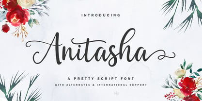 Anitasha is a modern pretty script font, organic, dynamic and energetic style. Can be used for various purposes such as the titles, signature, logos, correspondence, wedding invitations, letterhead, signage, labels, newsletters, posters, badges, etc. To enable the OpenType Stylistic alternates, you need a program that supports OpenType features such as Adobe Illustrator CS, Adobe Indesign & CorelDraw X6-X7, Microsoft Word 2010 or later versions. How to access all alternative characters, using Windows Character Map with Photoshop: https://www.youtube.com/watch?v=Go9vacoYmBw How to access all alternative characters using Adobe Illustrator: https://www.youtube.com/watch?v=XzwjMkbB-wQ Anitasha is coded with PUA Unicode, which allows full access to all the extra characters without having special designing software. Mac users can use Font Book and Windows users can use Character Map to view and copy any of the extra characters to paste into your favorite text editor/app. Thanks so much for looking and please let me know if you have any questions.
 - Bigelow Rules Pro by Stiggy & Sands,
$29.00 Bigelow Rules Pro is a serif display face that mixes everything up. It shuffles between lowercase and smallcap letterforms, it lifts the baseline to center beside the Capitals, some letters have a slight swash flair while others maintain a neutral stance, and yet it has a smallcaps feature that drops the smallcaps down to the baseline. Its just an all out fun fest waiting to be played with. Bigelow Rules Pro is loaded with features to give you plenty of customisation options: - A mix of small caps & lowercase forms for lowercase standard (vertically centered) - A SmallCaps feature for baseline aligned all SmallCaps letterforms. - A Full set of Inferiors and Superiors for Limitless Fractions - Tabular, Proportional, and Oldstyle figure sets - Stylistic Alternates feature for Caps to SmallCaps Approx. 653 Character Glyph Set: Bigelow Rules Pro comes with a glyphset that includes standard & punctuation, international language support, basic ligatures, alternate numeral styles, subscript and superscript, and Small Cap letters.
 - Marmellata Jar 01 by Fontscafe,
$39.00 When you think of marmalade or jam (that’s Marmellata in Italian), images of a happy breakfast table are conjured up into the mind, with of course the unforgettable emotive response accompanied. These emotions are exactly what our Marmellata fonts can conjure up for your designs as well (we agree, nothing can beat marmalade on a hot toast)! Our Jar 1 is ideal for all designs where you need to send across a feeling of care, childhood, comfort, motherhood or friendship...amongst all those ideas you will get on your own! With that classic breakfast table feel, you are sure to connect on a very comforting level with all those who view your designs using these fonts. May we suggest, these fonts go very well with unusually dull colours, and can add a spark of life to the most mundane of words! Try getting a taste of our Jar 2 if you want even more of the classic taste (sorry, touch!).
 - Dramatic Hearts by Mans Greback,
$49.00 Dramatic Hearts is a lovely script typeface. A romantic valentine typeface, Dramatic Hearts flows with love and passion. It has beautiful, swashy capital letters and its charming, hand-drawn character gives any project a true and genuine appearance. Use the parenthesis characters ( ) [ ] { } for decorative heart symbols. Use underscore _ anywhere in a word for swashes. Example: Restau_rant Use multiple underscore for different swashes. Example: Crea___tives The Dramatic Hearts family consists of eight styles: Regular and Bold, the swirly Swash and Swash Bold, plus each style as a slanted Italic. The font is built with advanced OpenType functionality and has a guaranteed top-notch quality, containing stylistic and contextual alternates, ligatures and more features; all to give you full control and customizability. It has extensive lingual support, covering all Latin-based languages, from North Europe to South Africa, from America to South-East Asia. It contains all characters and symbols you'll ever need, including all punctuation and numbers.
 - Celiya Script by Picatype,
$12.00 Celiya Script is a modern script with handwritten, decorative characters, and dancing basics! It's very suitable for use such as blog headings, branding, t-shirts, weddings, social media, product design, stationery, advertisements, clothing, book covers, business cards, greeting cards, branding, merchandise, invitations and handmade quotes and more. Celiya Script features alternate alternate OpenType features, binders and international support for most Western languages. To activate the OpenType Stylistic alternative, you need a program that supports OpenType features such as Adobe Illustrator CS, Adobe Indesign & CorelDraw X6-X7, Microsoft Word 2010 or newer versions. Celiya Script is coded with Unicode PUA, which allows full access to all additional characters without having special design software. Mac users can use the Font Book, and Windows users can use the Character Map to view and copy one of the additional characters to paste into your favorite text editor / application. If you have questions, feel free to contact me via email: picatypestudio@gmail.com Thank you!
 - Black Diamond by Set Sail Studios,
$16.00 Black Diamond isn't your average brush font, it’s raw, edgy & bursting with attitude! Hand-painted with extra attention to quick-strokes and dry textures, Black Diamond is guaranteed to deliver a loud, proud & unashamed message - ideal for logos, handwritten quotes, product packaging, merchandise, advertising, social media & branding projects. Black Diamond comes as a single font packed full of great features. It contains a full set of lower & uppercase letters, a large range of punctuation, numerals, and multilingual support. The font also contains several ligatures and stylistic alternates for those who have opentype capable software. Lastly you can add some finishing touches to your work with the added bonus extras; Just type out any of the square-bracket characters { } [ ] on your keyboard for quick and easy access to 4 different swashes, and the arrow up ^ key to produce paint splatters. Huge Language Update; Black Diamond has now been updated to support Greek & Cyrillic alphabets.
 - Flatline Sans by Up Up Creative,
$15.00Introducing Flatline, an elegant, modern sans serif font family. Meticulously drawn with high contrast between thick and thin strokes with the goal of making even the simplest sans serif letters look sensual, elegant, and warm. It’s perfect for headlines, editorial uses, and advertising projects. Makes beautiful luxe logos and wedding invitations, too. Flatline includes six styles (three weights each in both roman and italic), each of which includes nearly 500 glyphs. OpenType features include 20 standard and discretionary ligatures, a small number of character variants, three figure sets, four ampersand styles, and multilingual support (including multiple currency symbols). The OpenType features can be very easily accessed by using OpenType-savvy programs such as Adobe Illustrator and Adobe InDesign. (You can also access most of these features in Microsoft Word and other similar programs, but you'll need to get comfortable with the advanced tab of Word's font menu.) Find inspiration (and sneak peeks at my next font-in-progress) on: Instagram: http://instagram.com/julieatupupcreative My website: http://upupcreative.com