10,000 search results
(0.048 seconds)
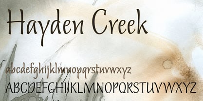
- Hayden Creek by Letters by Wordsworth,
$34.00 - MTF Dear Santa Pro by Miss Tiina Fonts,
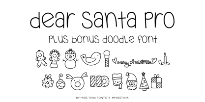
$9.00If you’re writing Santa a letter, use this adorable, handwritten childlike font! Dear Santa PRO not only gives you inspiration on how to start the letter, but it also has neat and original characters. This typeface duo also comes with some cute Christmas doodles to complement your writing. Have fun, and create something spectacular this Christmas! - Mountain Expedition by Vozzy,
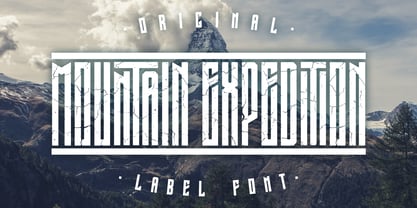
$10.00Introducing a vintage label font named Mountain Expedition. It contains capital and small characters. The small letters I created to support main design of the capital letters. Therefore the punctuation characters are designed to be used just with the capitals. Also the capital characters have a lot of ligatures. All available characters you can see on the preview. This strong typeface will be good viewed on vintage style posters, t-shirts, greeting cards, logo and more. - Flagstaff JNL by Jeff Levine,
$29.00Flagstaff JNL takes the lettering from Roma Initial Caps JNL and gives them the movement of an unfurled banner. For added effect, there are flagpoles facing in either direction on the lesser and greater keys. Left and right flag ends are placed on the parenthesis keys; a wide blank flag panel is on the left brace key and a narrow blank flag panel is on the right brace key. Letters only; no punctuation or extended characters. - Standard Request by Bogstav,
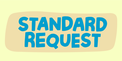
$18.00Standard Request is 100% handmade, and was inspired by both grafitti and comic book lettering. When viewed at large sizes, the handmade look and feel really stands out - at the same time, Standard Request, is super legible even at really small sizes. I've added 5 slightly different versions of each letter, and they automatically cycle as you type! - Hierra by John Moore Type Foundry,
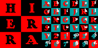
$29.90Hierra is a reinterpretation or redraw letter design of a font that appears in the collection of fonts of Dan X. Solo. Strong German flavor this is a letter of rough edges and a special blackness that recalls ancient typefaces Art & Crafts. Hierra is also presented in the Rough version which increases their antique woodtype appearance. - Tectura by Greater Albion Typefounders,
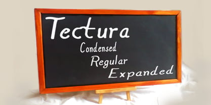
$11.95Tectura is hand drawn letters that come to you from the typefounders. It's all about those slight-but-telling imperfections that separate hand lettering—which this really is—from machine drawn imperfections. Use it for any work that needs an authentic touch of the human hand, it's genuinely hand drawn, yet clear and legible at all sizes. - FreeDee by HouseOfBurvo,
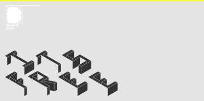
$-FreeDee is a re-draw of some experimental lettering first drawn during A-Level (just after high-school) art and design studies. It was originally purely self initiated, and one of the first things I used Illustrator to draw. This version takes the original handful of letters and extrapolates a full alphabet with basic latin accents. - Made In Japan JNL by Jeff Levine,
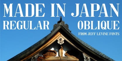
$29.00A set of rubber stamp letters, figures and punctuation used for marking electrical or communications equipment [and made in Japan] is the basis for this serif typeface. Varying widths and some letters in more of a block style than rounded are typical of Japanese packaging text from the 1950s and 1960s. Available in regular and oblique styles. - Nolan by Kastelov,
$55.00The idea behind Nolan is to create emotional response due to its inviting character and legibility. It is ideal for headlines, presentations, product signage and bespoke logotypes. Due to the structure of the letters, Nolan can also stand its ground in body text, although this is not its primary purpose. Nolan is created slightly wider than what is to be expected from a typical sans font, yet not to the point of being considered a wide typeface. This uniqueness lends the family an air of originality while adhering to already established standards in the creation of contemporary sans typefaces. Nolan has a large x-height, so as to deliver a better punch and be legible at a glance . Its clean and modern lines are reminiscent of architectural aesthetic. - Indie by Lián Types,
$37.00A FEW THOUGHTS Indie is a trendy script, result of the wide range of possibilities that can be achieved using a pointed brush. (1) “You Only Live Once” say The Strokes, (to me, symbols of indie music) so, what would represent that sensation of volatility better than a brush? As you may already know, this time inspiration came from hipsters and indies around us: We may sometimes criticise them, we may sometimes want to be like them, but the truth is that the universo gráfico they generated these past years is gigantic, full of colour and variations. (2) Brush lettering and Sign painting are fields I've been fond of since I started as a designer. Nowadays, these styles are getting a lot of attention and maybe it’s due to the undeniable mark of life that is materialised when using a brush. This tool is so expressive that shows the passions and fears of the artist, and materialises that idea of “living the present”, so popular in this era. When you see Indie, you think of skaters, rollers, surfers, hiphop dancers, street artists, summer, and why not? California beaches. So if you feel life is only one, it’s high time you got Indie into your fonts' collection! STYLES Indie comes in 4 styles plus another one which consists only in capitals. Indie; Indie Shade; Indie Shade Solo; Indie Inline are all open-type programmed and have exactly the same glyphs and metrics, so you can combine them without probem. (I.E. You may use Indie Inline, then write the same word using Indie Shade Solo, and finally put them together). In applications such as Adobe Illustrator, the font has nice results when fi ligatures is activated. However, if you want a more casual look, activate the contextual and the decorative ligatures. NOTES 1. After several years of practicing calligraphy I can say that to me, there’s nothing more satisfying than being able to create fonts out of your own handlettering. I owe a lot of this brush-style to Carl Rohrs. He was the very first calligrapher who taught it to me. His style is unique and what he can do with a brush is truly marvelous. I'm serious. 2. In spite of some particular cases, I can say I'm happy to live in a present in which Typography is living a kind of Renaissance along with Lettering. Like it happened with W. Morris a hundred years ago, handcrafts are being revalued/reborn, and some of this may be happening thanks to these indie designers that, trying to be unique, gave new/fresh air to different areas of graphic design. - Areplos by Storm Type Foundry,
$53.00To design a text typeface "at the top with, at the bottom without" serifs was an idea which crossed my mind at the end of the sixties. I started from the fact that what one reads in the Latin alphabet is mainly the upper half of the letters, where good distinguishableness of the individual signs, and therefore, also good legibility, is aided by serifs. The first tests of the design, by which I checked up whether the basic principle could be used also for the then current technology of setting - for double-sign matrices -, were carried out in 1970. During the first half of the seventies I created first the basic design, then also the slanted Roman and the medium types. These drawings were not very successful. My greatest concern during this initial phase was the upper case A. I had to design it in such a way that the basic principle should be adhered to and the new alphabet, at the same time, should not look too complicated. The necessary prerequisite for a design of a new alphabet for double-sign matrices, i.e. to draw each letter of all the three fonts to the same width, did not agree with this typeface. What came to the greatest harm were the two styles used for emphasis: the italics even more than the medium type. That is why I fundamentally remodelled the basic design in 1980. In the course of this work I tried to forget about the previous technological limitations and to respect only the requirements then placed on typefaces intended for photosetting. As a matter of fact, this was not very difficult; this typeface was from the very beginning conceived in such a way as to have a large x-height of lower-case letters and upper serifs that could be joined without any problems in condensed setting. I gave much more thought to the proportional relations of the individual letters, the continuity of their outer and inner silhouettes, than to the requirements of their production. The greatest number of problems arose in the colour balancing of the individual signs, as it was necessary to achieve that the upper half of each letter should have a visual counterbalance in its lower, simpler half. Specifically, this meant to find the correct shape and degree of thickening of the lower parts of the letters. These had to counterbalance the upper parts of the letters emphasized by serifs, yet they should not look too romantic or decorative, for otherwise the typeface might lose its sober character. Also the shape, length and thickness of the upper serifs had to be resolved differently than in the previous design. In the seventies and at the beginning of the eighties a typeface conceived in this way, let alone one intended for setting of common texts in magazines and books, was to all intents and purposes an experiment with an uncertain end. At this time, before typographic postmodernism, it was not the custom to abandon in such typefaces the clear-cut formal categories, let alone to attempt to combine the serif and sans serif principles in a single design. I had already designed the basic, starting, alphabets of lower case and upper case letters with the intention to derive further styles from them, differing in colour and proportions. These fonts were not to serve merely for emphasis in the context of the basic design, but were to function, especially the bold versions, also as independent display alphabets. At this stage of my work it was, for a change, the upper case L that presented the greatest problem. Its lower left part had to counterbalance the symmetrical two-sided serif in the upper half of the letter. The ITC Company submitted this design to text tests, which, in their view, were successful. The director of this company Aaron Burns then invited me to add further styles, in order to create an entire, extensive typeface family. At that time, without the possibility to use a computer and given my other considerable workload, this was a task I could not manage. I tried to come back to this, by then already very large project, several times, but every time some other, at the moment very urgent, work diverted me from it. At the beginning of the nineties several alphabets appeared which were based on the same principle. It seemed to me that to continue working on my semi-finished designs was pointless. They were, therefore, abandoned until the spring of 2005, when František Štorm digitalized the basic design. František gave the typeface the working title Areplos and this name stuck. Then he made me add small capitals and the entire bold type, inducing me at the same time to consider what to do with the italics in order that they might be at least a little italic in character, and not merely slanted Roman alphabets, as was my original intention. In the course of the subsequent summer holidays, when the weather was bad, we met in his little cottage in South Bohemia, between two ponds, and resuscitated this more than twenty-five-years-old typeface. It was like this: We were drinking good tea, František worked on the computer, added accents and some remaining signs, inclined and interpolated, while I was looking over his shoulder. There is hardly any typeface that originated in a more harmonious setting. Solpera, summer 2005 I first encountered this typeface at the exhibition of Contemporary Czech Type Design in 1982. It was there, in the Portheim Summer Palace in Prague, that I, at the age of sixteen, decided to become a typographer. Having no knowledge about the technologies, the rules of construction of an alphabet or about cultural connections, I perceived Jan Solpera's typeface as the acme of excellence. Now, many years after, replete with experience of revitalization of typefaces of both living and deceased Czech type designers, I am able to compare their differing approaches. Jan Solpera put up a fight against the digital technology and exerted creative pressure to counteract my rather loose approach. Jan prepared dozens of fresh pencil drawings on thin sketching paper in which he elaborated in detail all the style-creating elements of the alphabet. I can say with full responsibility that I have never worked on anything as meticulous as the design of the Areplos typeface. I did not invent this name; it is the name of Jan Solpera's miniature publishing house, in which he issued for example an enchanting series of memoirs of a certain shopkeeper of Jindrichuv Hradec. The idea that the publishing house and the typeface might have the same name crossed my mind instinctively as a symbol of the original designation of Areplos - to serve for text setting. What you can see here originated in Trebon and in a cottage outside the village of Domanín - I even wanted to rename my firm to The Trebon Type Foundry. When mists enfold the pond and gloom pervades one's soul, the so-called typographic weather sets in - the time to sit, peer at the monitor and click the mouse, as also our students who were present would attest. Areplos is reminiscent of the essential inspirational period of a whole generation of Czech type designers - of the seventies and eighties, which were, however, at the same time the incubation period of my generation. I believe that this typeface will be received favourably, for it represents the better aspect of the eighties. Today, at the time when the infection by ITC typefaces has not been quite cured yet, it does absolutely no harm to remind ourselves of the high quality and timeless typefaces designed then in this country.In technical terms, this family consists of two times four OpenType designs, with five types of figures, ligatures and small capitals as well as an extensive assortment of both eastern and western diacritics. I can see as a basic text typeface of smaller periodicals and informative job-prints, a typeface usable for posters and programmes of various events, but also for corporate identity. Štorm, summer 2005 - Doyen-D by Substance,
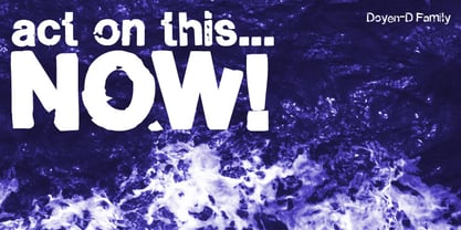
$12.00 - Bubbly Hills by Okaycat,
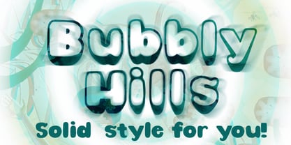
$24.50Bubbly Hills is the classic style bubble letter font! Combine the 3-D & flat letter styles, or use these styles separately..... many different looks can be created! There is a sprinkling of dingbats scattered around the alternates, just there to make this font extra fun and useful . Check it out! Bubbly Hills is extended, containing West European diacritics & ligatures, making it suitable for multilingual environments & publications. - Jodler by Beau Williamson,
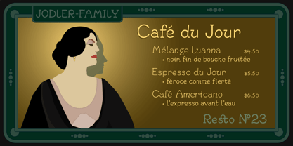
$4.99Inspired by show card lettering and the more human side of art deco, I wanted this font to retain the casual unevenness of informal hand lettering. As decorative as the font looks, I do envision it being used for text more than display. Obviously not a workhorse, but rather a quirky niche font. I find it makes dense philosophic texts more friendly to read. - LineDrive by Ingrimayne Type,
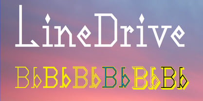
$12.95LineDrive was inspired by an obscure 19th century type design. It has no curved lines and what are normally circular elements in the lower-case letters are diamond-shaped. It might work best with only upper-case letters, which have a Victorian feel to them. In addition to the two weights of plain and bold, the family includes a shadowed version and an inline (or outlined) version. - Wacky Duck NF by Nick's Fonts,
$10.00A postcard for a 1952 DeSoto automobile, combined with the (non)sensibilities of legendary British lettering artist Cecil Wade, yielded this slightly tacky and thoroughly wacky gaggle of letters. Use liberally whenever levity, brevity (the soul of wit), or a bit of mischief is called for. Both versions of the font include 1252 Latin and 1250 CE (with localization for Romanian and Moldovan) character sets. - Komunidad Hebrew Script by Jonahfonts,
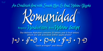
$42.00Komunidad is the Hebrew version of ”Quintana Light”. Suitable for logos and packaging statements. Invoking the OpenType / CONTEXTUAL variant produces the word terminals for all lower-case letterforms as well as diacritic letters. Final Hebrew Glyphs are also added. This can be done individually for each letter as well. Komunidad also contain alternative Swashes and TabOldstyle numerals. (OpenType-Variants may only be accessible via OpenType-aware applications.) - Fake Limp by Bogstav,
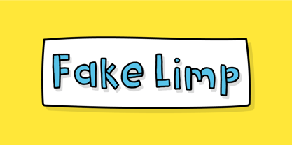
$17.00Fake Limp is my layered handmade sans font - use it for your craft project, or anything that needs a handcrafted and organic look. I've added 5 different versions of each lowercase letter, and they automatically cycle as you type. Furthermore There are 4 versions of the font (each with the same amount of lowercase letters!) - mix and match these versions for the result you like! Enjoy! :) - Junius by Eurotypo,
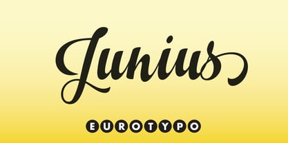
$34.00Are you looking for a new casual and organic script font? Please take a look at Junius! The Junius font is the perfect combination of sleek and casual that is best used in OpenType compatible software. This font contain 797 glyphs, equipped with plenty of OpenType features. Upper case letters can alternate between at least two different forms. Lowercase letters have at least six more options to avoid repetition. These effects include initial and final forms of lowercase letters. In addition, there is a set of 65 ornaments designed to support the font (accessing the ornaments through the Glyph palette). Some of these ornaments were specially designed to be combined with the letters for a "more calligraphic" effect. Junius font can be the option used to create titles, logos and posters for brand and packaging purposes. I hope you enjoy it. - Mirtha Display by Nois,
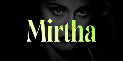
$24.00Mirtha Display is a modern display font with distinct Art Nouveau details. Its lighter weights are condensed and sophisticated, while the heavier weights have a more powerful effect, making it perfect for headlines, posters, branding, logos, packaging and more. With a set of over 450 glyphs, this font supports a wide range of languages. Key OpenType Features include numerators and denominators, Old Style and Lining numbers, standard ligatures and localized characters such as Uppercase and Lowercase Sharp S. Mirtha Display covers 5 weights, 10 styles and 2 Variable cuts (regular and italic) to give you more design flexibility. Any suggestion to continue improving Mirtha Display will be welcome, do not hesitate to contact us! - Aloe by ROHH,
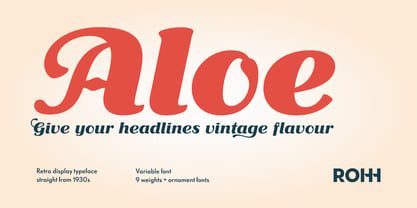
$29.00Aloe is a characterful and friendly display font family inspired by headlines from 1930’s newspapers and calligraphy. The family consists of 9 weights, ranging from Thin to Heavy, with matching ornament fonts. It features a variable font with weight axis. Each weight has over 900 glyphs including advanced typographic features, such as vast number of stylistic alternates, swashes, titling and terminal forms, case sensitive forms, ligatures, symbols, ornaments as well as lining and old style figures, fractions, subscripts and superscripts. This original mixture of display typeface with calligraphy gives a versatile family great for all sorts of uses - from advertising, packaging, branding, wedding invitations, menu cards and other editorial uses to screen and web projects. - Histories Family by Graptail,
$19.00Since the beginning, “Histories” has been inspired by the shape of the letters displayed on the cover of fairy tale books or animated film covers. Likewise with the naming of the font "Histories" so that the message of the letters is conveyed. And this stylistic combination should also be reflected in the lowercase set which also allows to open up a spectrum of possible uses. Basic calligraphy represents a solid basis for the development of lowercase glyphs, ensuring proper interaction with uppercase letters. “Histories” features multiple ligatures that combine the playerful structure with a more attractive feel. With glyphs, it provides a wide range of uses across ligature combinations, alternate marks, pre-caps, assortments and connectors; each of which can be accessed via Open Type. - Guadalupe by Rodrigo Navarro Bolado,
$32.00Article to appear on the font family page: According to the Catholic faith, a well known náhuatl story called "Nican Mopohua" (translated as "Here it's narrate") about the Marianas apparitions on the Tepeyac's hill, to the north of the actual Mexico City. After four apparitions, La Virgen de Guadalupe (LVG) told Juan Diego (JD) that he must introduce himself to the first Bishop of Mexico. JD took in his "ayate" some roses (that aren't natives to Mexico's barren territories) and when he dropped them in front of the bishop, the image of LVG appeared in front of him with indigenous features. I’ve worked a lot in this font that appears to came out of nowhere, just like the image of LVG itself, the fact is that I started first sketching some flowers, because I wanted to do something related to this mexican story, so, taking some features from this flowers I started sketching some letters, for example “r” and “i” and the counter forms for some letters like “a” and “o” (that I didn’t use by the way) and the punctuation marks, all inspired by this leaf forms. Lighter weight coming soon! Hope you like it. Any comments: rodrigonabo@gmail.com - Albia Nova by Greater Albion Typefounders,
$9.50Albia Nova is a bit of a new departure for Greater Albion-an unashamedly futuristic typeface. It was originally developed for a friend of ours-a set designer who needed some lettering on props for a science fiction play-the brief was to evolve conventional letter forms and speculate as to what they may look like in the future. As released Albia Nova is a more refined version of this idea, placing a bit more emphasis on readability (today) over evolution of the letterforms. The result is good for giving design projects a futuristic feel, but also has something of the 1970s and 1980s about it. - Forest Hill by PeachCreme,
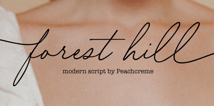
$20.00Meet our brand new script font - Forest Hill! It is a modern casual font with a full set of easygoing letters, numerals, and punctuation. The main feature of this font is that the letters are not separated. Just look how all the letters connect one by one and form one whole piece of writing. Featuring fabulous beginning and ending lowercase swashes, Forest Hill was inspired by clean handwriting with a natural flow and works well for various designs from wedding stationery to Instagram quotes, modern logos, packaging, websites, and many more. - Blueprint by Monotype,
$29.99Blueprint is an informal typeface designed by Monotype. A stylized handwritten letterform, Blueprint fills the need for a draughtsman-like typeface. The first letters drawn were capitals, the lowercase were added later to create a fully functional typeface. Designed to look like hand lettering but without any joining lowercase, this Blueprint font family is very legible and is well suited to any casual or informal application. Excellent for use in text, Blueprint is ideal in a wide range of setting, including: manuals, letters, faxes, presentations, instruction books and packaging. - Rossellina by GRIN3 (Nowak),
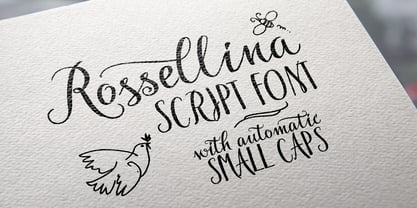
$28.00Rosselina is a handwritten, fully connected script with ligatures and contextual alternates to help with flow and readability. It can be used for invitations, greeting cards, posters, advertising, weddings, books, menus etc. Every lowercase letter has at least two variations. To get the alternate glyph just add "+" before the letter in any OpenType savvy application or manually choose the character from Glyph Palette. When you type uppercase letters they will change to Small Caps. Language support includes Western, Central and Eastern European character sets, as well as Baltic and Turkish languages. - Cat Burglar PB by Pink Broccoli,
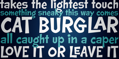
$16.00Cat Burglar is another off-kilter sans-serif font by Pink Broccoli, this time inspired by the titling of a 1961 Looney Tunes cartoon called "The Pied Piper of Guadalupe". As with some of my previous type designs, it is a typographic drunken stumble, wonderfully and awkwardly stumbling across designs, surprising with each letter typed. With an extensive character set, and offbeat letter weighting, Cat Burglar is fun to typeset with, with a collection of double letter ligatures, as well as discretionary ligature combinations that add to the quirky playfulness. - Sassoon Infant by Sassoon-Williams,
$48.00An upright typeface family developed to meet the demand for letters to produce pupil material for handwriting as well as for reading. Upright letters with extended ascenders and descenders are ideal on screen. They facilitate word recognition. The exit strokes link words together visually, and in handwriting they lead to spontaneous joins along the baseline leading logically to a joined-up hand. Teachers can print desk strips, charts of letter families and alphabet friezes, as well as consistent material across the curriculum. Together these typefaces provide a valuable resource for special needs teachers. When starting point and stroke direction has been learned, the arrow font (Tracker B) can be dropped and the simpler Tracker font used. Tracker B font, with its direction arrows helps pupils to start in the correct place. Motor movements can be refined by keeping inside the line. When starting and direction is no problem, the arrow can be dropped and the plain Tracker font used. When starting point and stroke direction have been learned, the arrow font (Dotted B) can be dropped and the simpler Dotted font used. Free to download resources How to access Stylistic Sets of alternative letters in these fonts Purchasers of this font package may use their Order Number to receive a free Copybook PDF by Rosemary Sassoon recommended for effective teaching - Mr Orange by Hipopotam Studio,
$28.00Mr Orange is a typeface based on our handwritten letters which we used in some of our books H.O.U.S.E, D.E.S.I.G.N and Who Eats Whom. It has up to three alternate glyphs for each character, even for every diacritic letter. We do use our fonts in our books so we know that switching alternate glyphs can be a pain in the ass. Thats why we’ve created a very cool Contextual Alternates feature. It automatically sets alternate glyphs depending on frequency of appearance of the same character. The script doesn’t throw random glyphs. It’s checks if lets say letter “A” appears more then once in a sequence of characters. For example in the word “ANAKONDA”, the third “A” and the second “N” would be changed to glyphs from first stylistic set, the second “A” would also be changed but to glyph from second stylistic set. We’ve designed different rules for basic characters and different for diacritics and punctation. It really works great but of course you can always fine tune it by hand. This option has one obvious advantage for web fonts. Browsers that support OpenType calt feature will be able to display alternate characters. And since you can’t put by hand alternate glyphs on your website this is the only way to use them. - Linotype Compendio by Linotype,
$40.99Linotype Compendio is a part of the Take Type Library, chosen from the contestants of the International Digital Type Design Contests from 1994 and 1997. Christian Bauer designed this font based on the basic forms of Transitional faces of the 17th century. The outer contours of the letters are purposely raw and irregular, much like alphabets printed on low-quality paper. The legibility of the font is thus reduced, making it necessary to use this font only for shorter texts or headlines, but it is exactly this characteristic which lends Linotype Compendio its distinctiveness. - Jack Stanislav by deFharo,
$22.00Very condensed typography, thick line and fun look for headlines and advertising where you are looking for saving space and originality at the same time. The upper inclination of the letters, the combination of horizontal with inclined forms, the ascending and descending short, and the lower elongation of some antlers will allow you to print varied styles with a lot of movement according to the context of the design. I started drawing this font with the intention of creating a new decorative typeface Blackletter style but modernizing the strokes, after drawing several letters imitating the ductus of this type of fonts trying to simplify them, emerged all the DNA of the current Jack Stanislav, finally a retro typography without Serif of linear strokes that mimic the angle of a thick pen. Use the following keys to write the bitcoin symbol and the Jack icon: b #, a # - Challah Display by Typophobia,
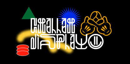
$25.00Challah is a display font containing 295 glyphs. Letters are very diverse, but because they contain several shapes characteristic for each other - they retain a certain coherence. When creating the font, the main inspiration was to take from the Brazilian graffiti trend - Pichação and Korean typography. Most of the letters are the same size and width, however, when designing, we also tried to include at certain moments small "surprises" that will surely interest and surprise the user of the above-mentioned typeface. The font fits very well into the urban structure, therefore it perfectly matches the art on the walls with the art on the billboards, creating a kind of dialogue. - Sticky Shoes by Bogstav,
$15.00Sticky Shoes was inspired by a sign at a local flea market. The artist behind the sign obviously didn’t care much about painting the letters “in the right way” - leaving a slobby and uneven impression. And what is wrong with that? Nothing, if you ask me. I tried my best to capture the charm and innocence behind that sign in Sticky Shoes. I even made the paint version go outside the outline in the Regular version! I added 6 different versions of each letter, and they automatically changes as you type. That goes for all 4 versions, and they even mix very nicely! - Dancing Marathon JNL by Jeff Levine,
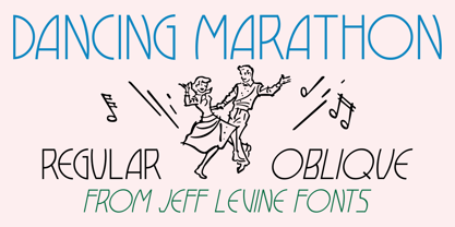
$29.00The hand lettered title found on the cover of the 1932 sheet music for “Dancing Marathon” inspired the digital revival of this unusual lettering as well as the font’s name. This eccentric Art Deco design (with a slight bit of Art Nouveau mixed in) is a thin, monoline typeface. Dancing Marathon JNL is available in both regular and oblique versions. Dance marathons got their start during the Great Depression as people desperate to earn a few dollars would enter into contests that went on for hours until the last couple remained standing on the dance floor. - Pietra LP by LetterPerfect,
$39.00Pietra is a Baroque-inspired, all-majuscule type design, based on the massive five-foot tall mosaic lettering high above the floor in St. Peters in Rome. The font includes two sets of capitals: full sized, proportioned on the actual lettering; and small capitals, scaled vertically to capture the foreshortened effect of viewing the lettering from the floor. It was designed by Garrett Boge in 1996. Pietra is part of the LetterPerfect Baroque Set. - Echowarp by Luxfont,
$18.00Introducing Echowarp is an unusual COLORED font family. Main idea of this font is that a colored echo spreads and fades from minimalistic letters to the sides. Distorted letters give the effect of temporary refraction. The originality of this family is primarily suitable for a bold design. And if you add a random distortion in a graphics program to the finished heading written in this font, the inscription will turn into an absolutely unique and inimitable one. Futuristic set has 23 fonts in the family! Do not limit your imagination, because the font opens up a huge space for creative experiments. Check the quality before purchasing and try the FREE DEMO version of the font to make sure your software supports color fonts. Features: Free Demo font to check it works Letters with color echo & distortion 23 OTF SVG color fonts in the family Gradient and hologram fonts Kerning IMPORTANT: - OTF SVG fonts contain vector letters with gradients and transparency. - Multicolor OTF version of this font will show up only in apps that are compatible with color fonts, like Adobe Photoshop CC 2017.0.1 and above, Illustrator CC 2018. Learn more about color fonts & their support in third-party apps on www.colorfonts.wtf - Don't worry about what you can't see the preview of the font in the tab "Individual Styles" - all fonts are working and have passed technical inspection, but not displayed, they just because the website MyFonts is not yet able to show a preview of colored fonts. Then if you have software with support colored fonts - you can be sure that after installing fonts into the system you will be able to use them like every other classic font. Question/answer: How to install a font? The procedure for installing the font in the system has not changed. Install the font as you would install the classic OTF | TTF fonts. How can I change the font color to my color? Adobe Illustrator: Convert text to outline and easily change color to your taste as if you were repainting a simple vector shape. Adobe Photoshop: You can easily repaint text layer with Layer effects and color overlay. ld.luxfont@gmail.com - WildWords by Comicraft,
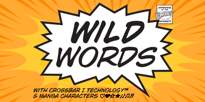
$49.00Created for Jim Lee's Wildstorm books, WildWords has proved to be one of our most popular fonts and has been featured in TIME magazine and the LEGO catalog, as well as used to letter thousands of Manga pages. Comicraft fonts are created BY comic book letterers FOR lettering comic books. Accept no substitutes! See this family related to WildWords: Wild Words Lower - Aisle Seats JNL by Jeff Levine,
$29.00The Redikut Letter Company of Hawthorne, California specialized in die-cut cardboard display letters used by sign makers to achieve a three-dimensional effect on show card and display work. A set of these letters purchased by Jeff Levine brought back memories of classic movie houses with their fancy display and lobby cards, and thus was created "Aisle Seats JNL".
