10,000 search results
(0.06 seconds)
- South Central by Loshaj Foundry,
$9.00 "To us it ain't vandalism. It's just letting the people know: We grew up here. This is our neighborhood. And as they pass by they know where we're at." – Los Angeles gang member Graffiti is equivalent to local news, its intended purpose is to inform general populace where gang members are, where they operate, as far as territory lines, and which neighborhoods are at war. Gang Graffiti can be used for: – Marking territory with graffiti. – It's a form of gang advertisement. – Letting people know who's in the gang, living, dead, or in prison. – Which neighborhoods they are at war with. – Who are their allies. Graffiti has along history, specifically Los Angeles gang graffiti, which has has been around since the 1930s. South Central typeface includes uppercase letters, numbers, and select punctuation glyphs.
 - El Guapo by A New Machine,
$19.00 El Guapo is a hand drawn font available in sans serif and script faces. It is suitable for headlines and call outs of all kinds where a hand made look is desired. The letters were drawn by Prissy Pots owner Erin Solomon and include regular and bold versions. Each face also includes an entirely separate set of lowercase letters accessible in your glyphs palette. These extra letter will automatically show up with contextual alternates turned on for a more natural, random look.
 - Revisthond by Namara Creative Studio,
$18.00 Introducing Revisthond Script : An authentic monoline hand-drawn script font, perfect for branding, wedding invites, cards, and/or any other suitable projects. Includes full set of gorgeous uppercase and lowercase letters, numerals, a large range of punctuation, alternates, and ligatures. All lowercase letters include beginning and ending swashes, giving realistic hand-lettered style. In order to use the beautiful swashes, you need a program that supports OpenType features such as Adobe Illustrator CS, Adobe Photoshop CC, Adobe Indesign and Corel Draw.
 - Saturday Brunch by Rachel White Art,
$18.00 Saturday Brunch is a smooth script. It fits into tight and tall places, has big loops, and lots of attitude. Saturday Brunch has a set of alternate lowercase letters with no tails (which are coded to work with tricky letters like x and z who don't play well with tails), a bunch of double letter ligatures, and a few fun alternates, like t's with long swooping crossbars, and 3 alternate ampersands so you can pick the perfect style for your project.
 - Nerves of Steel BB by Blambot,
$9.00 Here's a deluxe comic book dialogue font with a vintage feel! Nerves of Steel BB comes with Regular, Italic, Bold, and Bold Italic. Contextual Alternates and Auto-ligatures enable six versions of every letter, and three versions of each number, the exclamation point and question mark. Barred-I correction is included as well as bouncy baselines when three or more duplicate letters are typed. To top it off, you get glyphs included for manga letterers, and a large European set of characters!
 - Agasiz by Putracetol,
$24.00 Agaiz - Modern Display Font. Inspired from unique typography and lettering in the elegant alphabet from modern megazine and we combine with elegant typography style. With modern ligature you can make great lettering for beautiful artwork. Come with open type feature ( a lot of alternates and end swash), its help you to make great lettering. Agaiz best uses for Logotype, heading,cover, poster, logos, quotes, product packaging, header, merchandise, social media & greeting cards and many more. Agaiz font is also support multi language.
 - Faikinlan by IRF Lab Studio,
$11.00 Introducing Faikinlan Tattoo Lettering Font with more details, clean, and more complex. Faikinlan includes uppercase and lowercase letters, numerals, a large range of punctuation, ligatures and multilingual language. All lowercase letters include ending swashes and alternative font. Faikinlan swash In order to use the beautiful swashes, you need a program that supports OpenType features such as Adobe Illustrator CS, Adobe Photoshop CC, Adobe Indesign and Corel Draw. Please contact us if you have any question, we are happy to help you! Thank you !
 - Fan Script by Sudtipos,
$99.00 A friend of mine says that sports are the ultimate popular drug. One of his favorite things to say is, “The sun’s always shining on a game somewhere.” It’s hard to argue with that. But that perspective is now the privilege of a society where technology is so high and mighty that it all but shapes such perspectives. These days I can, if I so choose, subscribe to nothing but sports on over a hundred TV channels and a thousand browser bookmarks. But it wasn't always like that. When I was growing up, long before the super-commercialization of the sport, I and other kids spent more than every spare minute of our time memorizing the names and positions of players, collecting team shirts and paraphernalia, making up game scenarios, and just being our generation’s entirely devoted fans. Argentina is one of the nations most obsessed with sports, especially "fútbol" (or soccer to North Americans). The running American joke was that we're all born with a football. When the national team is playing a game, stores actually close their doors, and Buenos Aires looks like a ghost town. Even on the local level, River Plate, my favorite team where I grew up, didn't normally have to worry about empty seats in its home stadium, even though attendance is charged at a high premium. There are things our senses absorb when we are children, yet we don't notice them until much later on in life. A sport’s collage of aesthetics is one of those things. When I was a kid I loved the teams and players that I loved, but I never really stopped to think what solidified them in my memory and made them instantly recognizable to me. Now, thirty-some years later, and after having had the fortune to experience many cultures other than my own, I can safely deduce that a sport’s aesthetic depends on the local or national culture as much as it depends on the sport itself. And the way all that gets molded in a single team’s identity becomes so intricate it is difficult to see where each part comes from to shape the whole. Although “futbol” is still in my blood as an Argentinean, I'm old enough to afford a little cynicism about how extremely corporate most popular sports are. Of course, nothing can now take away the joy I got from football in my childhood and early teens. But over the past few years I've been trying to perceive the sport itself in a global context, even alongside other popular sports in different areas of the world. Being a type designer, I naturally focus in my comparisons on the alphabets used in designing different sports experiences. And from that I've come to a few conclusions about my own taste in sports aesthetic, some of which surprised me. I think I like the baseball and basketball aesthetic better than football, hockey, volleyball, tennis, golf, cricket, rugby, and other sports. This of course is a biased opinion. I'm a lettering guy, and hand lettering is seen much more in baseball and basketball. But there’s a bit more to it than that. Even though all sports can be reduced to a bare-bones series of purposes and goals to reach, the rules and arrangements of baseball and basketball, in spite of their obvious tempo differences, are more suited for overall artistic motion than other sports. So when an application of swashed handlettering is used as part of a team’s identity in baseball or basketball, it becomes a natural fit. The swashes can almost be visual representation of a basketball curving in the air on its way to the hoop, or a baseball on its way out of the park. This expression is invariably backed by and connected to bold, sleak lettering, representing the driving force and precision (arms, bat) behind the artistic motion. It’s a simple and natural connective analysis to a designer, but the normal naked eye still marvels inexplicably at the beauty of such logos and wordmarks. That analytical simplicity was the divining rod behind Fan Script. My own ambitious brief was to build a readable yet very artistic sports script that can be a perfect fit for baseball or basketball identities, but which can also be implemented for other sports. The result turned out to be quite beautiful to my eyes, and I hope you find it satisfactory in your own work. Sports scripts like this one are rooted in showcard lettering models from the late 19th and early 20th century, like Detroit’s lettering teacher C. Strong’s — the same models that continue to influence book designers and sign painters for more than a century now. So as you can see, American turn-of-the-century calligraphy and its long-term influences still remain a subject of fascination to me. This fascination has been the engine of most of my work, and it shows clearly in Fan Script. Fan Script is a lively heavy brush face suitable for sports identities. It includes a variety of swashes of different shapes, both connective and non-connective, and contains a whole range of letter alternates. Users of this font will find a lot of casual freedom in playing with different combinations - a freedom backed by a solid technological undercurrent, where OpenType features provide immediate and logical solutions to problems common to this kind of script. One final thing bears mentioning: After the font design and production were completed, it was surprisingly delightful for me to notice, in the testing stage, that my background as a packaging designer seems to have left a mark on the way the font works overall. The modern improvements I applied to the letter forms have managed to induce a somewhat retro packaging appearance to the totality of the typeface. So I expect Fan Script will be just as useful in packaging as it would be in sports identity, logotype and merchandizing. Ale Paul
 - Schotis Text by Huy!Fonts,
$35.00 Schotis Text is a workhorse typeface designed for perfect reading on running texts. Its design is based in Scotch Roman 19th-century style but designed from scratch, with a more contemporary and not nostalgic look. It has seven weights plus matching italics, with 1100 glyphs per font, with a very extended character set for Latin based languages as well as Vietnamese, and shows all its potential with OpenType-savvy applications. Every font includes small caps, ligatures, old-style, lining, proportional and tabular figures, superscript, subscript, numerators, denominators, and fractions. The Scotch Romans were one of the most used letters during the 19th and early 20th century, but they don’t have their own place in the main typographical classifications. They appeared at the beginning of the 19th century with Pica No. 2 in the catalog of William Miller (1813) and assumed the British route towards high contrast and vertical axis modern Romans. In fact, they were called just Modern. In opposition to the continental route of Fournier, Didot, and Bodoni, the English way opted for a wider, more legible letter also resistant to bad printing conditions. The name Schotis comes from the misspelling of Scottish that gave the name to a popular dance in Madrid in the 19th-century. It first was called Schotis and today is knows as Chotis.
 - Withrose by Sakha Design,
$14.00 Withrose is a romantic and elegant handwritten font. Its distinct and well rounded letters make this font a masterpiece. Fall in love with its incredibly versatile style and use it to create spectacular designs! Withrose is PUA encoded which means you can access all of the glyphs and swashes with ease!
 - Click Clack by Fonthead Design,
$15.00ClickClack is a family designed by Ethan Dunham that is made of hand-drawn typewriter letters. An actual sample of a typewriter alphabet was blown up and carefully traced into the two versions, regular and light. This family has a bouncy, informal feel and is a departure from other typewriter fonts. - FE 5 Cent by Egor Stremousov,
$50.00 5 pixel font for games, display and web. 748 glyphs support for over 89 languages. The 5 Cent font is designed for extremely small font size. To be precise, usual height of capital letters in this font is just 5 pixels and height of lowercase chars equals to 4 pixels.
 - Celebration by RMU,
$35.00 A blackletter font of decorative style and of obscure origin which was rescued for all devotees of these old hot-metal letters. This font contains a bunch of useful ligatures, and by typing 'N', 'o' and period and activating the OT feature Ordinals you get an old-style number sign.
 - Sportfield Varsity by Rvandtype,
$9.00 Sportfield Varsity is a Sport Font Family. It’s perfect for all your athletic and sports-related designs. With its strong and angular letters, this font conveys a sense of power and motion, making it the ideal choice for logos, headlines, and other graphic elements that need to make a big impact.
 - Magical Snow by Sronstudio,
$15.00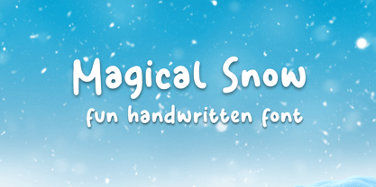 Magical Snow is a Handwritten Font, this font Is perfect for product packaging, product designs, label, photography, watermark, special events, or anything. The Snowday comes with uppercase and lowercase letters, multilingual symbols, numerals, punctuation. If you have any questions please don't hesitate to drop me a message :) Thank You, Sronstudio
 - Eccentric Wood Type JNL by Jeff Levine,
$29.00 An online display of pages from a book on wood type fonts provided an example of a bold, eccentric slab serif design with unusual curves and letter shapes. This font’s eccentricities became the basis for its name, Eccentric Wood Type JNL – which is available in both regular and oblique versions.
 - Rossela by Letterena Studios,
$17.00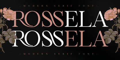 Rossela is an elegant, distinct and stylish serif font. This typeface is perfect for an elegant & luxury logo, book or movie title design, fashion brand, magazine, clothes, lettering, quotes, and so much more. It is also PUA encoded which means you can access all of the glyphs and swashes with ease.
 - Best Hero by Yoga Letter,
$16.00 "Best Hero" is an elegant and unique font with star decoration on each letter. This font is equipped with uppercase, lowercase, numerals, punctuations, multilingual support. Very suitable for the nuances of struggle, 4th of july, teacher, father's day, graduation, film titles, magazines, book titles, promotions, banners, branding, stickers and others.
 - Stylized Deco JNL by Jeff Levine,
$29.00 In their book "Lettering of Today" by W. Ben and Ed C. Hunt, an Art Deco "thick and thin" alphabet with some stylized characters (which leaned a lot toward a calligraphic style) stood out from the rest. This is now available as Stylized Deco JNL, in both regular and oblique versions.
 - Original Script by Monotype,
$29.99This script collection is used in advertising, invitations, greeting cards, and wherever a formal hand-lettered or engraving look is desired. Original Script has an elegant connecting alphabet based on formal handwriting. The Original Script font is a safe choice for invitations to weddings and formal occasions, and personal stationery. - AZ Script by Artist of Design,
$25.00 AZ Script font was inspired from a need to have a "worn look" on bold headline script of letters This font utilizes an "old look" to the line work which is designed to have a "worn feel" to it. Ideal for use as headline or sub-head text in you design.
 - HT Maison by Dharma Type,
$19.99 HT Mason is bold and hand painting font. This font is retrospective and decent, but it is also funny and cute. Holiday Type Project offers retro hand drawing scripts. Inspired by retro script on shopfront lettering, wall paint advertisements in Italy around 1950s. Check out the script fonts from Holiday Type!
 - Everleigh by Gleb Guralnyk,
$14.00 Everleigh is an elegant thin typeface inspired by antique old school fonts. It includes lots of ligatures and stylistic alternates helps to create an authentique and original lettering compositions. Also this font has multilingual support. Check out all available characters on the previews. Thank you and have a nice day!
 - Ragtime by ITC,
$29.00Ragtime was designed by Alan Meetks, an all capital condensed sans serif typeface. It features thick/thin weight variances and fine line casing adornment which recalls magazine styles of the 1940s. This typeface should not be letter spaced too closely. Ragtime is excellent for anything requiring an elegant, refined look. - LOLO Cursive by Okaycat,
$32.50LOLO Cursive is sweet & funky lettering written with distinct character. Create a memorable look with this flowering, freehand script. In this font I envisioned a style with a grassroots flavor, yet a fashionista's edginess. Small, distressed detailing contrasts beautifully with the rolling curves of this feminine hand-style. The strokes are punky yet refined - for widest appeal. LOLO Cursive is extended, containing West European diacritics & ligatures, making it suitable for multilingual environments & publications. Go ahead and have fun with it! - BORCHA by Top Type,
$9.00 Hello there.. I introduce to you a new work by the name of BORCHA. This font has an attractive style as well as elegant. In addition, this font is also equipped with several ligature features, stylistic alternate and stylistic set so that it can be the best work in each of your work. This font can be used to create letters, advertisements, logos, banners, web, and everything else. Thank you, glad to be able to contribute to your best work.
 - Okelani Script by Fontop,
$14.00 Tropical temptation with Okelani script. Cute hand lettered font inspired by Hawaii islands’ natural beauty and zest. Stylistic alternates gives an additional handmade mood. Your quotes, wedding items would look sooo cute with this font. Also is perfect for social media texts, blogs and much more. Font is Latin multilingual and have uppercase letters, lowercase letters, numbers and basic punctuations.
 - Comalle by Latinotype,
$49.00 Comalle is an organic typeface that rescues some elements of handwritten script, but its stroke does not necessarily answer to a literal calligraphy structure. So Comalle could produce a powerful impact on the page, it was designed with thicker strokes than its counter forms. The objective is that the black of the letter fills the page and causes a fastest visual impact than typographies that balance blacks and whites. One of the most important tasks of the Comalle design was to think of how to handle the unequal percentages of blacks and whites in the typeface. The peculiar thing, is that the precision work of the letter does not make the blacks, but the whites; this is the reason why in one first instance it was very valid to start off designing in a very gross way, nevertheless, the majority energies are put in the details of the design of counter space. From the drained filling concept of forms Comalle was born, a typeface that pretends to enchant with its delicate counter space design and to impact with the heavy outlines which compose its form.
 - Rubrical by Ditatype,
$29.00 Introducing Rubrical, a script font that gives personalized feel to the design with a confident presence. This typeface is characterized by its substantial weight, giving your design a bold and impactful appearance. Rubrical maintains consistent proportions across all its letters, offering a sense of stability. It also adds a sense of warmth and personality. It has flowing and connected letterforms that are embellished with graceful swings that adorn select letters. These decorative elements, which can include ornate initials or elegant swinging flourishes, add a touch of sophistication and artistic flair to your text. They create a visual journey that is engaging, unique, and memorable. In addition, enjoy the features here. Features: Ligatures Stylistic Sets Swashes Multilingual Supports PUA Encoded Numerals and Punctuations Rubrical fits in headlines, logos, posters, flyers, branding materials, print media, editorial layouts, and many more designs. Find out more ways to use this font by taking a look at the font preview. Thanks for purchasing our fonts. Hopefully, you have a great time using our font. Feel free to contact us anytime for further information or when you have trouble with the font. Thanks a lot and happy designing.
 - Springate by Putracetol,
$24.00 Springate is a modern script font that inspired by streetwear lettering and combination hand lettering style. And also this font has elegant and stylish characteristics, so it is also suitable for logos or product titles. Also ideal for logos, badge, label, apparel, club, event, handwritten quotes, product packaging, header, poster, merchandise, social media & greeting cards. Springate come with opentype feature like a lot of alternates. Its help you to make beautiful lettering. This font is also support multi language.
 - Australove by Garisman Studio,
$20.00 Australove is a modern handwritten font with magical radiance. I believe this font is perfect for creating signature logos and watermarks for a photography studio or wedding invitation, best for initial or branding logo signatures. Made fully with love and uniqueness!! Australove includes a full set of beautiful hand-lettered uppercase and lowercase letters, numerals, a large range of punctuation and ligatures, and contains alternates in every special glyphs for an optional letter! This is so sick!
 - Every Style by alphArt,
$23.00 Every Style Font is a handwritten script font with a simple and natural style, this font is great for your next creative projects such as watermark on photography, quotes, album cover, logo, business card, and many other design project. Every Style comes with uppercase letters, lowercase letters, lowercase alternative letters, numbers, punctuation, ligature and multi lingual support we hope you enjoy this font. If you have any questions please don't hesitate to drop me a message :) Thank you,
 - Ambicase Fatface by Teeline Fonts,
$48.00 Most fonts include uppercase and lowercase letters. Some experimentally-minded designers have proposed unicase typefaces as well: rather than having two different forms for a given letter, unicase fonts have one, chosen from the upper- or lowercase forms. Ambicase Fatface takes the next step, offering not "either/or", but rather "both/and". Each letter in Ambicase Fatface is a combination of its traditional upper- and lowercase forms, in an extra-bold style. Its inventive, hybrid forms are a bolder take on those of its 2010 sibling typeface, Ambicase Modern. Ambicase Fatface stands out as a carefully crafted experimental font: its eccentric forms do not hinder its readability. It is suitable for high-style display settings. Ambicase Fatface offers a large character set and extensive OpenType features. Most notably, in modern OpenType-aware applications, Ambicase Fatface can be set in swash mode, which features sophisticated decorative flourishes that differ depending on whether the letter is at the beginning, middle, or end of a word. Ambicase Fatface is available in two optical sizes: Regular and Poster. At very large sizes, the Poster cut, with its finer details, is recommended.
 - Ed's Market by Laura Worthington,
$29.00 It’s like hiring your own professional sign painter with a solid repertoire of styles; each one is distinctive, yet clearly by the same hand. No variants were created on the computer – each weight and version was individually hand-lettered. Ed’s Market lets you evoke the warm, inviting vibe of classic 20th-century grocery posters and showcard lettering right from your type menu. Smart programming ensures that digital perfection doesn't trump human charm: each display face features three variations of each letter, to ensure a natural hand-painted look when characters repeat. Ed’s Market includes three script styles, each with more than 100 alternate characters and swash forms. Seven display faces feature three variations of each letter, to ensure a natural hand-painted look when characters repeat. Design Elements offer expandable arrows, rules and ribbons; along with badges, swashes, scribbles, clouds and snipes. See what’s included! http://bit.ly/1Mzurs3 *NOTE* Basic versions DO NOT include swashes, alternates or ornaments These fonts have been specially coded for access of all the swashes, alternates and ornaments without the need for professional design software! Info and instructions here: http://lauraworthingtontype.com/faqs/
 - Fosho by Chank,
$49.00 For more than 70 years the 10-foot tall letters displaying the word FOSHAY have illuminated the Foshay Tower in the Minneapolis skyline. However, the typestyle has never been made into a font before. This new modern font family, dubbed Fosho Book, is optimized for book print usage as well as functioning as big bold display type on screen. The Fosho fonts are available in three styles: Outlines, Dotted Bulb Inlines and Composite with both. You can use the three styles in overlapping colors for dramatic chromatic effects.
 - Hand Stamped JNL by Jeff Levine,
$29.00Years before the many "modern" ways to creates signs and posters, the popular method was the rubber stamp printing set. Many of these sets used the classic DeVinne typeface, and were manufactured by at least a half dozen different companies. The "sign and chart printers" (as they were known) often consisted of both upper and lower case letters, numbers, punctuation, pointing hands and other symbols. "Hand Stamped JNL" puts all the fun of the rubber stamp printing set into an easy-to-use digital font with no messy ink spills or clean-up. - Casual Deco JNL by Jeff Levine,
$29.00 The hand lettered sans serif title on the1931 sheet music for “(Potatoes are Cheaper-Tomatoes are Cheaper) Now’s the Time to Fall in Love” presented another opportunity to create a typeface from the wealth of unusual alphabets found on the covers of vintage and antique song sheets. However, it seems that even as late as the 1930s, song writers had the urge to pen long-worded titles for their musical compositions. This thirteen word verbal excursion became the model for Casual Deco JNL, which is available in both regular and oblique versions.
 - Broadveau by Wundes,
$18.00Broadveau is retro typeface that embodies the feel of both Broadway and Art Nouveau. The upper case characters are standardized, while the lower case letters contains playful curvy alternates that give the font its character. While most fonts maintain a common baseline, and vary in height, some of Broadveau’s alternates vary on the baseline, making for an interesting, yet surprisingly readable, textual landscape. This is a title case font only, which contains all the standard sub-255 (upper case) unicode characters. With the alternates it’s almost like 2 fonts in one. - Retro Nouveau JNL by Jeff Levine,
$29.00 Because of the large influx of Irish immigrants during the late 1800s and early 1900s, it was not unusual for songwriters of the day to craft songs around Irish themes, offering a nostalgic link to their homeland. One such 1917 piece entitled "You Brought Ireland Right Over to Me" had the title hand lettered on the sheet music cover in a sans serif design reflecting the popular Art Nouveau movement of the day. This design is now available digitally as Retro Nouveau JNL, in both regular and oblique versions.
 - Claudius by RMU,
$25.00 A blackletter font tending towards the gothic which was released by Klingspor, Offenbach am Main, in 1937. Claudius can be used for clerical as well as for secular purposes and shows a strong character of its own. The original esthetic atrocities of placing the dieresis within the letters A and O - due to former German industry standards - were abolished. Allow the font's beauty spread by giving it enough leading between the lines. This font contains various useful ligatures, and by activating the Ordinals feature and typing 'N', 'o' and period you get an oldstyle numbersign.